Image
Image
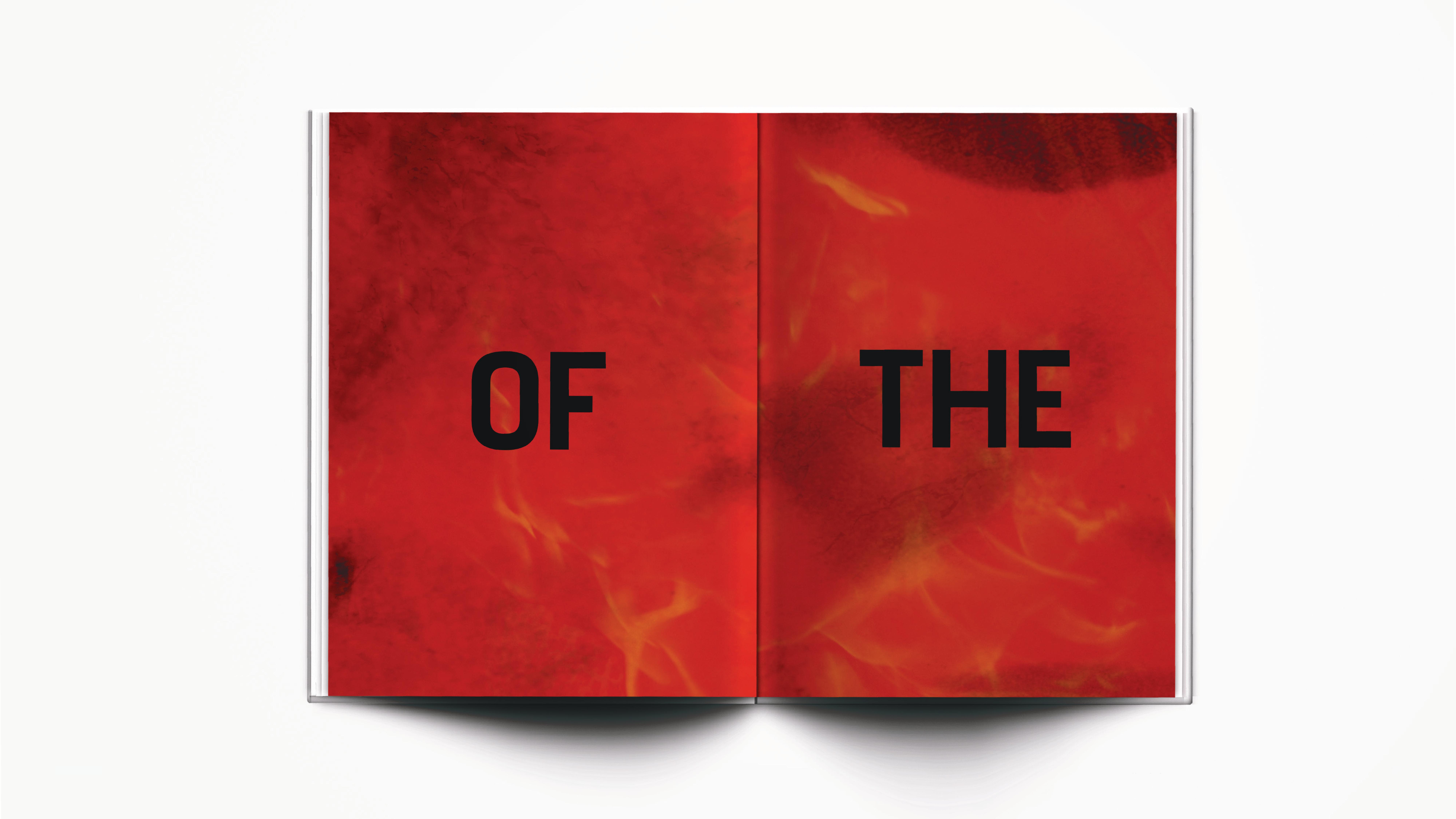
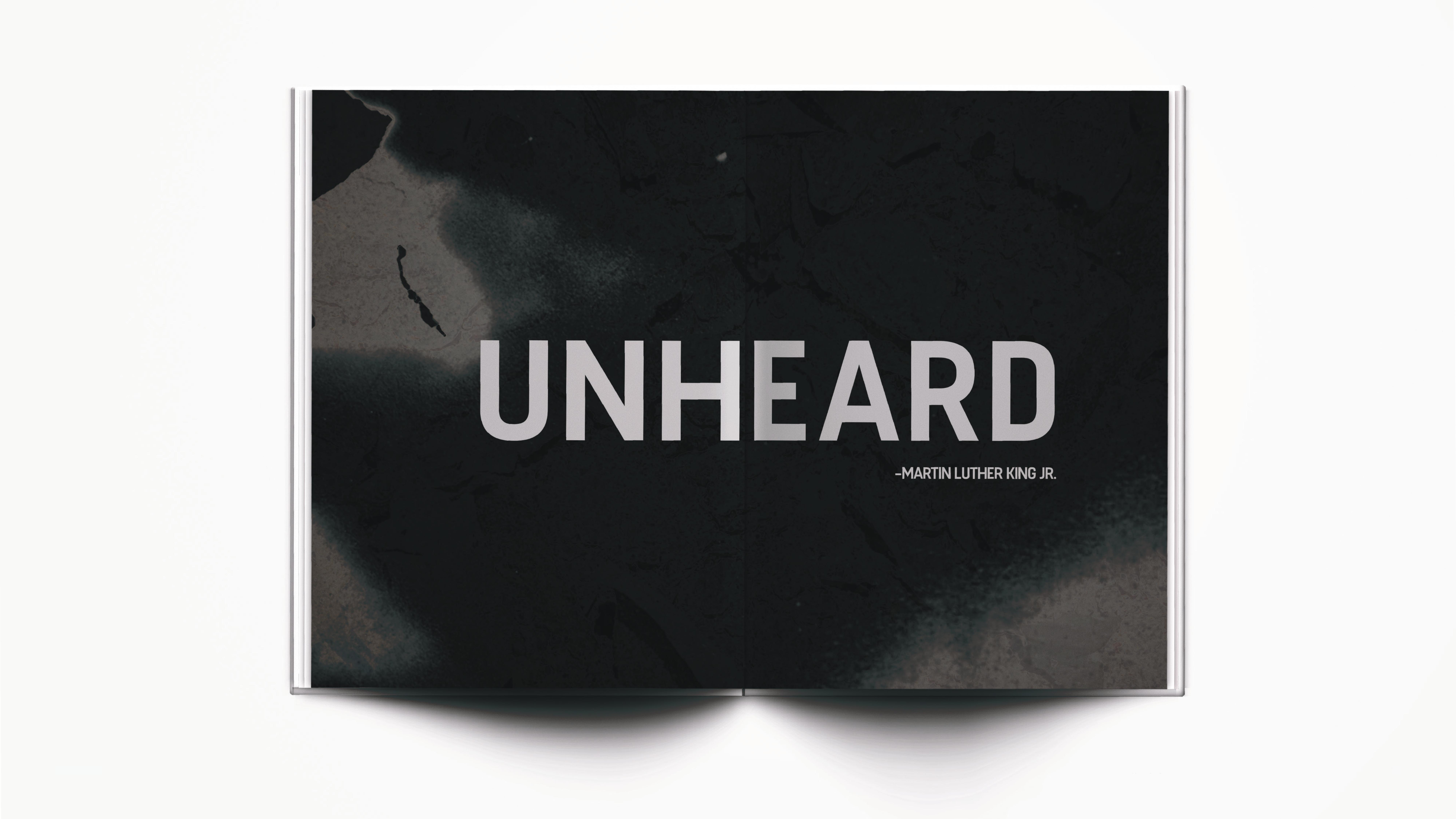
The starting spreads of my book, also known as the "Engawa. The Engawa can be seen as the "opening spreads" for a book that leads the audience to the feeling and tone of your book — like an opening. Experimenting with burnt paper and fire, I used fire as a symbol of the L.A Riots of 1992.
Image
Image
Image
Image
Image
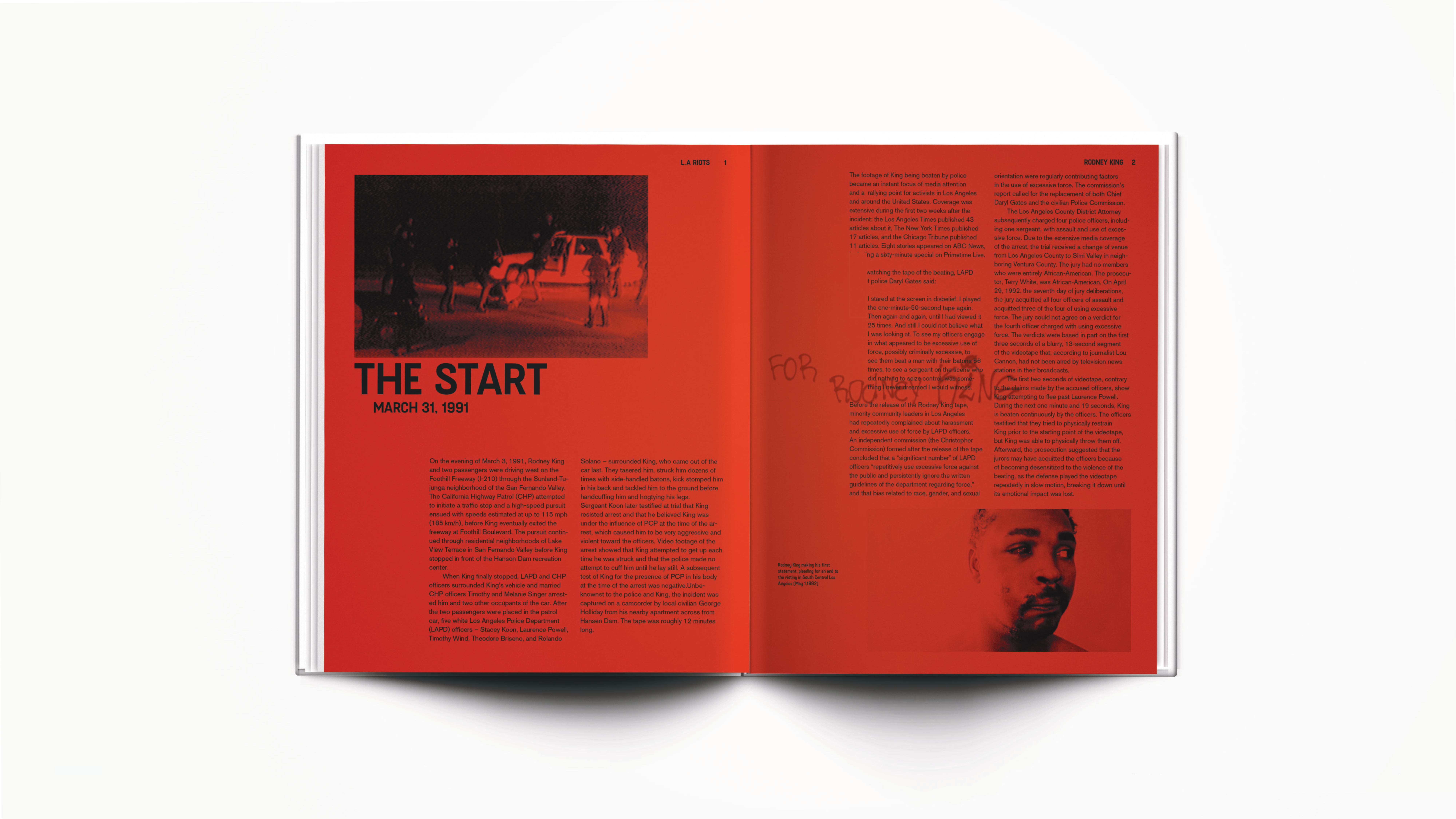
The starting article spread of my book. I started off with an article that talked about the events that led to the the L.A Riots of 1992 and how these events progressed to the happening of the riots.
Image
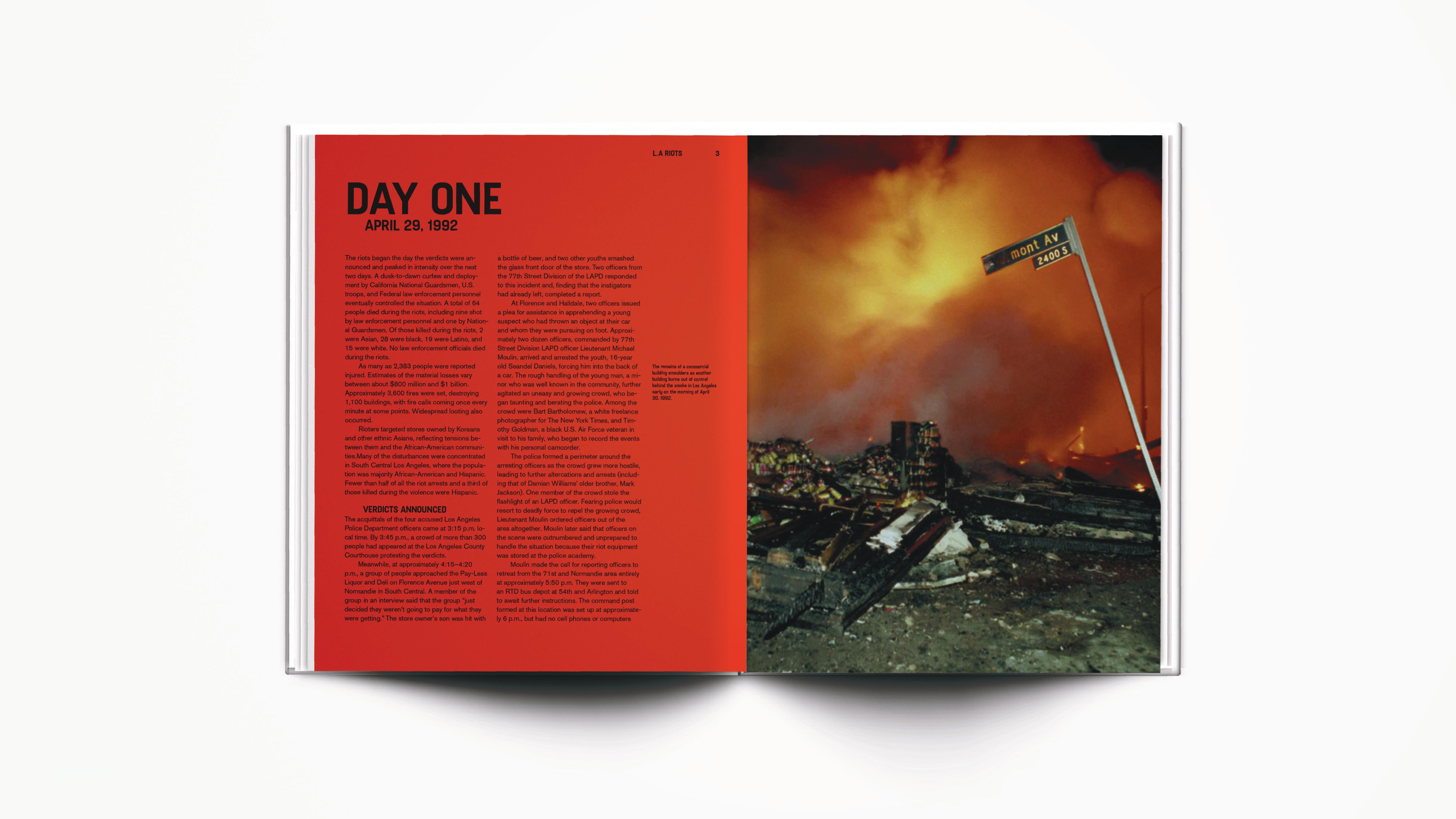
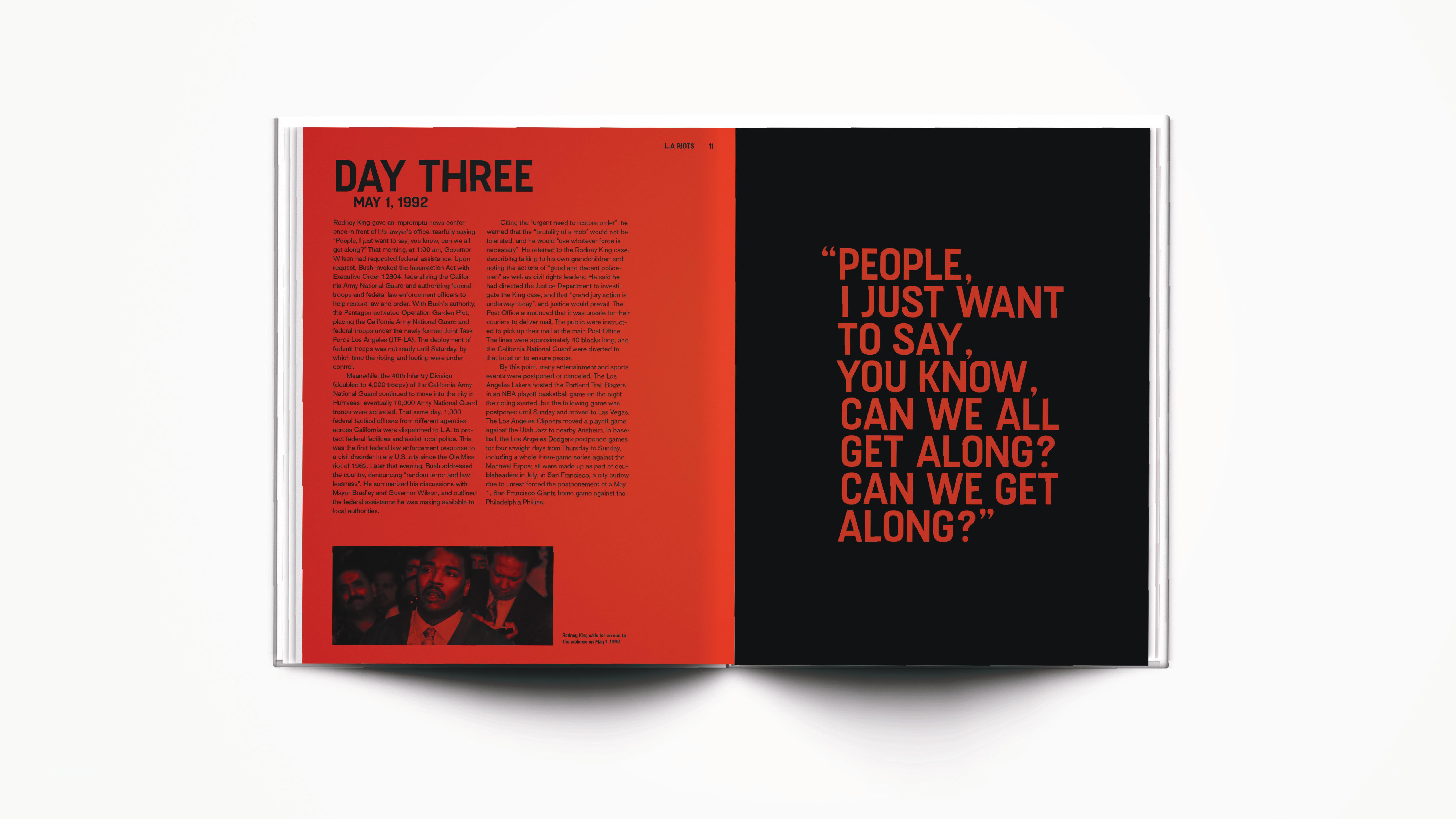
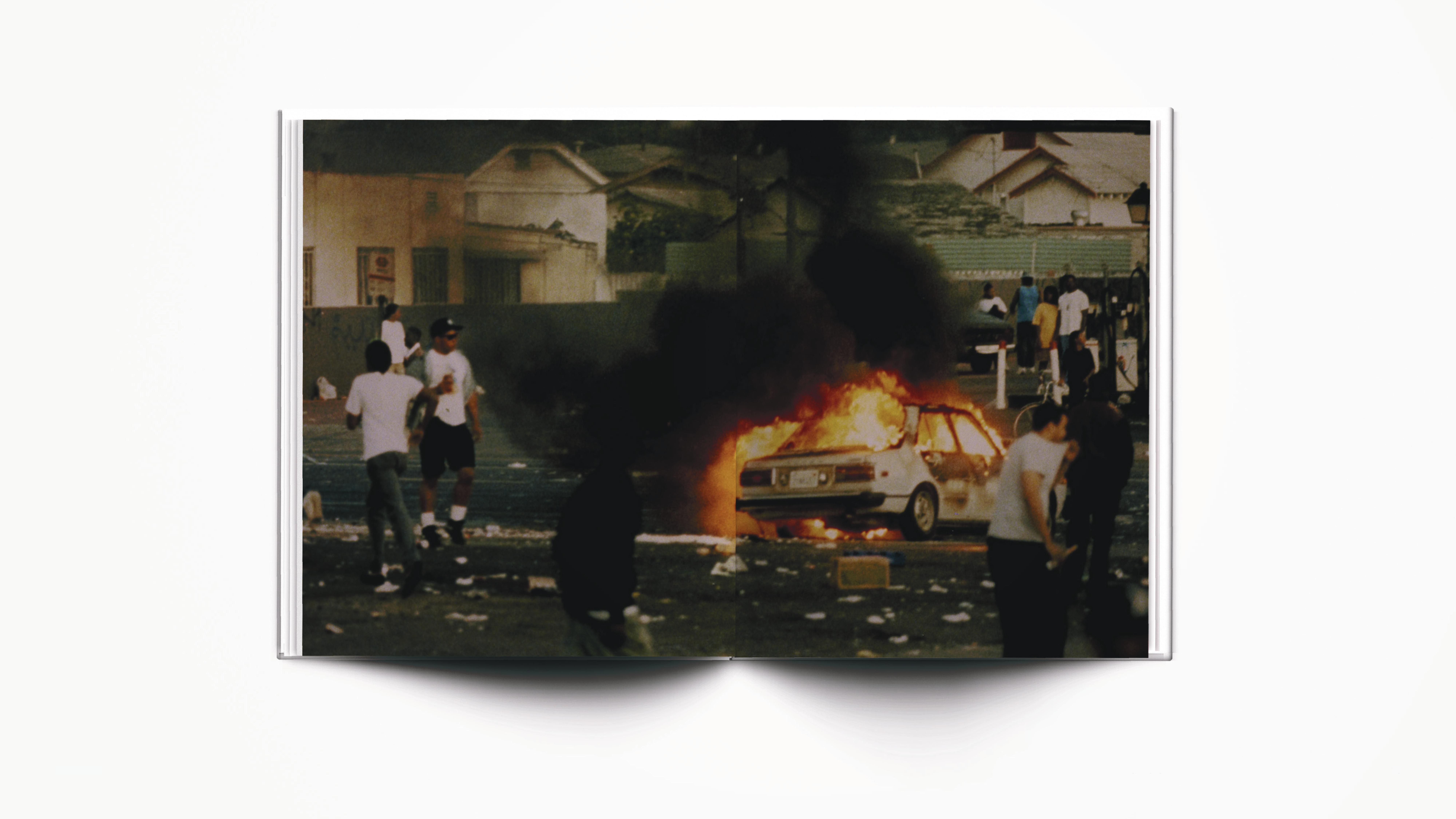
The booklet then has different sections of the six days that the Riots lasted.
Image
Image
Image
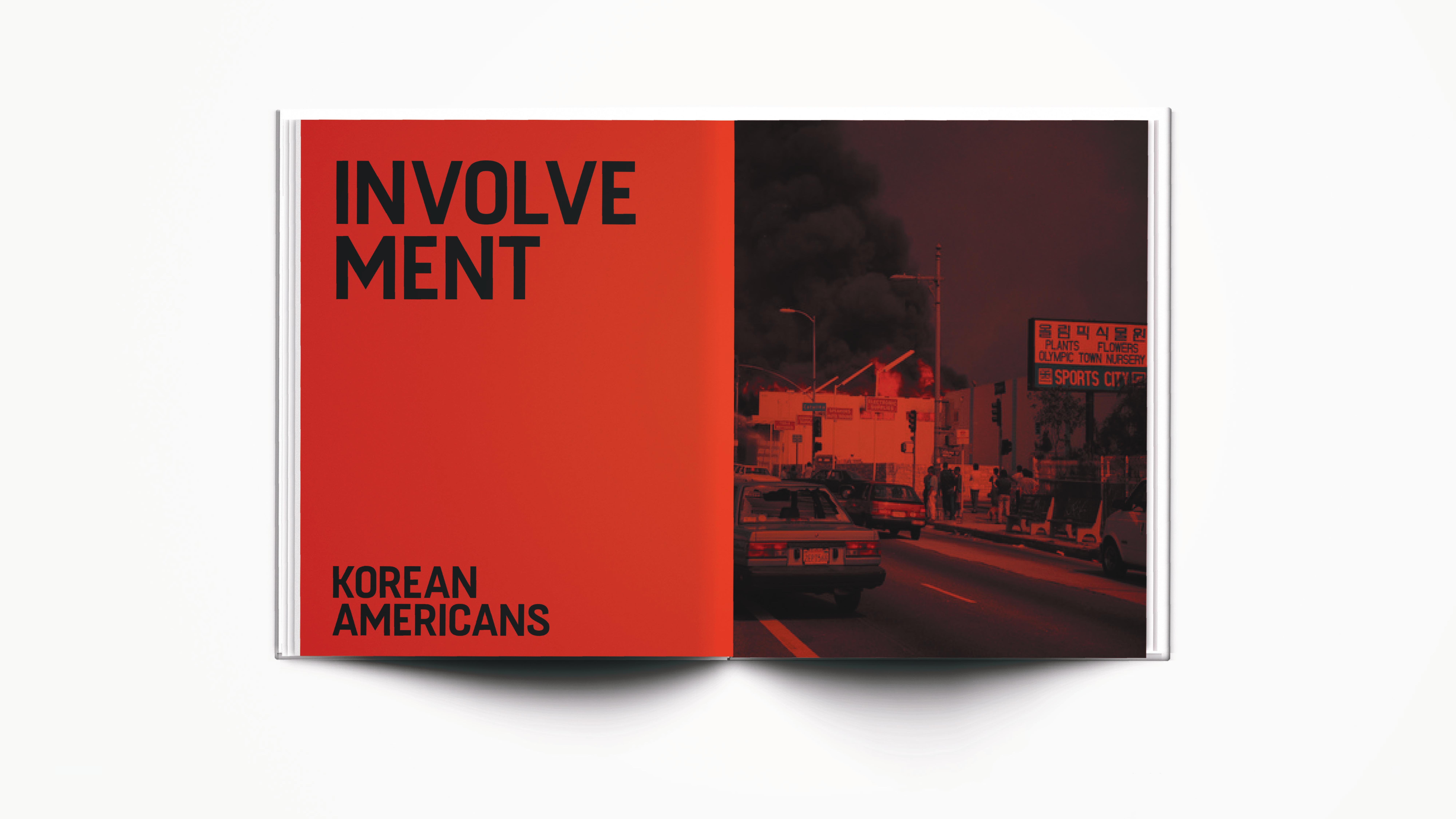
Another section of my booklet showed the different communities that had been affected through the riots — the African American, Korean American, and the Mexican American community that had been affected (and how it affected each community).
Image
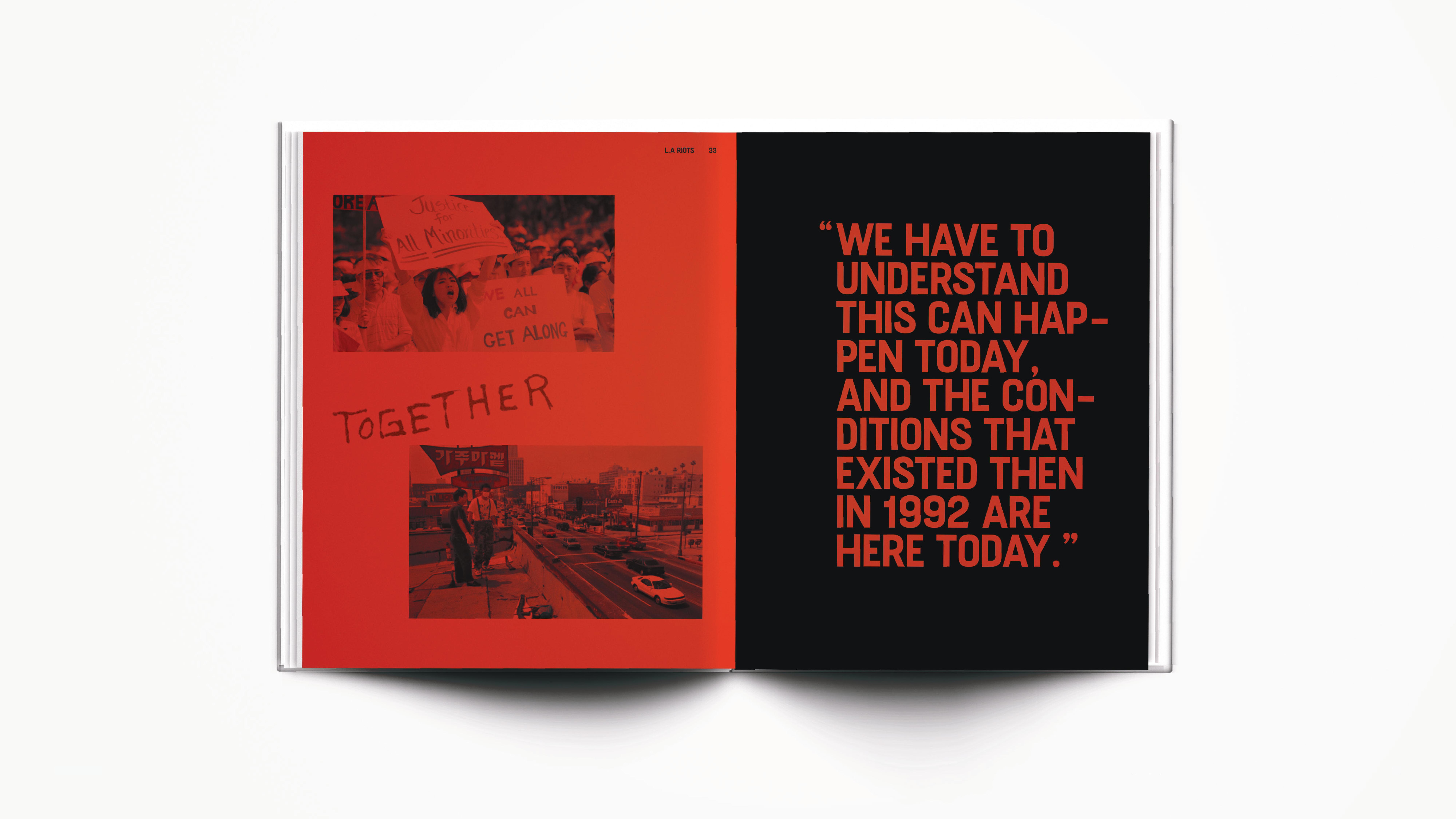
Graffiti from the aftermath of the riots are used throughout my booklet to signify the importance of the riots.
Image

Image
Image
Image
Image

Image
Image
Image
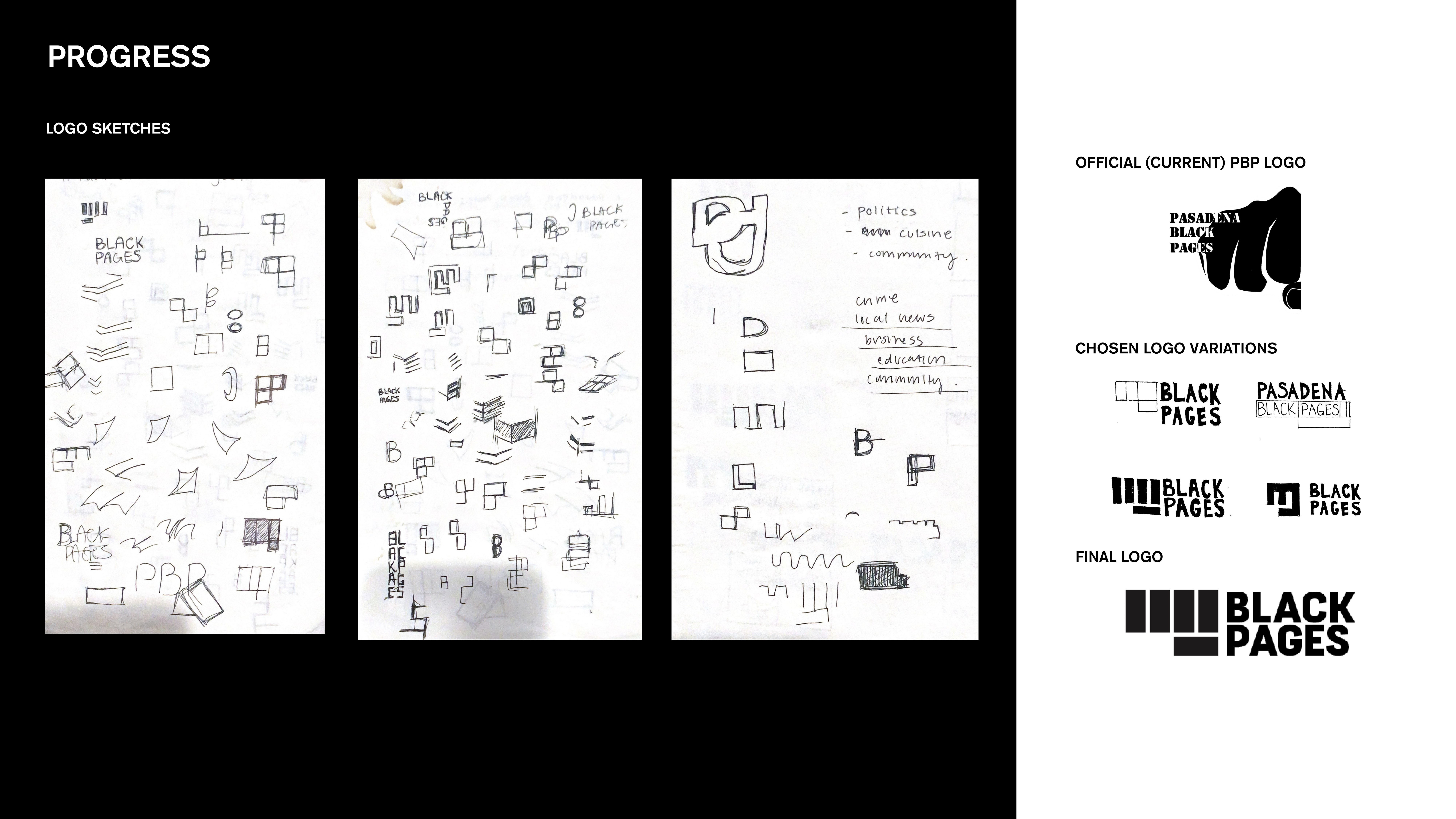
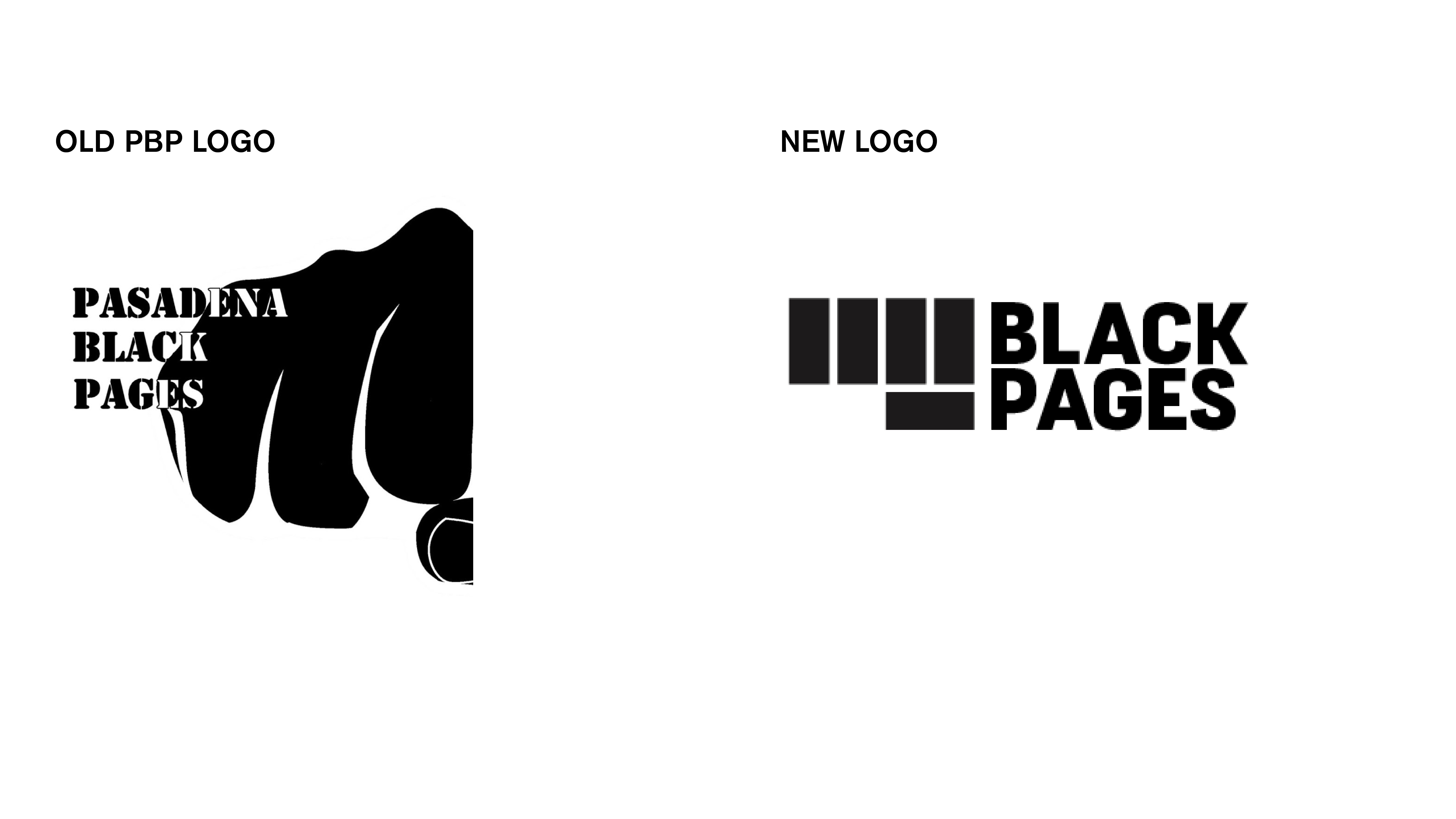
For logos, my main goal of creating a logo for Pasadena Black Pages was to create something that will feel less outdated but still was recognizable in terms of representation of the community. I tried various versions as shown in the progress pictures. The raised fist is a significant symbol for the black community (which the organization represents) representing solidarity and unity. The original logo for PBP (as shown to the right) was a raised fist that was directed towards the viewer — so with the original logo in mind, I created a logo that visually represents a raised fist to further visually communicate the symbol of resistance and defiance.
Image
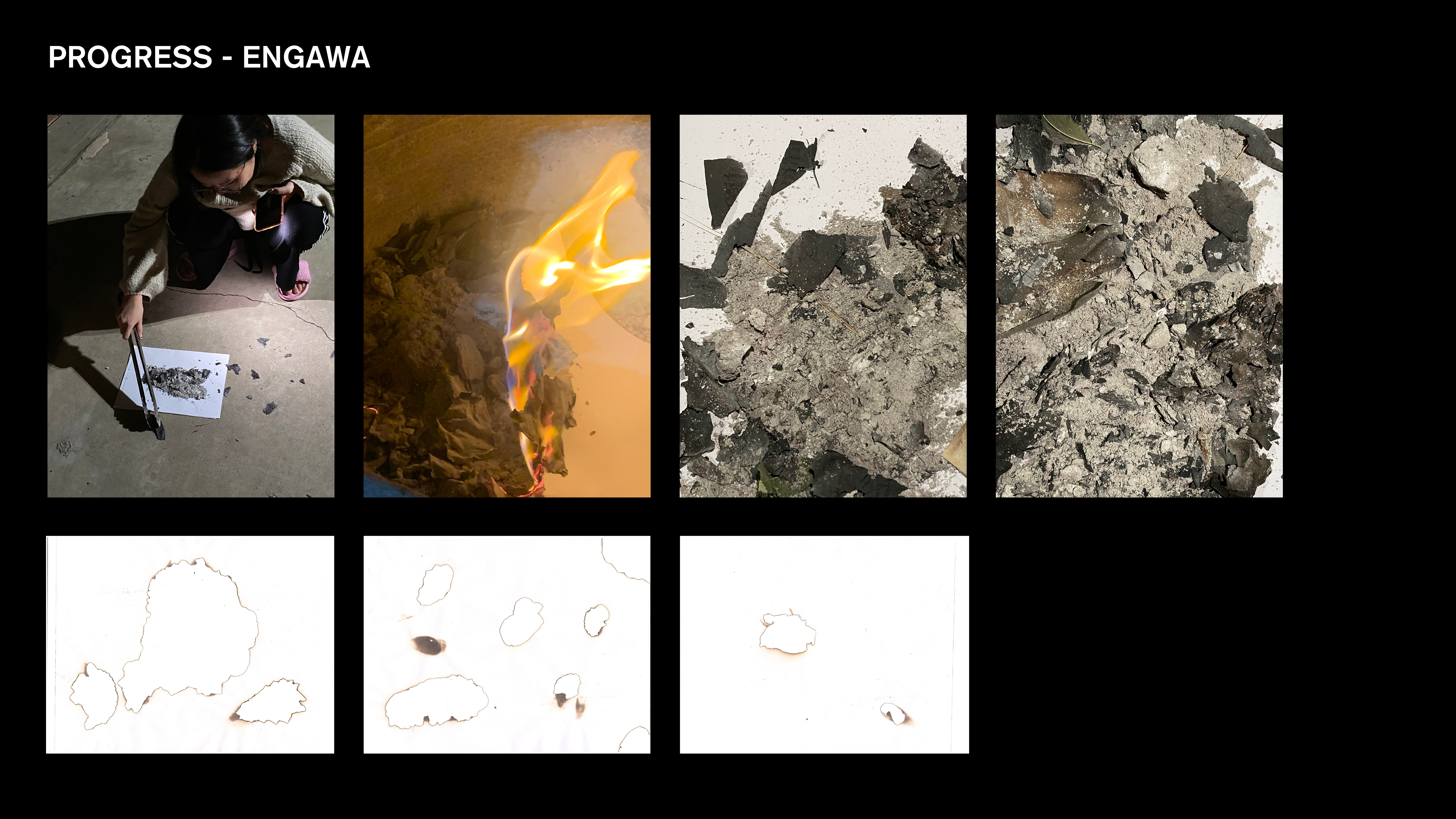
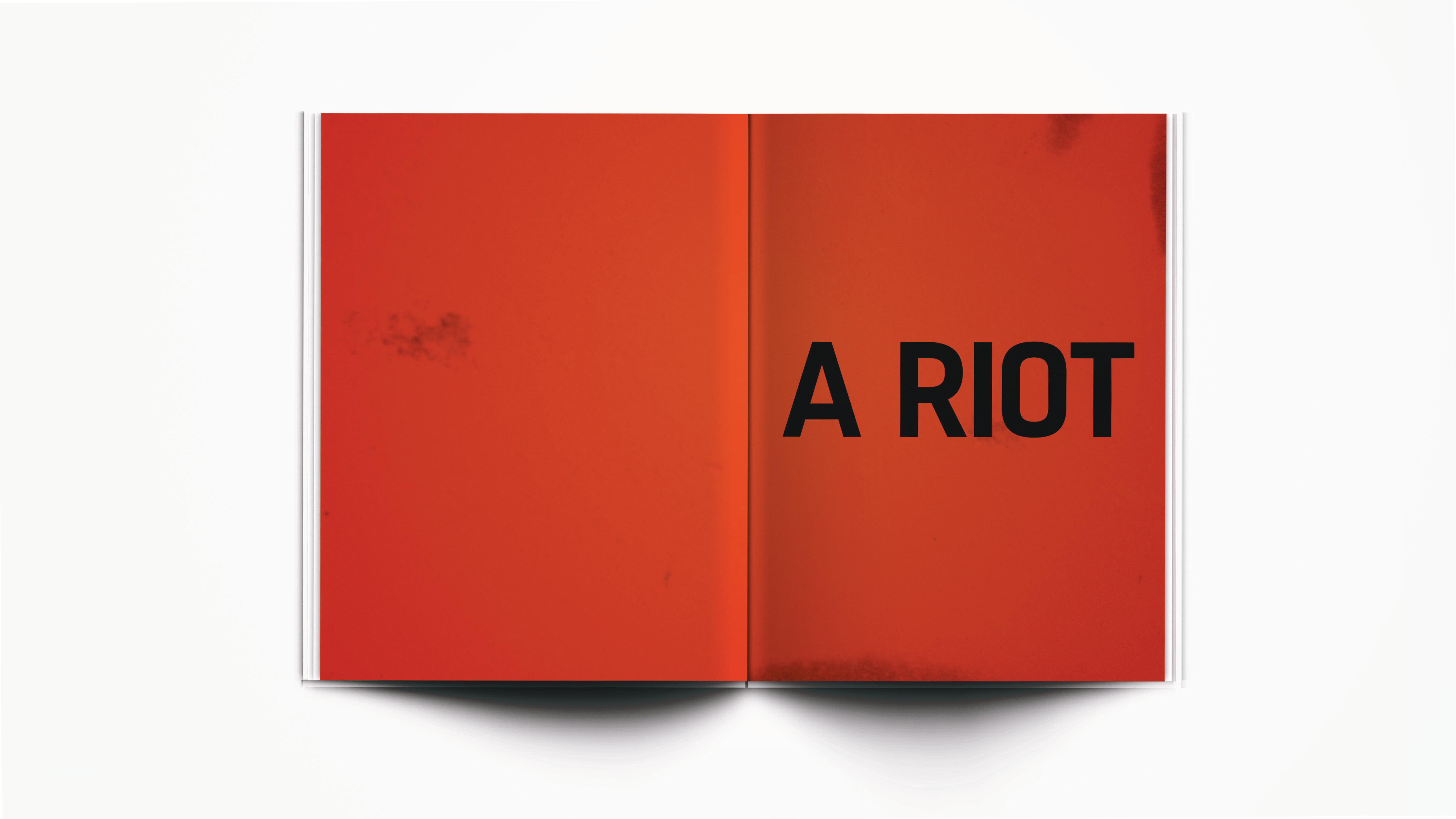
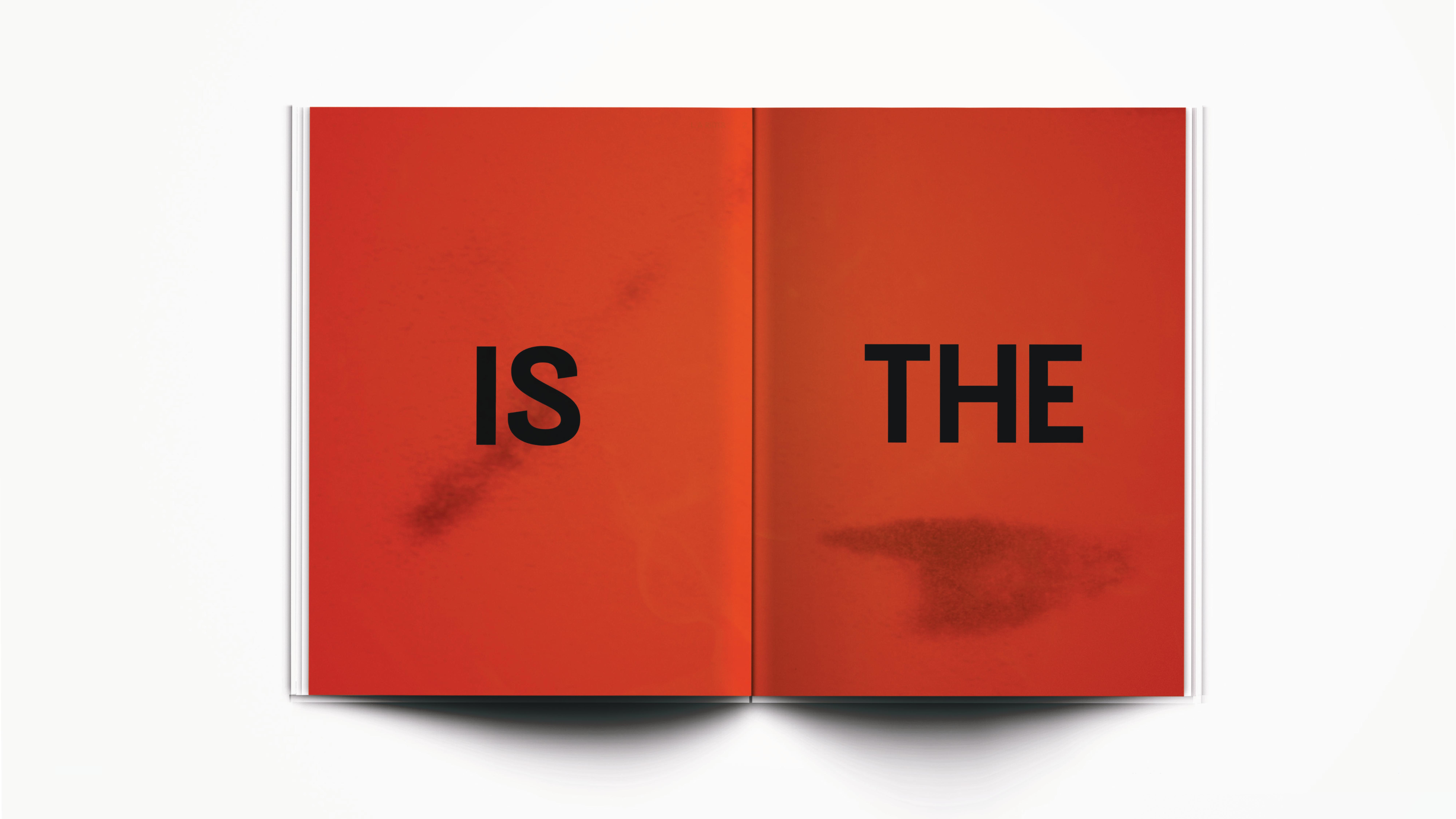
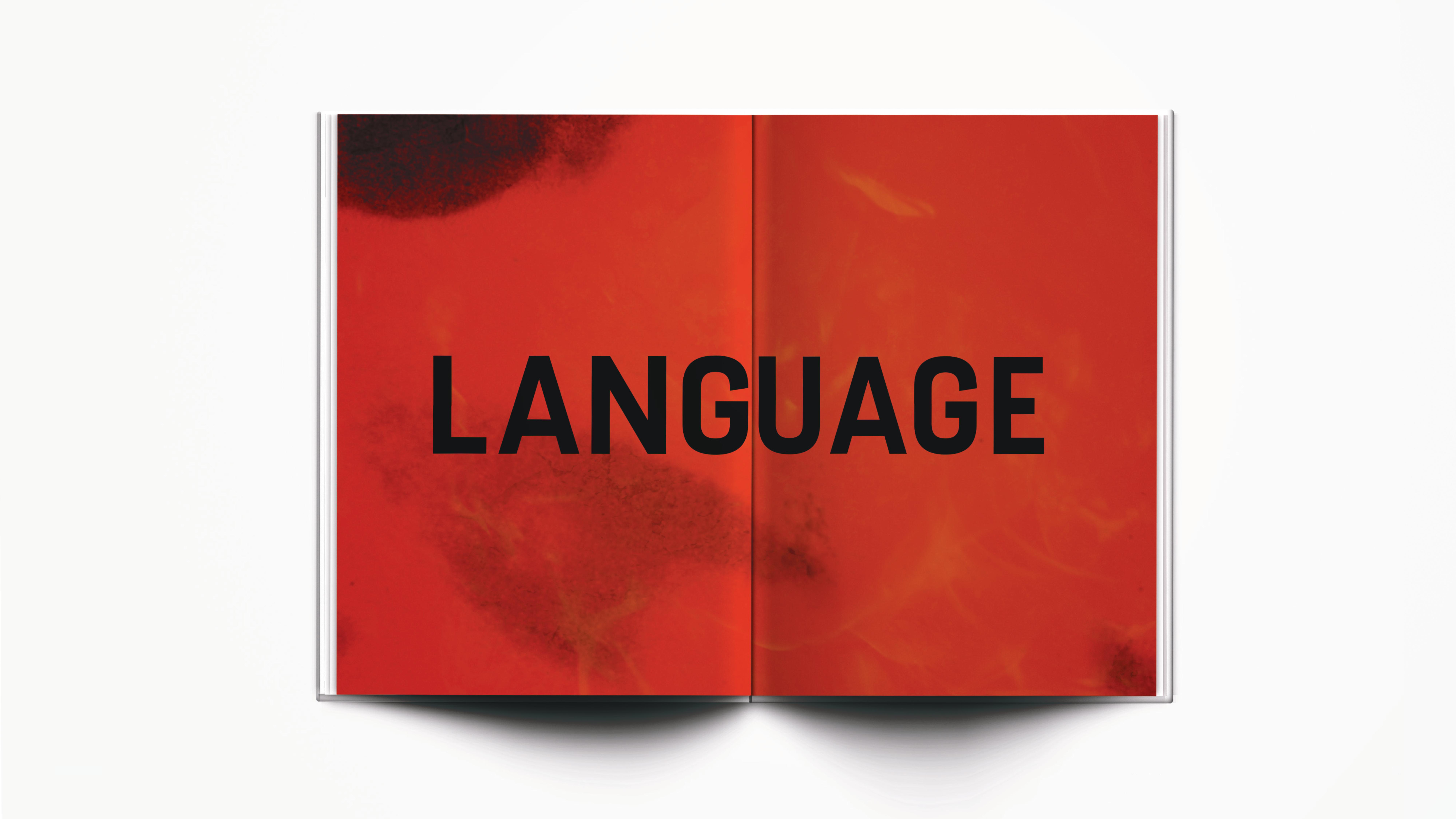
We were tasked on to create an Engawa of the book. The Engawa can be seen as the "opening spreads" for a book that leads the audience to the feeling and tone of your book — like an opening. Since my book talks about the L.A Riots of 1992, I wanted to visually communicate a tone that felt powerful and strong. The L.A Riots were an important event in our history and I wanted to fully be able to communicate the rage and anger that the people of color were affected. Through that in mind, fire was one of the main important signifiers of the L.A Riots. Not only does "burning" fire represent the chaos and anger, when a fire burns out, there are remnants of ashes that signify something has been destructed and cannot be reverted. So through this in mind, I wanted to represent the L.A Riots in an abstract way but still visually communicate the events of the L.A Riots and the events proceeding after the riots. I burned paper at my home, using remnants of ashes and fire. I scanned in paper I burned in as well to create imagery for my engawa.
Image
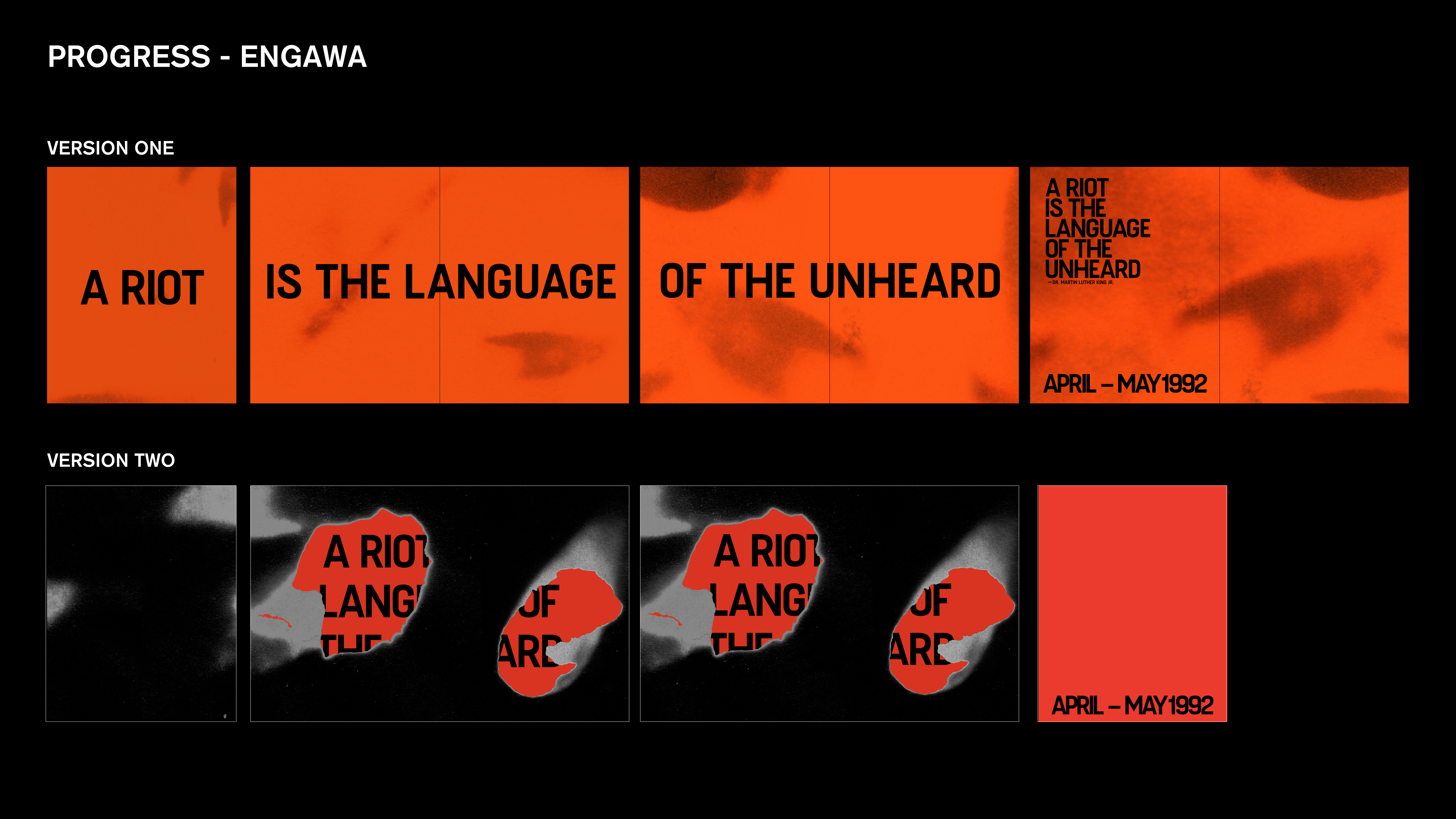
Here are two variations that I did for my engawa. The quote is "A riot is the language of the unheard." by Martin Luther King Jr. that I felt representing the L.A Riots but riots as a whole. Through this quote, I wanted the viewers to feel a powerful opening not just through the text but imagery as well. The second variation (eventually not chosen) slowly revealed the quote whereas the first chosen variation split the quote so viewers could feel the tension of the quote.
Image
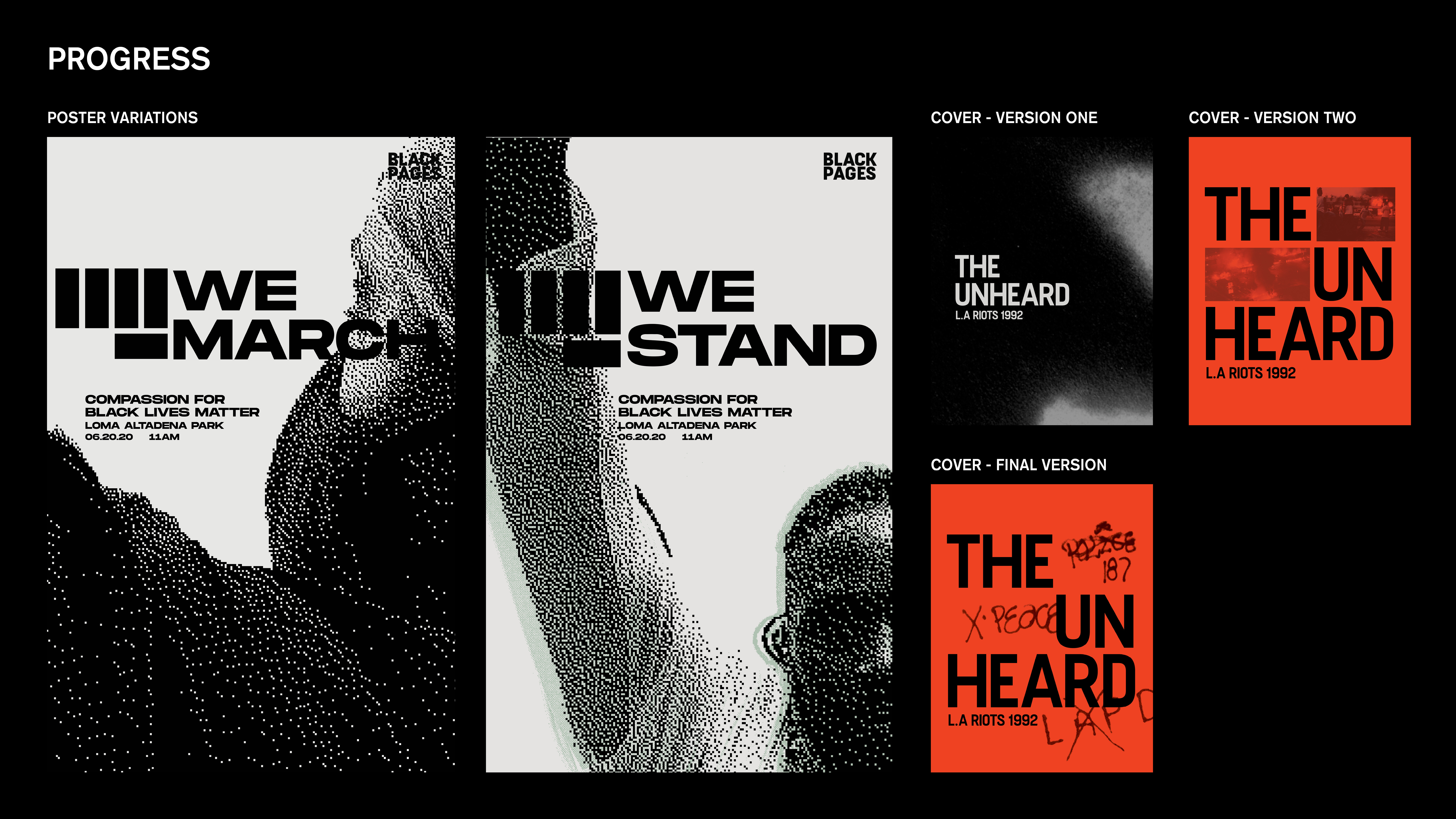
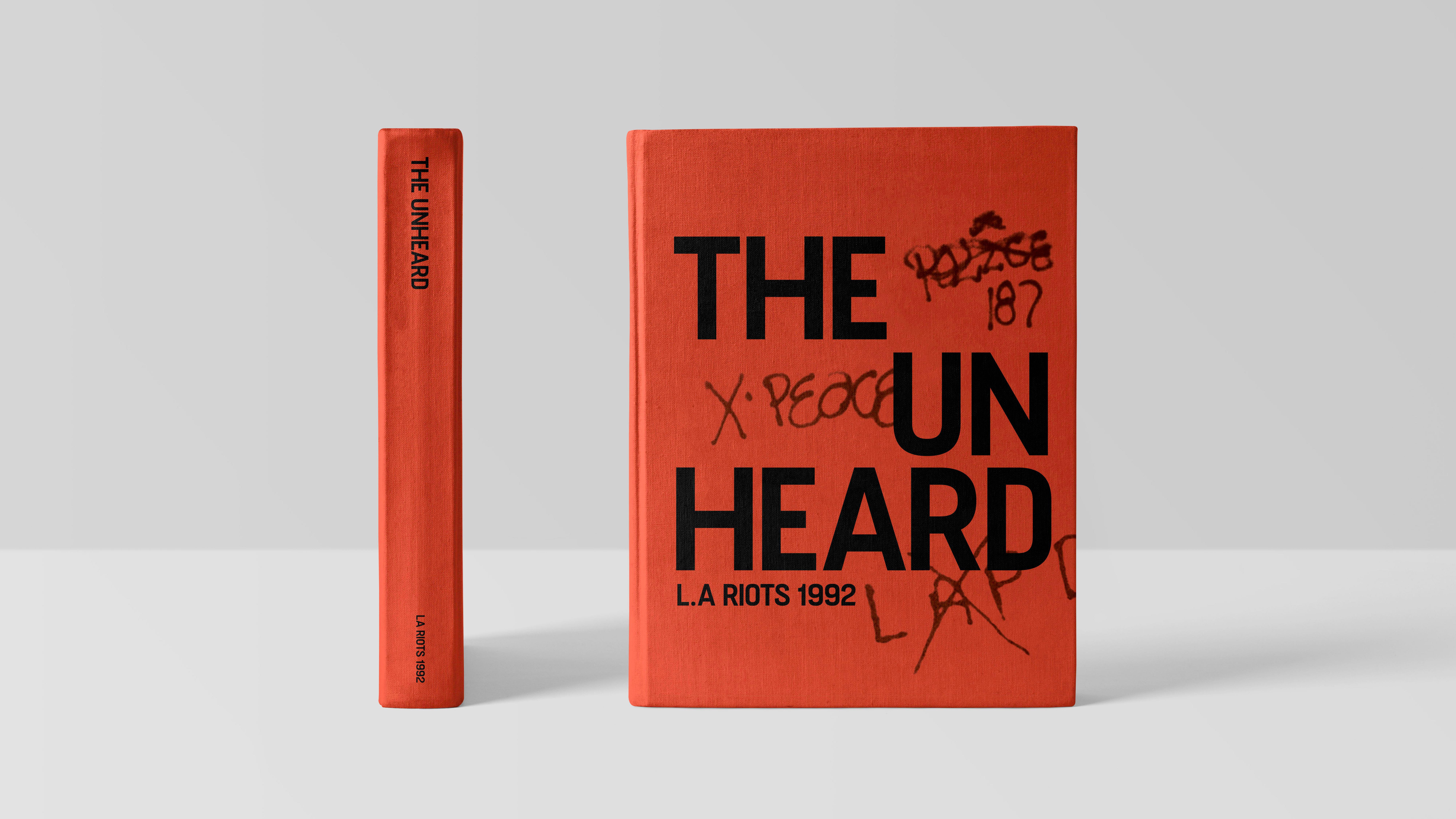
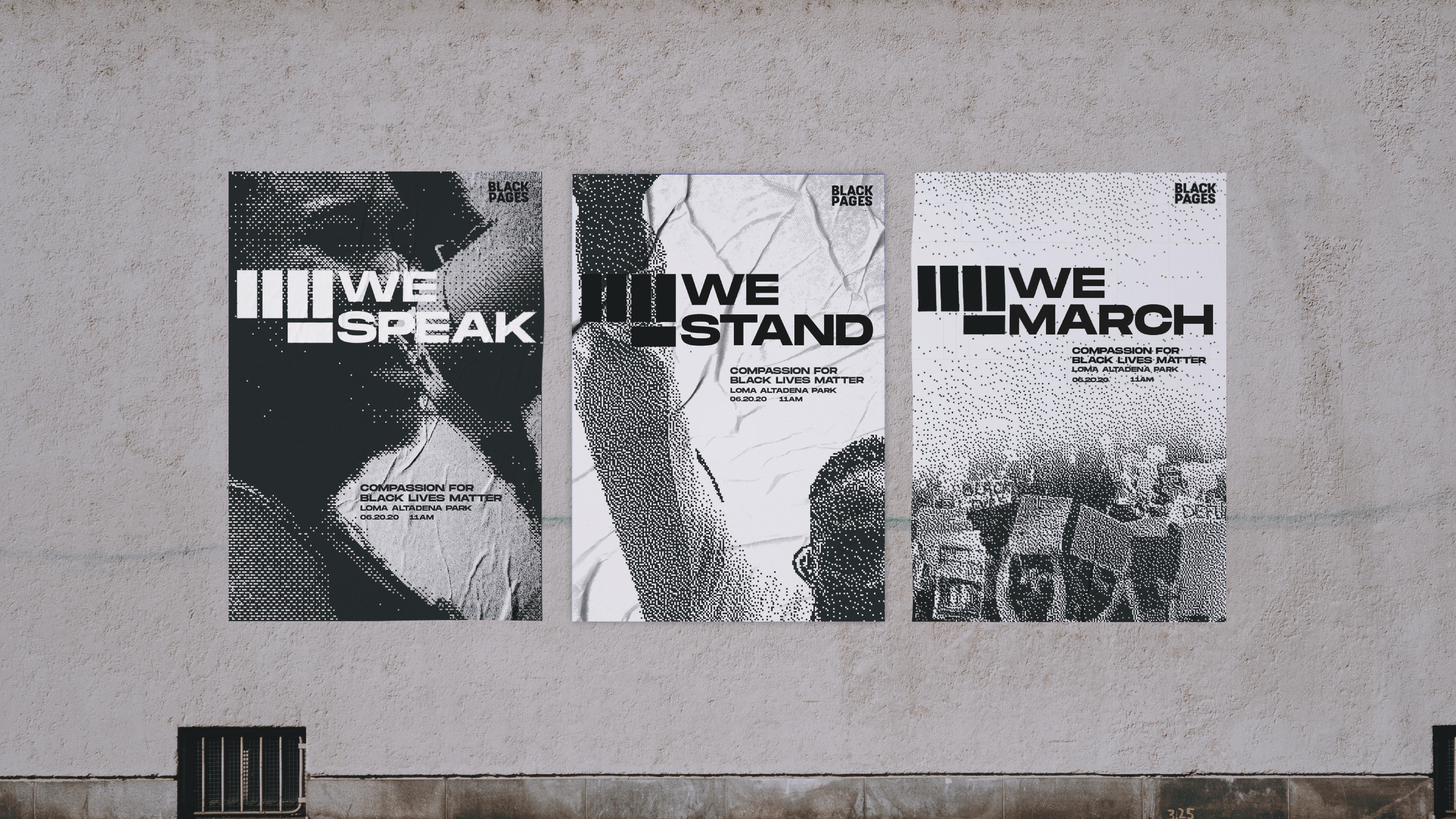
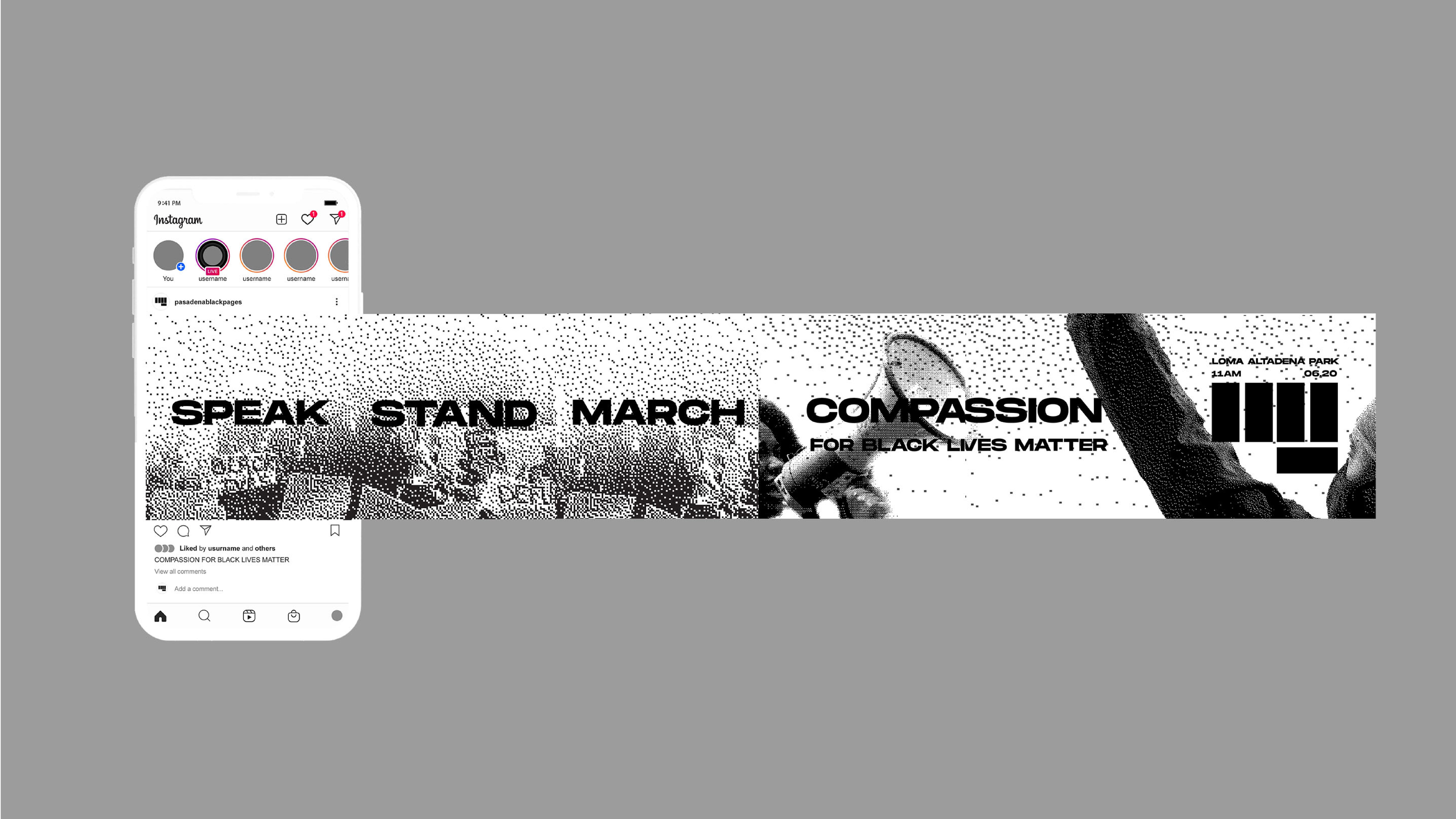
This shows the process of a few posters and cover versions I created. For the poster, at first, I only chose photos that showed individual people. Through various critiques and progress however, I learned that perhaps changing the last poster to something that represented the community would work better. The right shows a color variation I did as well — a color that was derived inspiration from the Black Liberation flag. The first cover variations I did were used with type and imagery/color from my book. However, through progress, I took graffiti from the L.A Riots itself because I felt that strongly expressed the defiance and significance of my event.