Image
Image
Image
Image
Image
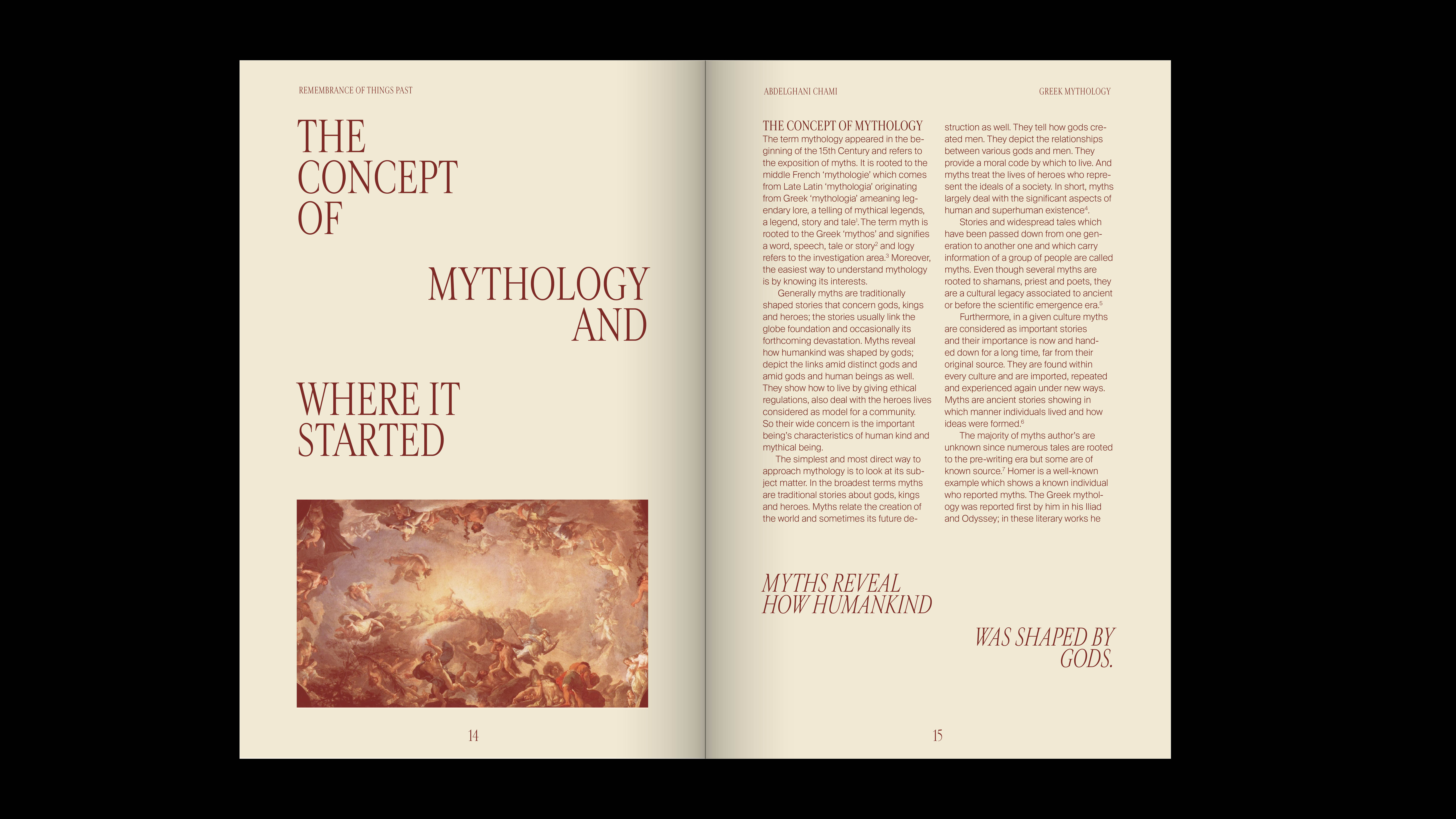
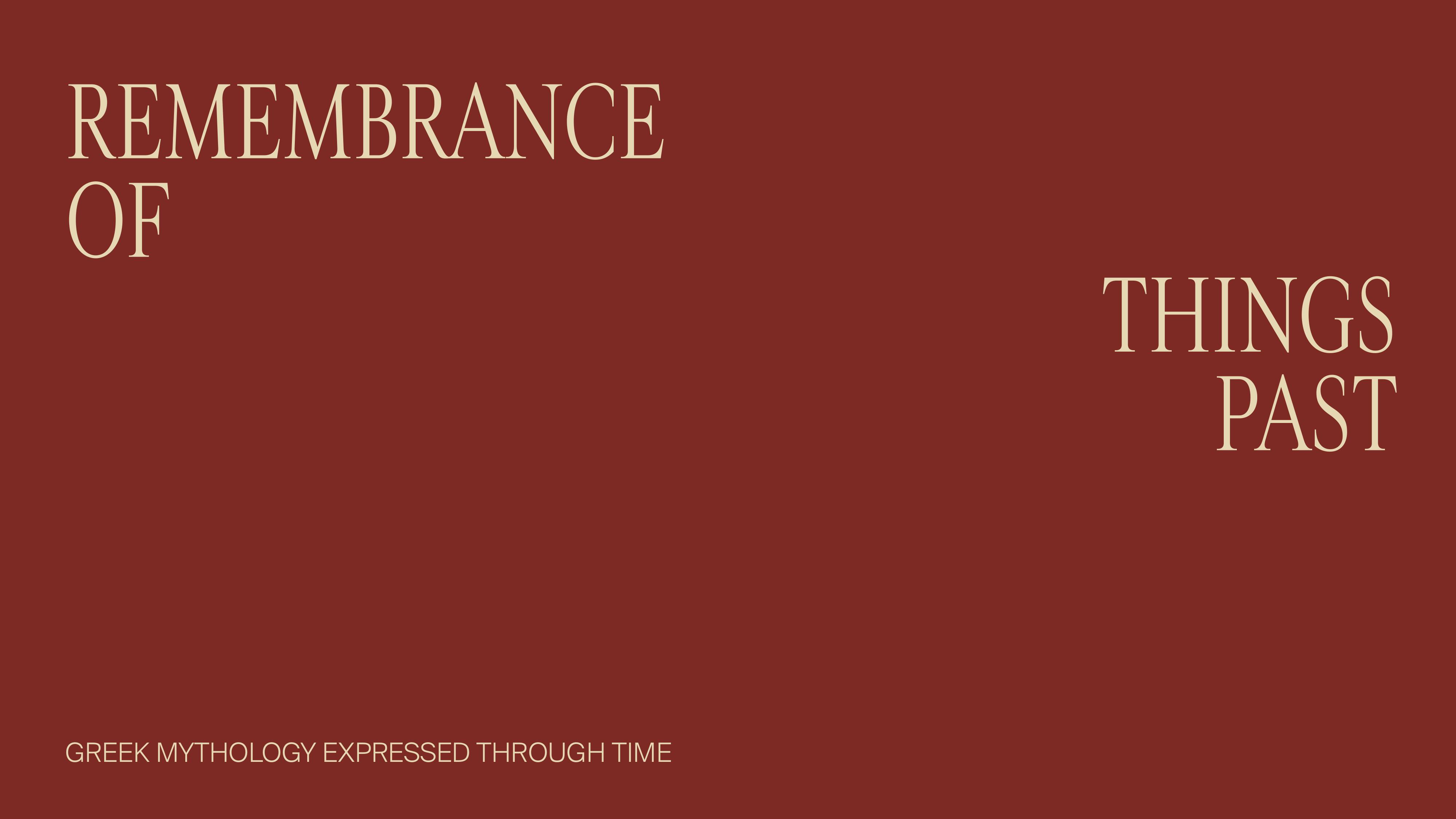
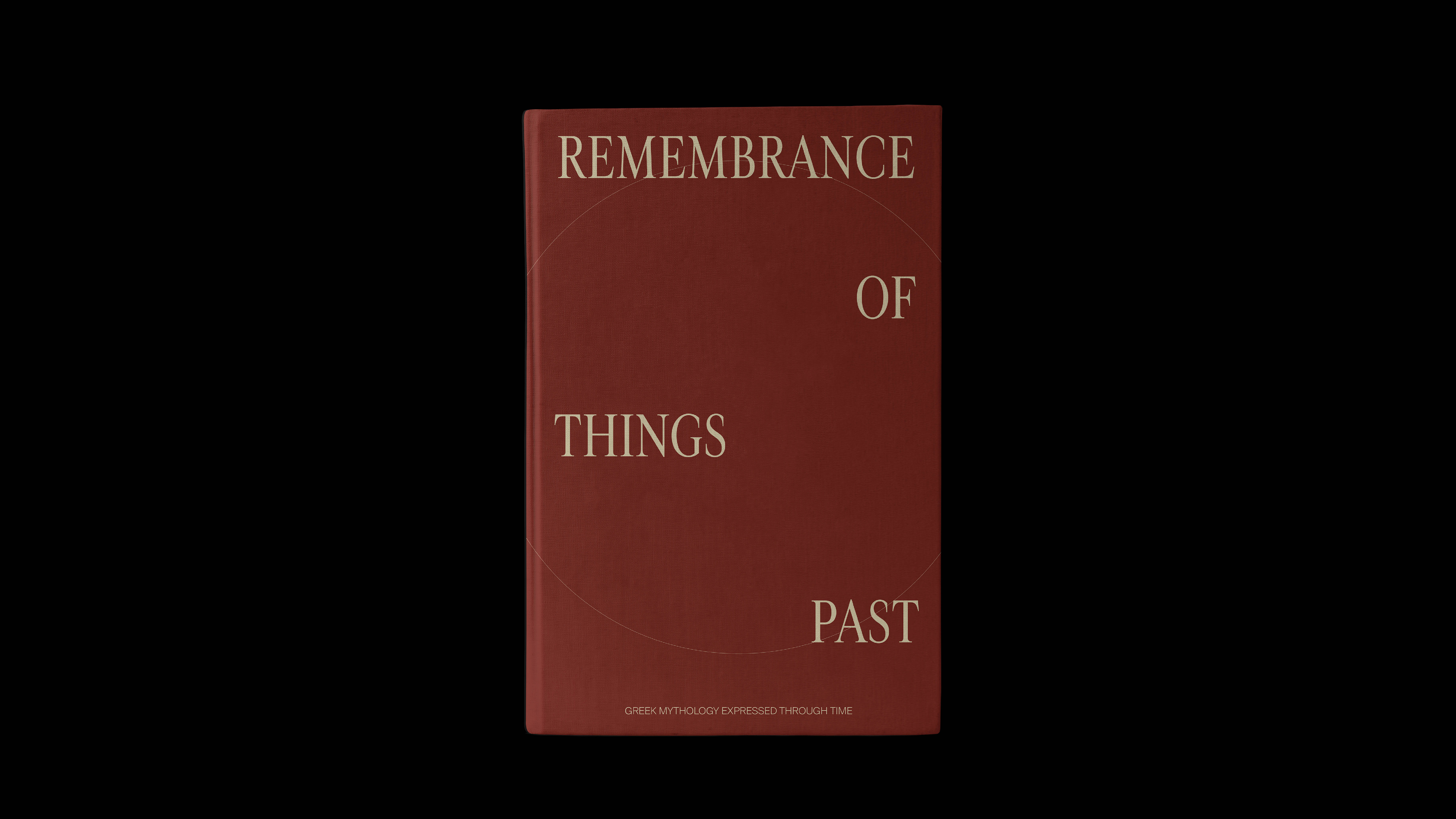
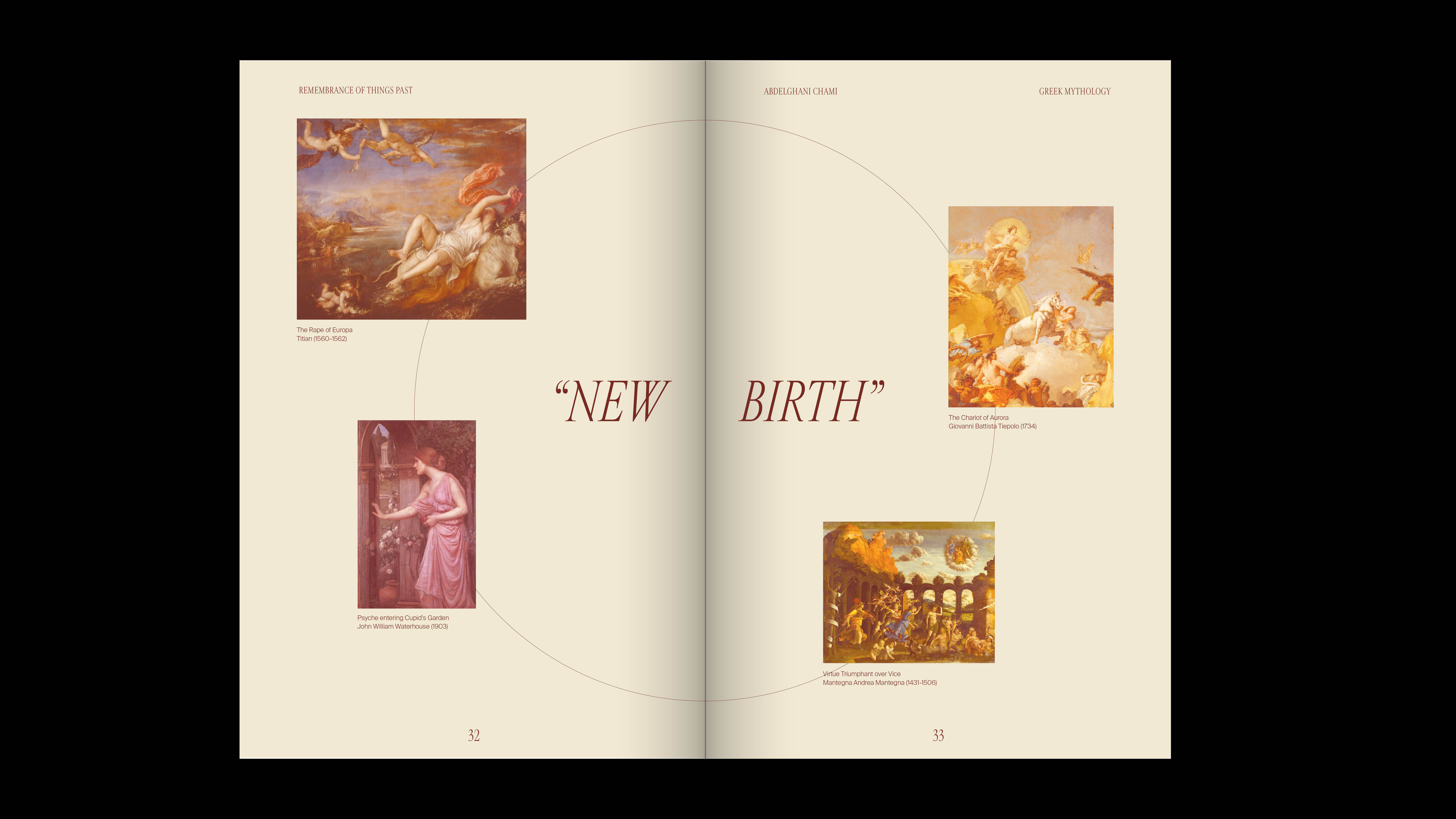
This is the starting spread of my book. One of the main typographic moves that I use throughout my book is the breaking of text (as shown in the title or pull quotes) to represent the deities (which indicate the divine/higher) and humanity/humans (below the deities).
Image
Image
Image
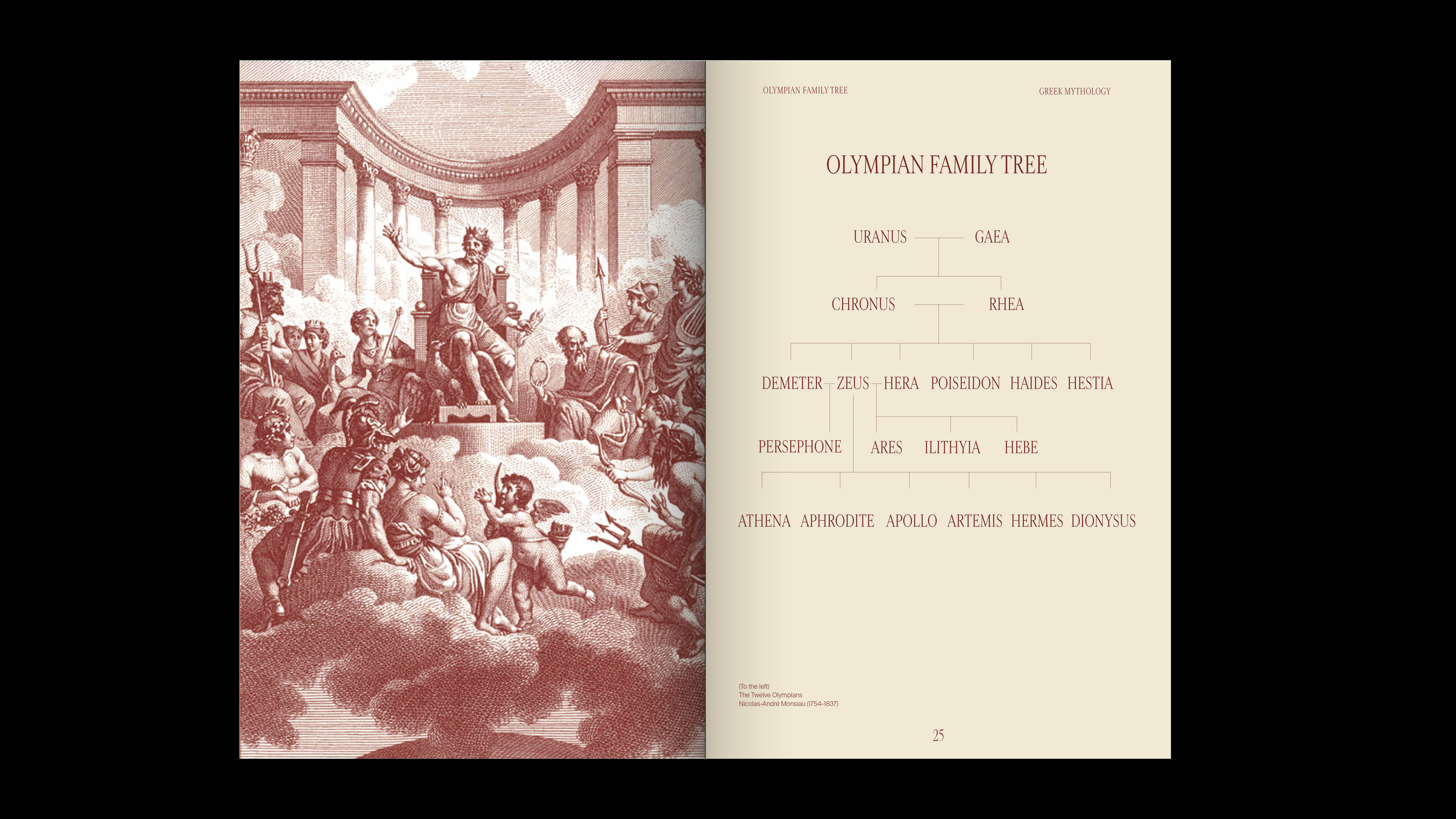
This spread shows the Olympian family tree. In Greek Mythology, the twelve Olympians are the major deities of the Greek Pantheon. Through typographic moves, I wanted to give the same sense of structure throughout both sides of the pages through visual means.
Image
Image
Image
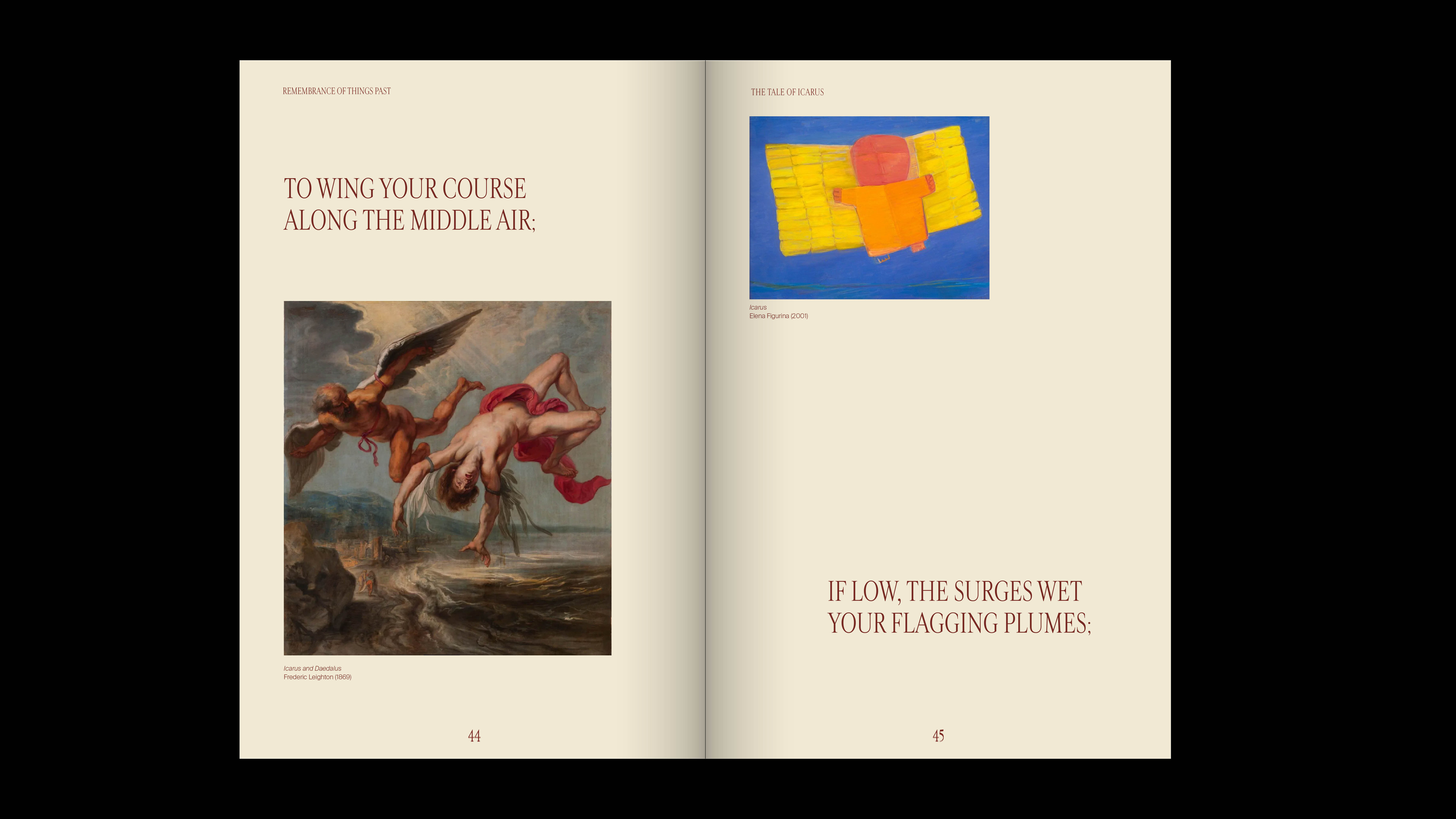
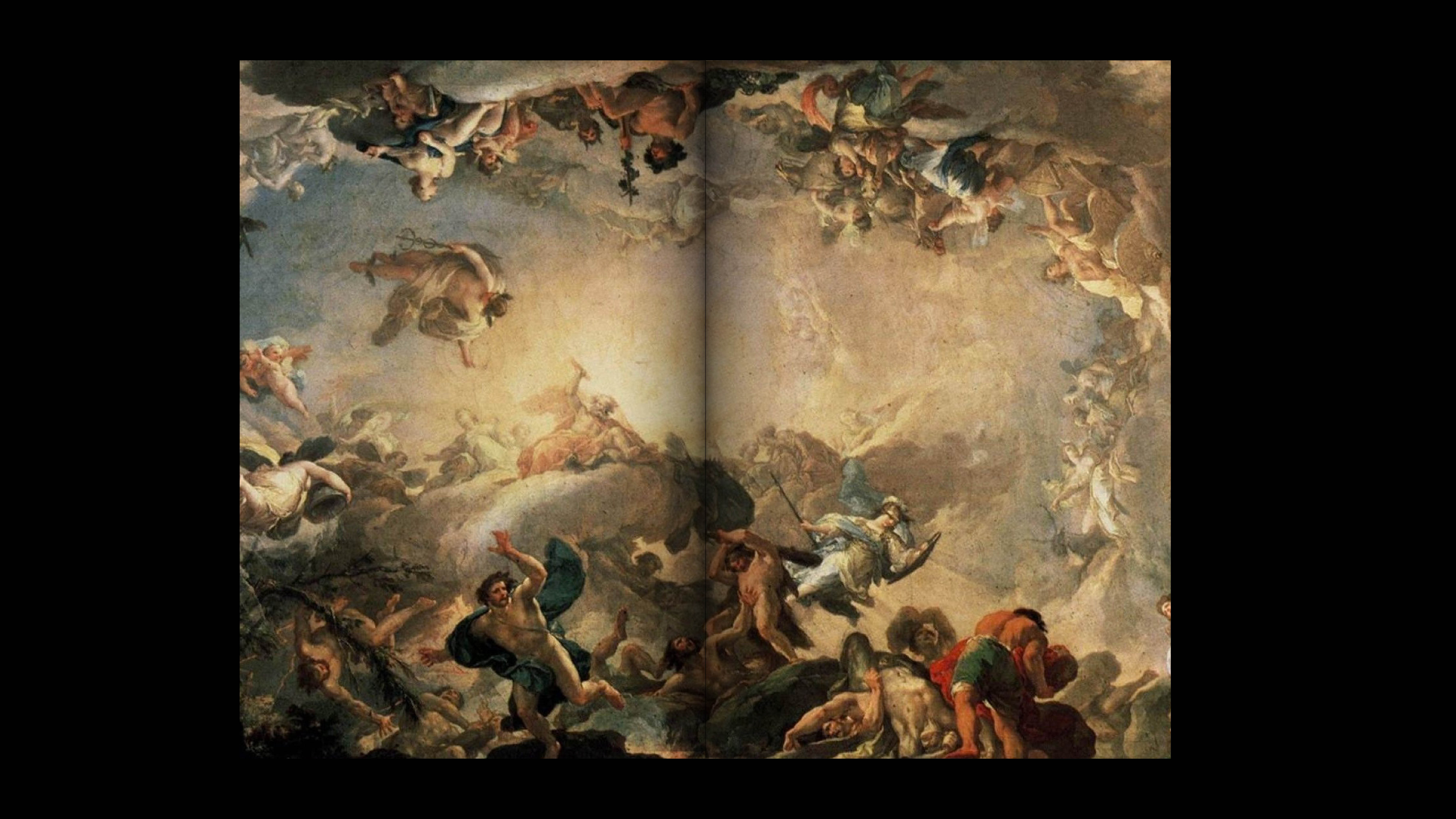
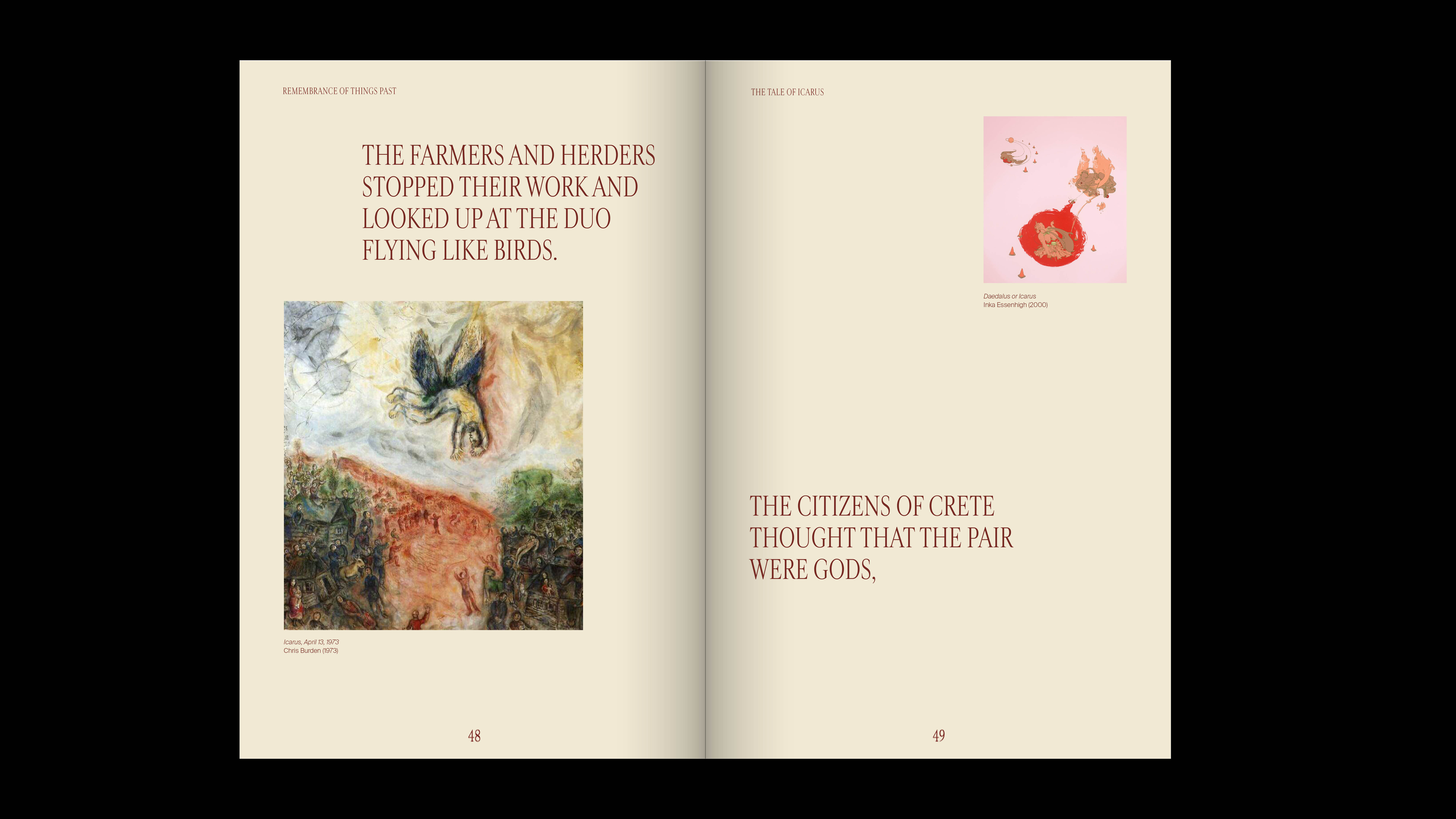
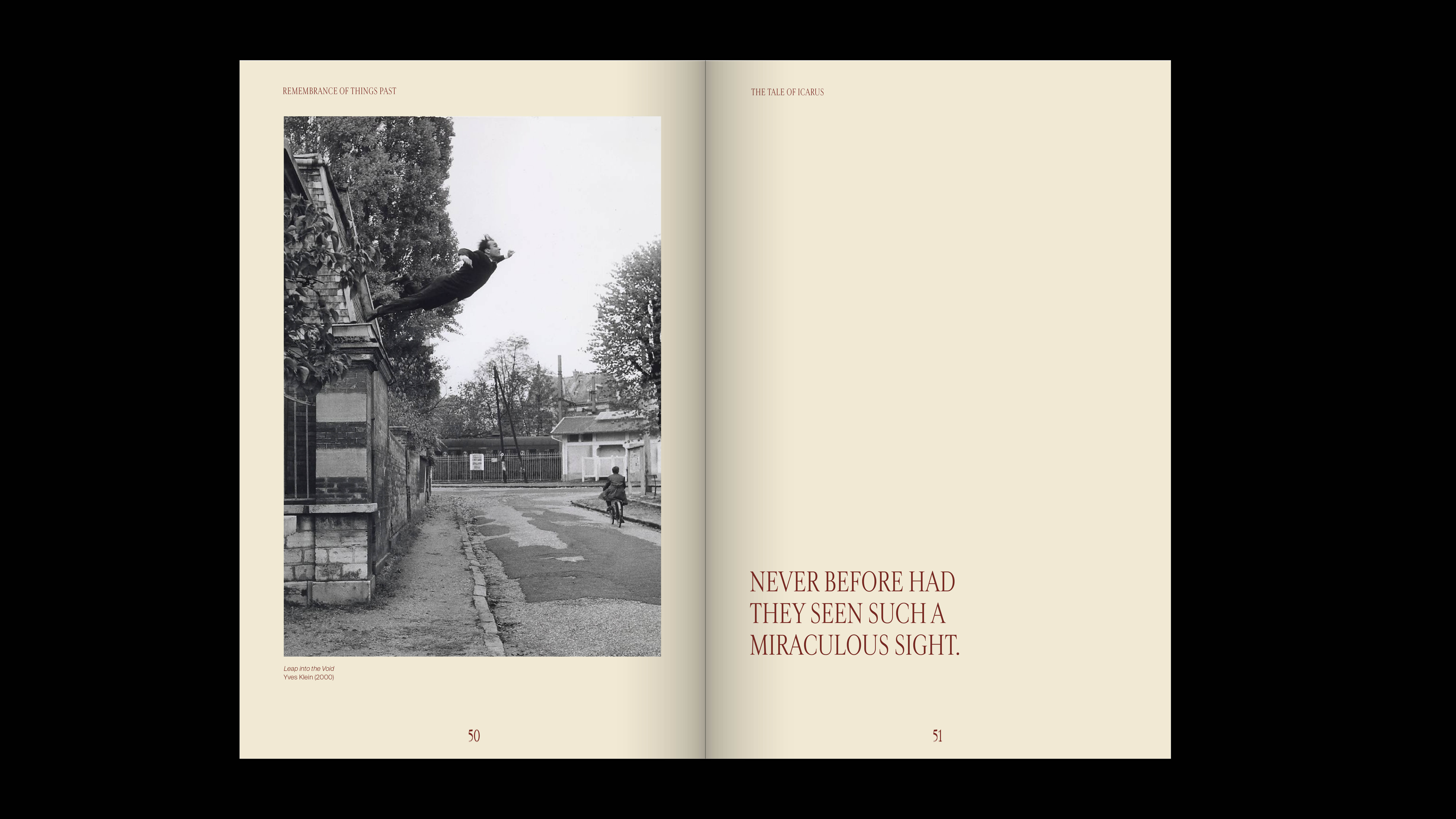
In my case, I chose to do my artists sections on the famous mythological stories. Within each "artist" section, I chose to show the different artwork portraying the mythological tale from early periods like the Renaissance all the way up to present day. This section tells the story of The Tale of Icarus and Daedalus. I pulled an excerpt from the tale itself to portray a story as my audience can connect it from the timeline of how these tales were represented in artworks.
Image
Image
Image
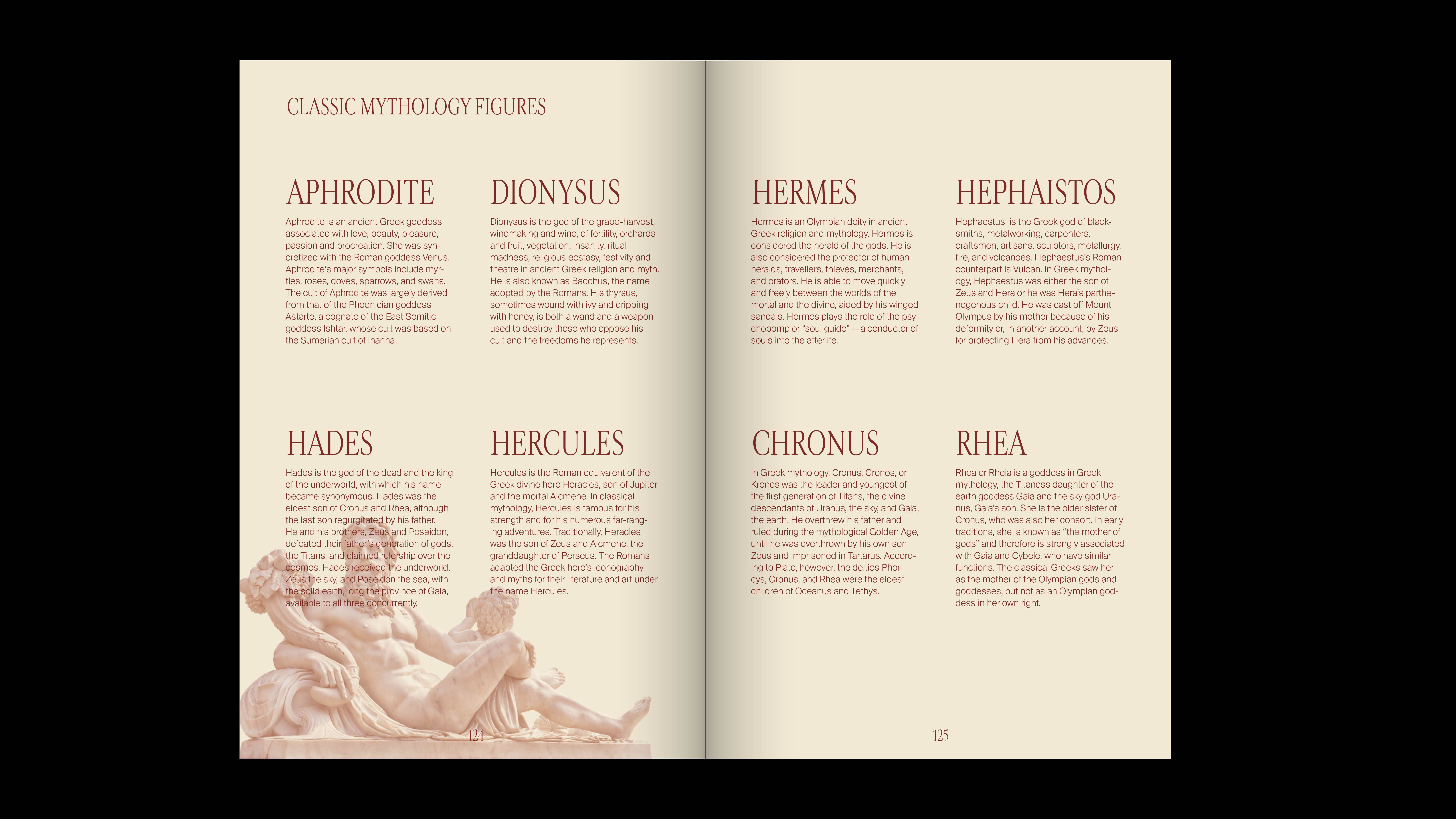
This is one of the ending spreads that was to portray any past exhibitions related to my artists in my book. As my exhibition was based off classic mythology and there were no previous exhibitions based off my topic—through critique and consideration, I decided to base these spreads off the classic mythology figures mentioned throughout my book.
Image
My exhibition wall—using the same typographic moves within my book.
Image
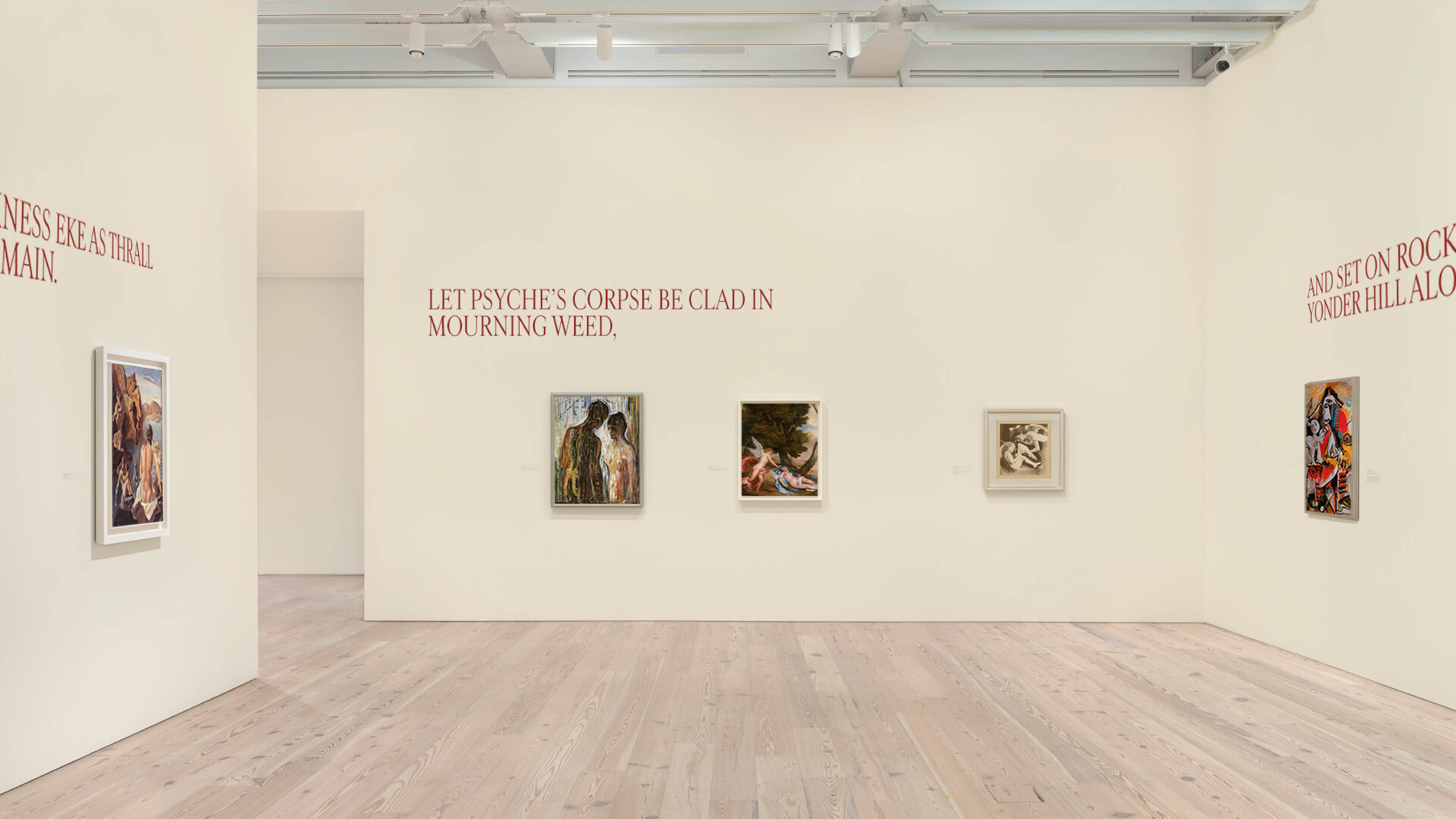
My exhibition gallery wall, where hypothetically each room would focus on one mythological tale—this one being the mythological tale of Cupid and Psyche. I chose to split up the excerpt pulled from the tale as reflected in my artwork section in my book so that the audience would have a better sense of the correlation between the tale and the images as they walked the exhibition.
Image

Image
This shows my other layout variation style for my book. This variation focused more on the complexity of the type layout, with a black and white colored theme. The text always stuck to four columns out of a five column grid.
Image
This shows how some spreads looked when printed out in actual size. The second picture shows the size difference between the first and second variation that I did — which was one of the key factors on how I decided which layout to go ahead with.
Image
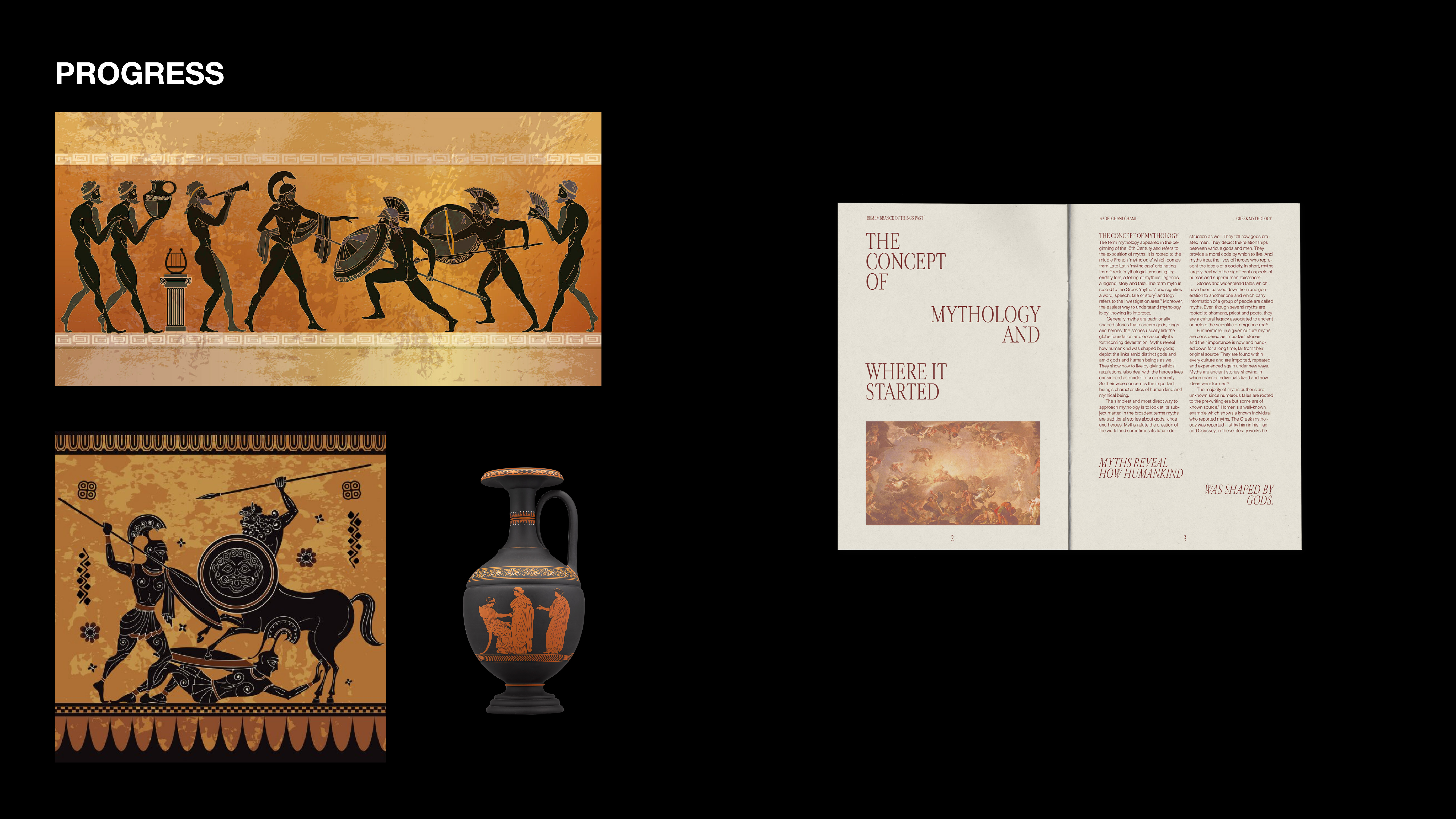
Color inspiration for my chosen layout. The deep red and slight tan color is derived inspiration directly from Classic Greek Mythology pottery and drawings.