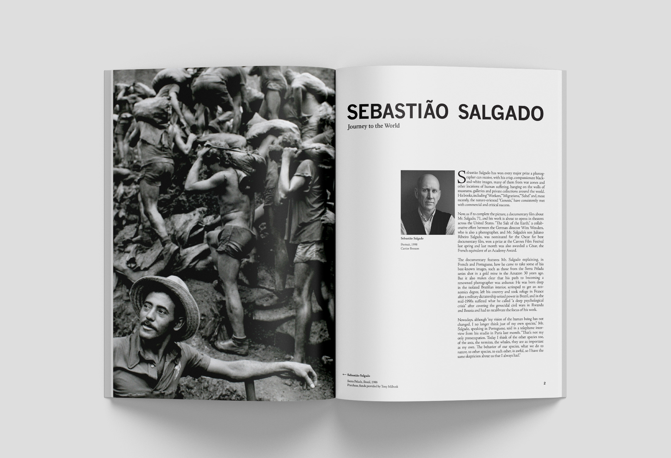
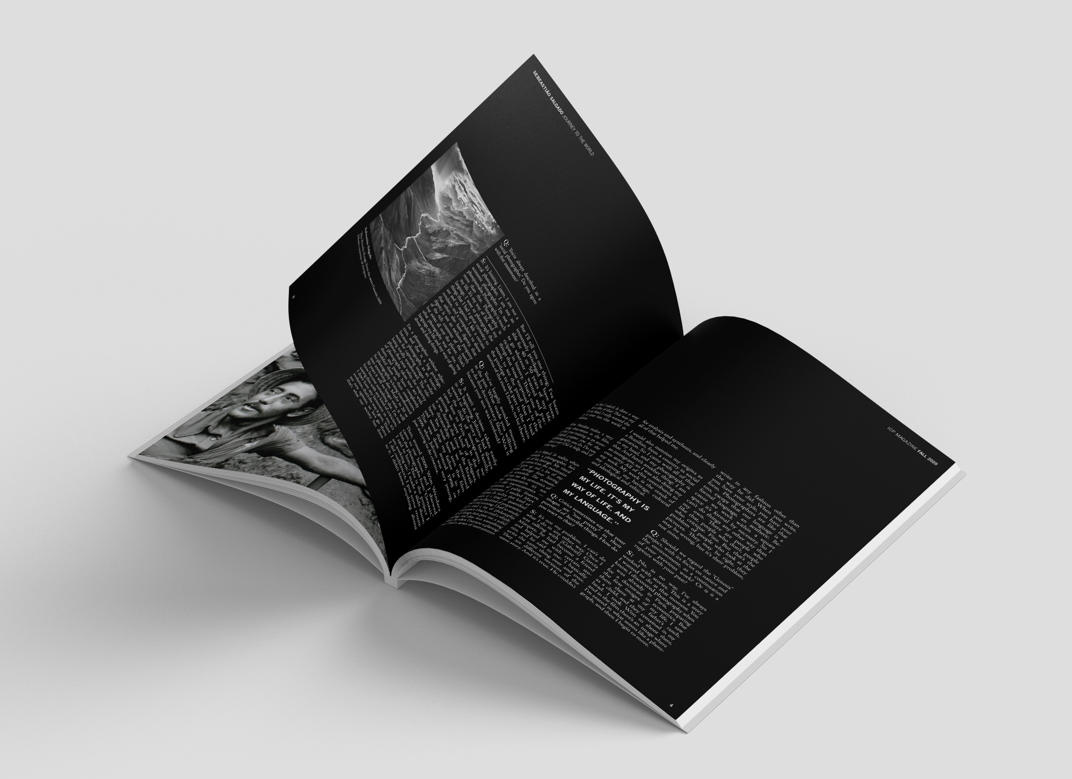
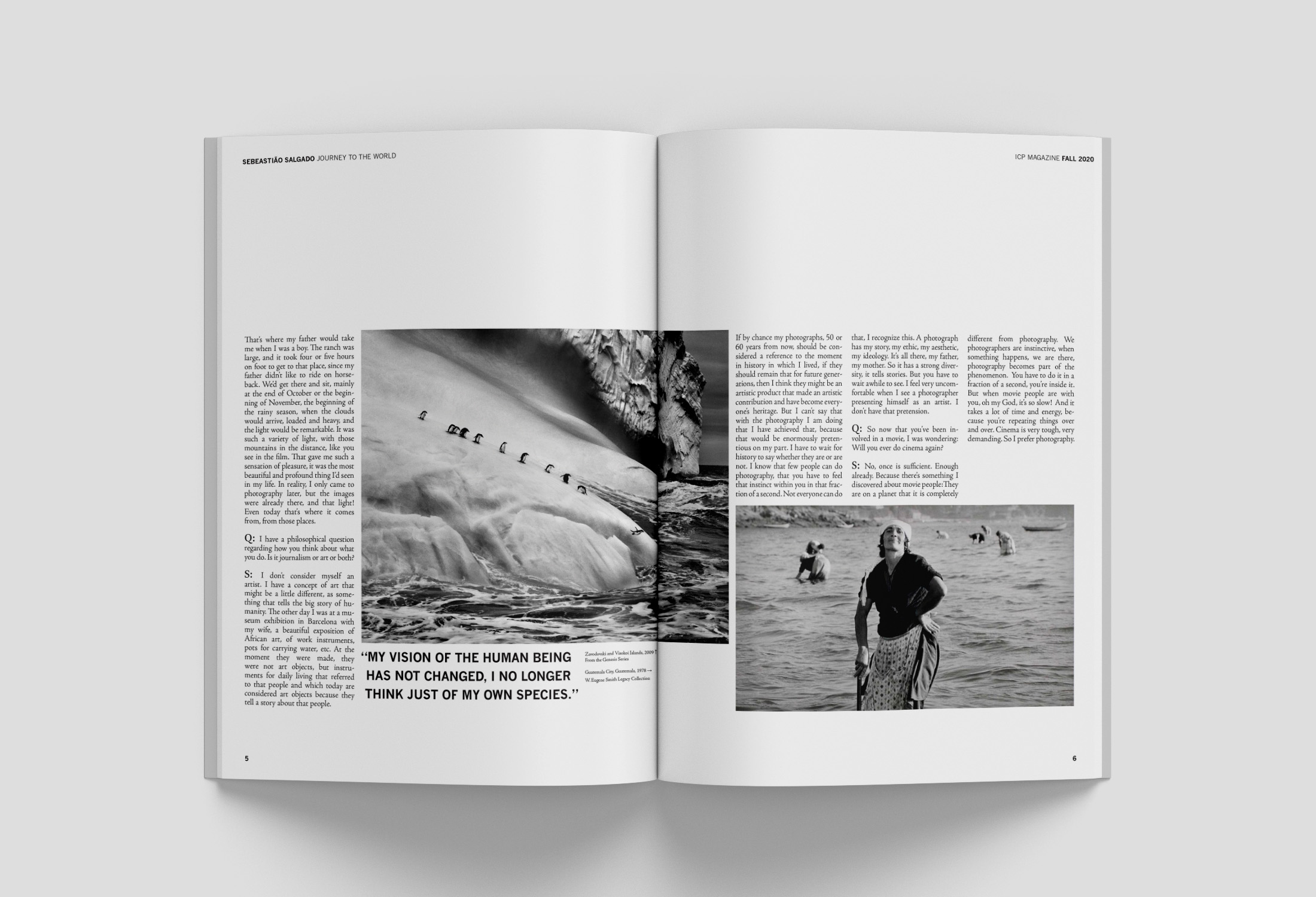
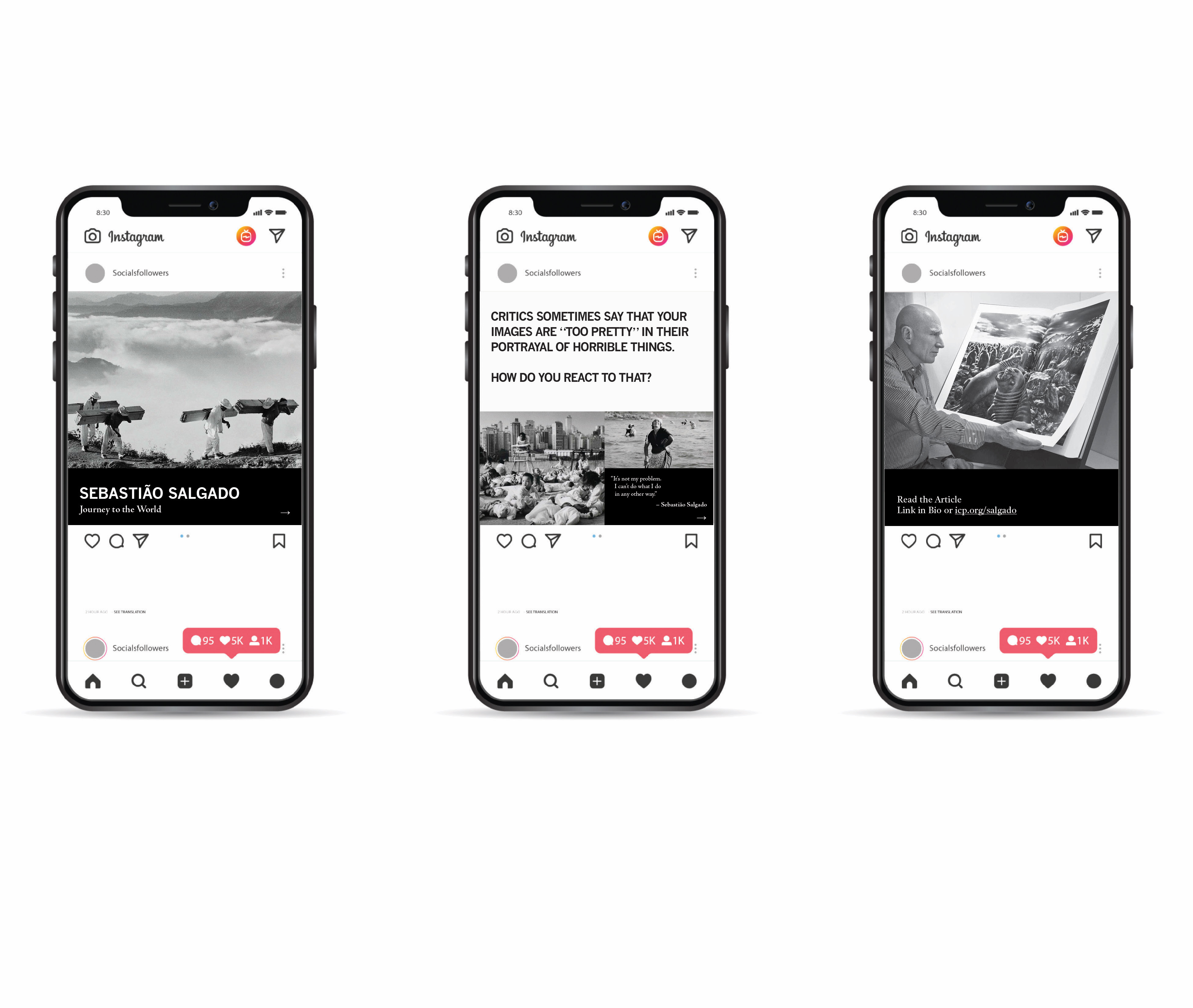
Sebastião Salgado is a world-wide photographer. Since his images are often of serious human conditions and environments, I chose to use inverted text. Additionally, the magazine layout uses negative space to showcase his photography.
Learning Outcomes:
This project was focused on typesetting using justified type for the magazine. I also learned how to balance image size and text to create a unified, but interesting spread.