Image

Image

Inspired by snouts and tails, the logo reflects the gesture of a tail through its round and pointed terminals. The snout to the right of the wordmark resembles a dog snout and a seedling sprouting from the ground, representing Earthbath's commitment to all-natural ingredients.
Image
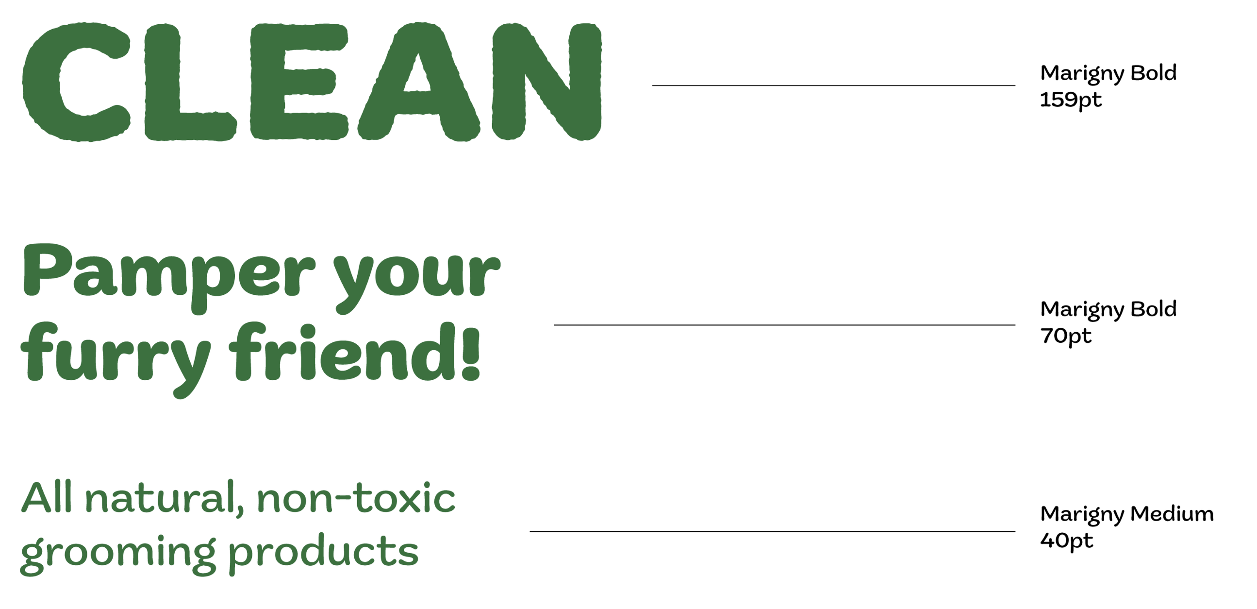
The typography reflects the round nature of bubbles. Drawing inspiration from a dog’s fluffy fur, the edges of the typeface are roughened to give off the feeling of their fur.
Image
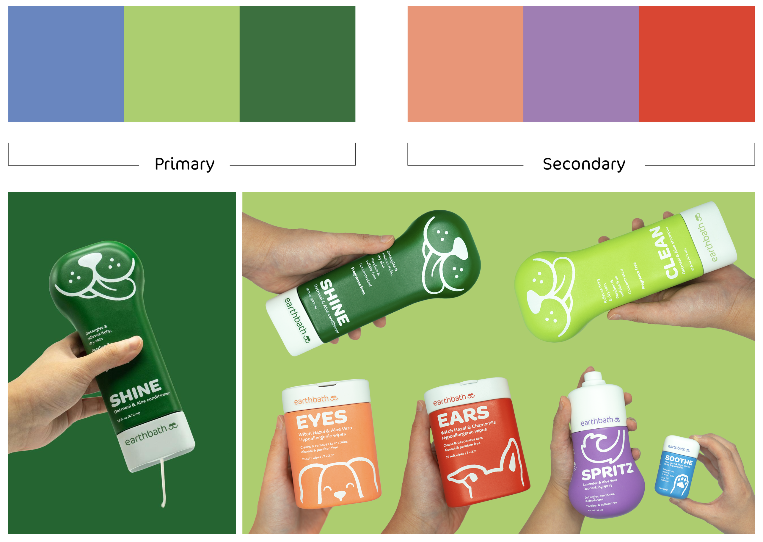
Captivated by the unique personalities of dogs, the color palette emphasizes the bold and bright energy that each dog possesses. The colors are carefully chosen to reflect the vibrant spirit and individuality of each dog.
Image

I was inspired by the shape of bones and their strong relation to dogs. Each form resembles a dog bone seen from various angles to pique interest and create a unique one-handed operation. Additionally, the shampoo and conditioner bottle design are carefully crafted to prevent slipping out of the hands, ensuring ease of use for pet owners and a comfortable experience for their furry companions.
Image
Image

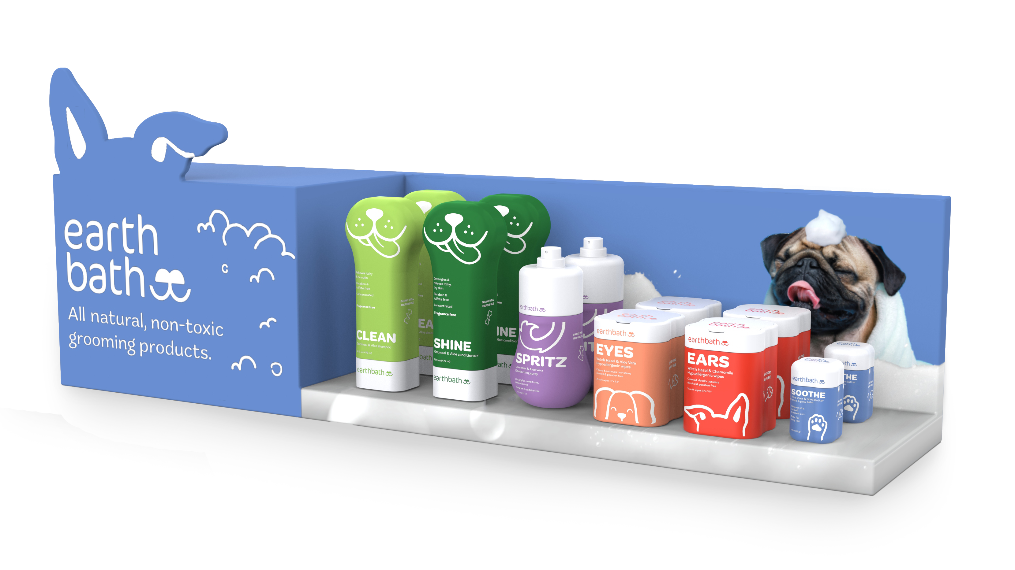
The retail environment in a pet store can be challenging to navigate with so many products competing for attention. To make it easier for pet owners to find the product, I designed the point of purchase with simplicity in mind, showcasing the simplicity and purpose of the products.
Image
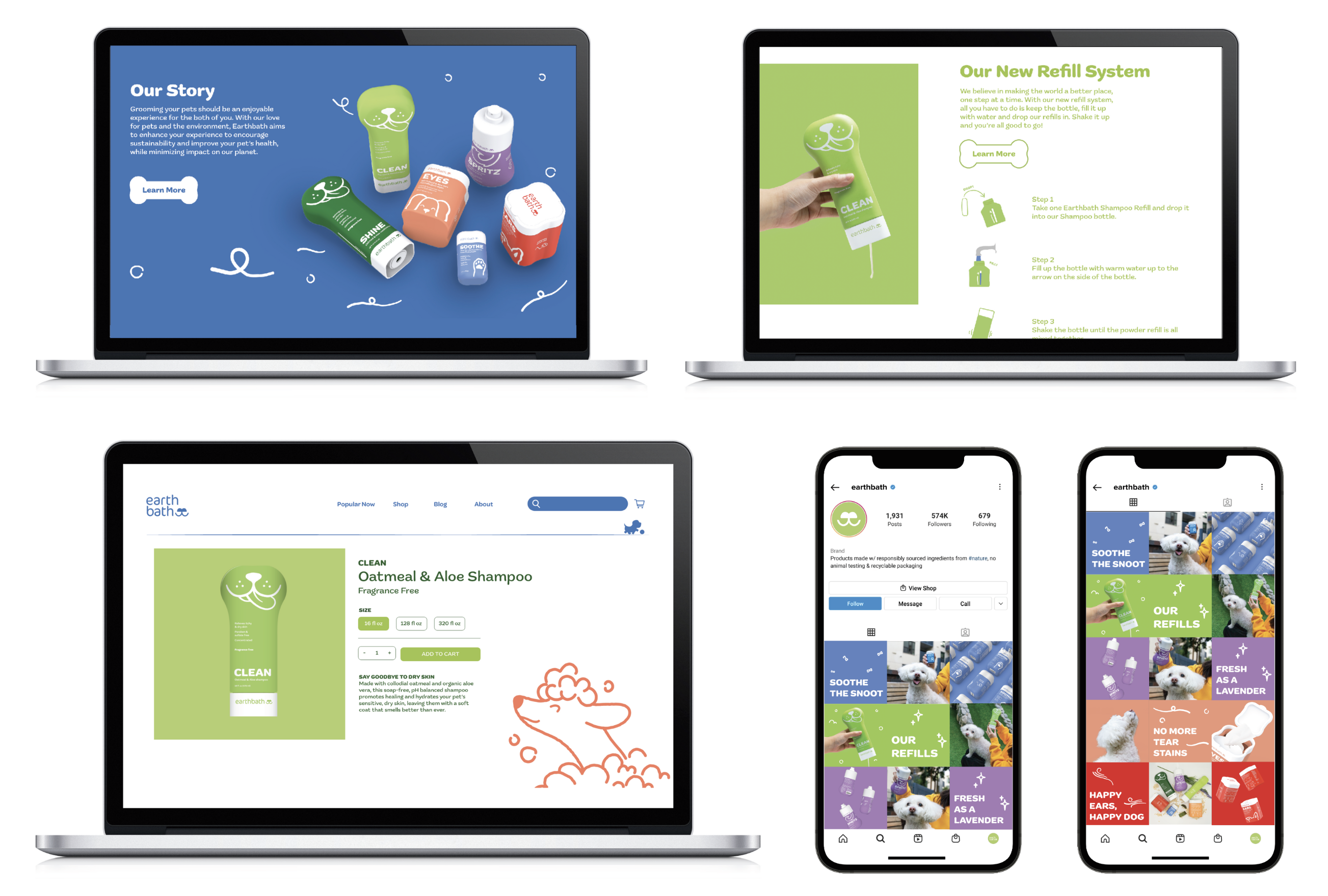
Utilizing the illustrations, I extended the brand onto the website and Instagram grid. The website provides users with an immersive experience where they can learn more about our brand and shop for products online. The Instagram grid serves as a platform to promote the products and engage with the audience.
Image

Since 5% of plastic gets recycled, to reimagine sustainability, a refill system is introduced where users keep the existing bottle, buy the solid refills, drop them into the bottle, add water, and shake it until it’s ready to be used for the next bath.
Image
