Image
Image
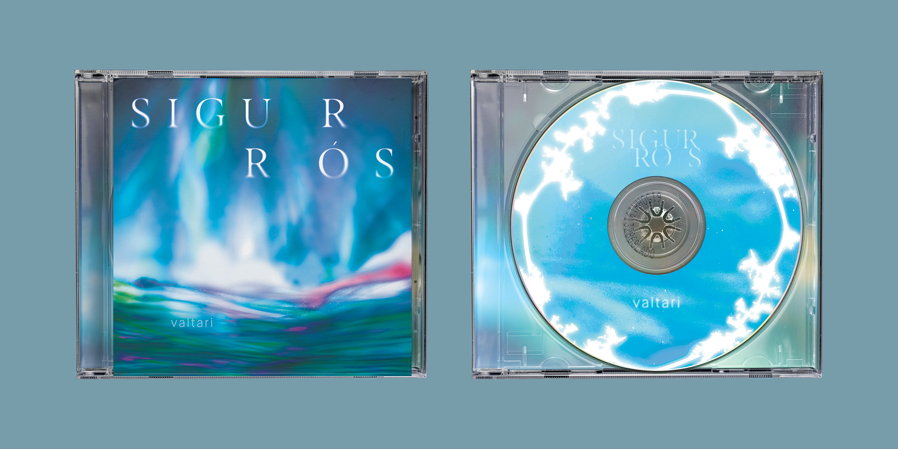
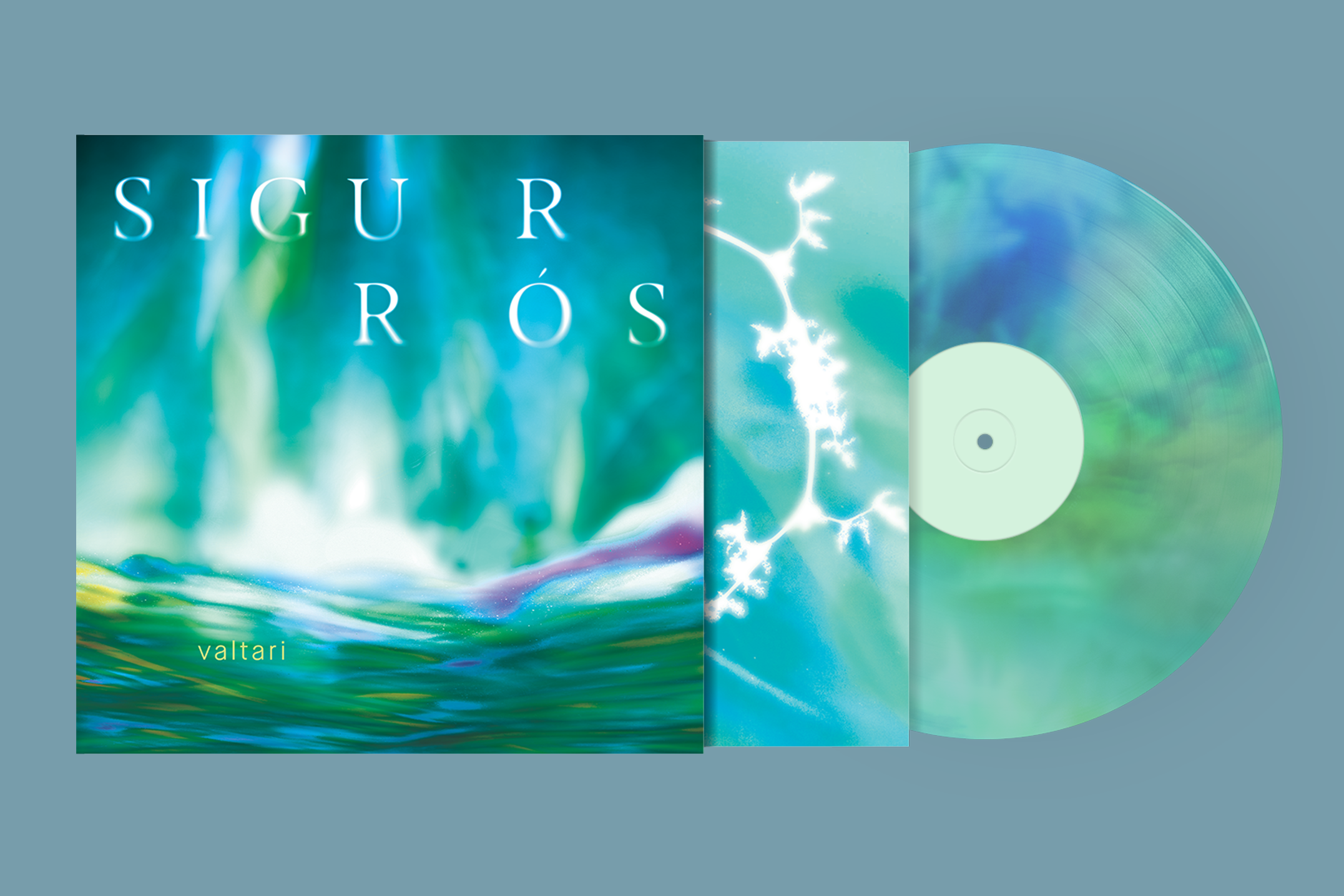
The CD and Vinyl are both inspired by the auroras and nature present in the band’s home country of Iceland. In particular, the aurora borealis relay the gentleness yet grand essence of the album.
Image
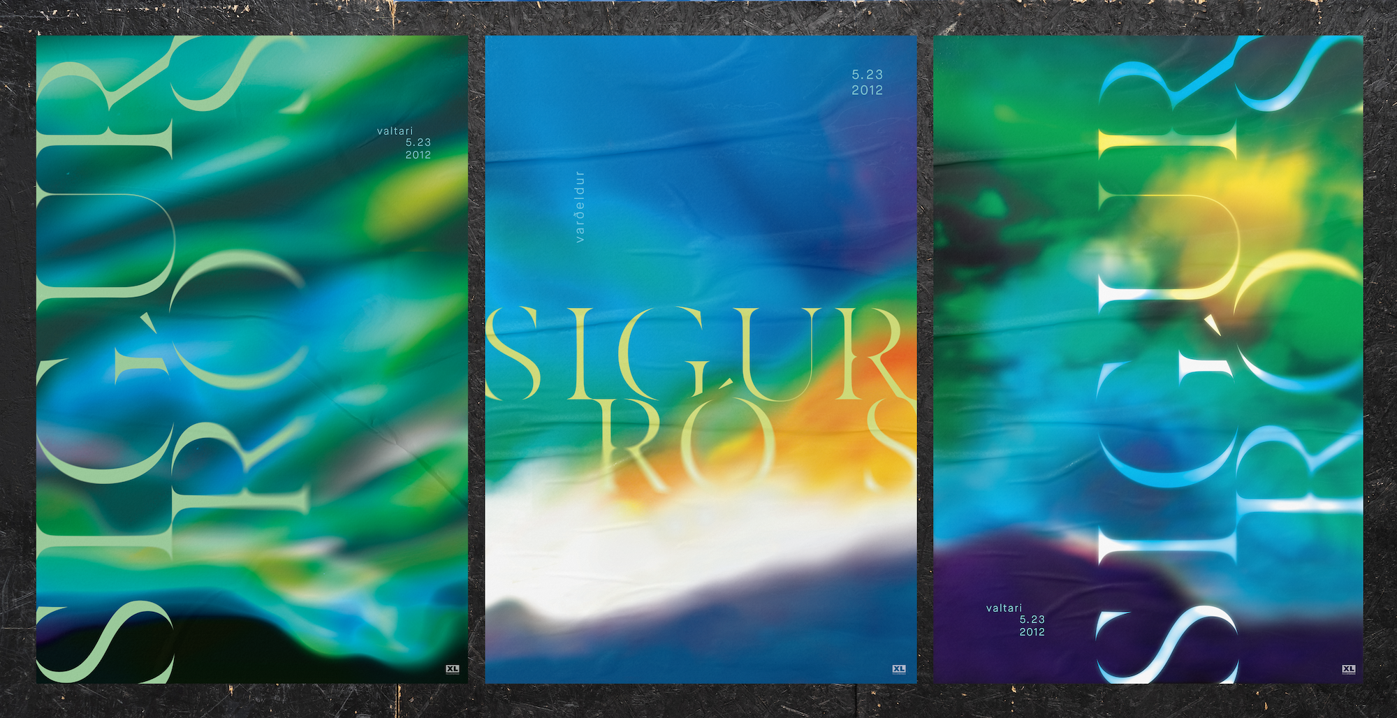
The posters use a different wordmark from the packaging to work at a bigger scale, but uses the same typefaces to connect to the identity created for the band and the album.
Image

Wordmark 1 is inspired by the chords and large amount of space present in the album. It can also be read from left to right/ bottom to top or the letters on the left together then the letters on the right together.
Image

Wordmark 2 is inspired by the swelling of chords in the album but also the fluidity, which is embodied in the connecting letters.
Image
Image
Image
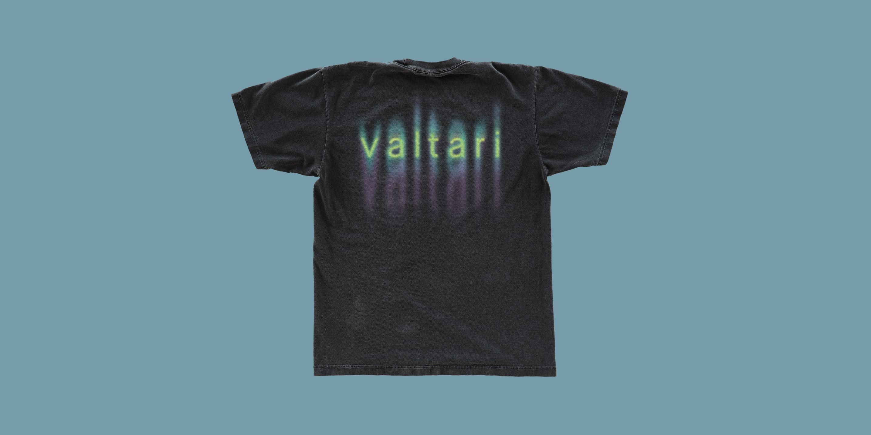
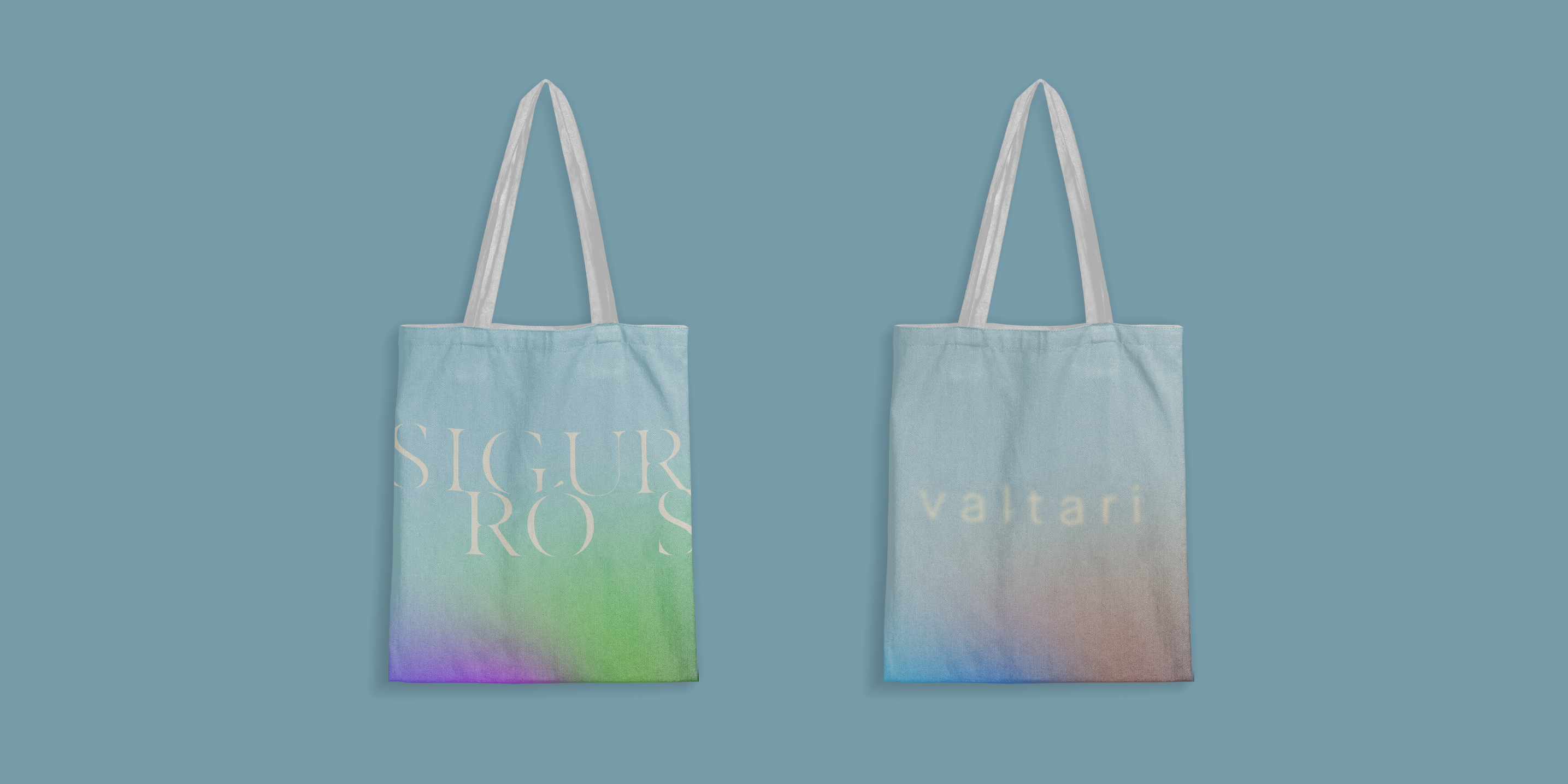
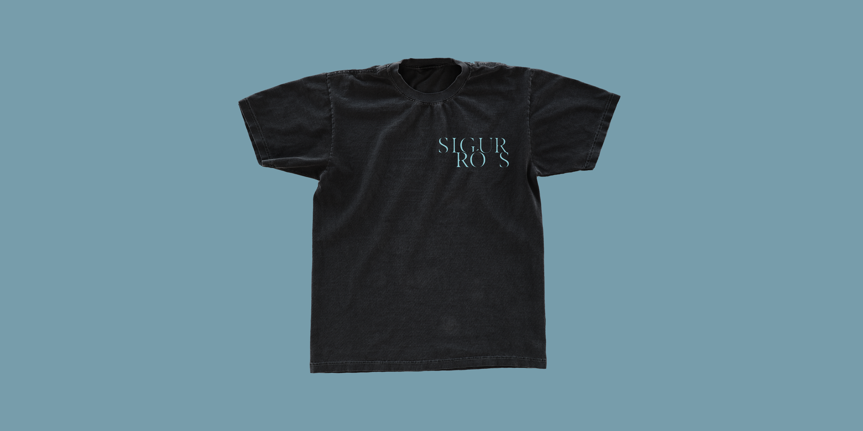
The accompanying merchandise exists in the same universe as the other collateral but has its own unique voice. It takes inspiration from the same ideas (Northern lights, swelling chords) as the vinyl and CD but expressed in a more modern and urban way to support lifestyles.