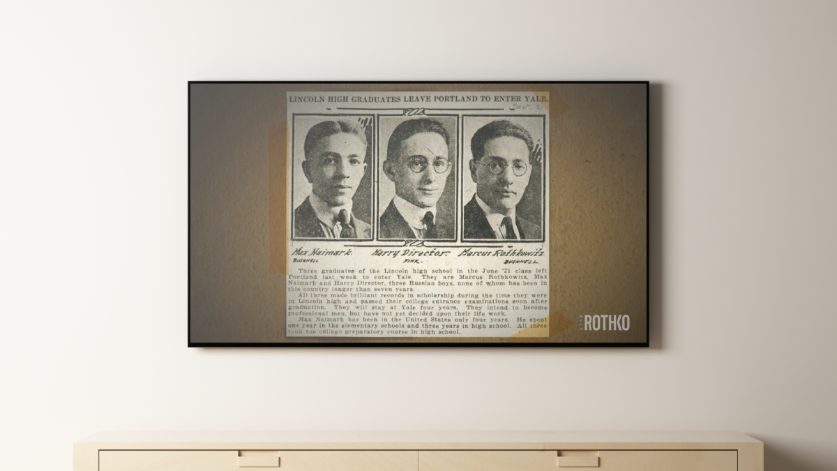
Image
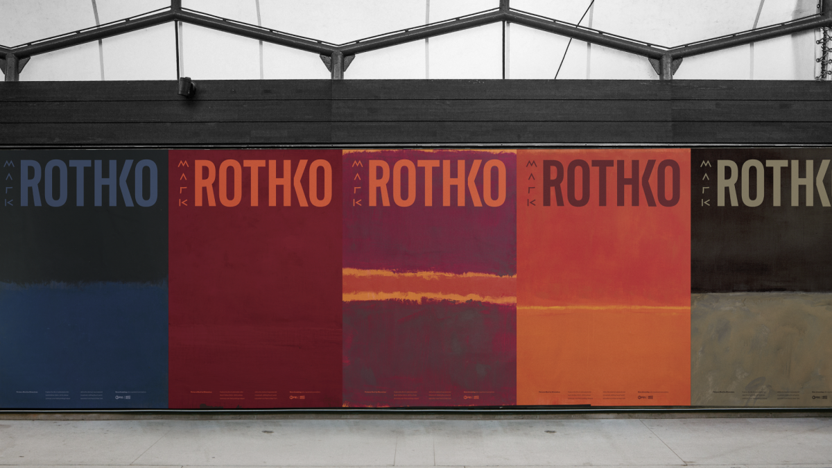
A series of posters to promote the PBS documentary episode. Each poster places the viewer “inside” the painting. This immersive perspective is not unlike the experience of looking at a large scale Rothko painting.
Image
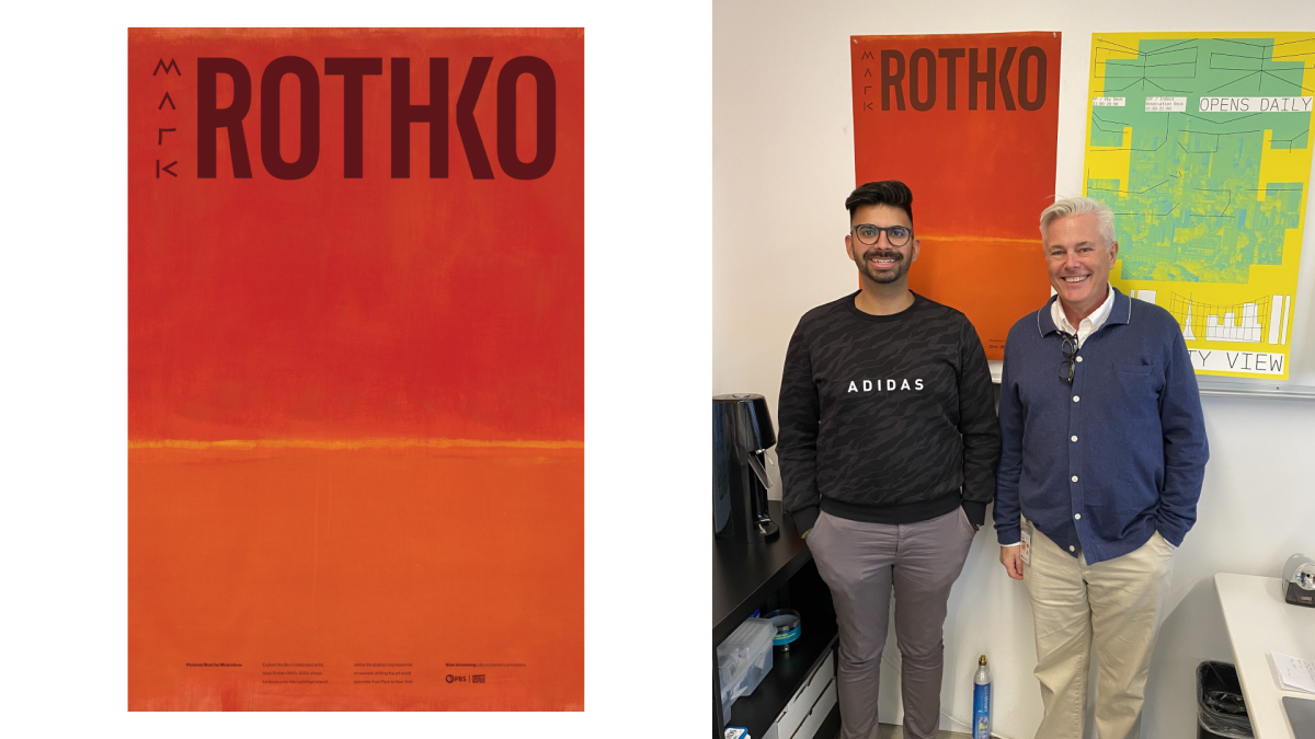
After my first term, Sean Adams selected my poster to be in his office for the entirety of the following term. This was a huge honor and something I’m incredibly grateful for.
Image
Image
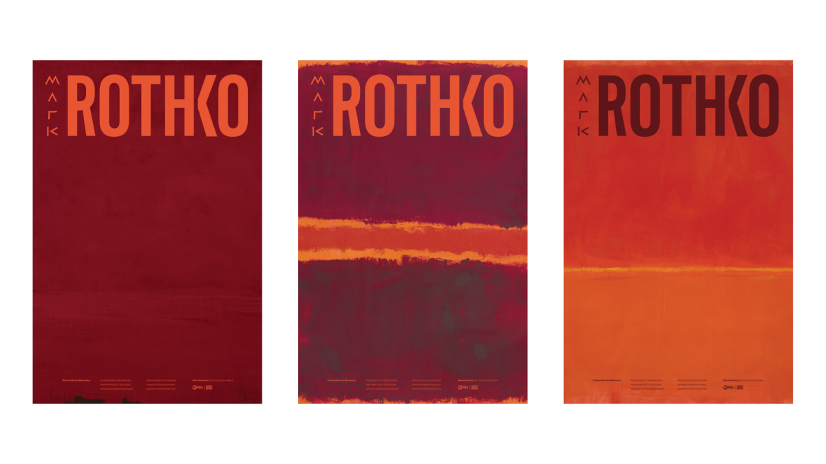
Flat view of the original poster triptych, harmonized by similar paint colors. Sequenced as such to symbolize a breakthrough or transformation between posters 1 and 3.
Image
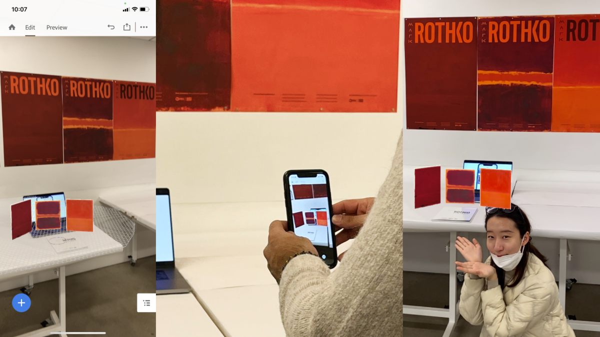
AR experience of the 3 paintings from the poster triptych, triggered by the book cover. I put this together quickly during our final symposium, while we had a 20 minute donut break.
Image
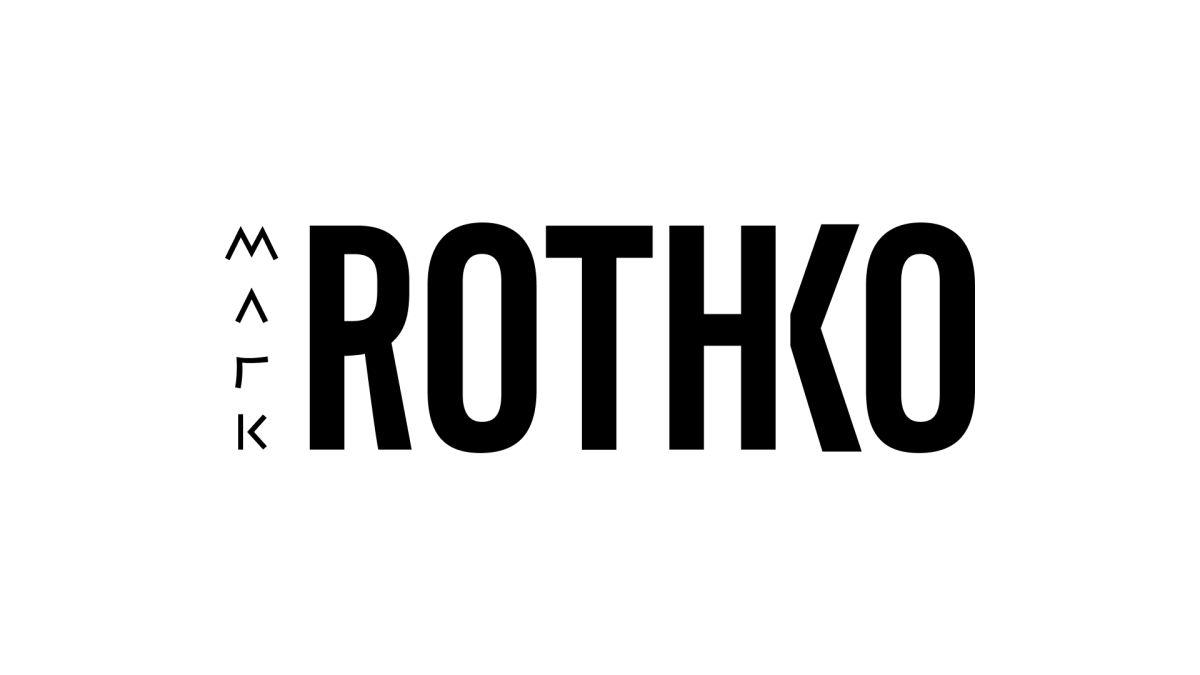
The primitive forms for “Mark” tie back to the primitive emotions evoked by his work. While “Rothko” is set in all caps to symbolize the monolithic scale of his paintings.
Image
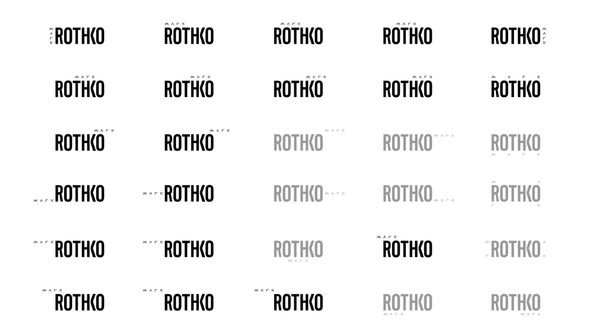
During our midterm critique with some recent alumni, Erin Georgia suggested looking at the placement of “Mark” as a dynamic element which could create a logo system. Conceptually, this connects back to Mark Rothko’s many years of searching before finally settling on the style of art we know him for (and his legacy) as Rothko.
Image
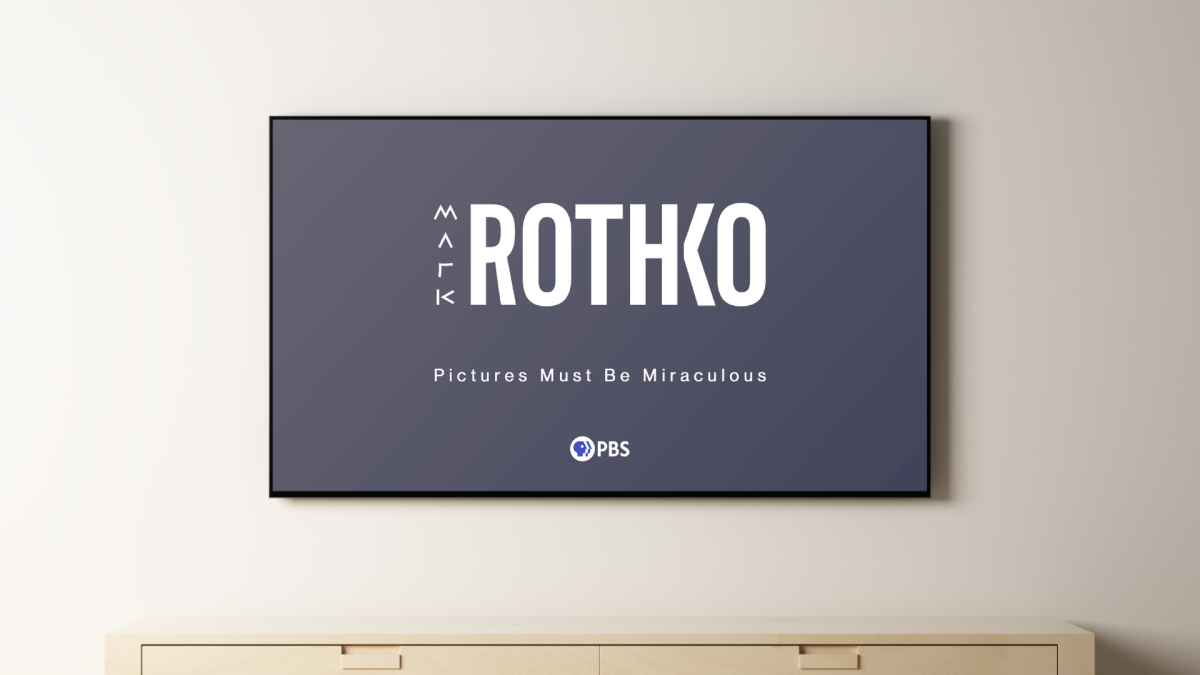
Placing the wordmark in context of a bumper for the documentary.
Image
Testing the functionality of the wordmark at scale when used as a watermark.
Image
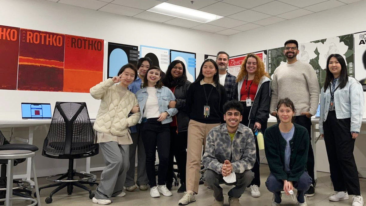
This was our cohort’s last final of our first term at ArtCenter! After class we all celebrated over pizza and drinks.
Image
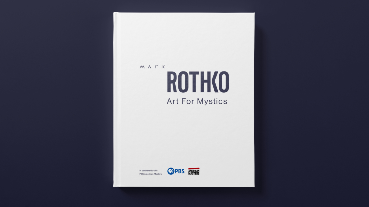
Extending the identity to a booklet required a special consideration for messaging. I chose the title “Art for Mystics”, based on the following definition for mystical: inspiring a sense of spiritual mystery, awe, and fascination. This sense of awe is due partly to the scale of Rothko’s paintings.
Image
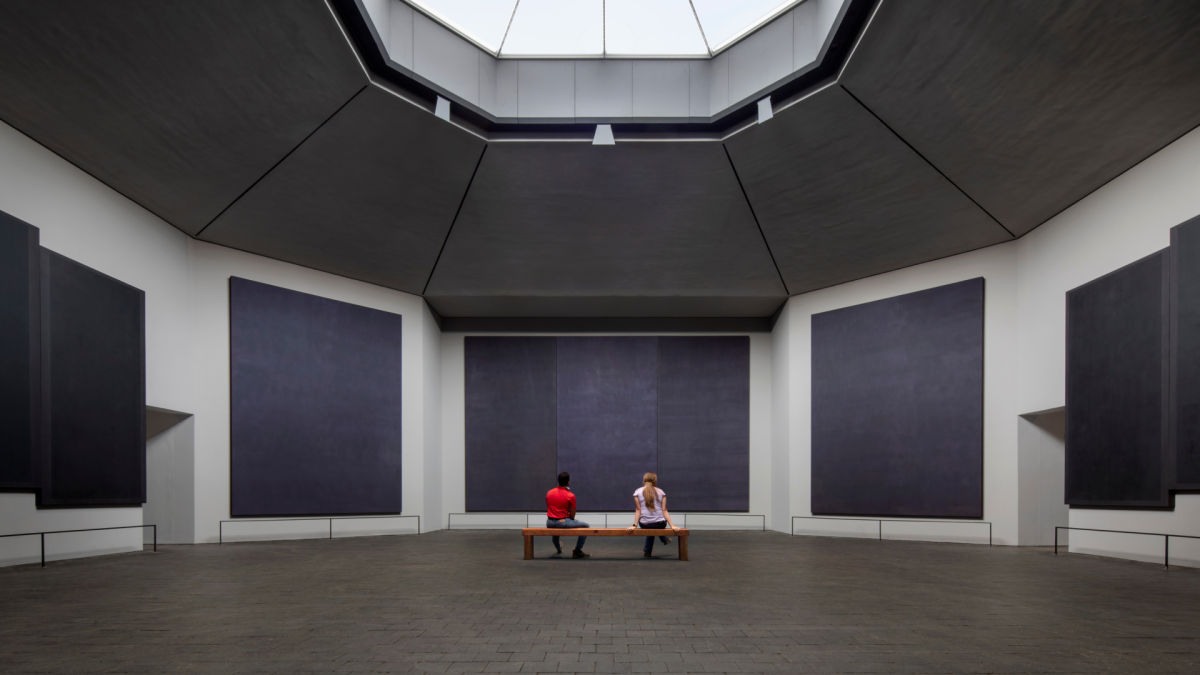
Extending the identity to a booklet required a special consideration for color. Colors were inspired by the Rothko Chapel in Houston, Texas. The non-denominational Chapel was one of Rothko’s final projects which he never saw completed.
Image

Intro/outro: A few spreads guide the reader from from the everyday material world to that of the mystical, symbolized by a slow gray to purple gradient. The outro follows the sequence in reverse. This concept is based on an engawa, a Japanese architecture element to bridge the outside world to the home.
Image

Image

Image
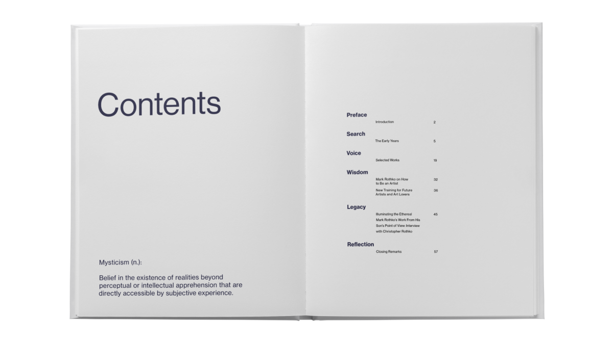
Recalling the definition of mysticism which inspired the publication title.
Image
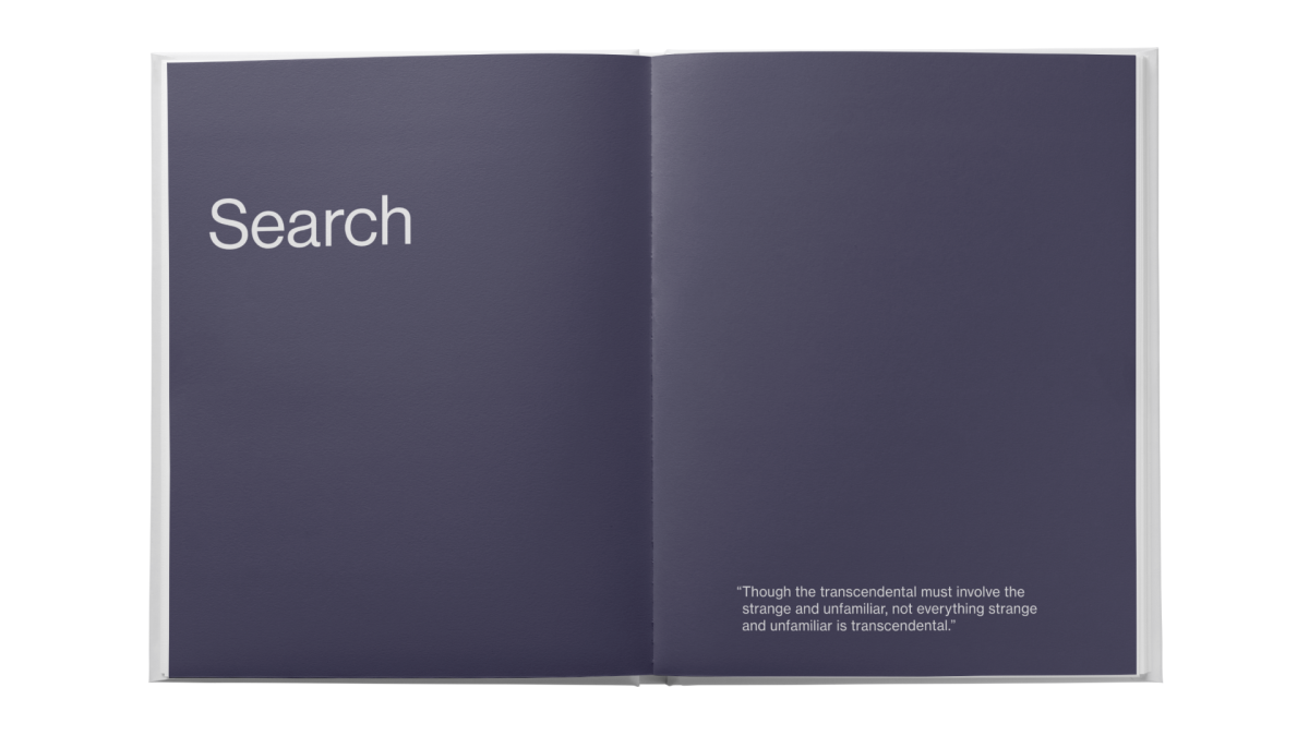
Each chapter begins with a full spread. The chapter title is large, paired with a relevant Rothko quote on the opposite page.
Image
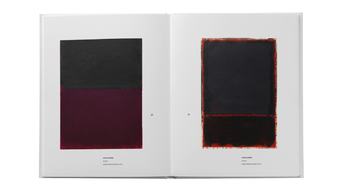
Spread from chapter 3: Voice — a photo essay of his best known abstract works.
Image
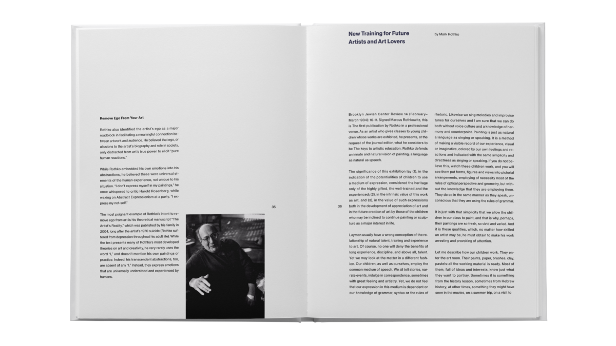
Spread from chapter 4: Wisdom — his advice for new artists.
Image
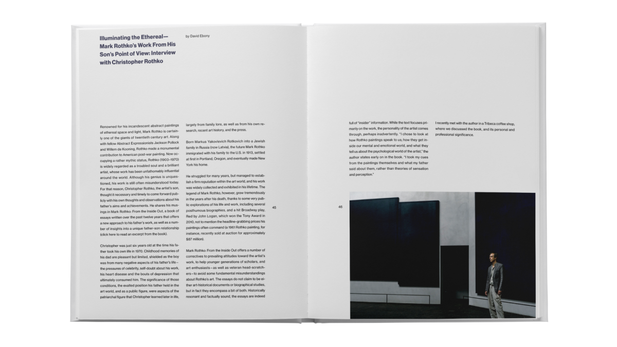
Spread from chapter 5: Legacy — an interview with Christopher Rothko, his son, which informed my overall design direction.
Image
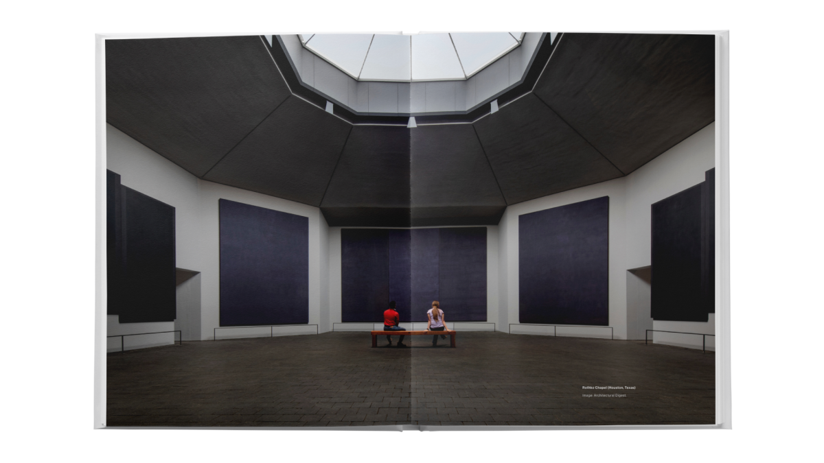
Special thanks to Architectural Digest for a beautiful photo of the Rothko Chapel..
Image
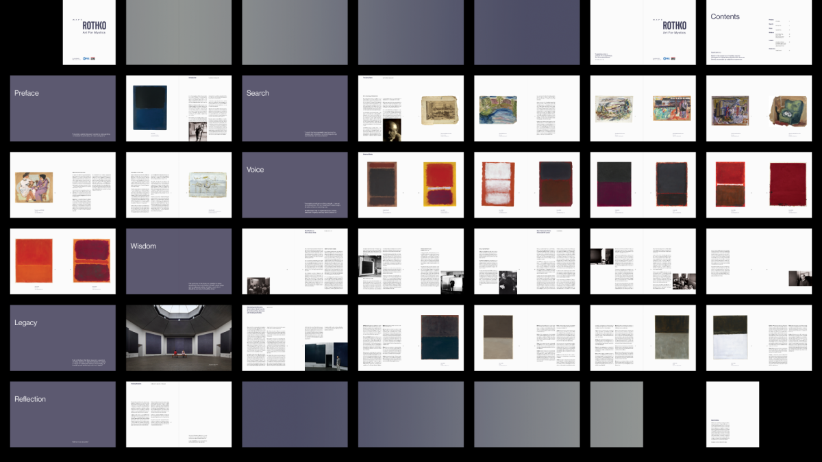
Full pagination of the book, an exercise I continue to return to thanks to Christian.
Image
This is the first project from ArtCenter that I’ve shared on LinkedIn, and the post received some unexpected praise. Before my Spring 2025 grad show, I plan to make some revisions and reprint the book.