Image
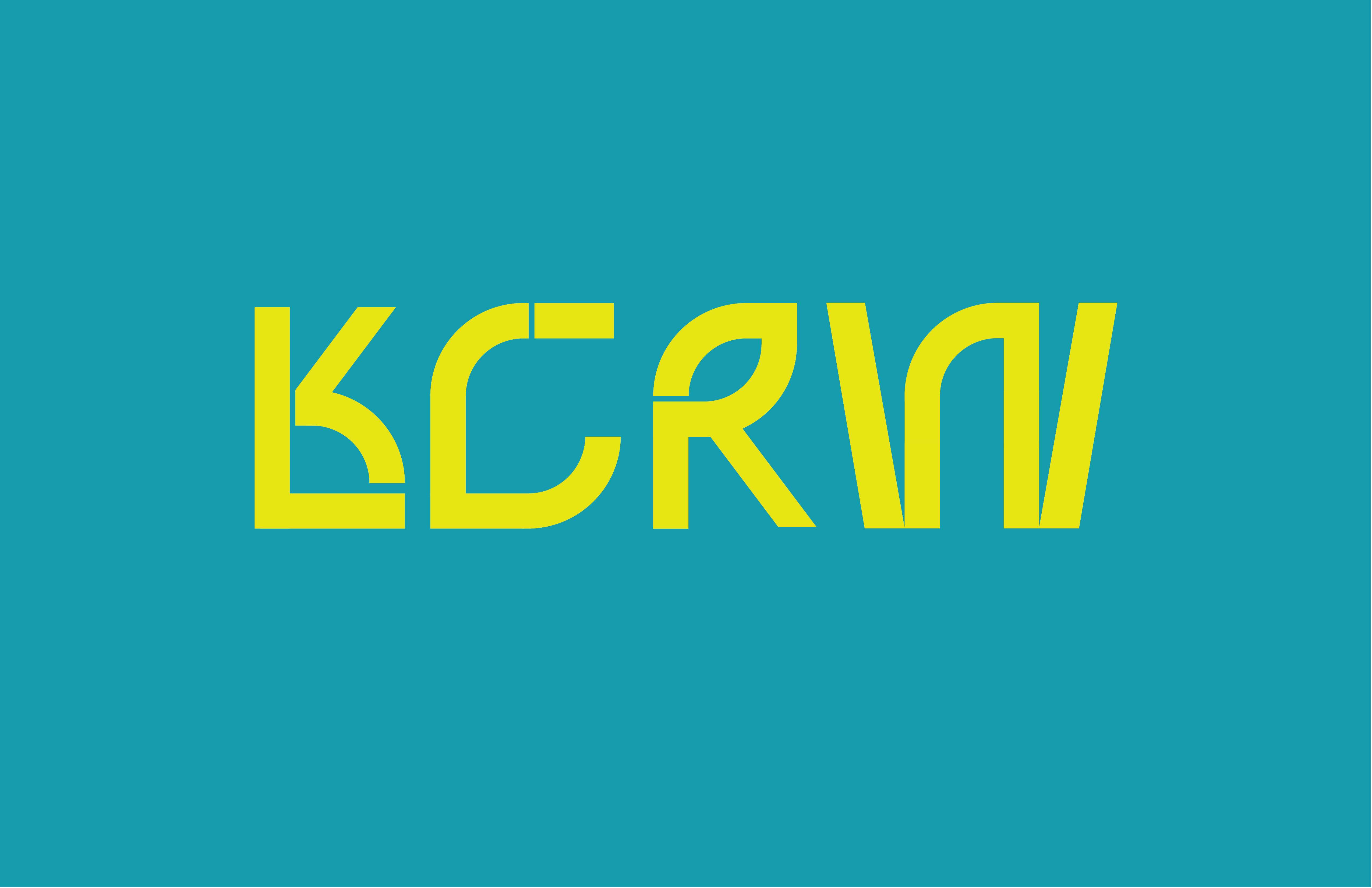
The work plays on the dynamic yet grunge nature of LA and KCRW. The colors are urban but bright to bring the liveliness and organic aspects of KCRW's mission out of the mark.
Image
The visual metaphor of the identity is that KCRW emulates LA. Through typography the symbiotic relationship between KCRW and LA comes to life. LA is an urban sprawl that grows and contracts dynamically and this is embodied in the typography.
Image
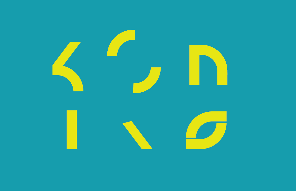
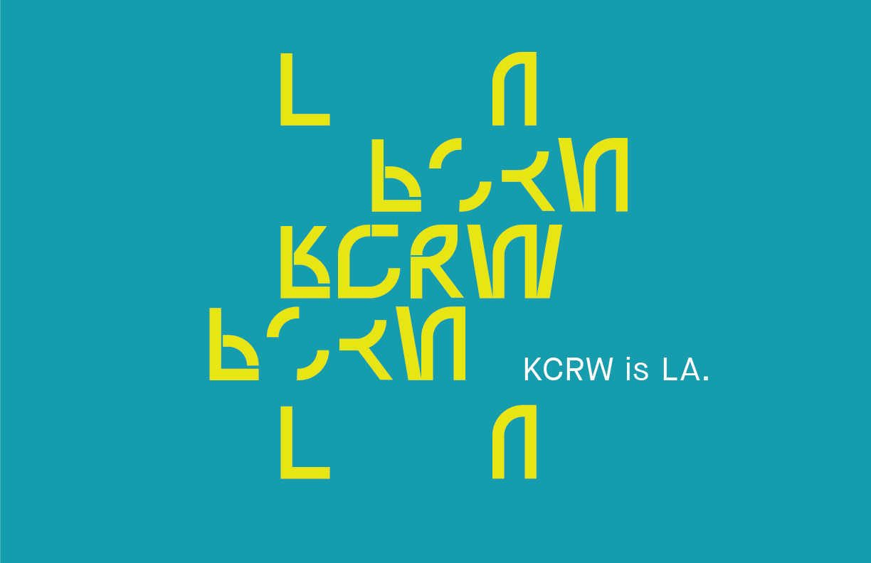
The graphic elements are derived from the wordmark itself and serve many purposes.
Image
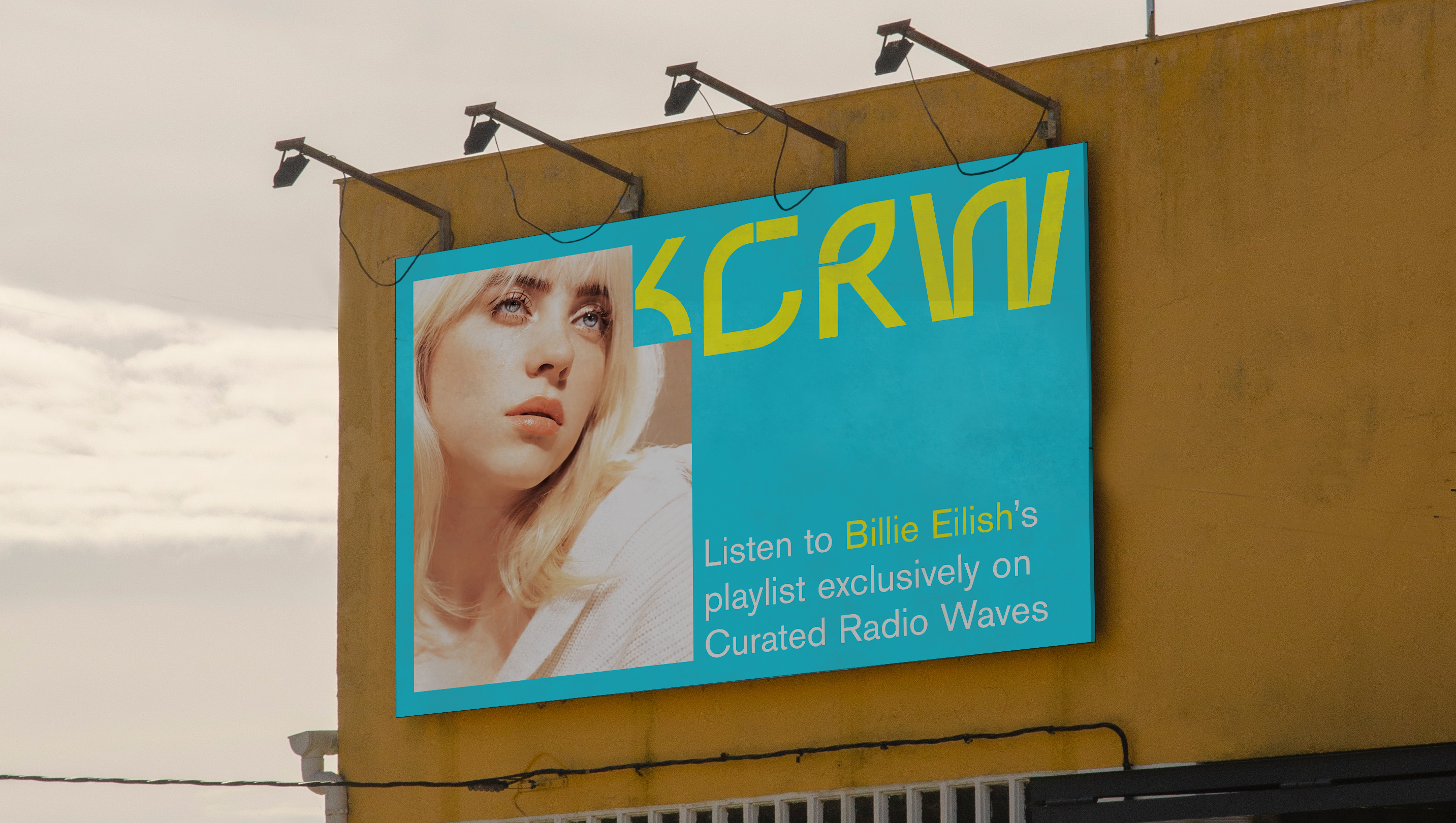
The wordmark then becomes the frame through which we see Los Angeles and the content of KCRW.
Image
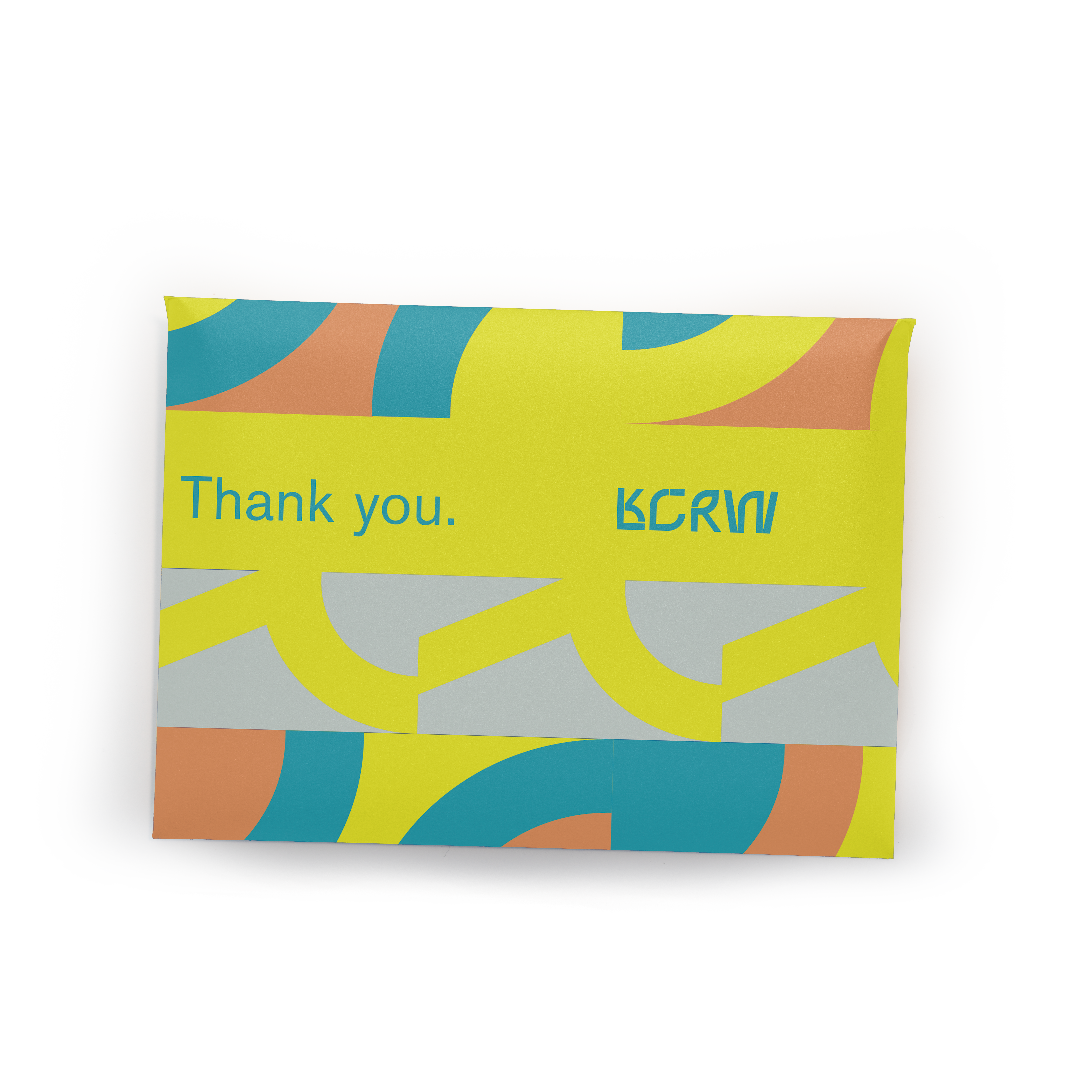
Graphic Elements can also be used to make patterns for print. (Mailer for KCRW member gift)
Image
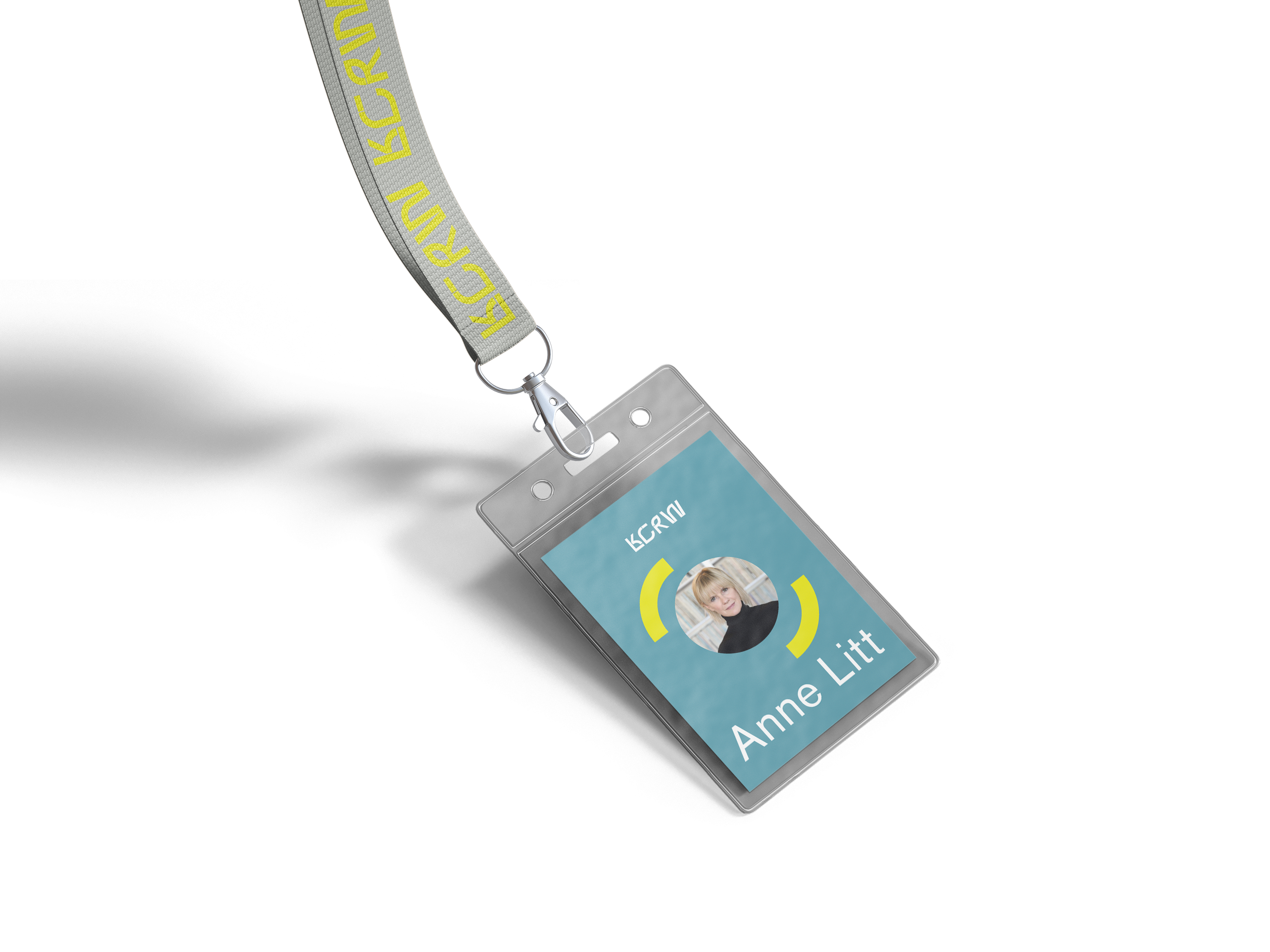
Possible Application of graphic element on employee nametag
Image
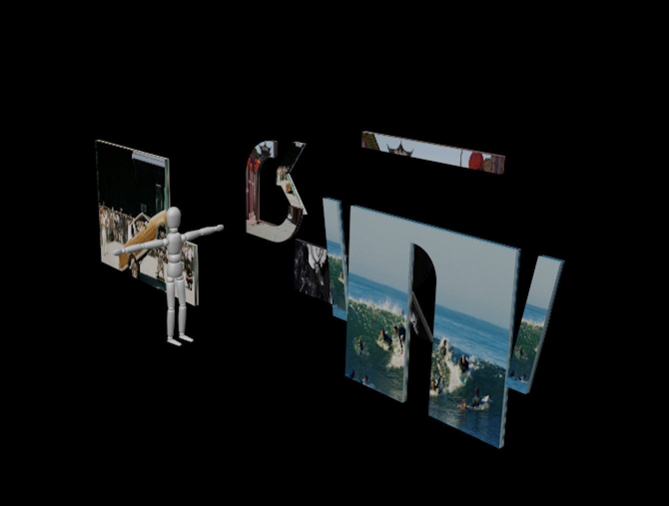
Possible Transmedia exploration of interactive space in public spaces for viewers to interact with Los Angeles subcultures.
Image
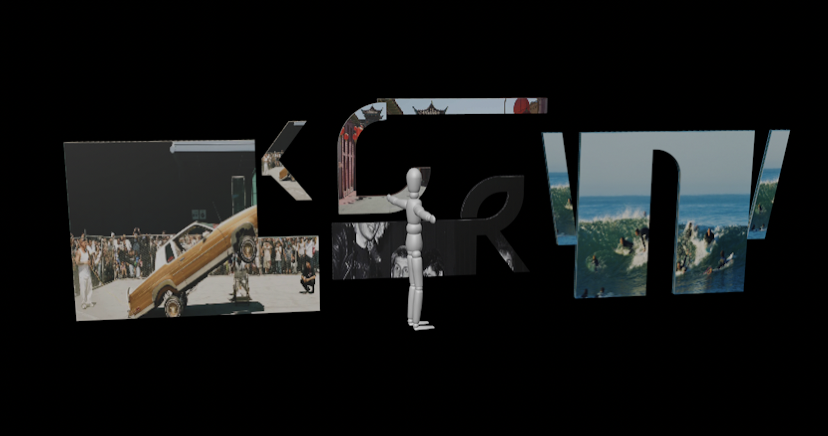
Another angle of Transmedia exploration
Image
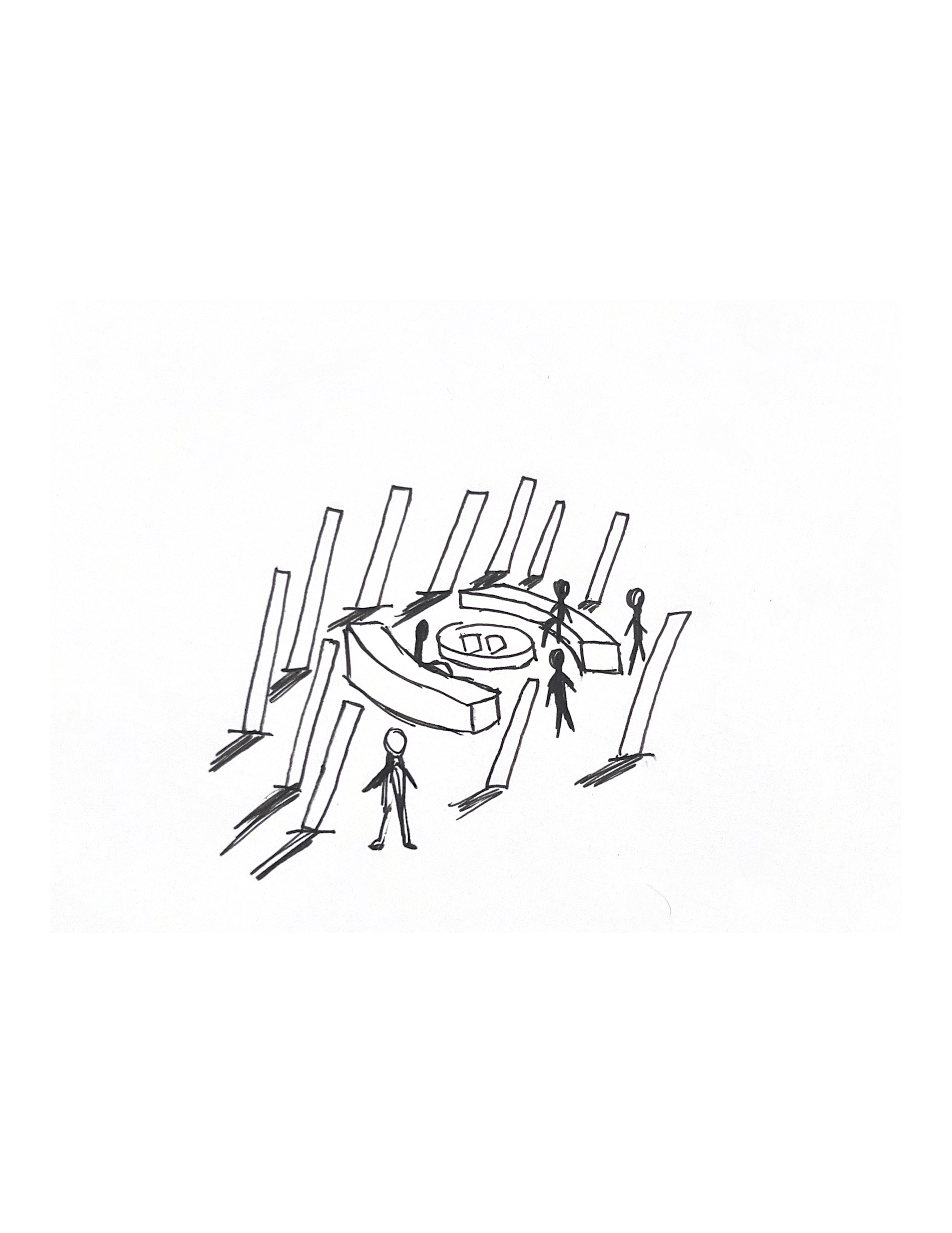
Another Transmedia exploration where the graphic elements from a circular communal area where people to sit and interact with KCRW content.