Graduates

Grace Hwang

BFA in Graphic Design — Graphic Design
Course:
GPRT-252 Communication Design 4: Identity Systems
Faculty:
Simon Johnston

General Electric

The logo mark “GE” means the speed of innovation and breakthrough of technology. Geometric forms represent manufacturing, engineering, and IT. The straight line represents the company’s aspirations for the future and speediness of growth. The optical friction between G and E represents breakthroughs or new changes in technology. This transition approach may also be applied throughout the graphic language.
Learning Outcomes:
The purpose of this project was to explore a visual language and form based on research, expanding visual vocabulary. The General Electric Company (GE) is an American multinational company, which started as an electricity company but is now expanding into three areas: electricity, aviation, and healthcare. Additionally, it is making its transition from a manufacturing company to a digital company. Their current aim is to sell not just products but solutions based on technology.
Image
Image
Image
Image
Image
Image
Image
Image
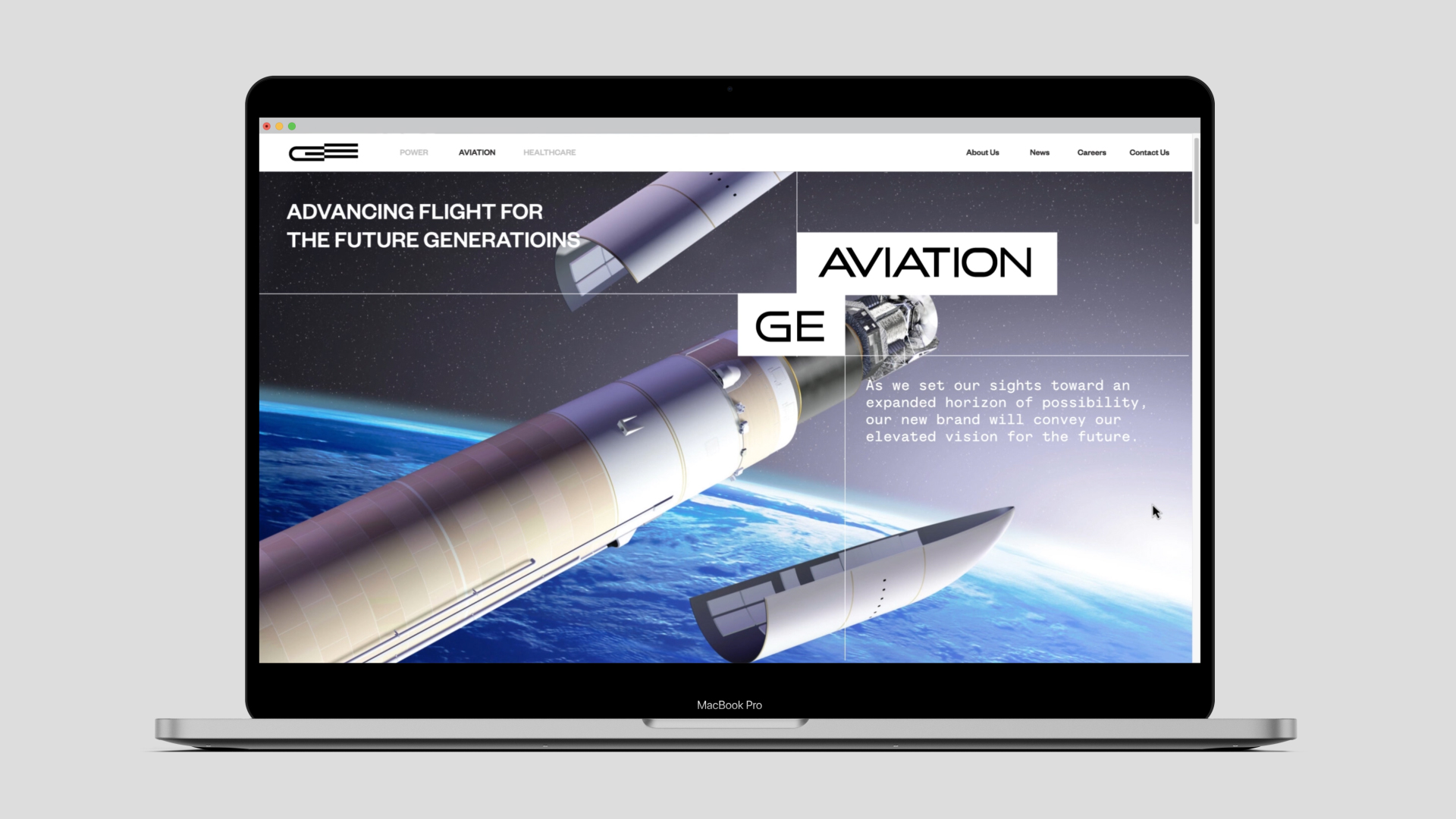
Website Design (Please watch in Fullscreen)
Image
Image
Image
Image