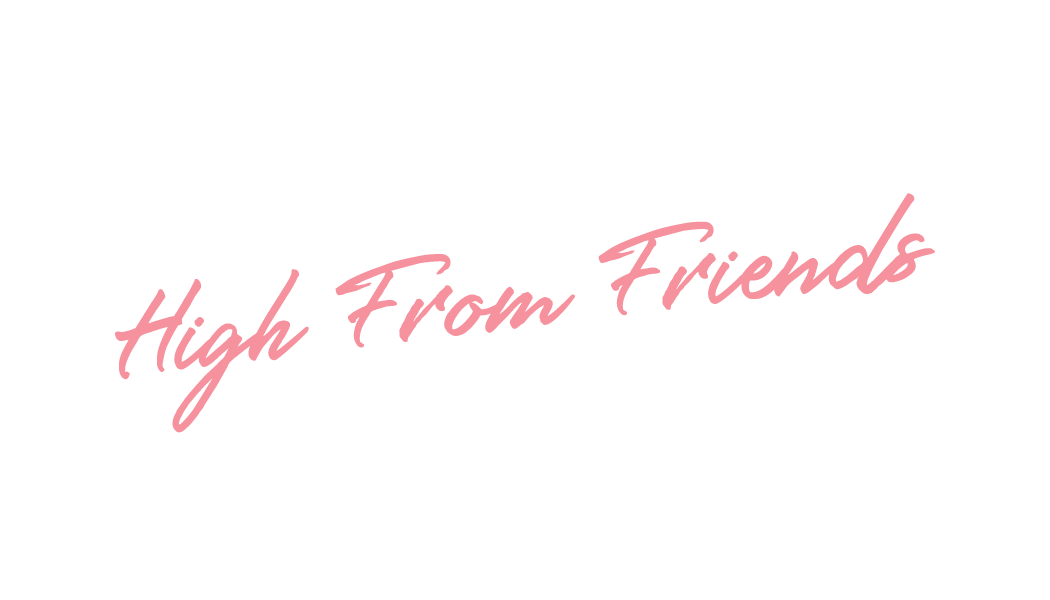
Graduates

Elton Tinoco

Graphic Design

High From Friends

High From Friends CEO, Ant Powell needed business cards for marketing his unique "cannatainment" business. So, I micro branded a business card design for his project which included a script logotype, use of GT Walsheim (typeface), brand colors and a QR-code that takes his clientele directly to his website.
Learning Outcomes:
I learned how to let the typefaces be the hero of a design. Its always an interesting branding experience when working with clients from the cannbis industry. What I got out of this project was a fun way to brand a niche market that's "romanticized" but still feels "entertainment" enough. The branding direction is essentially "I Love Lucy" meets "Vice city."
Image
Logotype
Image
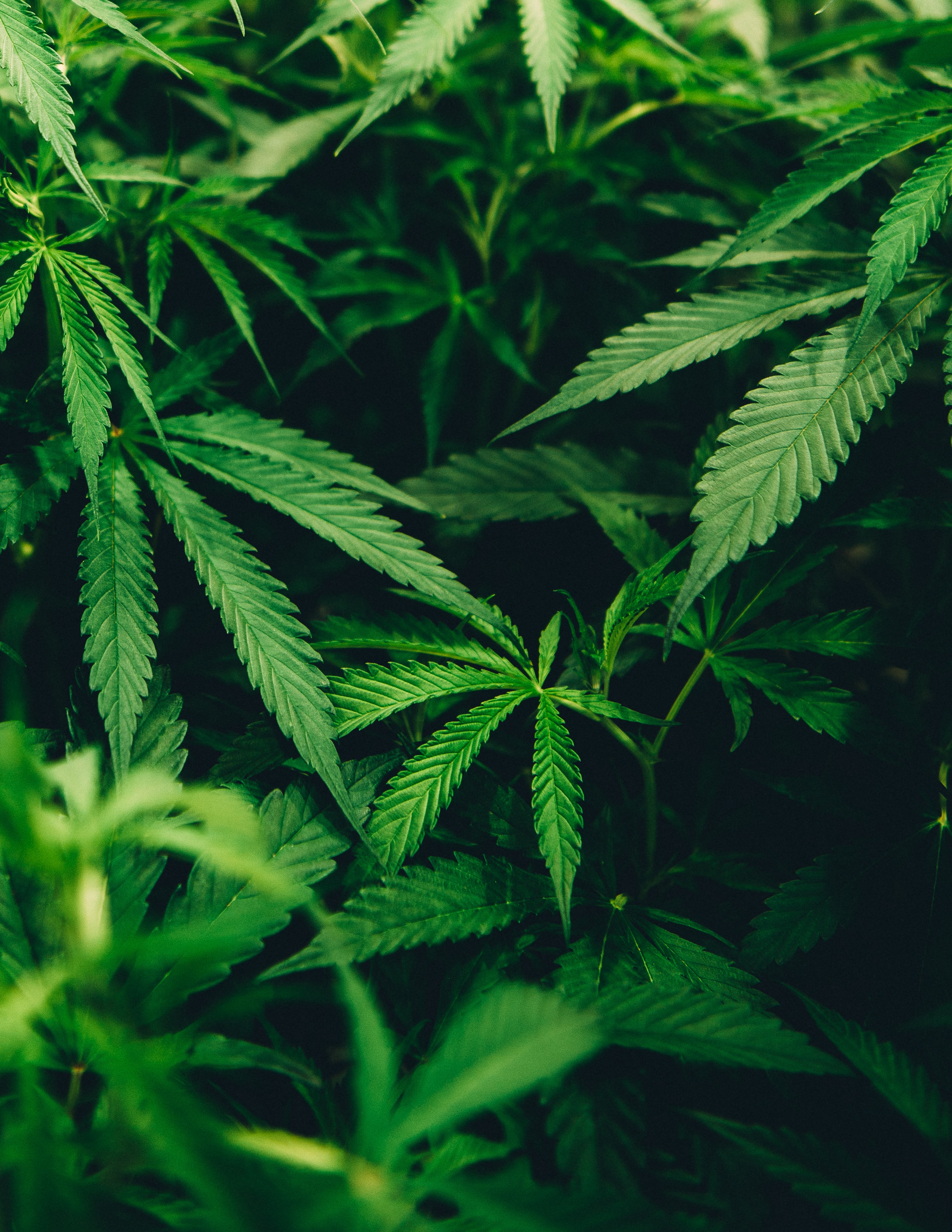
I didn't want to use the mundane cannabis plant icon, so I decided to use a stock image of hemp plants with the intention of muting its color values towards a hunter green by use of adjustment layers.
Image
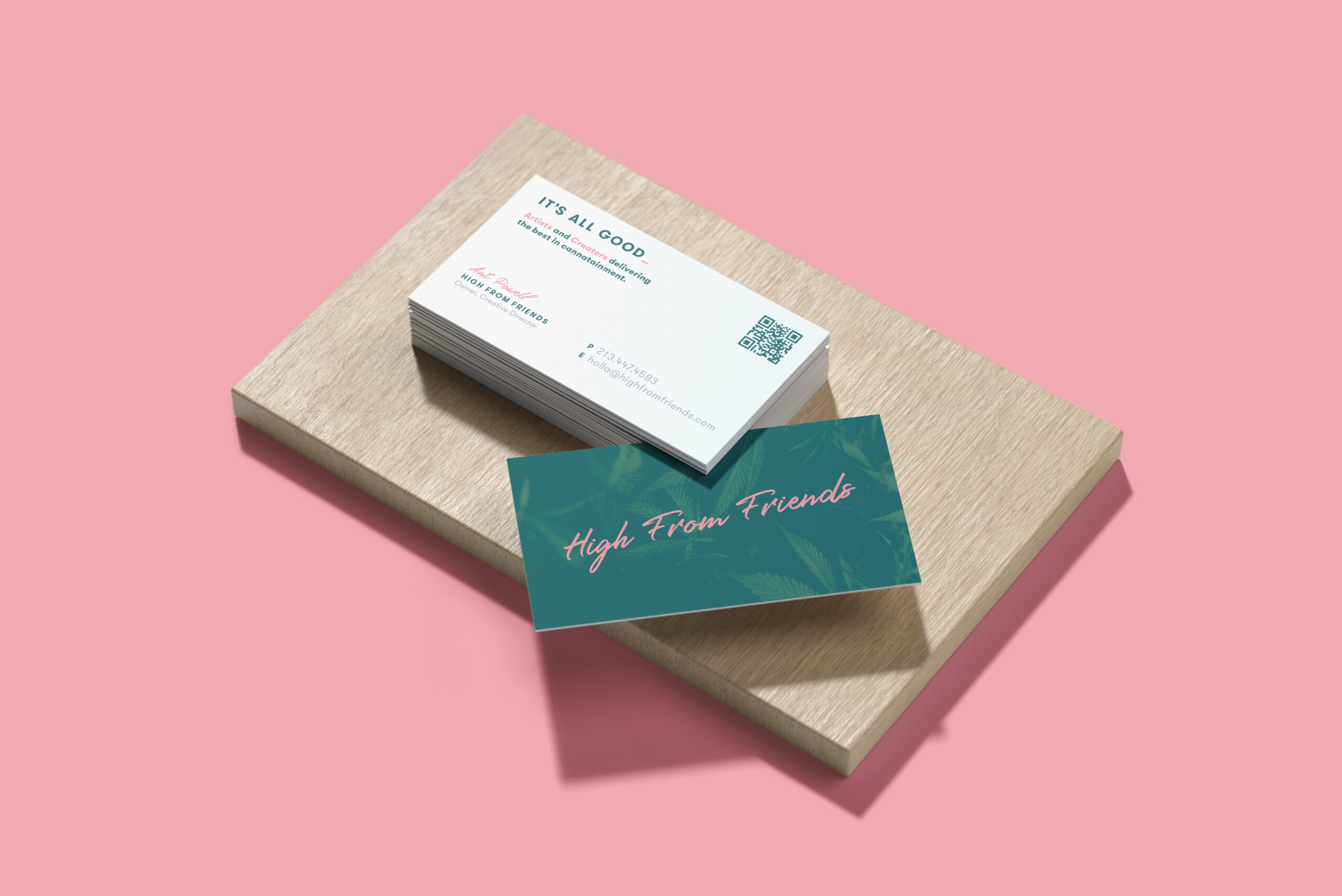
A digital mock up used for the clients design and print approval.
Image
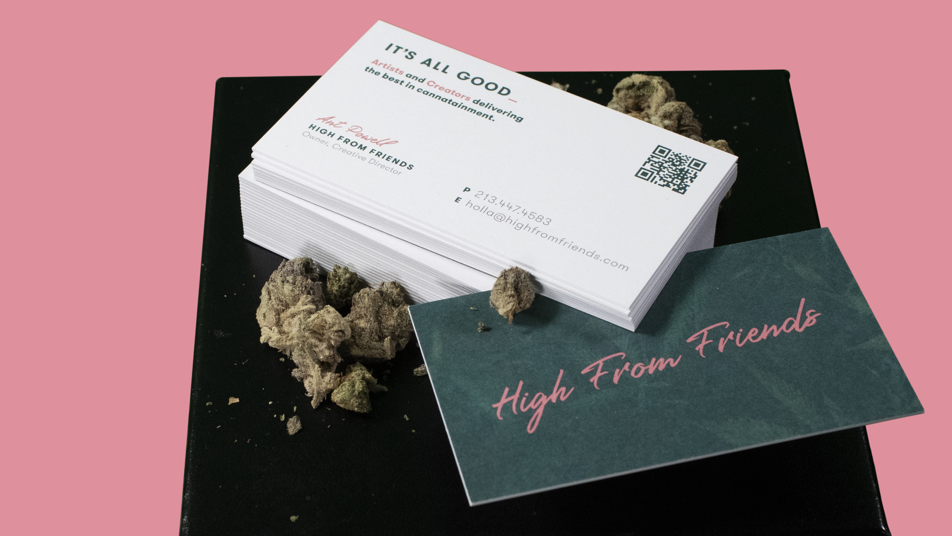
The finished print product; 4-color process (4/4), 32pt card stock with a matte dull finish.