Graduates
Aldon Chen
BFA in Graphic Design — Graphic DesignObservations
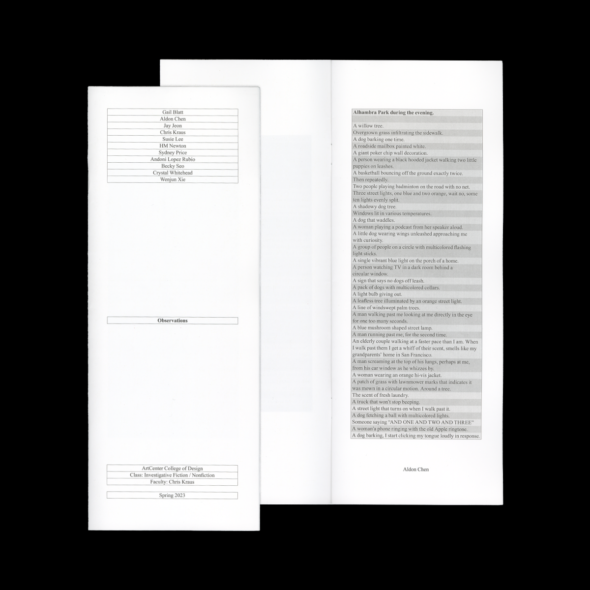
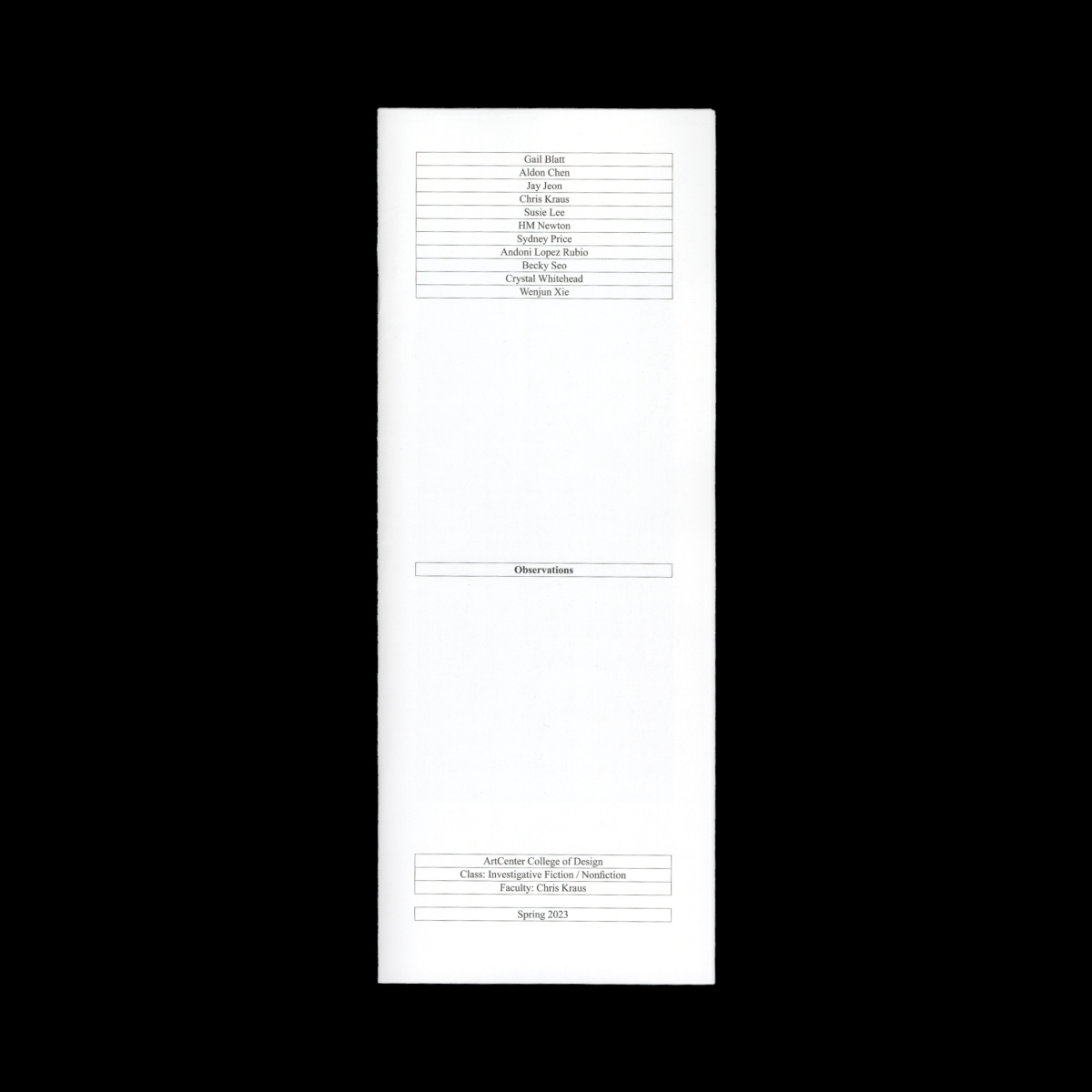
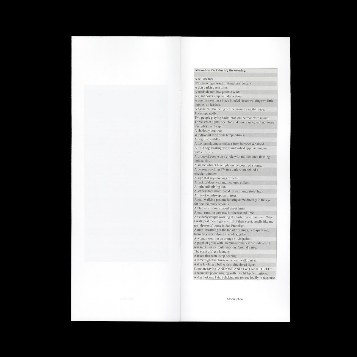
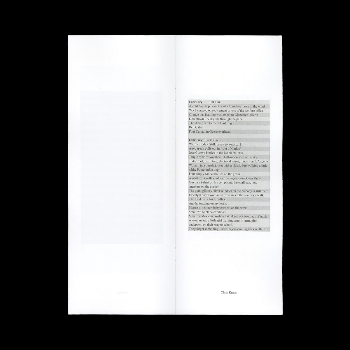
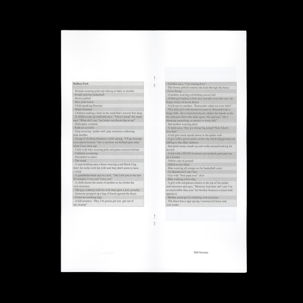
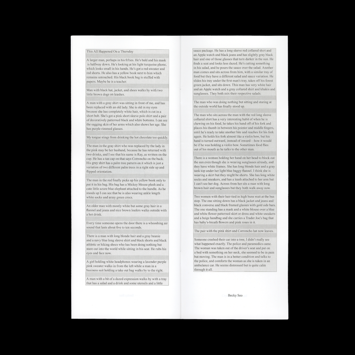
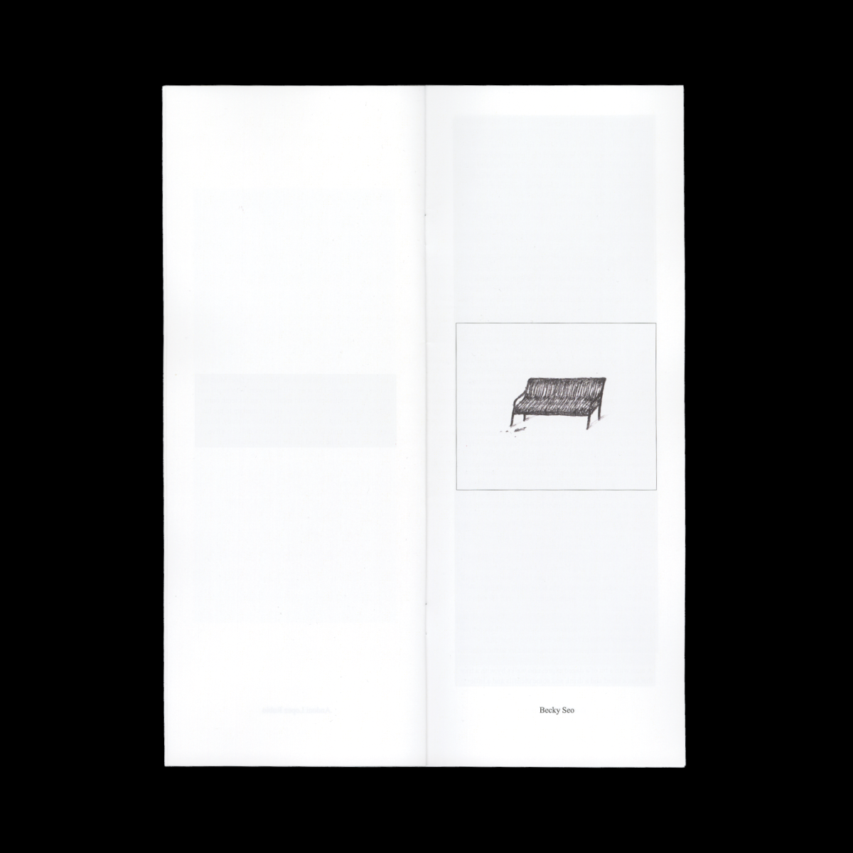
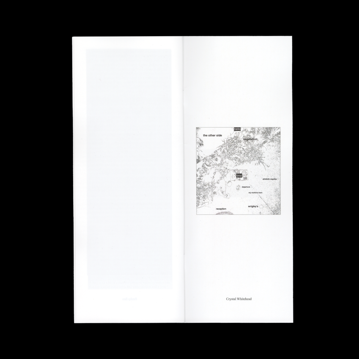
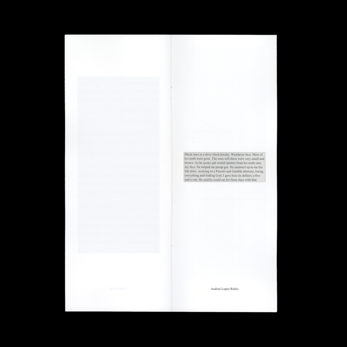
I designed a zine featuring writing done by the students in Chris Kraus' HNAR-324-01: Investigative Fiction/Nonfiction class. Intentionally dry, default, and static. Inspired by the sobering clarity achieved through the simple act of recording observations and which was the goal for many of the class assignments. "Seeing comes before words" - John Berger.
Learning Outcomes:
That I care about honesty, neutrality, and clarity in design. Times New Roman, by being a kind of non-choice, is a way of resisting the aestheticization or codification of neutrality (and therefore becoming merely a performance of formal neutrality) faced by traditionally 'neutral' typefaces such as Helvetica.

