Image
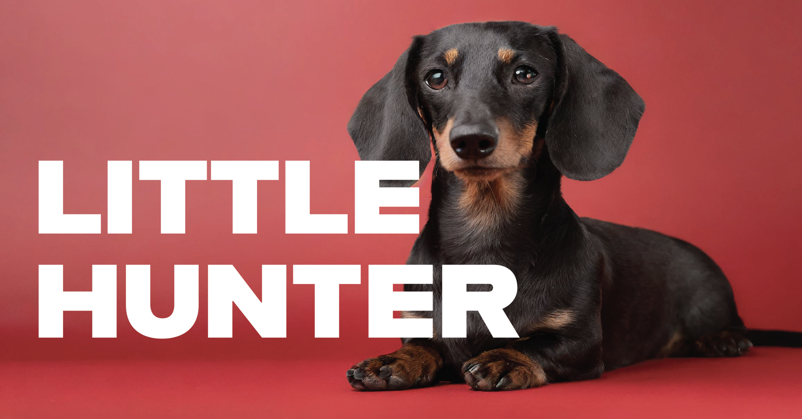
The logo system was created to be minimal and bold, and play on the concept of how each dog is in fact a Little Hunter. The simplicity of this design allows the logo to work well with various images, illustrations and copy.
Image
Image
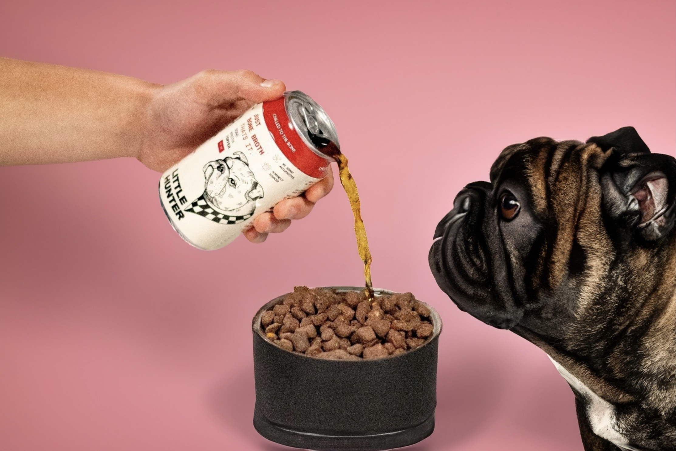
The photography style is also bold and straightforward using the colors and showcasing how to best use the products. Dogs and color become the star of the show, honing in on their unique and fun personalities.
Image
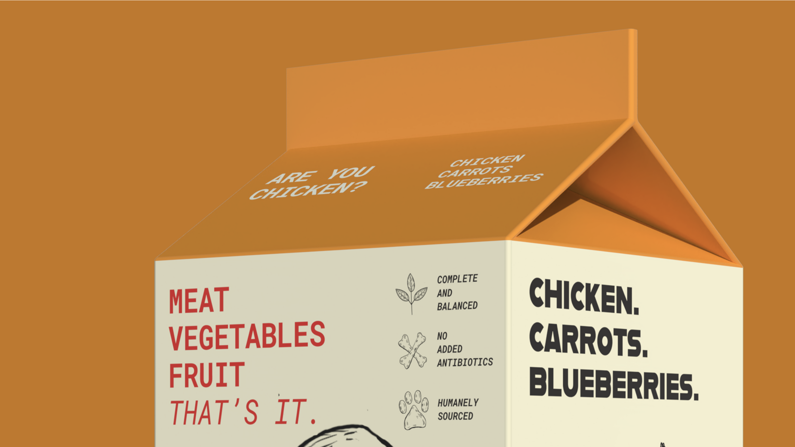
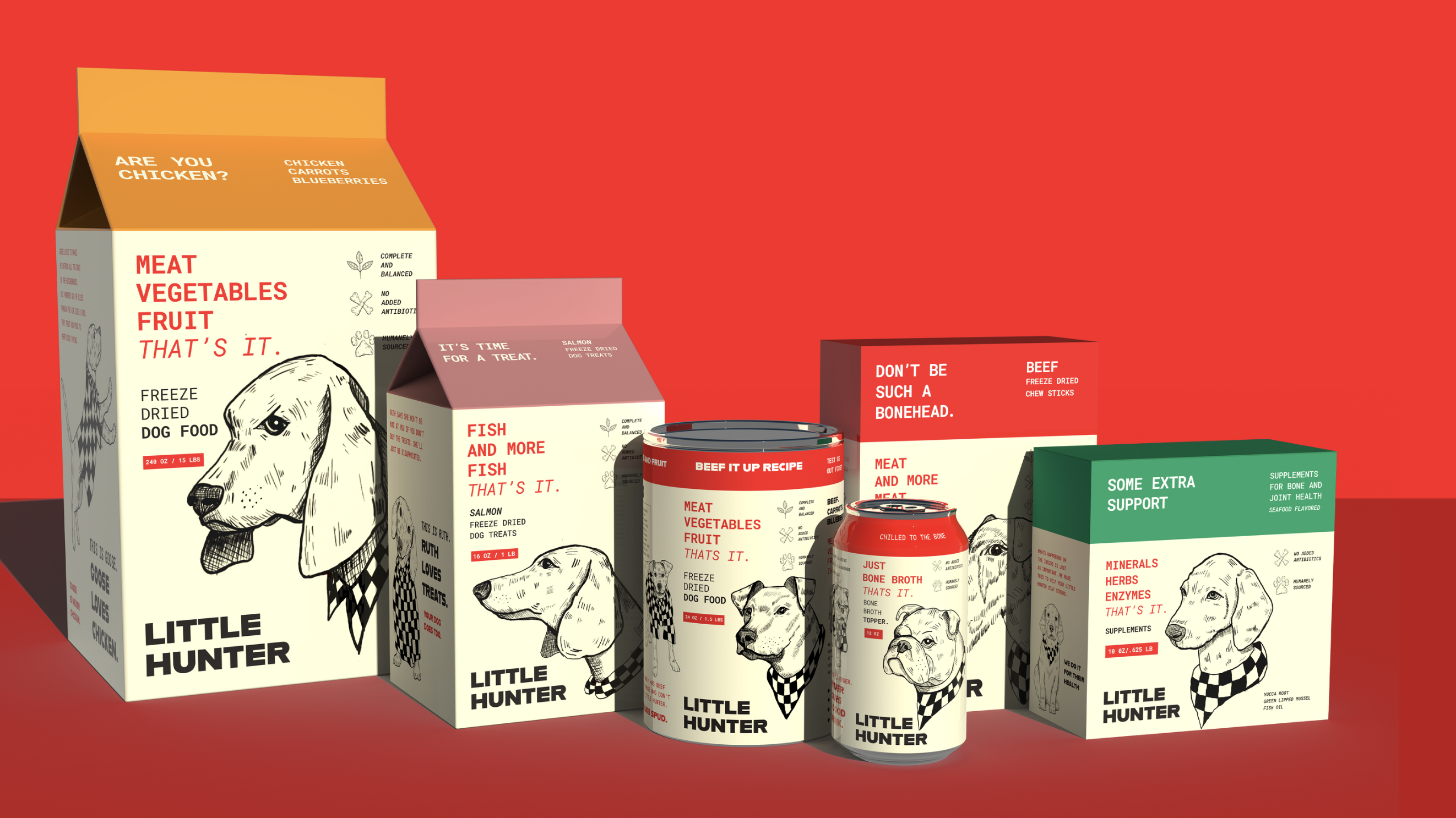
The copywriting is straight forward with bold typography that is both eye-catching and highly recognizable. Words like “ARE YOU CHICKEN”, make the brand playful and fun, while also telling the buyer what the product is. It works to leave a smile and a lasting impression on potential buyers.
Image
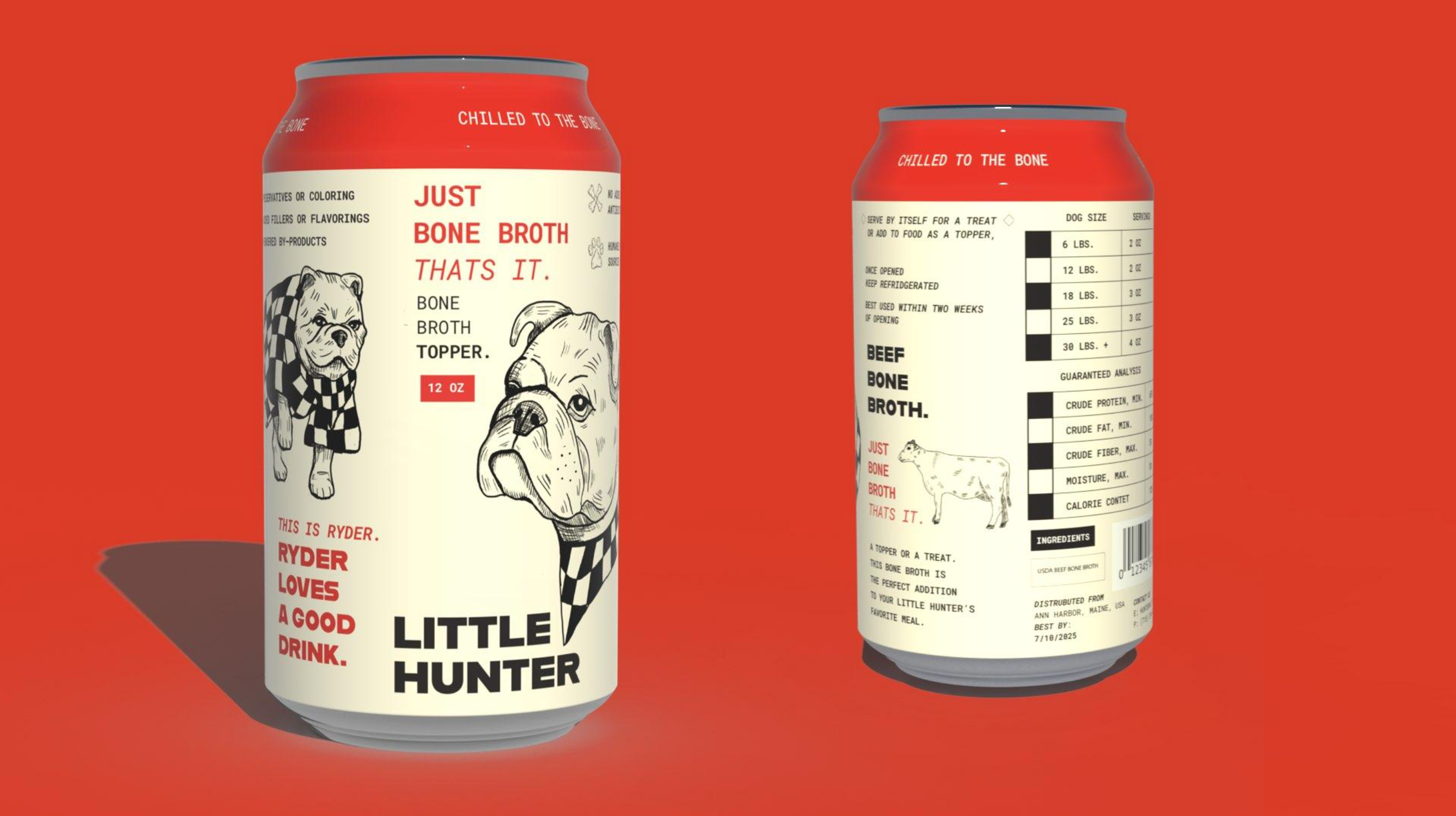
The illustrations feature different types of dogs that have names and their own stories. I drew each with their personalities in mind. For instance, Ryder is a rebel who loves a good drink. The personification allows the consumer to have a relationship with the brand, while also allowing each package to tell its own story.
Image
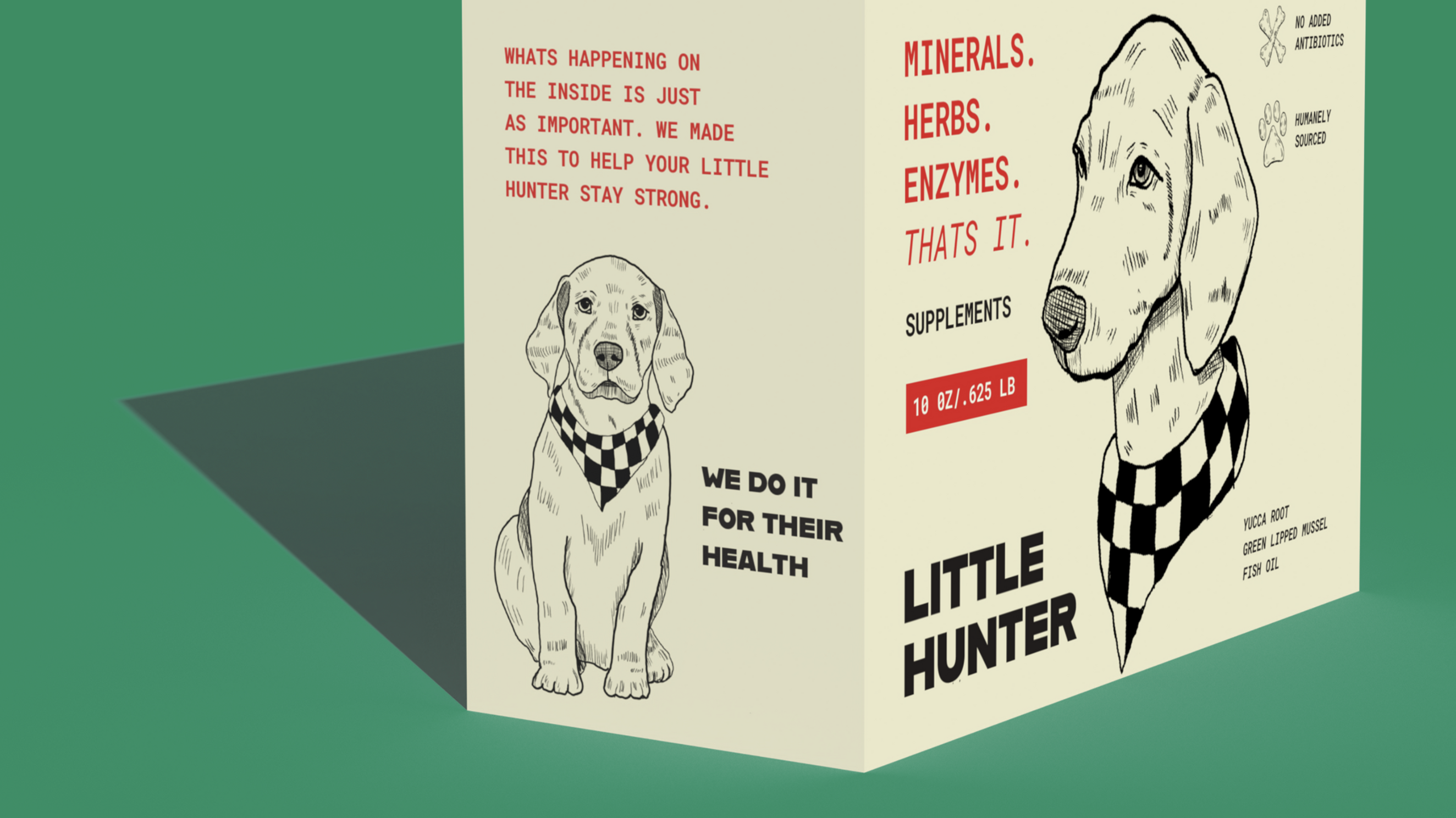
The system was created so it can be used across many systems and product types. This includes supplements. The design allows flexibility to allow the brand to expand to diverse sectors in the ever changing pet food market.
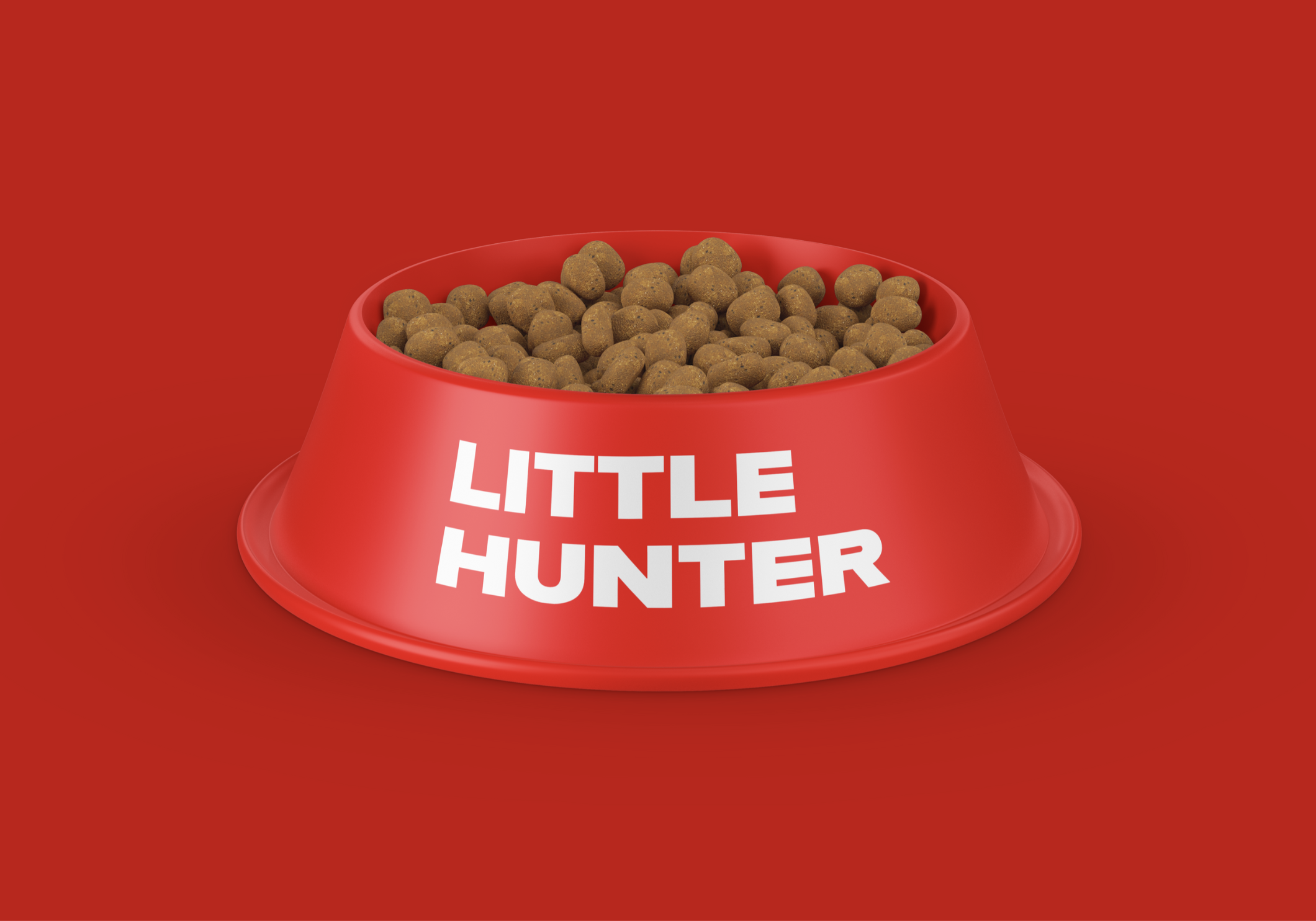
Image
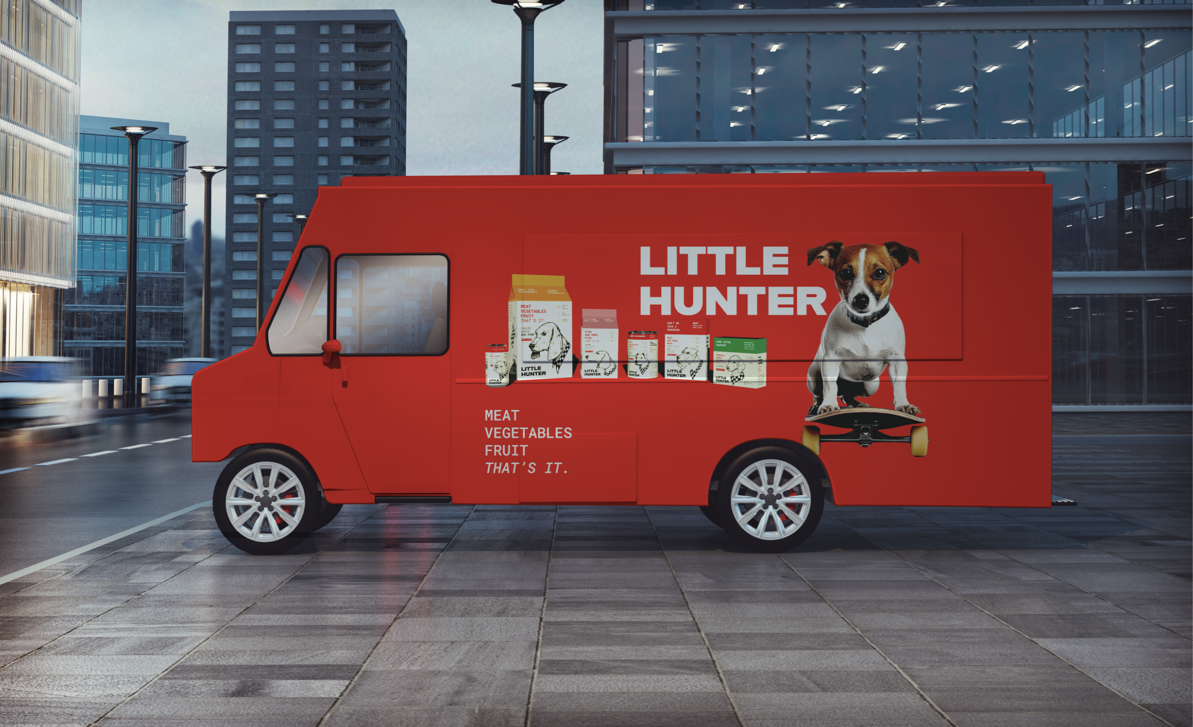
The brand can then be applied to other touch points like food trucks dog food bowls, end caps, or other product types that provide marketing and advertising for the brand.
Image