Image
Image
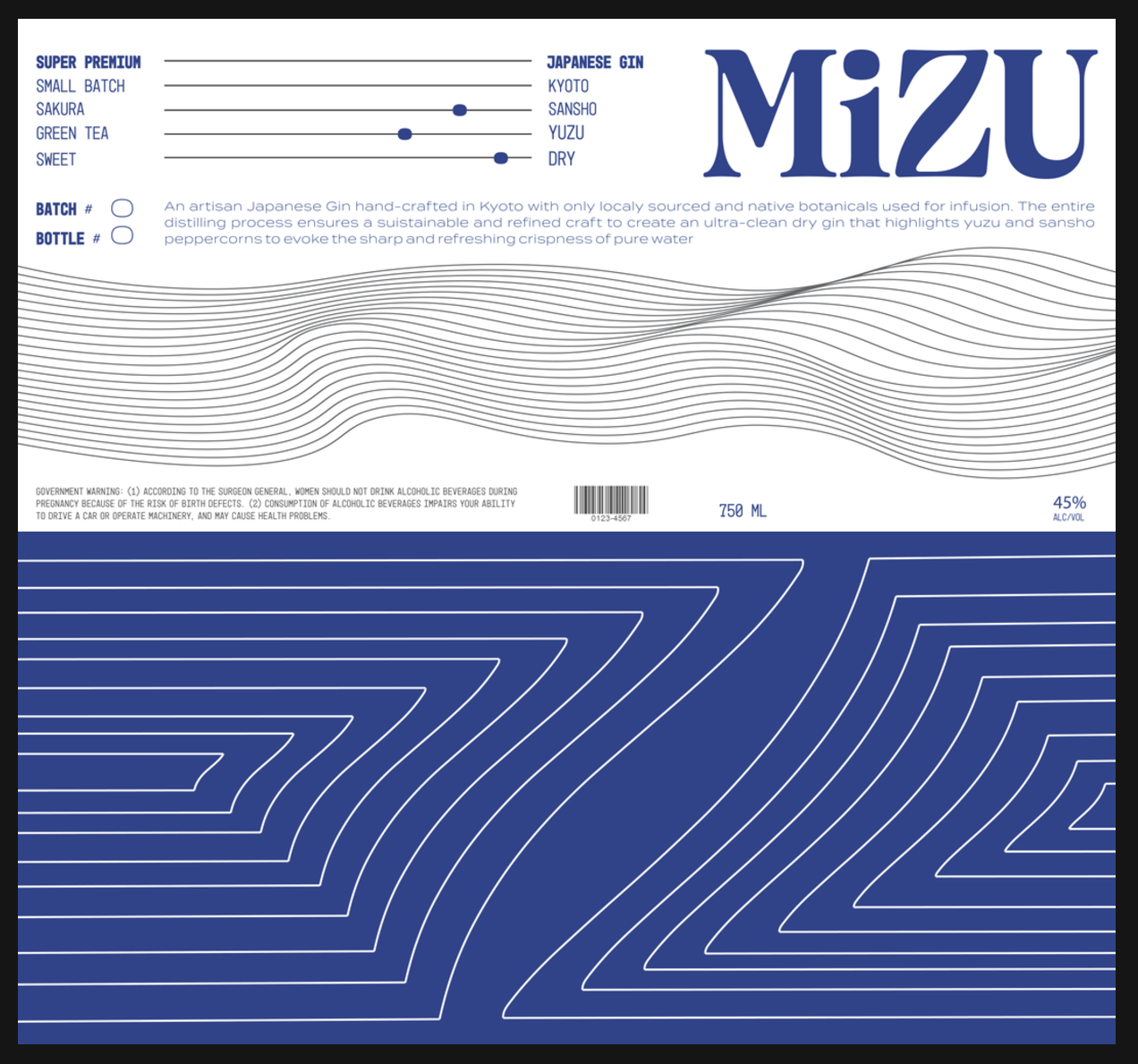
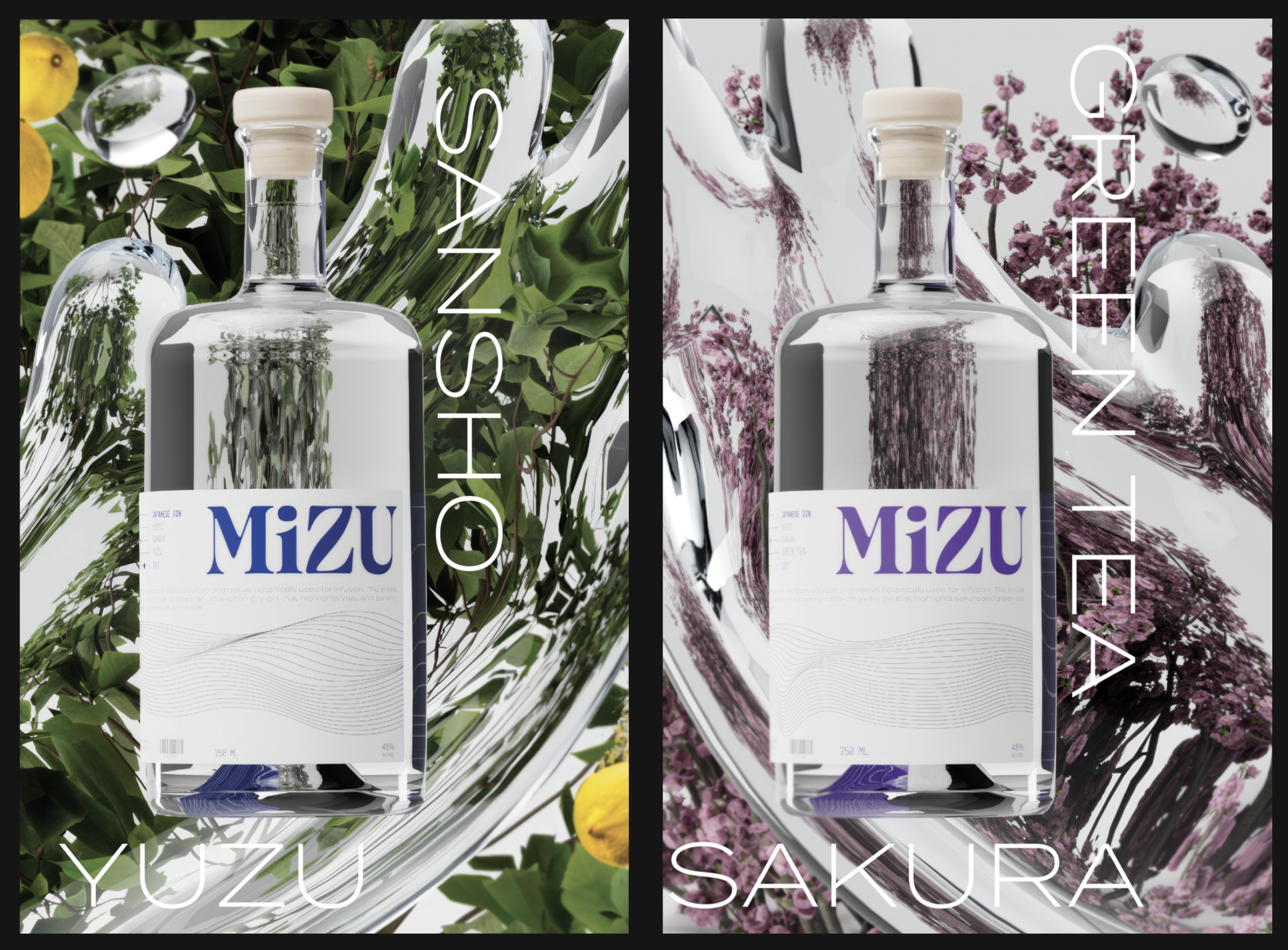
The layout of the label is intentionally reversed to force the viewer to either turn the bottle to view the interior artwork created from the “z” of the wordmark distorted by the liquid in the bottle, or turn the bottle to the left and follow the line art representing flowing water to reach the flavor profile, handwritten batch number and other information
Image
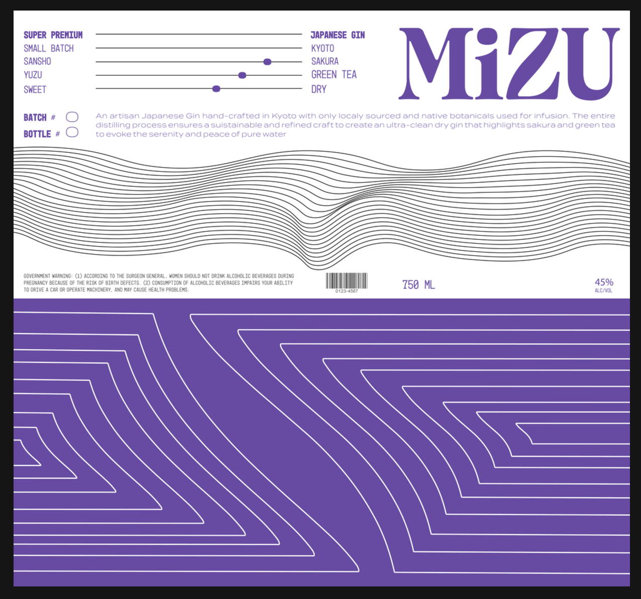
The line art on the front is repeated on the inside of the flavor label on the bottle neck, which is intentionally offset with the main label.
Image
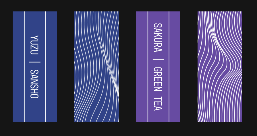
Neck Labels
Image
Image
Brand Activation
Image

Image
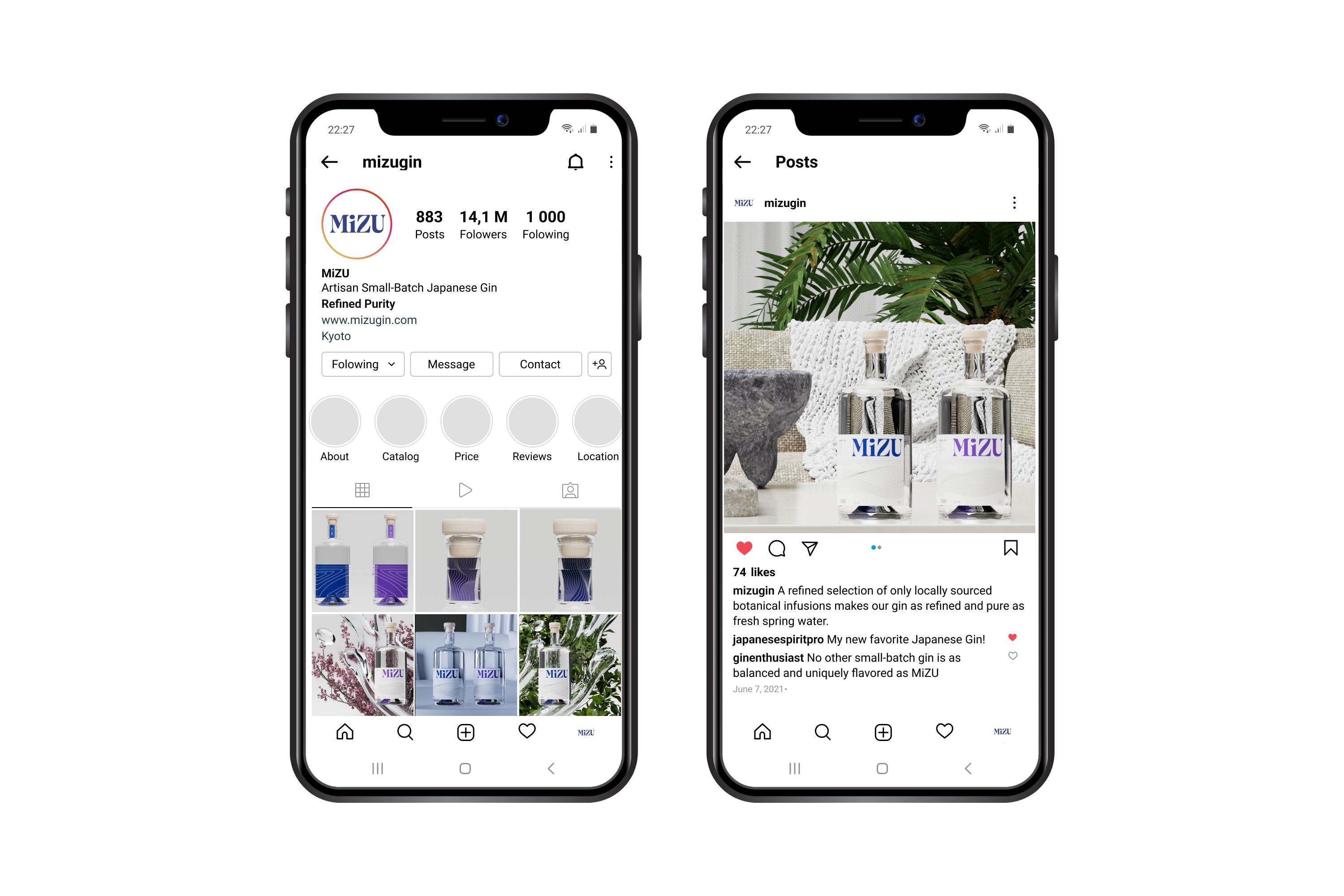
Digital Media
Image
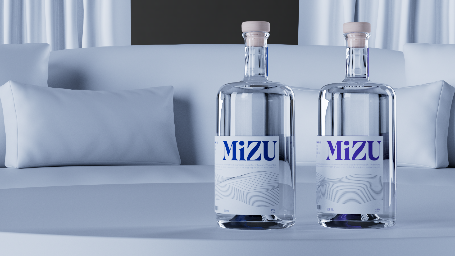
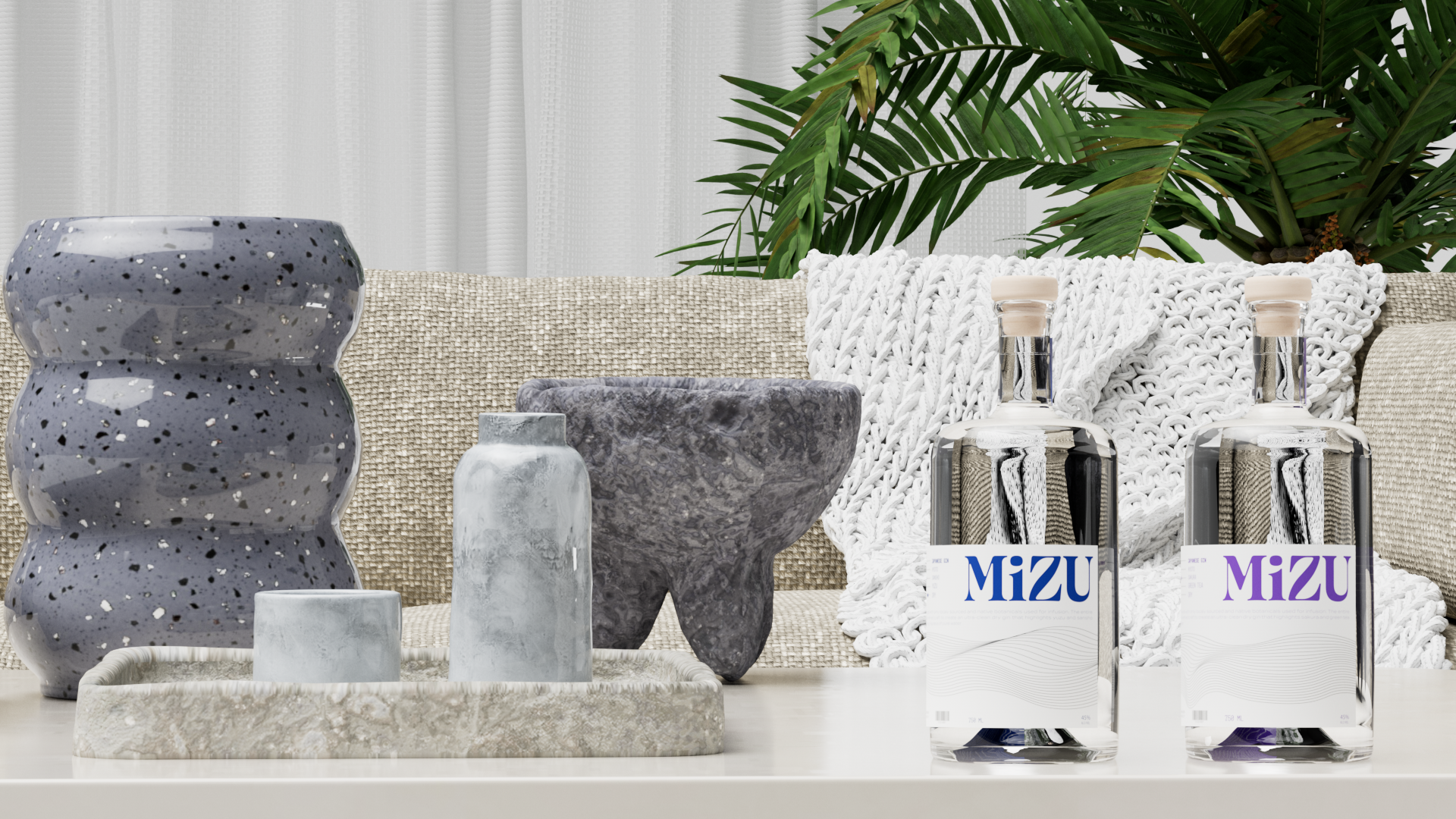
Digital Renderings
Image
Digital Renderings