Image
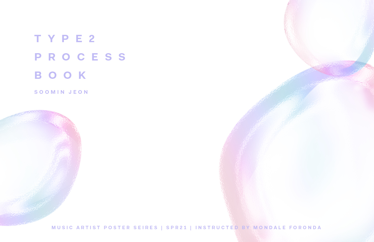
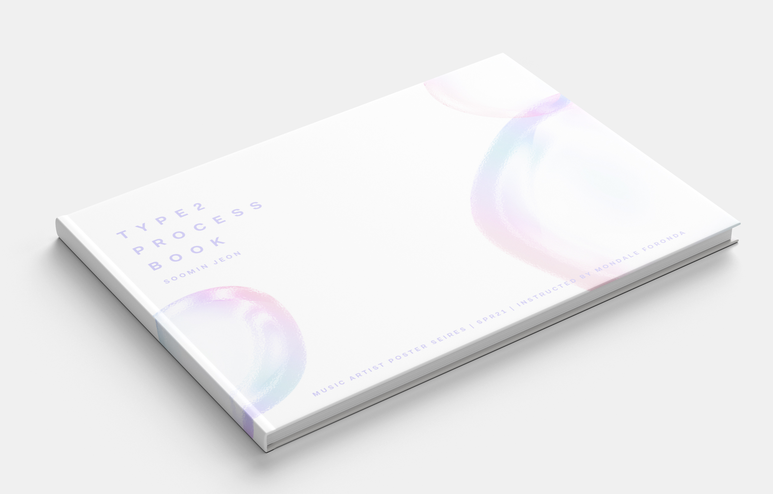
It is the front cover of the process book of the music artist poster series. I used a visual element from my final concert tour poster to deliver the consistency of my poster series. I used light purple Fakt Pro typefaces since I mostly used Sand-Serif typefaces for this project.
Image
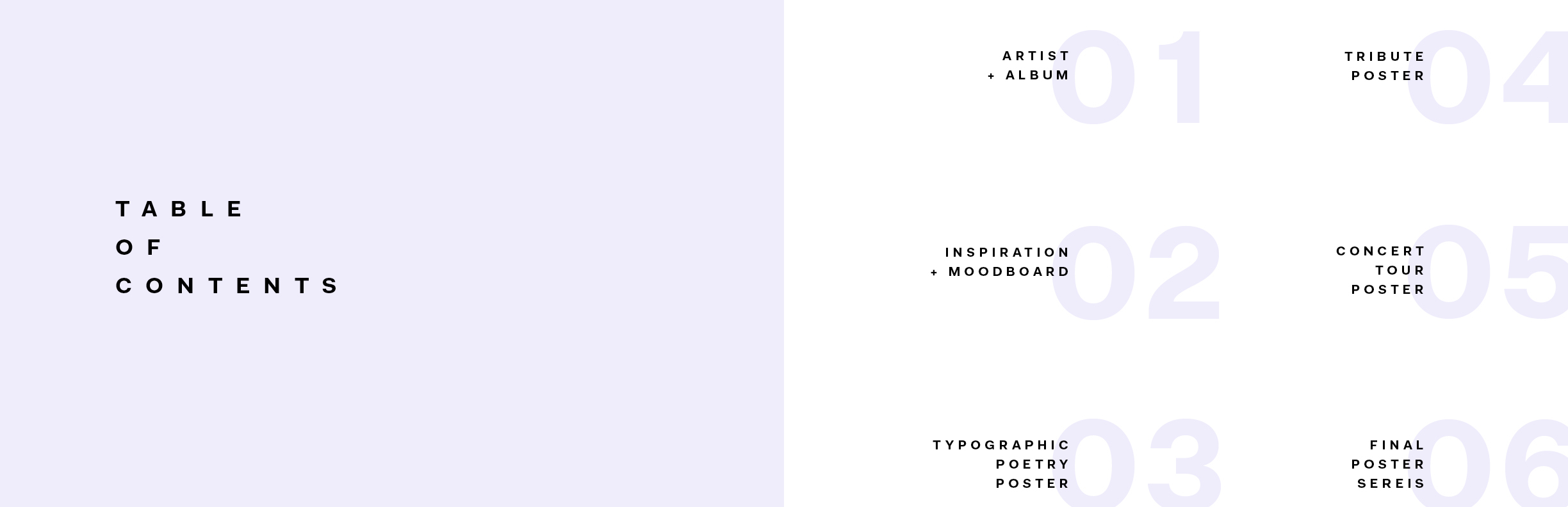
Table of Contents Spread
Image
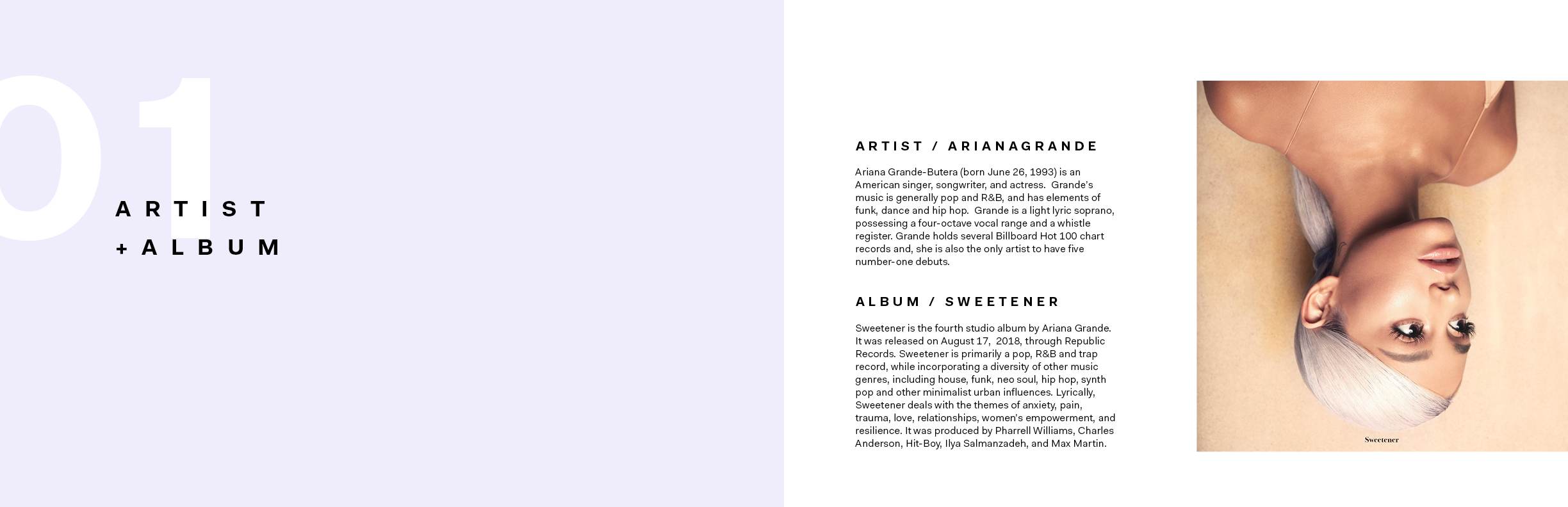
The explanation of the artists and the album that I chose
Image
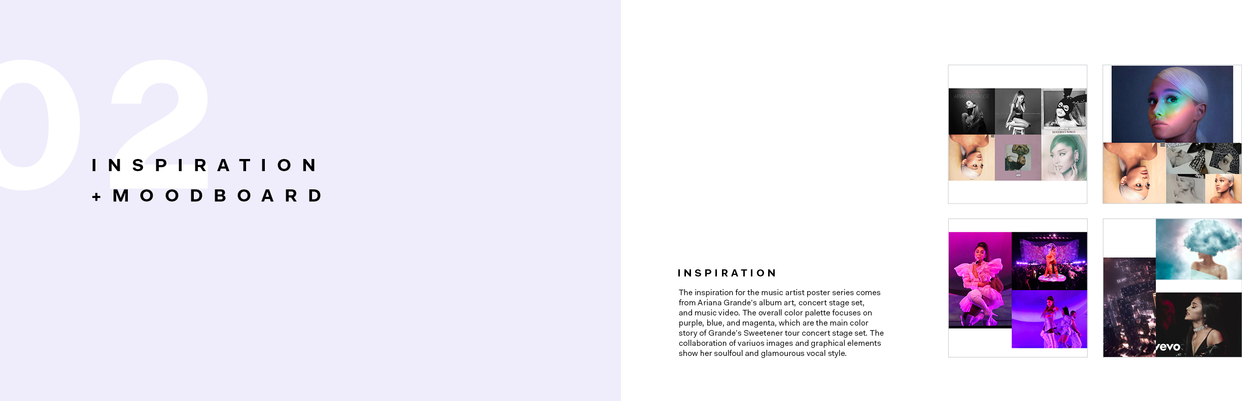
This is the spread of my inspiration and a mood board. Her concert tour performance inspired me in terms of using color for the poster series.
Image
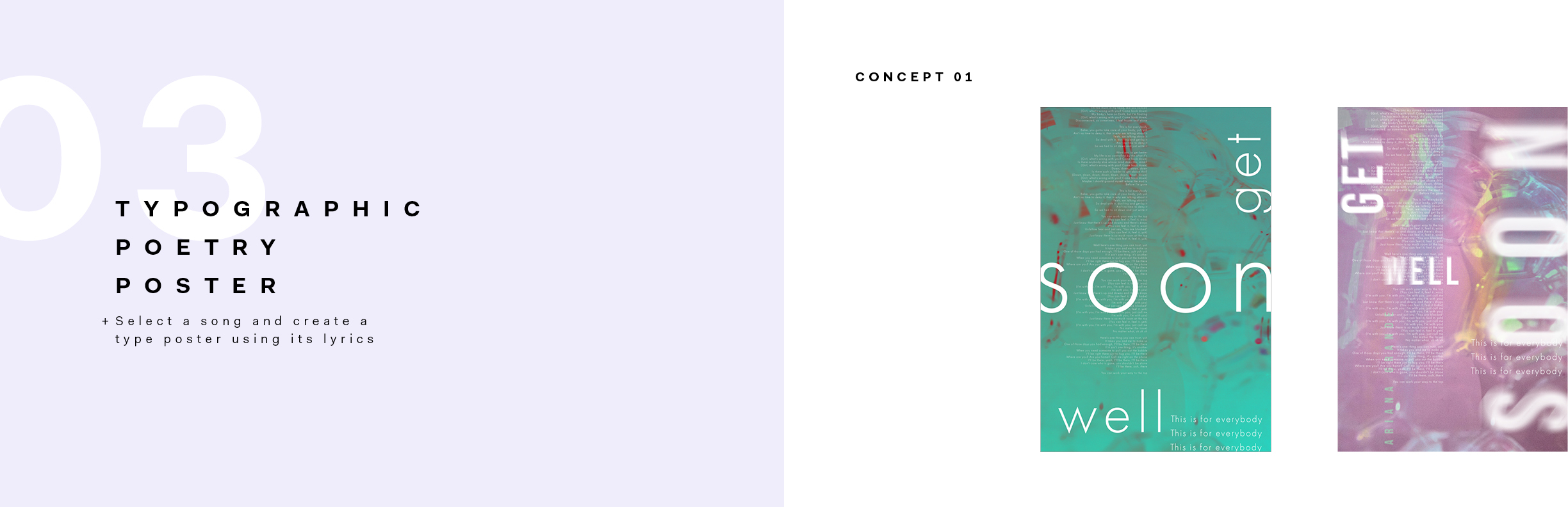
This is the first concept of the typographic poetry poster. I used the title of the song, which is "Get Well Soon," and the lyrics to narrate the piece into the poster.
Image
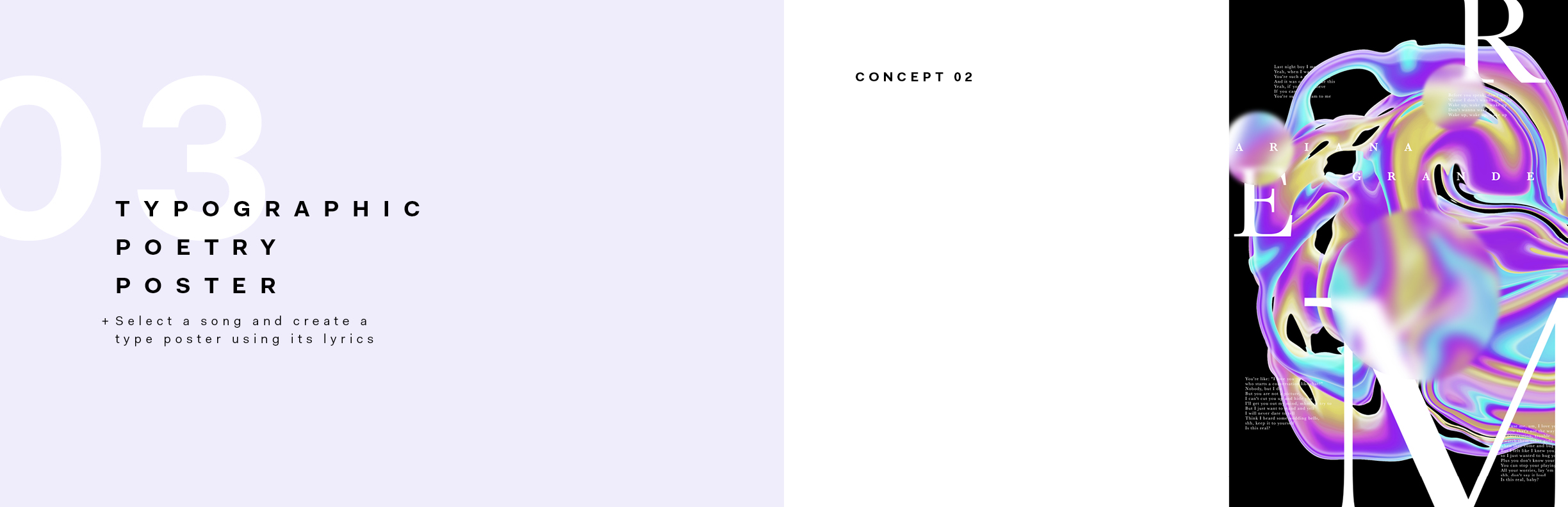
This is the final version of the second typographic poetry poster concept. The song "R.E.M" is represented by abstract elements and blurred texture, which illustrates our unconscious condition when we are sleeping.
Image
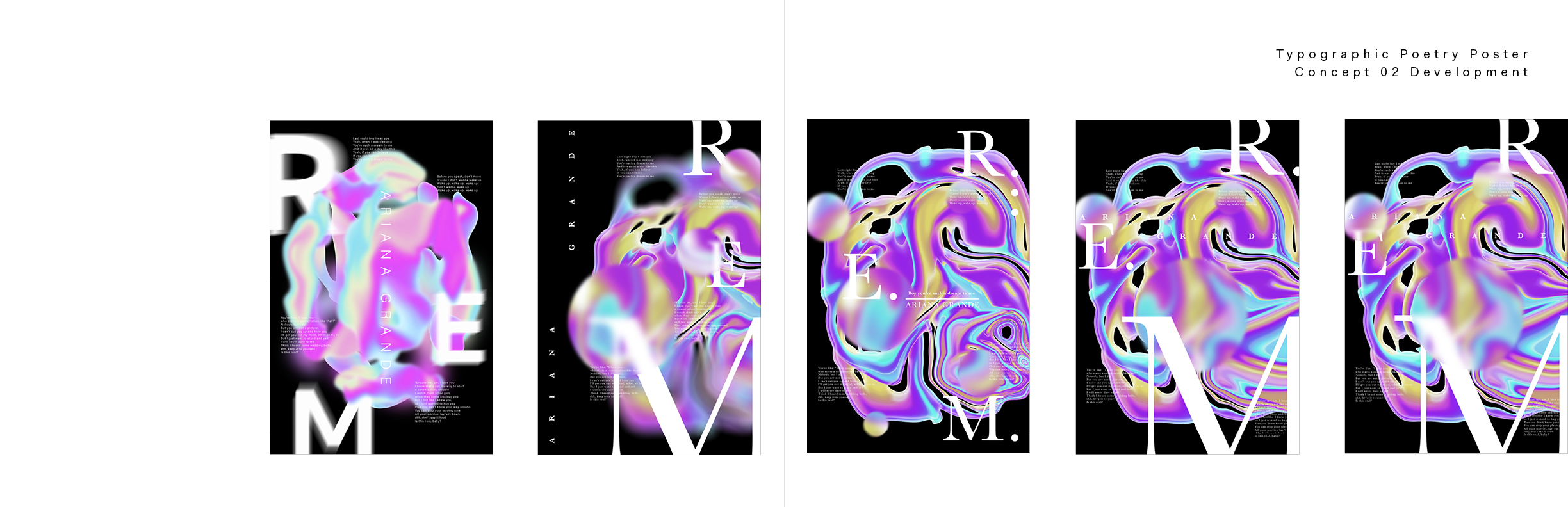
The development page of the second concept of the typographic poetry poster
Image
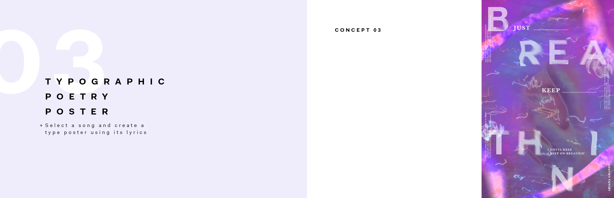
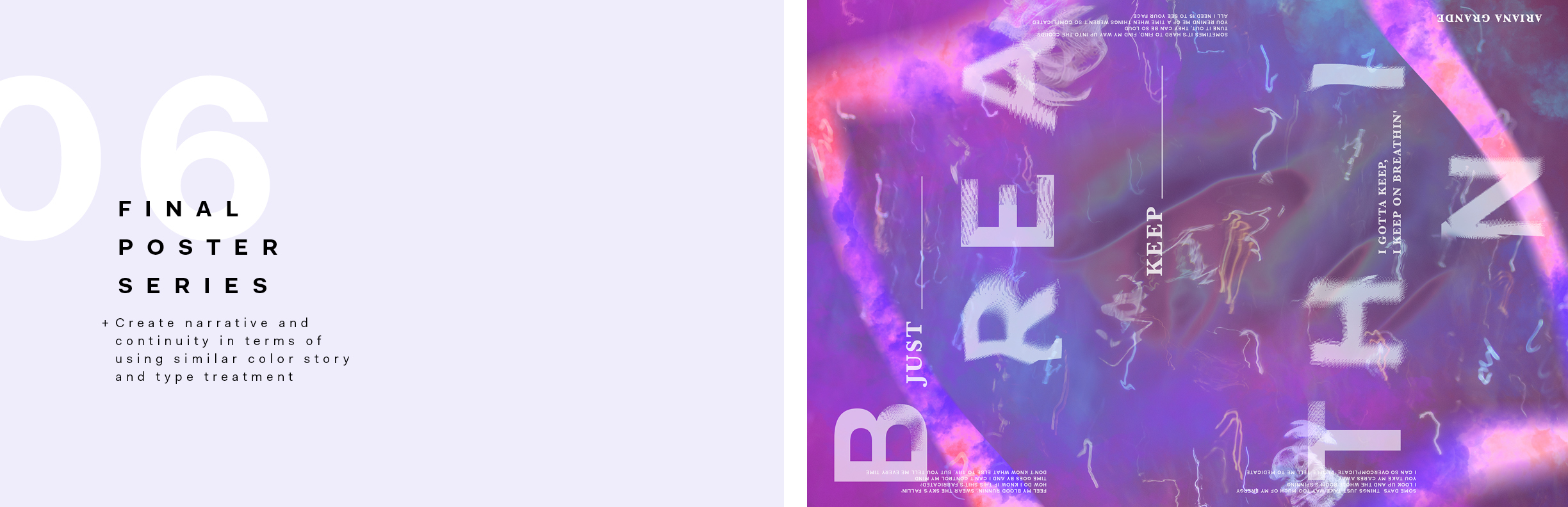
This is the final version of the third typographic poetry poster concept. I wanted to show the difficulty of breathing and confusion through images and various textures. Since it is a song about the artist's anxiety, it tried to show the feeling by spreading the song title "Breathin".
Image
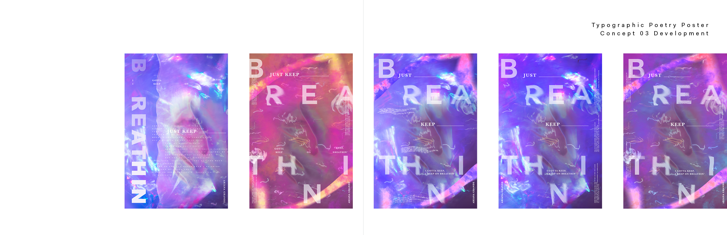
The development page of the third concept of the typographic poetry poster
Image
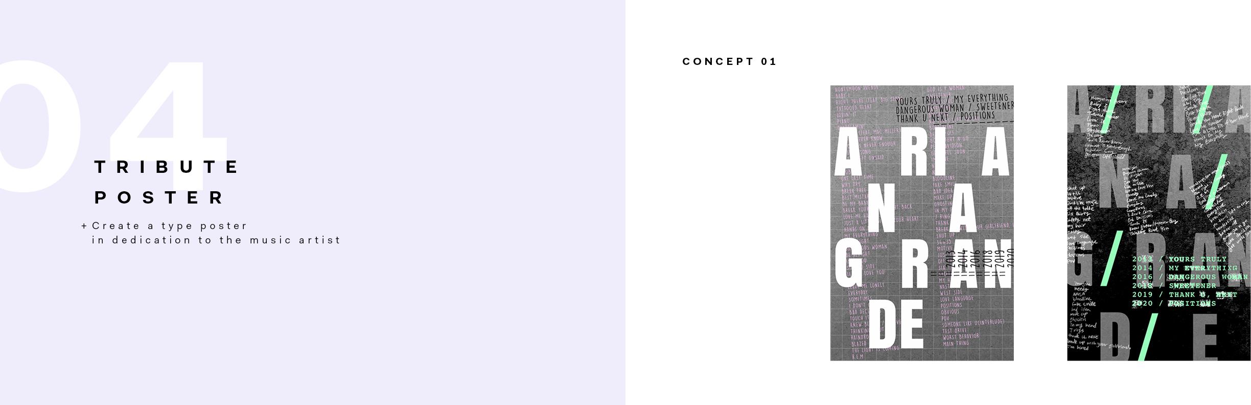
It is the first concept of the tribute poster concept. I used the actual texture paper that I took as a background of the poster. In the second poster, I added my handwriting to give a feeling of an analog-style poster.
Image
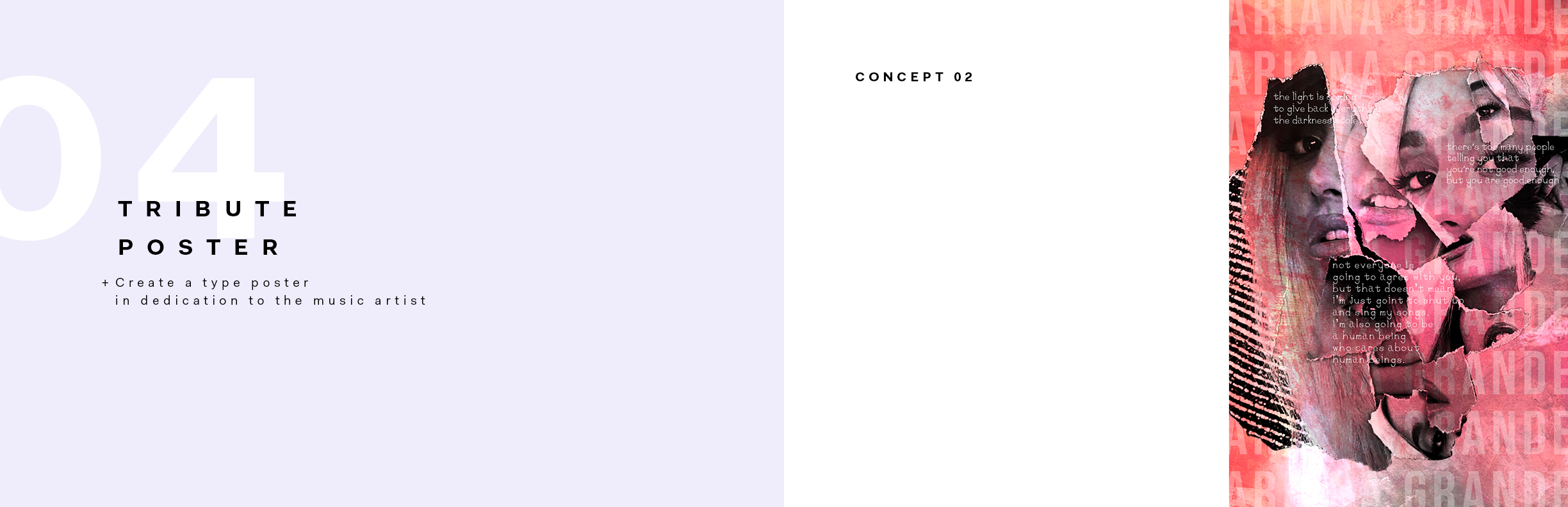
It is the final version of the second tribute poster concept. I ripped off the artist's images from the magazine and collaged them to create a visual image.
Image
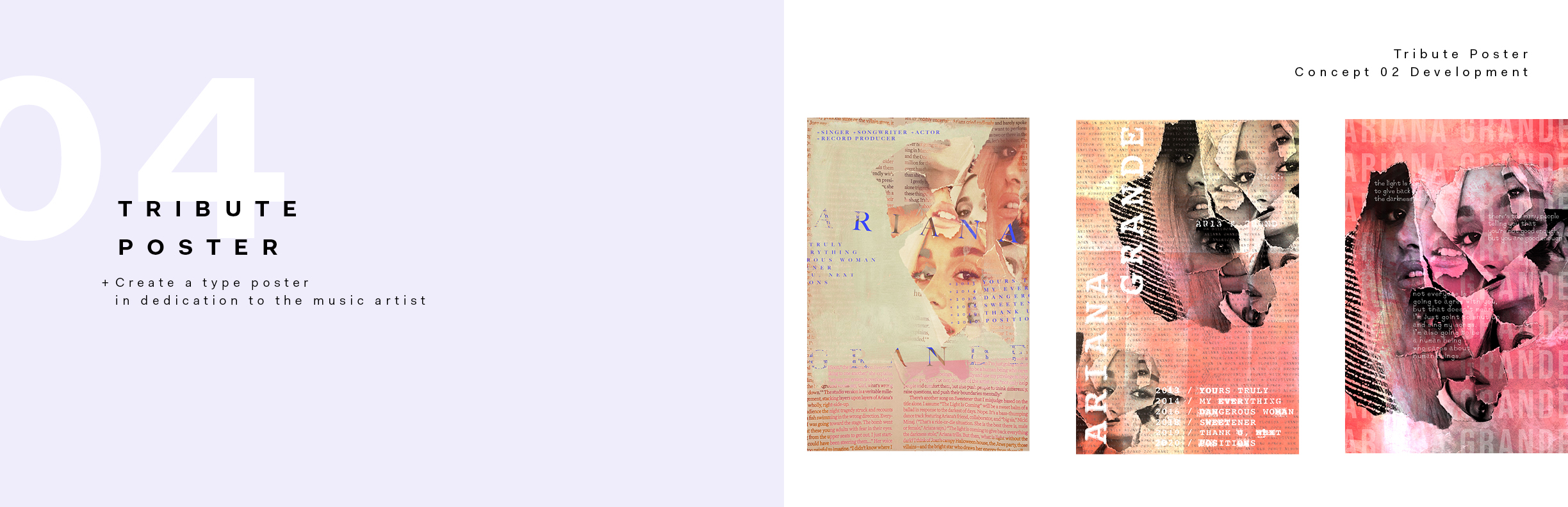
The development page of the second concept of the tribute poster
Image
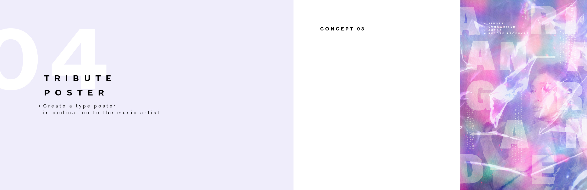
This is the final version of the third tribute poster concept. Since it is a dedication to the music artist, I wanted to give a feeling that a shiny wrapper covered the poster itself, so I blended the texture of the wrapper. Also, the artist's name was highlighted in large bold typefaces.
Image
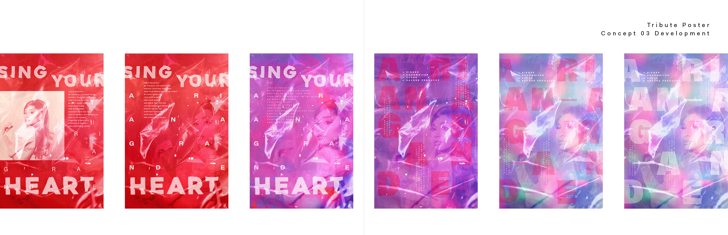
The development page of the third concept of the tribute poster. I originally used red to show her passion for music but changed it into purple to make continuity with other posters.
Image
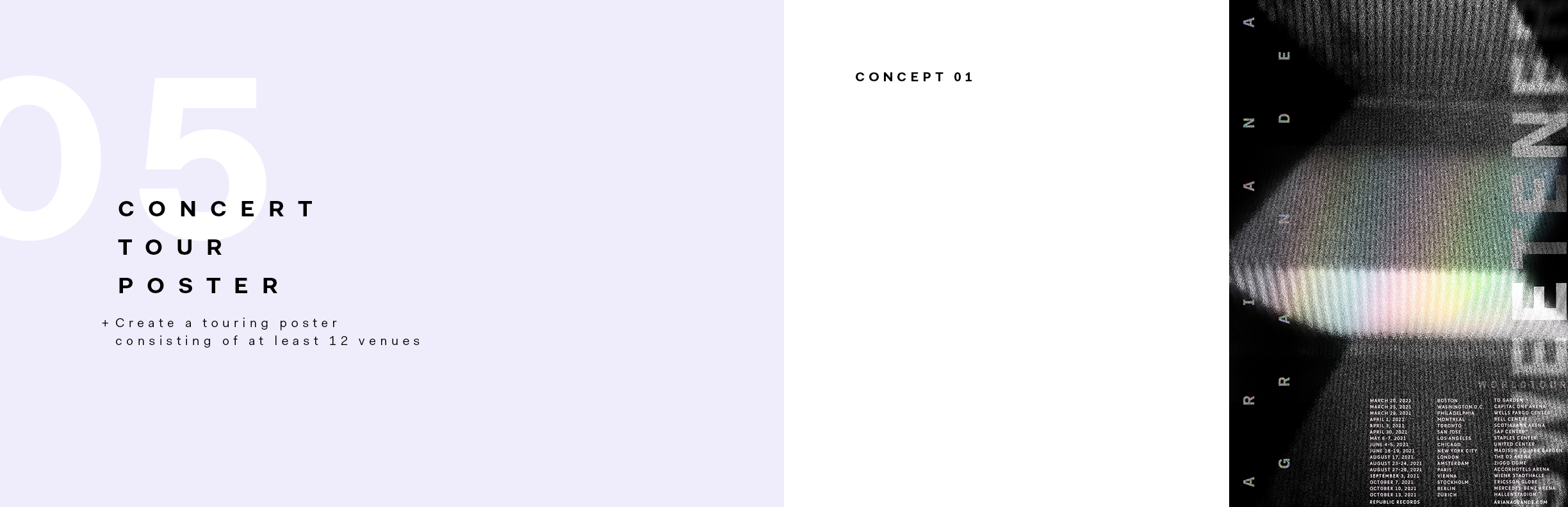
This is the first concept of the concert tour poster.
Image
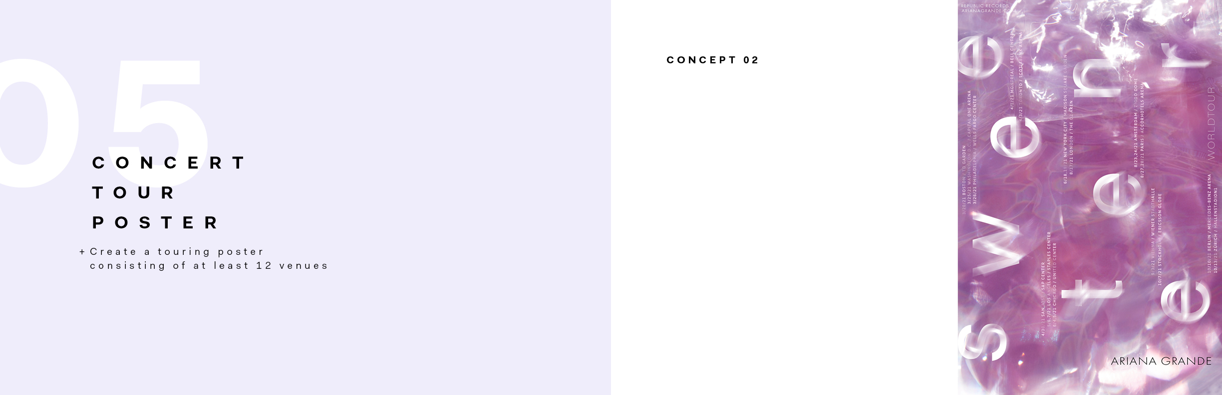
This is the final version of the second concert tour poster concept. In this poster, I tried to show an ethereal and dream state feelings mirroring Ariana's voice. I was inspired by her first track of the album, full of her voice without any instrument.
Image
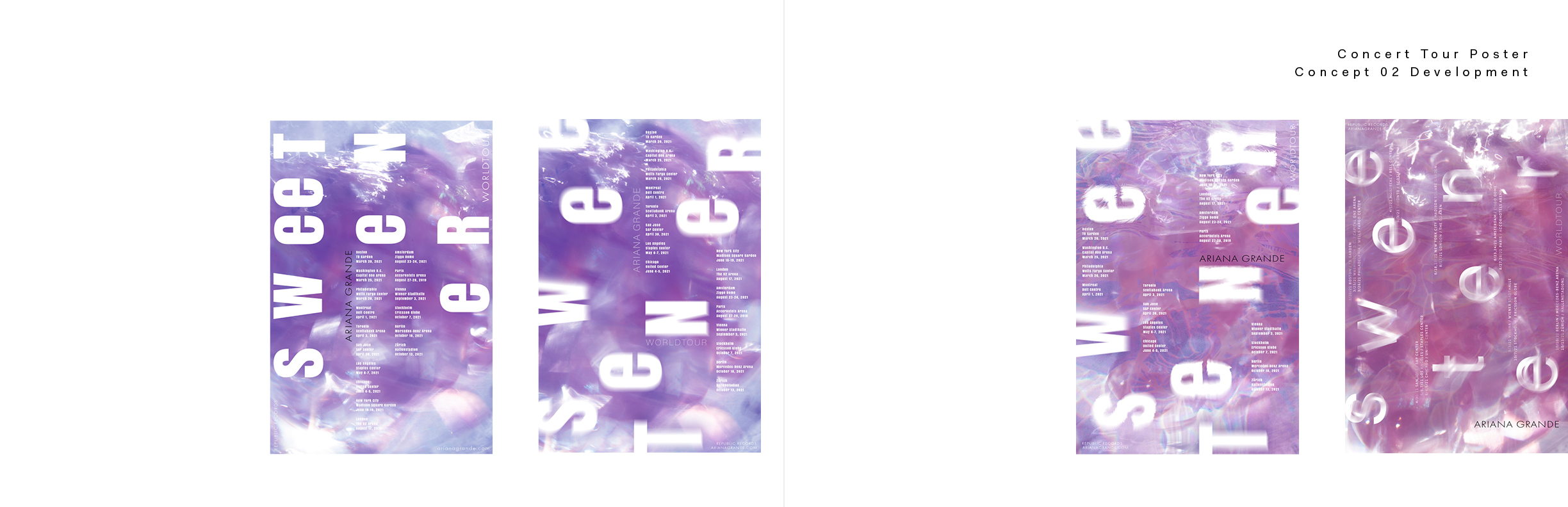
The development page of the second concept of the concert tour poster.
Image
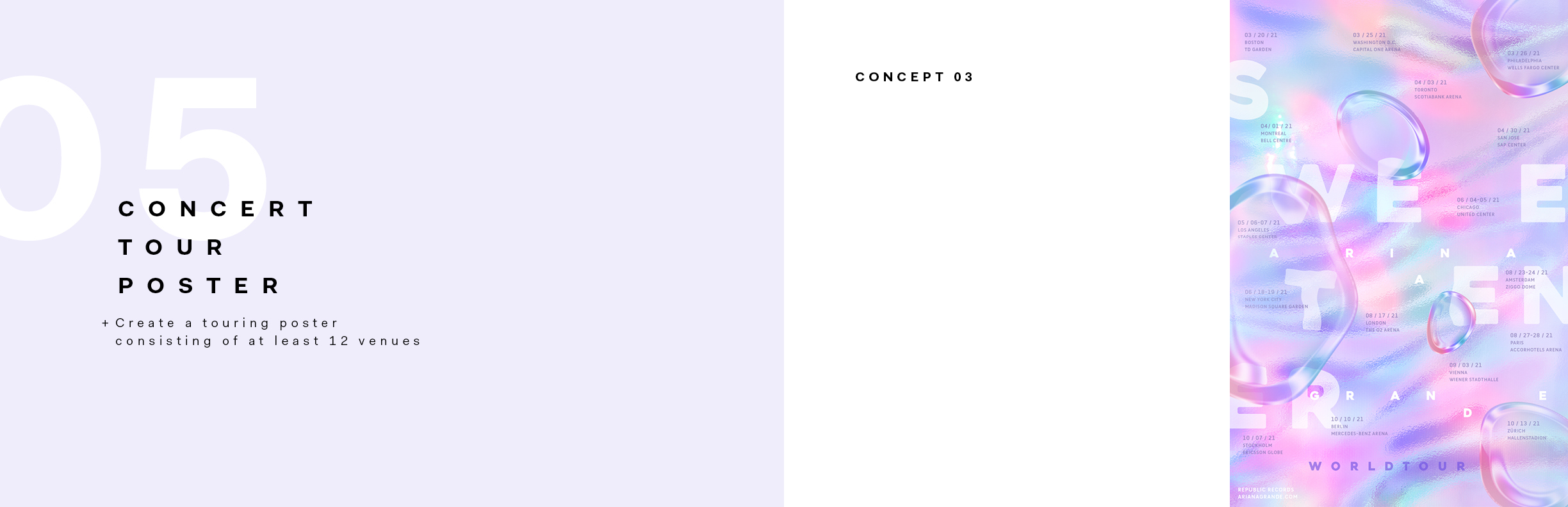
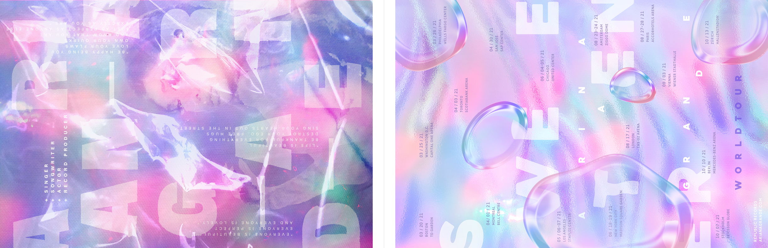
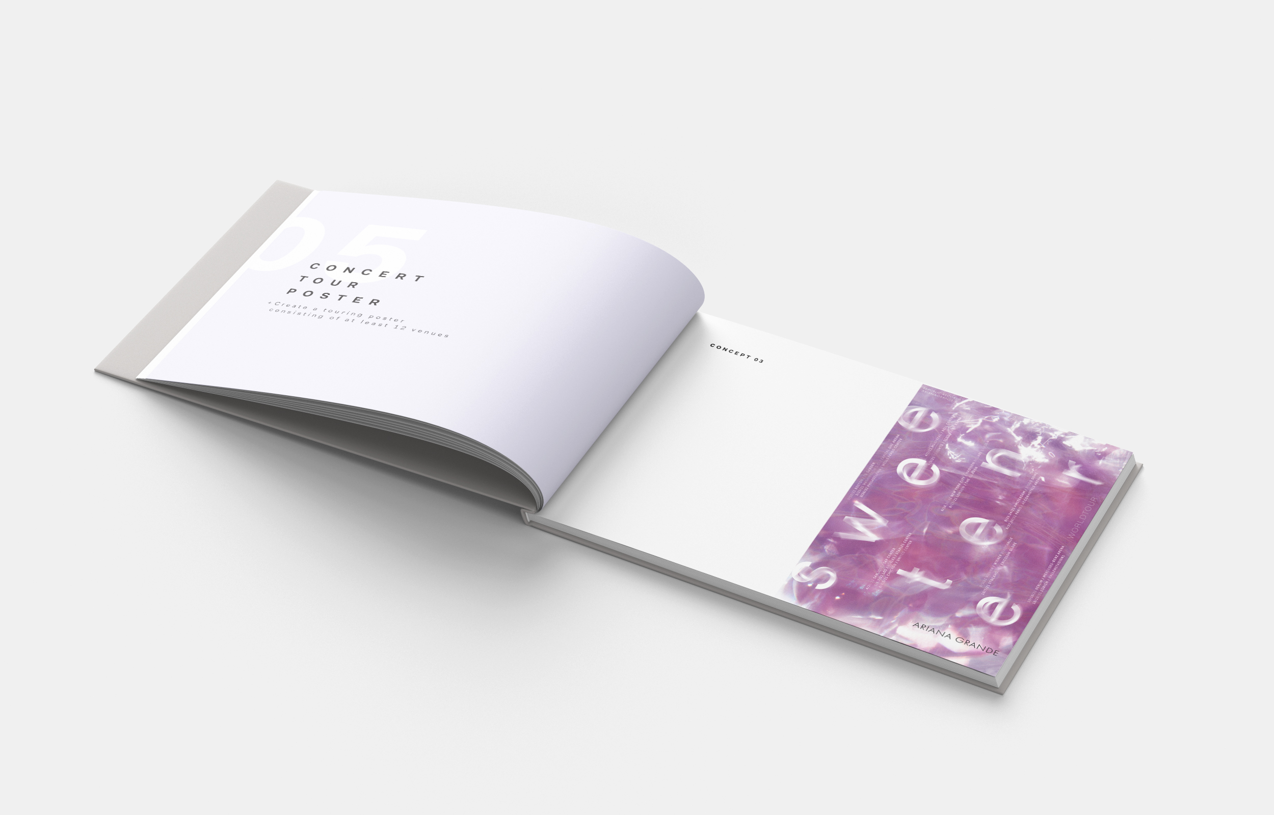
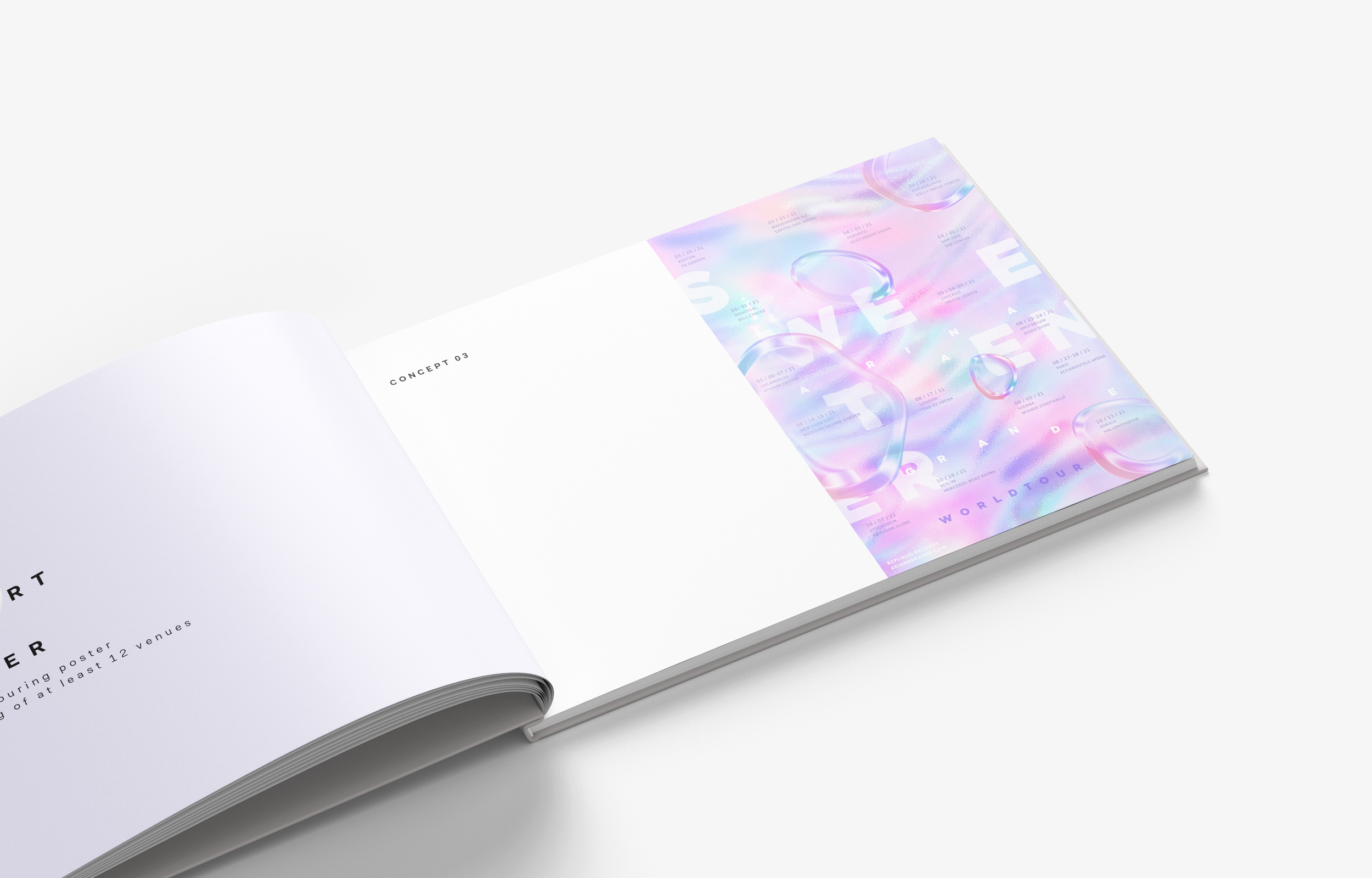
This is the final version of the third concert tour poster concept. I illustrated this poster in a more playful way with brighter colors and distortion. Floating bubble elements and 12 venues and type treatment show visual dynamics in this poster.
Image
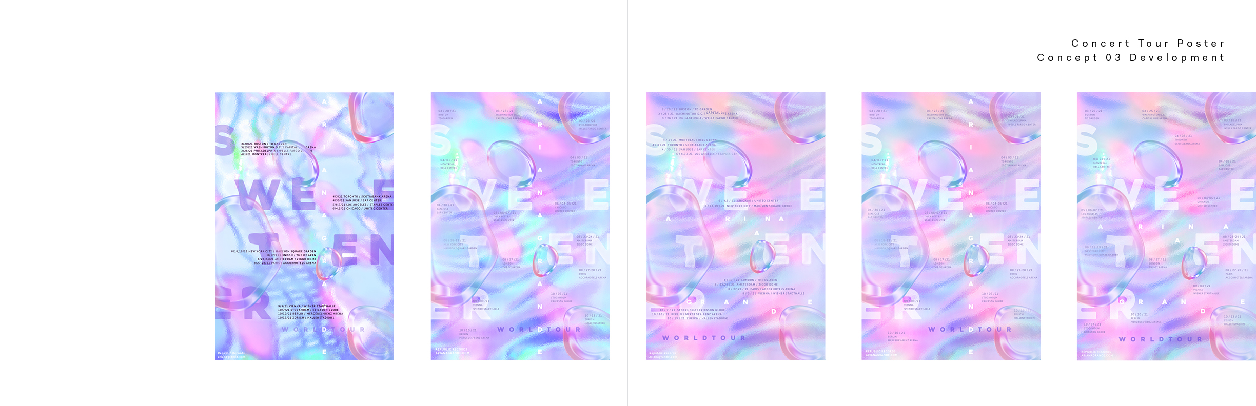
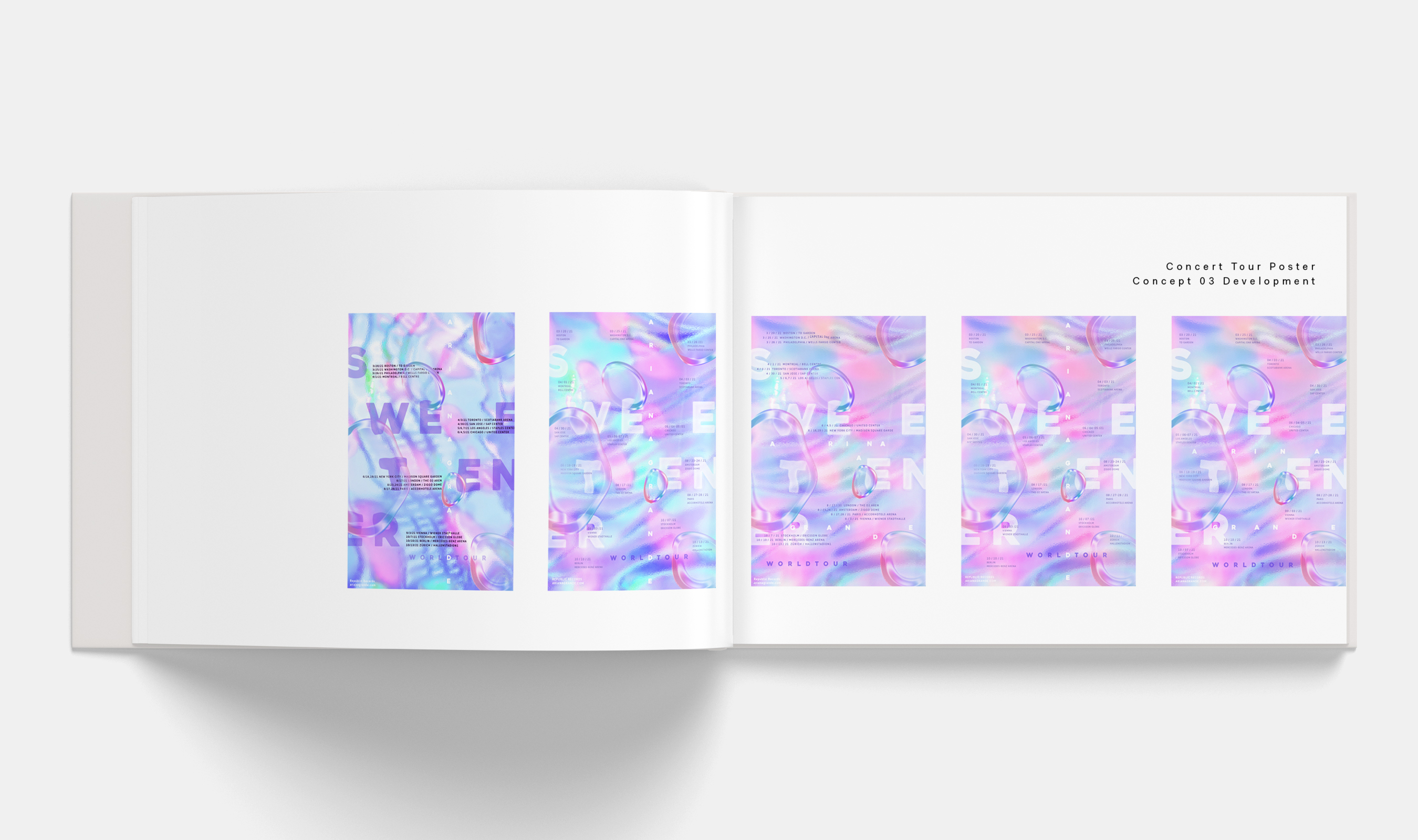
The development page of the third concept of the concert tour poster.
Image
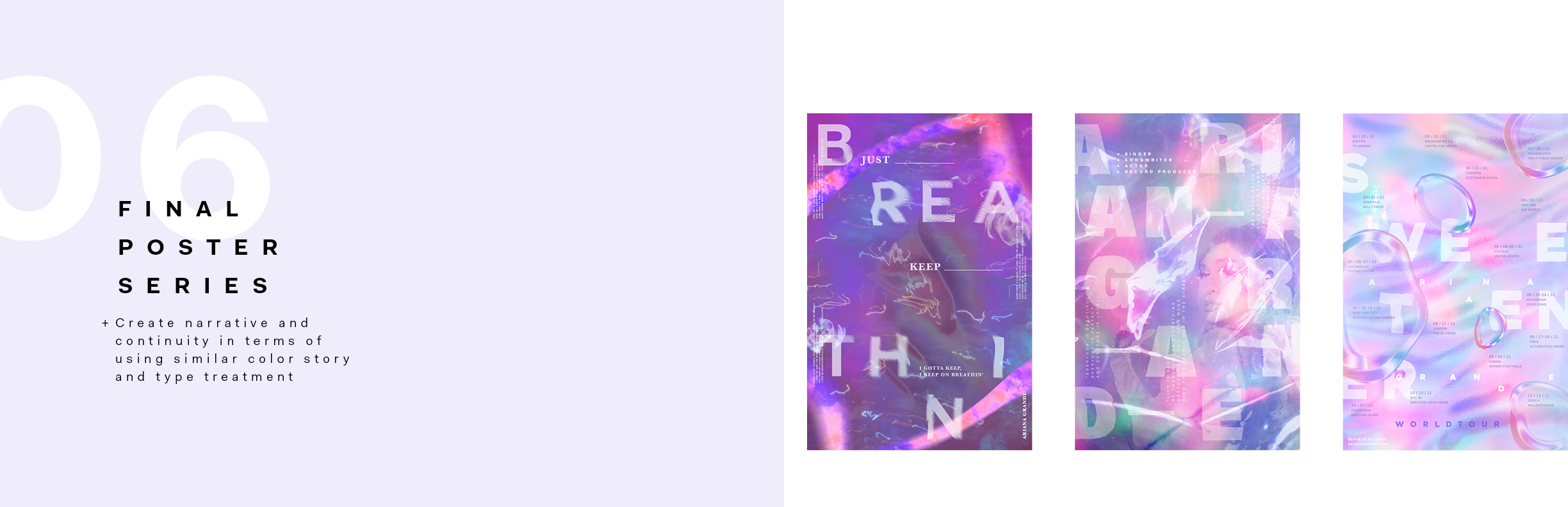
Final poster series. I executed a continuity between three posters in terms of using purple, blue, and pink colors, dismantled type treatment, and various textures.
Image
Single page for final music artist poster series.
Image
Image
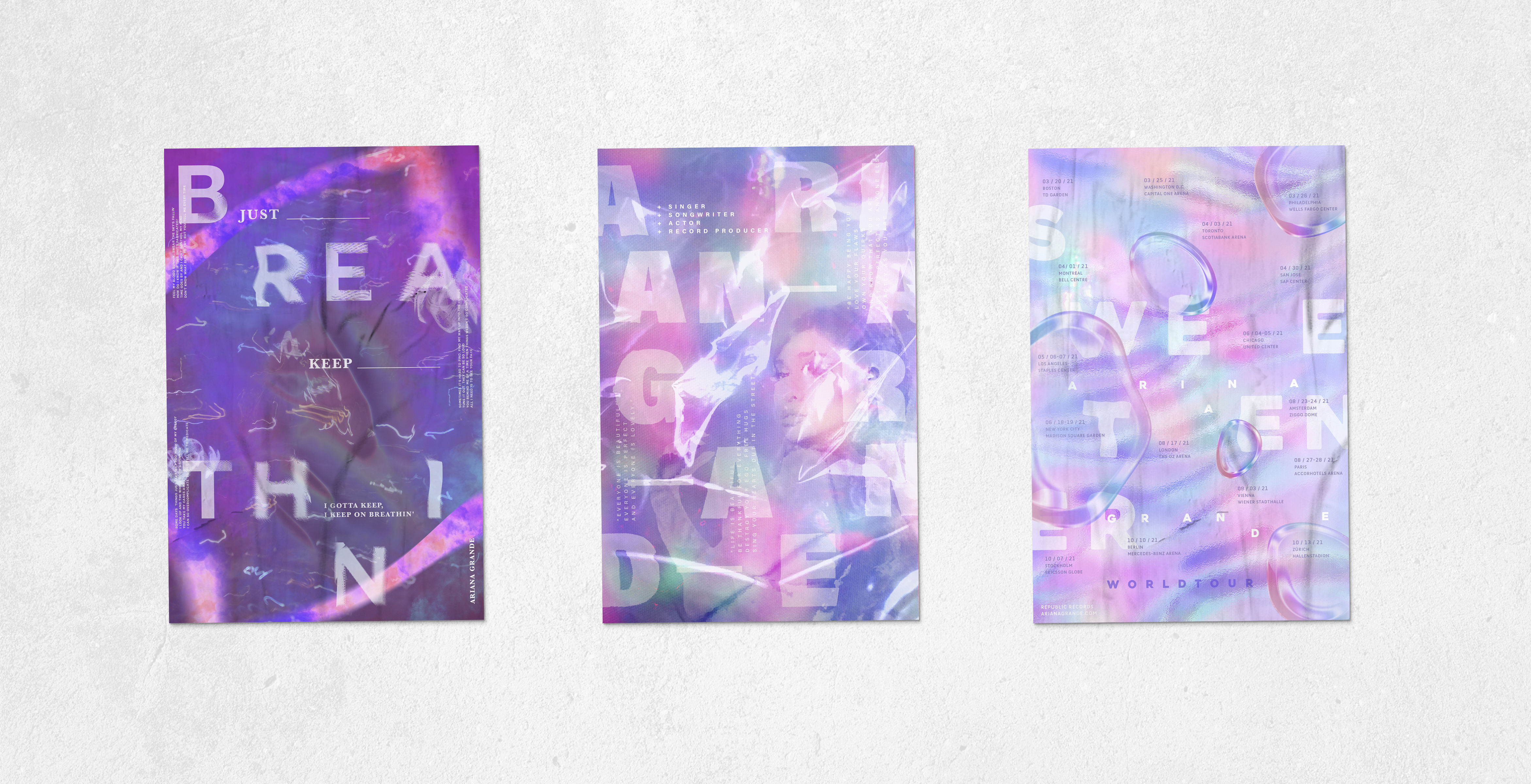
Final three music poster series in mockup
Image
Cover page of the process book in mockup
Image
Spread page of the process book in mockup
Image
Image