Image

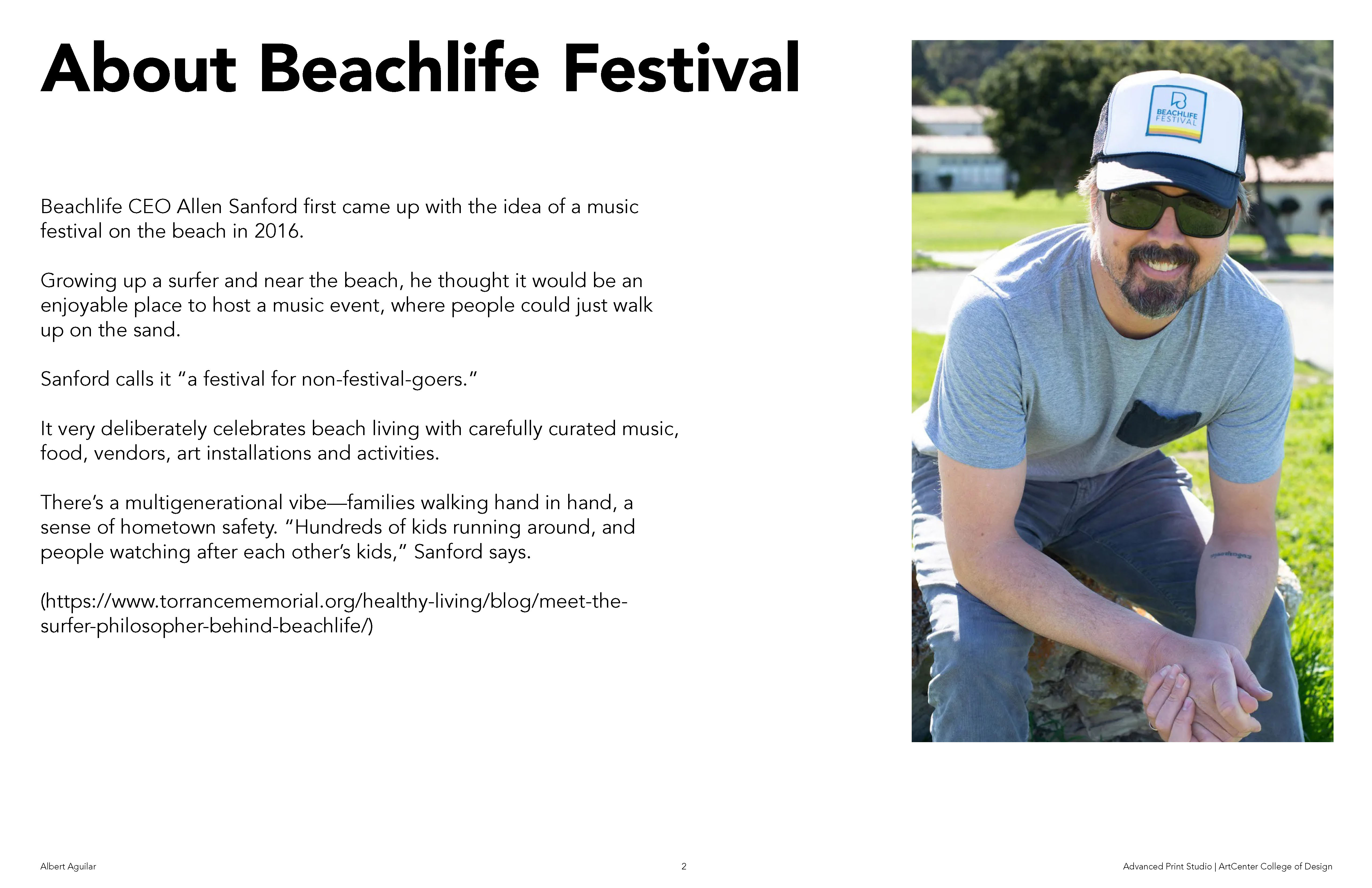
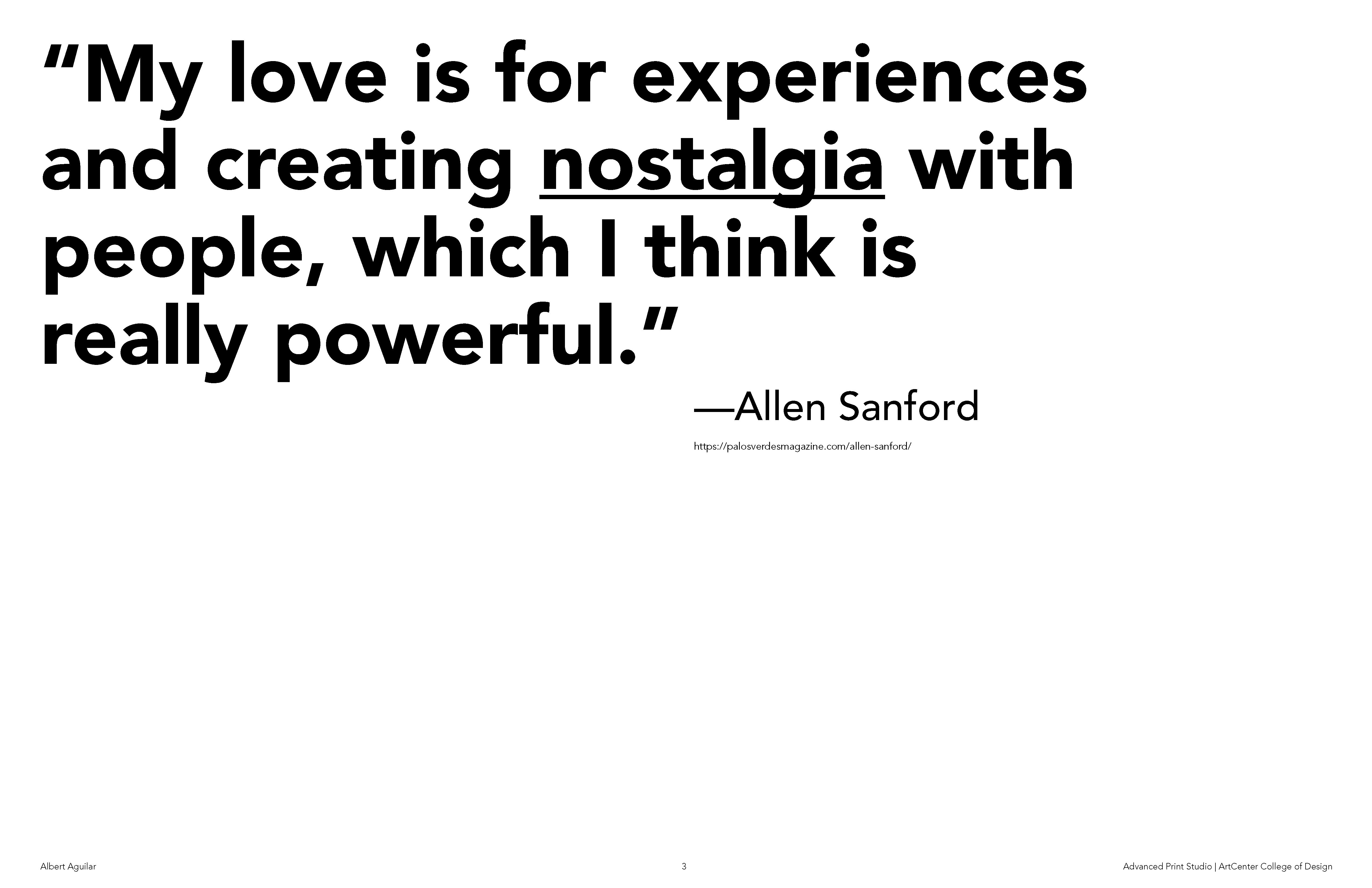
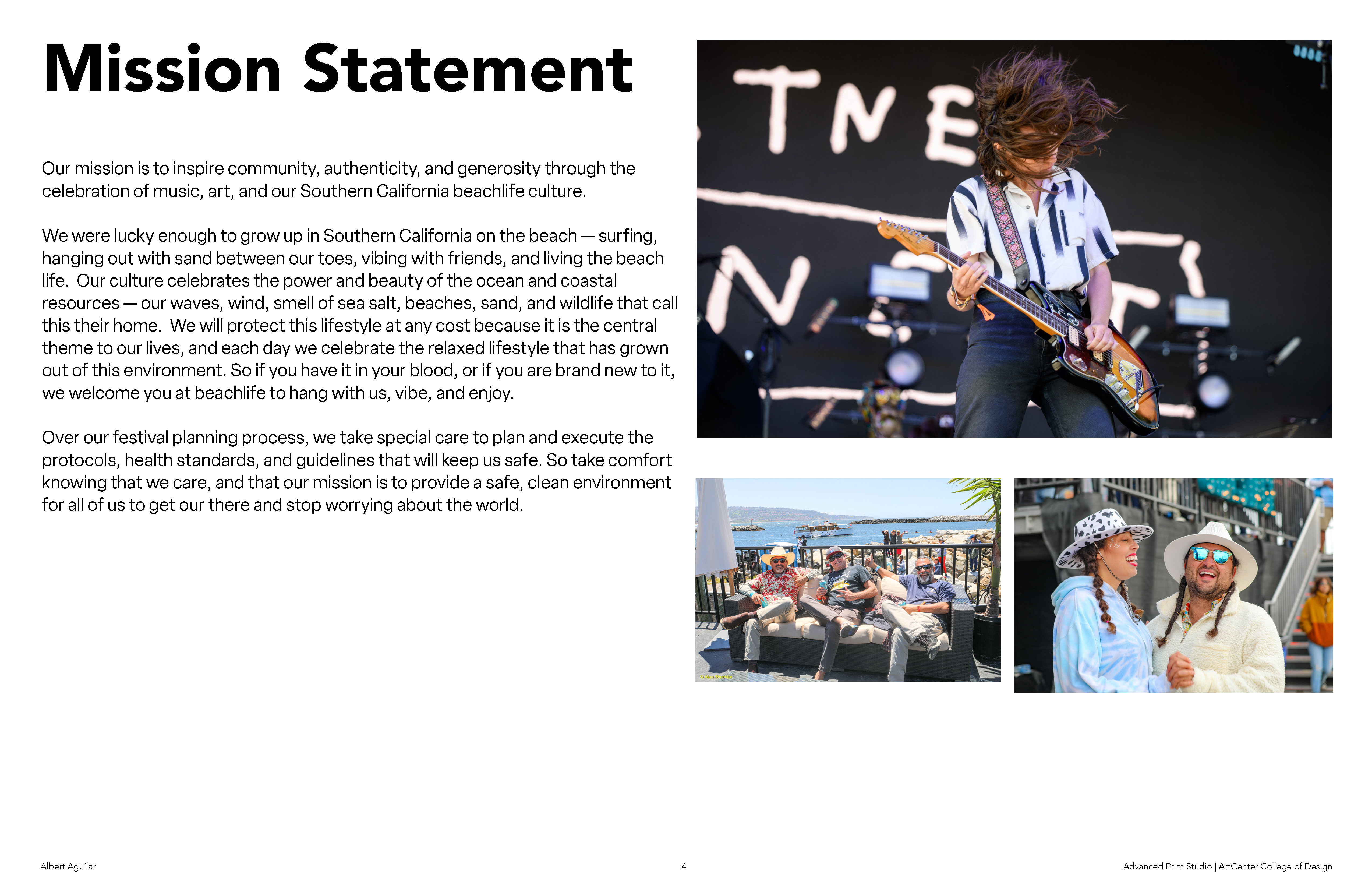
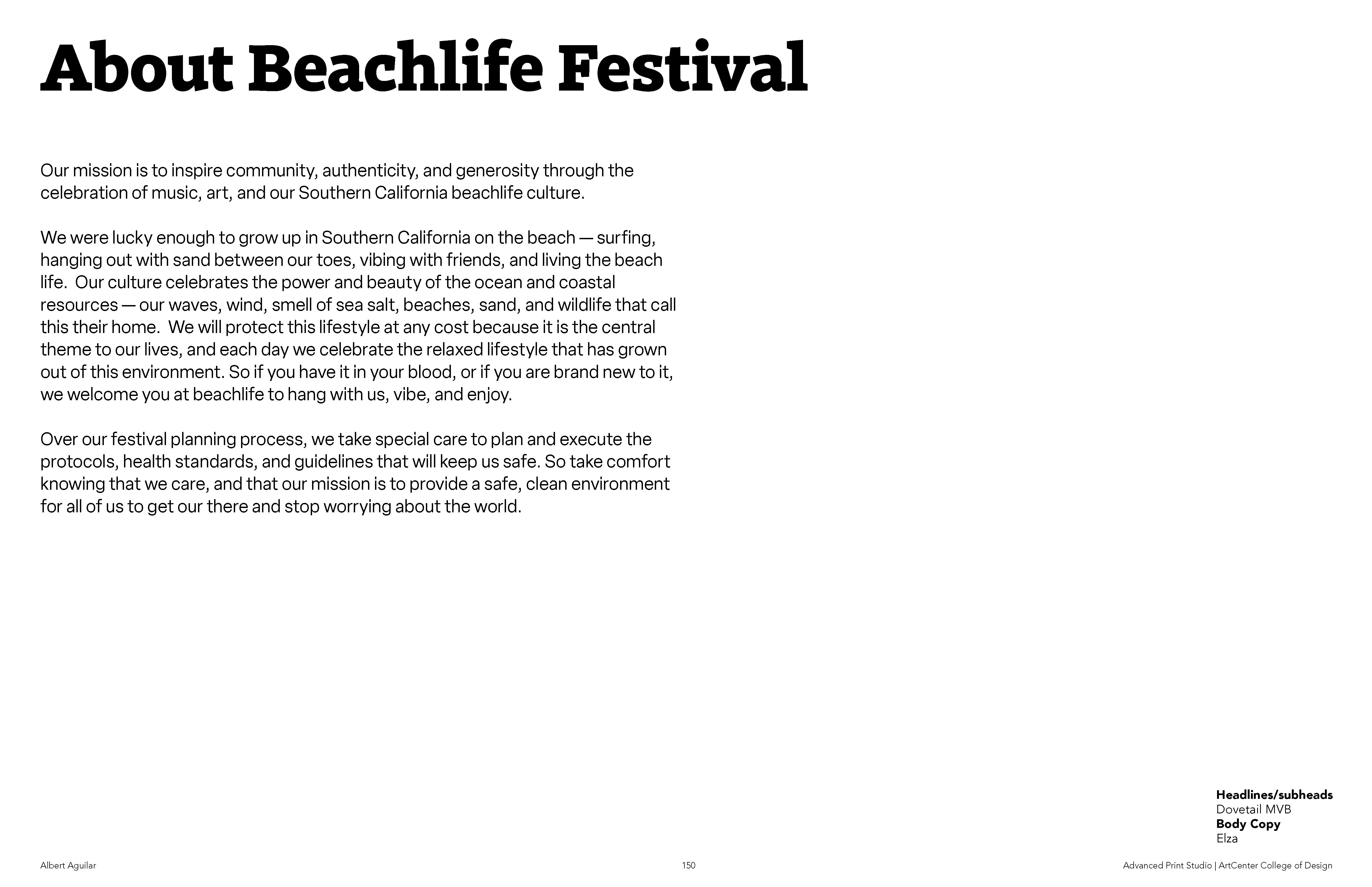
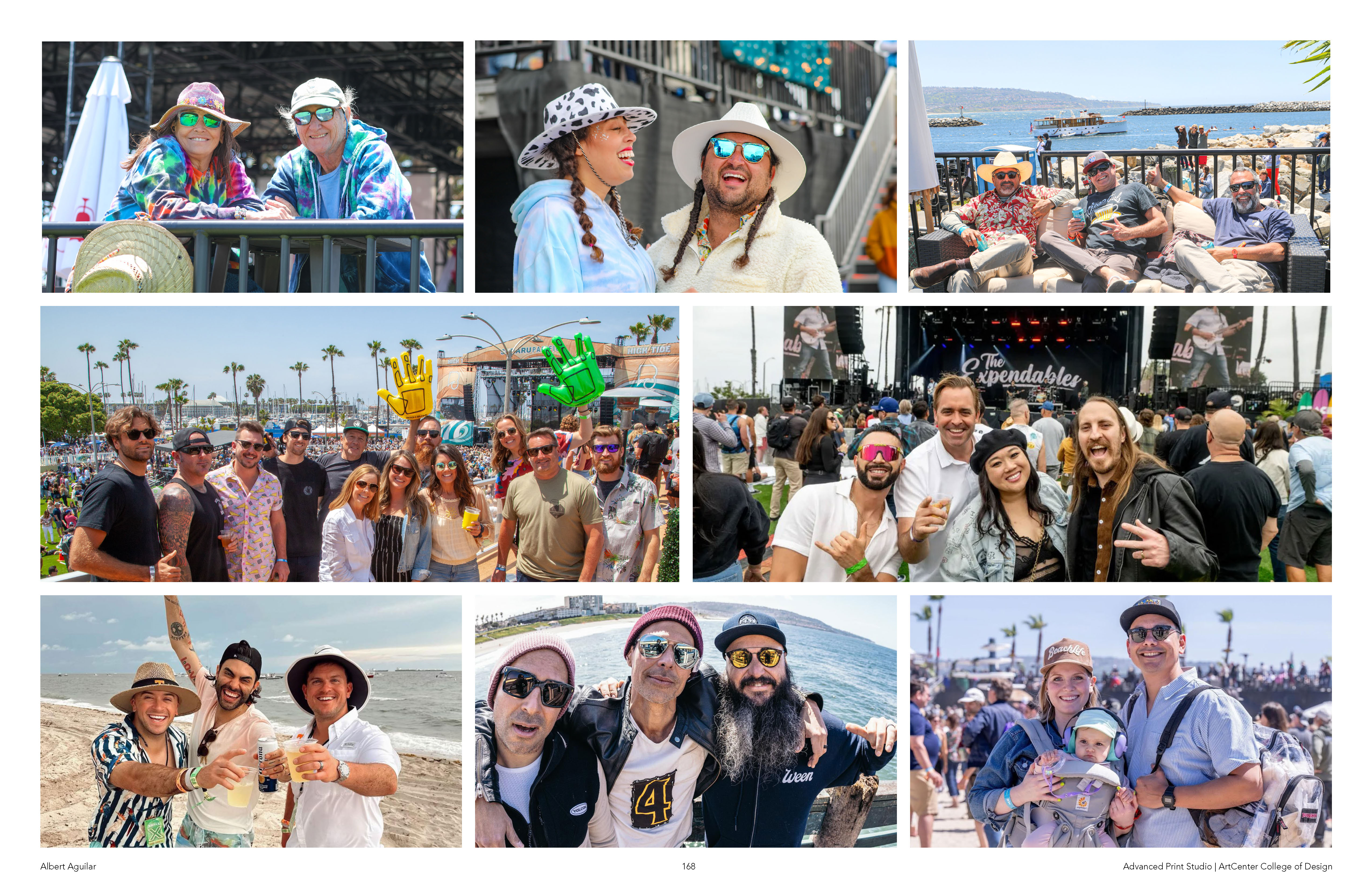
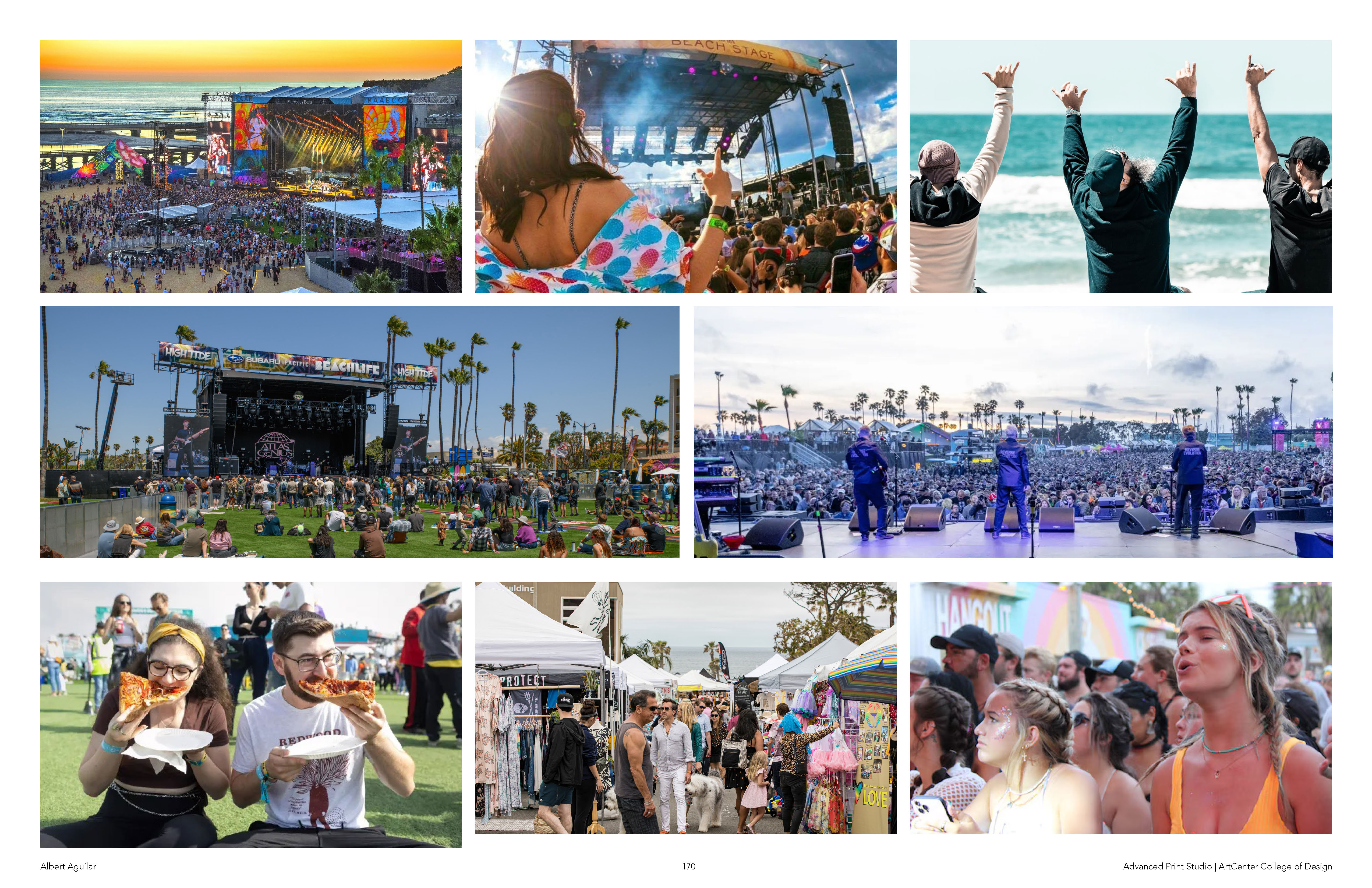
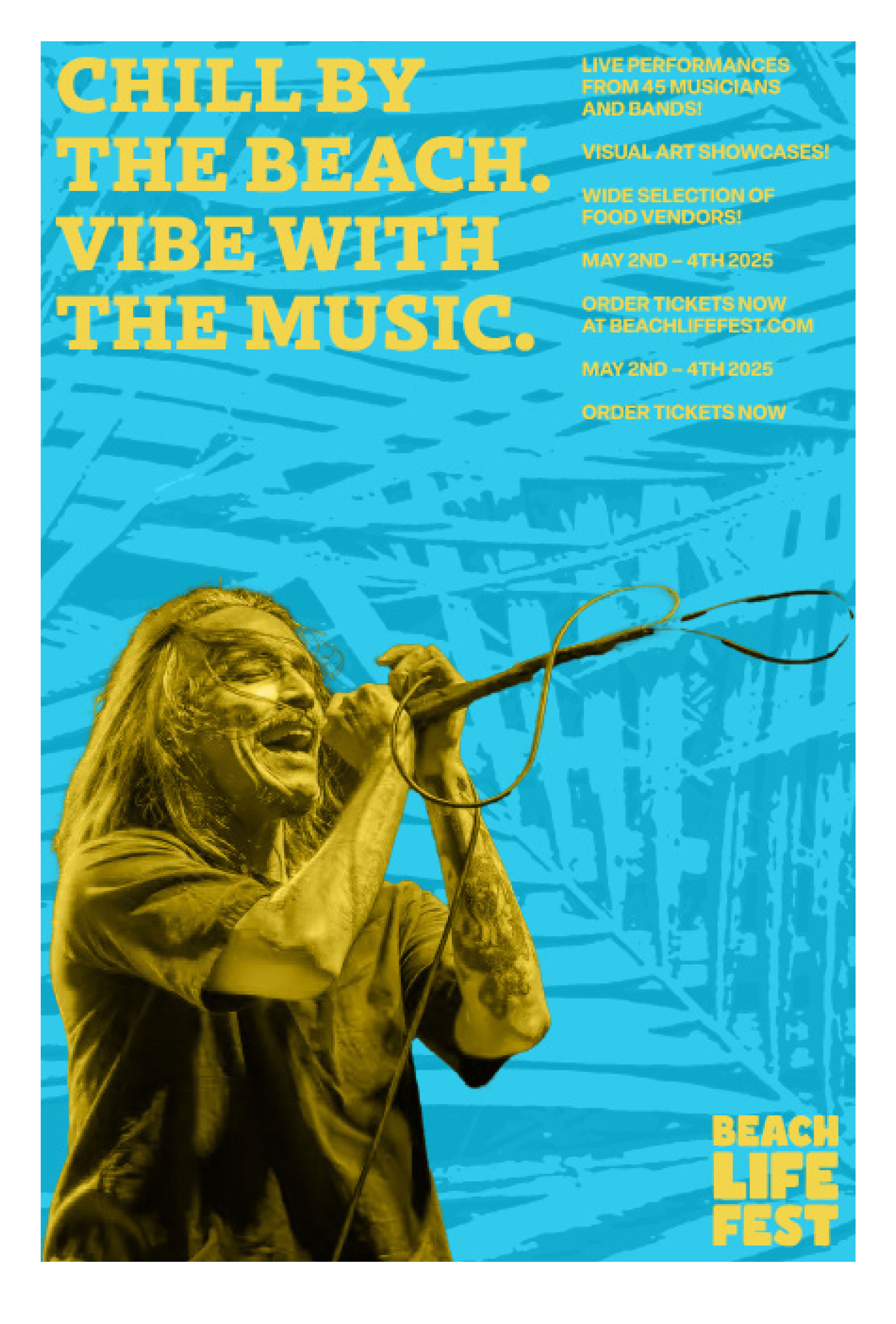
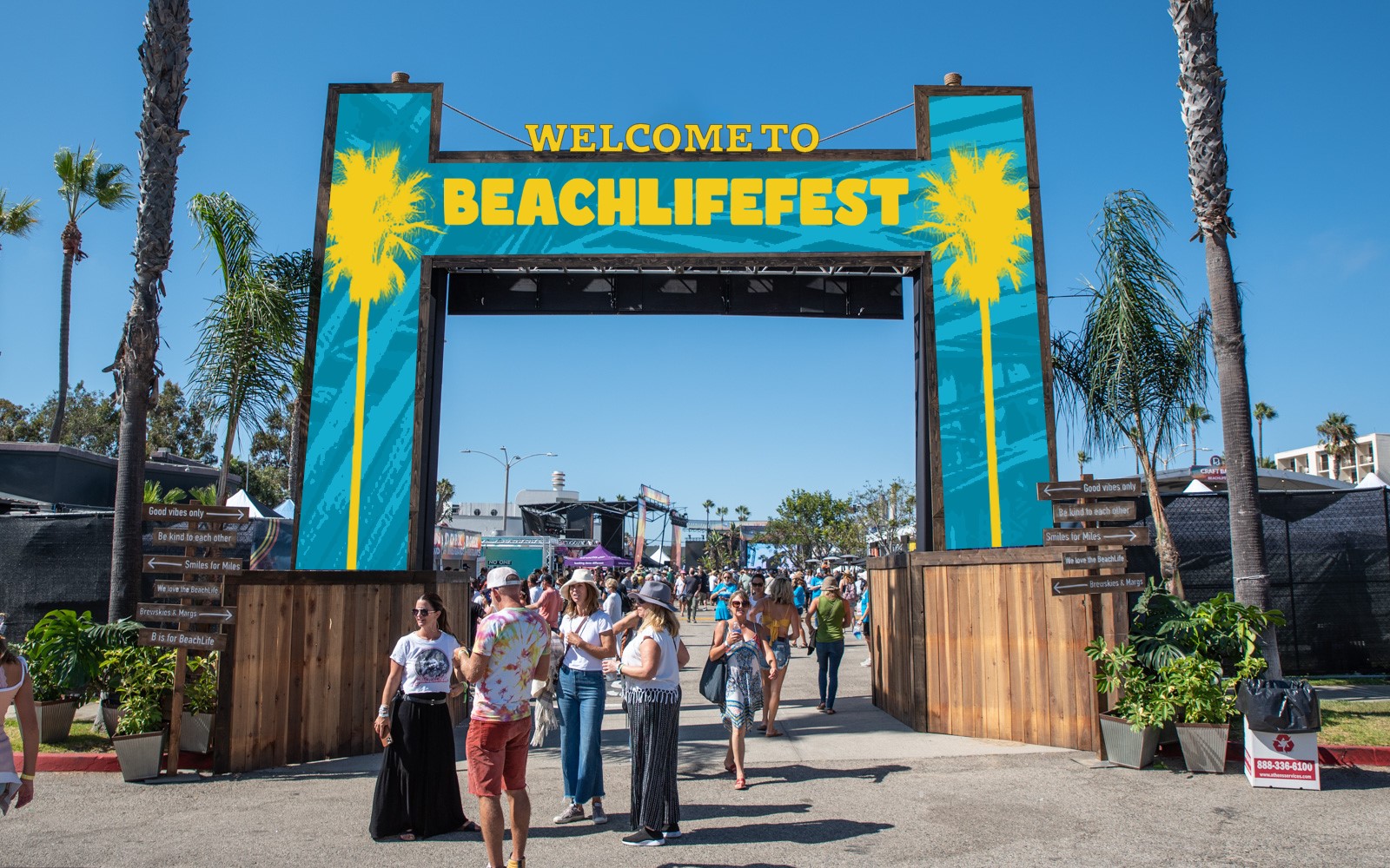
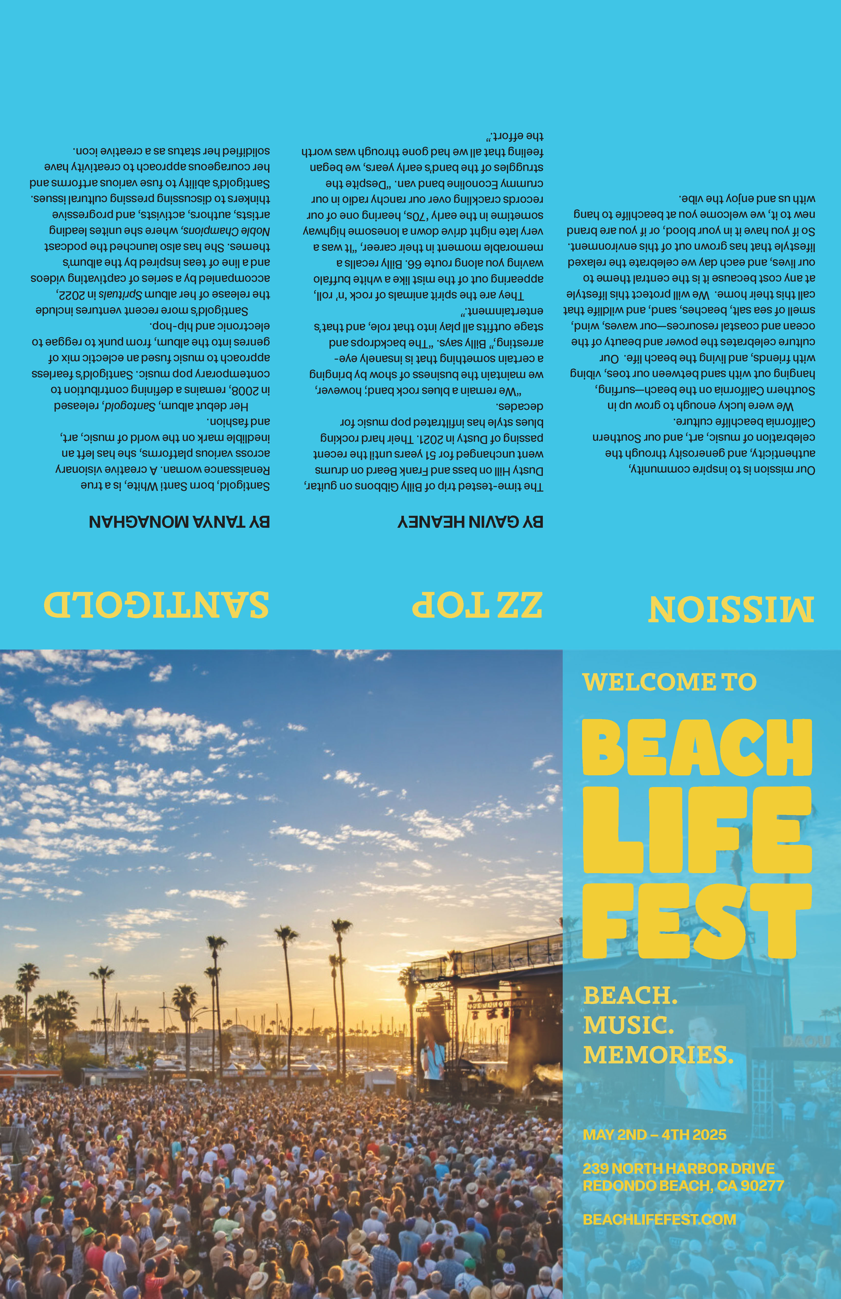
Driven by my interest in event and experiential design, I created a more cohesive identity system for Southern California’s BeachLife Festival for an experimental project. Held annually in Redondo Beach since 2019, this family-friendly music festival celebrates beach culture with curated music, food, art, and activities.
Image
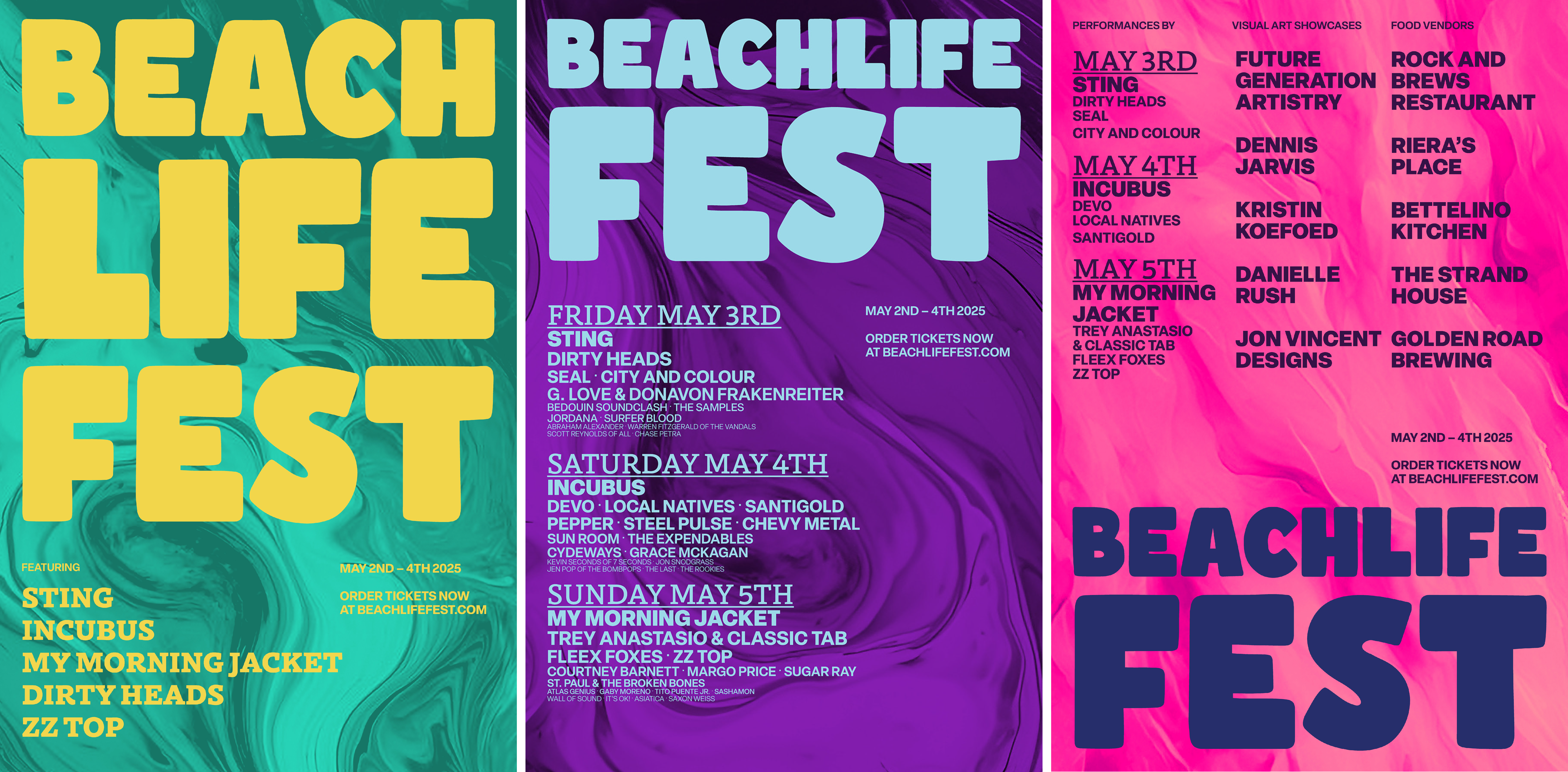
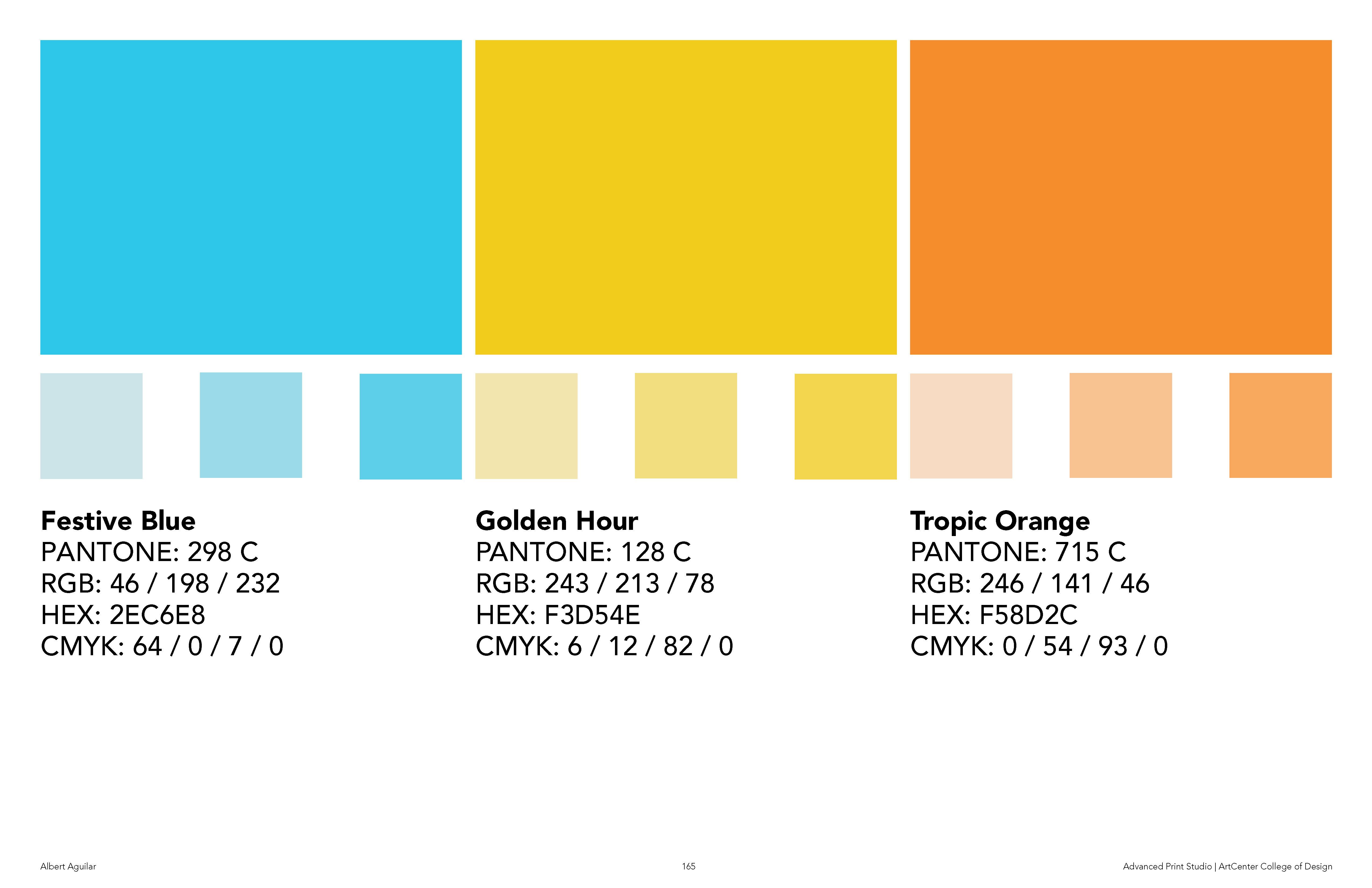
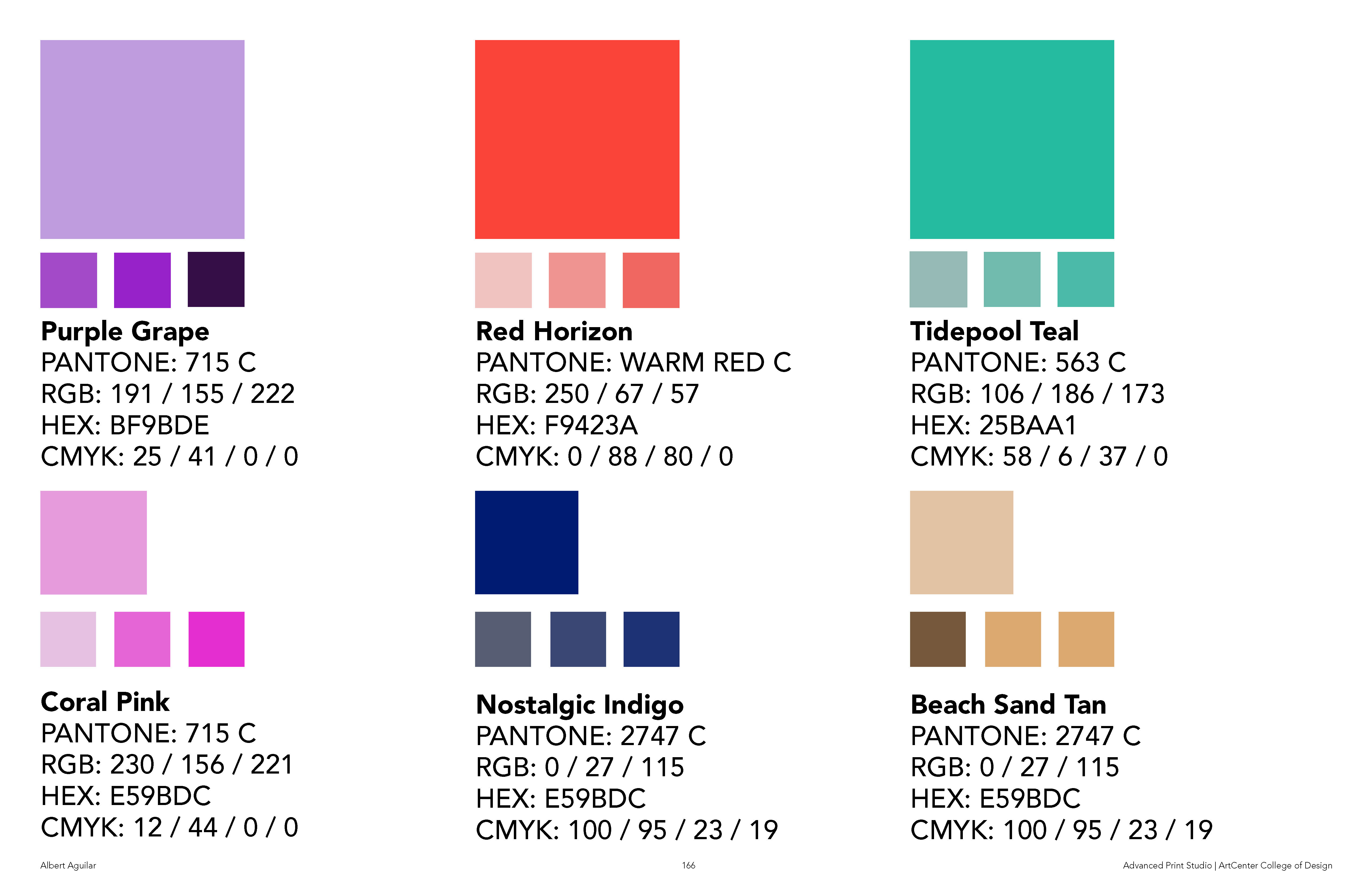
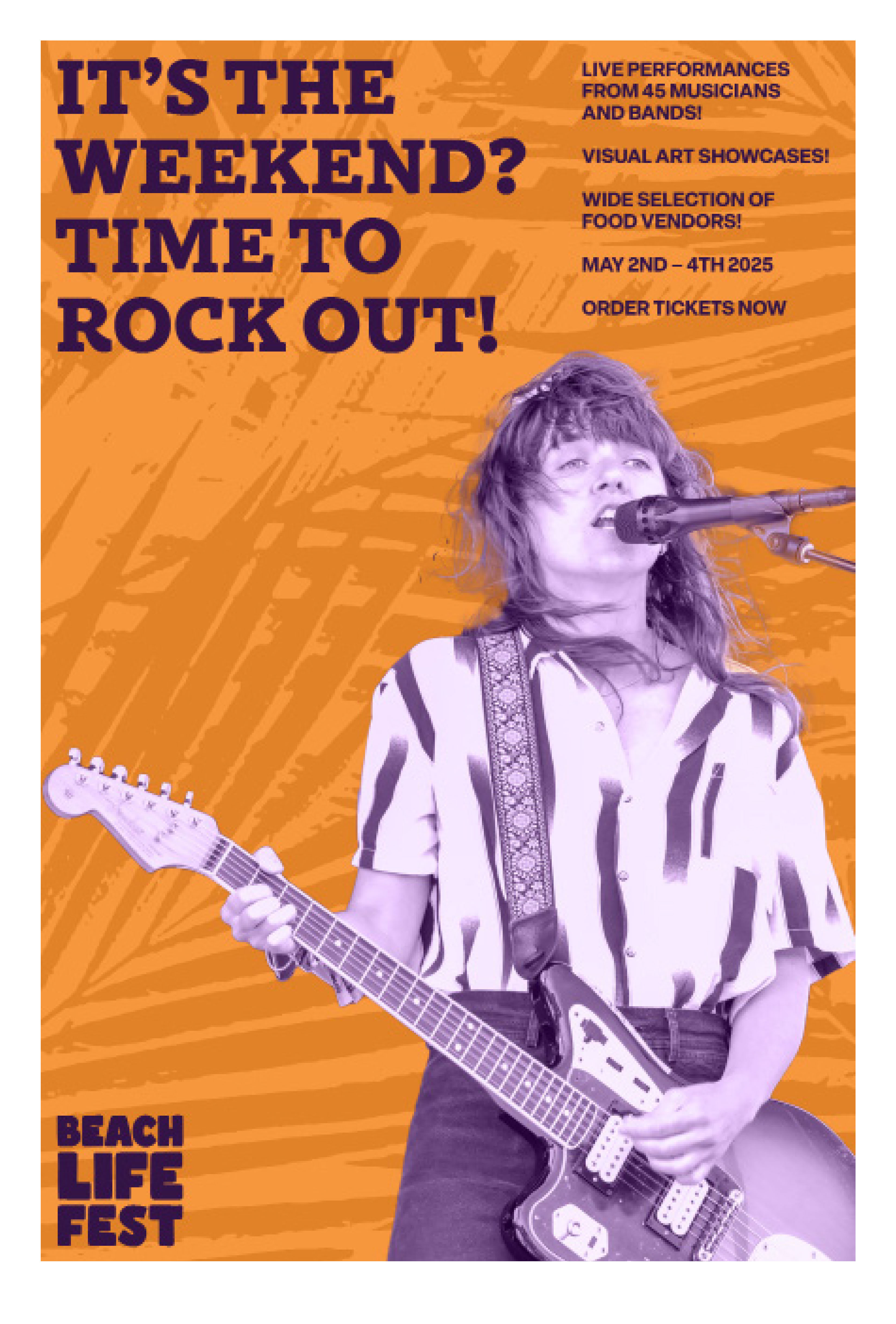
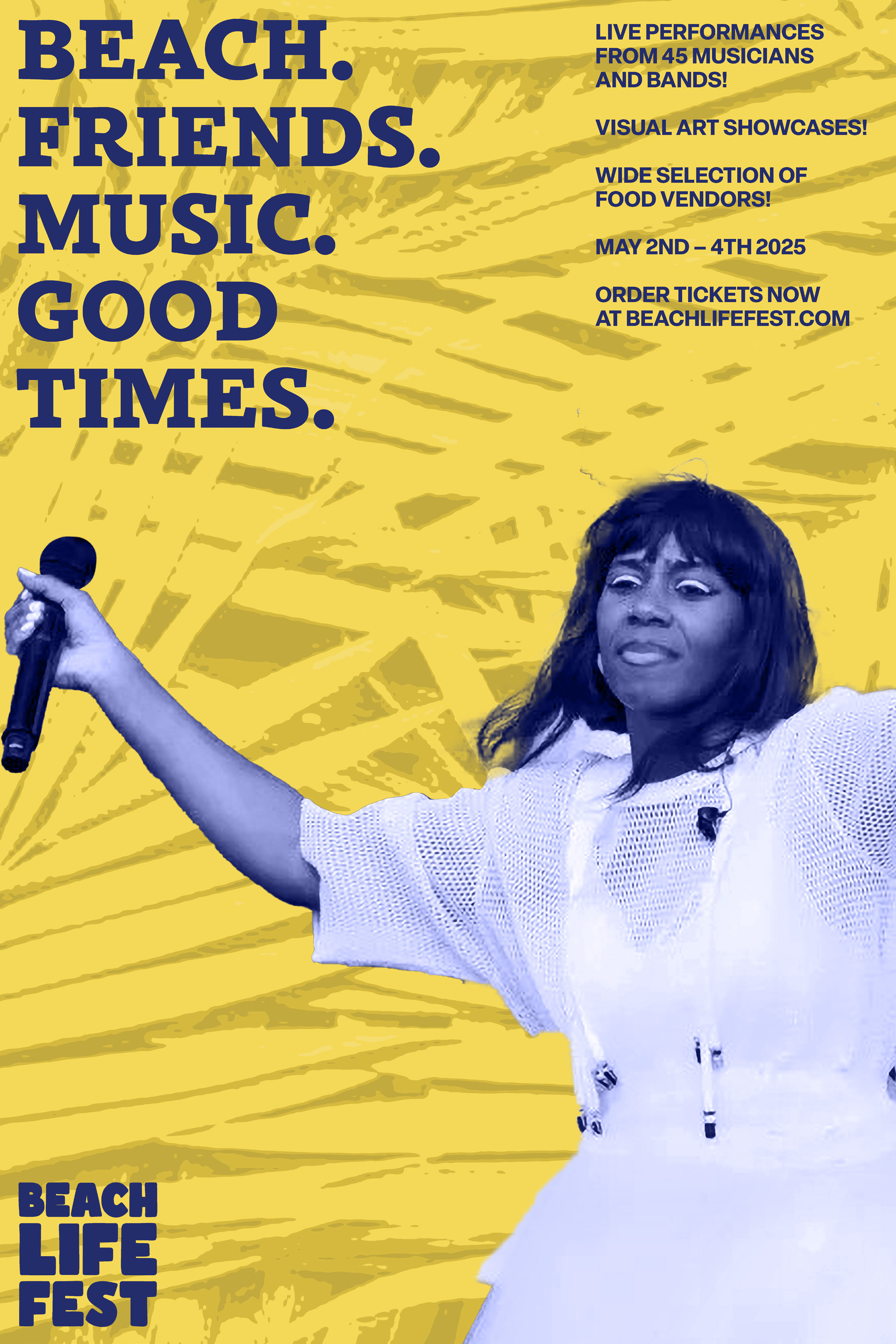
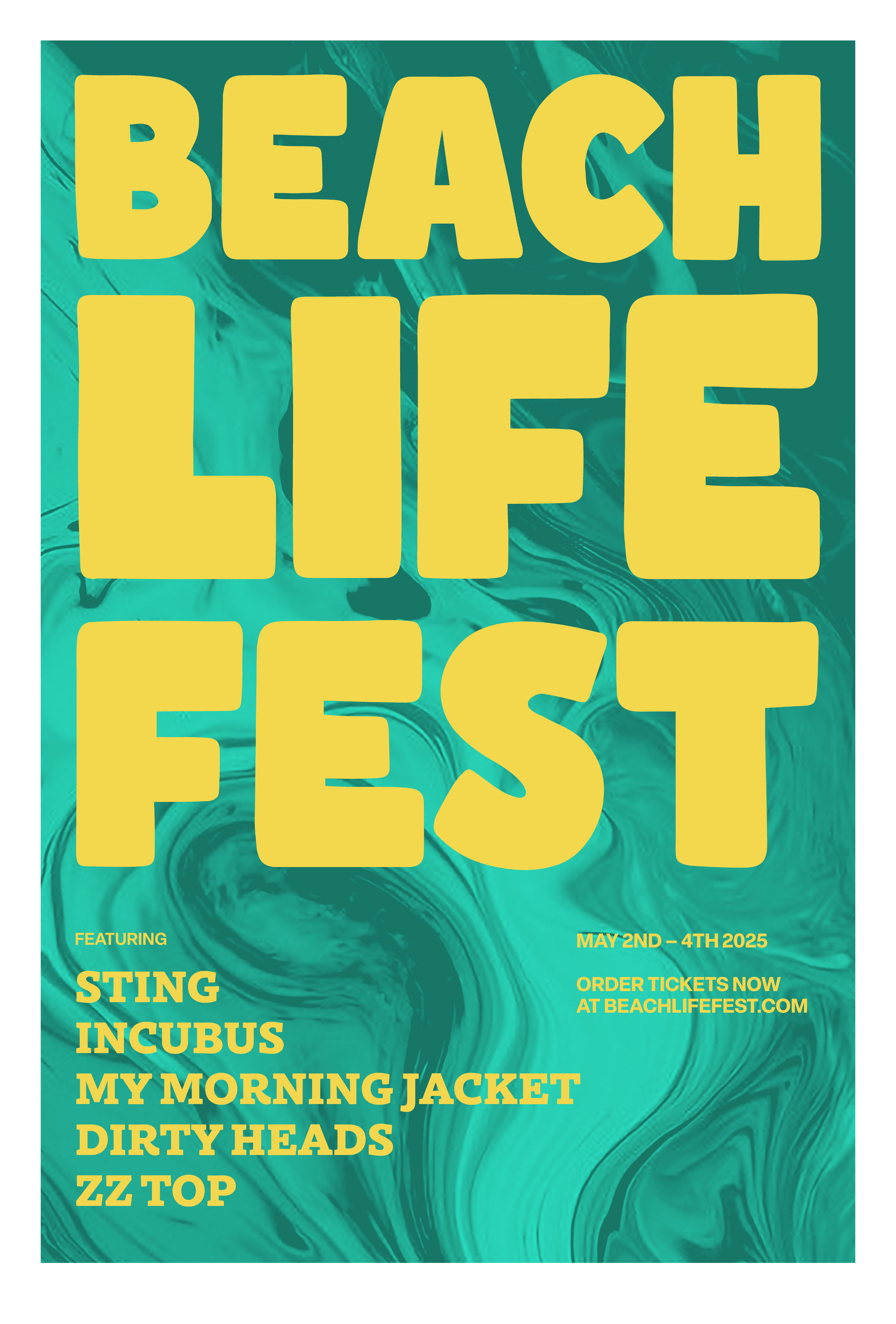
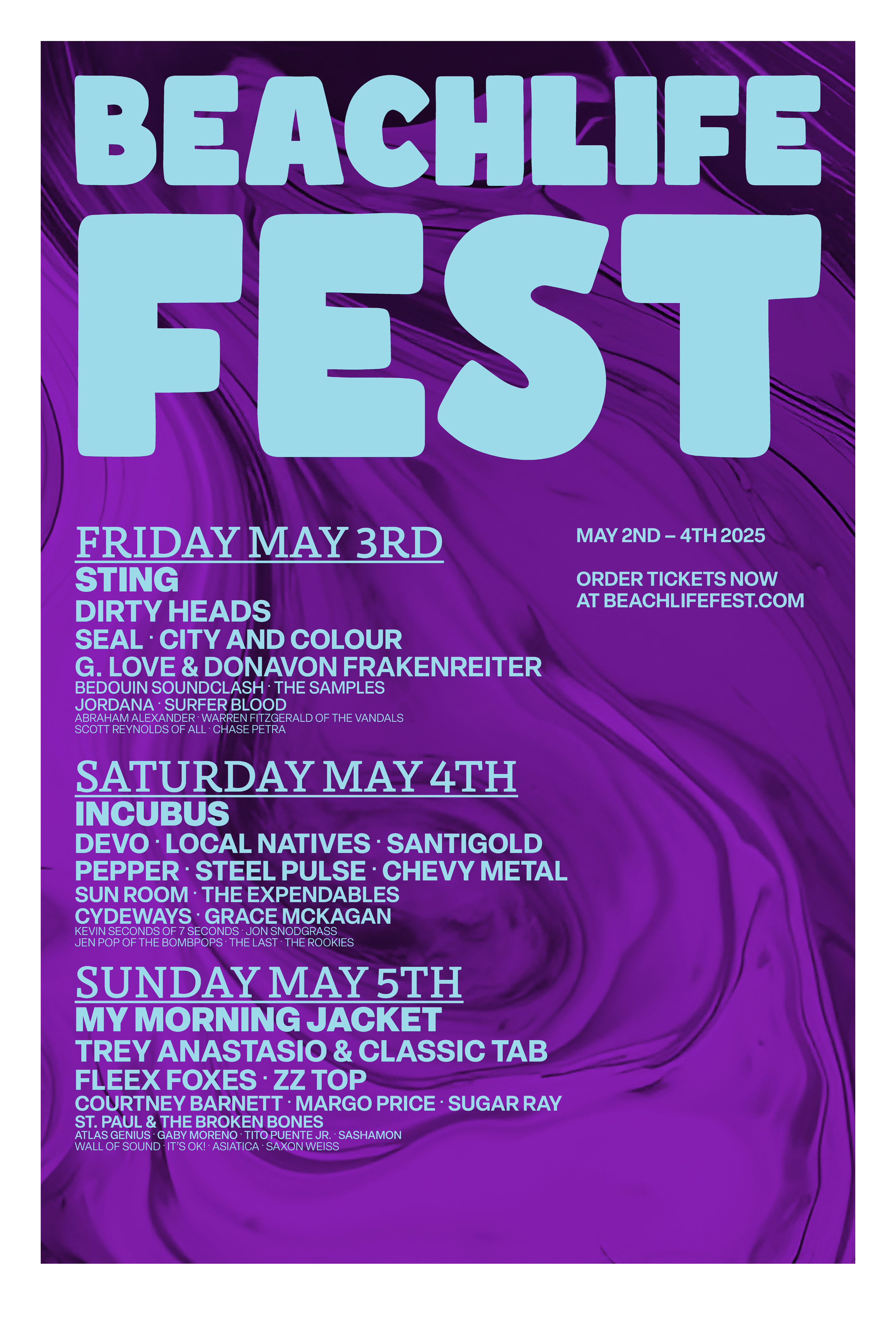
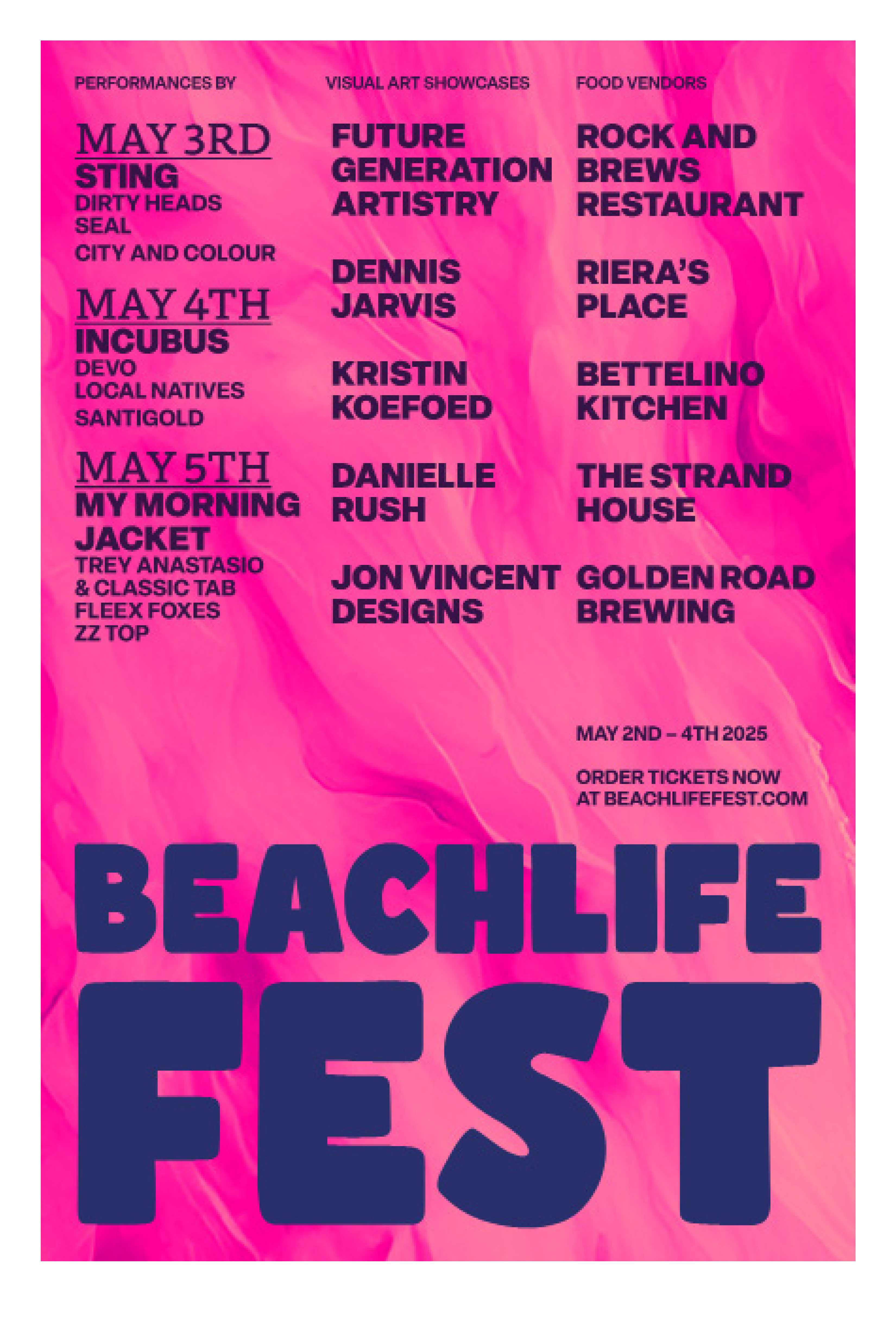
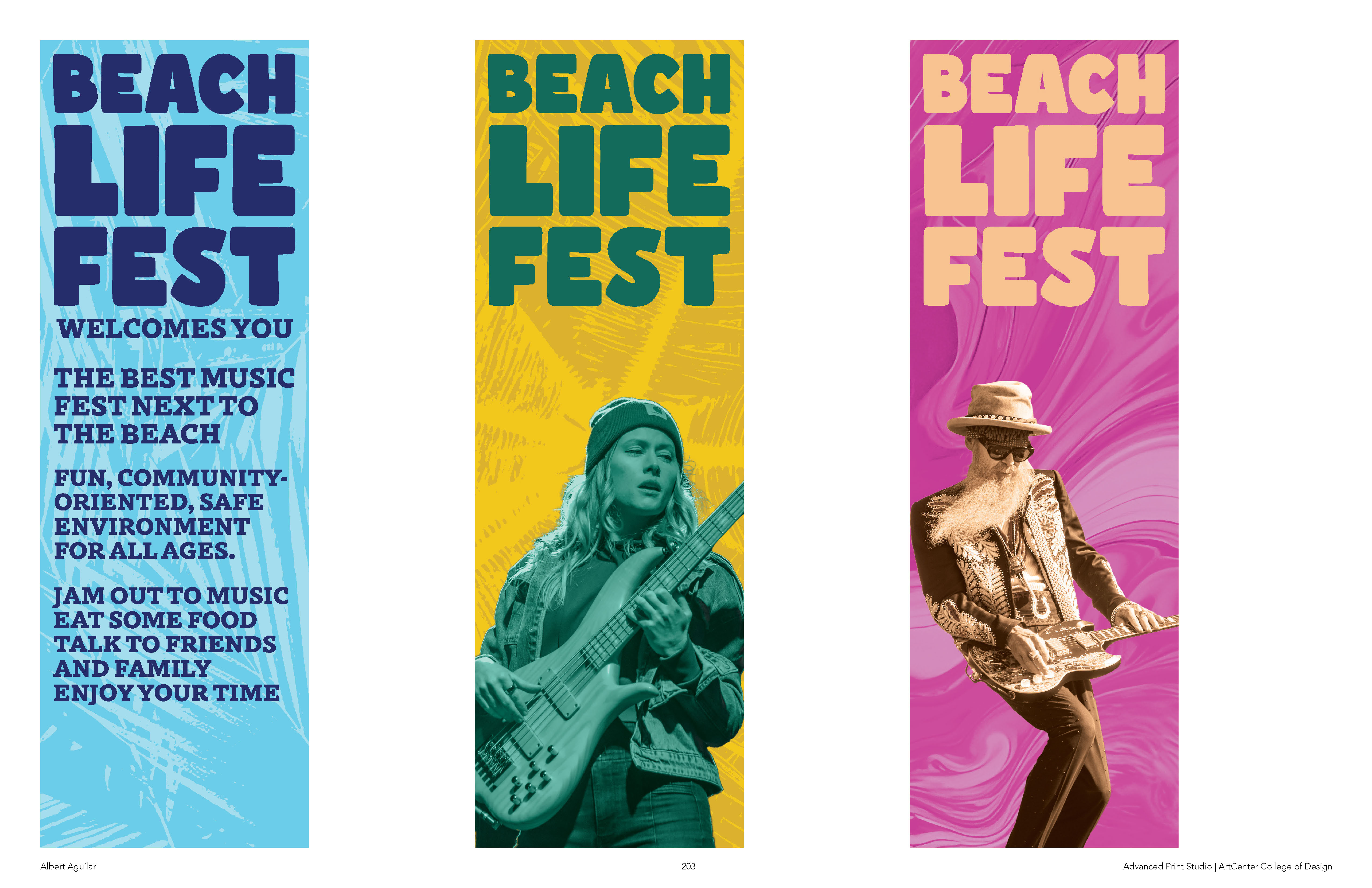
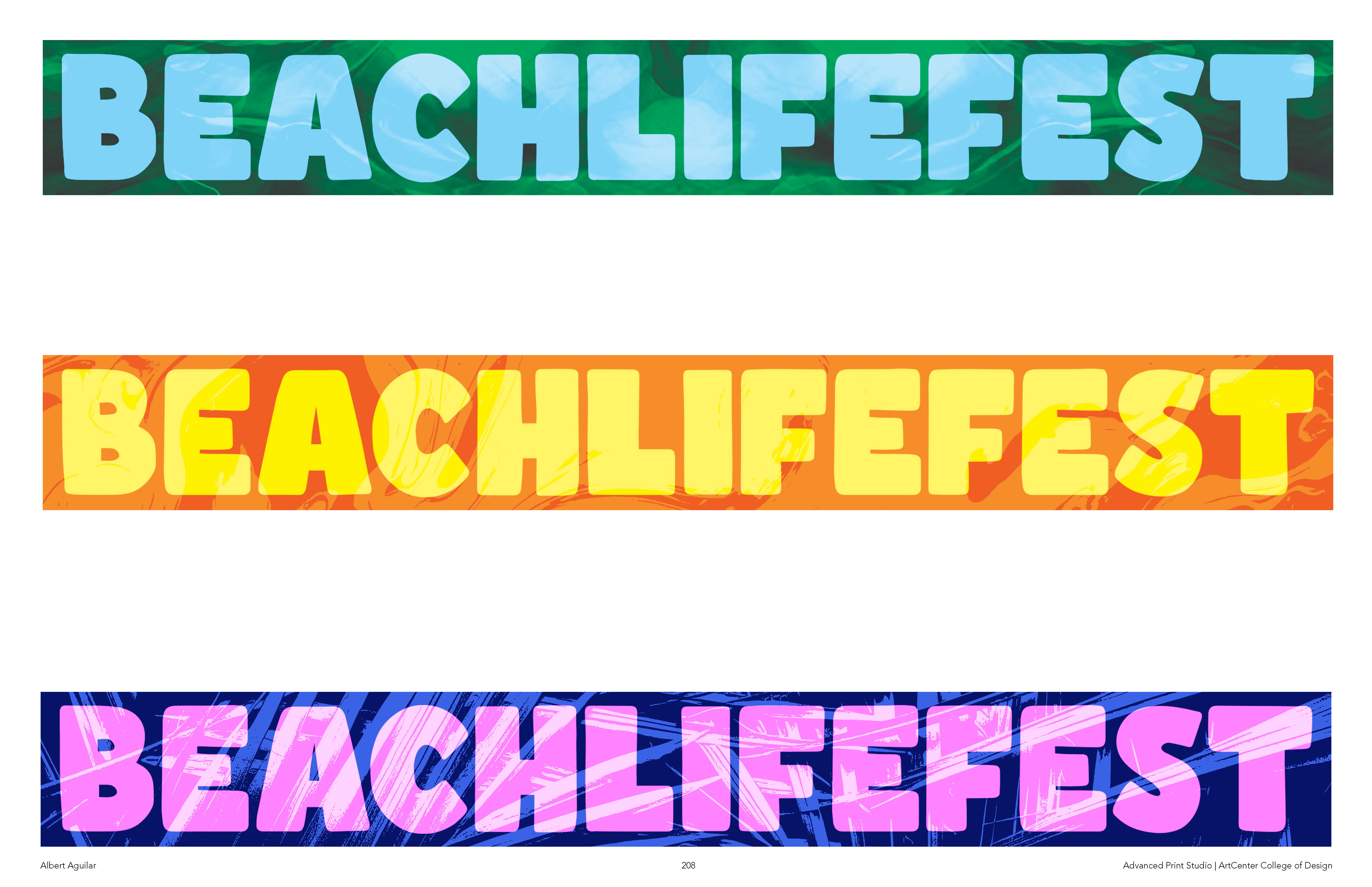
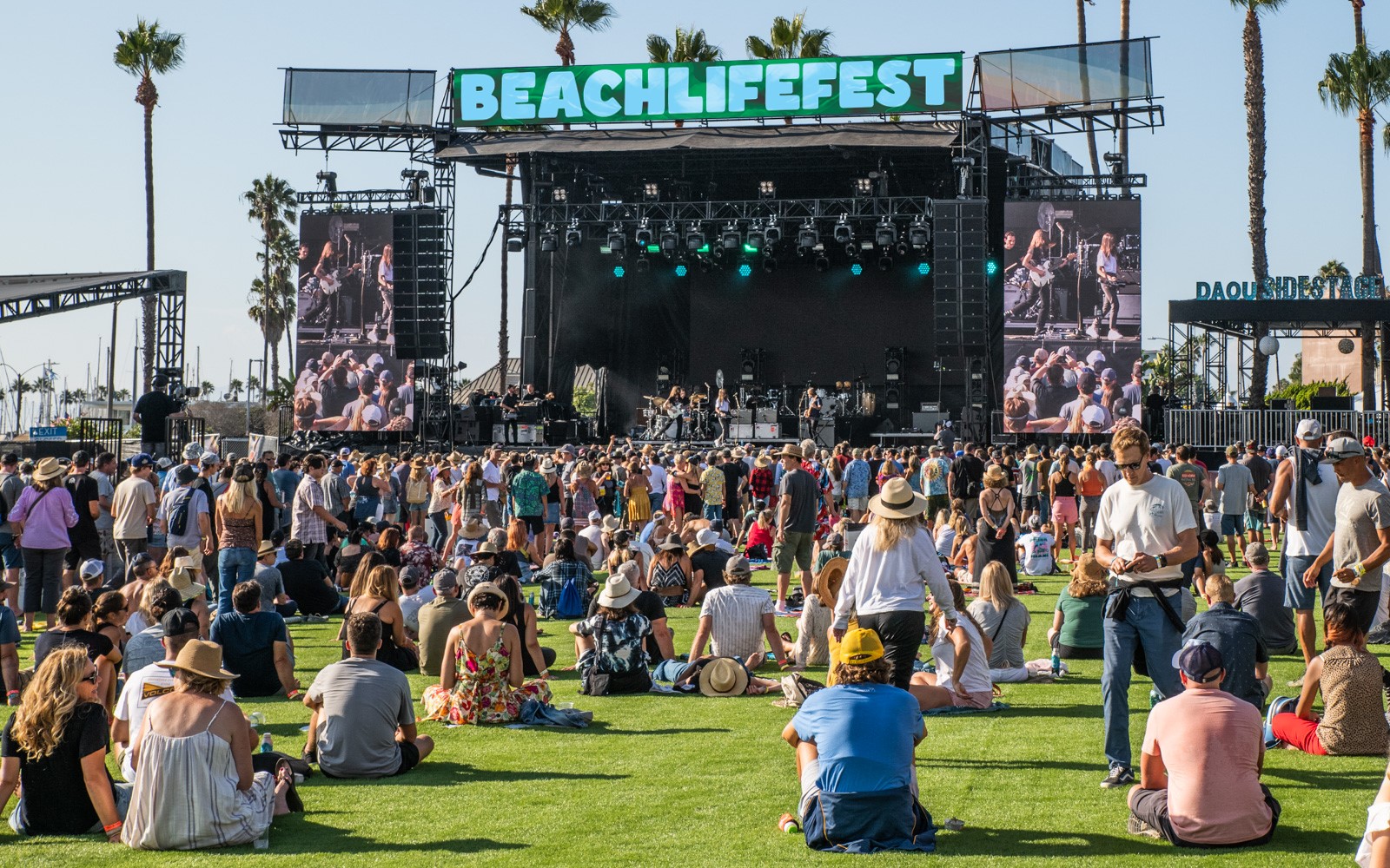
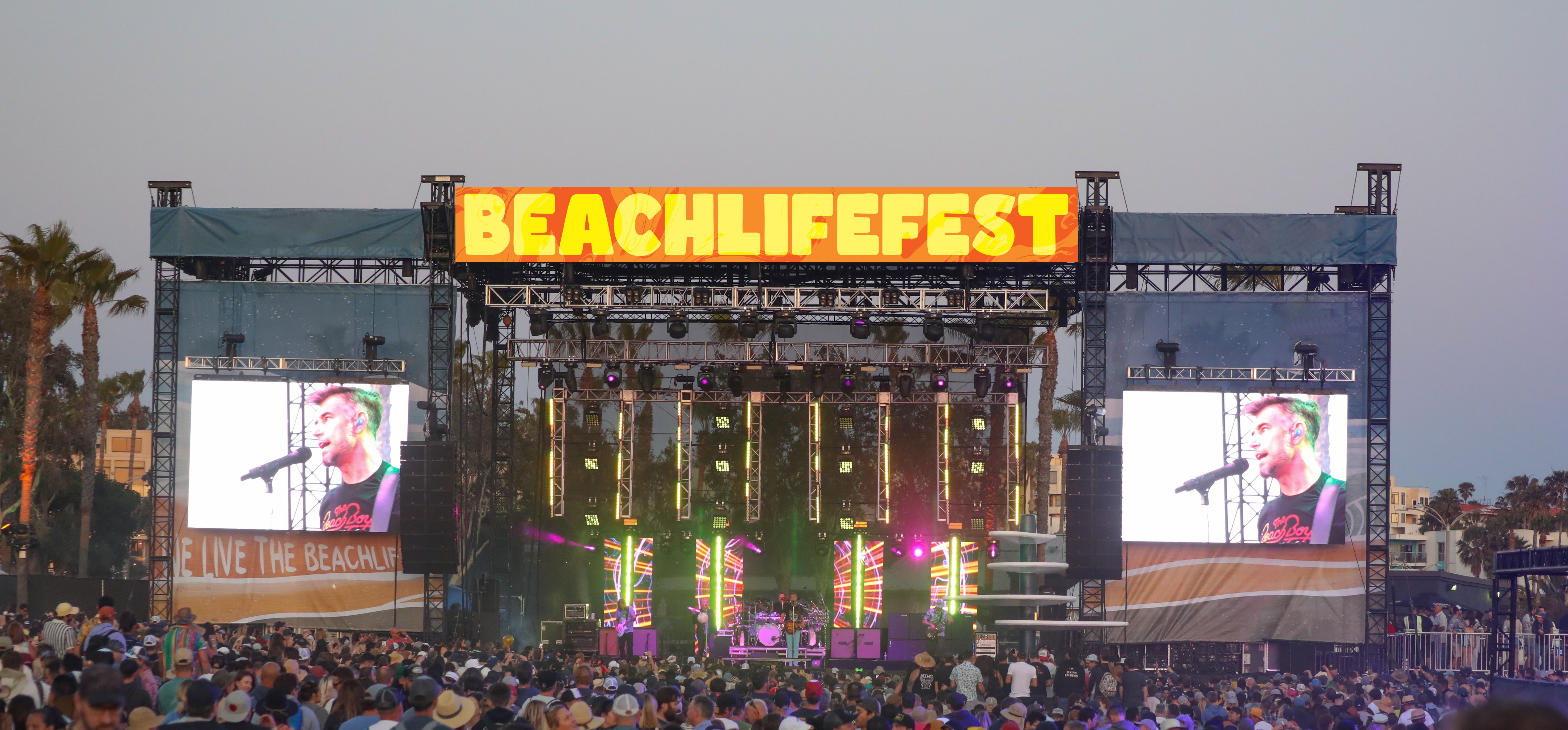
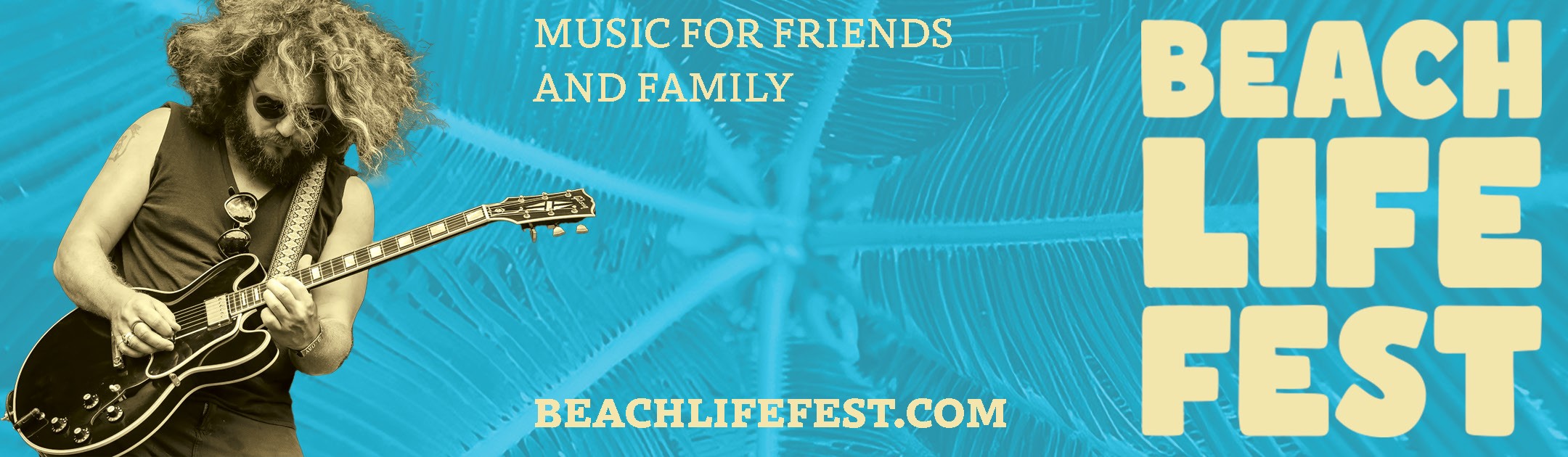
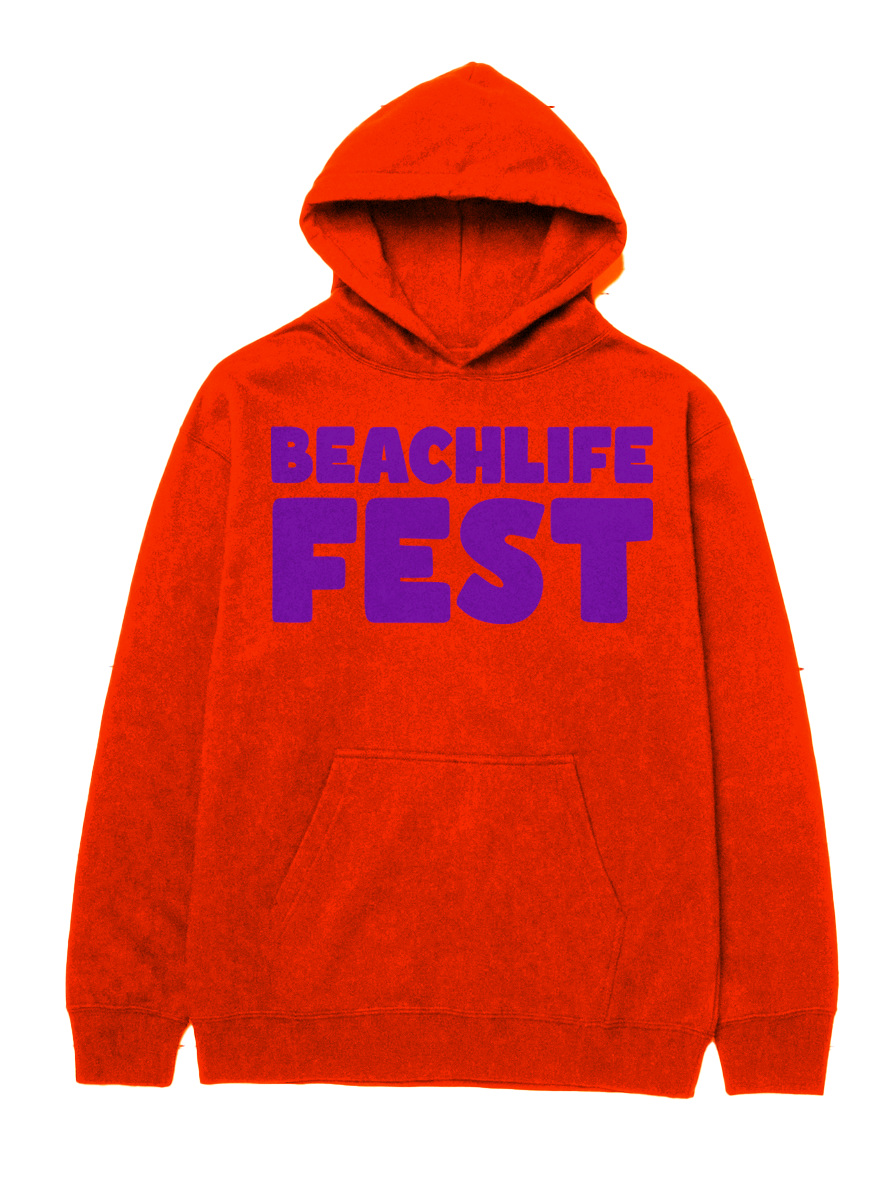
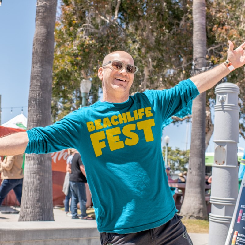
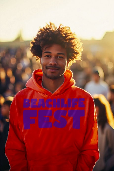
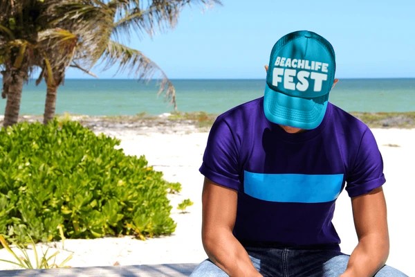
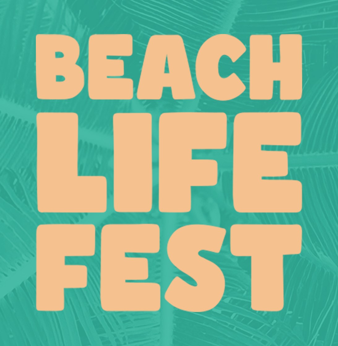
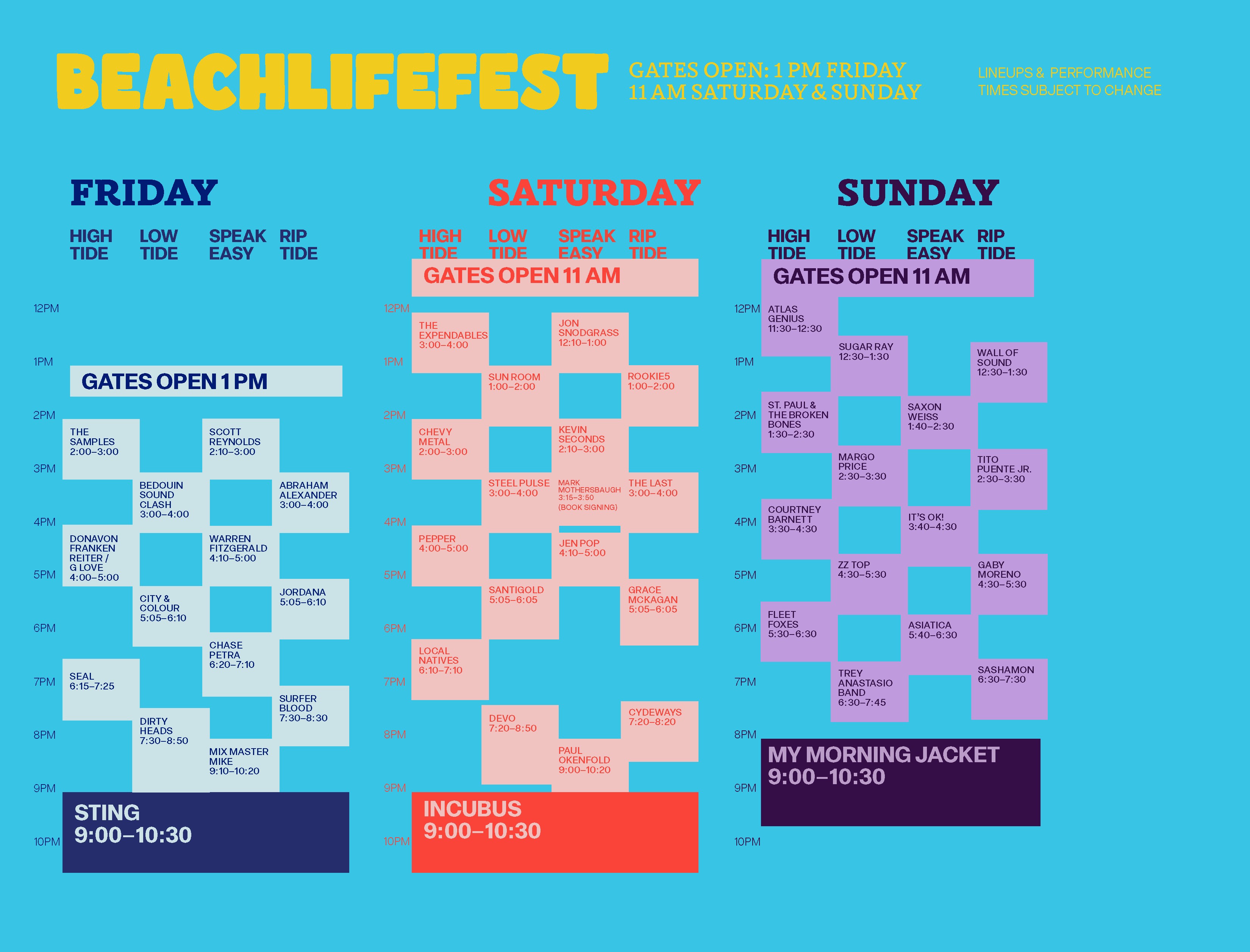
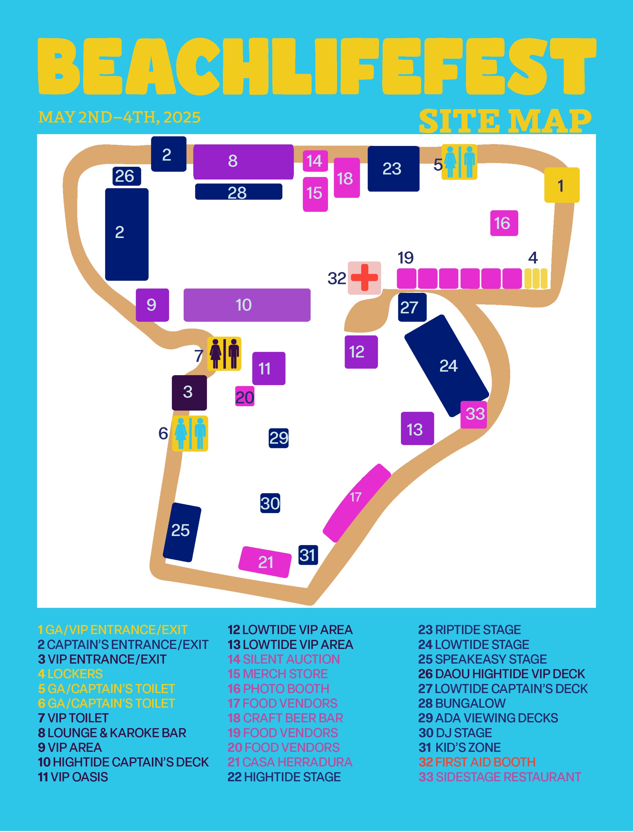
My color palette (shades of blue, yellow, orange, red, and purple) is based off the changing colors of the sky. The music festival is held over a weekend, with its opening at noon and closing at 10 pm. The color palette acts as a metaphor for the audience’s day at the event.
Image
Image

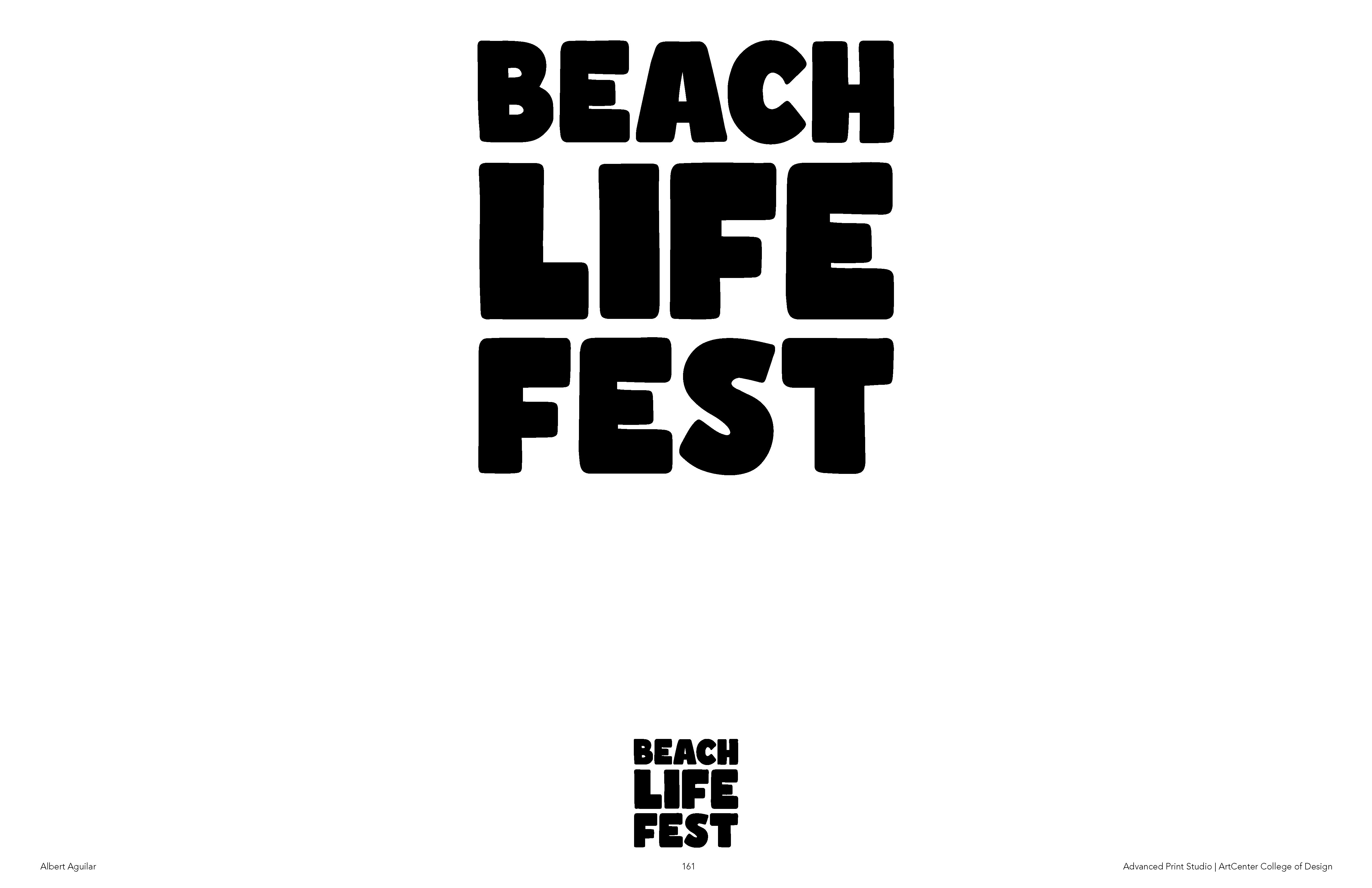
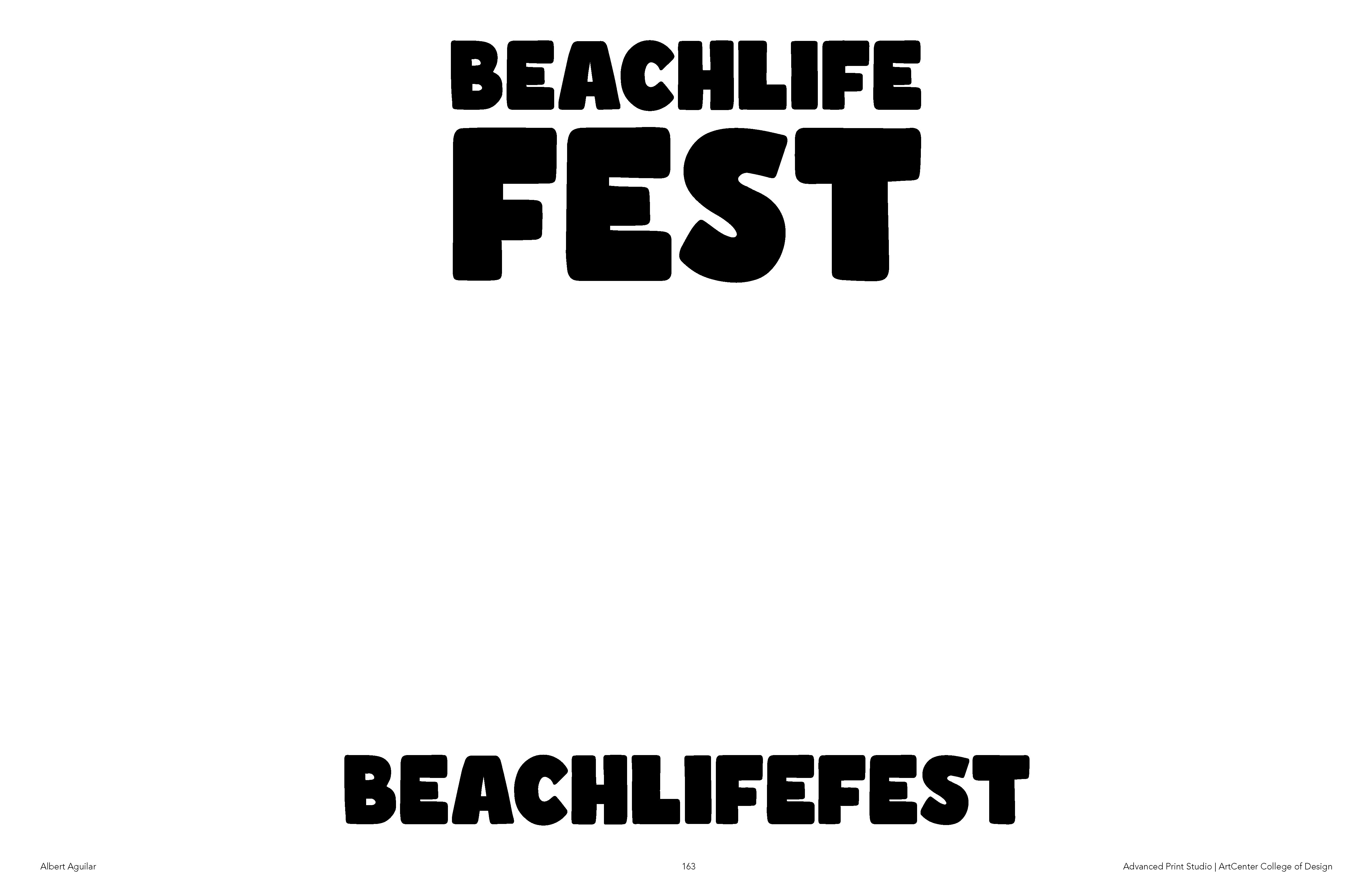
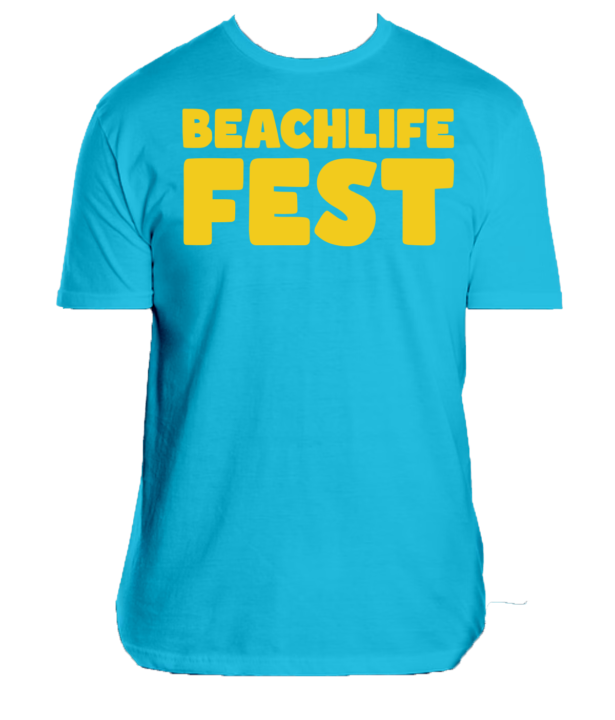
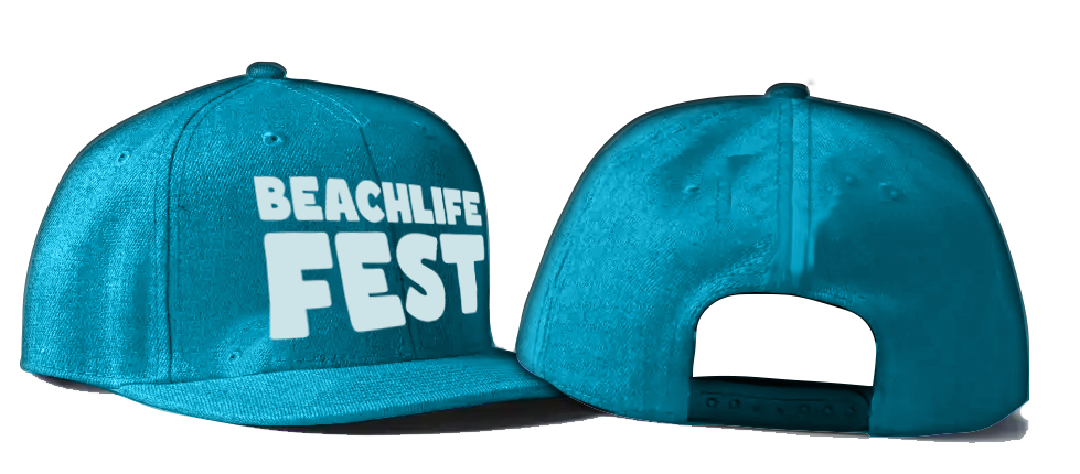
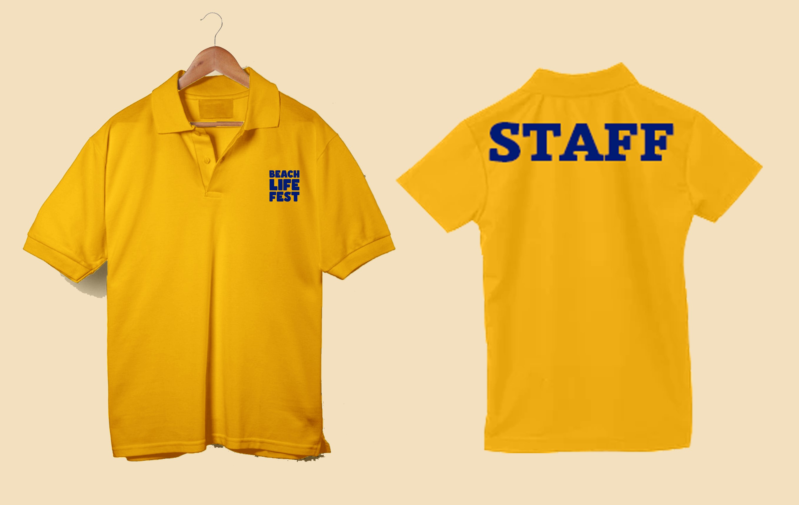
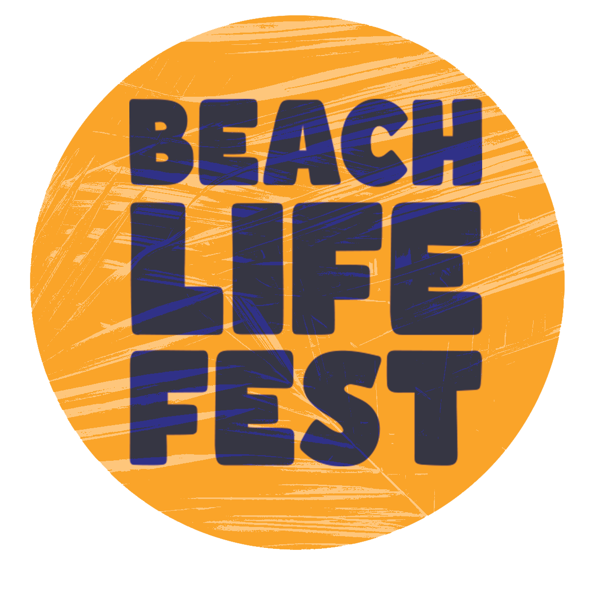
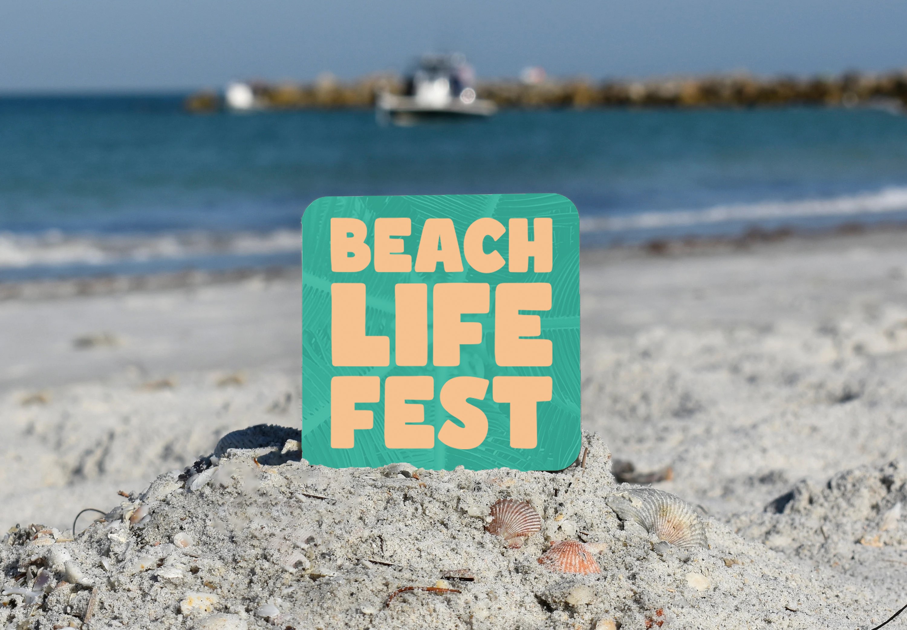
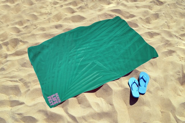
My revised logotype utilizes the typeface Comicy. It's rounded and bubbly forms communicate Beachlife's brand values including community, casual, fun, and safety. I modified the festival’s brand name to make it shorter and catchier, enhancing its memorability.
Image
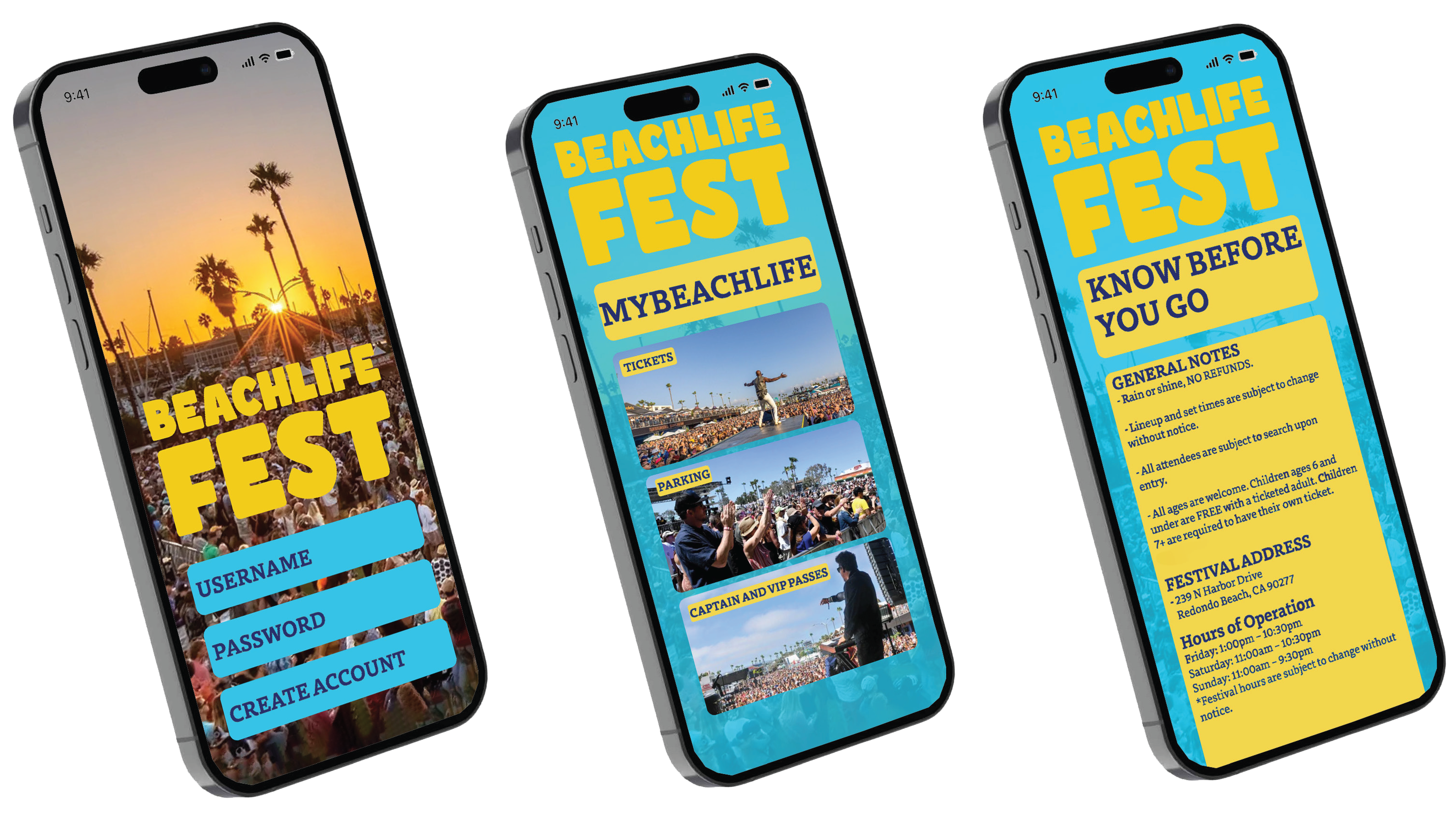
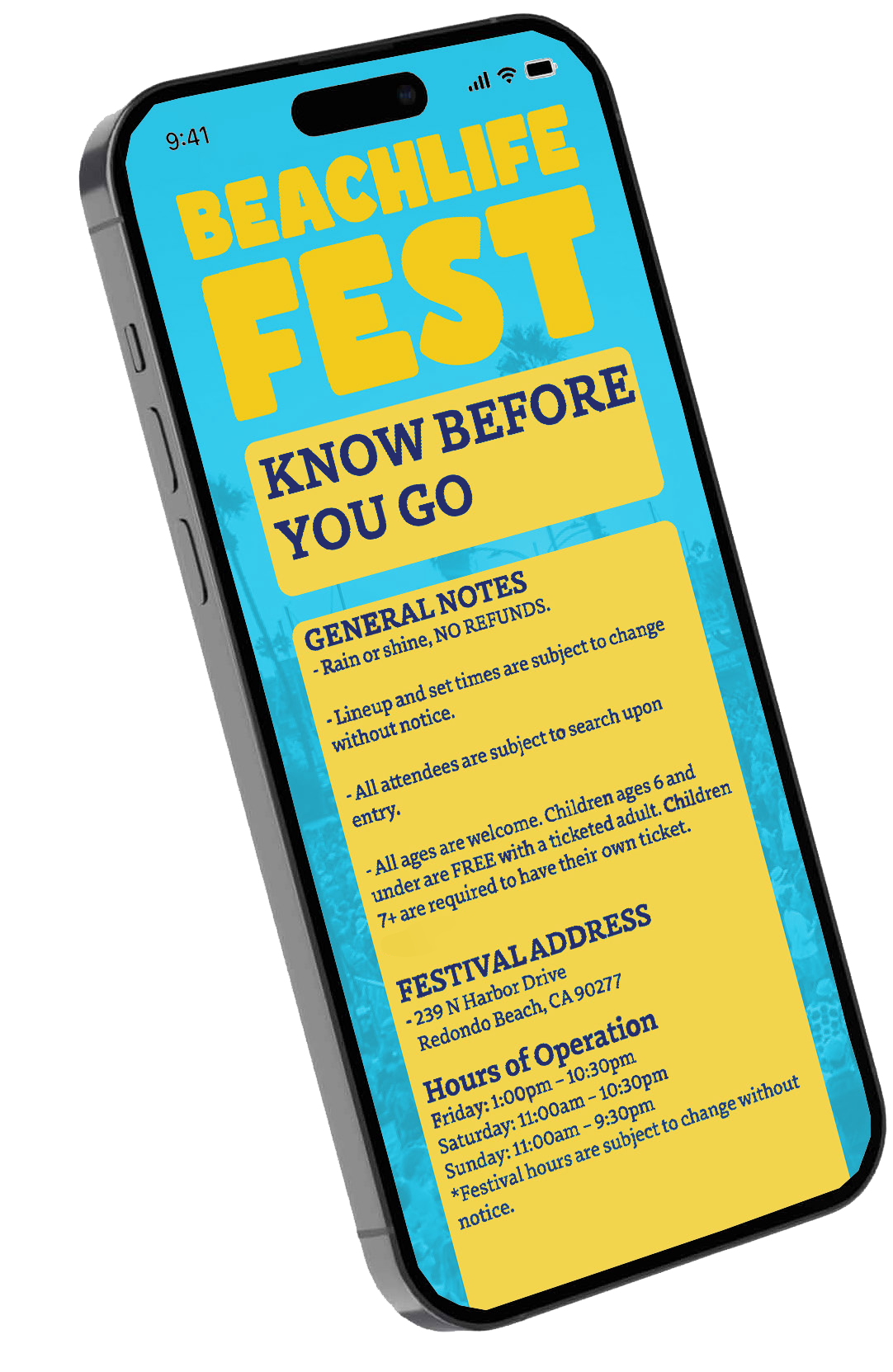
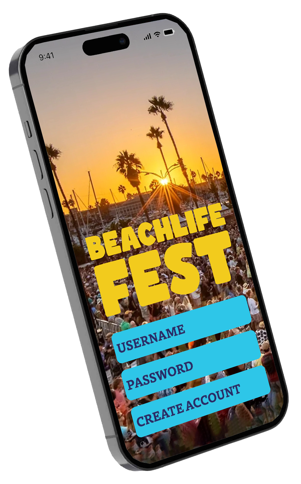
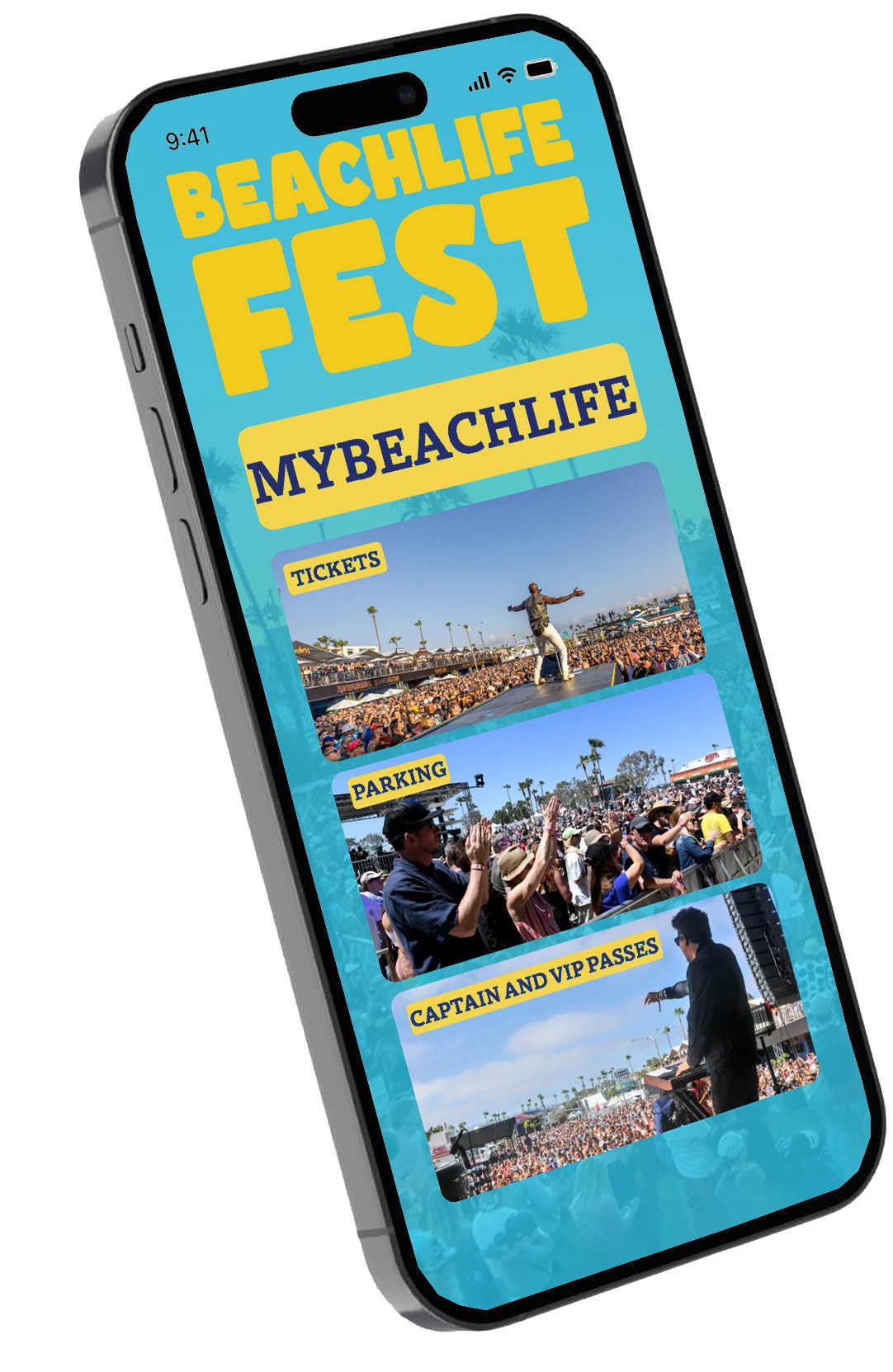
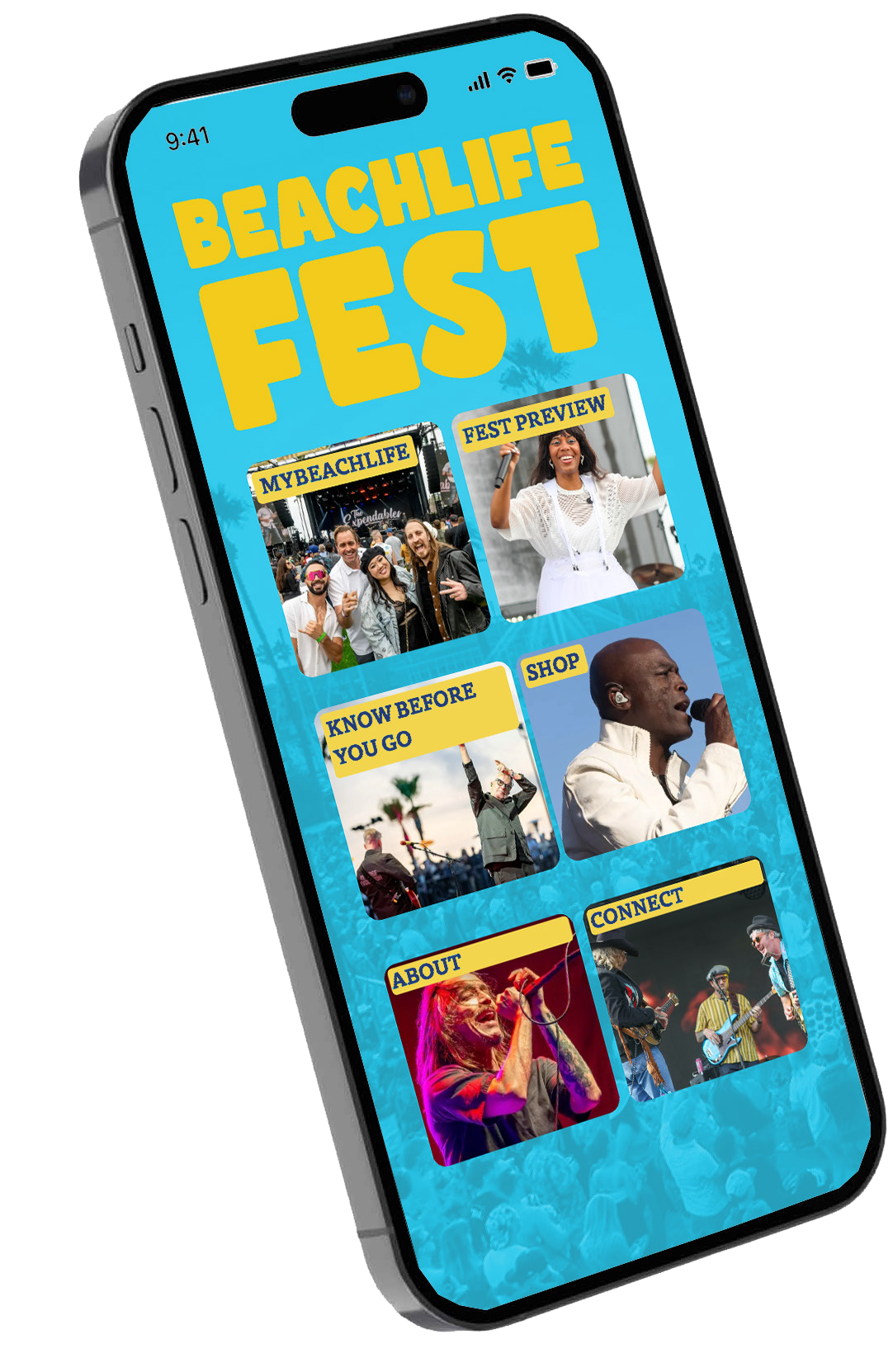
My revised identity system, as applied on the proposed app, integrates the organization’s key words (music, beach, community, safety) in order to better connect the brand to its target audience. They can observe elements such as the logo lockup, photography styles, and be encouraged to attend the event.
Image
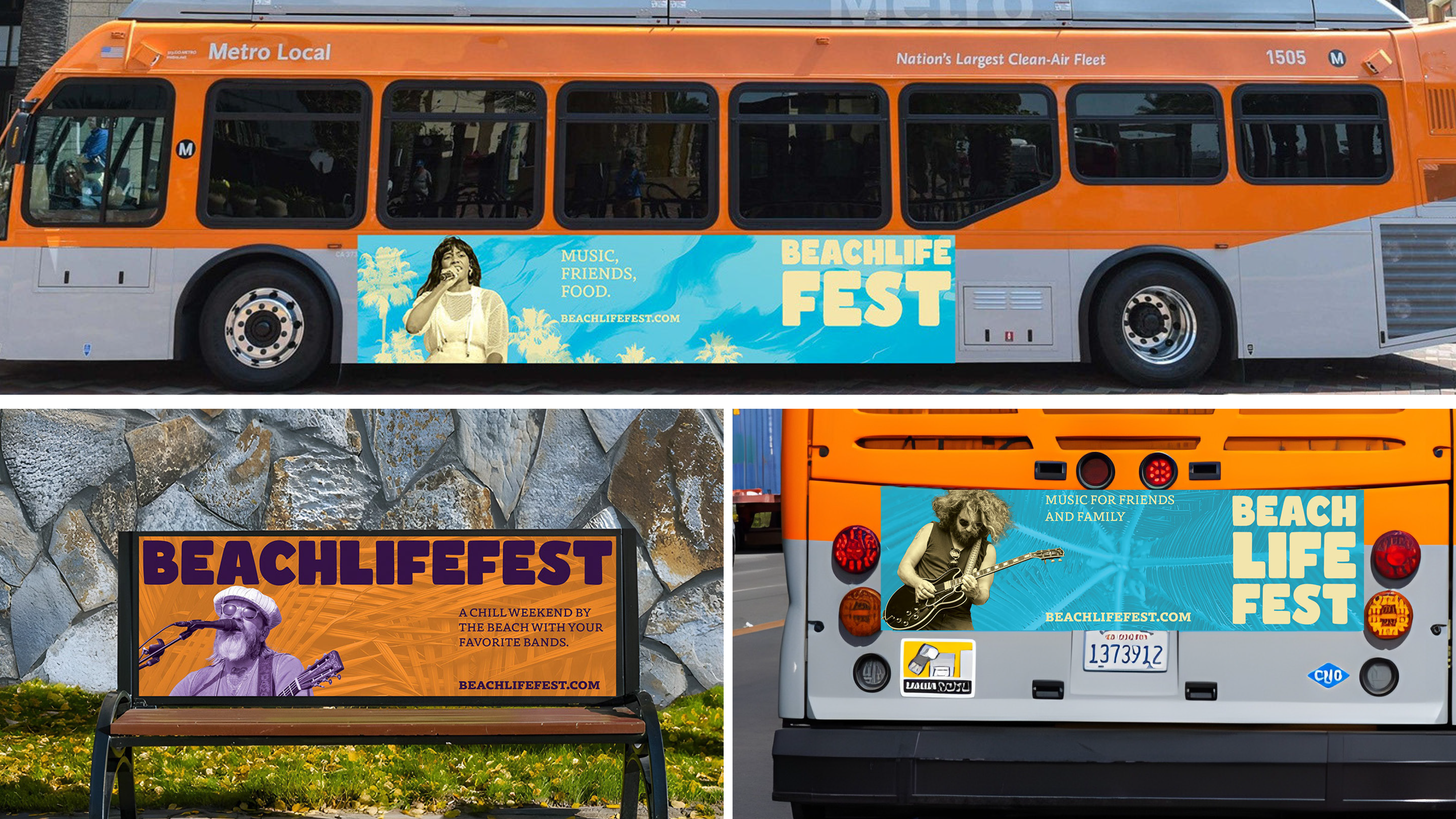
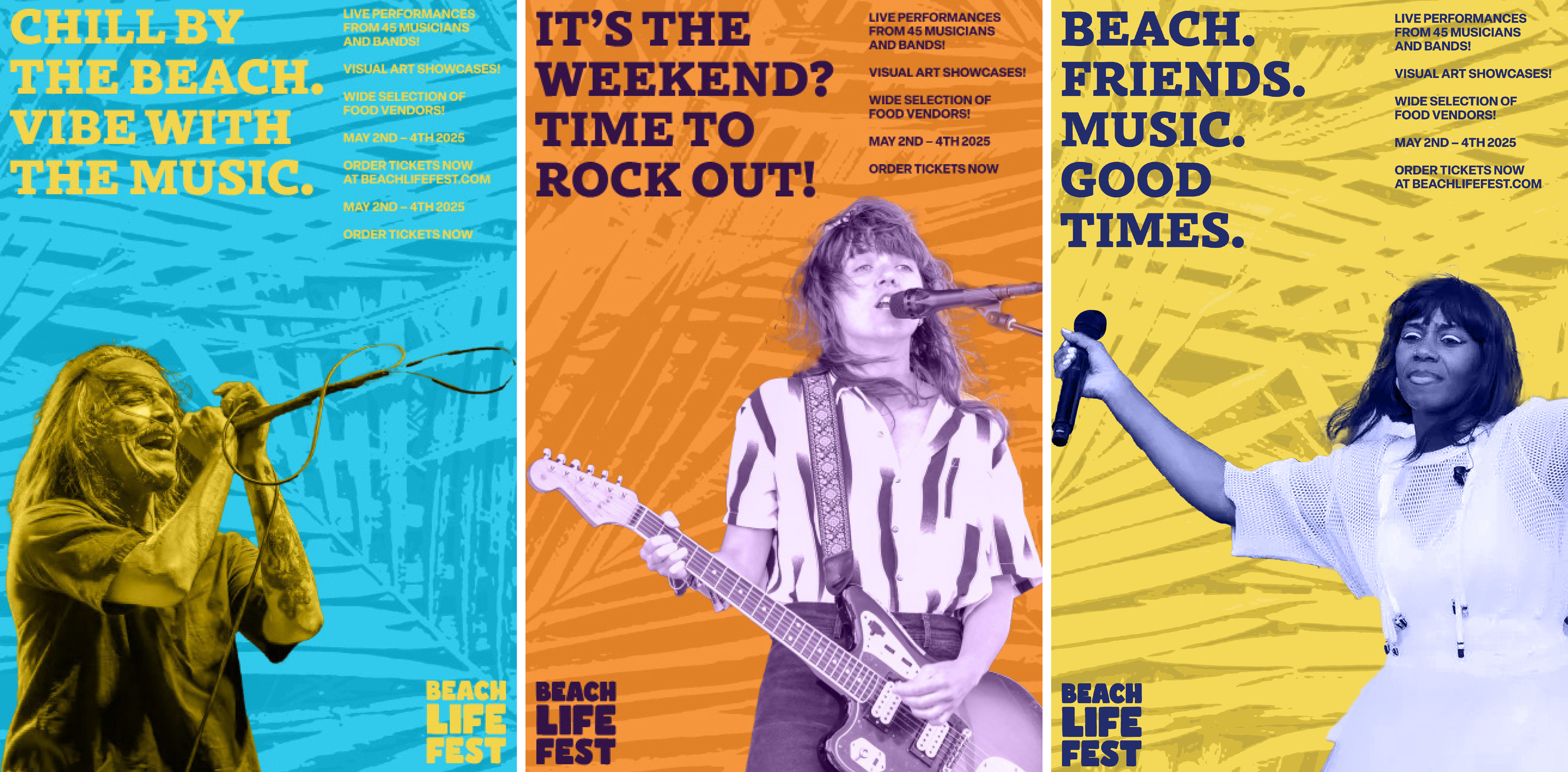
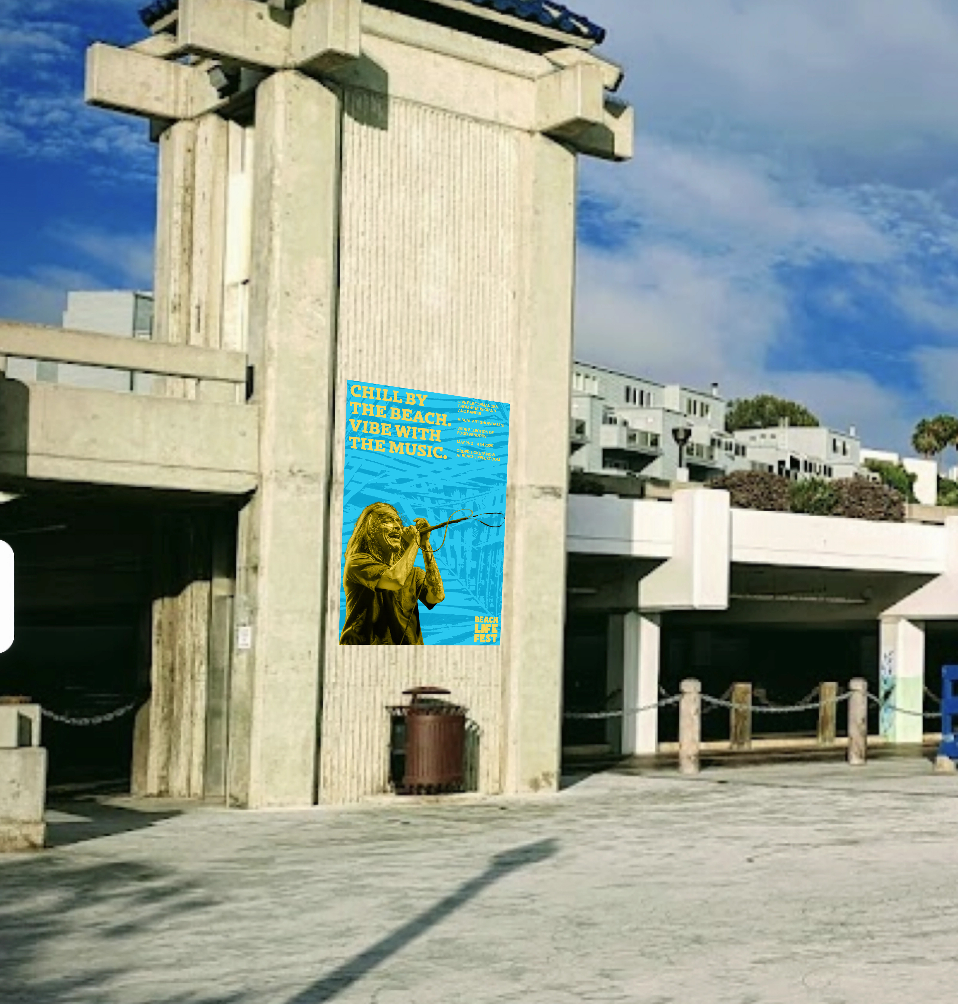
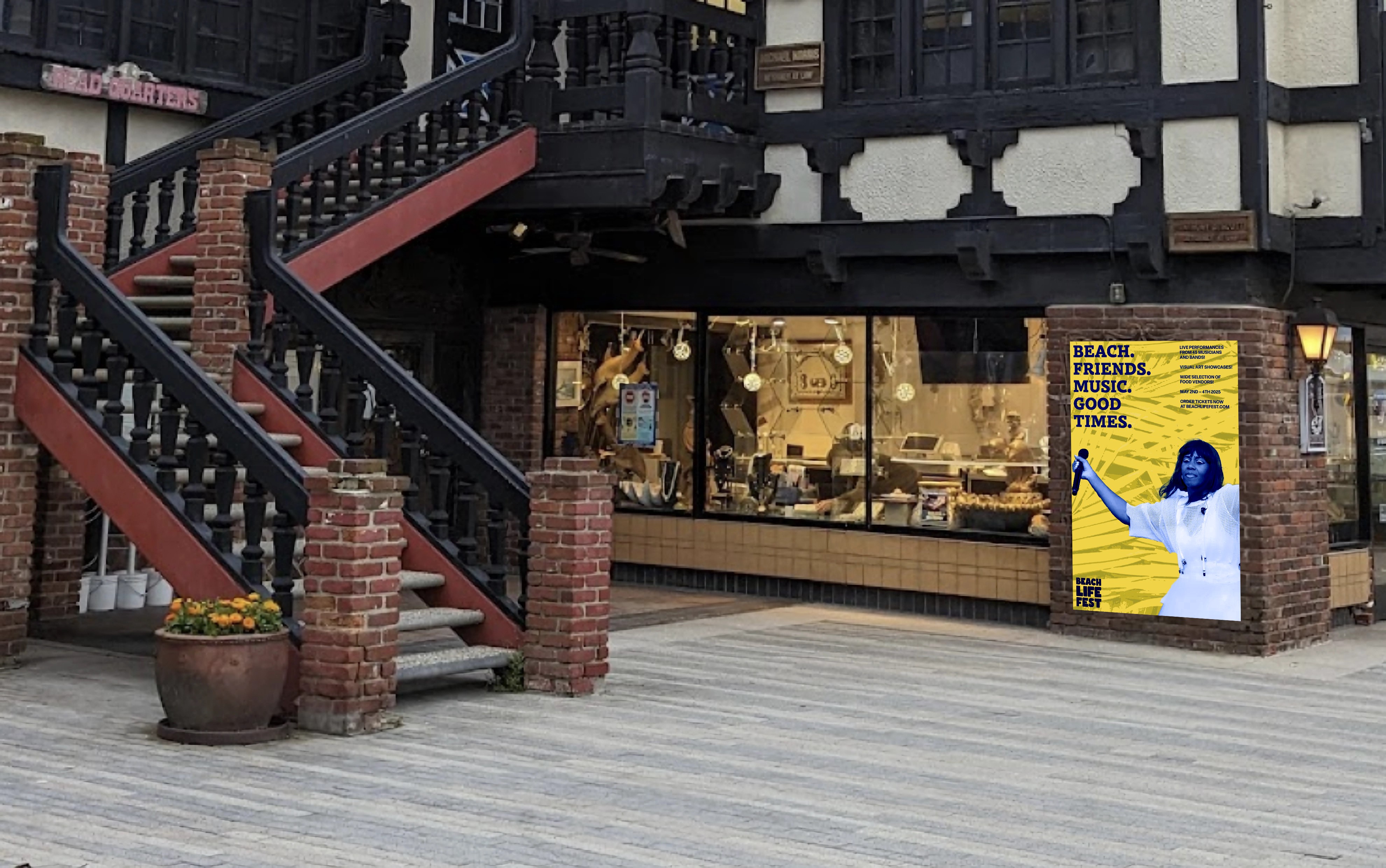
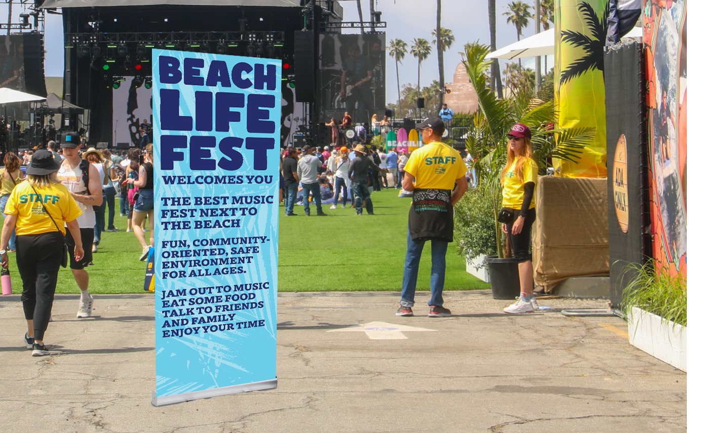
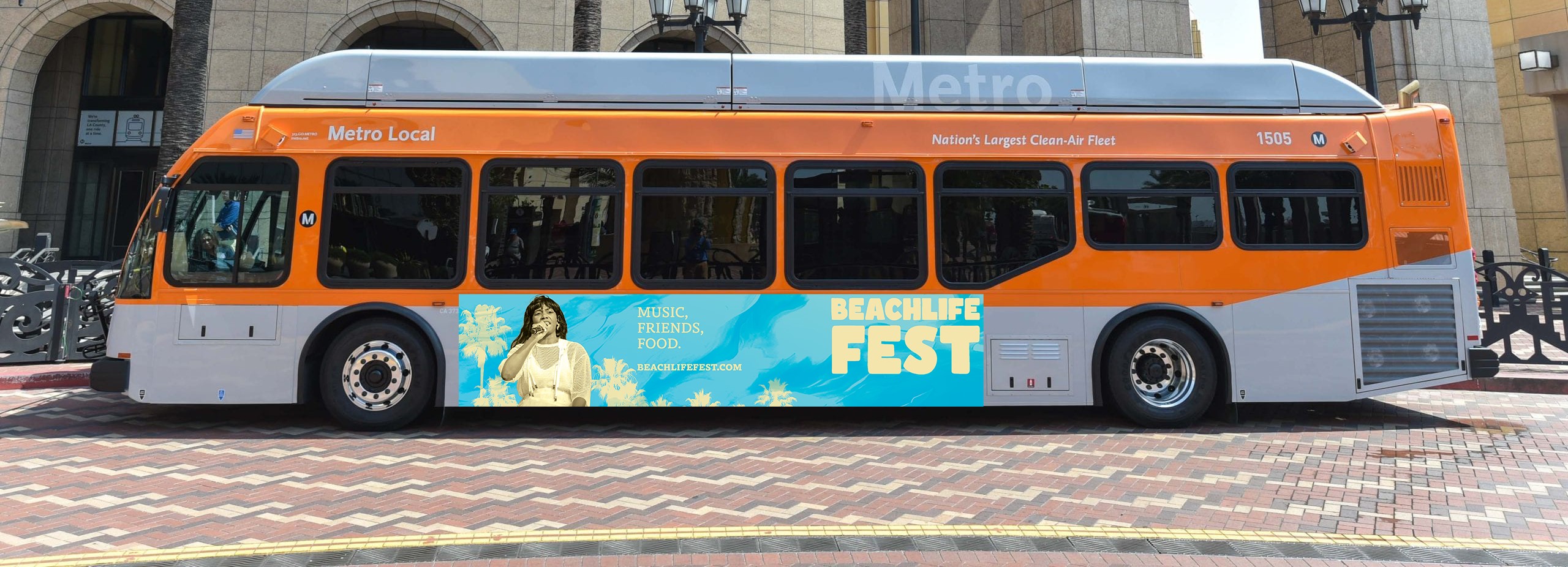
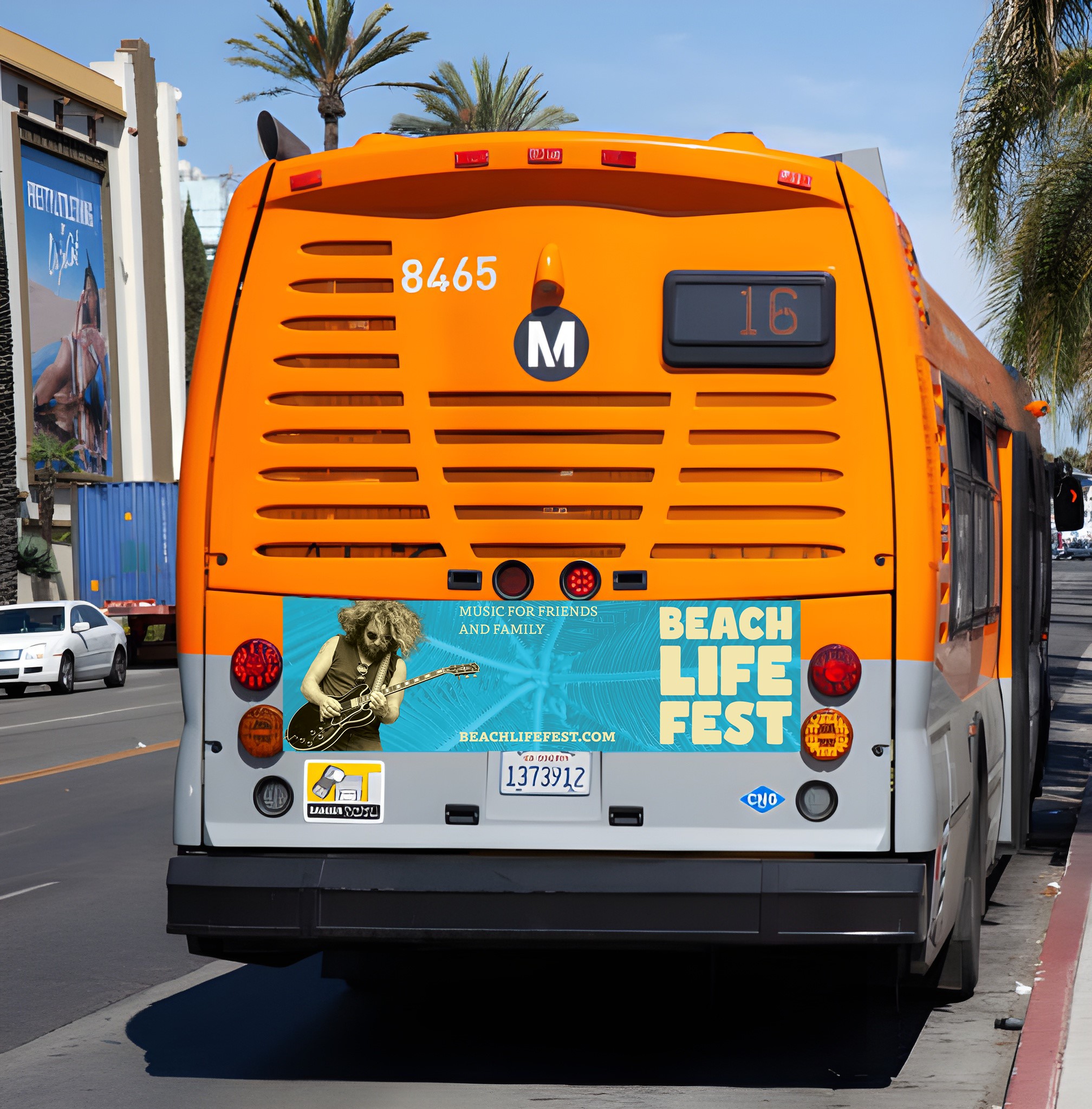
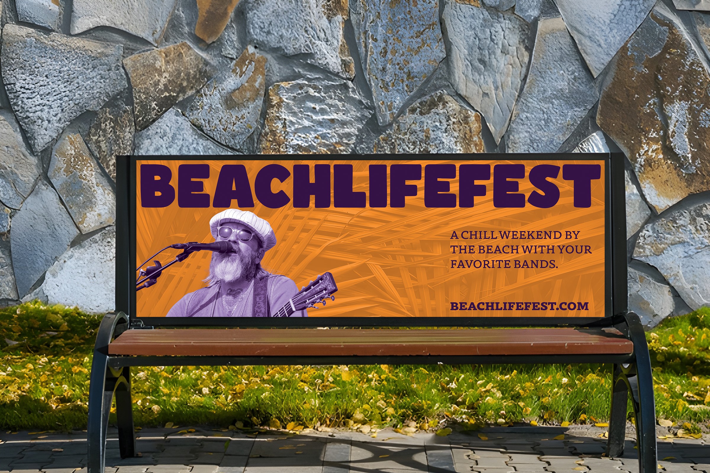
I designed festival advertisements for public transportation and park benches to effectively reach adults (30s to 60s), a demographic that may be less exposed to online promotions than younger audiences. These outdoor touchpoints help increase brand awareness and ensure visibility among this group.
Image
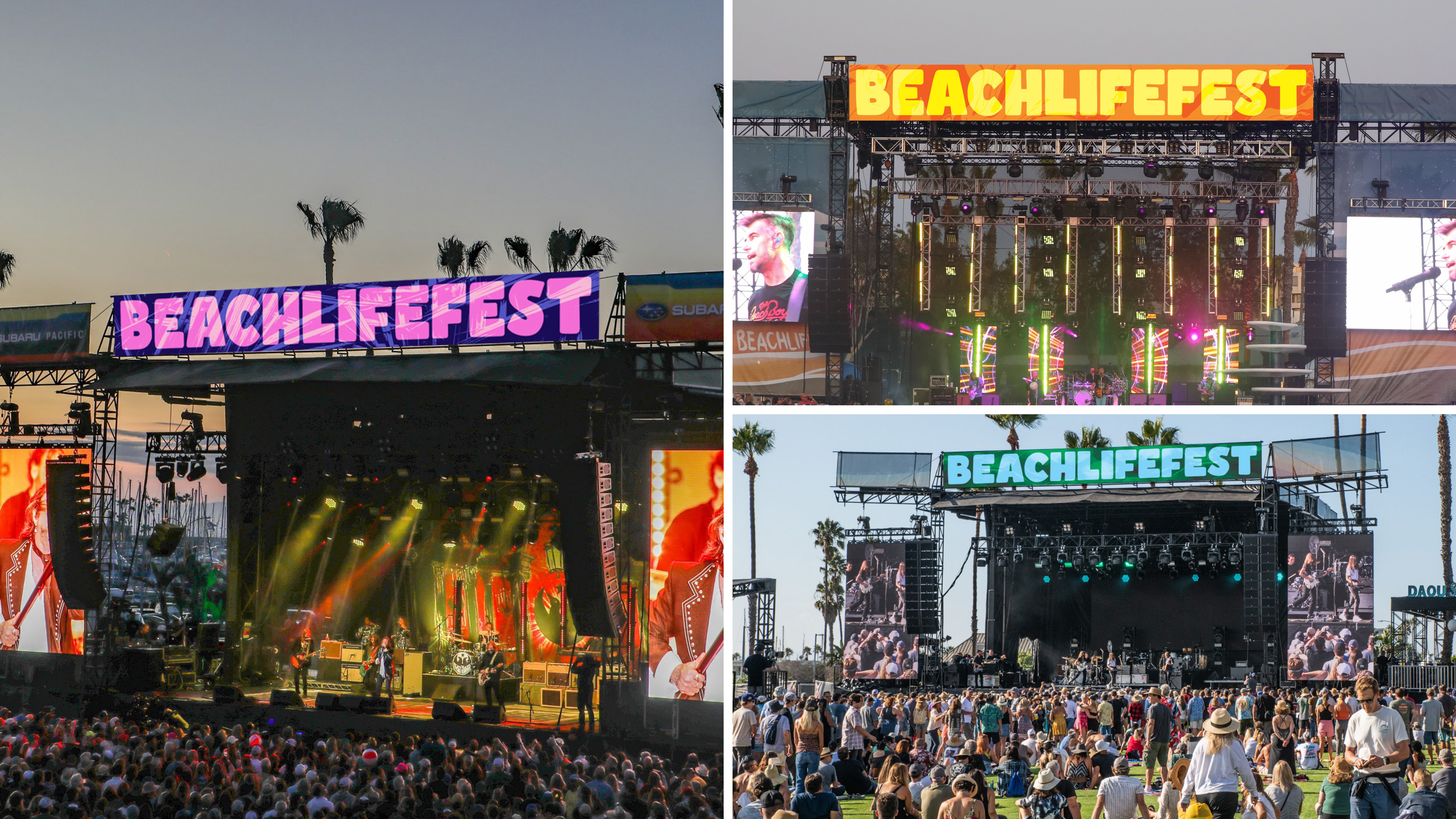
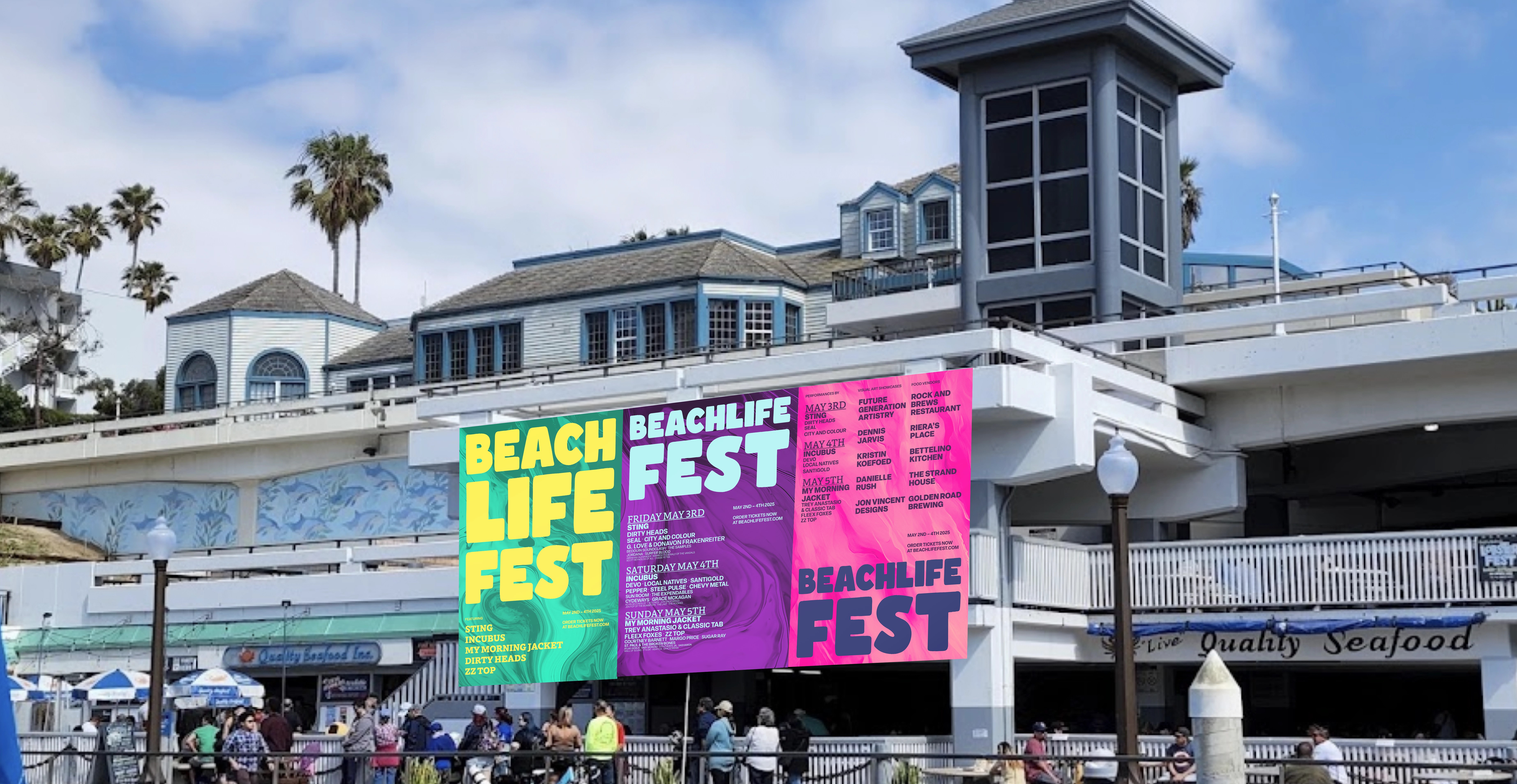
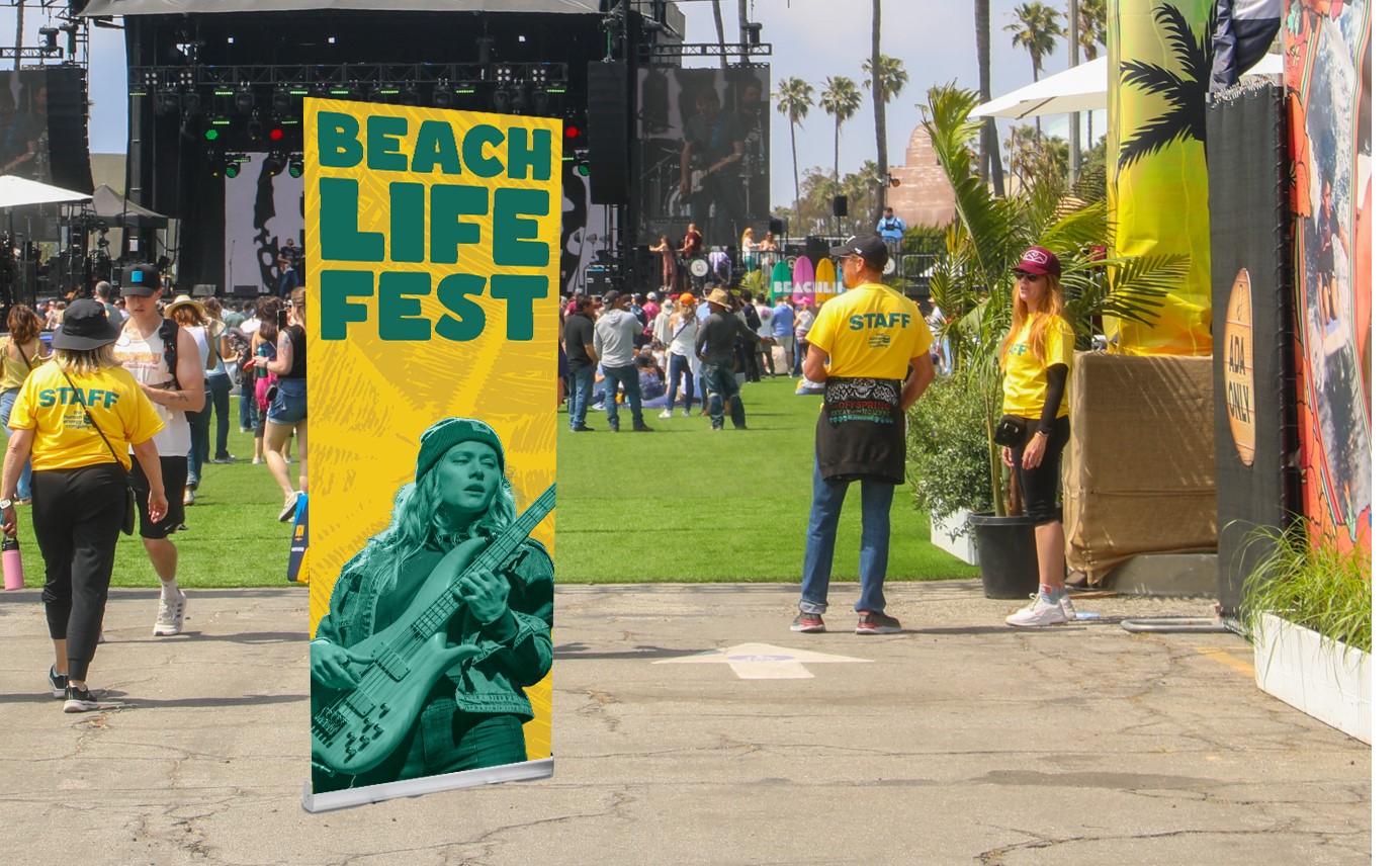
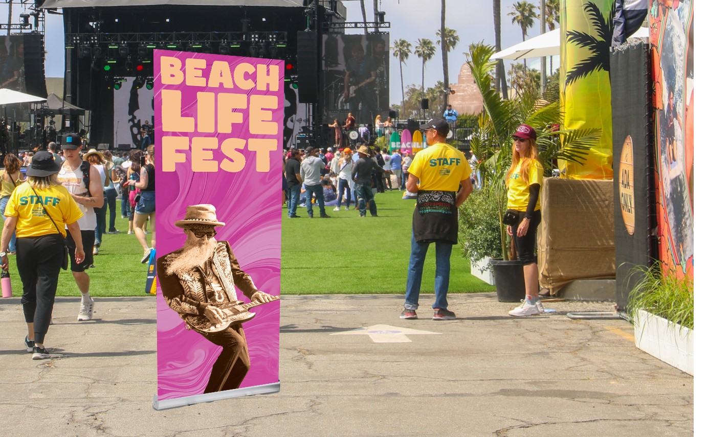
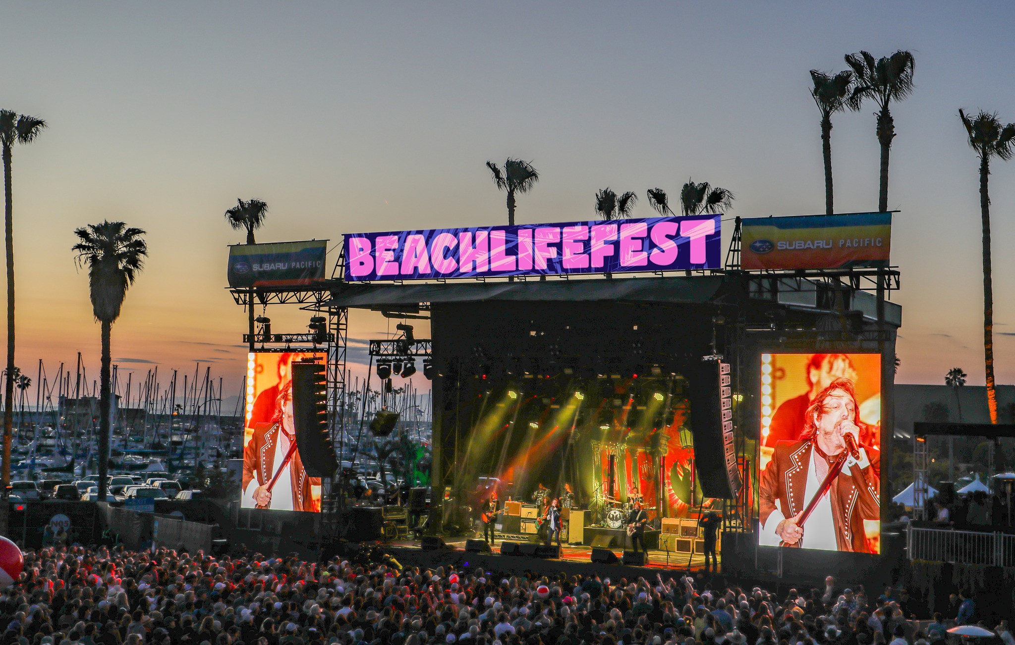
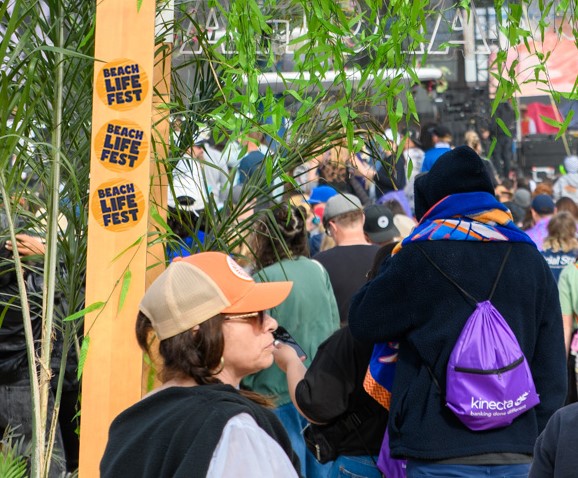
My stage banners utilize a digital treatment (palm trees) and the secondary logotype. They change color as the day passes.
Image
Image
Image
Image
Image
Image
Image
Image
Image
Image
Image
Image
Image
Image
Image
Image
Image
Image
Image
Image
Image

Image
Image
Image
Image
Image
Image
Image
Image
Image
Image
Image
Image
Image
Image
Image
Image
Image
Image
Image
Image
Image
Image
Image
Image

Image
Image

Image
Image
Image
Image
Image
Image
Image
Image
Image
Image
Image

Image
Image
Image
Image
Image
Image
Image
Image
Image
Image
Image
Image
Image