Graduates

Zifei Ding

BFA in Graphics — Graphic Design
Course:
303 Communication Design 5: Visual Interaction

Rab Rebrand

Rab is an outdoor gear brand that specializes in equipment for alpine adventures. It is known for its commitment to product excellence and environmental sustainability. However, Rab's visibility in North America is quite limited due to a small market presence, minimal publicity efforts, and a restricted product range. In this project, I aim to enhance the brand's identity by optimizing its visual system and developing a user-friendly mobile app that aligns with current device trends.
Image
Image
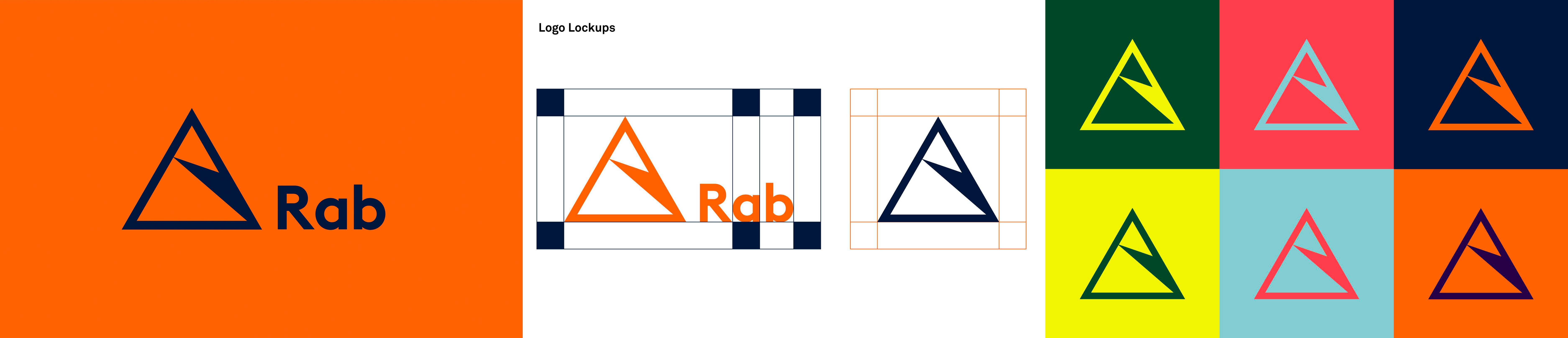
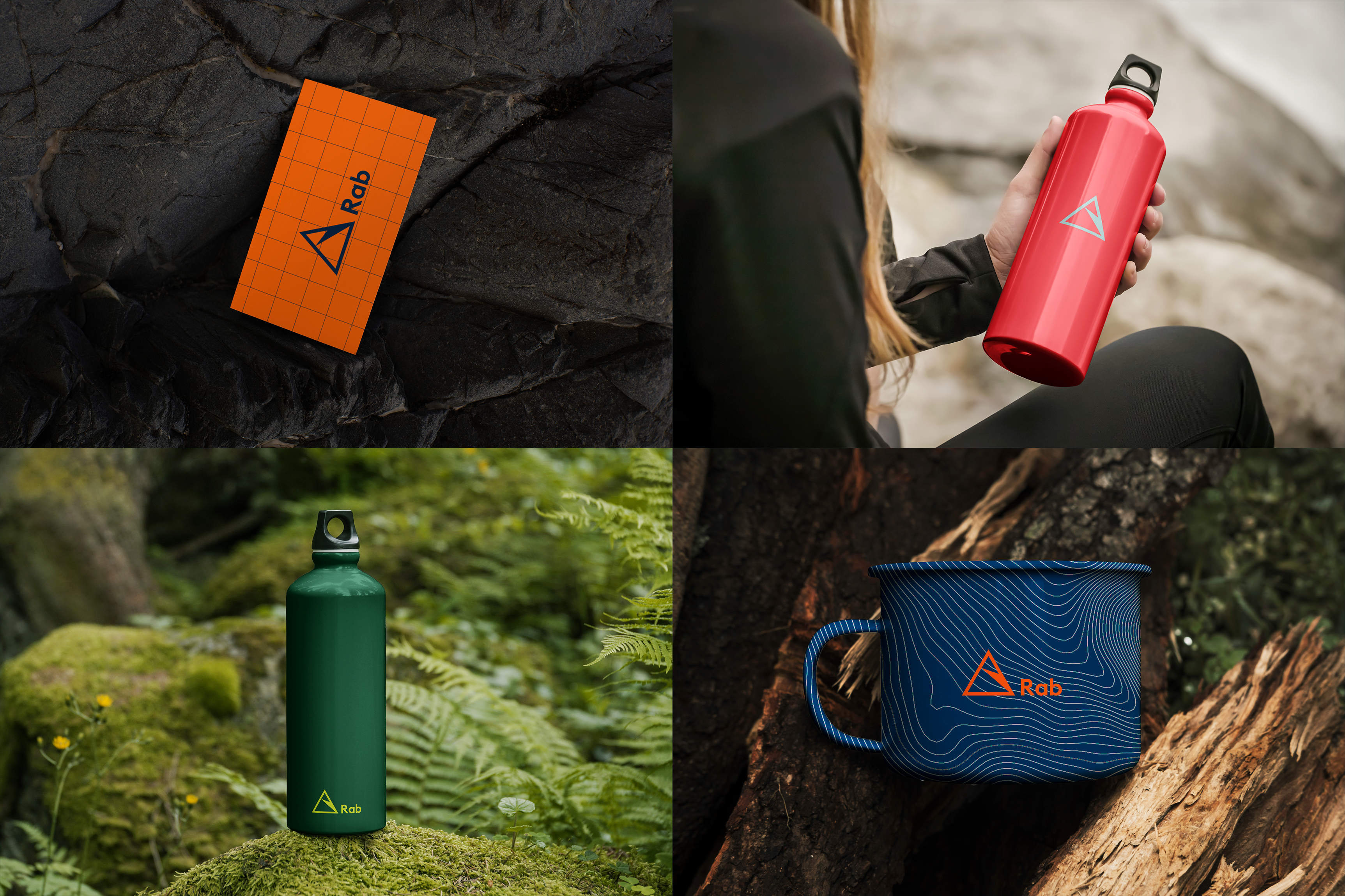
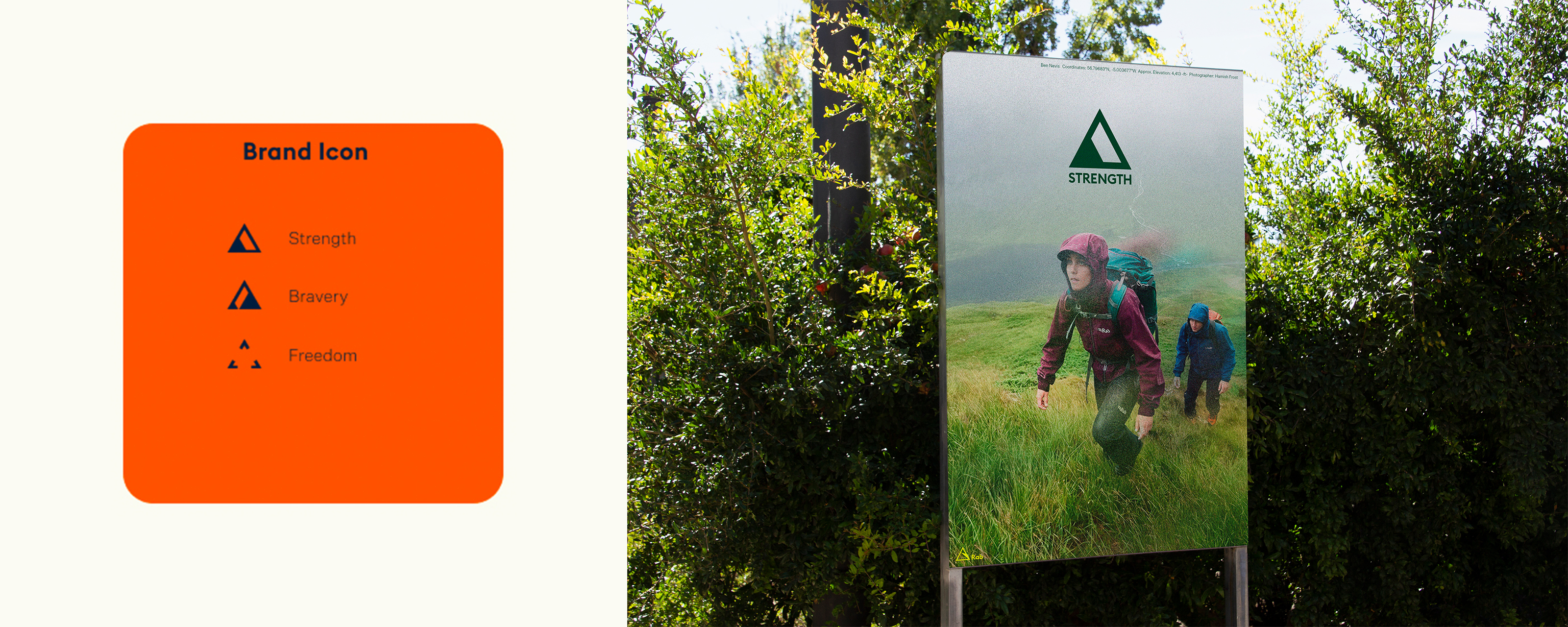
For Rab, the key concepts for the logo and branding are courage, peaks, pioneering spirit, balance, and dependability. I chose the triangle as it is the most stable and strongest shape. Since Rab's primary products are related to mountaineering, I aimed to incorporate the metaphors of mountain tops and hiking trails into the logo.
Image
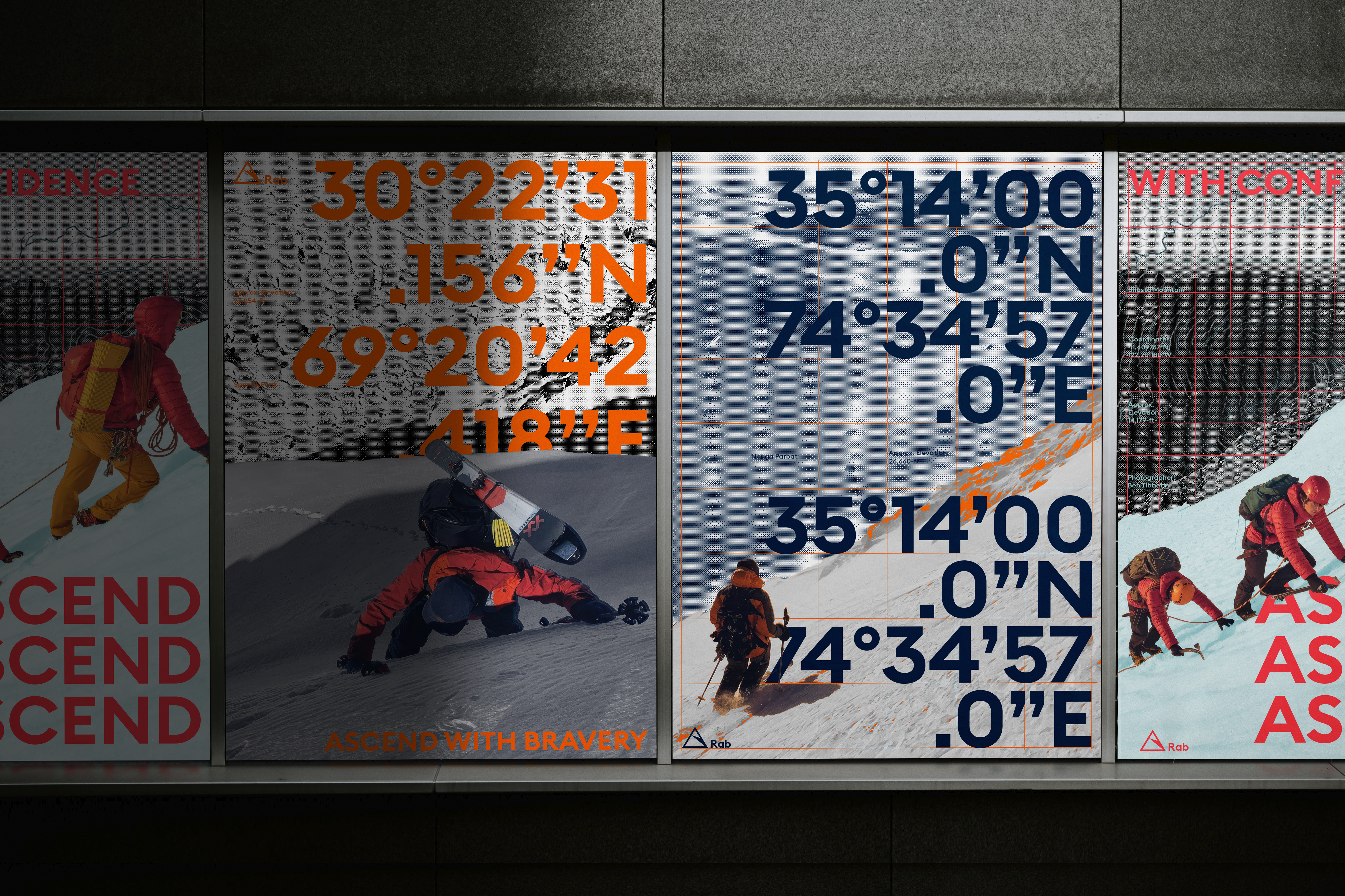
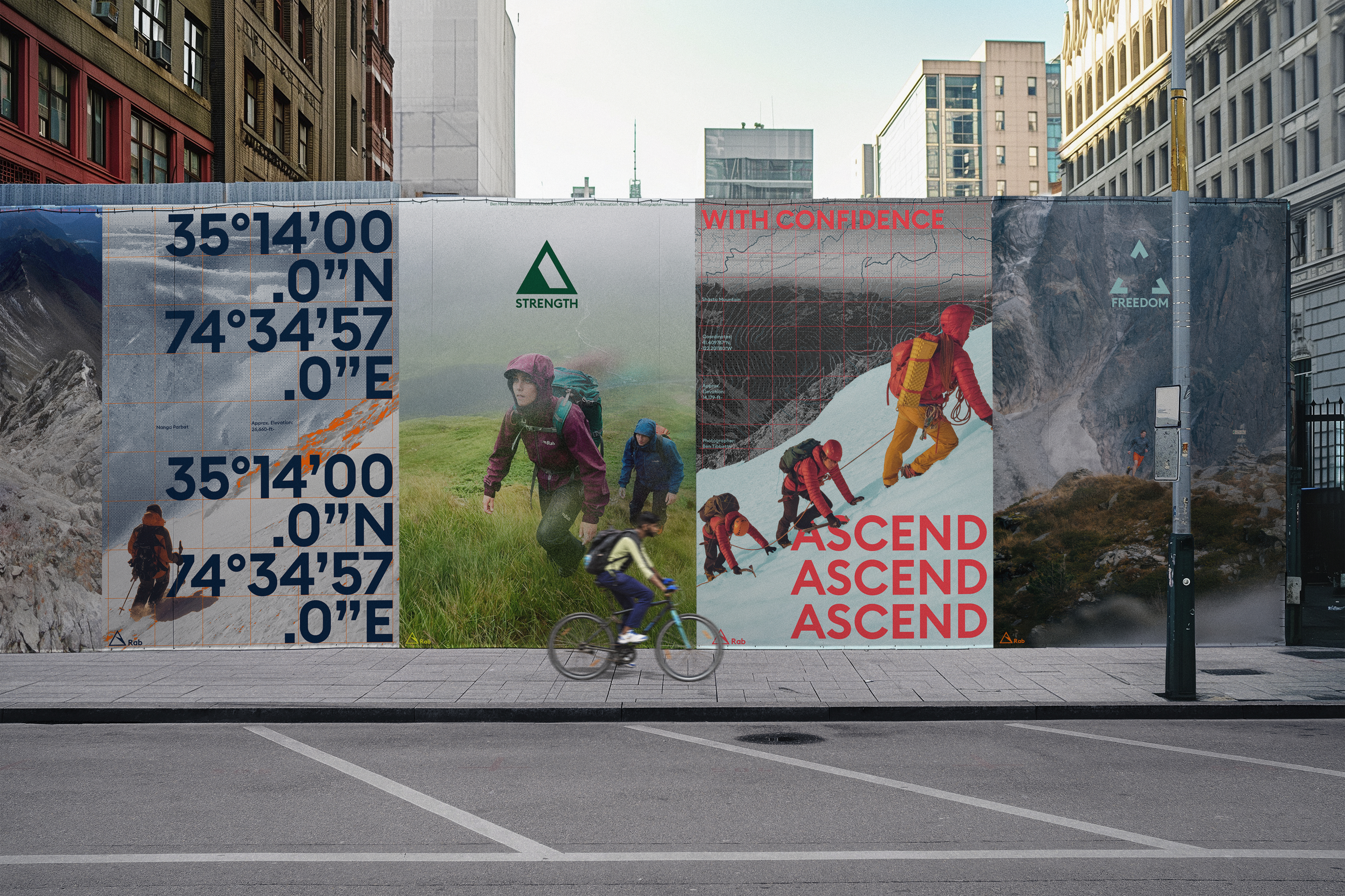
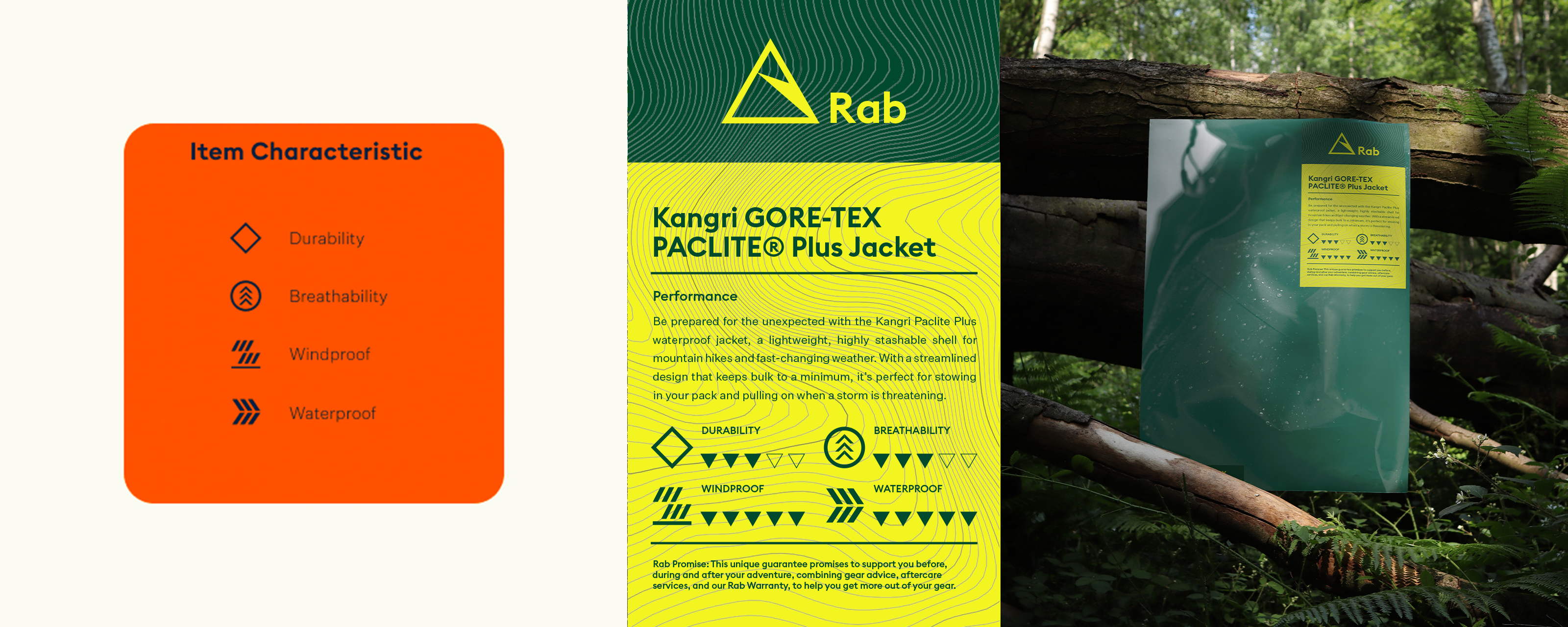
The whole visual is inspired by mountaineering maps. I took the grid listings from the maps and the contour lines that people refer to when hiking and combined them with a large font to create a passionate feel.
Image
Image
Image
Image
Image