This rebrand leans into the soft, heart-lifting feeling of being understood in a space built for everyone. It takes OkCupid’s inclusive roots and turns them into a world that feels bright, friendly, and full of hope. The refreshed logotype uses rounded shapes and heart filled counters to create a gentle face that greets users with warmth and reminds them that dating can feel personal and human.
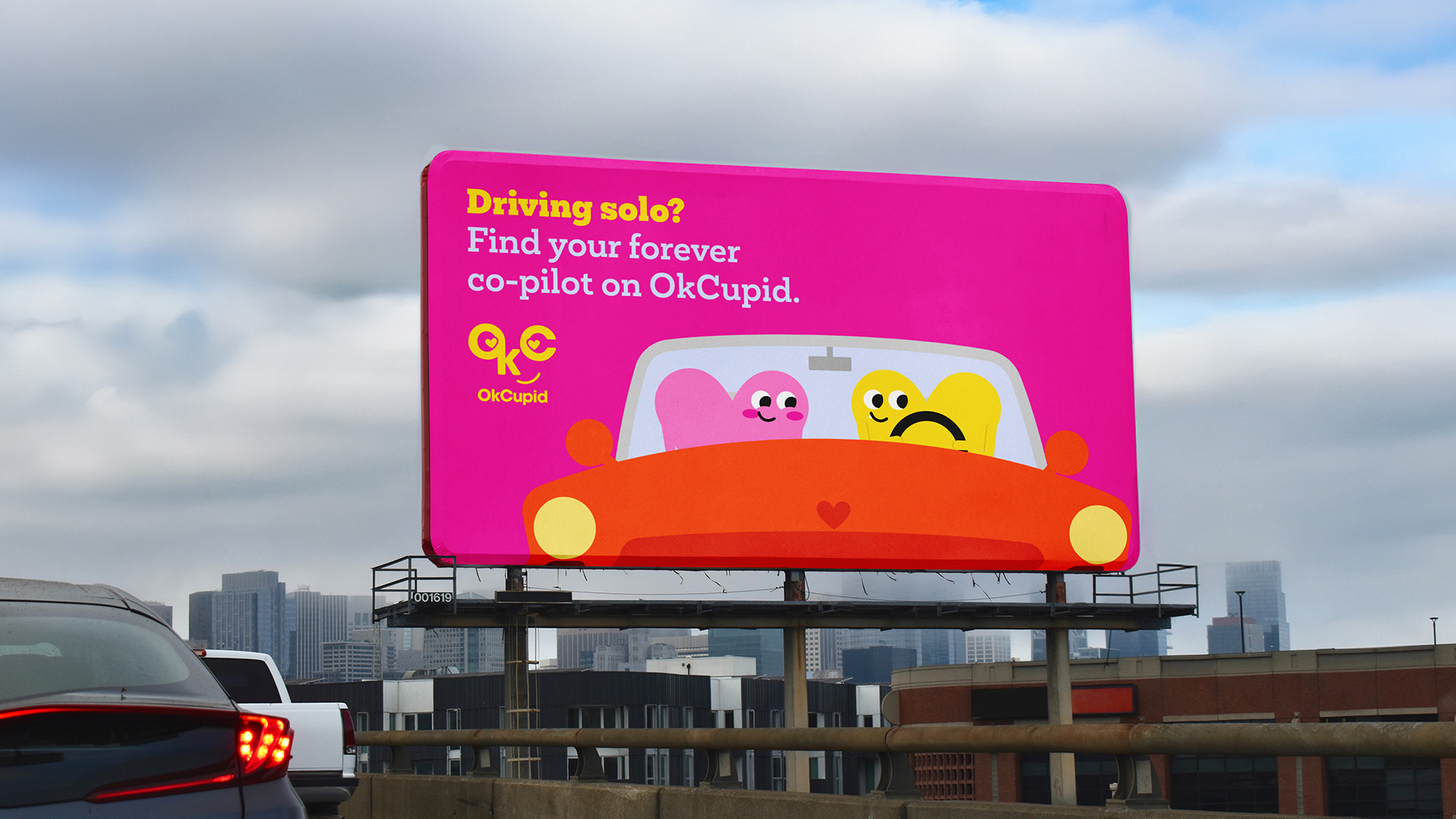
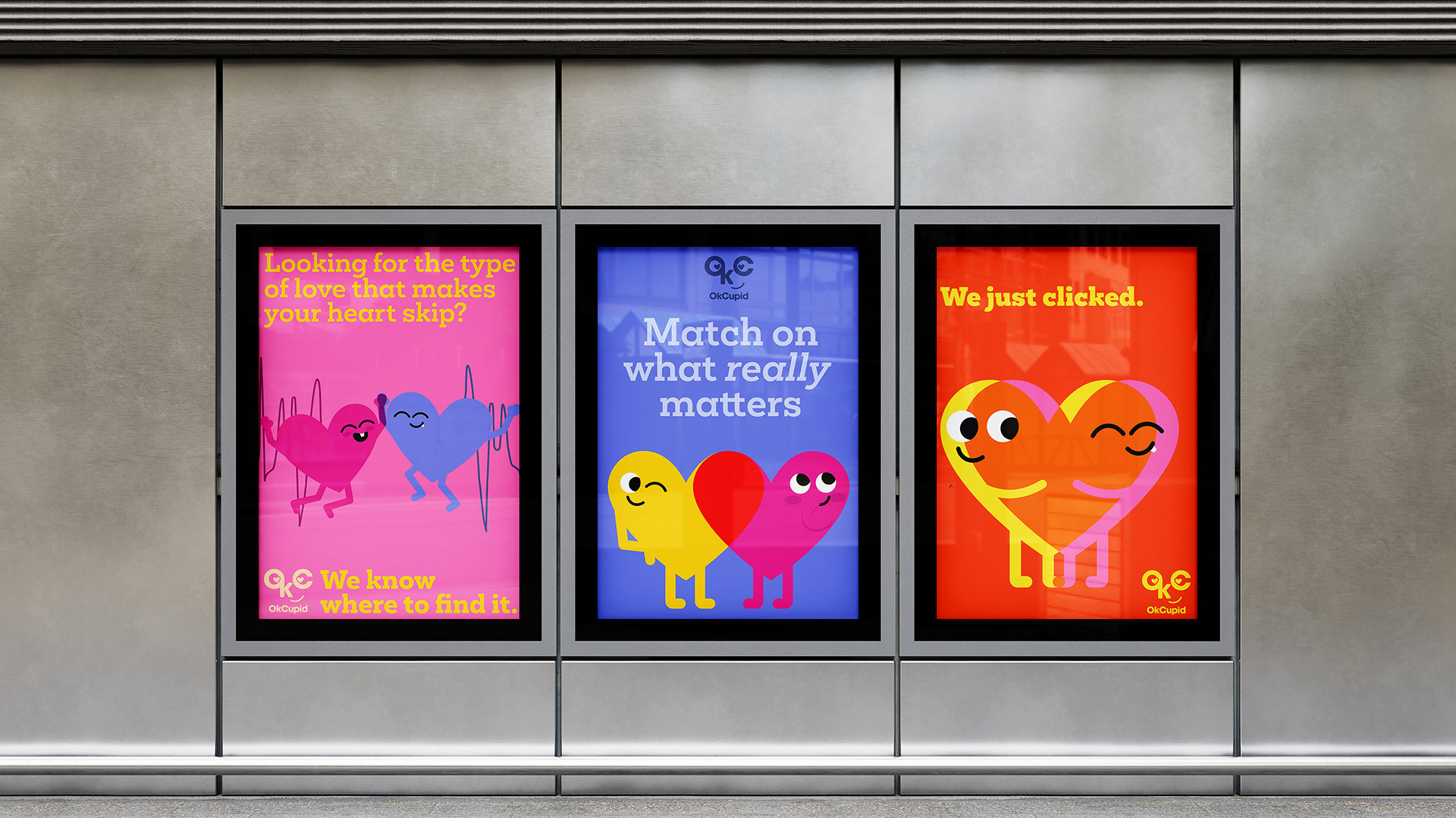
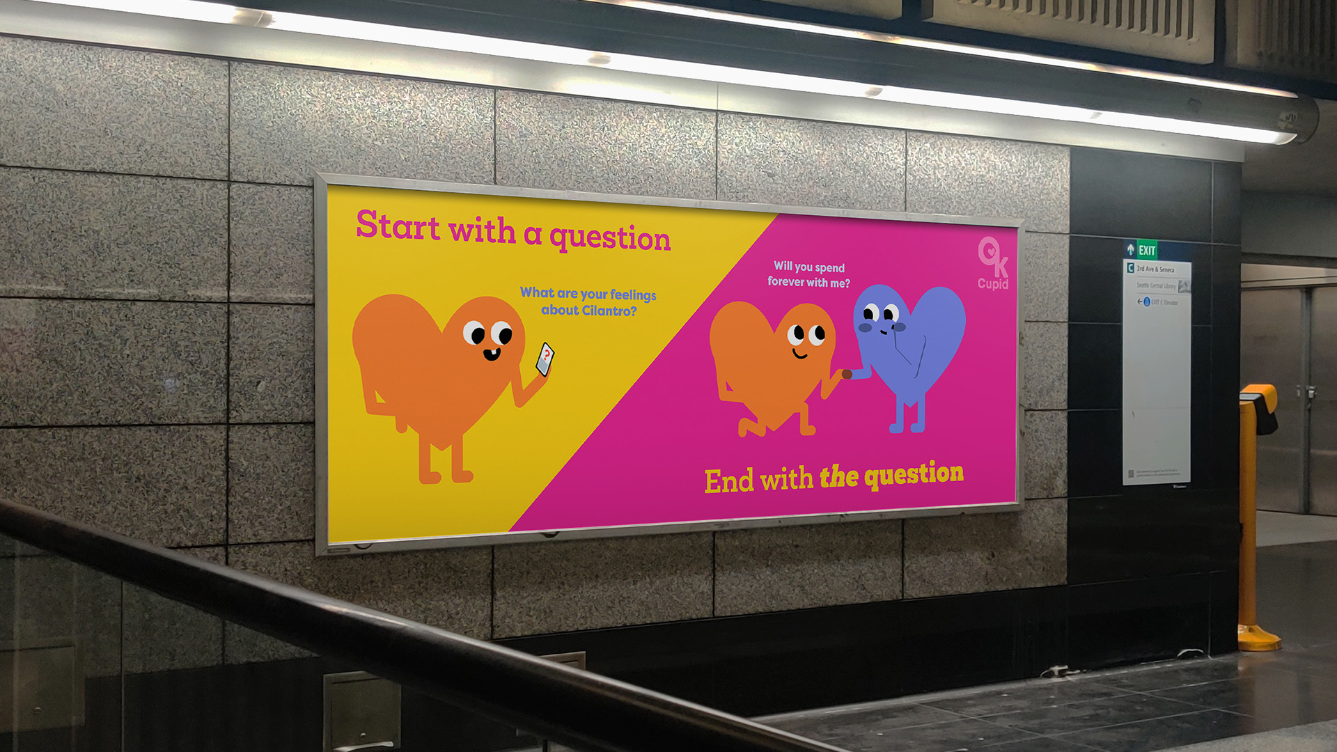
A lively color palette and whimsical storytelling bring the fluttery excitement of new love into the visual language. The Heartsies mascots overlap and blend to show how two people can make something more vibrant together, giving users a simple way to see themselves in the story.
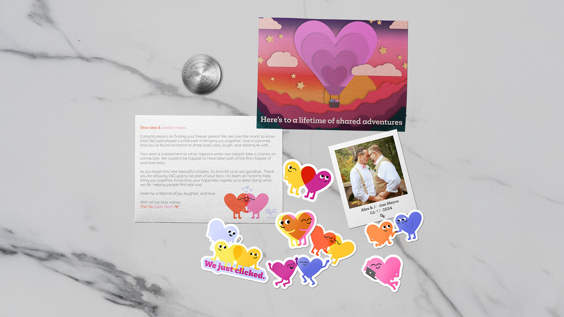
Interactive moments like the projection mapped pop up game and the Happily Ever After Package make the brand feel grounded and thoughtful. Whether encouraging two curious strangers to explore a spark or celebrating couples who met on the app, the experience aims to feel joyful, supportive, and full of heart.