Image

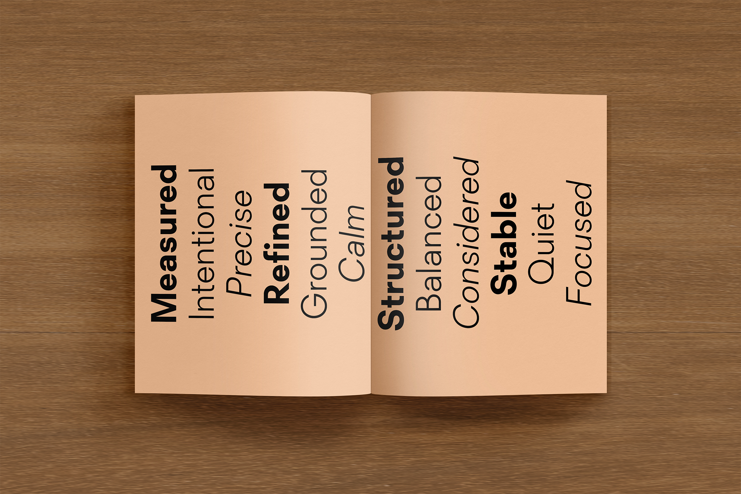
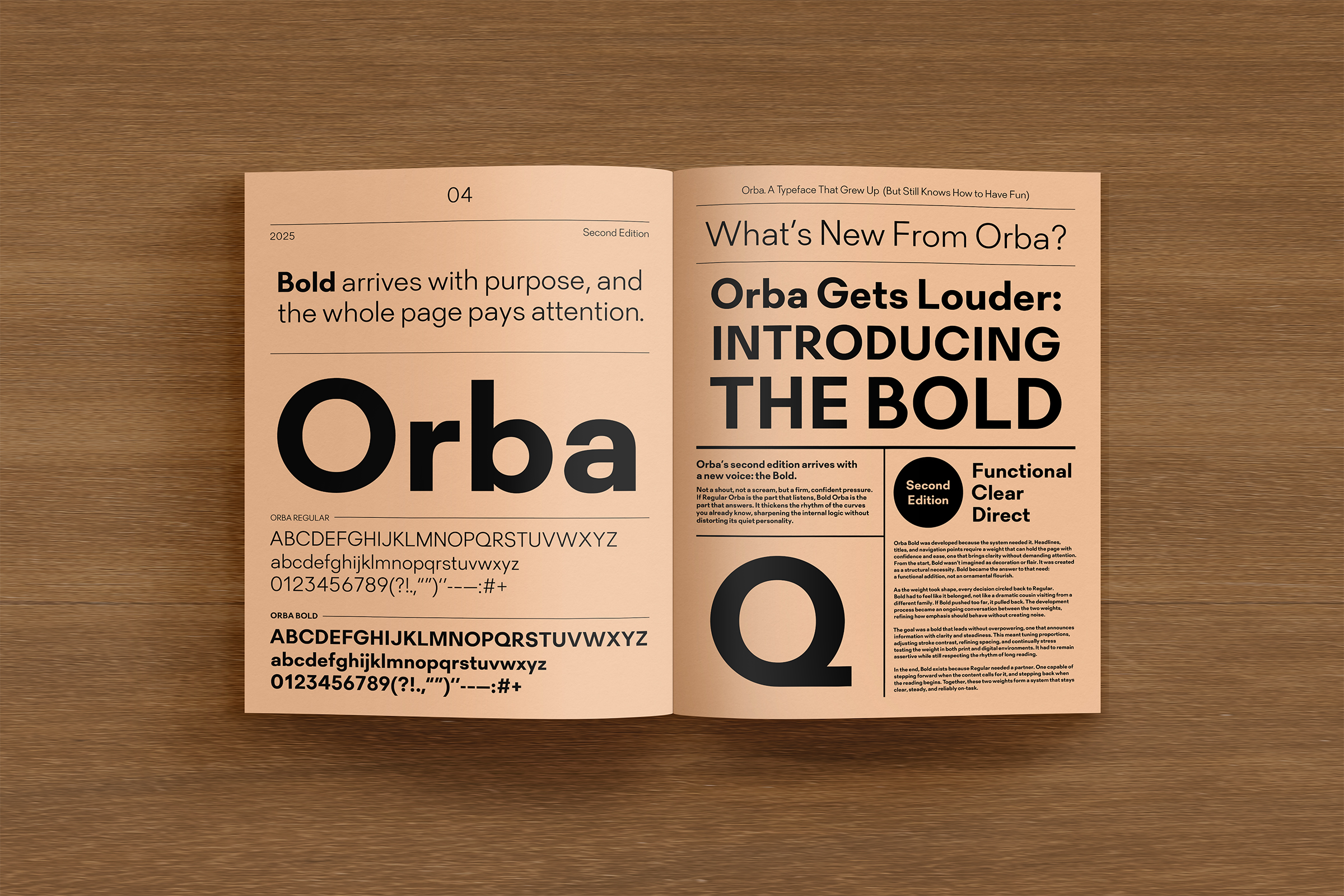
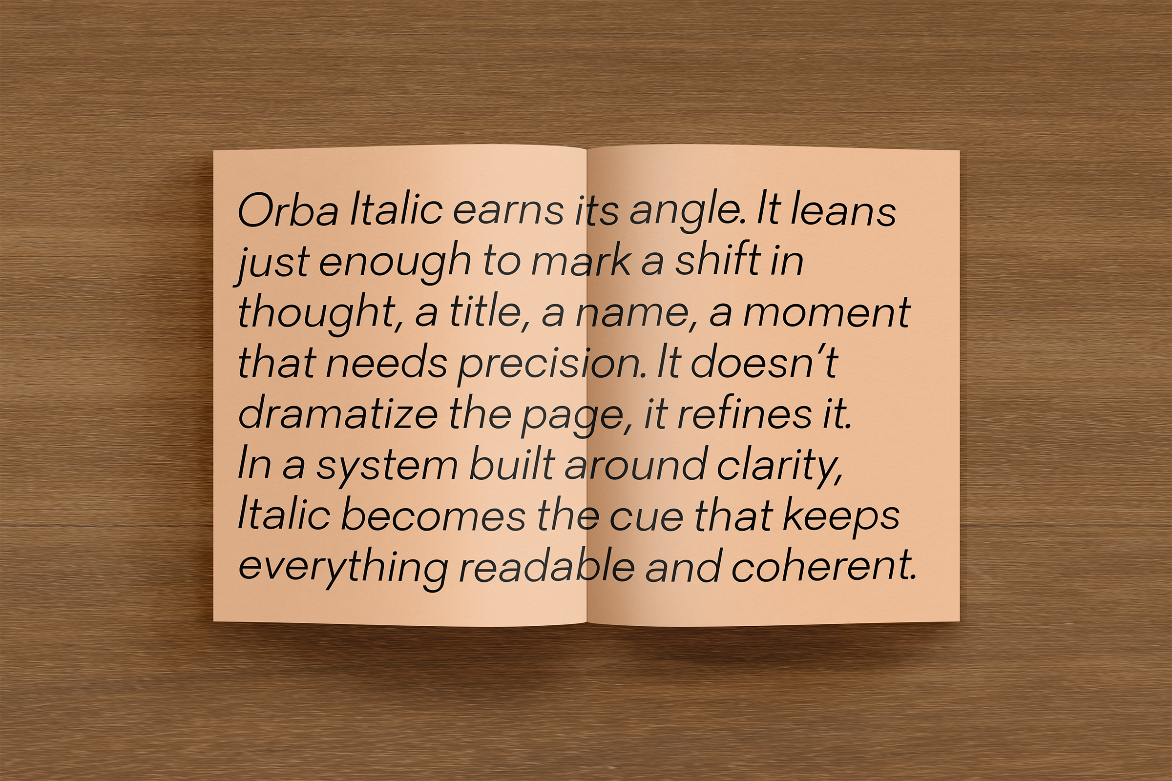
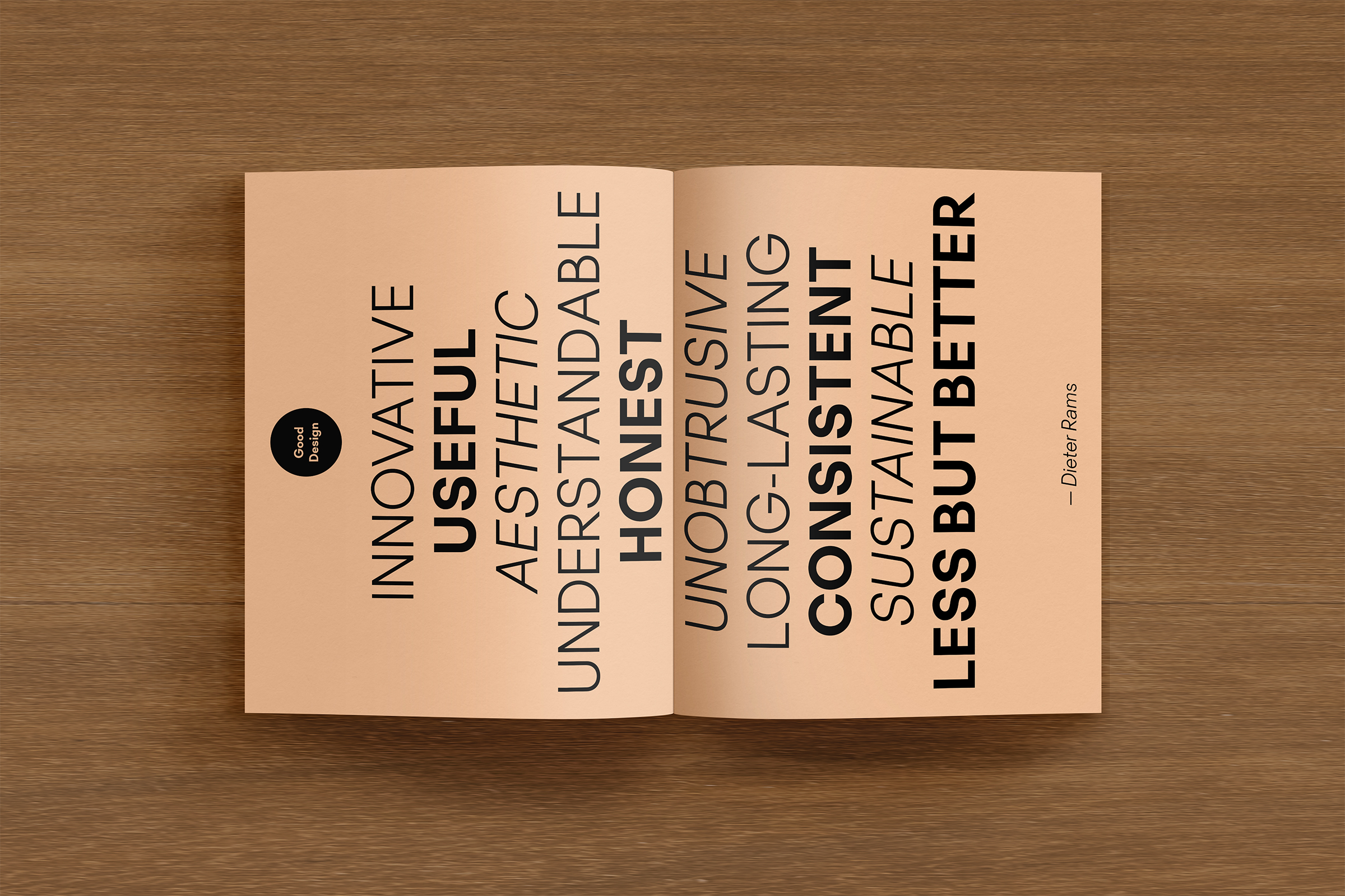
This specimen newspaper demonstrates Orba in use, showcasing its clarity and flexibility across sizes, formats, and messages. Guided by Dieter Rams’ principles of good design, Orba was approached as a product—prioritizing readability, confidence, and serves its purpose without distraction.
Image
Image
Image
Image
Image
Image
Image
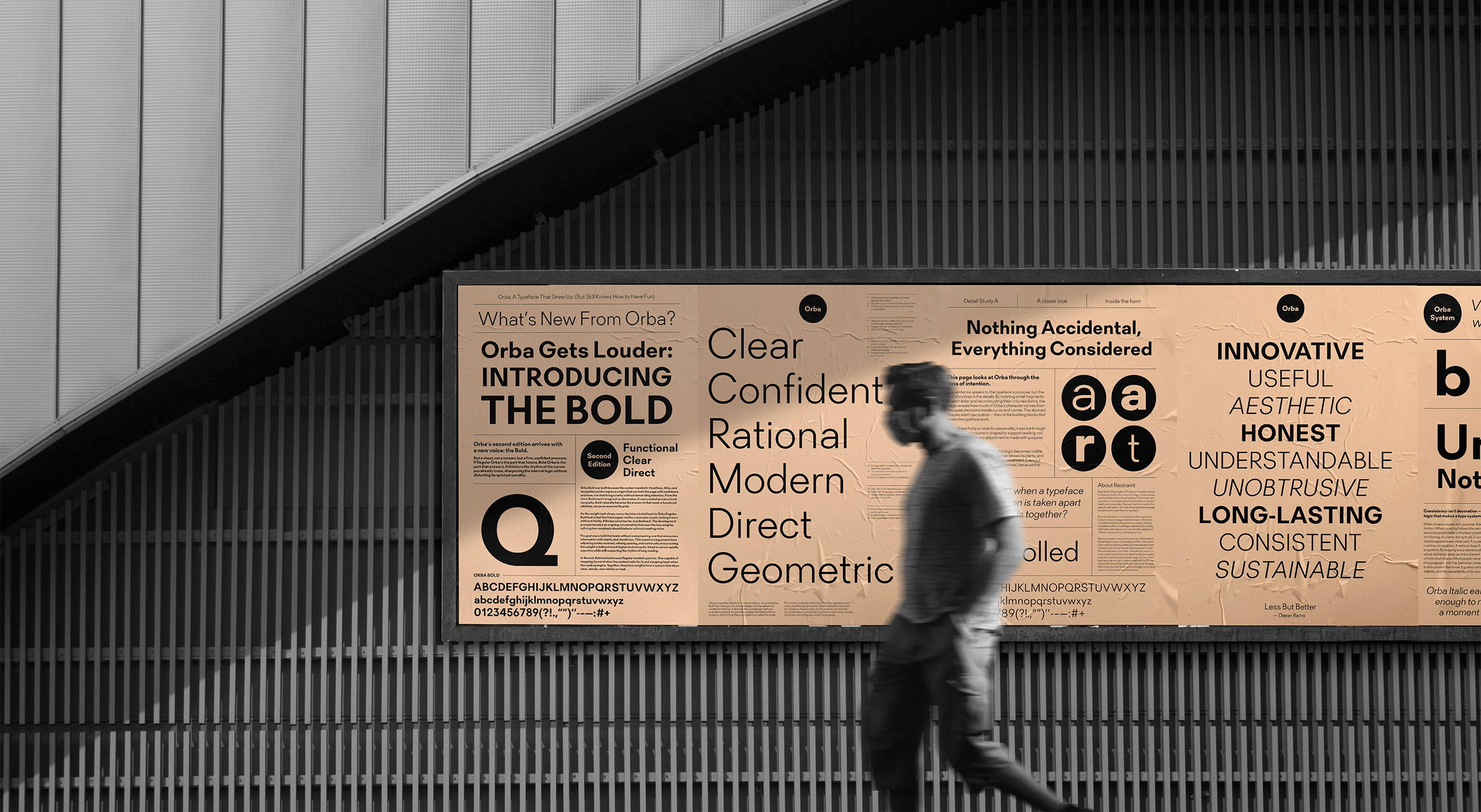
Building on the specimen newspaper, I extended Orba into a series of promotional posters designed to champion the typeface. Rather than decorative advertising, these posters function as direct communication allowing Orba’s voice to speak for itself.