Graduates

Mohsen Alattar

MFA in Graphic Design - 2 Yr Path — Graduate Graphic Design
Course:
Font Design 1
Faculty:
Greg Lindy
Term:
2025 Summer
Collaborators:
Co instructor: Hampton Dunlap

Los Angeles Gothic Font

This project explores how a typographic voice can reflect both history and place. Los Angeles Gothic is a revival that reinterprets the American Gothic type tradition through a modern lens. The goal was to create a type system that balances the honesty and structure of early 20th-century grotesques with the diversity and rhythm of contemporary Los Angeles.

Process:

Los Angeles Gothic is a typeface, a custom-designed set of letters you can use in writing, printing, or on screens. It’s inspired by a bold style of lettering that was common in the United States during the 1900s. These kinds of fonts were used everywhere: newspapers, posters, signs, basically, the visual voice of the early 20th century.

This project brings that classic American lettering style back to life, but with a modern twist. It keeps the strong, straightforward look of the originals, while making the spacing and shapes more balanced for today’s design needs. Whether you’re making a flyer, a brand, or a poster, Los Angeles Gothic is meant to feel both familiar and fresh, like an old soul with a new outfit.

Learning Outcomes:

This project sharpened my sensitivity to the micro-details of type, examining how every curve, counter, and terminal contributes to the voice of a typeface. I learned to engineer letterforms with precision, balancing optical correction with structural consistency across styles and weights. Working in Glyphs deepened my fluency in font development tools, and I developed a rigorous process of iteration, spacing, and testing to ensure the type performs in both display and text settings. Ultimately, the project expanded my understanding of what it means to design type not just as form, but as a system.

Tags:
Typography
Image
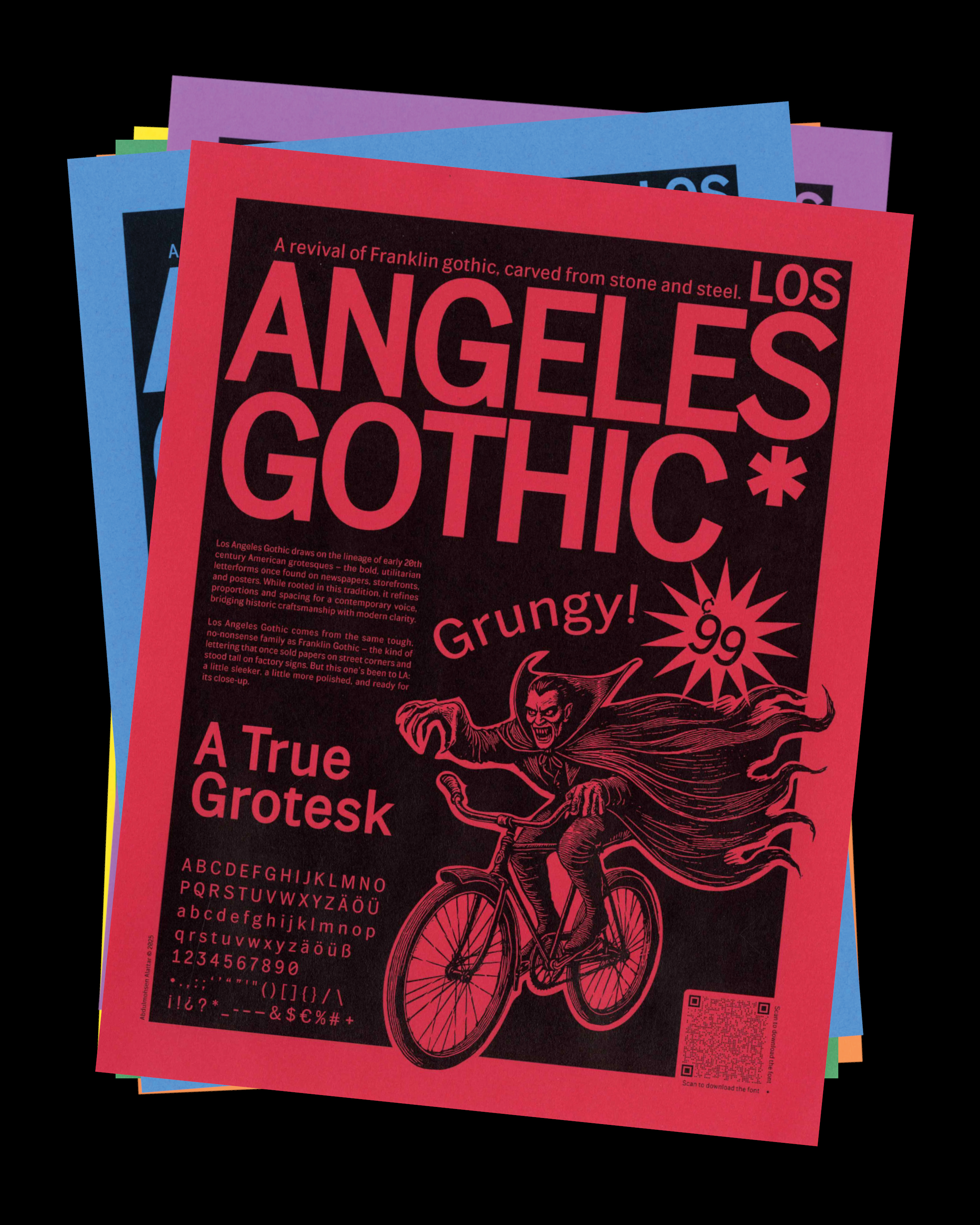
As part of the Los Angeles Gothic project, I created mini flyers to test how the typeface performs in real-world applications. Each flyer focuses on typographic composition, hierarchy, and scale, exploring how different weights and spacing interact in print. These small pieces were a way to experiment freely, to see how Los Angeles Gothic behaves off the grid, in motion, in texture, and in everyday use.

They were also meant to be given to people as a way to promote and share the typeface, inviting them to download and interact with it, because I believe typography should feel alive when it meets people, not just exist in a specimen or on a screen.
Image
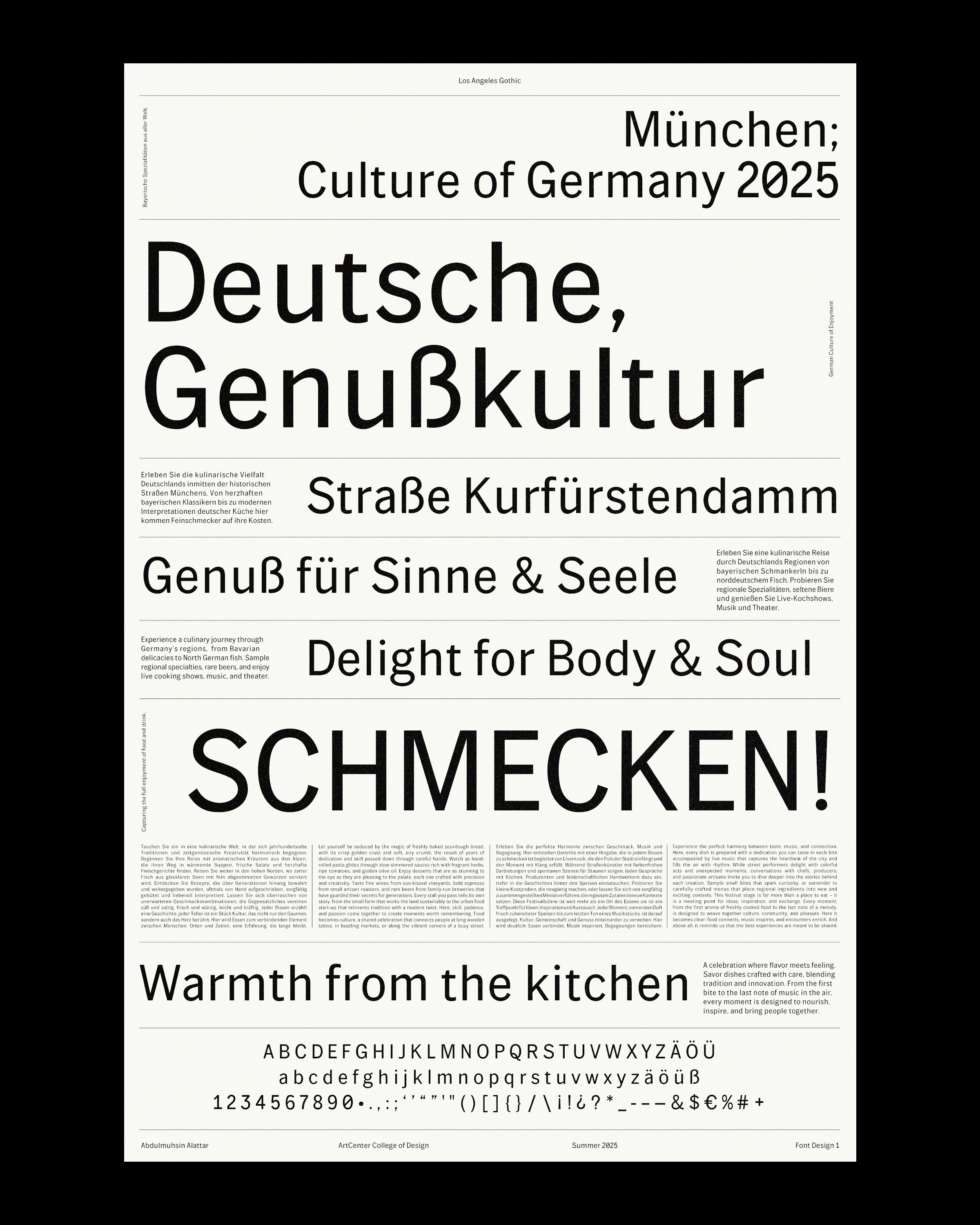
The specimen poster is set in German, a deliberate choice to both honor the Gothic type tradition and to test performance. German is known for its long compound words, which made it ideal for stress-testing the typeface’s rhythm, spacing, and readability. Because Los Angeles Gothic has an open structure and generous counters, setting it in German highlighted its legibility under tighter conditions. The result not only connects back to the historical roots of the Gothic genre but also demonstrates how the design adapts across language and context.