Graduates

Ronnie Alley

MFA in Graphic Design - 2 Yr Path — Graduate Graphic Design
Course:
Grad Type Studio 4
Faculty:
Gloria Kondrup
Term:
2025 Spring

Agenda Outré

In February 1987, Michael Swift wrote For the Homoerotic Order, originally published in Gay Community News during the height of the AIDS epidemic. Intended as a satirical, rage-fueled response to crisis, it has since been co-opted by the Right as “evidence” of a so-called Gay Agenda, and cited in Congress and the Supreme Court in debates over queer civil rights. Through this publication, I recontextualize the manifesto’s origins and expose the hypocrisy behind the construction of the Gay Agenda narrative.

View full project case study HERE.

Process:

Before designing the publication and accompanying typeface, I immersed myself in the mindset of Michael Swift, researching the gay liberation movement and the AIDS epidemic. This process allowed me to engage with the rage embedded in the manifesto, which became a driving force for the visual system.

For the publication, I structured the content in two parts. The first half focuses on queer history, republishing Swift’s manifesto in full alongside material that reflects the cultural climate of the time. The second half examines how the religious Right co-opted its language to construct the “Gay Agenda” narrative.

Learning Outcomes:

Working on this project was nothing short of cathartic. Growing up in the South, I was never exposed to this era of queer history, and I couldn’t help but put myself in Swift’s shoes as he wrote his manifesto. The stories uncovered through my research ignited a passion to correct the narrative, especially as hostility toward the queer community continues to rise today.

Tags:
Publication Design,
Typography
Image
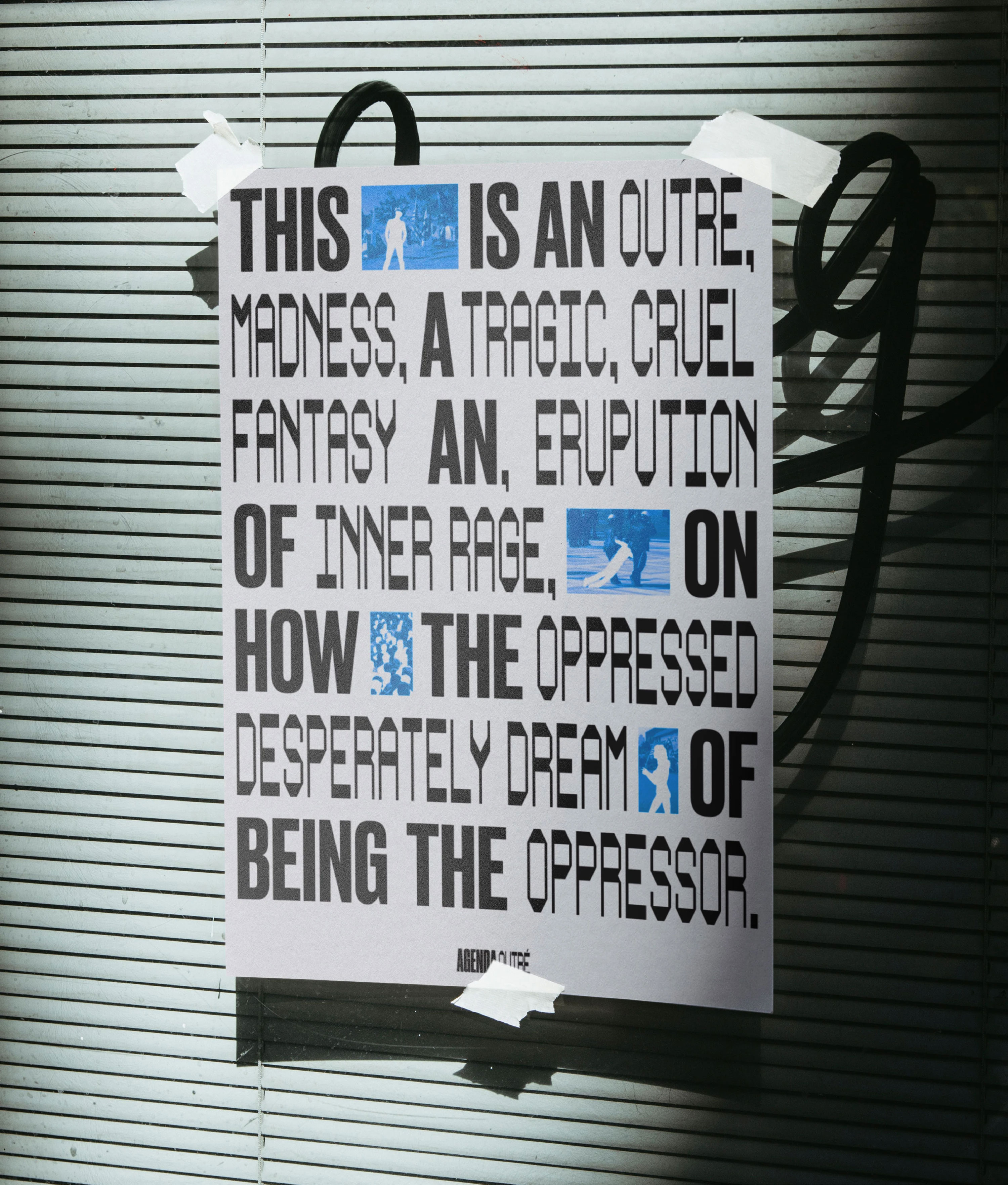
When cited by the Right, the opening sentence of Swift’s manifesto is always conveniently omitted. In it, Swift makes clear that the piece is satire, an “eruption of inner rage.” In designing this publication, I sought to channel that rage through design gestures and provocative imagery.
Image
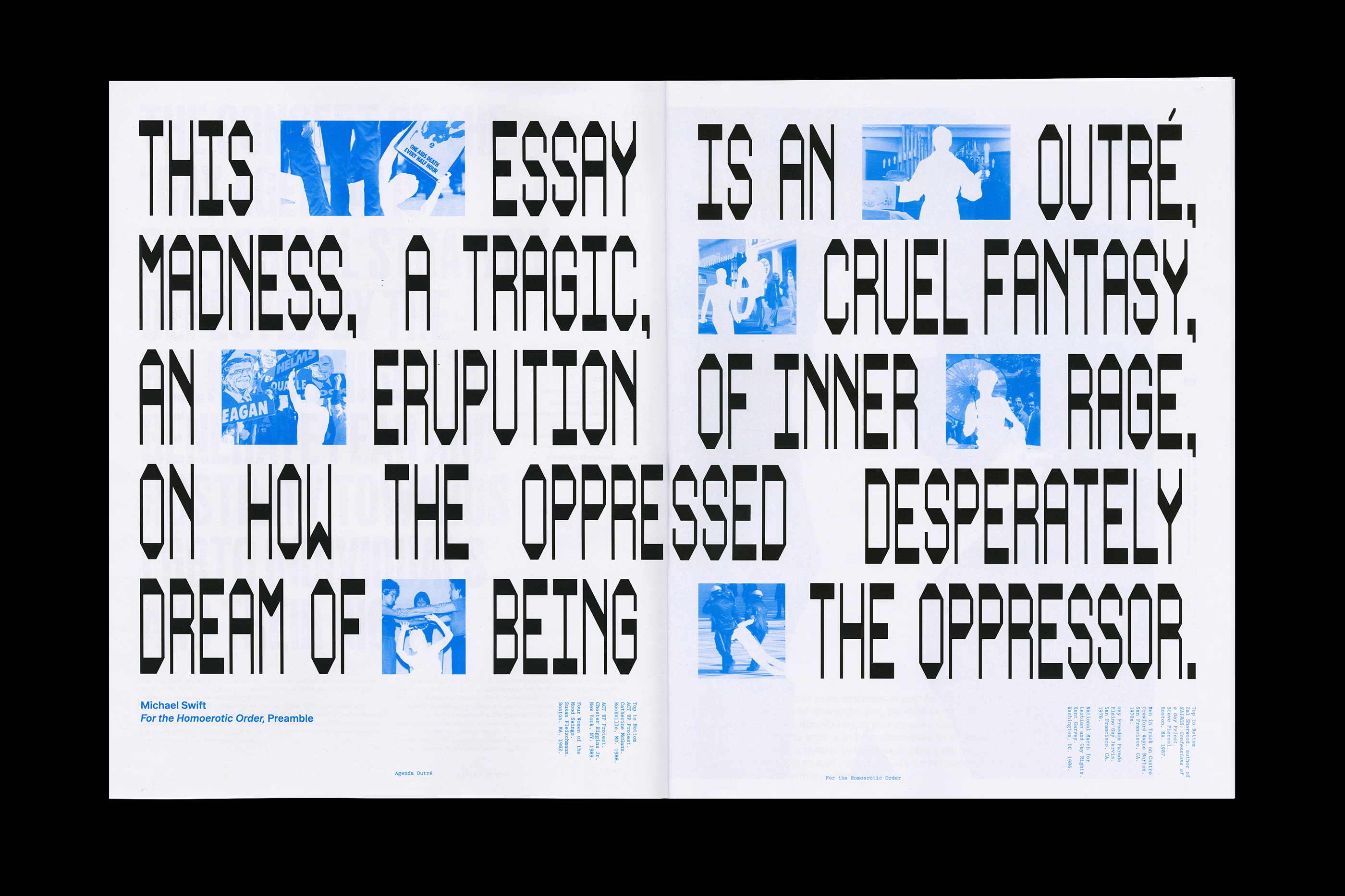
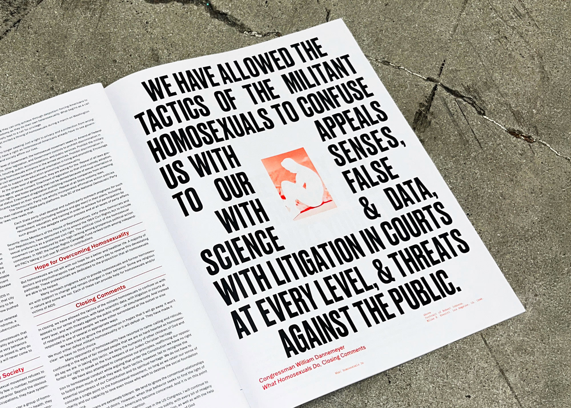
Swift’s manifesto was written during an era in which the queer community was largely ignored, and they were quite literally dying to have their voices heard. In drawing a visual parallel, I chose to erase their presence in images, leaving blank white space to signify their absence and loss.
Image
Video file
When conceptualizing how to treat the layout of the publication, I took inspiration from societal pressures. Content related to the voices of the queer community are pushed to the margins of the page, while material associated with the patriarchy and the Right remain centered.
Image
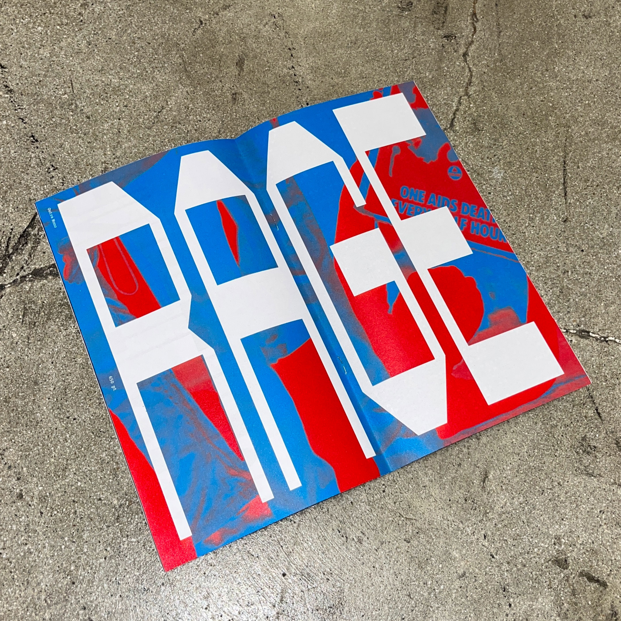
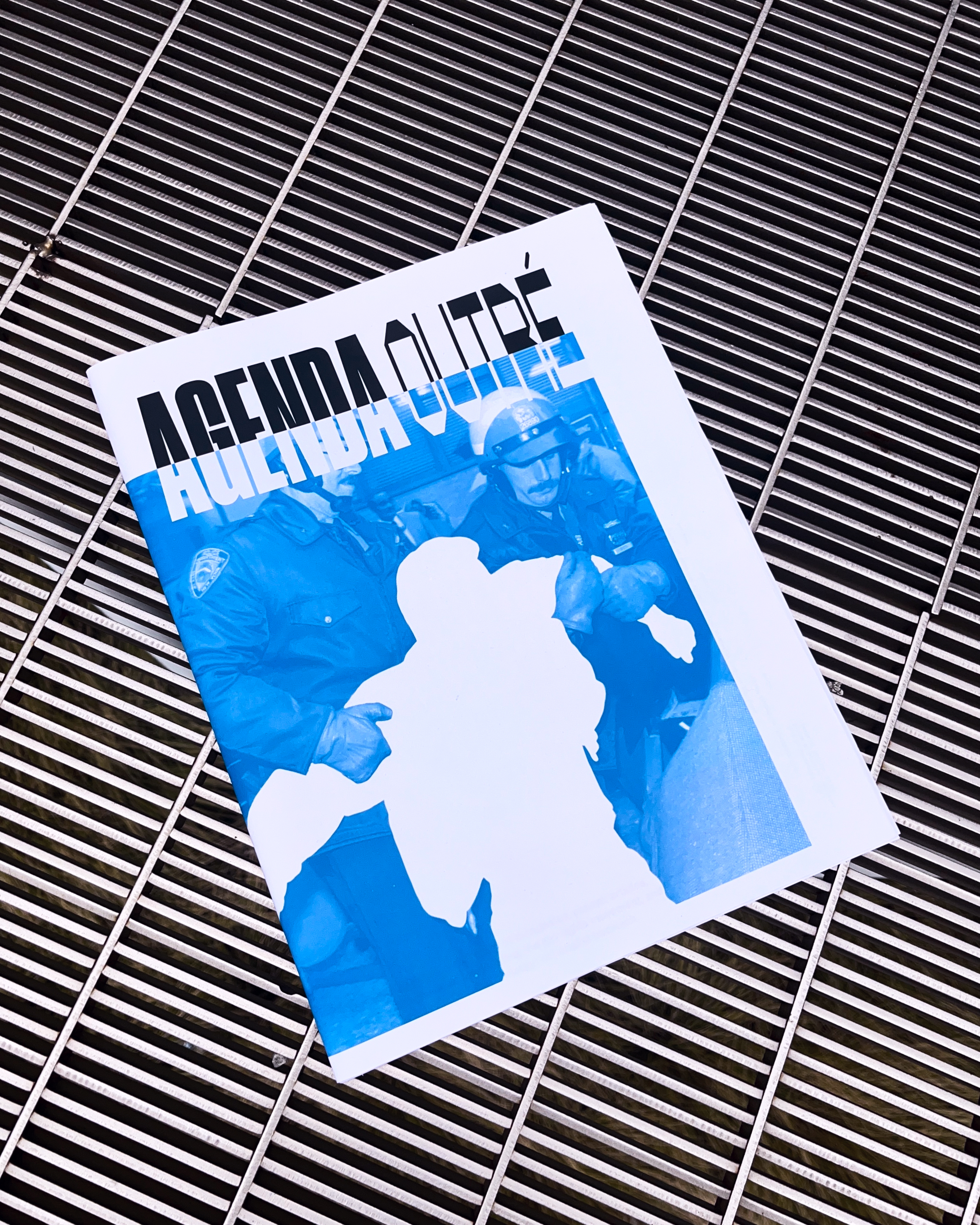
Directly inspired by the harsh language of Swift’s manifesto and the rigidity felt from living under oppression, I created a modular typeface that embodies the tightness and tension of that era.
Video file
With the specimen booklet, I wanted to test the limits of legibility within the typeface, making the reading experience more intensive as a way to force the viewer to engage with the text consciously.
Image