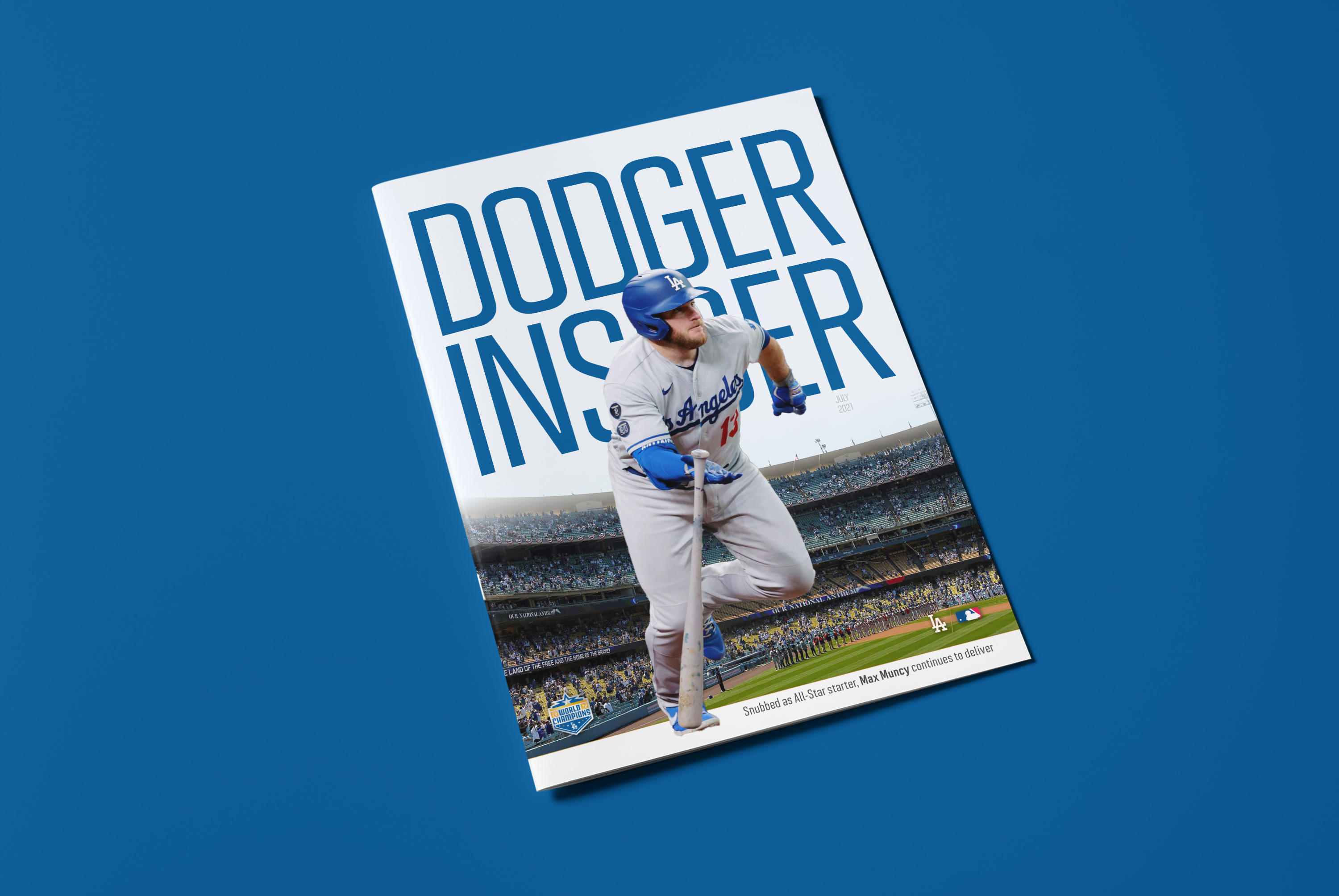
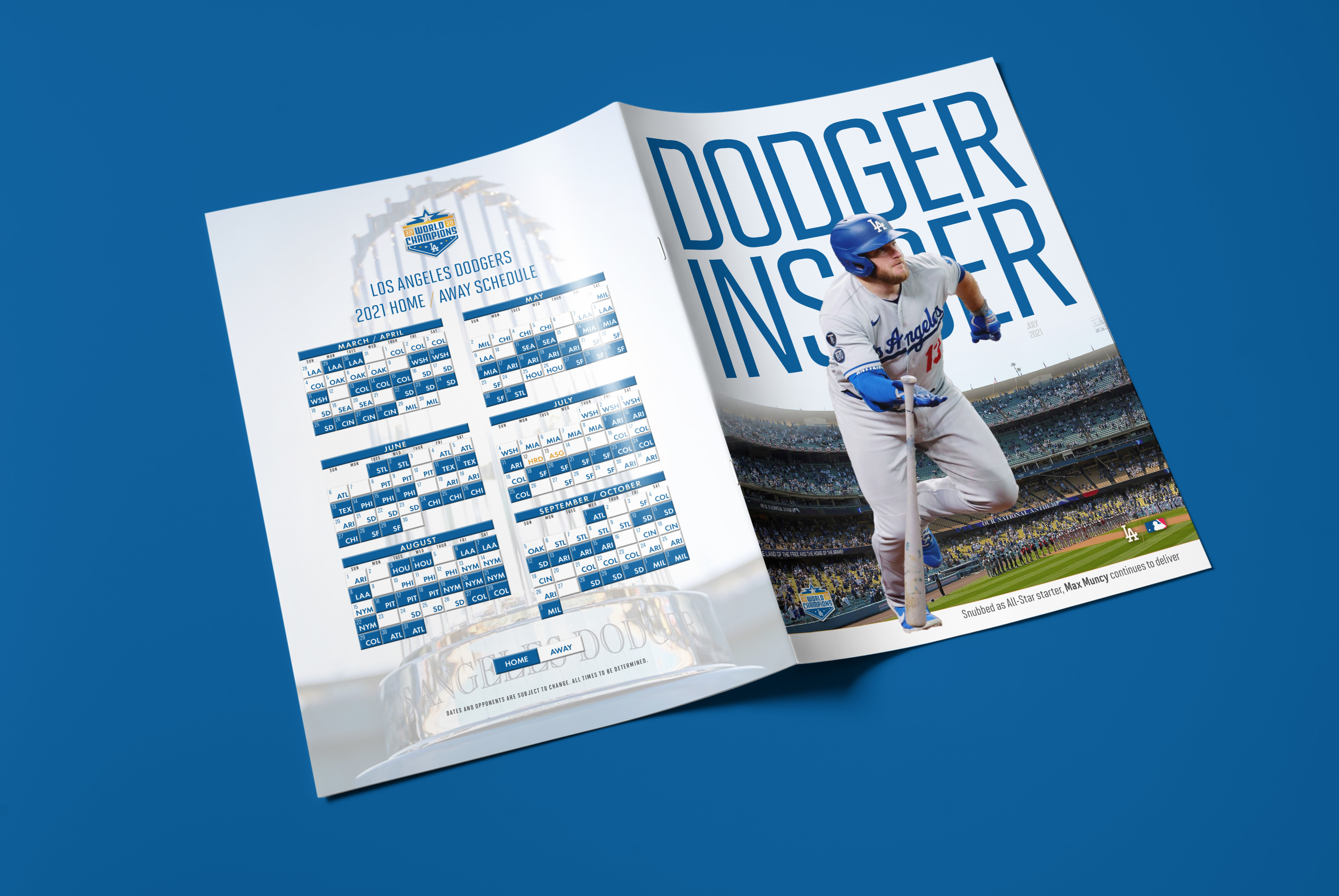
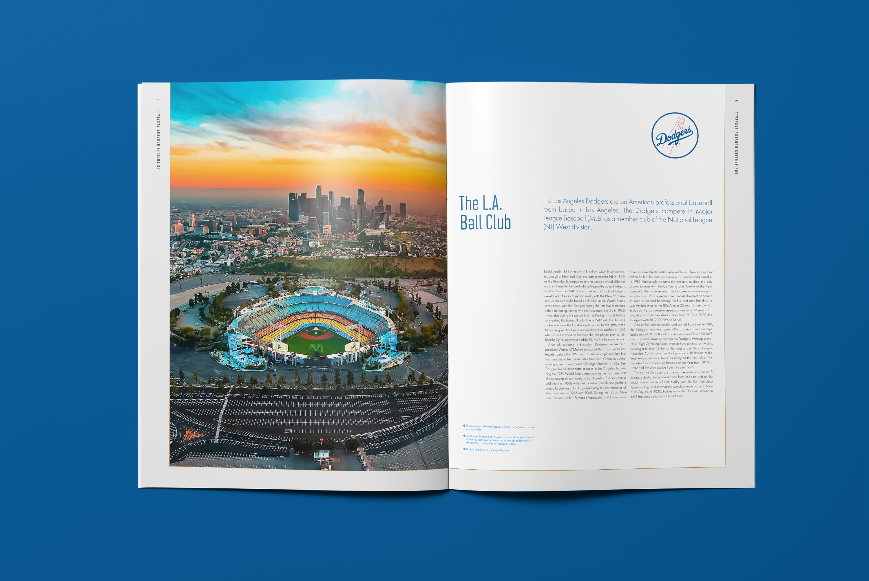
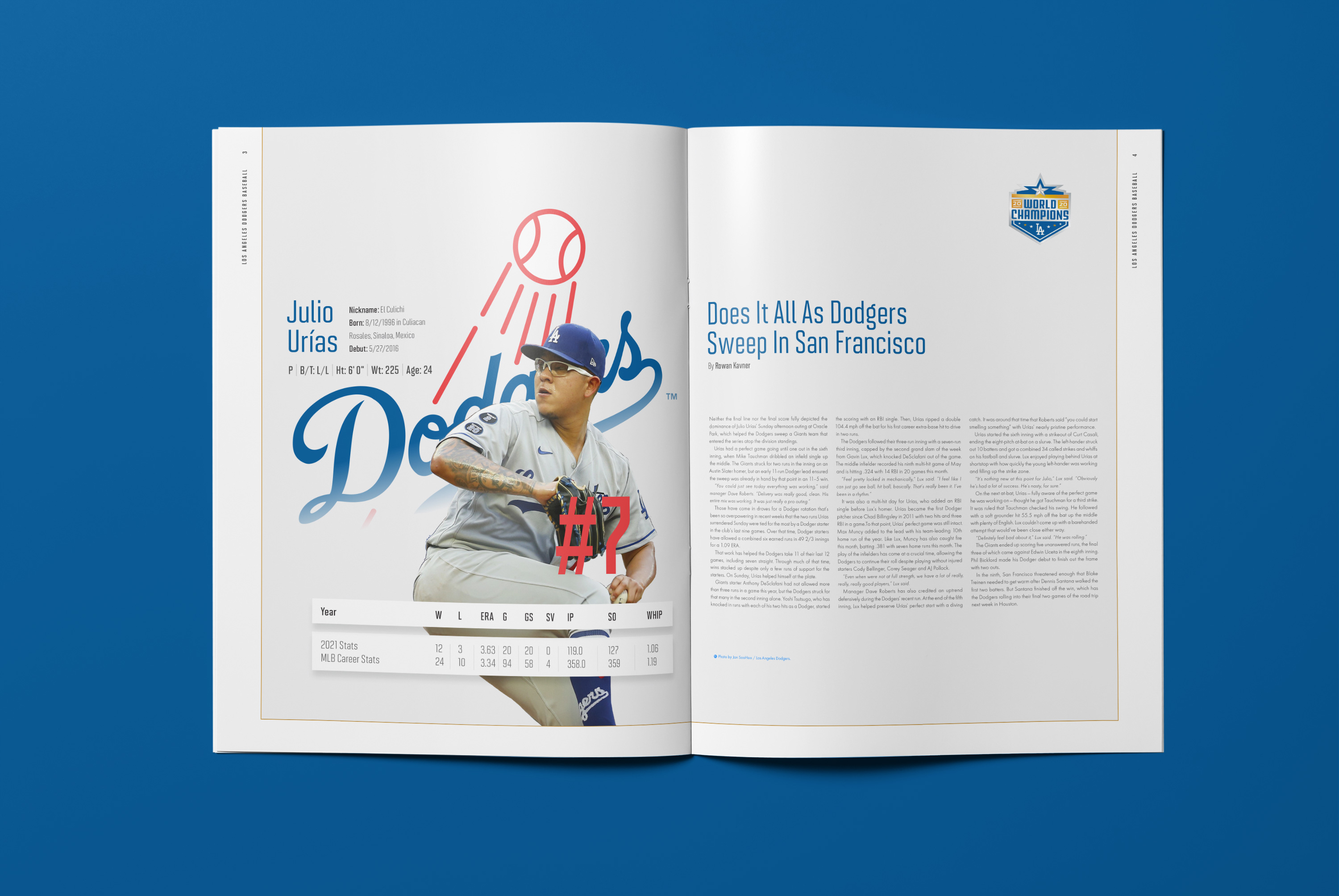
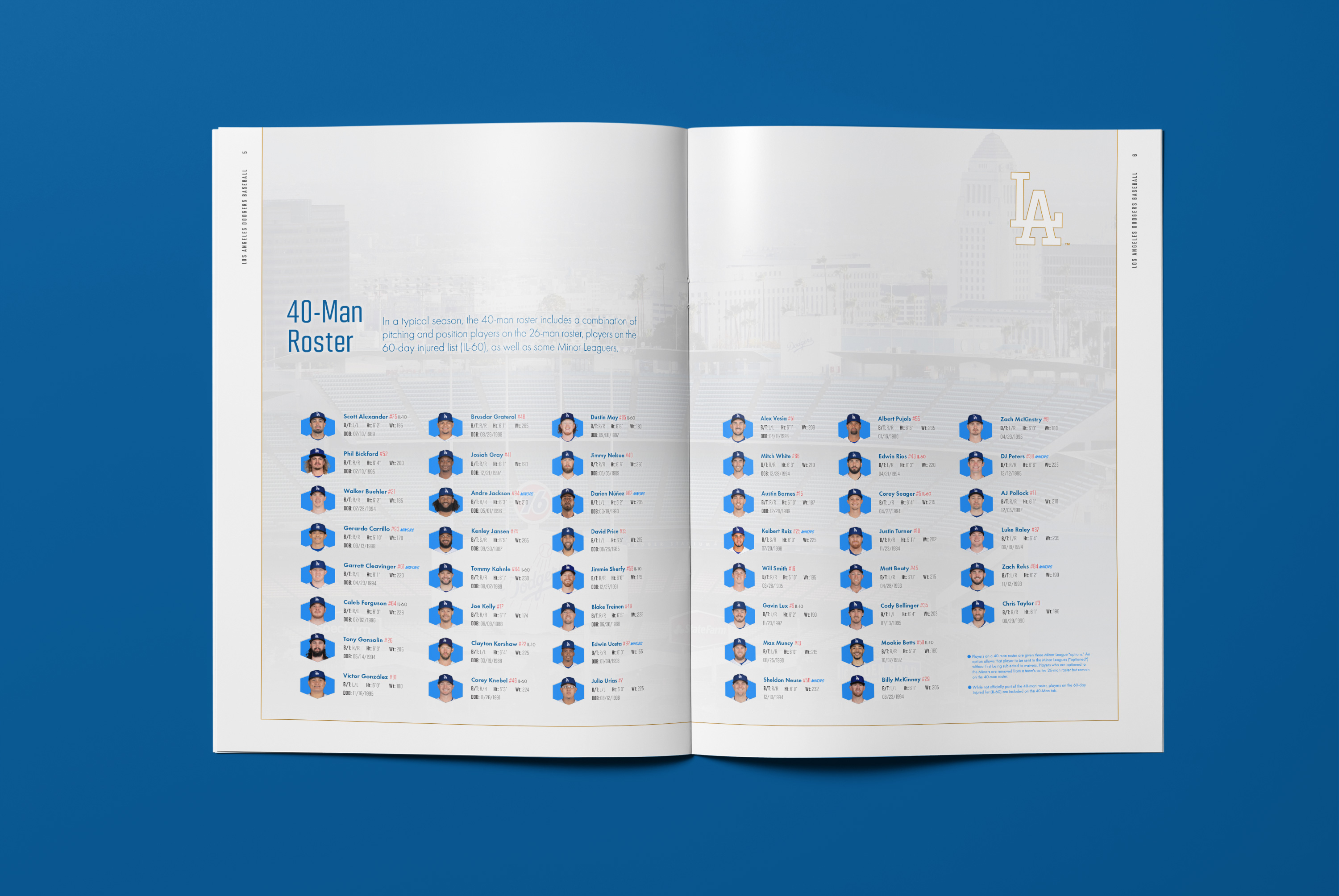
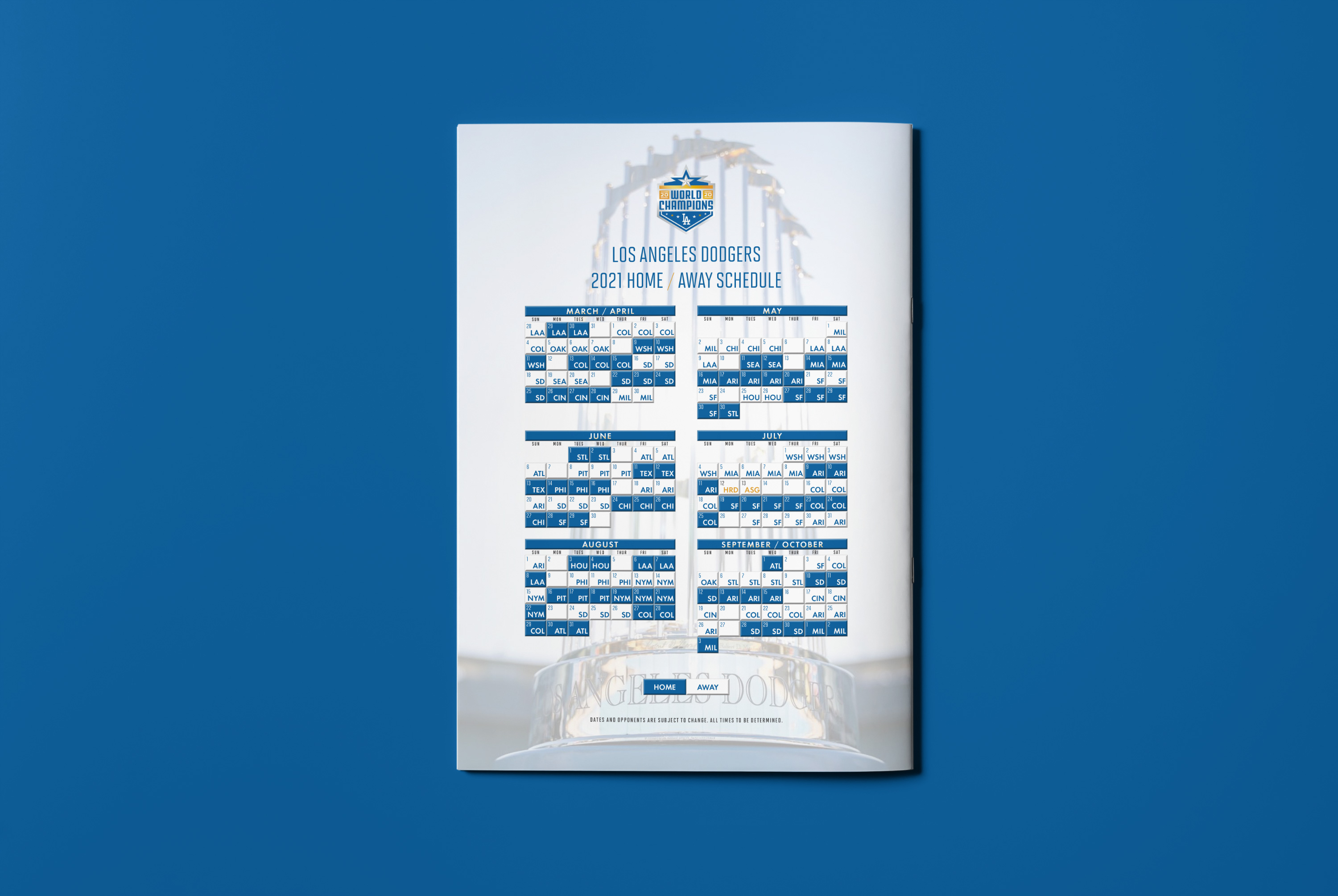
For project two in Type 3, our class was assigned to design a 4 page text-heavy publication for an art/sport event. It included: 1. front cover (title, intro and image) 2. inside spreads 3. Schedule of the art/sport event including detailed information about the subject (i.e., venue, ticketing, pricing.) 4. Images as secondary to the text. My project chosen was a re-design of the Dodger Insider, the official magazine of the Los Angeles Dodgers. It releases about 12+ issues featuring team news.
Learning Outcomes:
Design for sports entertainment was tougher than expected (especially when your instructor is a big yankee fan, ha!) When the subject matter is sports, the typography has to carry a certain aesthetic and finding the right type treatment can be tricky. Imagery posed a challenge of itself where I didn't want it to look like an advertisement, so player clippings and retouching helped. Another thing was if you want it to look pro, you're going to need some design assets other than just a team logo.