MFA in Graphic Design - 3 Yr Path — Graduate Graphic Design
Course:
Grad Type 4
Faculty:
Gloria Kondrup
Term:
2025 Spring
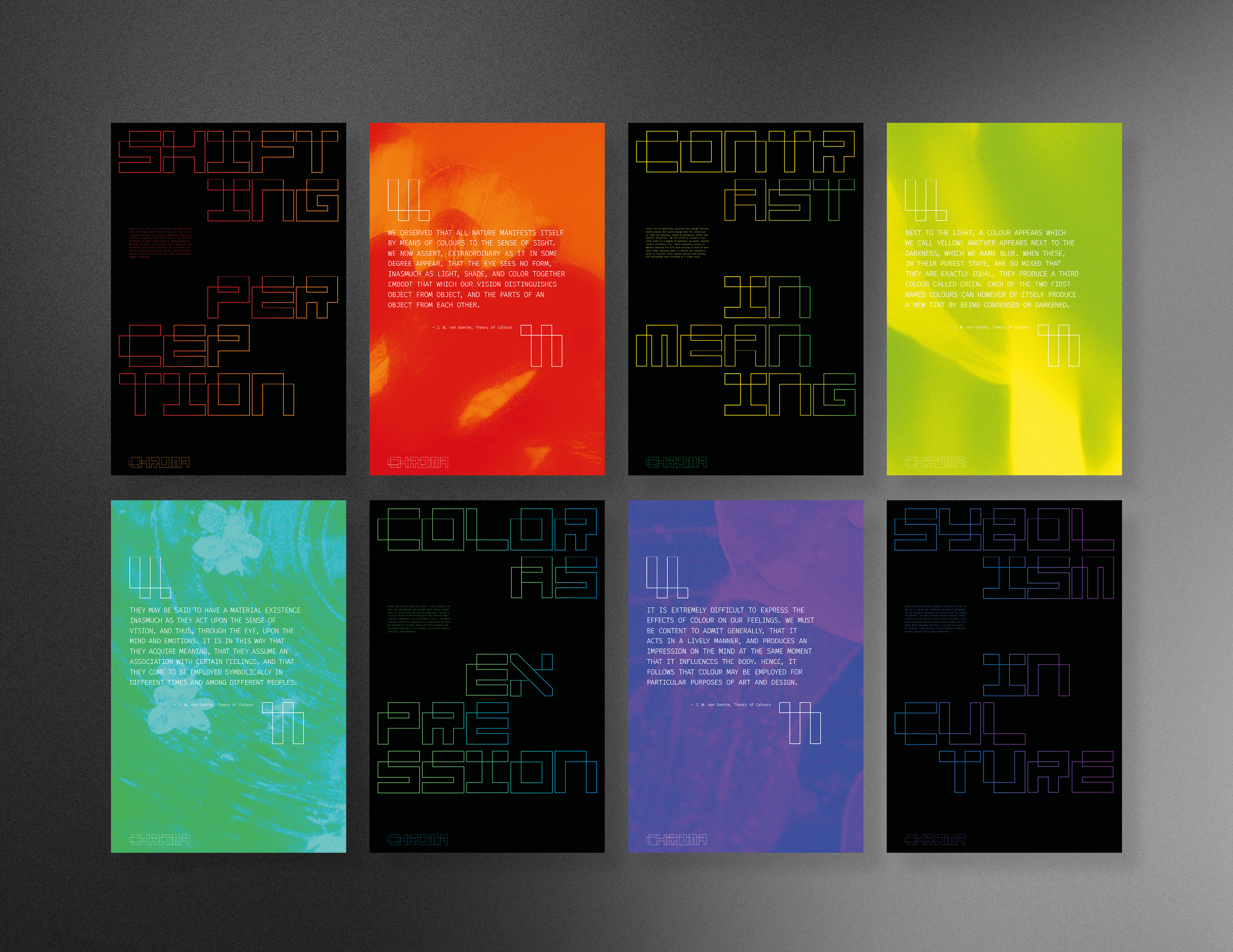
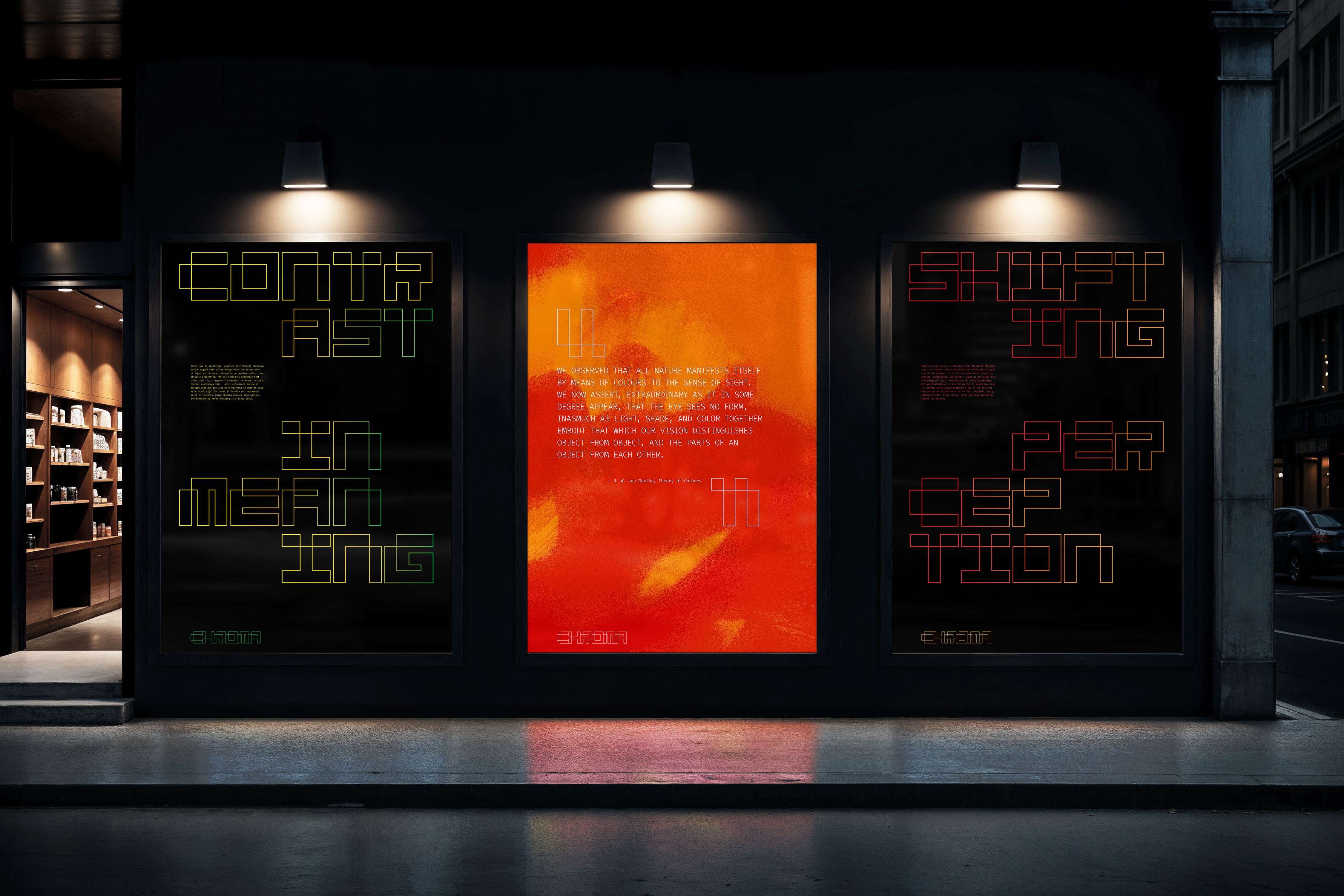
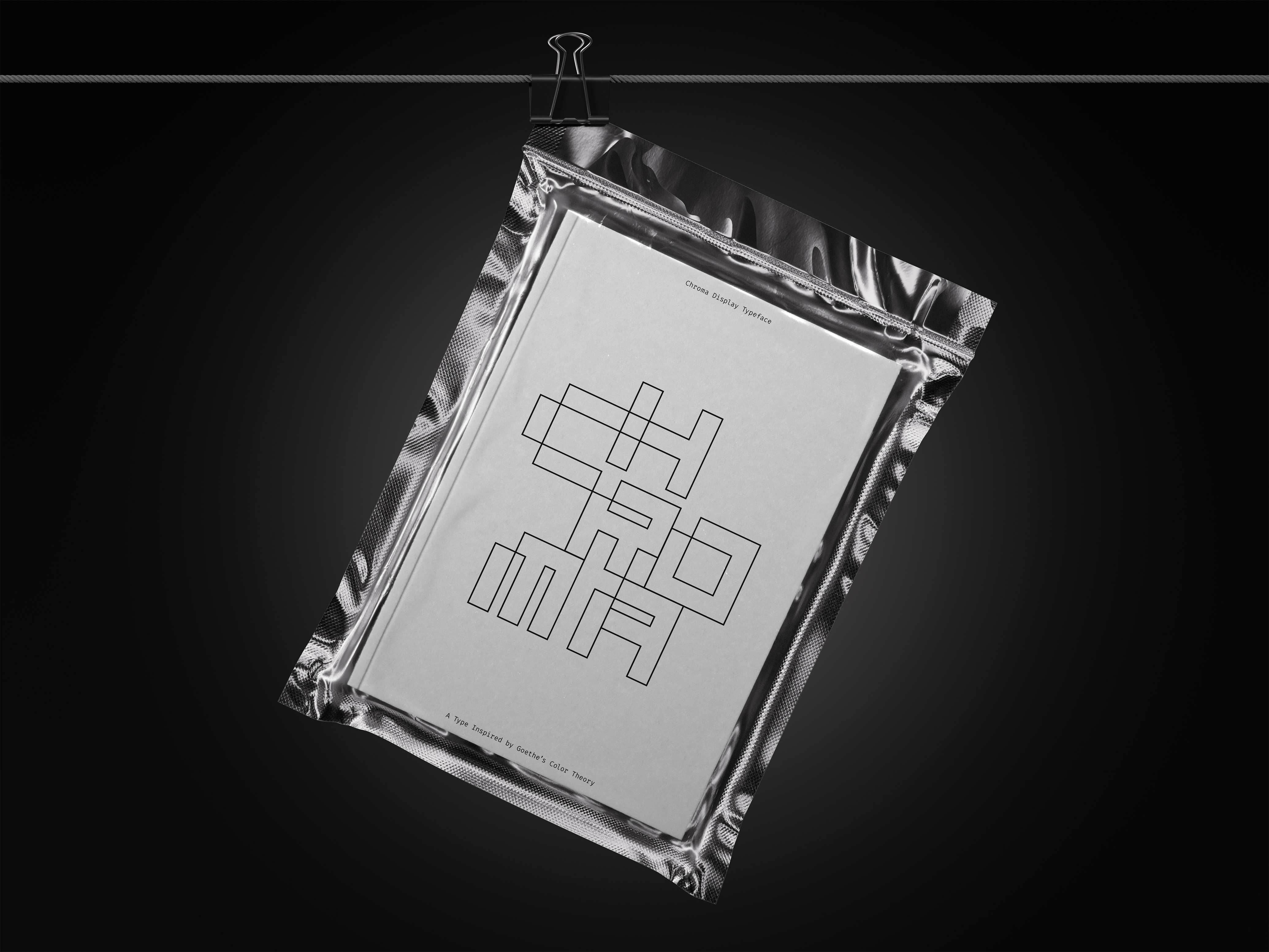
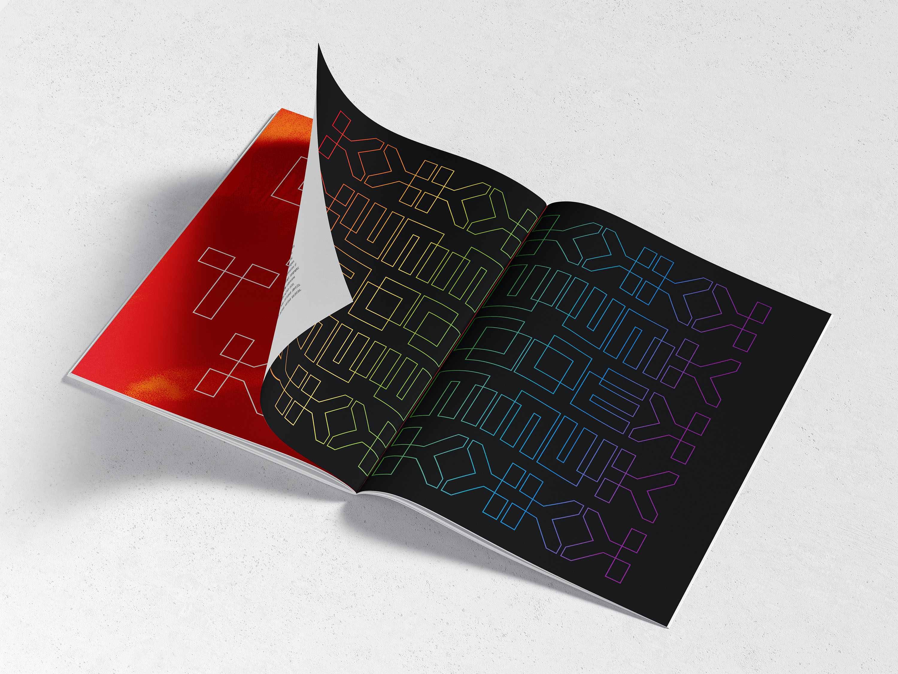
Chroma
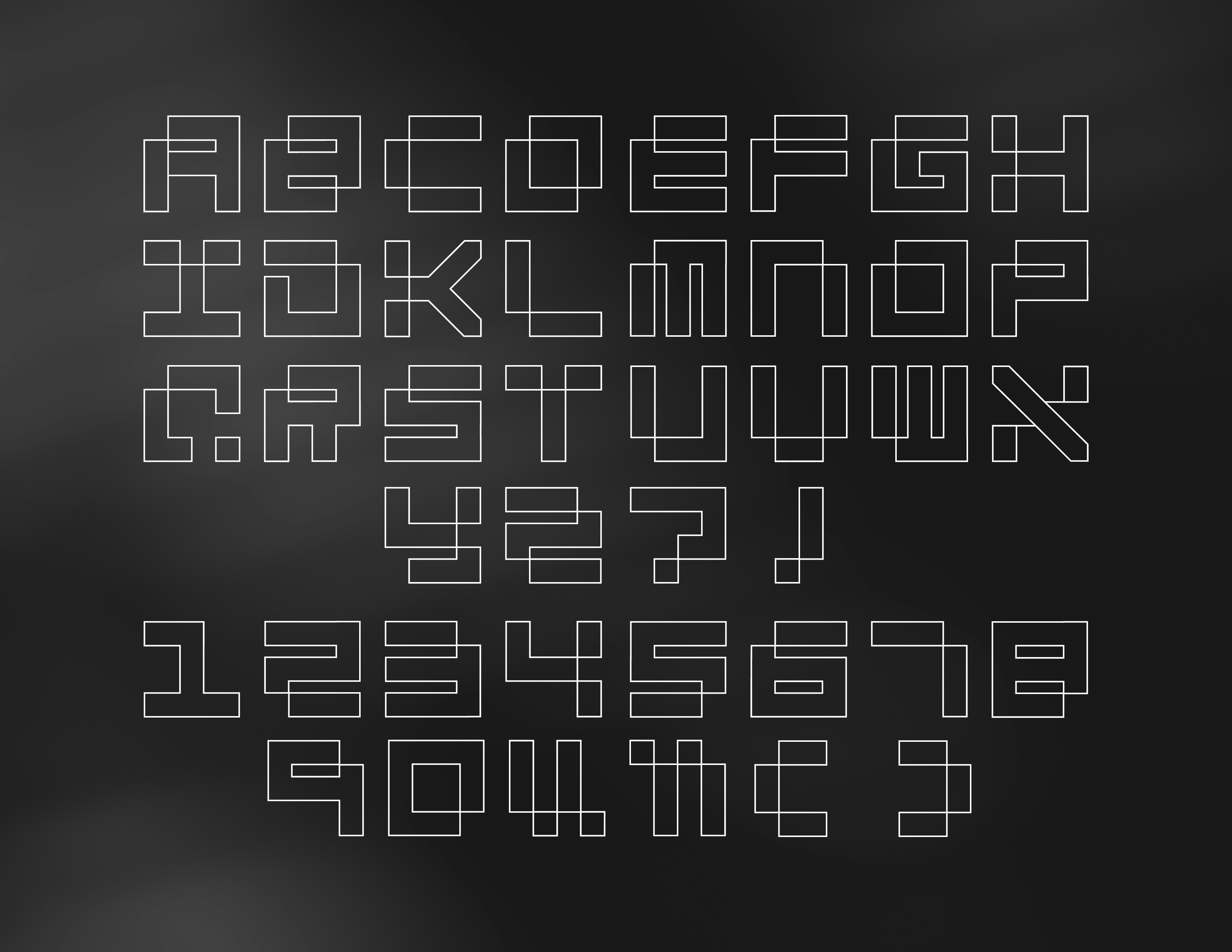
Color is often treated as fixed and objective, but its meaning shifts dramatically depending on perception, culture, and context. In visual communication, this complexity is frequently overlooked—leading to oversimplified uses of color that ignore its symbolic and emotional depth. There’s a need to re-express color as a relational, cultural, and perceptual experience rather than a static visual property. CHROMA is a custom typeface I designed based on Goethe’s manifesto. Goethe believed that color doesn’t exist on its own—it’s shaped by how we perceive it in context. So, color is always changing depending on light, shadow, and cultural interpretation. I brought that same idea into the typeface. Each letter is built from lines that connect and interact with one another. It’s not just about a continuous stroke—it’s about how the lines relate and overlap. That interaction reflects how meaning comes from relationships, not isolated parts.
Instead of filled shapes, the outline structure makes the letterforms feel open and flexible—like a framework. Goethe said we don’t just see color—we experience it depending on where and how it appears. These letters work the same way. Their meaning and visual weight come from how they exist in space, not from being solid.