Image
Image
Image
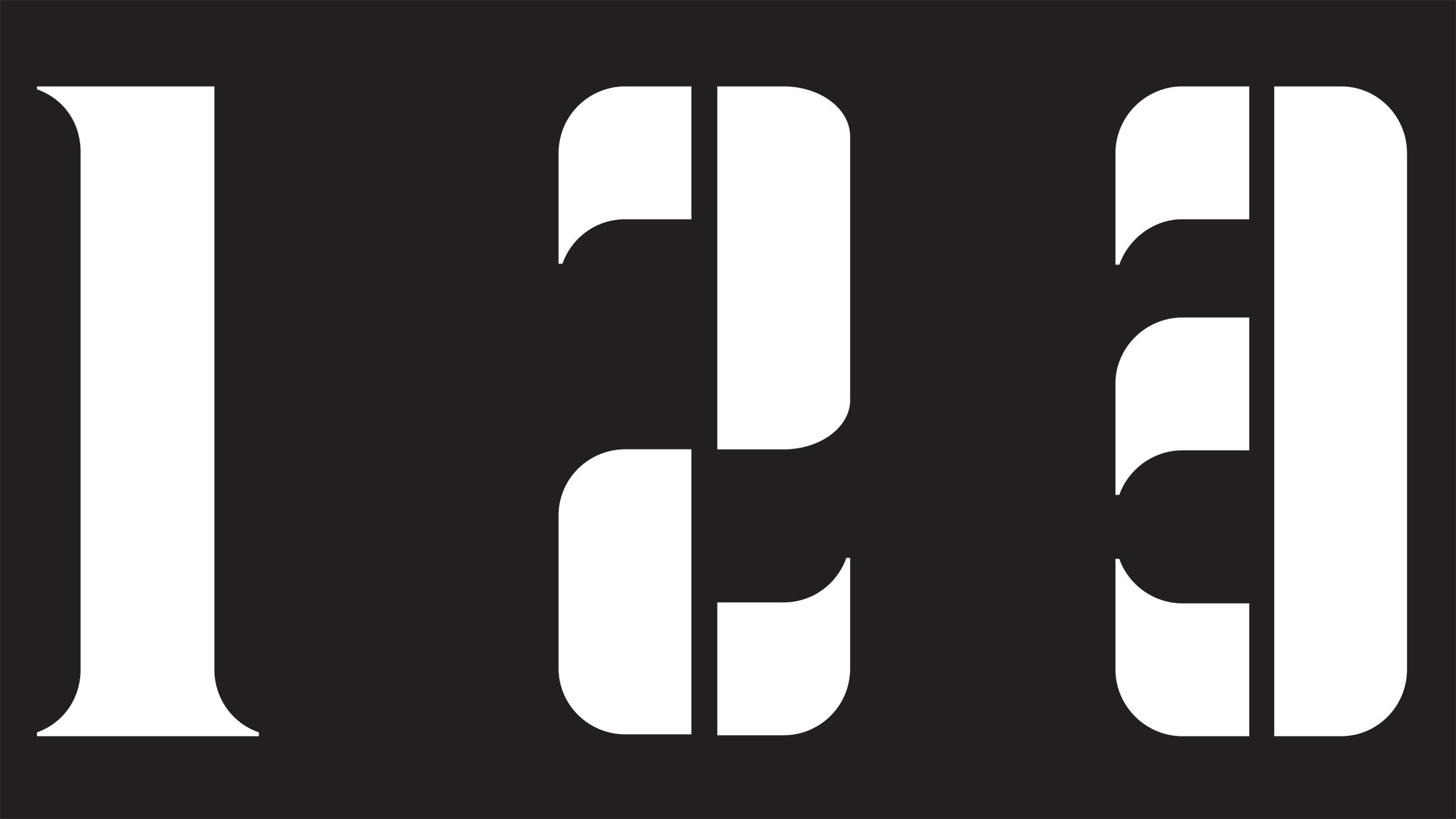
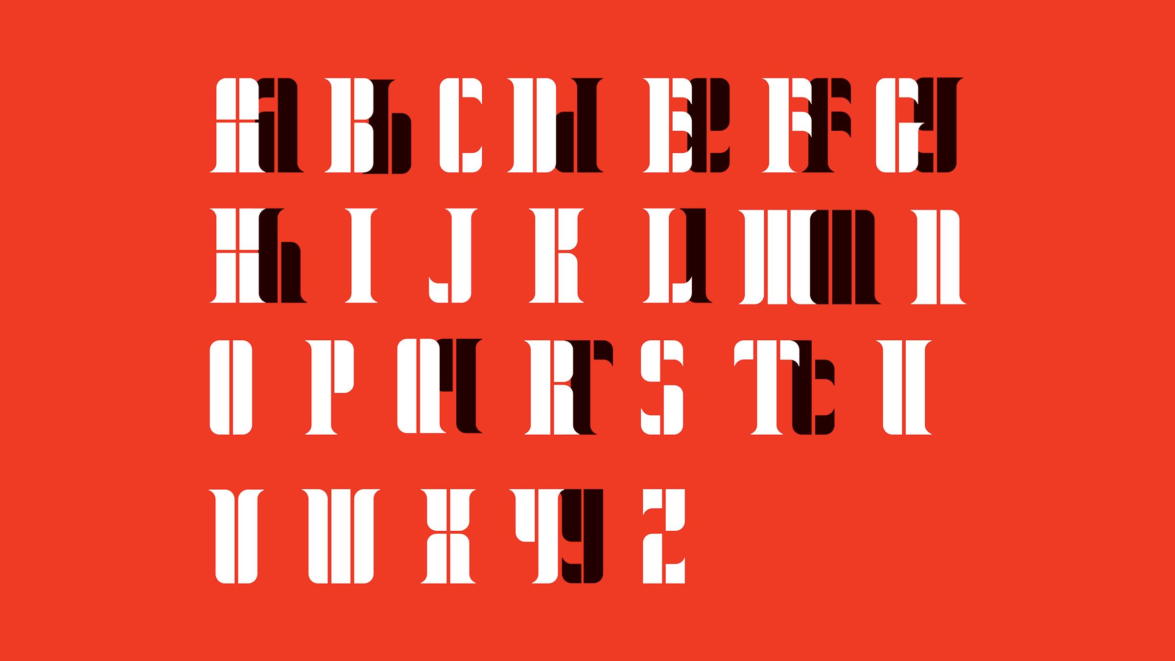
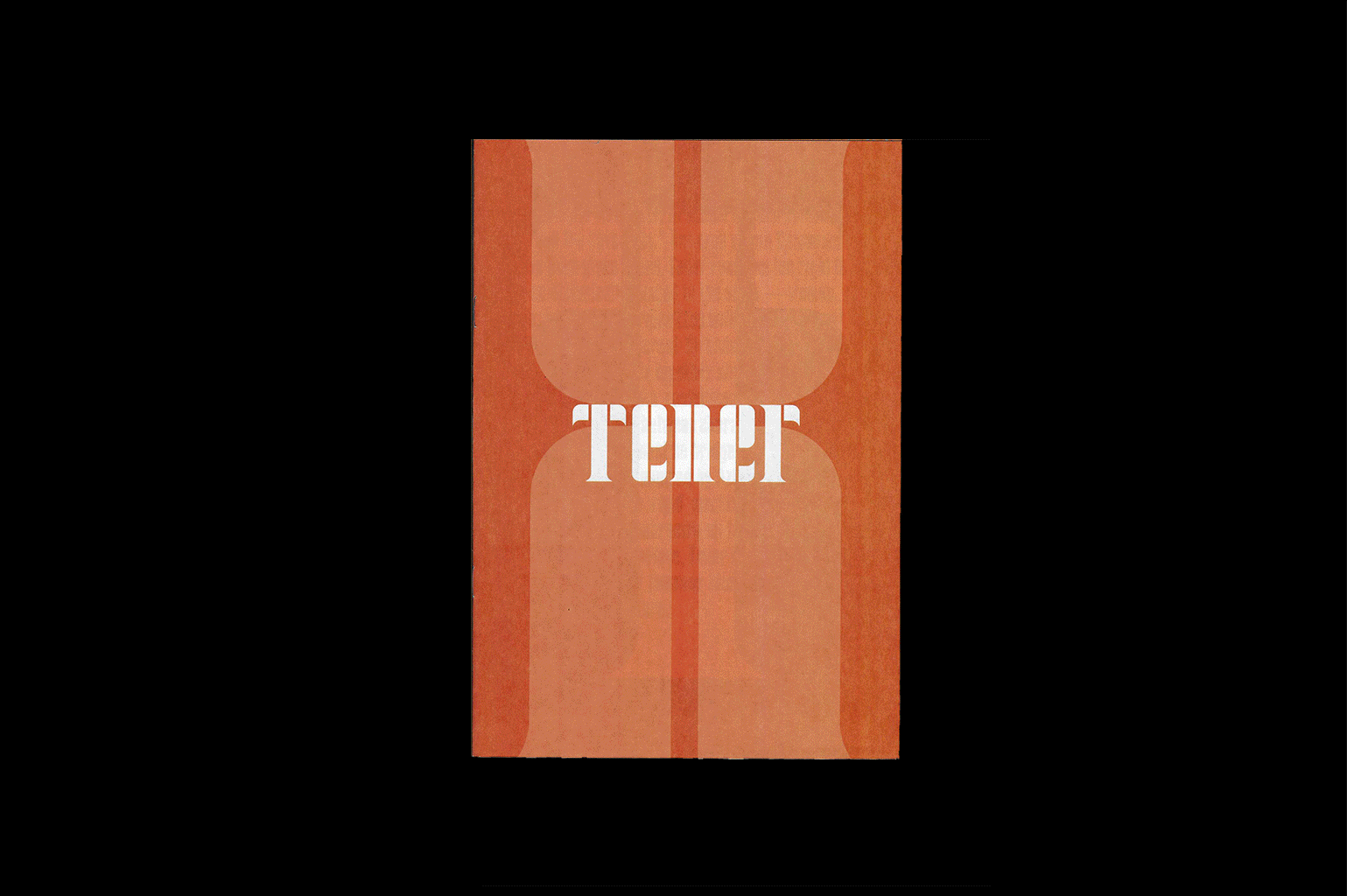
In the development of the typeface, I drew inspiration from protest posters representing the have-nots and needing to fight for rights, and Aztec symbols representing the haves and owning a unique identity and culture. The intentional spaces between characters reflect the gaps in representation, ones that must be acknowledged; voices that must be heard to form a strong foundation for the future. Tener weaves together structural precision and fluidity, a symbol of both resistance and transformation.
Image
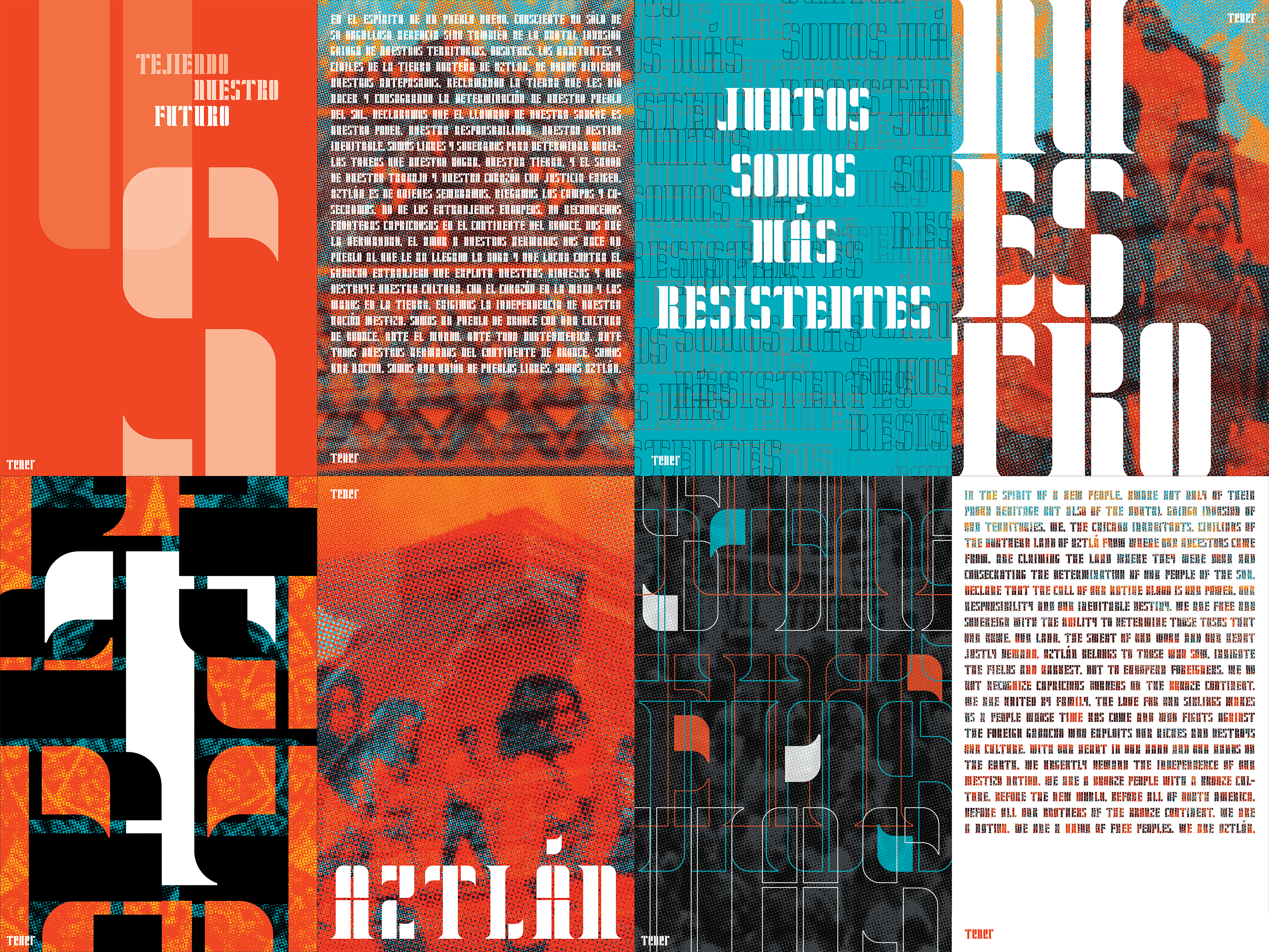
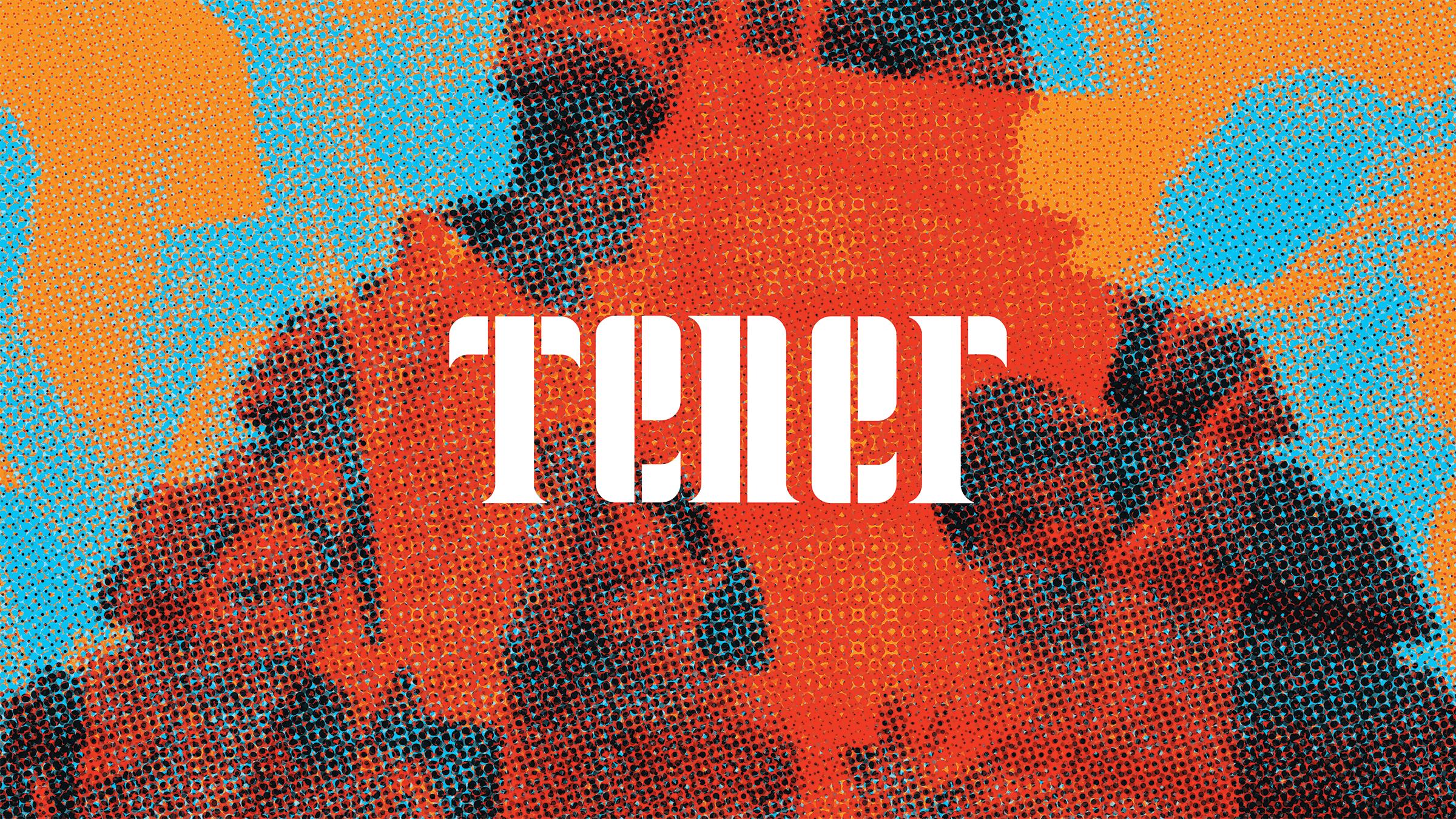
Leaning into the visual references of Aztec textures, I created an identity that honors complex Chicano history while envisioning a united future. I arranged the typography to look woven together, overlapping to show how intertwined Chicano identities are to one another. I drew on weaving metaphors to guide viewers in understanding the collective strength it takes for threads to form a strong, resistant fabric. Similarly, I used a halftone pixelation in my image treatment to mimic the aforementioned fabrics. Paired with the bold type treatments and color choices, this identity calls for both attention and action.
Image
Image
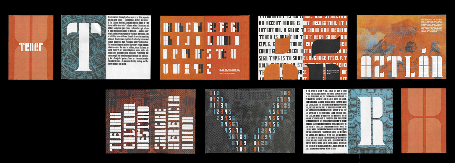
The colors were chosen based on those that had the most significance to Aztec culture. Blue was seen as a life-giving color, important to agriculture and sustenance. It represents the idea of having the things necessary to live abundantly. Red was a symbol of life, war, and blood, and represented the sun’s energy. Here, it represents the have-nots and the constant battle for freedom. The two work together as a message to Chicanos that we’re powerful when we stand together. Designed in both English and Spanish, the identity’s voice speaks to all Chicanos, regardless of language. It emphasizes the power of unity by using phrases anchored in the idea of Aztec stitching.