Image
Video file
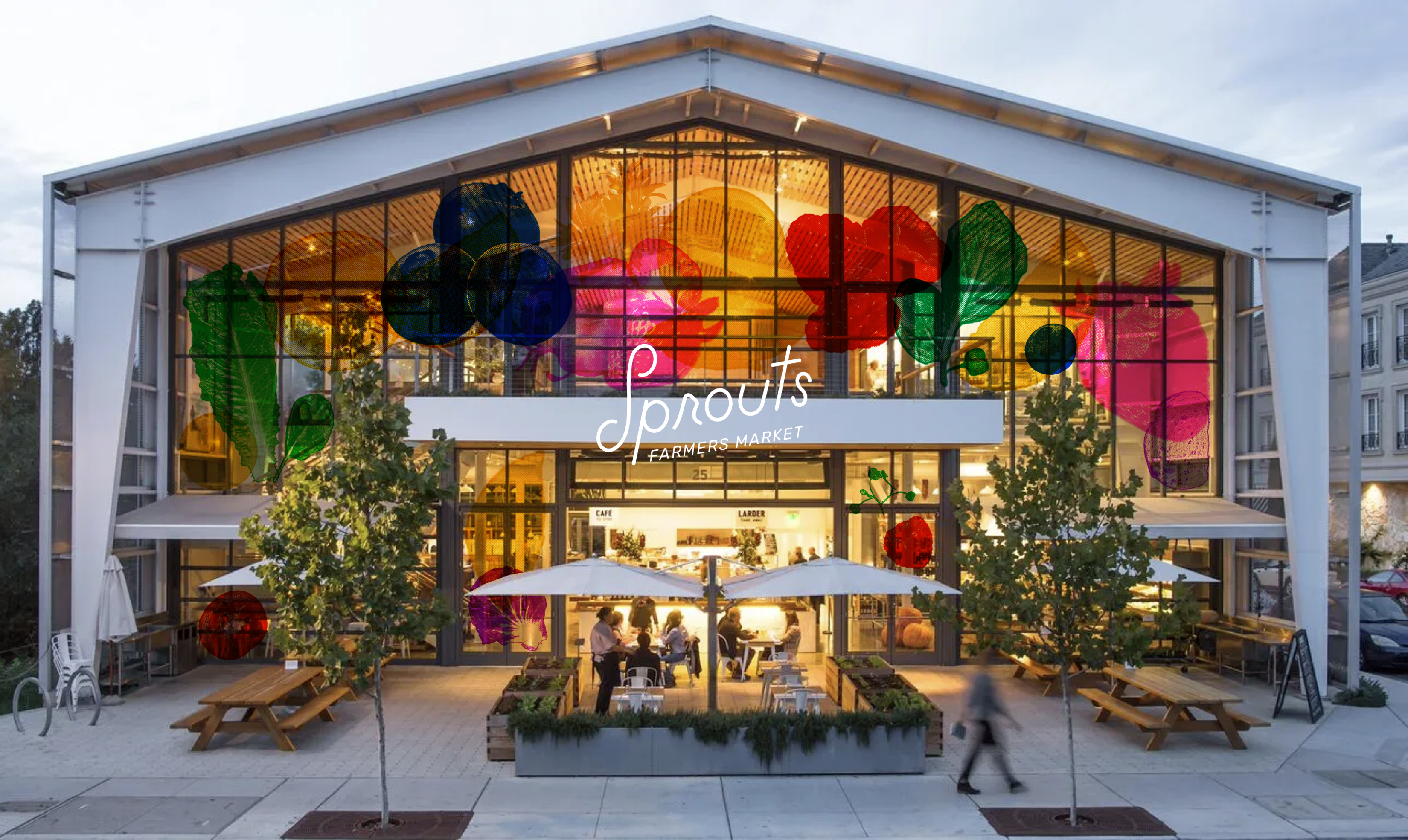
An iconic heritage revived and redrawn.
Image
In order to preserve the heritage and approachability of Sprouts Farmers Market, I reinforced its position as a community-oriented, caring, trustworthy grocer by creating a hand-drawn monoline logo to preserve an approachable look and feel, while maintaining the friendly and enthusiastic demeanor of Sprouts.
Image
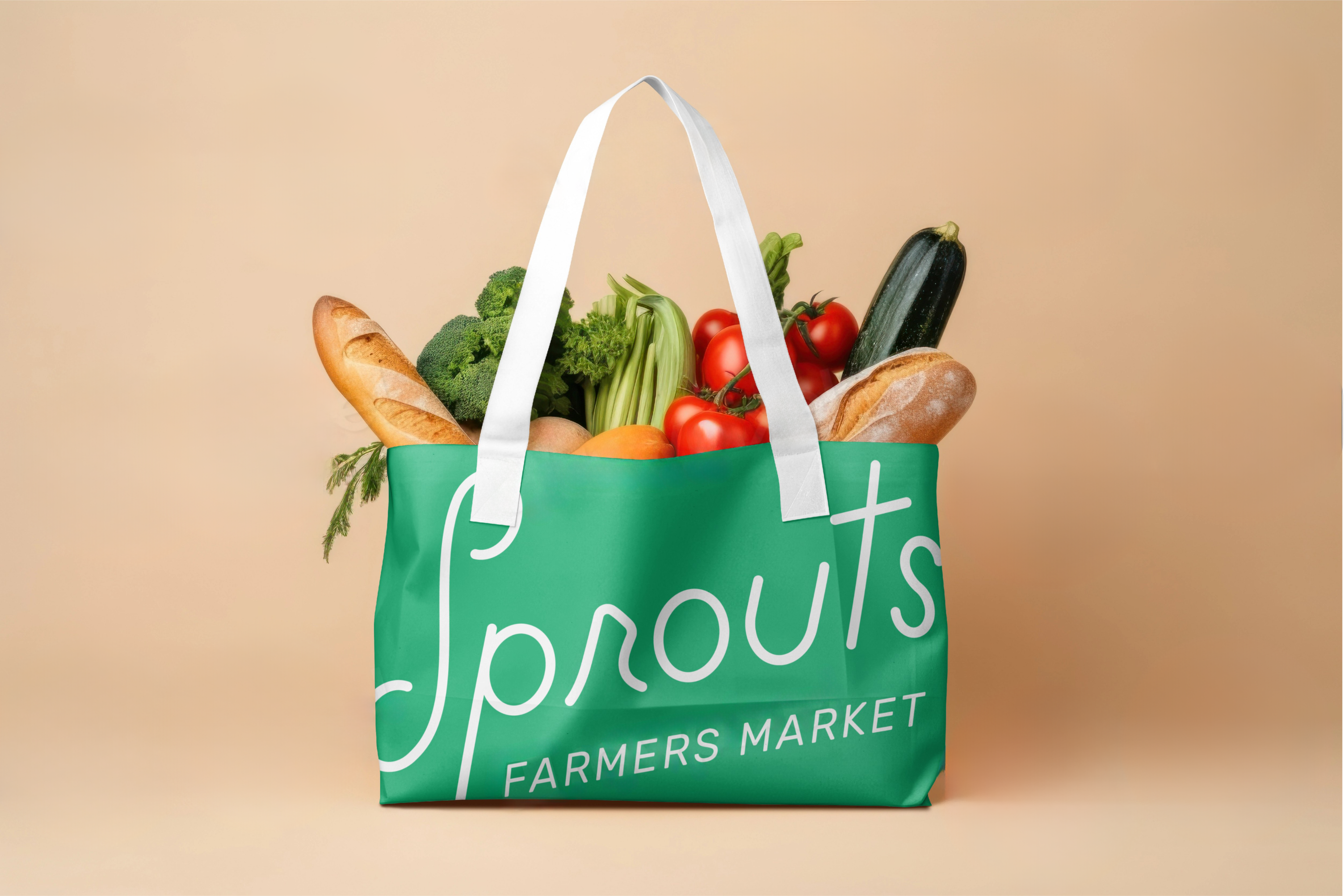
Sprouts' commitment to wholesome, honest food inspired a typographic direction that feels personable and genuine. As a result, I created a hand-written typeface that reflects the tactile, human quality of fresh produce and farming, grounding the brand in trust and approachability.
Image
Image
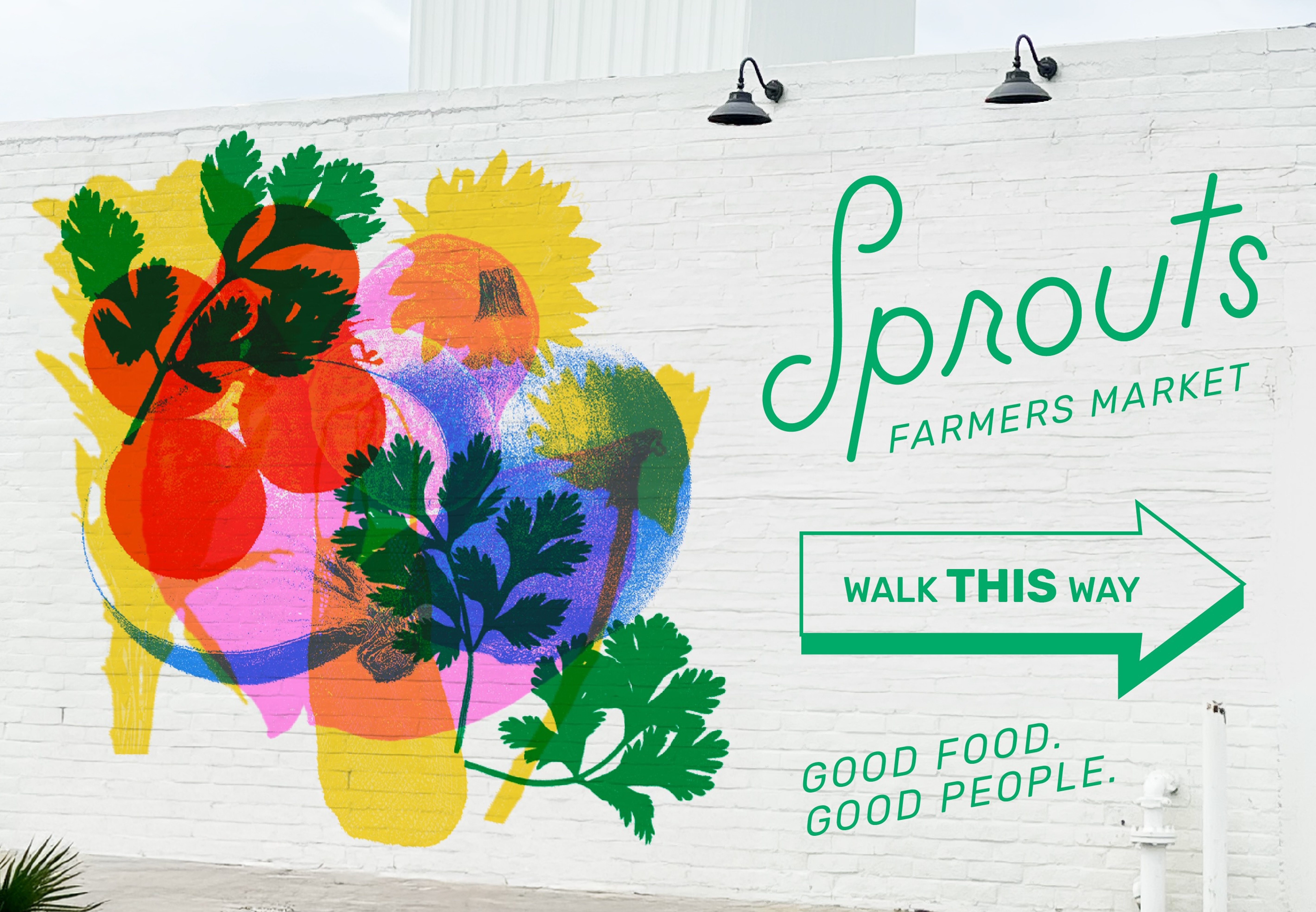
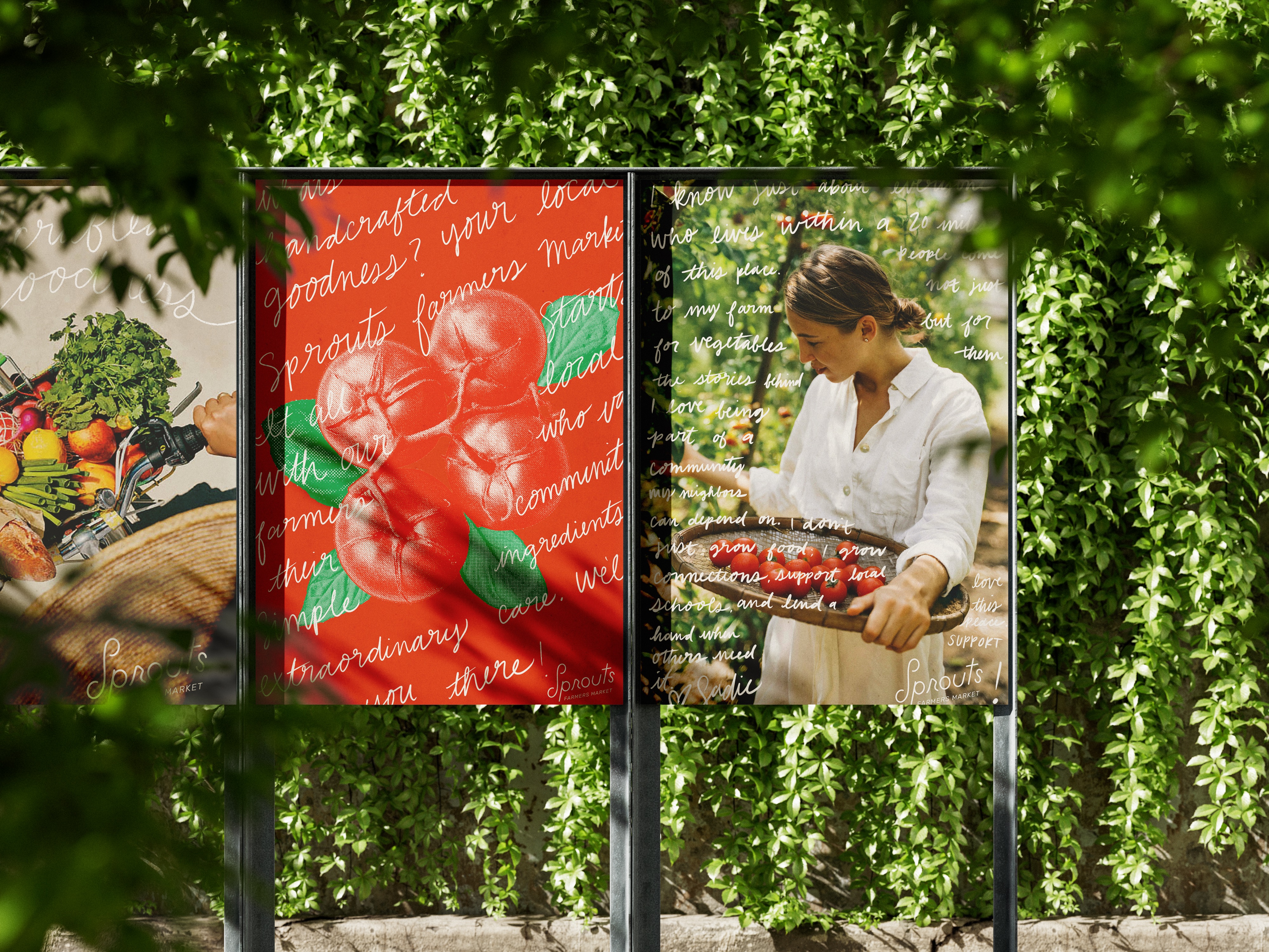
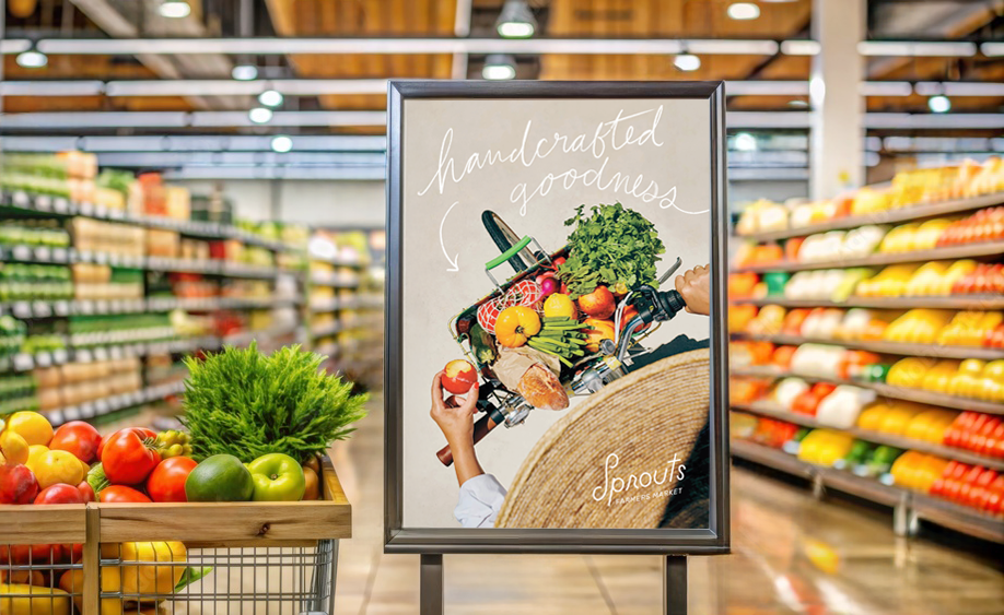
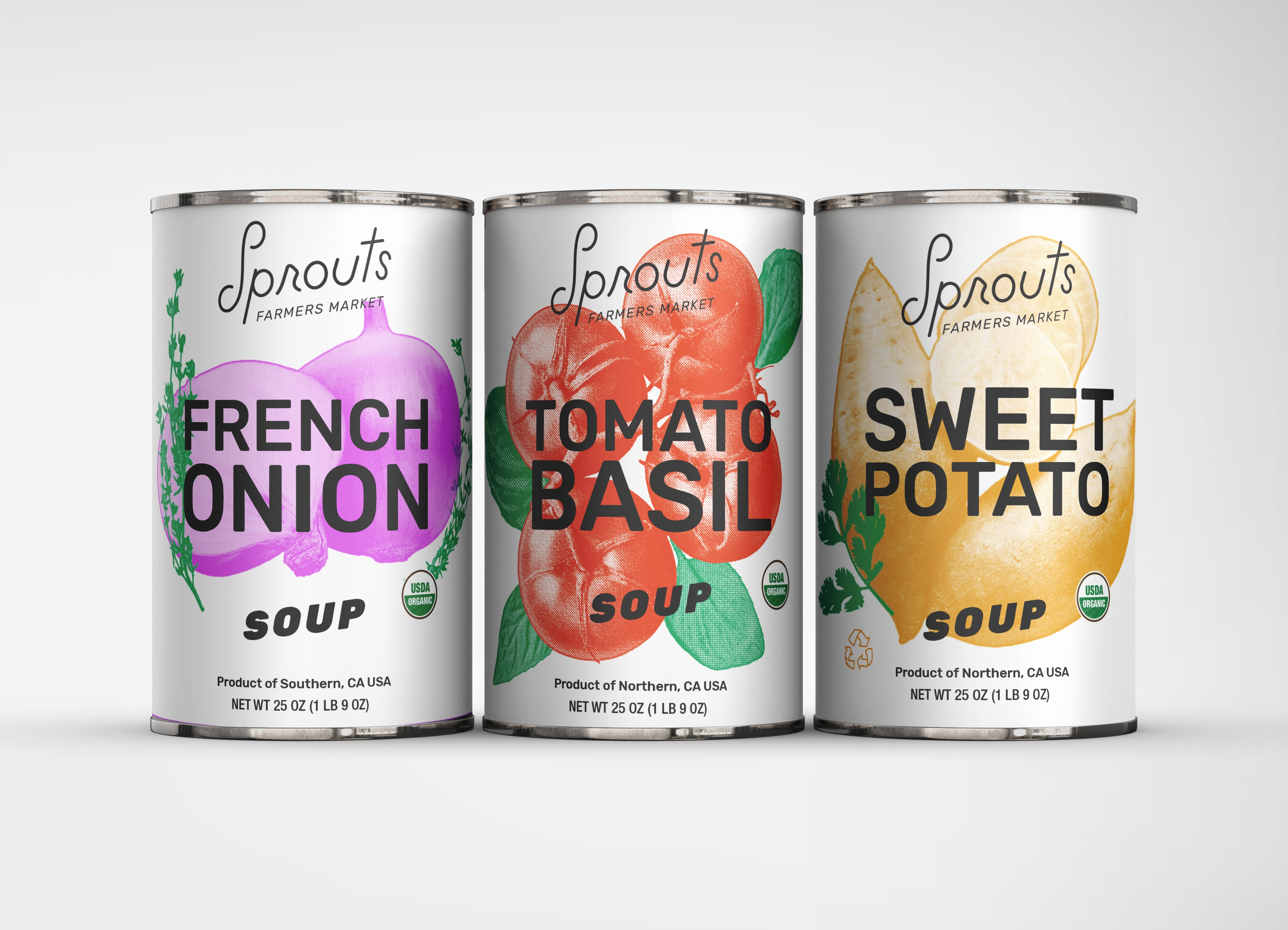
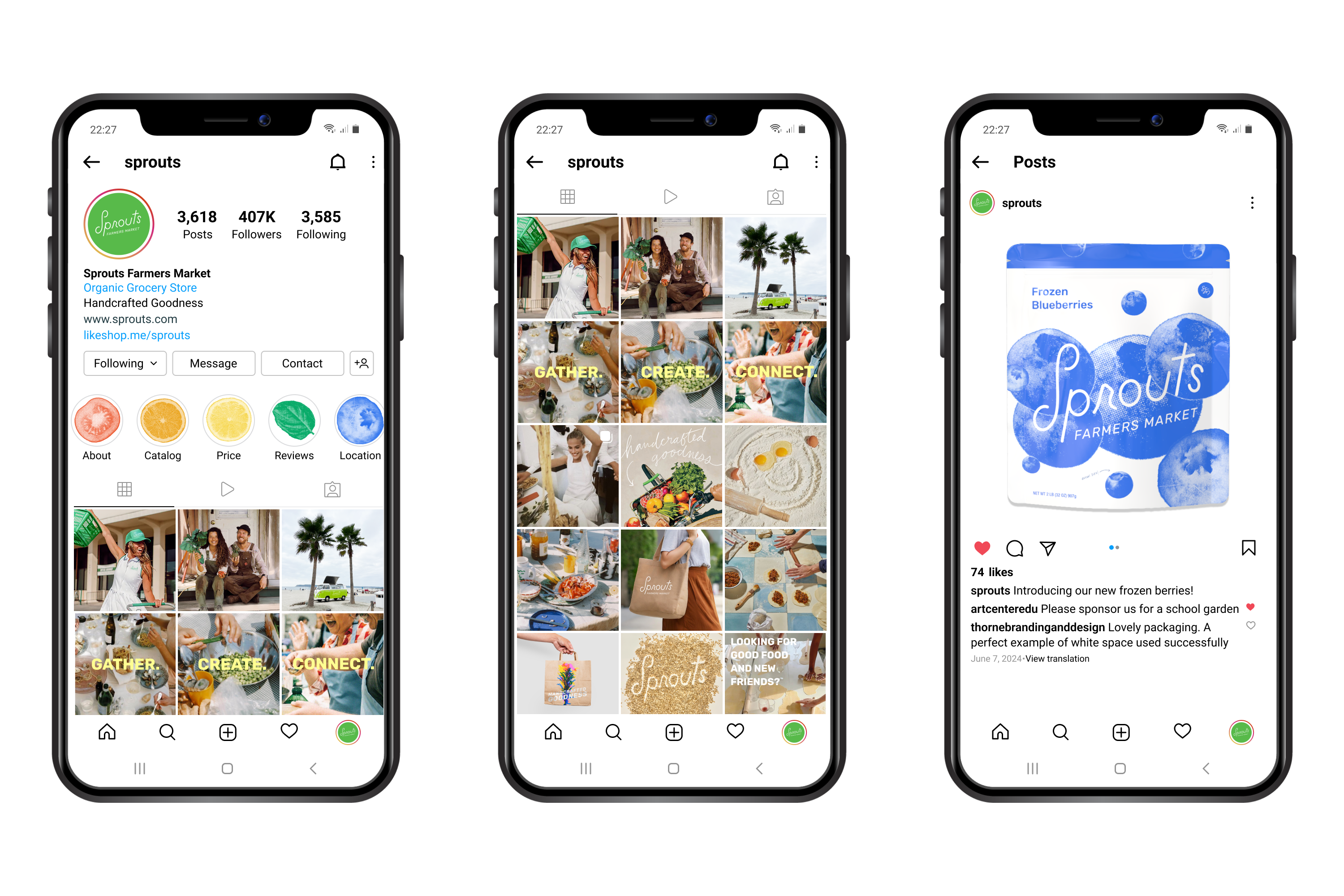
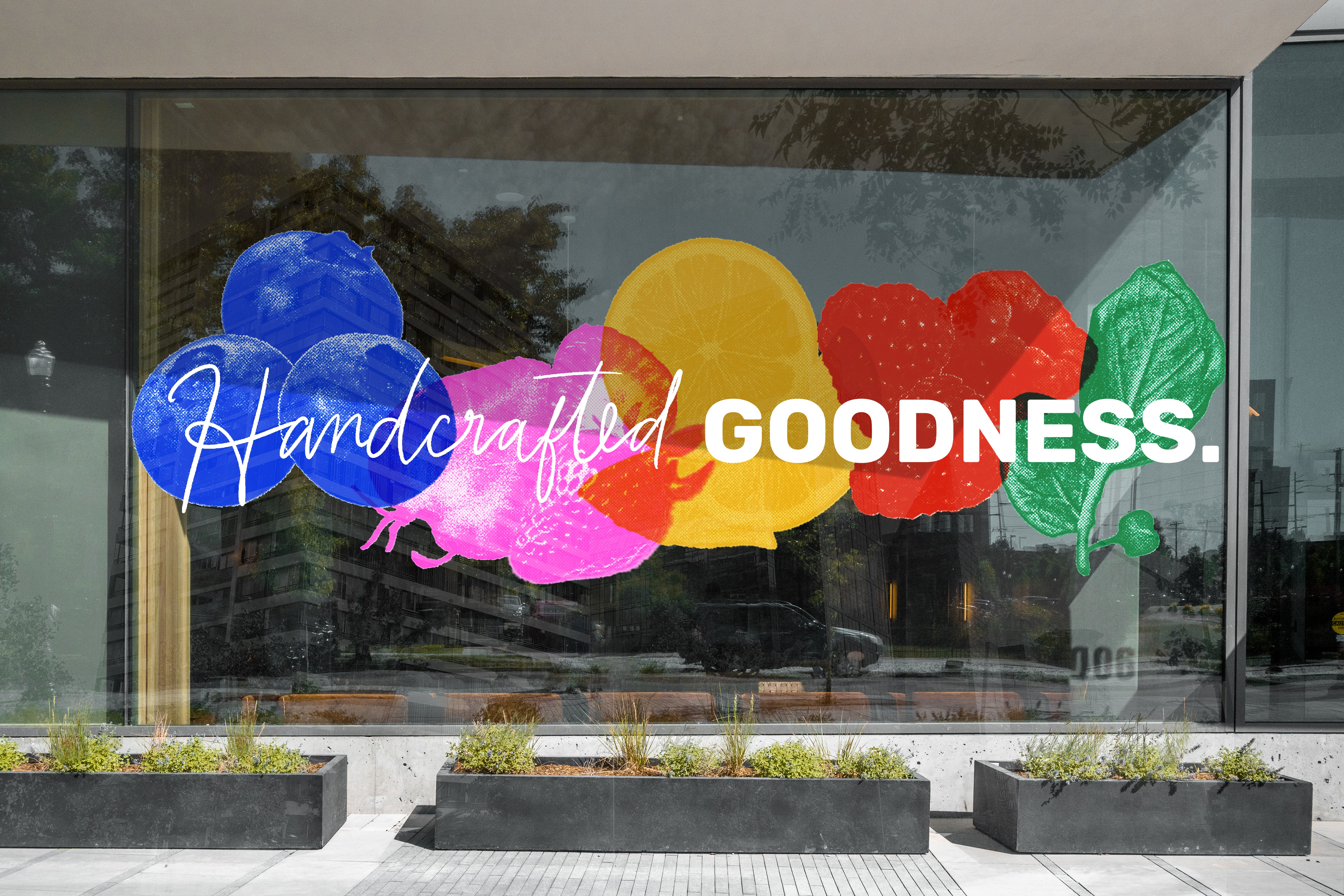
Scanned produce forms the foundation of a transparent, colorful identity system that celebrates Sprouts' vibrant spirit. I drew from an organic risograph aesthetic to cultivate authenticity while engaging a health-enthusiast audience. I designed the system to scale fluidly across signage, motion, print, and social; balancing energy and movement at every touchpoint.
Video file
The process of how literal Sprouts produce became the media and vibrant identity system for the rebrand.
Video file
This animation captures Sprouts newfound health enthusiast attitude and brand identity of celebrating healthy living.
Image
Image
Image
Image
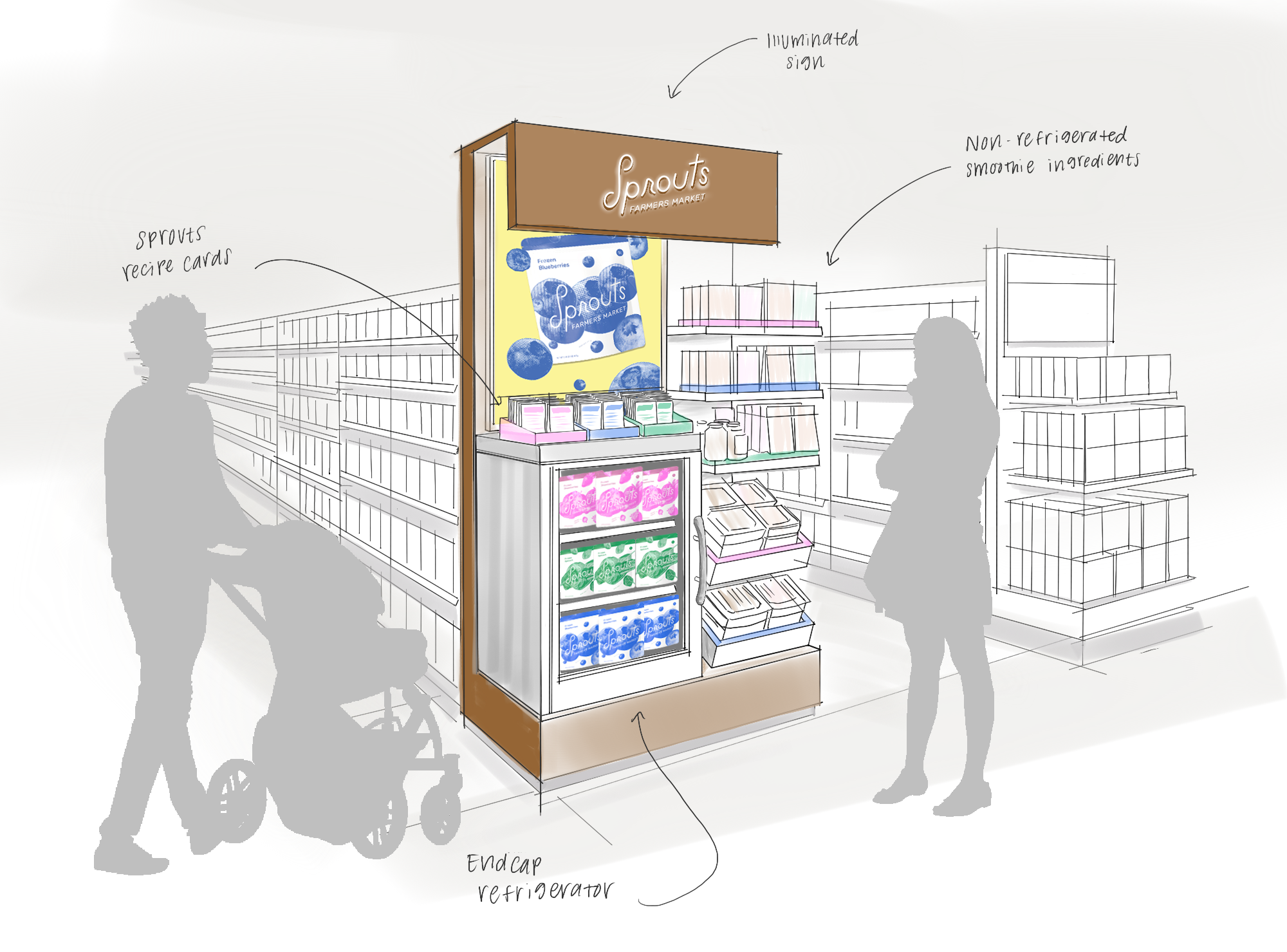
The end cap offers an interactive display of local samples and recipe cards; with an illuminated sign reflecting Sprouts’ vibrant energy!