Image
Exhibition entry.
Image
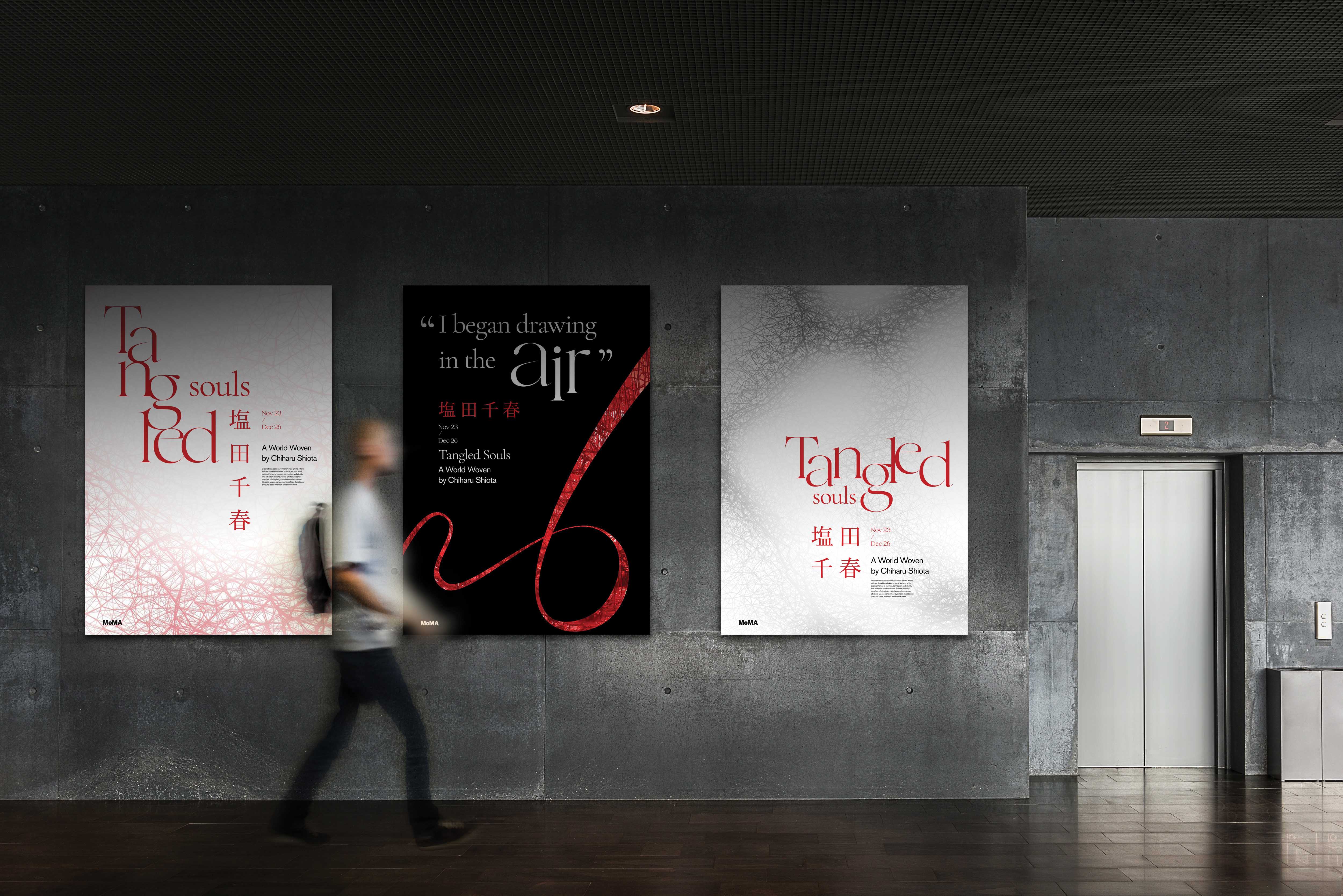
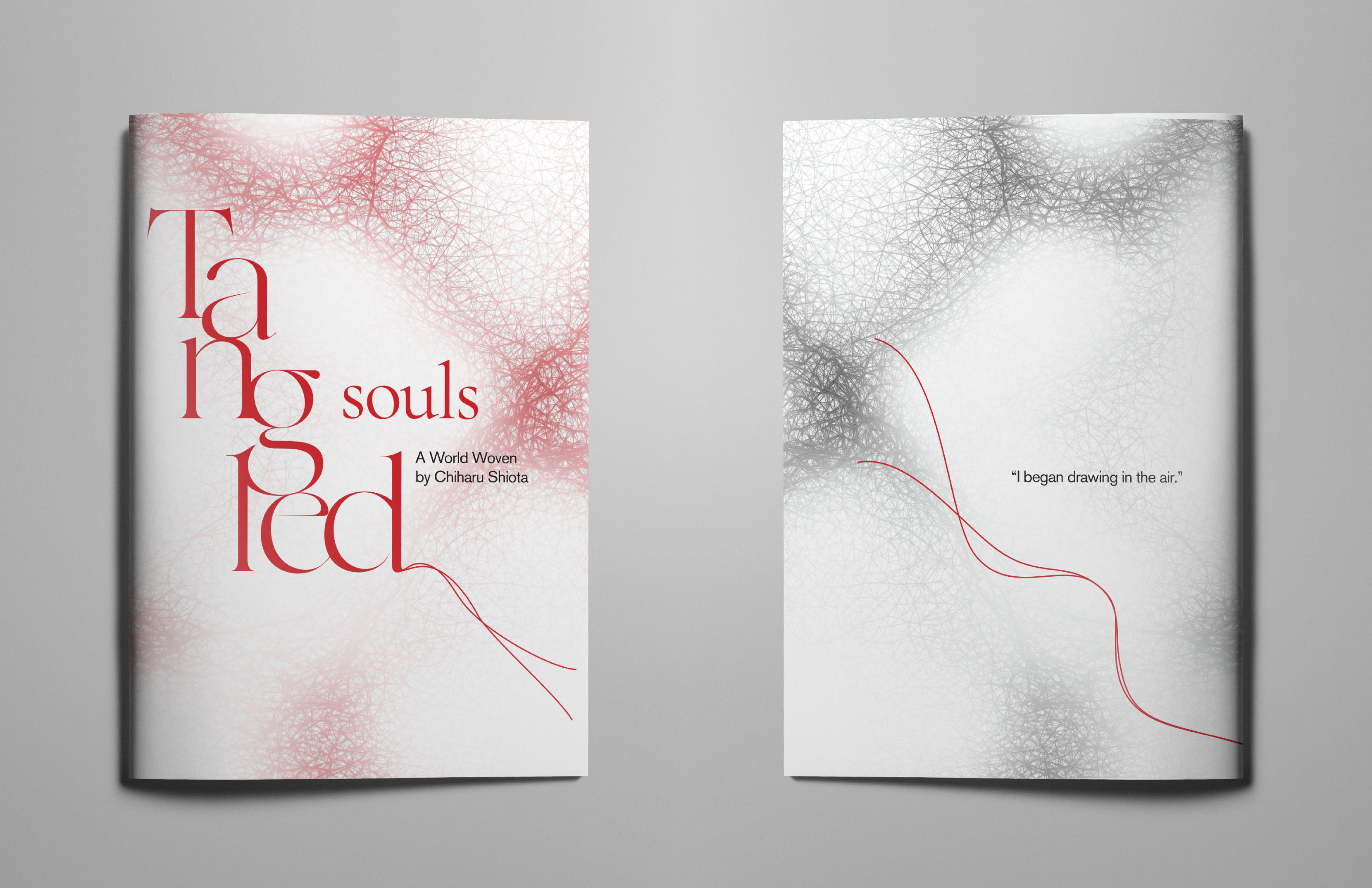
The Tangled Souls posters translate the movement of thread into typography and composition, creating a visual language that expresses connection, tension, and flow.
Image
Image
Image
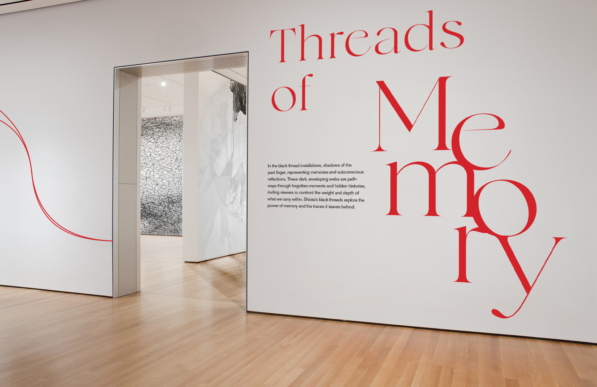
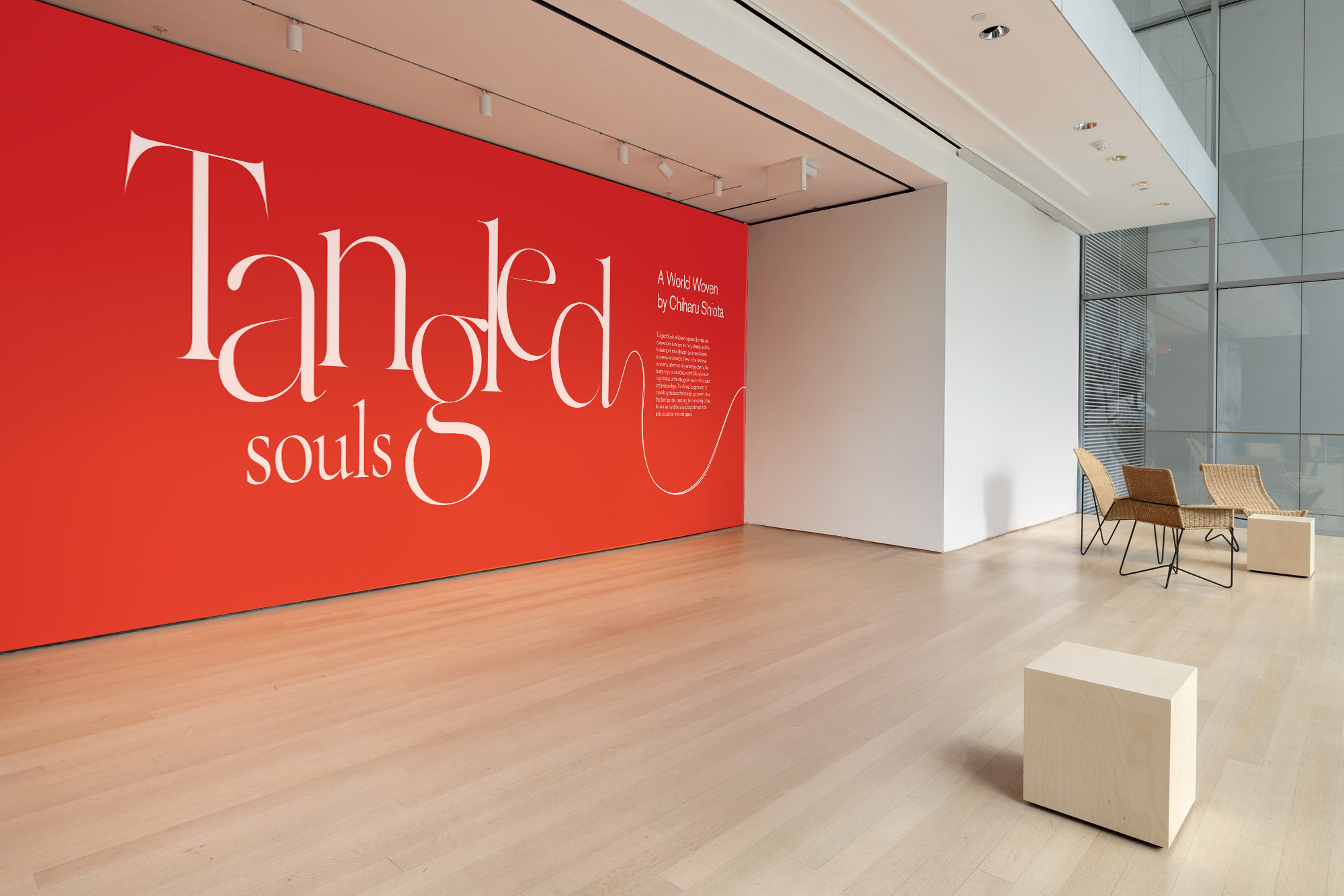
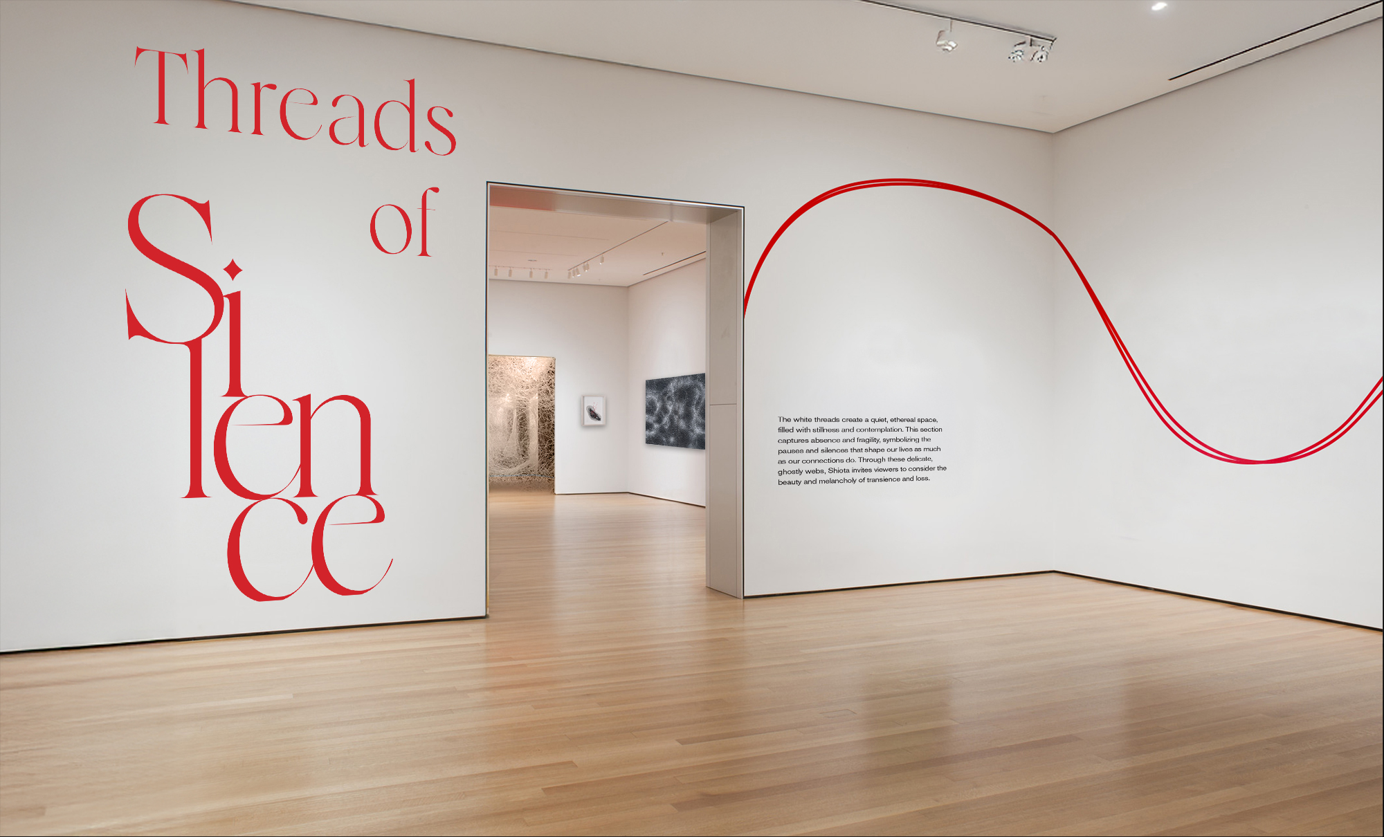
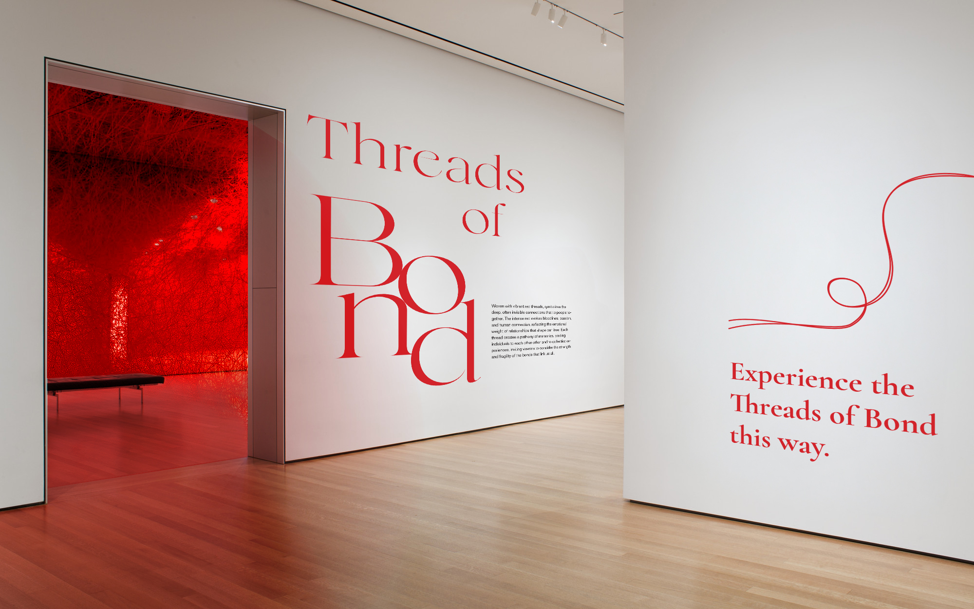
The wall graphics and wayfinding system draw directly from Shiota’s threaded installations, using flowing lines to guide visitors through the space with a sense of quiet continuity. Large serif typography anchors each room, echoing the emotional weight of her work while keeping the visual language gentle and unobtrusive. Together, the lines and type create a subtle pathway that leads visitors through the exhibition without distracting from the power of the installations themselves.
Image
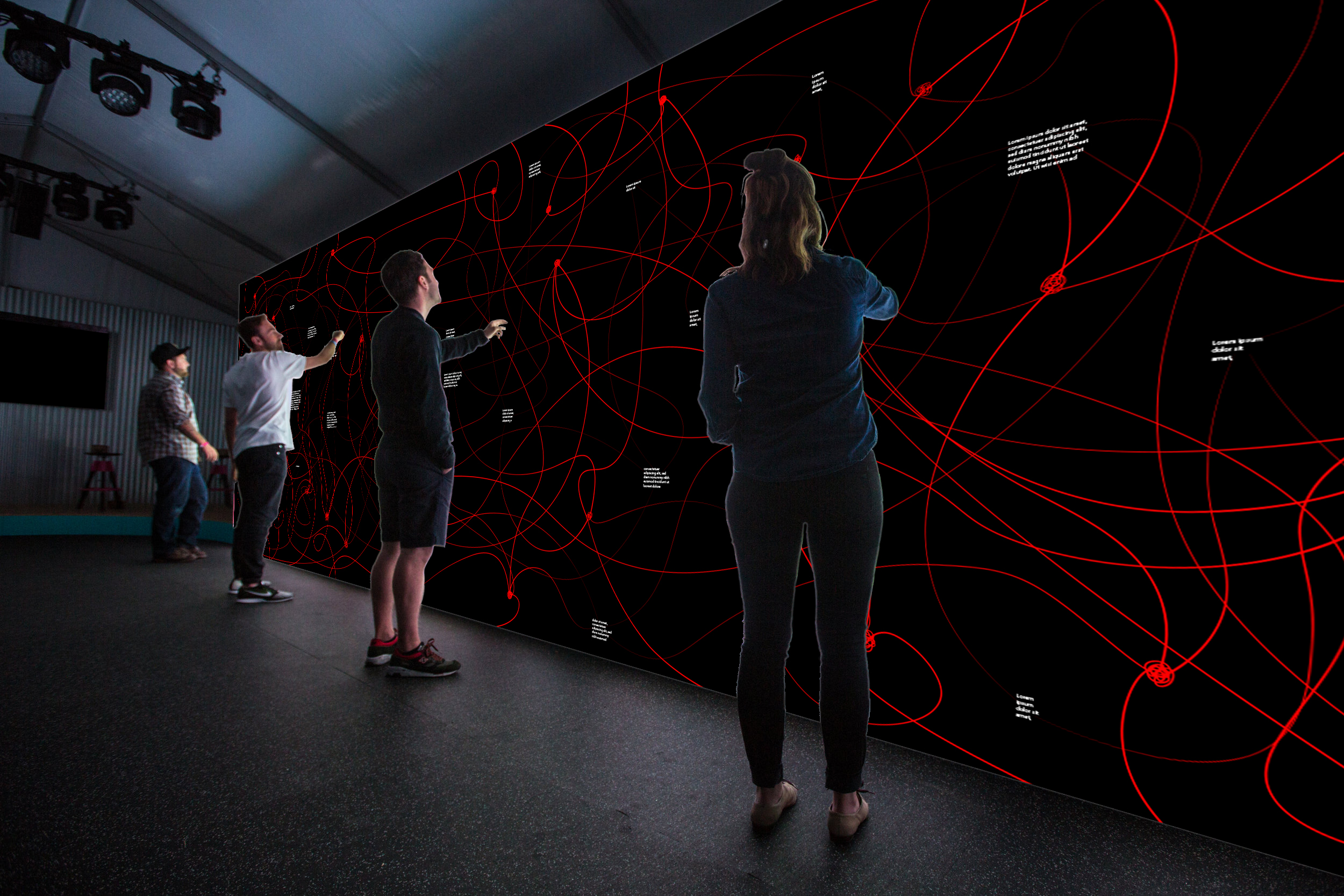
An interactive digital wall where visitors trace, write, and connect their own memories, becoming part of an evolving network of threads.
Image
Image
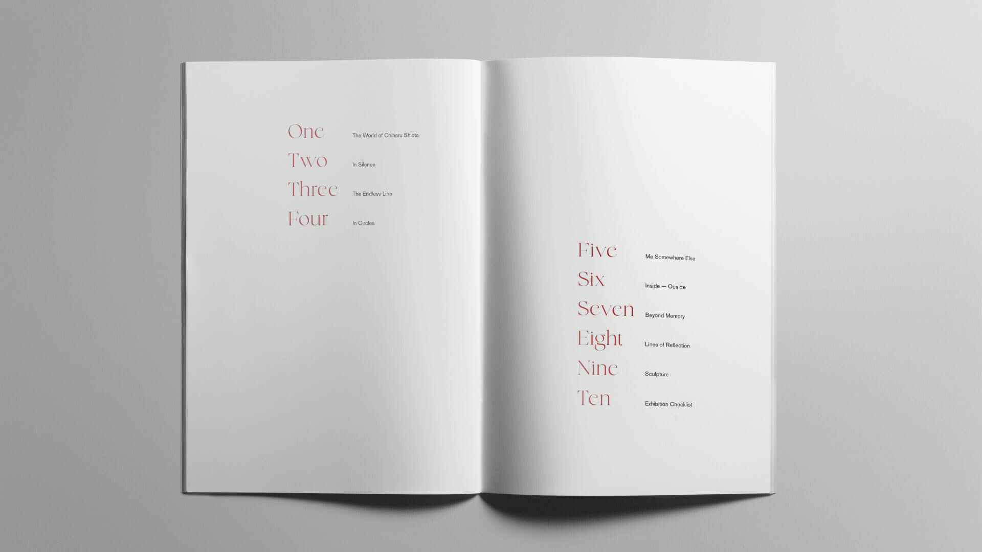
The exhibition catalog extends the identity through soft gradients, delicate thread textures, and refined serif typography. Each spread is paced with quiet space and subtle rhythm to reflect the meditative quality of Shiota’s work. The design remains minimal and calm, allowing the imagery and themes of memory, tension, and connection to unfold with clarity and intention.
Image
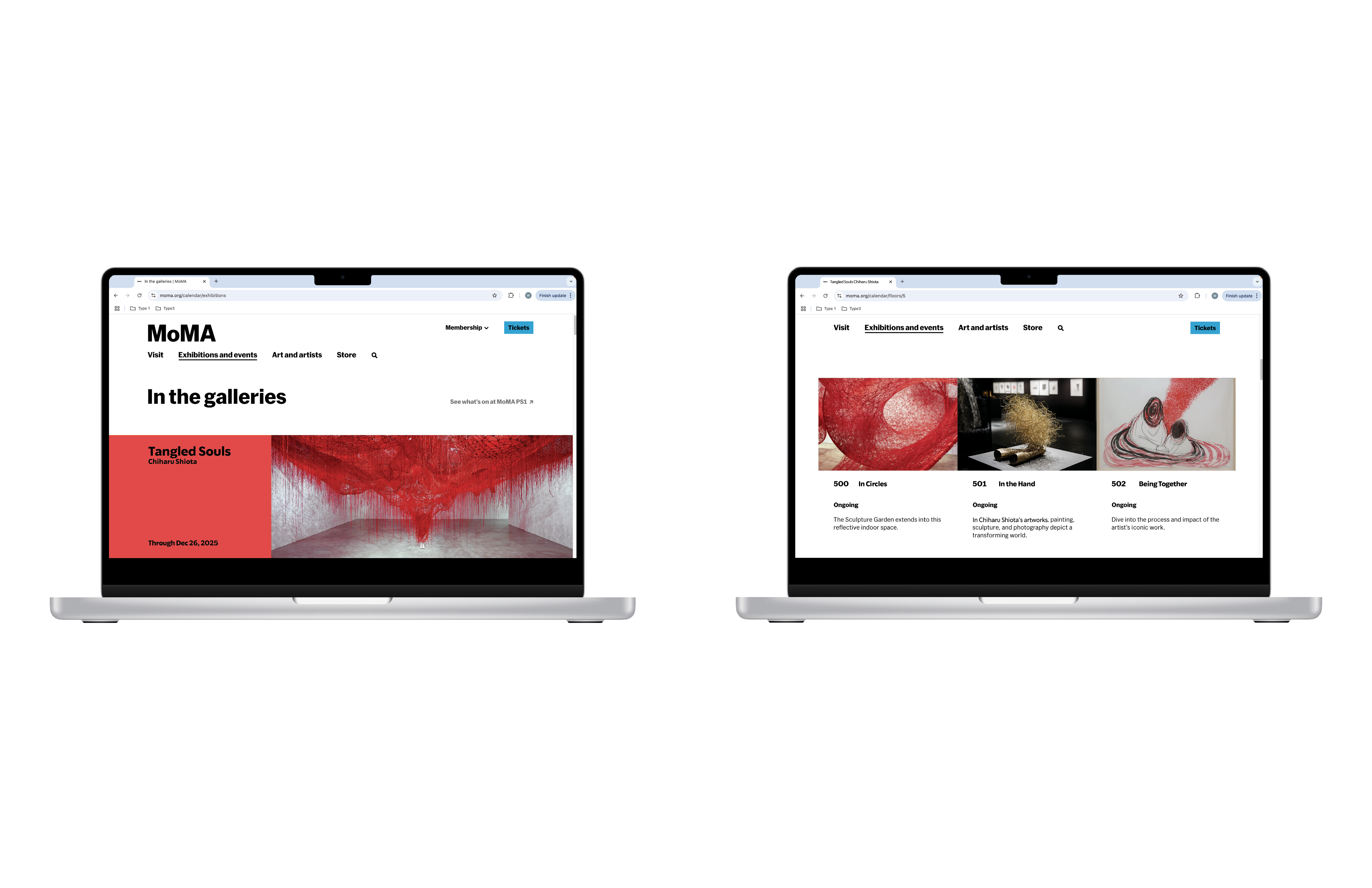
MoMA website.
Image
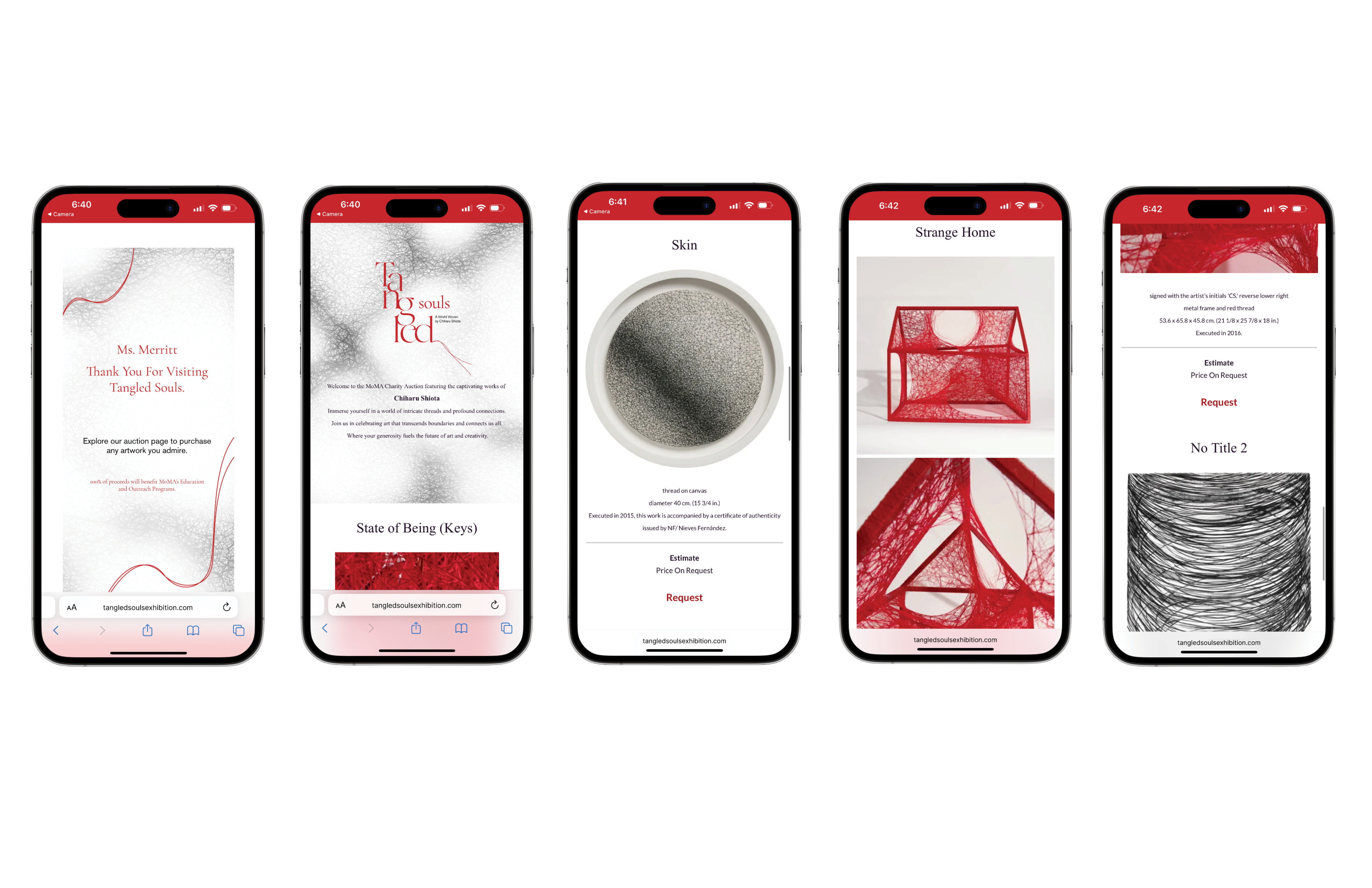
The web experience continues the exhibition’s visual language online with soft thread textures and refined type. Visitors can access the auction page through a QR code on their wristband ticket, allowing them to explore and bid on works after leaving the gallery. All proceeds support MoMA’s education and outreach programs, extending the impact of the exhibition beyond the physical space.
Image
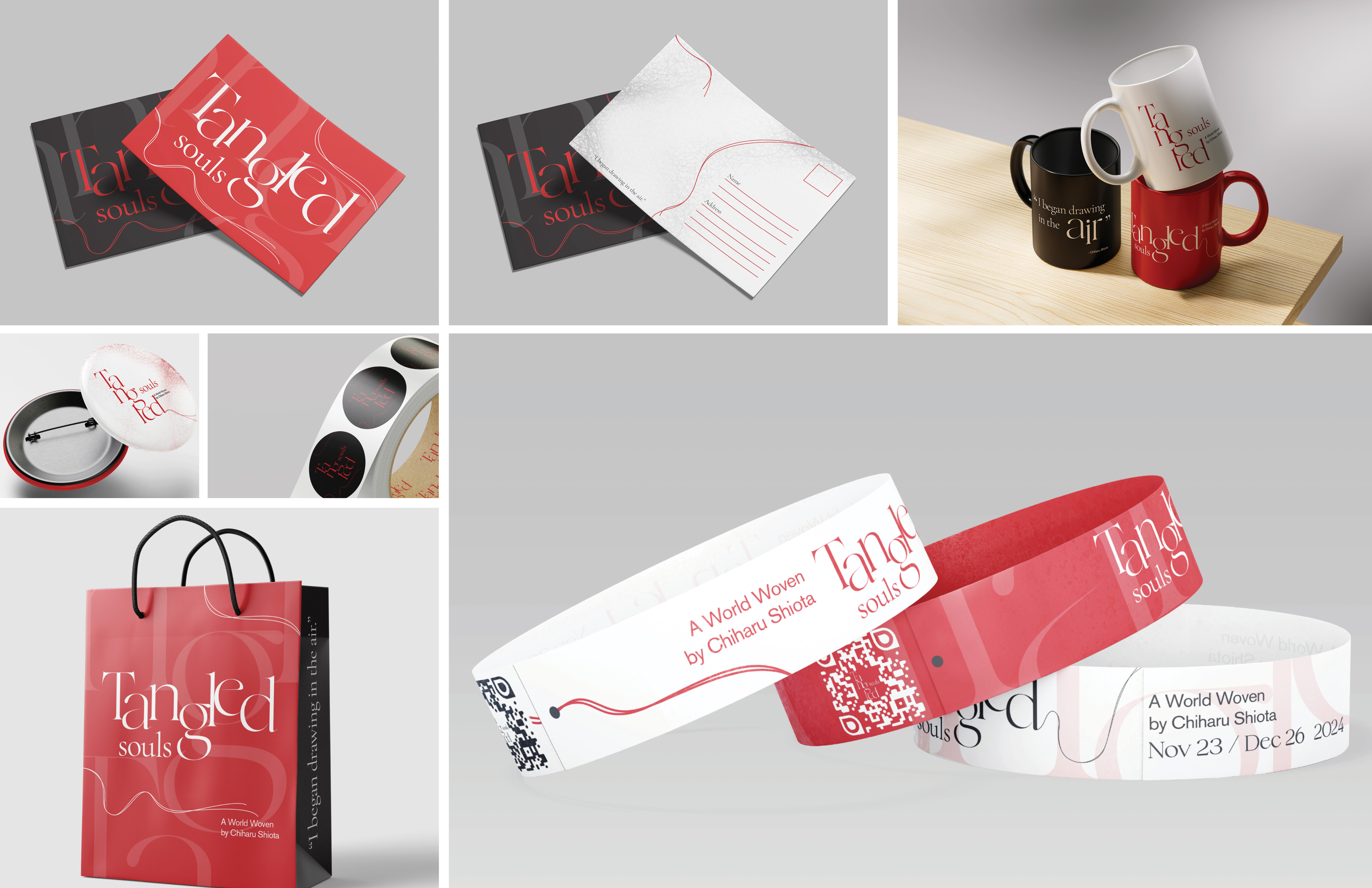
The print applications translate the identity into tactile moments that visitors can hold and take home. Postcards, stickers, wristbands, packaging, and merchandise all use the same delicate thread motifs and refined typography to maintain a cohesive visual language. Each piece is designed to feel like a small extension of the exhibition, capturing the quiet tension and emotional resonance of Shiota’s work in accessible, everyday forms.