Graduates
Jaiwon Lee
BFA in Graphic Design — Graphic DesignFaculty:
Cheri Gray
ERROR: Art of Imerfection
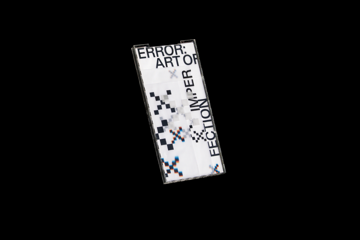
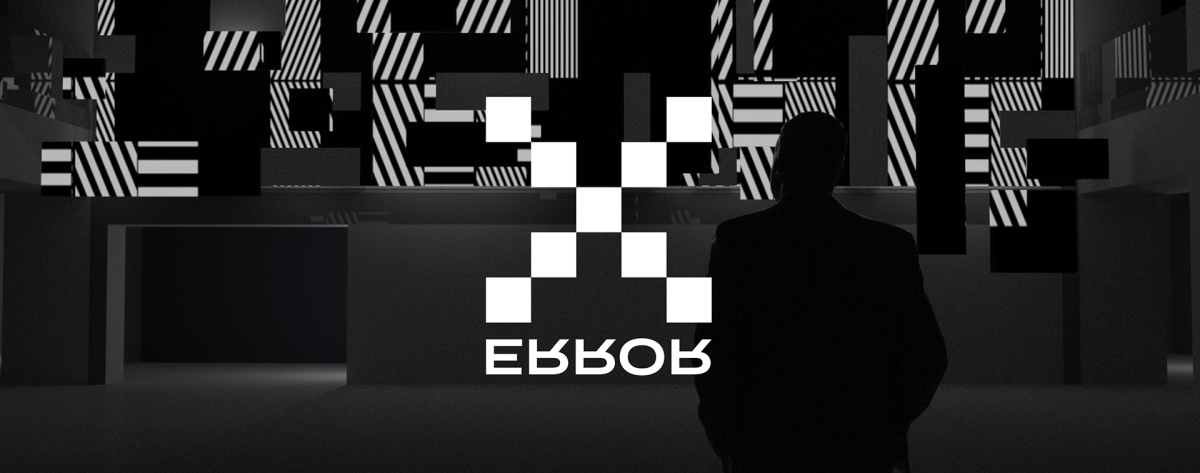
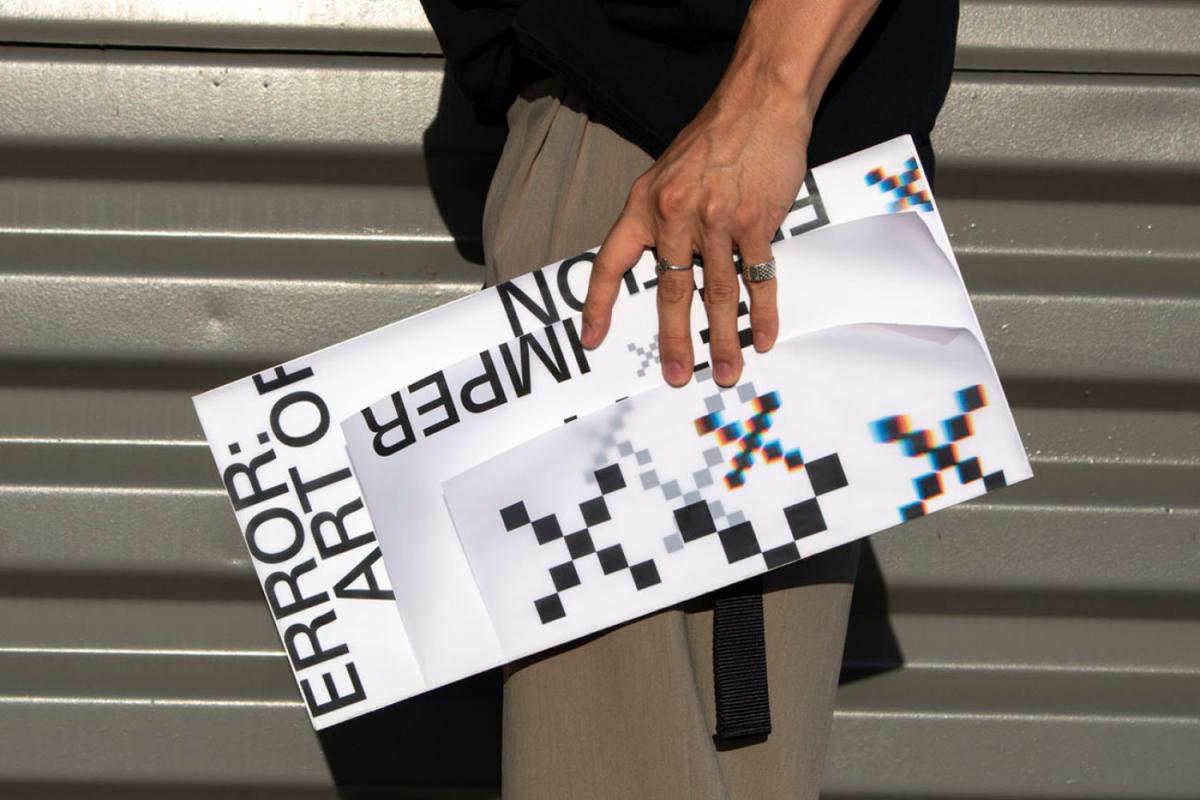
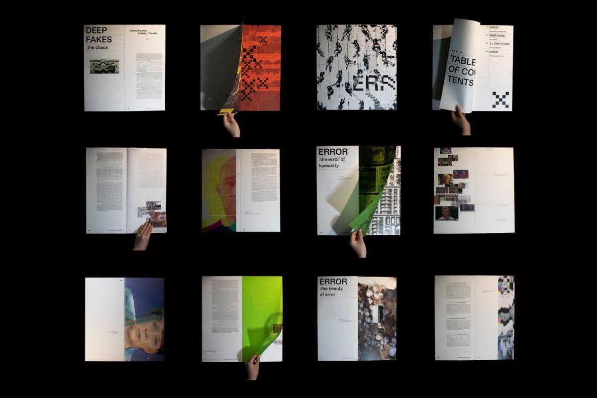
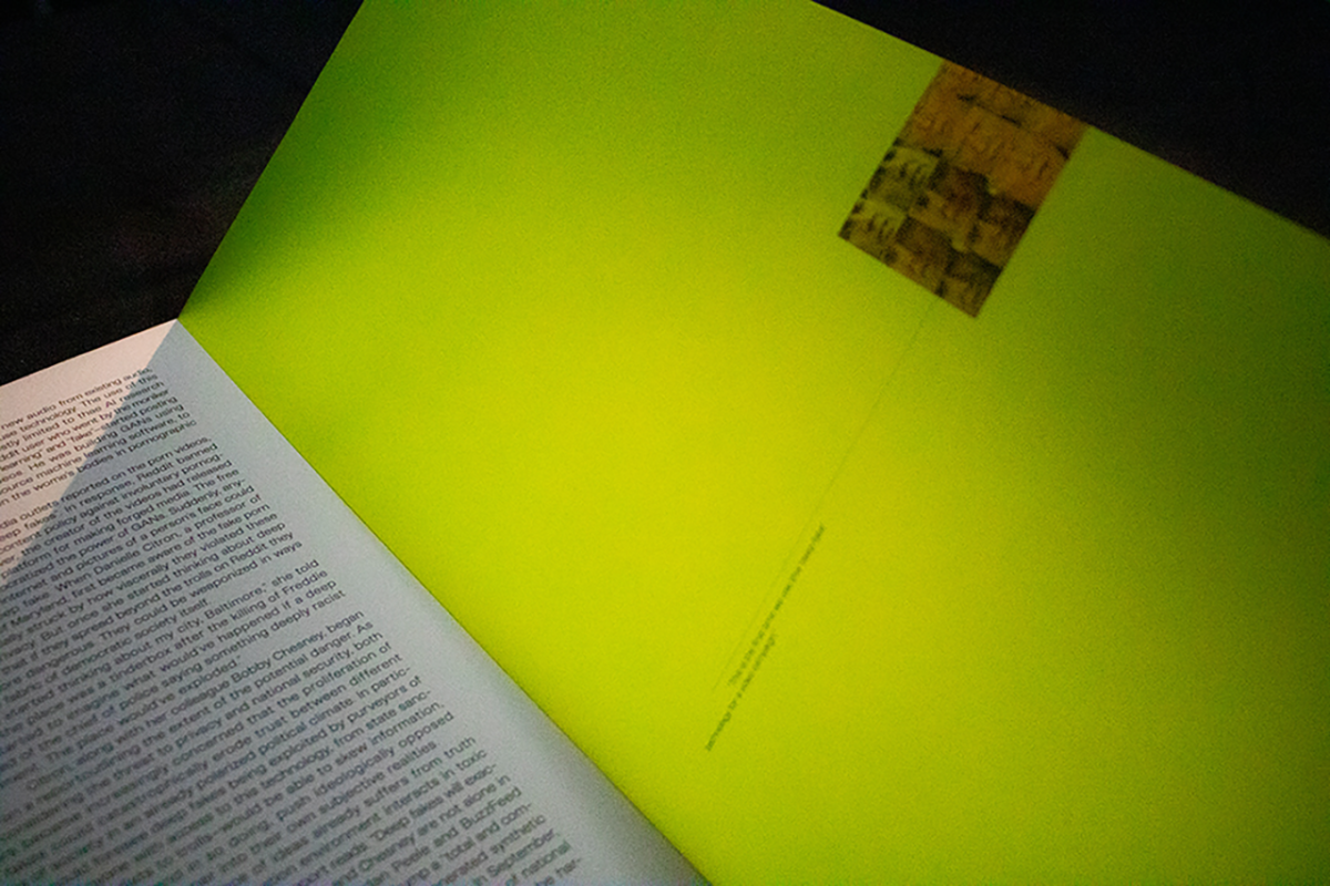
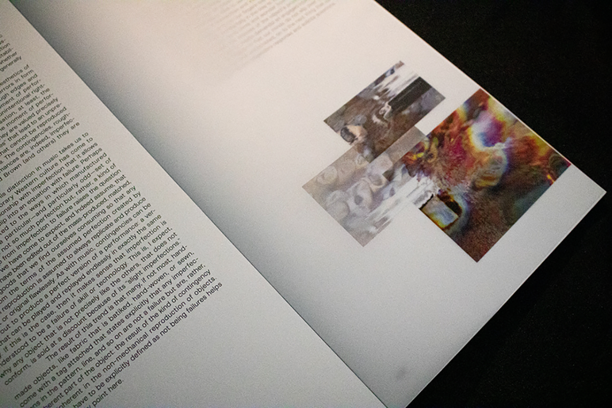
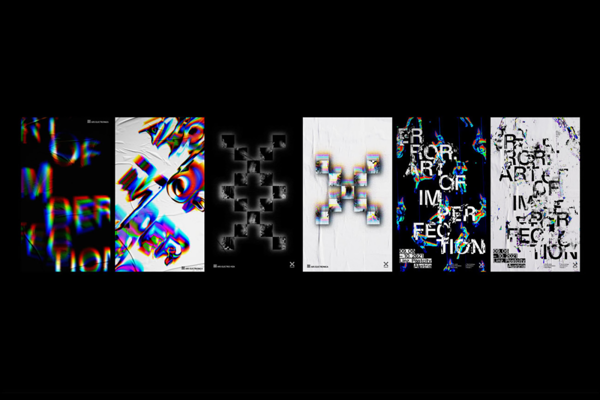
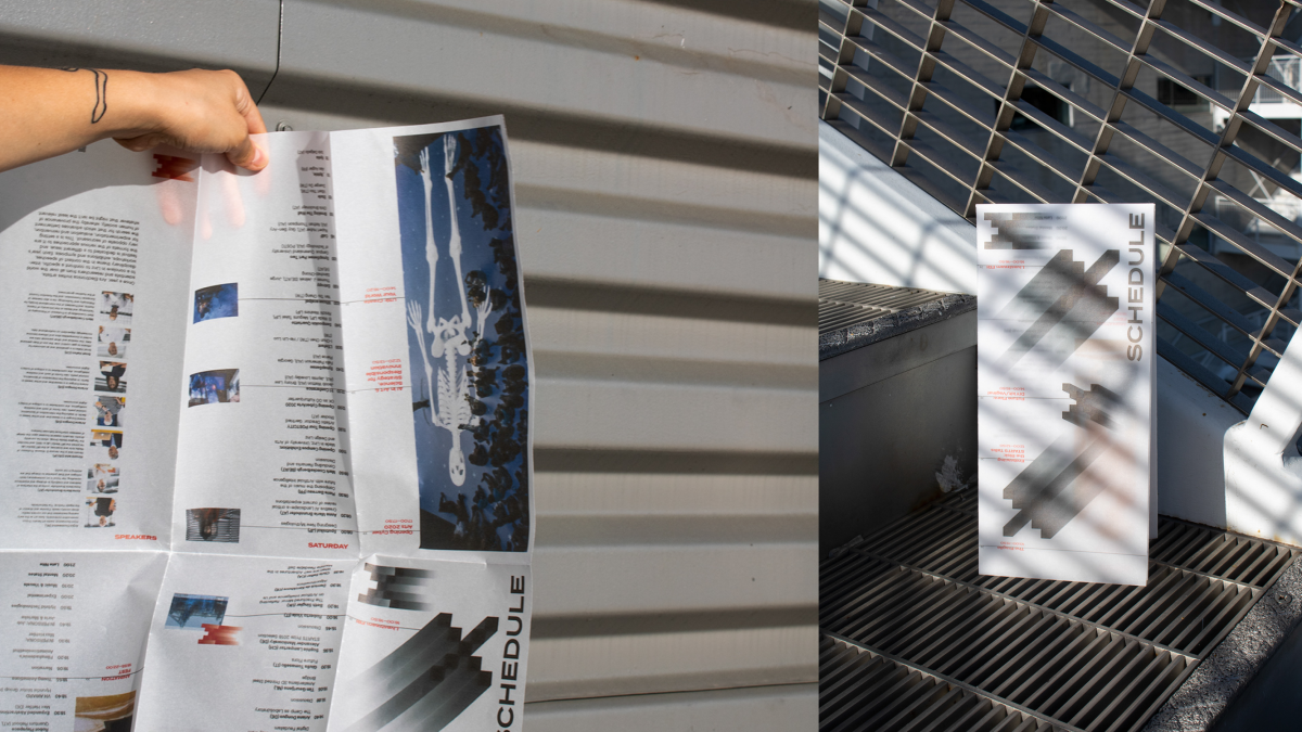
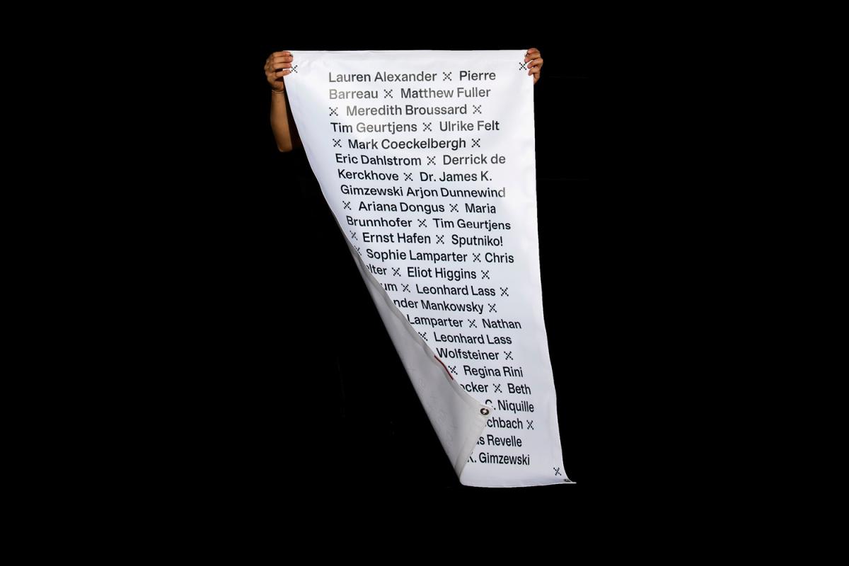
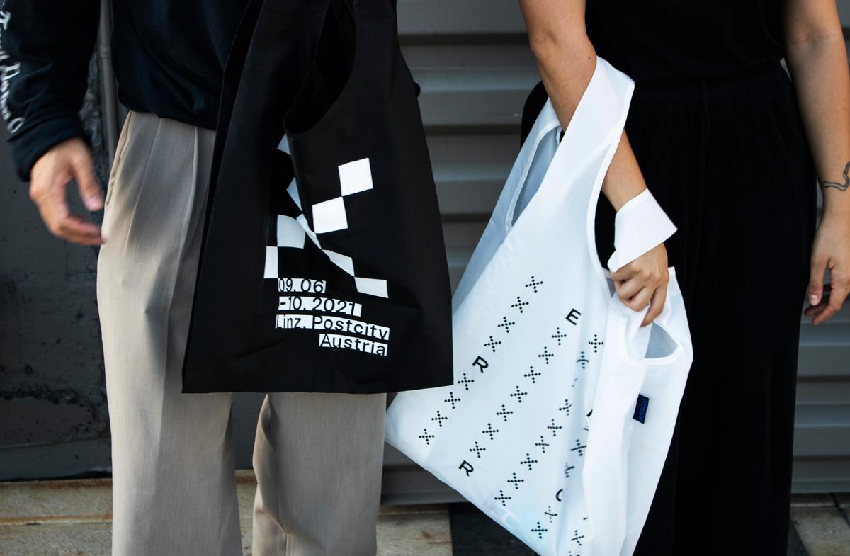
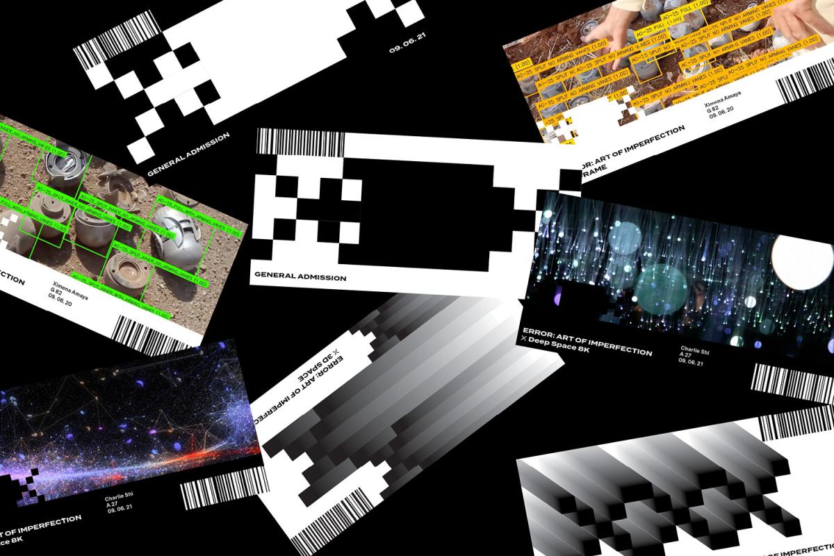
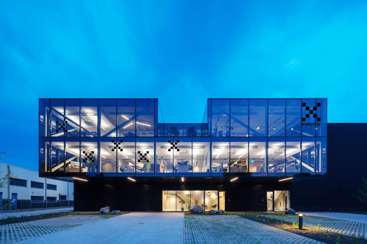
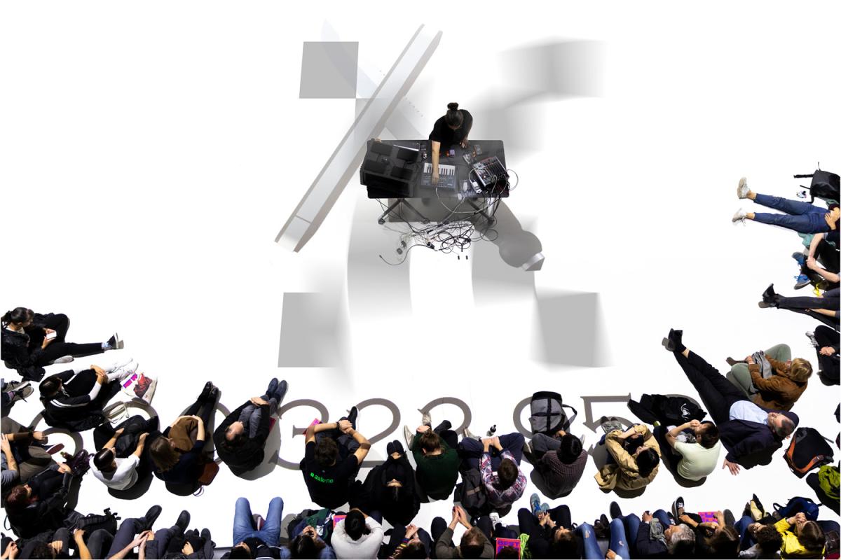
This is a rebranding project of the festival ERROR: ART OF IMPERFECTION. Festival has a unique subject matter of “error” where they invite artists and technicians to explore errors in different areas such as music, art, and technology. The festival doesn't hide errors. They ask experts and audiences to explore errors by fully embracing them. The main insight as visual director was to communicate the idea of error in a literal way both visually with glitches and vellum as main visual elements.
Learning Outcomes:
The course Experimental Type was a challenge for me to break rigid typographic systems and be more expressive with typography. I learned that even when experimenting with type, structure is the key. And same applied in the branding process. I also learned to explore things that are not familiar. The whole printing and binding process with vellum papers required some failures, but I realized that a little experiment helps to come up with something original and creative.

