MS in Environmental Design - 2 yr Furniture and Fixture — Graduate Spatial Experience Design
Course:
GPRT-153 Type 2: Structure
Faculty:
Cheri Gray
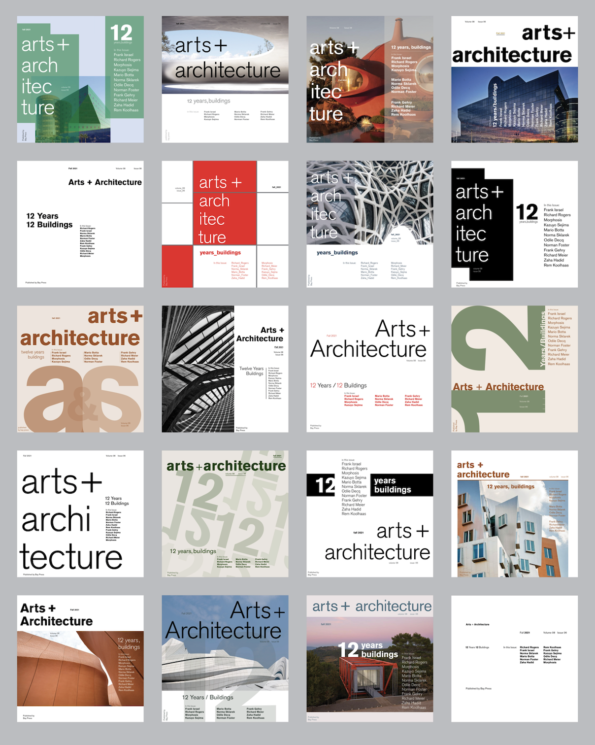
Arts + Architecture
This is a 7-week exploration of the cover for Arts + Architecture magazine. With the first week limited to strictly 8 point Akzidenz Grotesk and in the final week having any sizes, three weights, bars, rules, colors, and photography. Having these restrictions forced me to think creatively and come up with innovative solutions to this magazine cover. The photographs are the works of the architects highlighted in this issue of the magazine, while the colors are inspired by an architectura palette.
Learning Outcomes:
I learned so much about hierarchy and negative space from these weekly assignments. This allowed me to practice using the golden section grid, colors, and photography to create a compelling yet sophisticated cover for Arts + Architecture. Although at first, it was hard to understand how to use my negative space and how to not make my hierarchy confusing, I think after 7 weeks of practicing, I have a much better grasp of what makes a cover design successful.