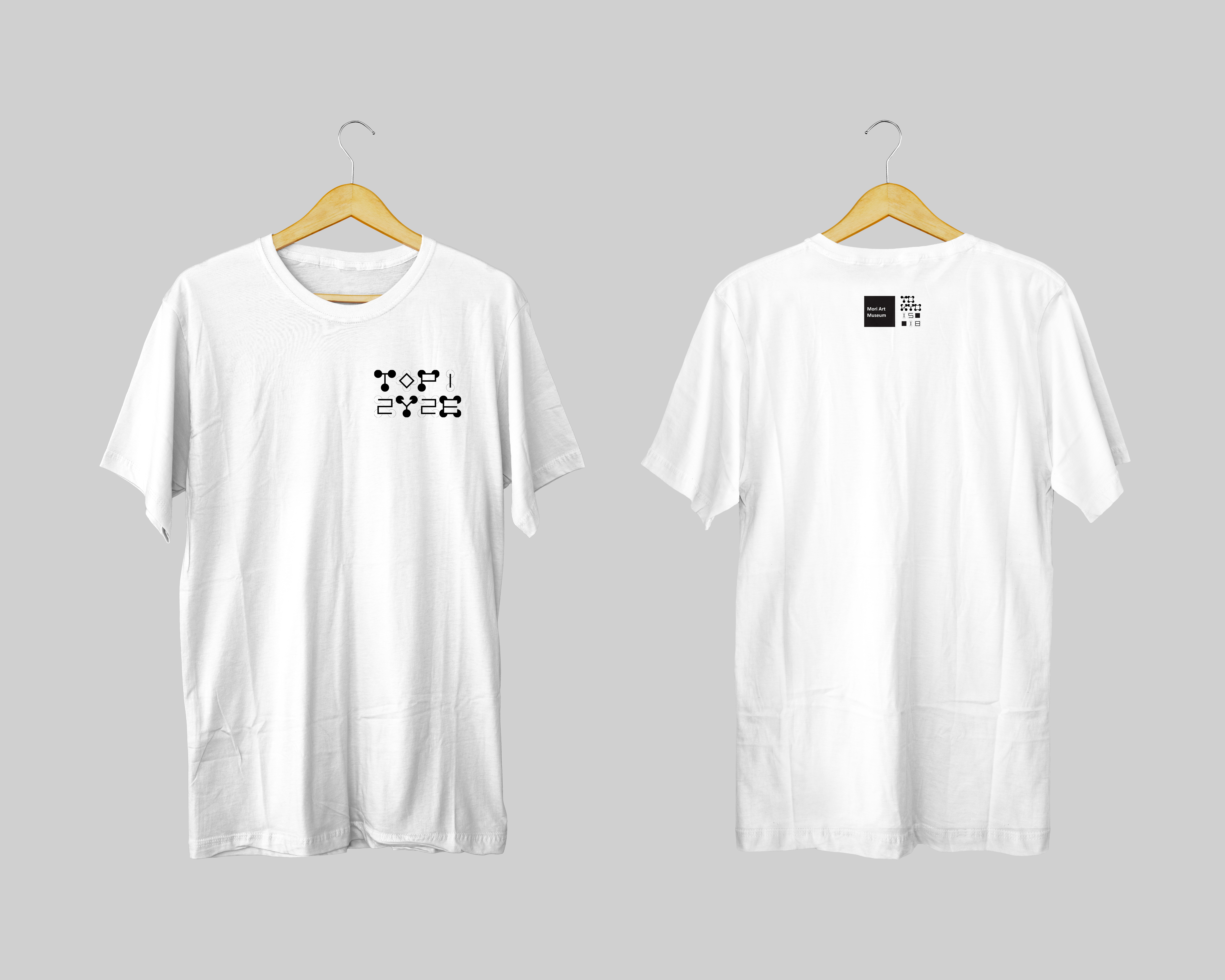
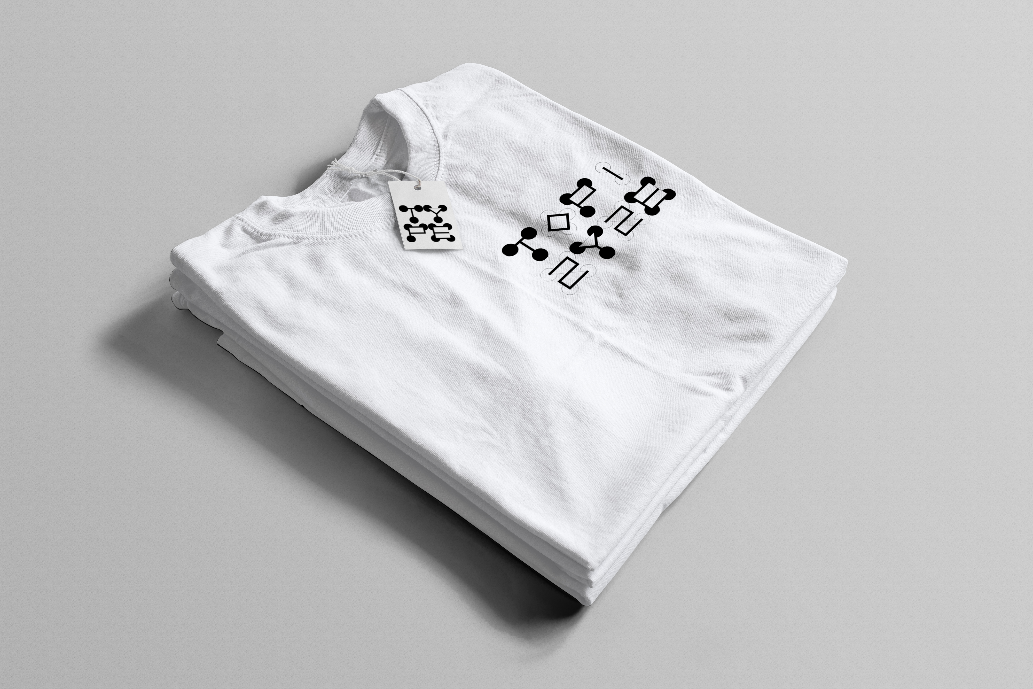
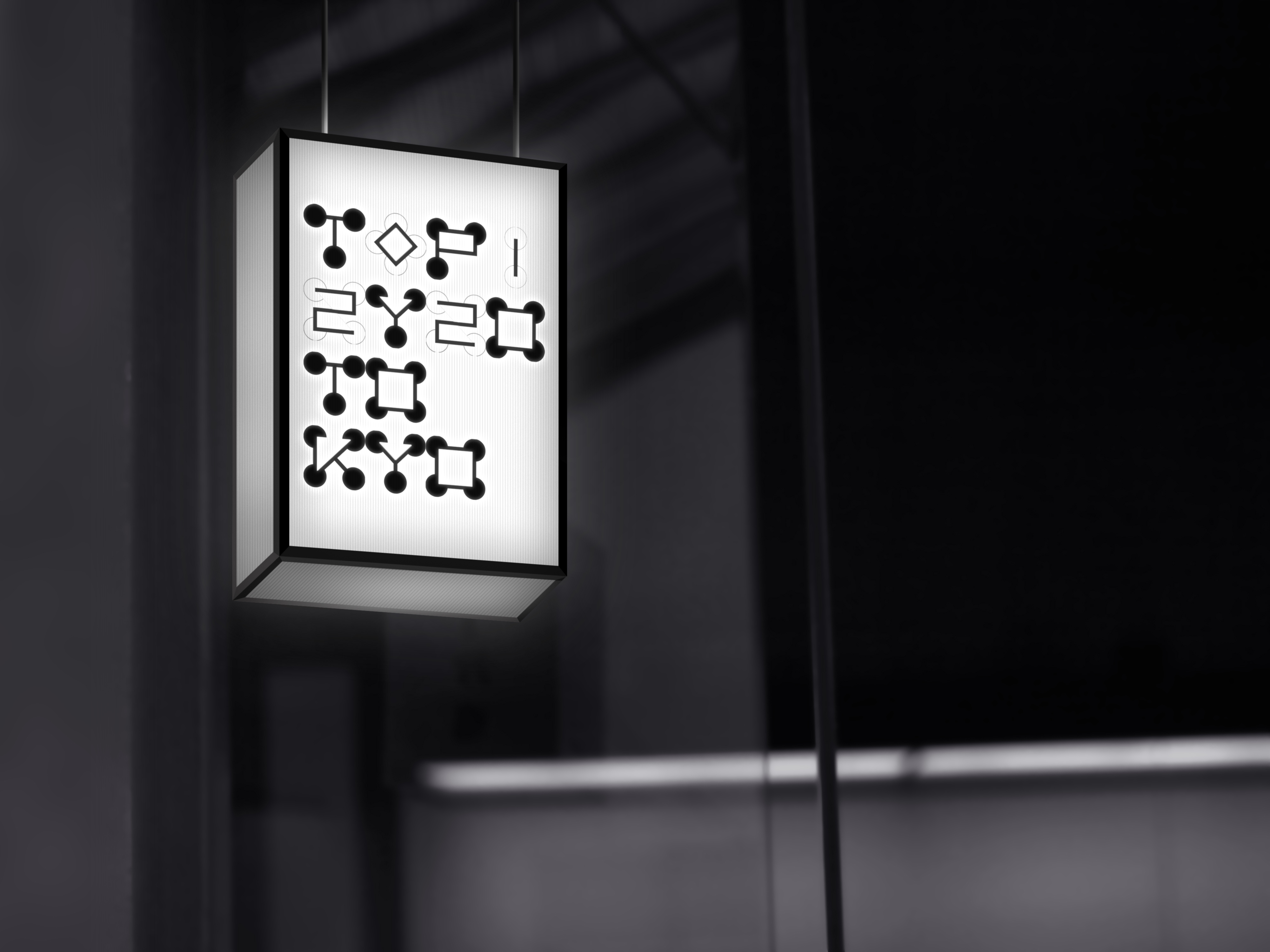
I was free to choose a Typographic Conference and create a typographic wordmark for it with my own fonts and create two pairs of black and white posters for this Typographic Conference and apply the logo to 2 - 3 other pieces.
Learning Outcomes:
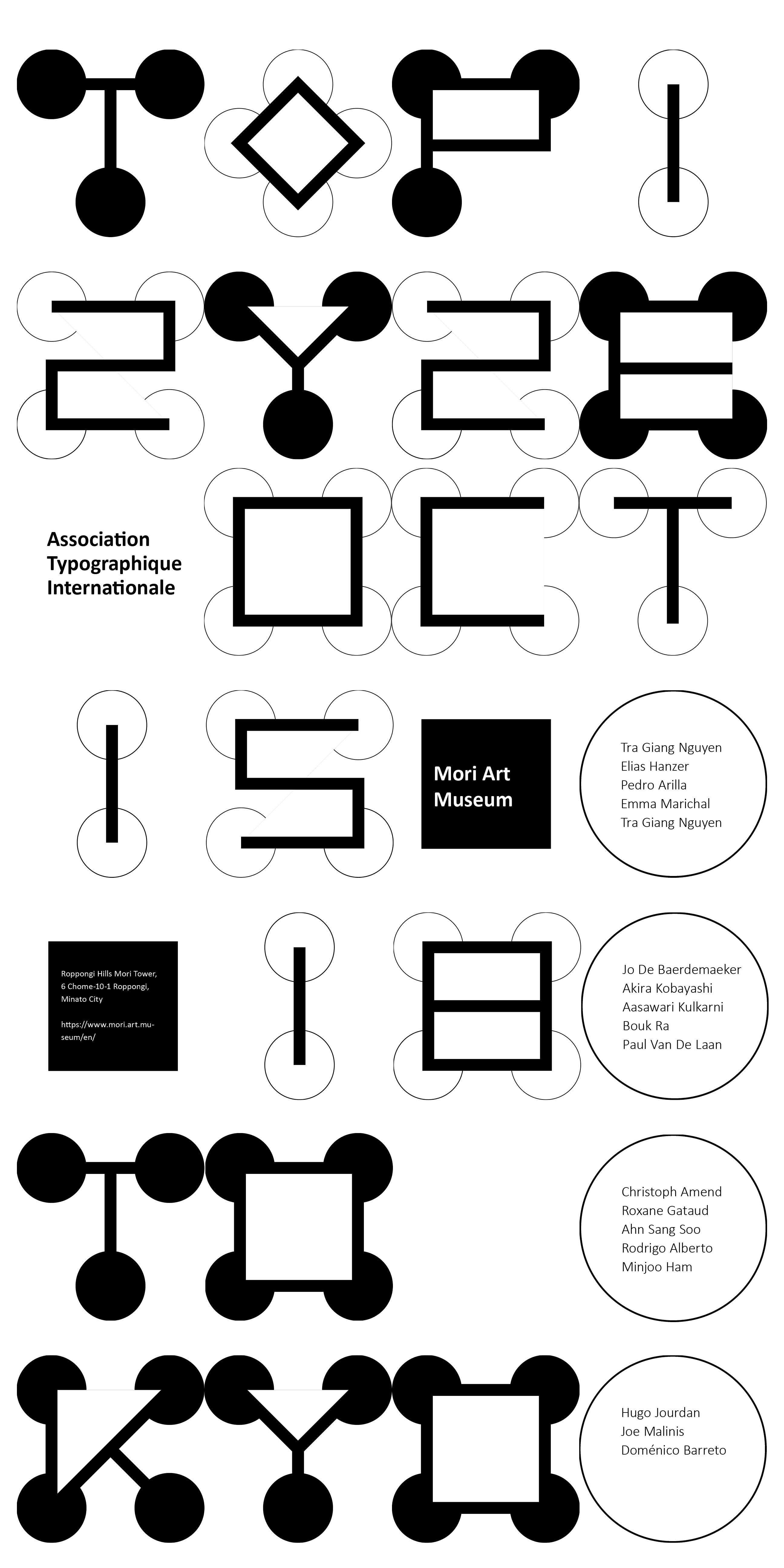
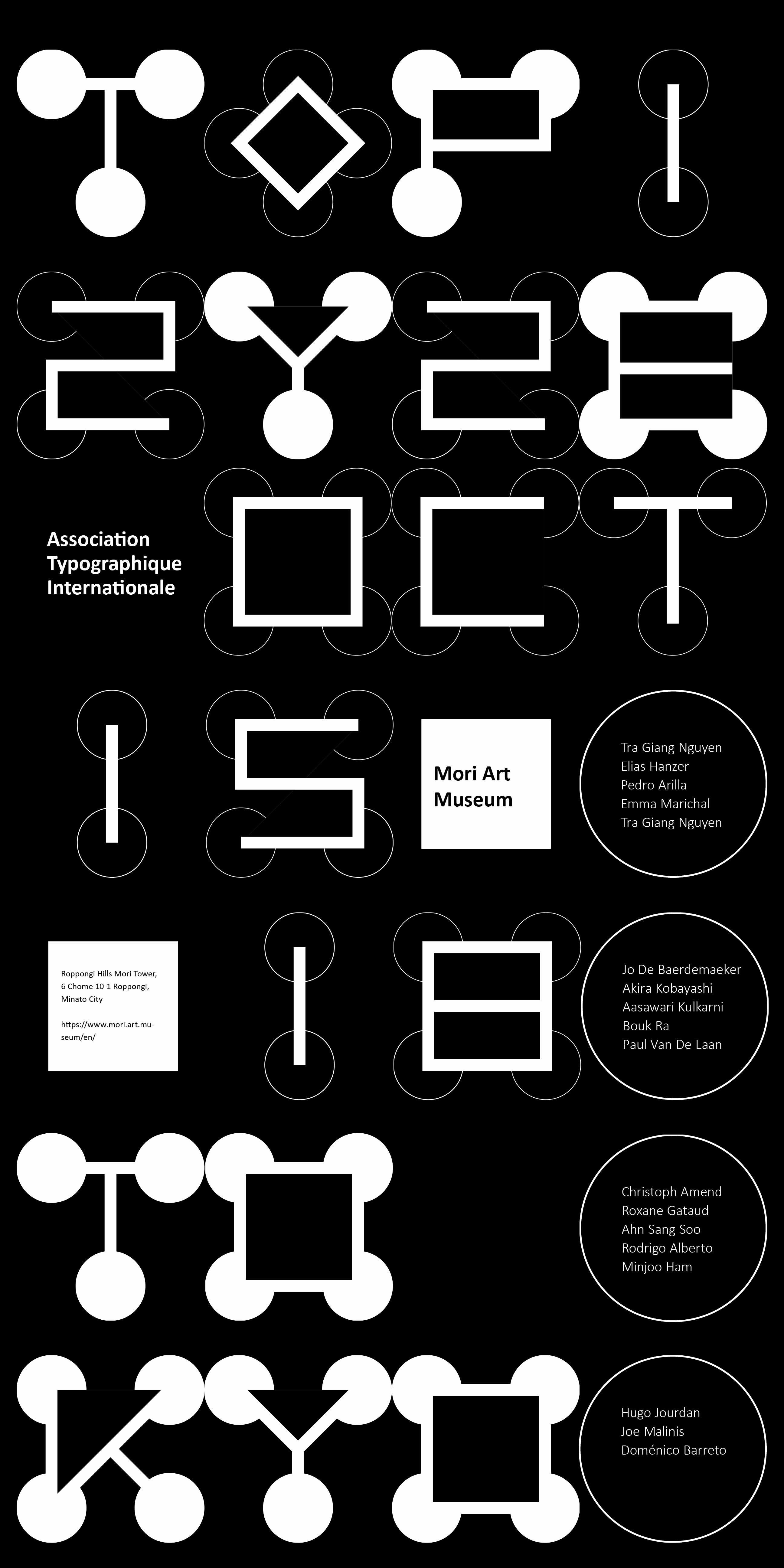
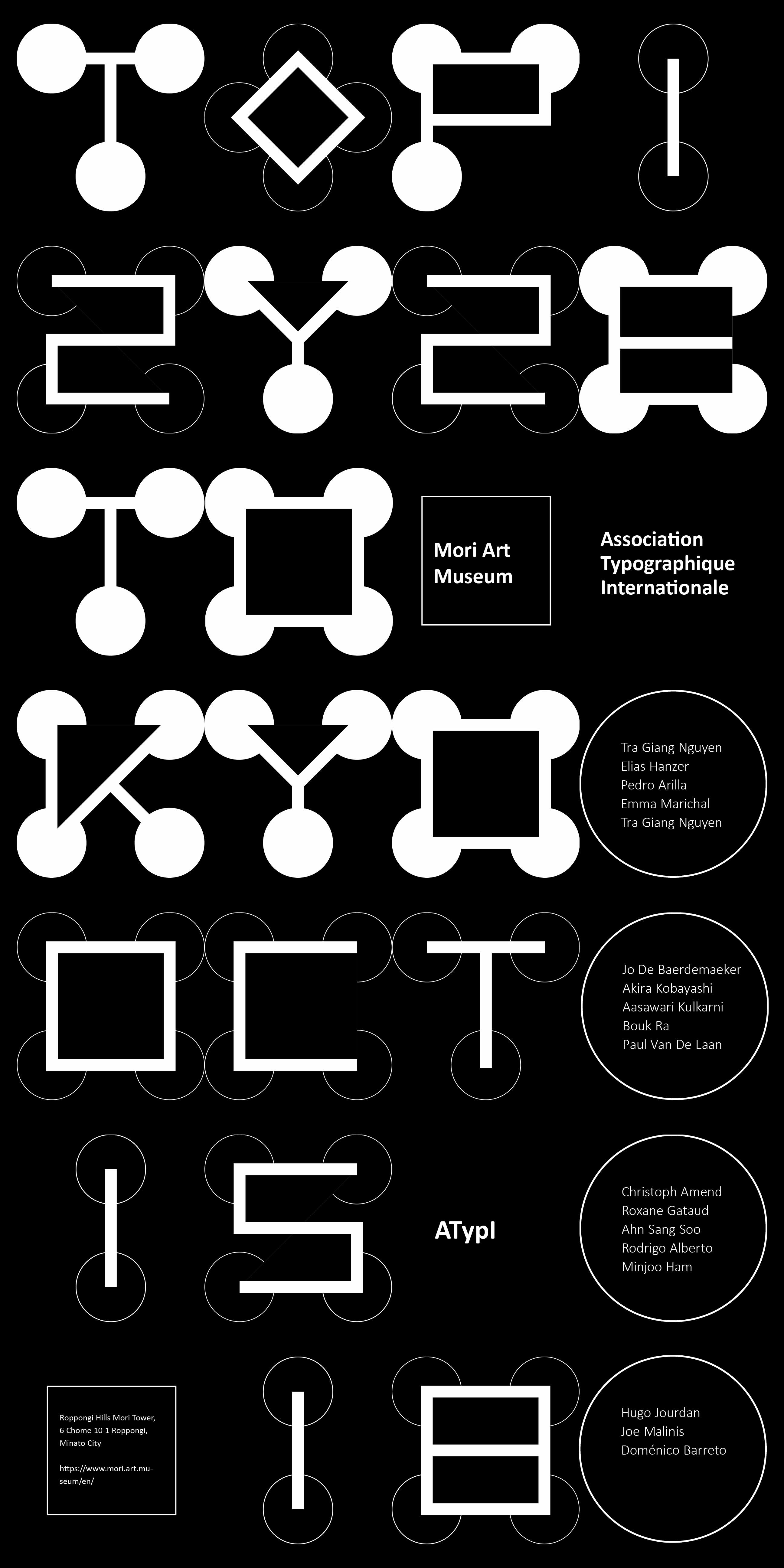
I chose the Mori Art Museum in Tokyo, Japan, although it was a fictional event. But the information on the poster should be as complete and clear as possible. Secondly, in the process of designing the typeface, I felt the difference between the letters of the alphabet and how to amplify their characteristics to make the typeface interesting and easy to read at the same time.