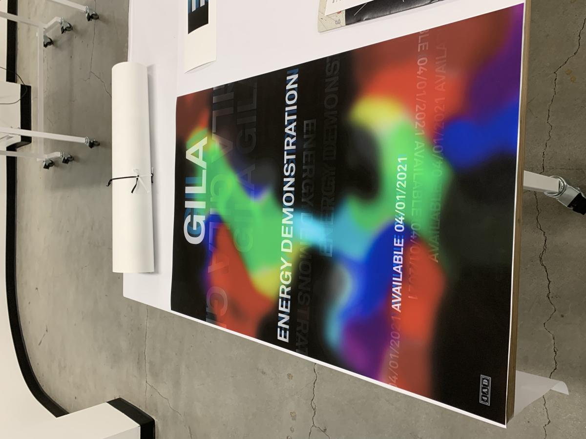
Lastly, I added in some transparent blue text to create some more depth and play more into my idea of repetition. This poster took the pattern of text I liked and the repetition of my previous designs but it just needed to be a little less text-heavy and so I went in and blurred the text to create the final piece.
Graduates
Tatiana Khoury
MS in Environmental Design - 2 yr Furniture and Fixture — Graduate Spatial Experience DesignCourse:
GPRT-153 Type 2: Structure
Faculty:
Cheri Gray
Gila Music Poster
This poster is announcing the release of Gila's song Energy Demonstration on 4/1/2021. The poster is meant to give the viewer the feeling of the music and to excite them for the release of the song.
Learning Outcomes:
I learned that you really need to study whatever it is you are creating a piece for. With this project, I listened to this song for hours and hours on repeat as I created different backgrounds and type explorations that I felt reflected the feeling of the music. I also learned about printing such a large size and doing test prints to ensure your colors are correct when you print.


