Image
Previous logo
Image
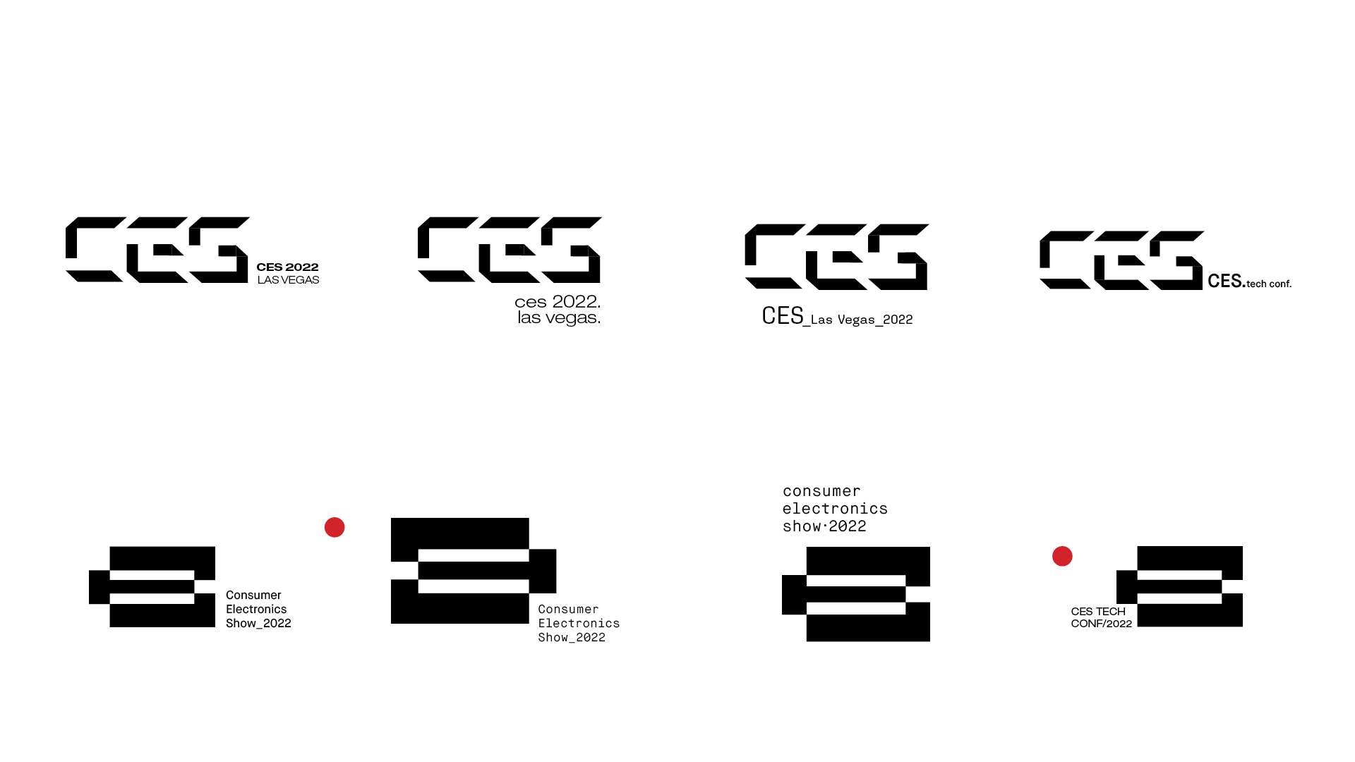
Short Logo Lockup
Image

Long Form Logo Lockup w/ Secondary Typography
Image
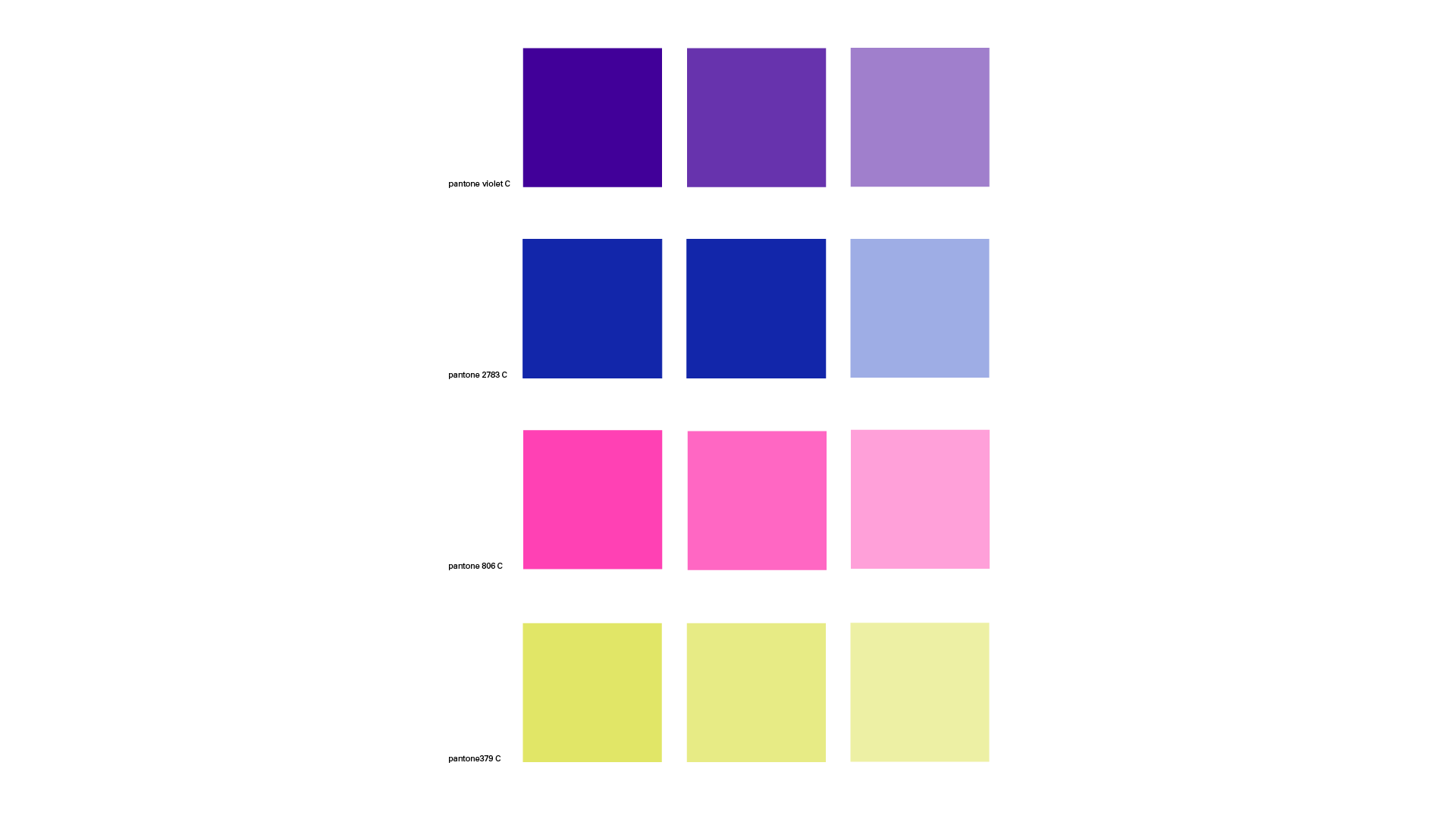
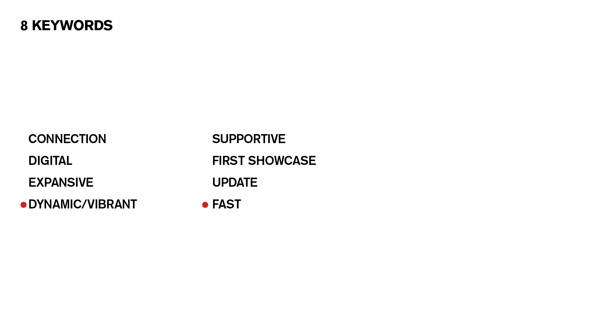
Color palette: I used saturated colors to represent the energy and exciting contents/ events in CES
Image
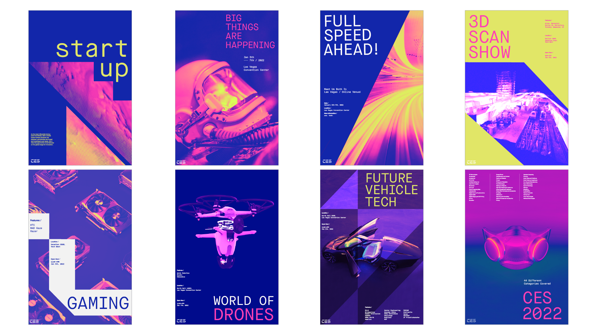
Initial 8 posters: I am using the angle of the logo image as a graphic elements, incorporating images with different tonal values in chosen color palette.
Image
Progress of the logo design: starting with Initial keywords for the concept. I chose dynamic and fast for the redesigning concept.
Image
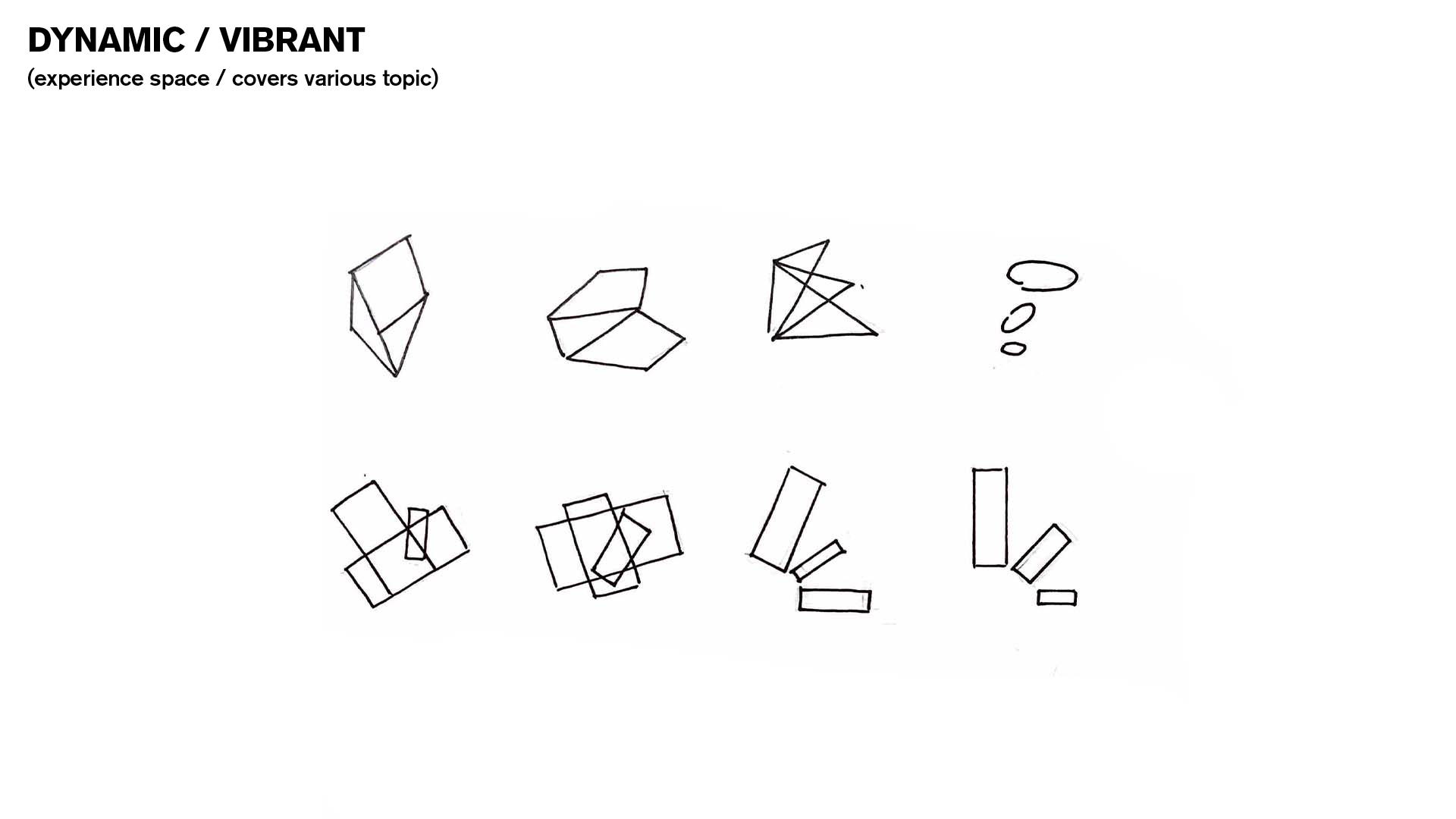
Hand-drawn sketches for each keyword (dynamic/vibrant)
Image
Image
Image
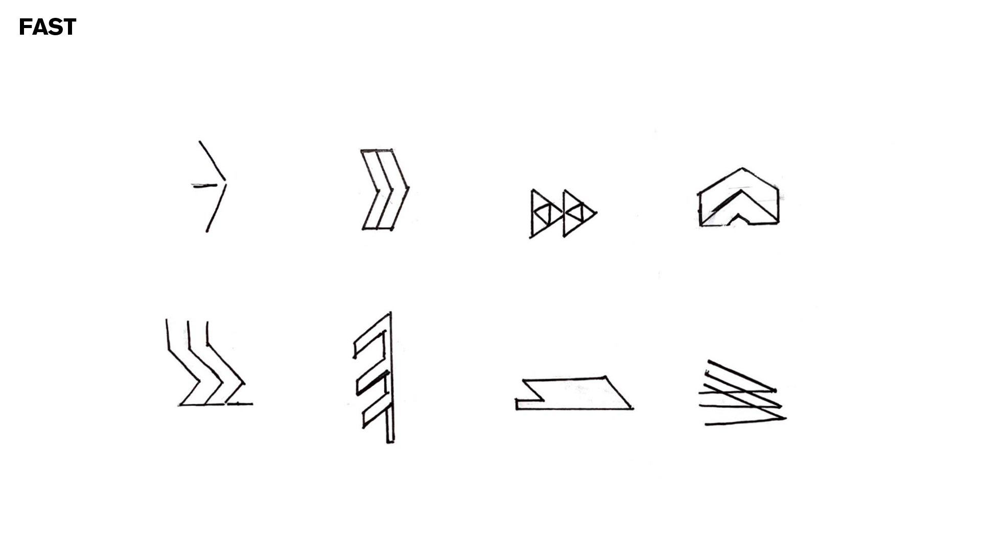
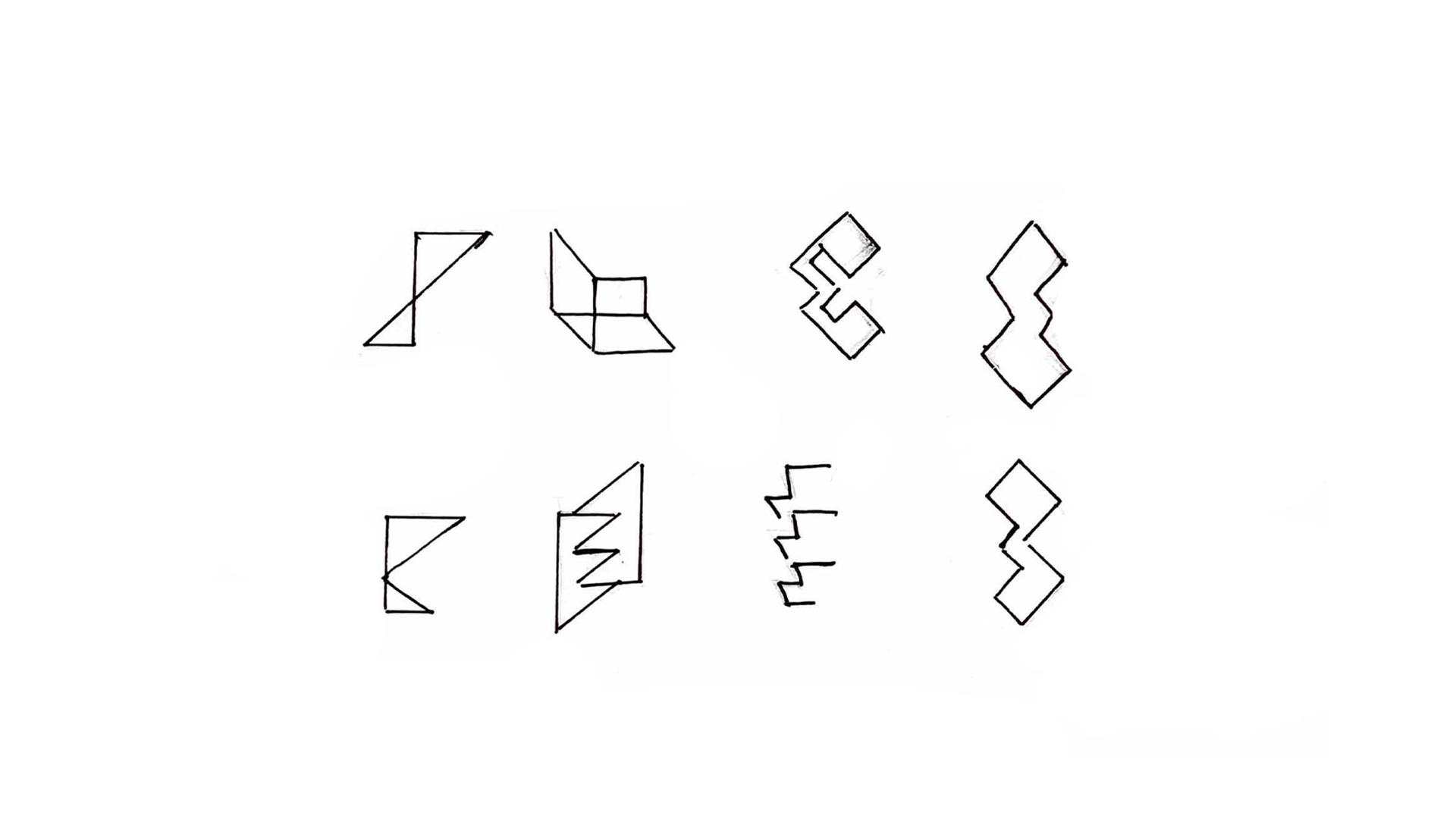
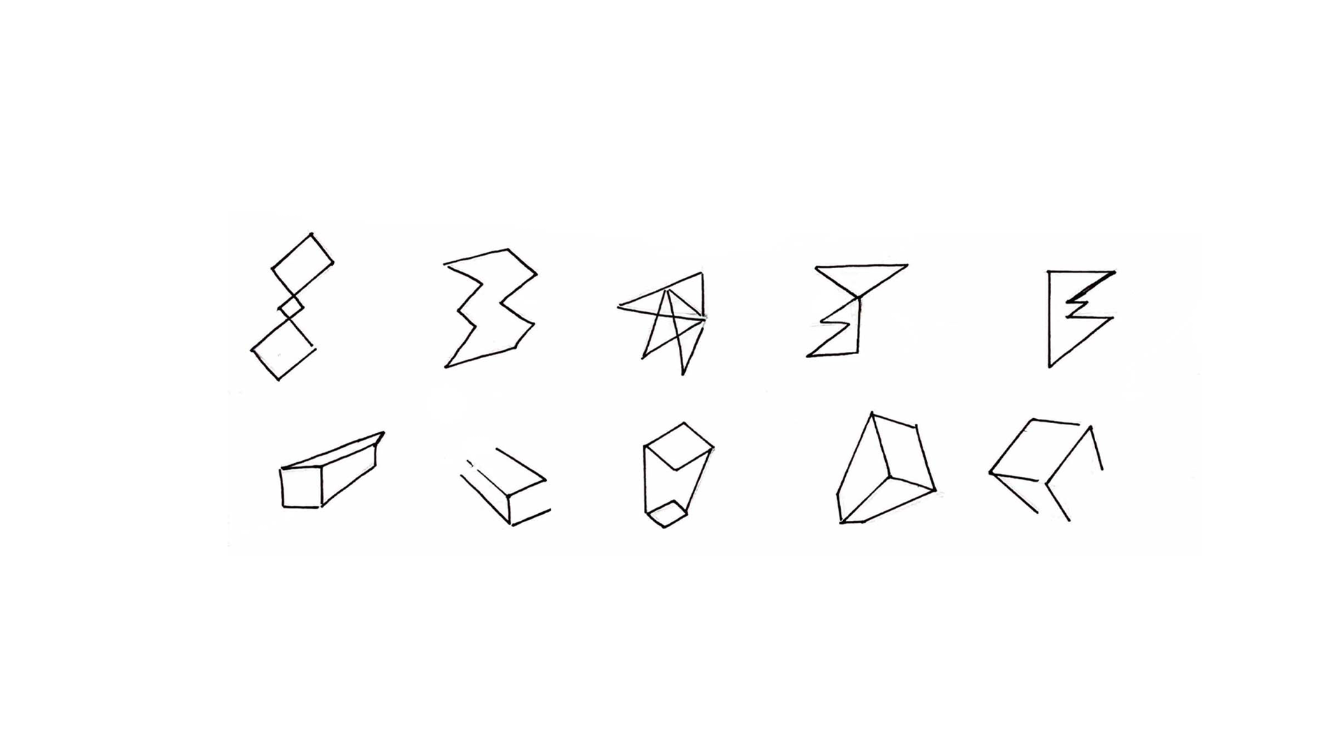
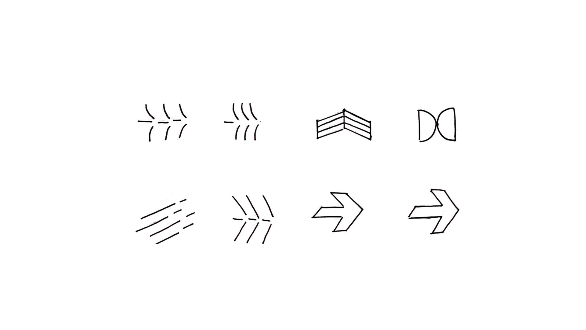
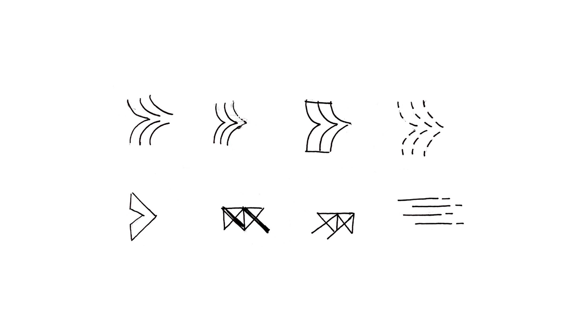
Hand-drawn sketches for each keyword (fast)
Image
Image
Image
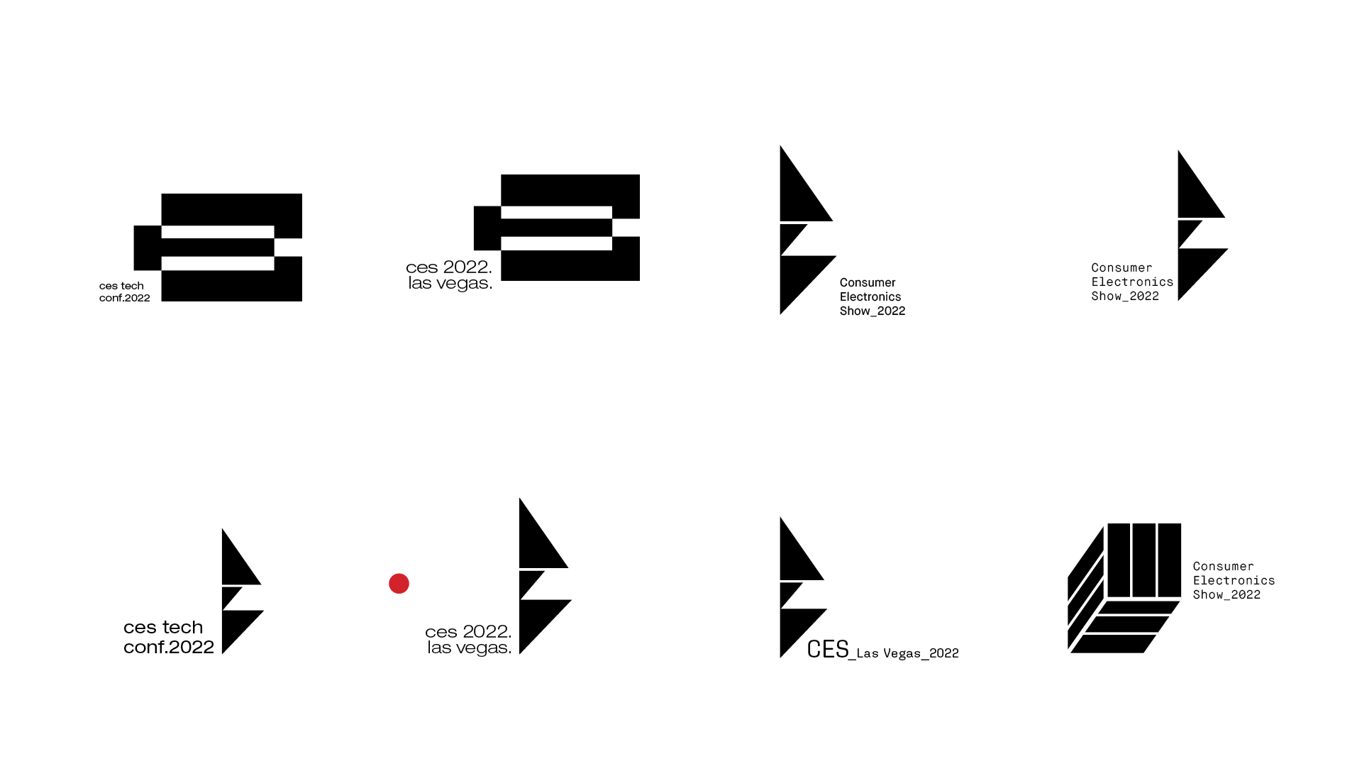
Digital logo sketch (first round)
Image
Image
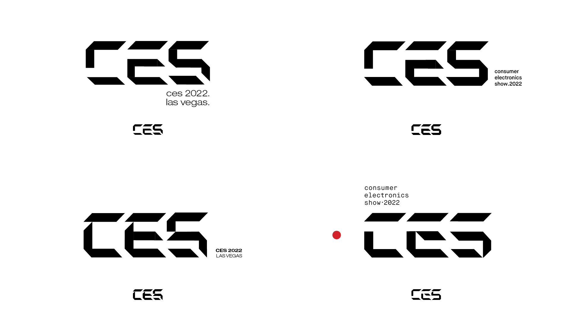
Chosen direction of creating custom typography with slanted shapes for dynamic and speed of the technology
Image
Image

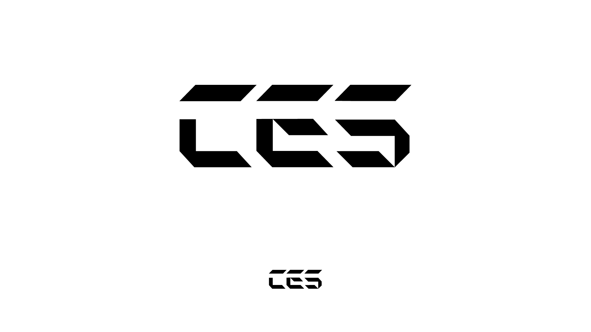
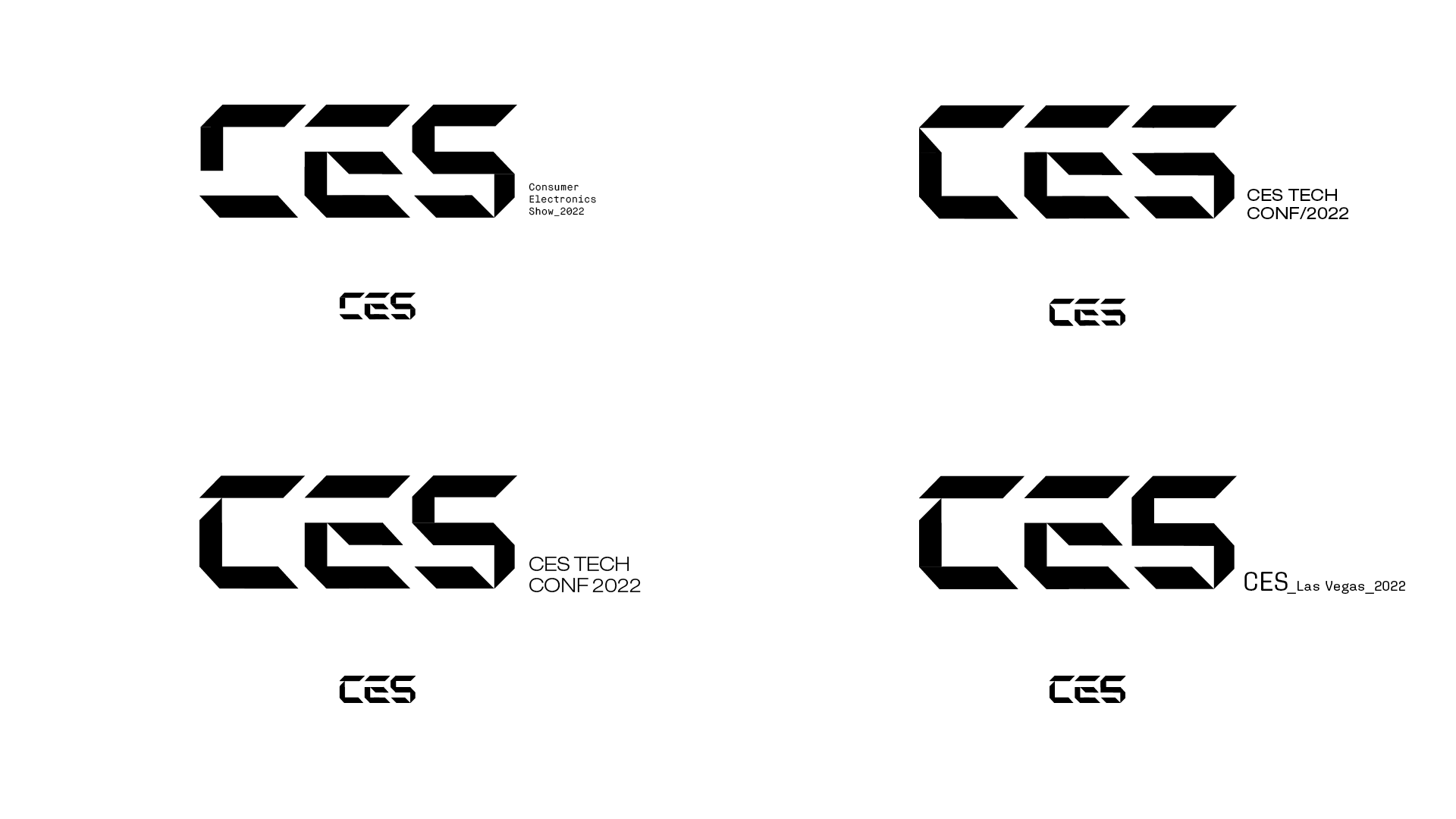
Final revision: short form
Image
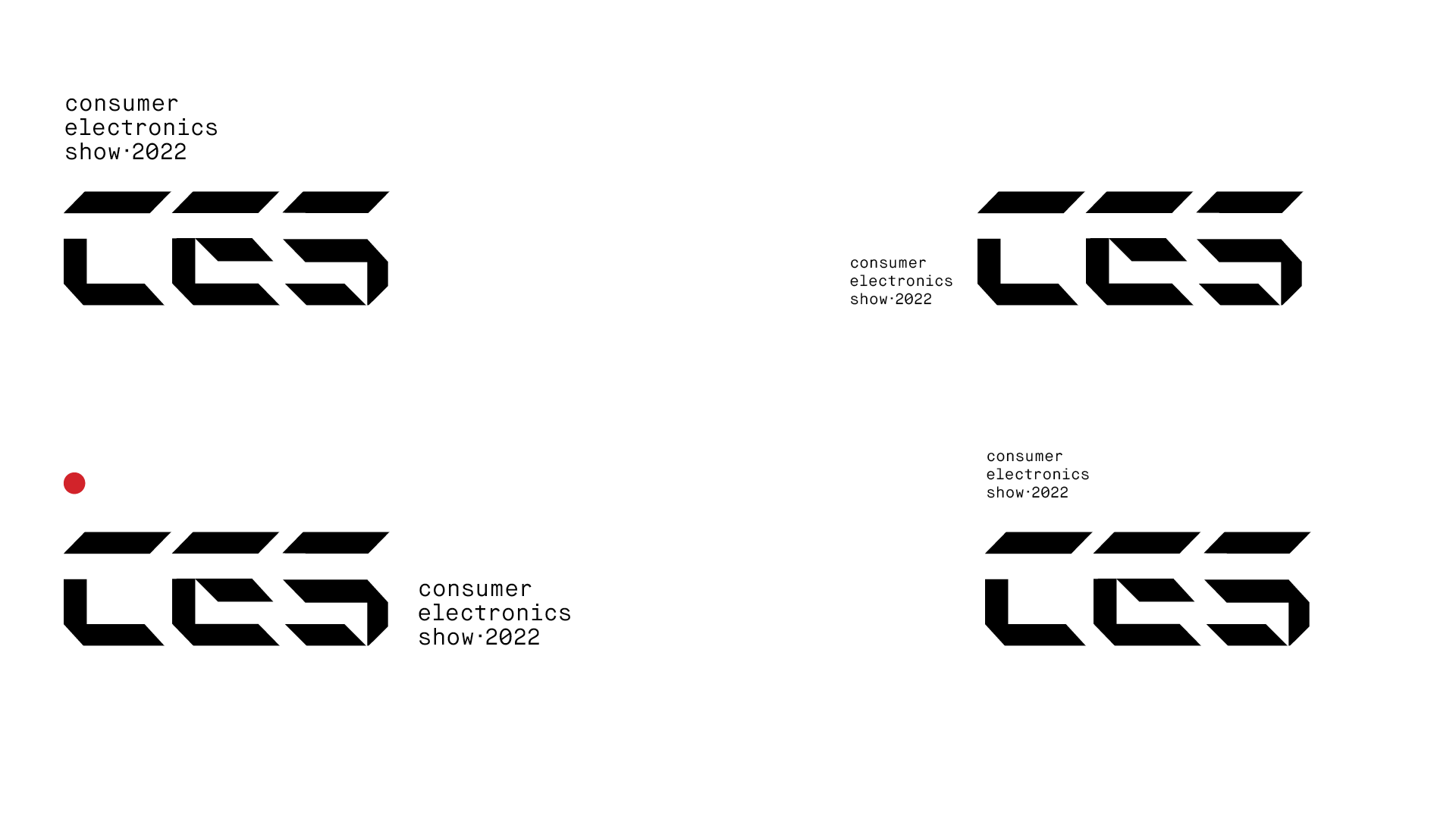
Final revision: long form w/ secondary typography