Image
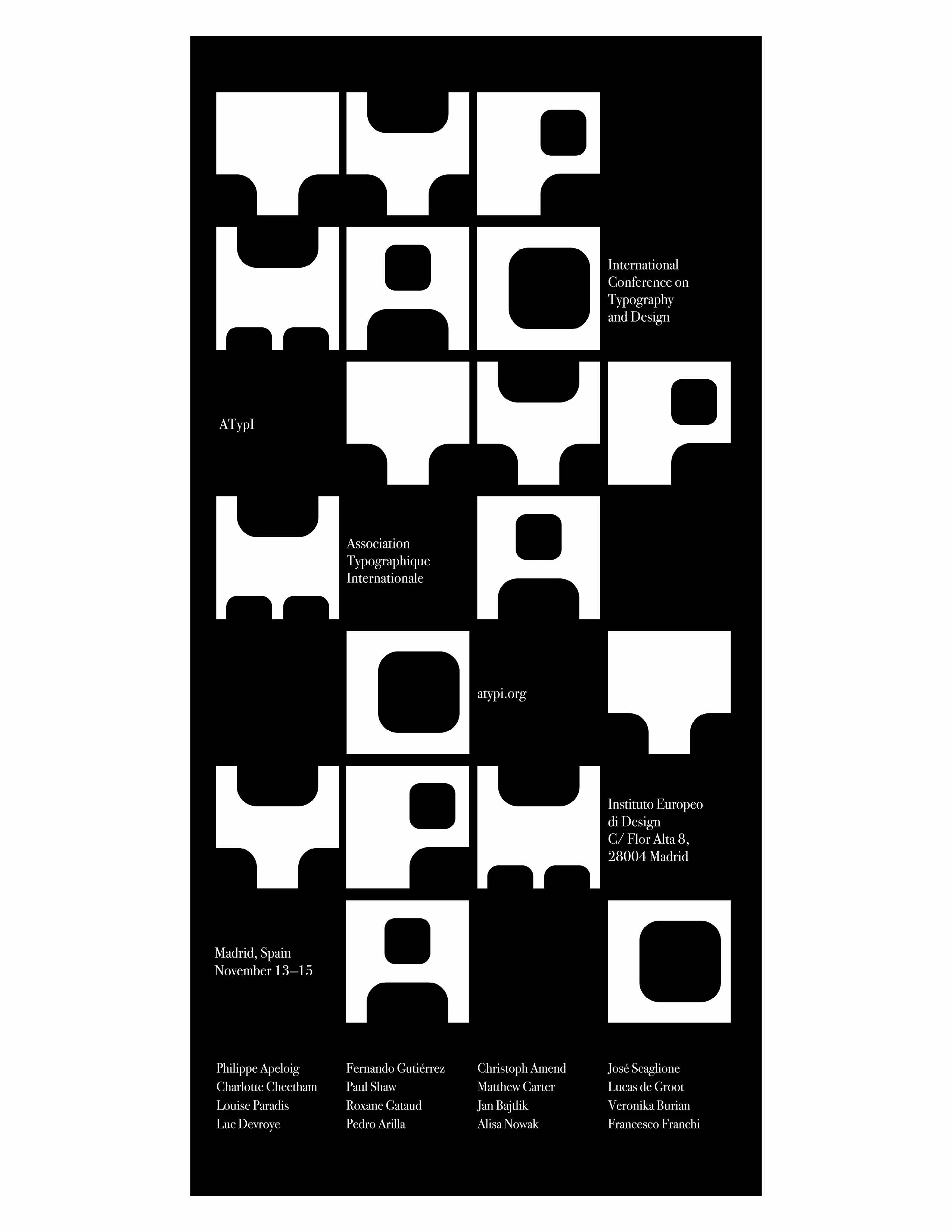
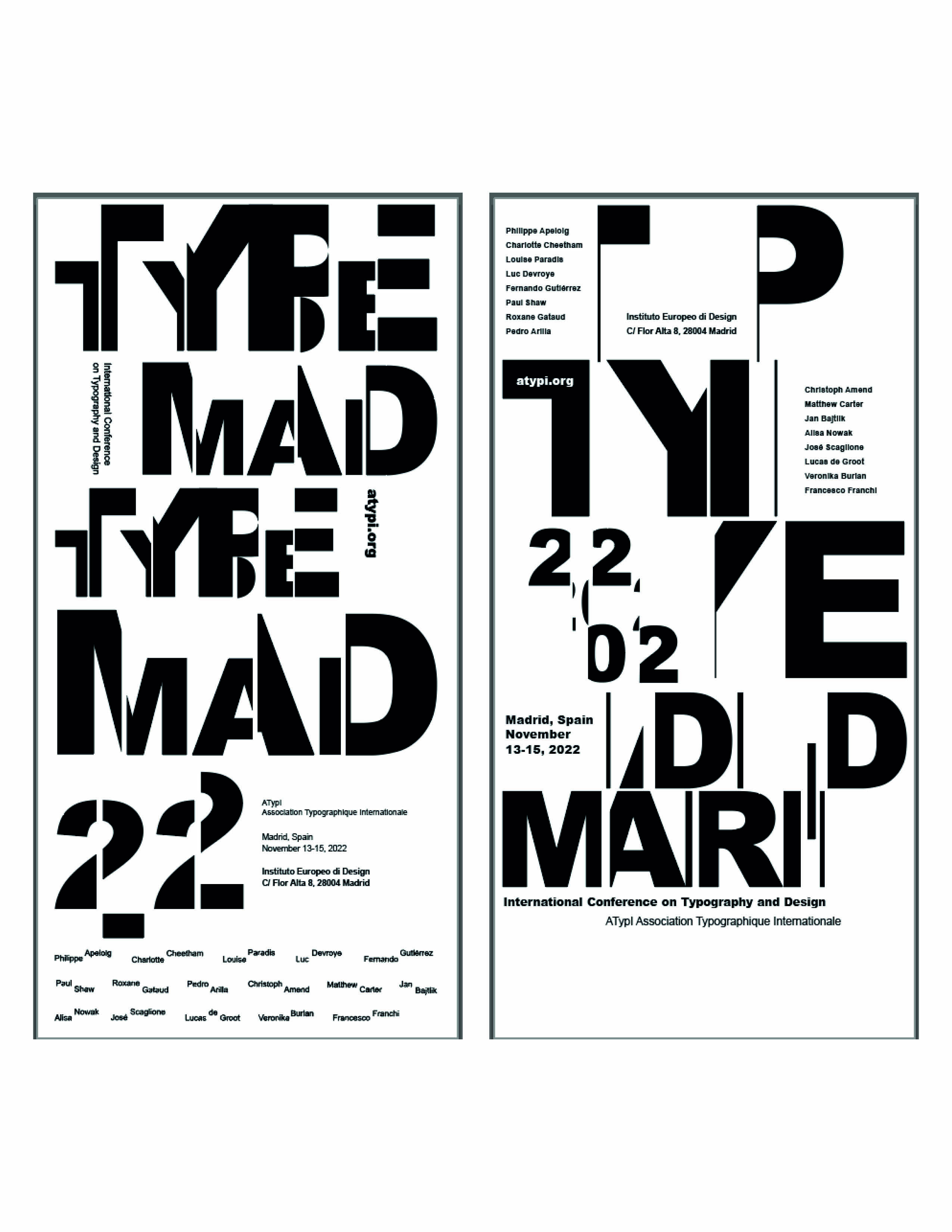
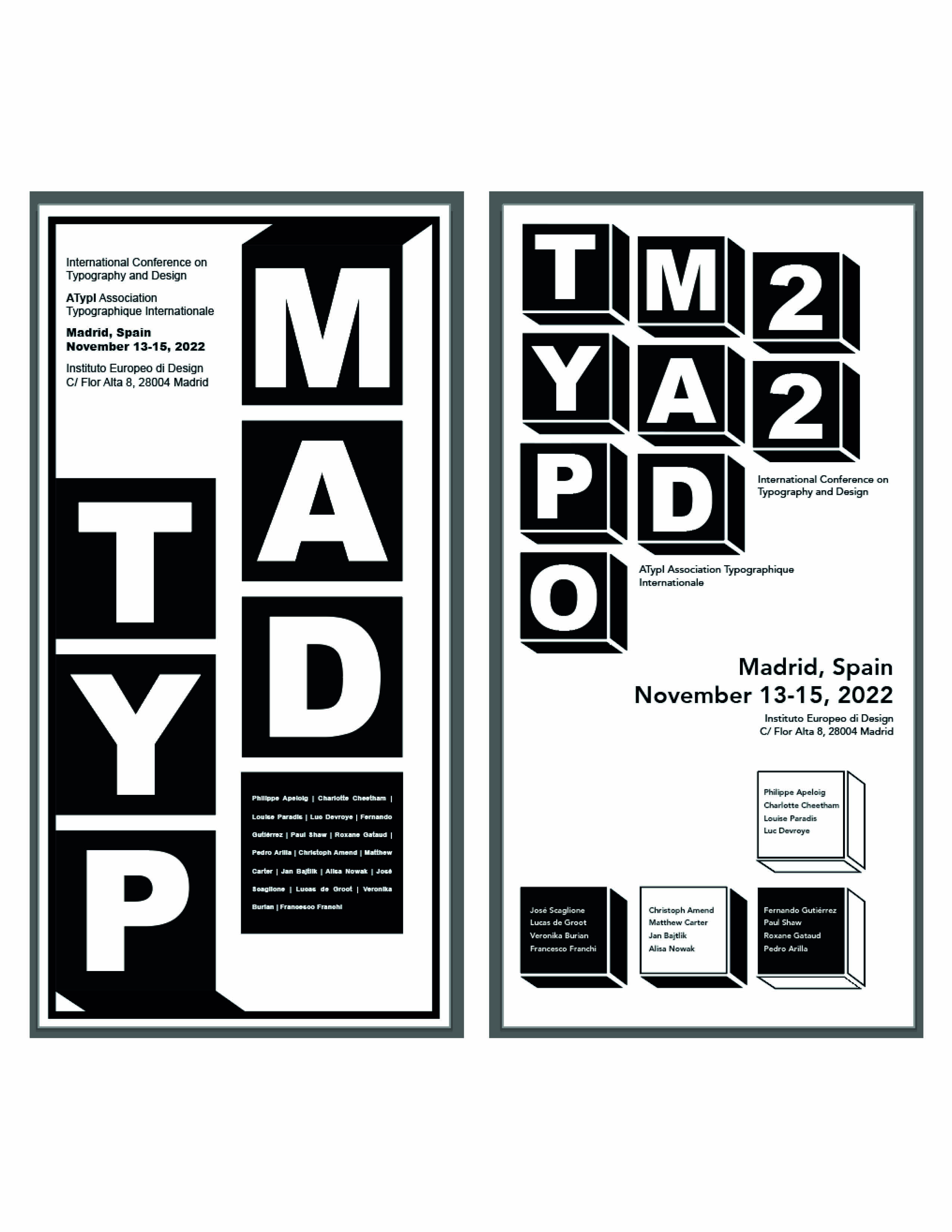
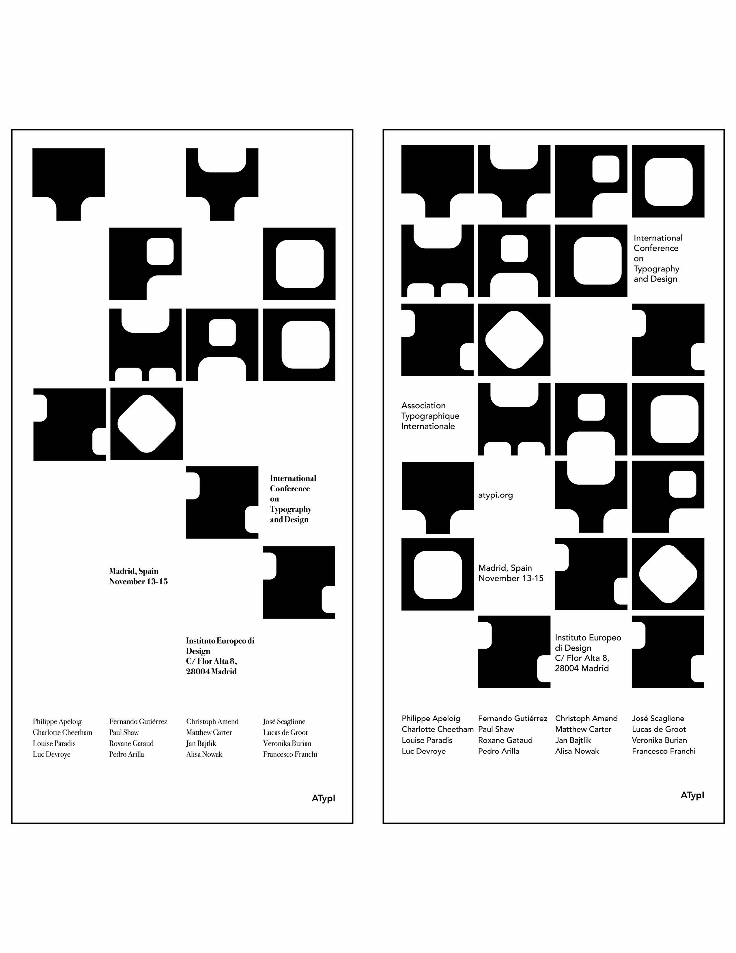
Final Poster White Background
Image
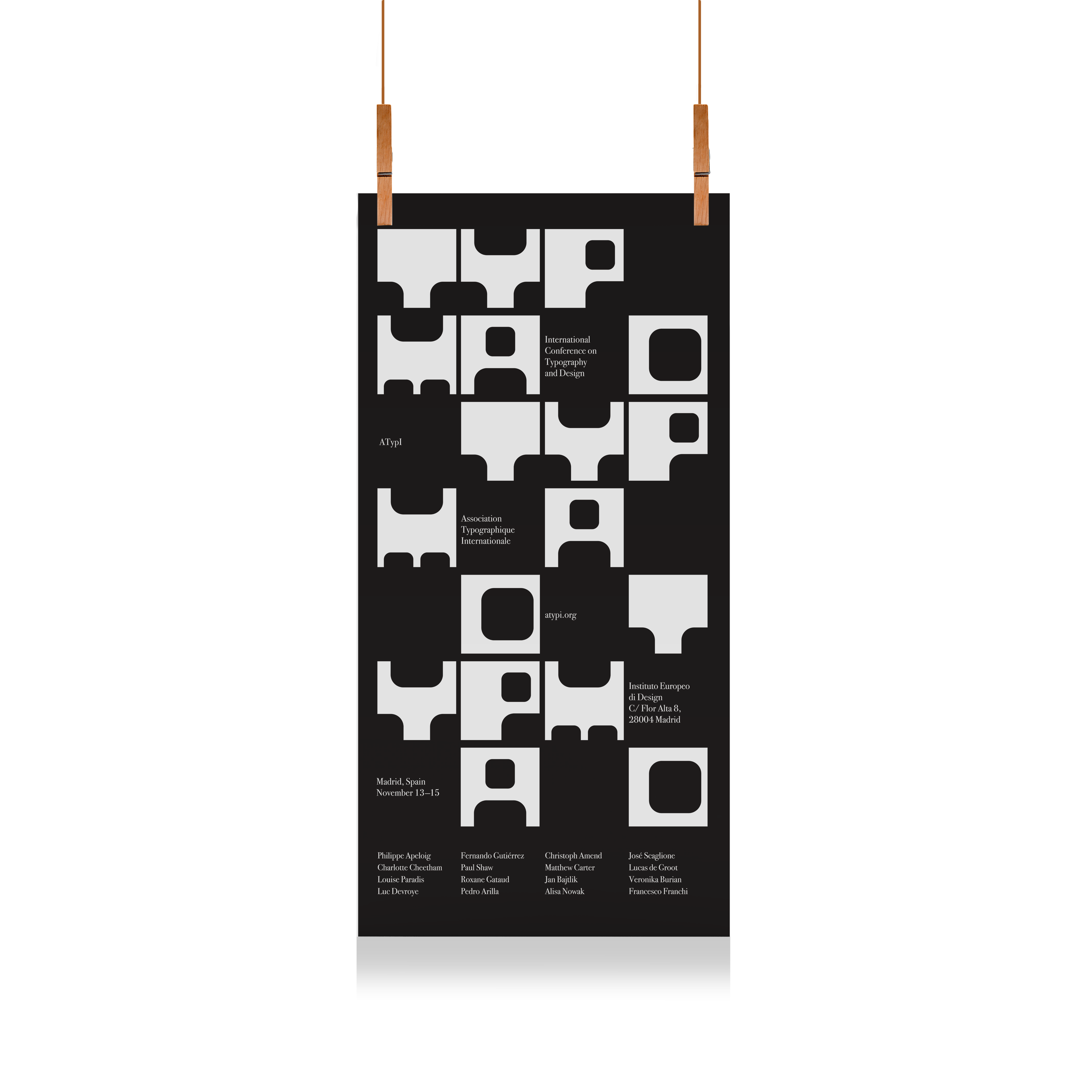
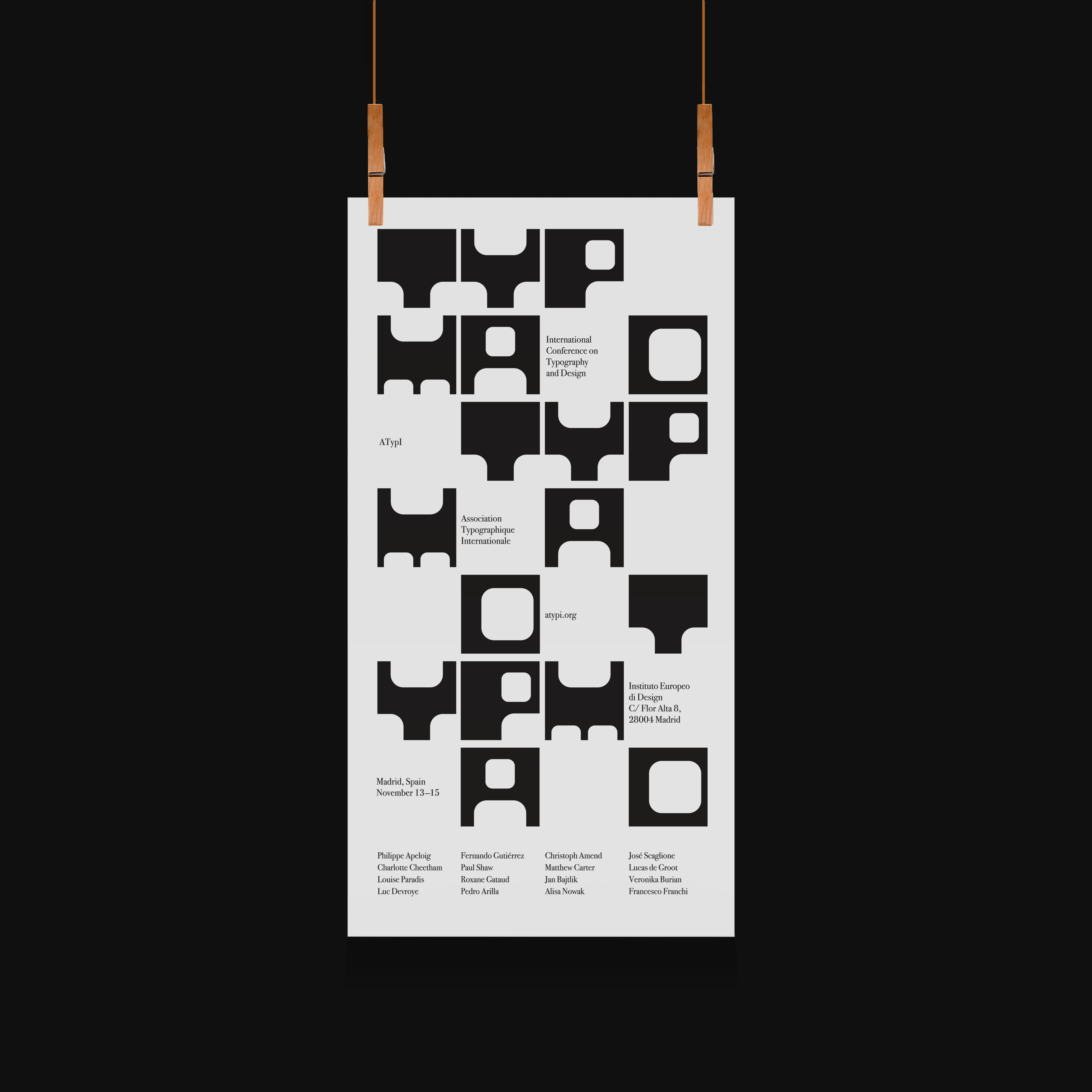
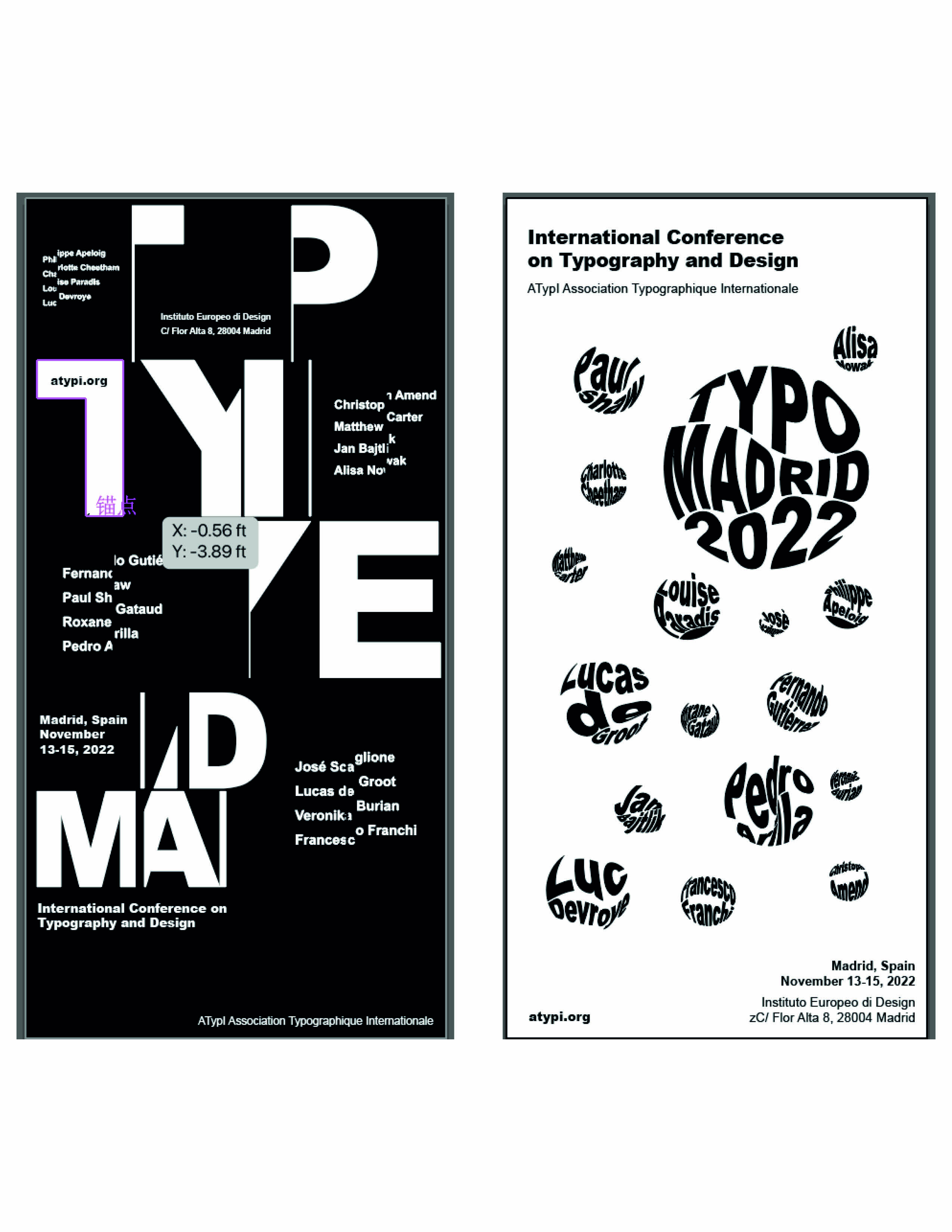
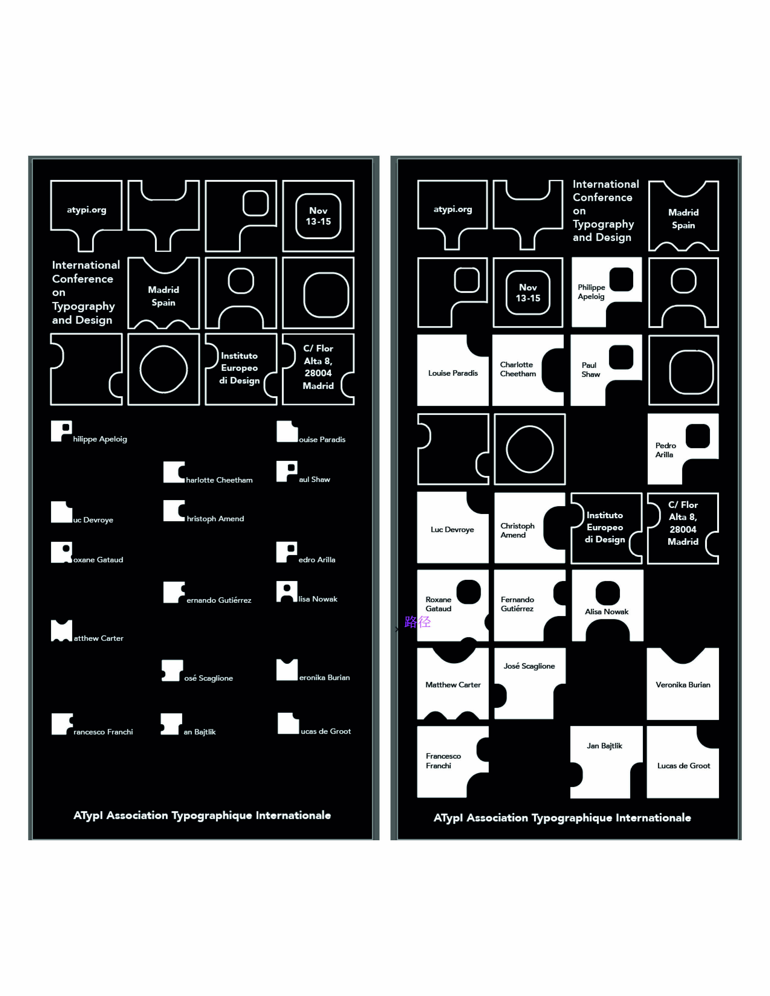
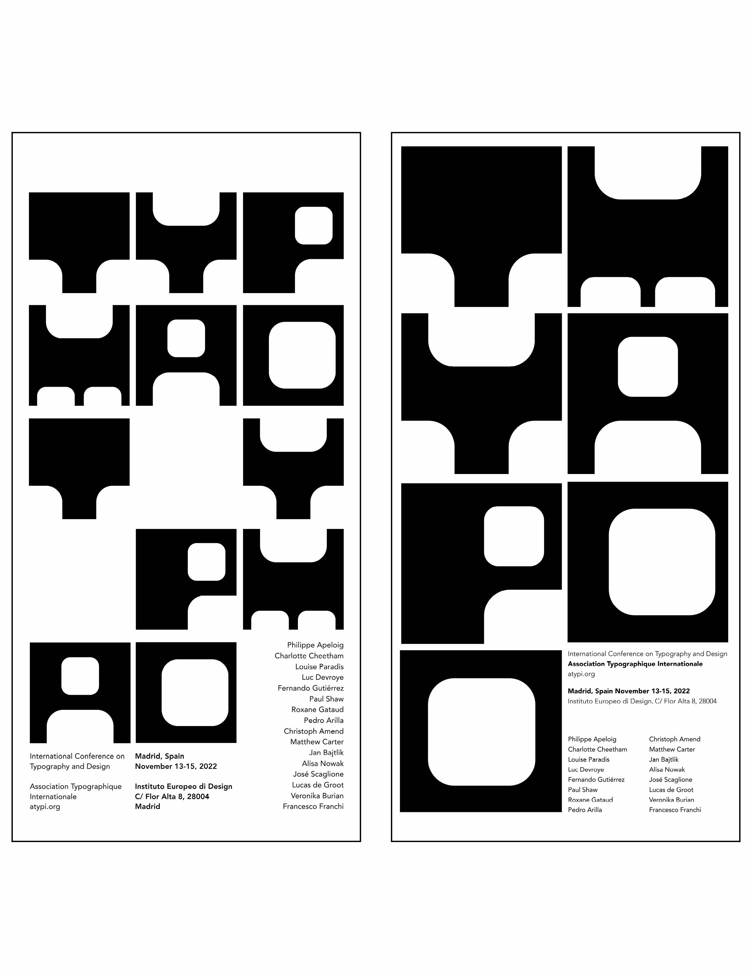
Final Poster Black Background
Image
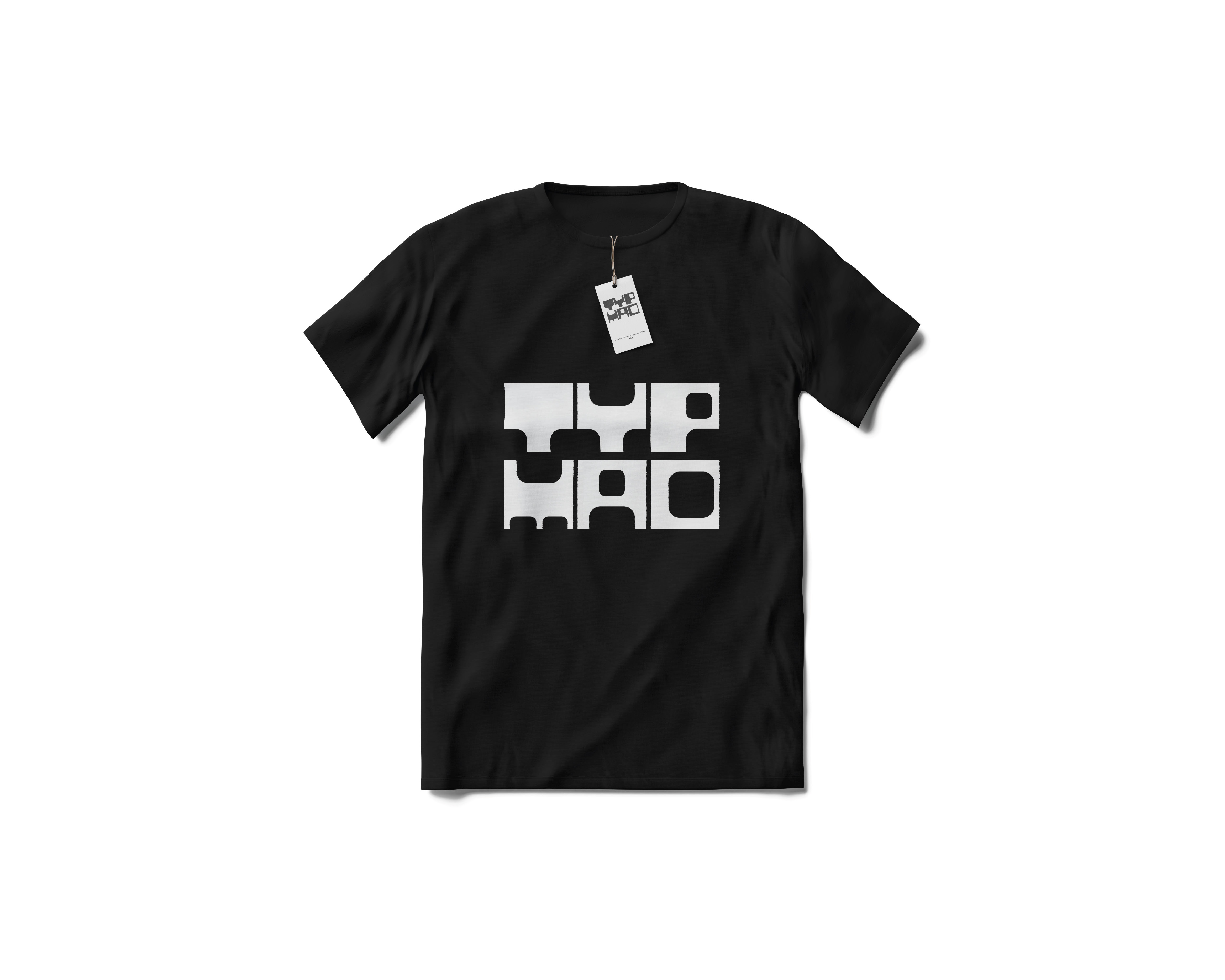
T-Shirt
Image
Image
Bag
Image
Card
Image
badge
Image
First Logo Sketch
Image
Image
Image
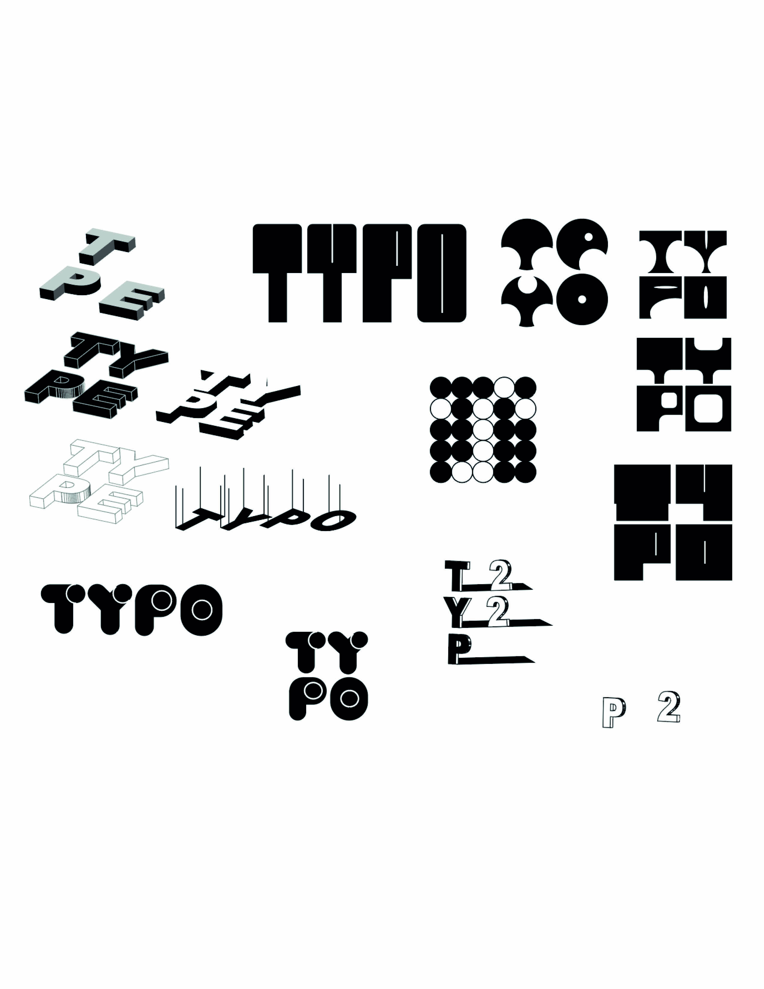
Different Directions of Logo Directions of Up: inspiration is movable type printing Directions of Bottom: geometric shapes font design by myself ( direction I choose)
Image
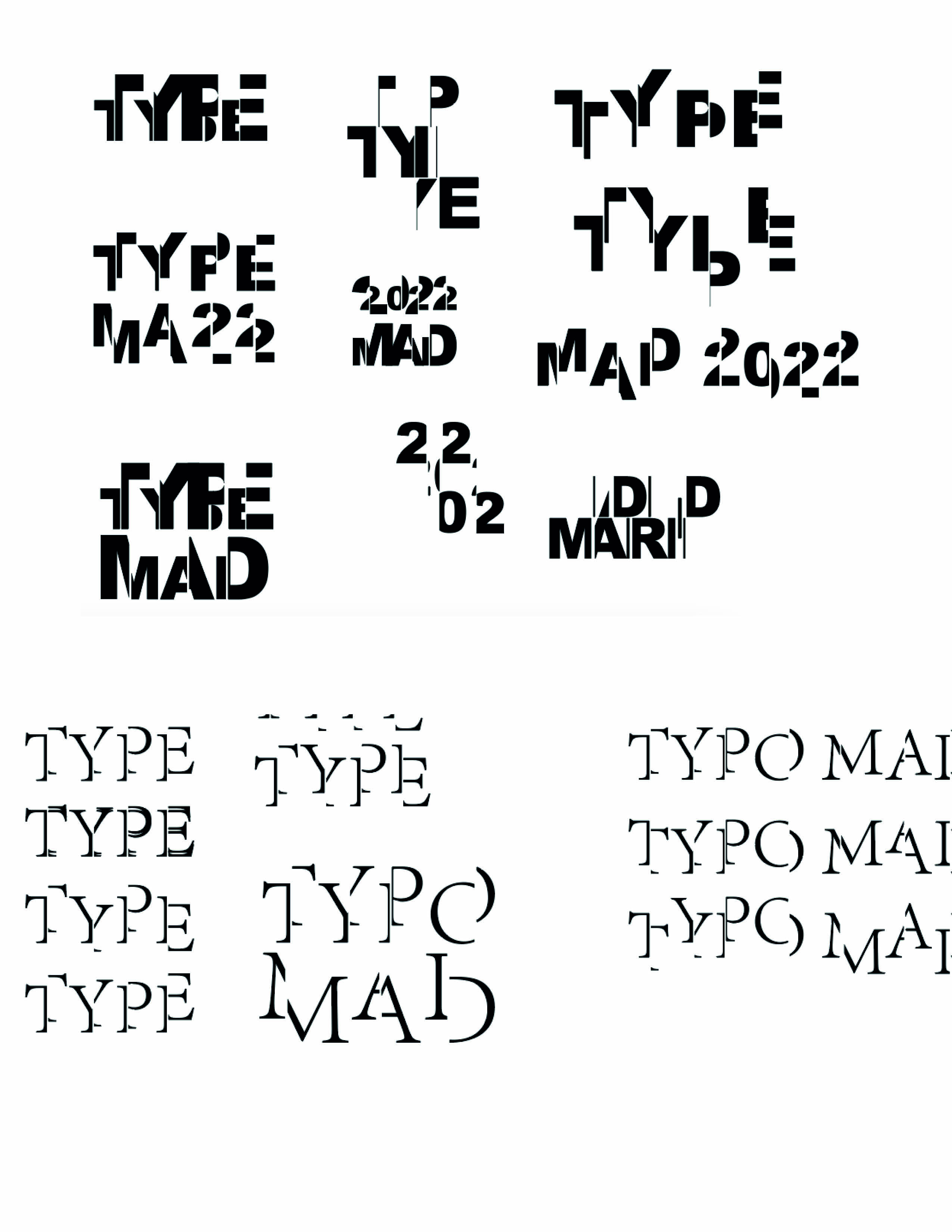
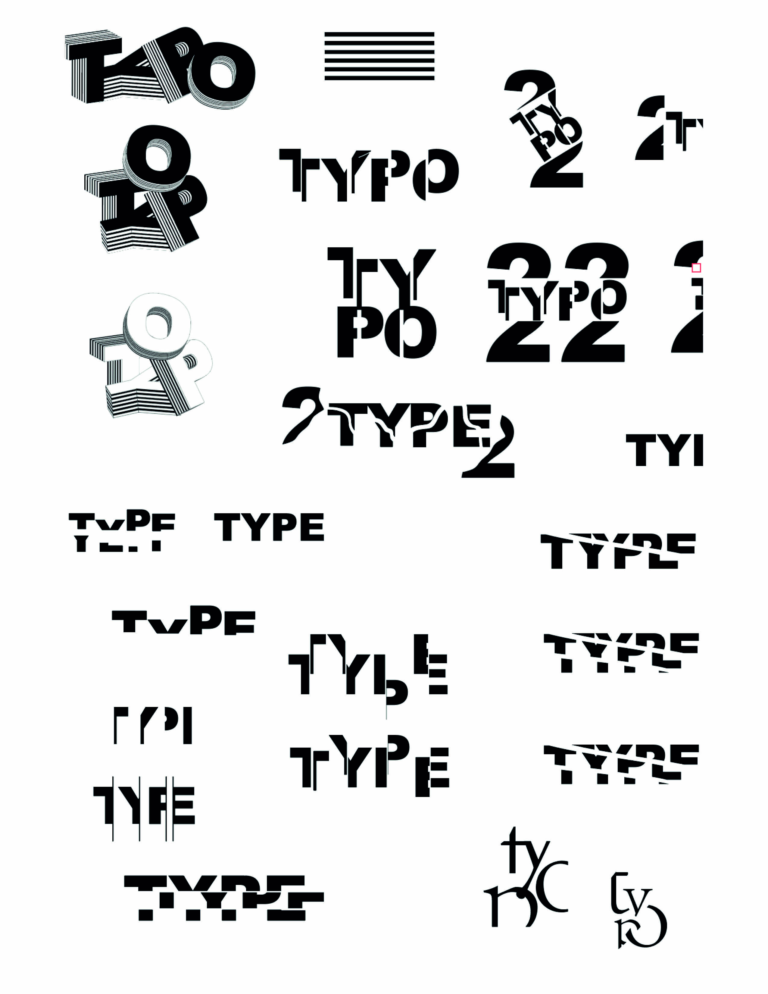
Logo Sketch Directions: split letters
Image
Logo Sketch Directions: Distort letters into geometric shapes
Image
Poster Sketch
Image
Image
Image
Image
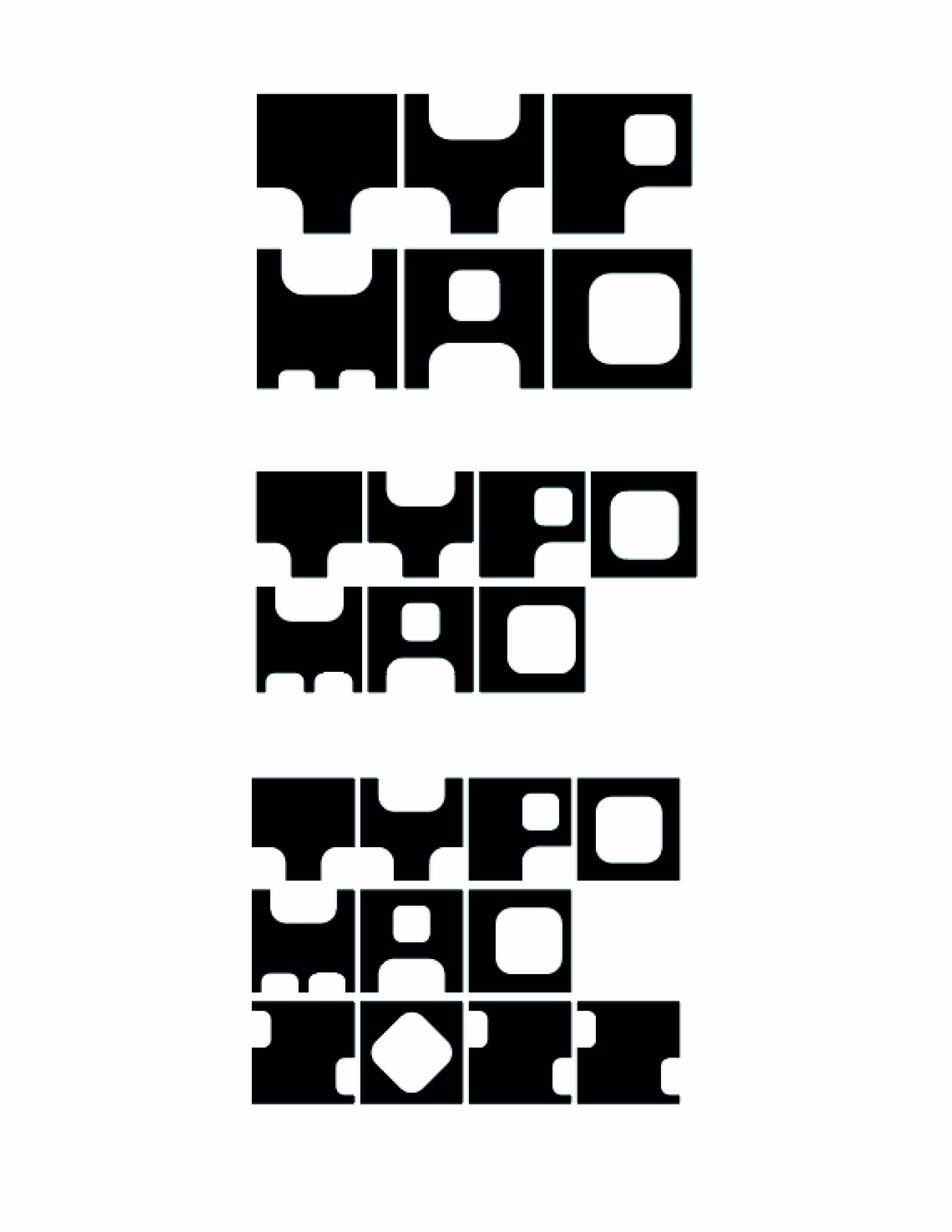
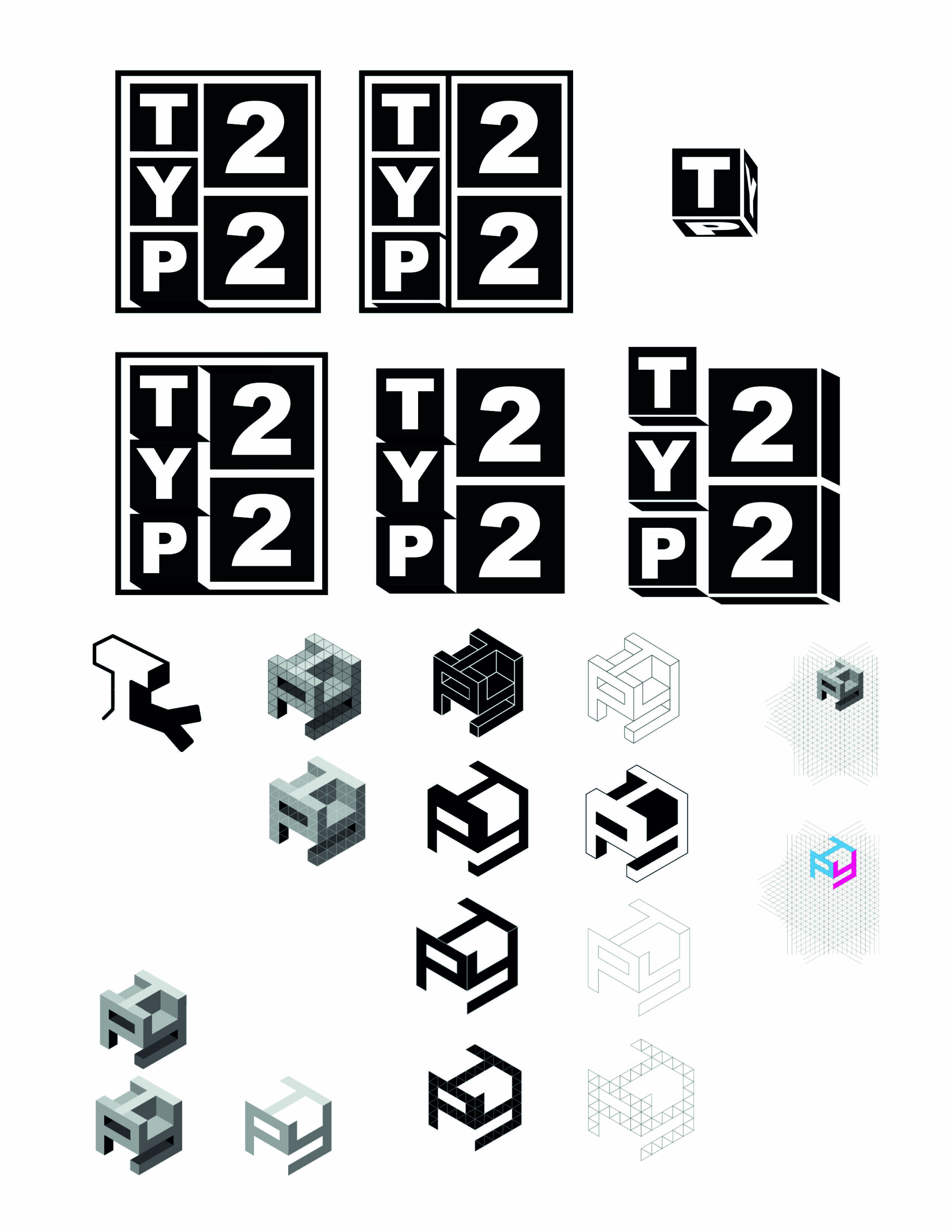
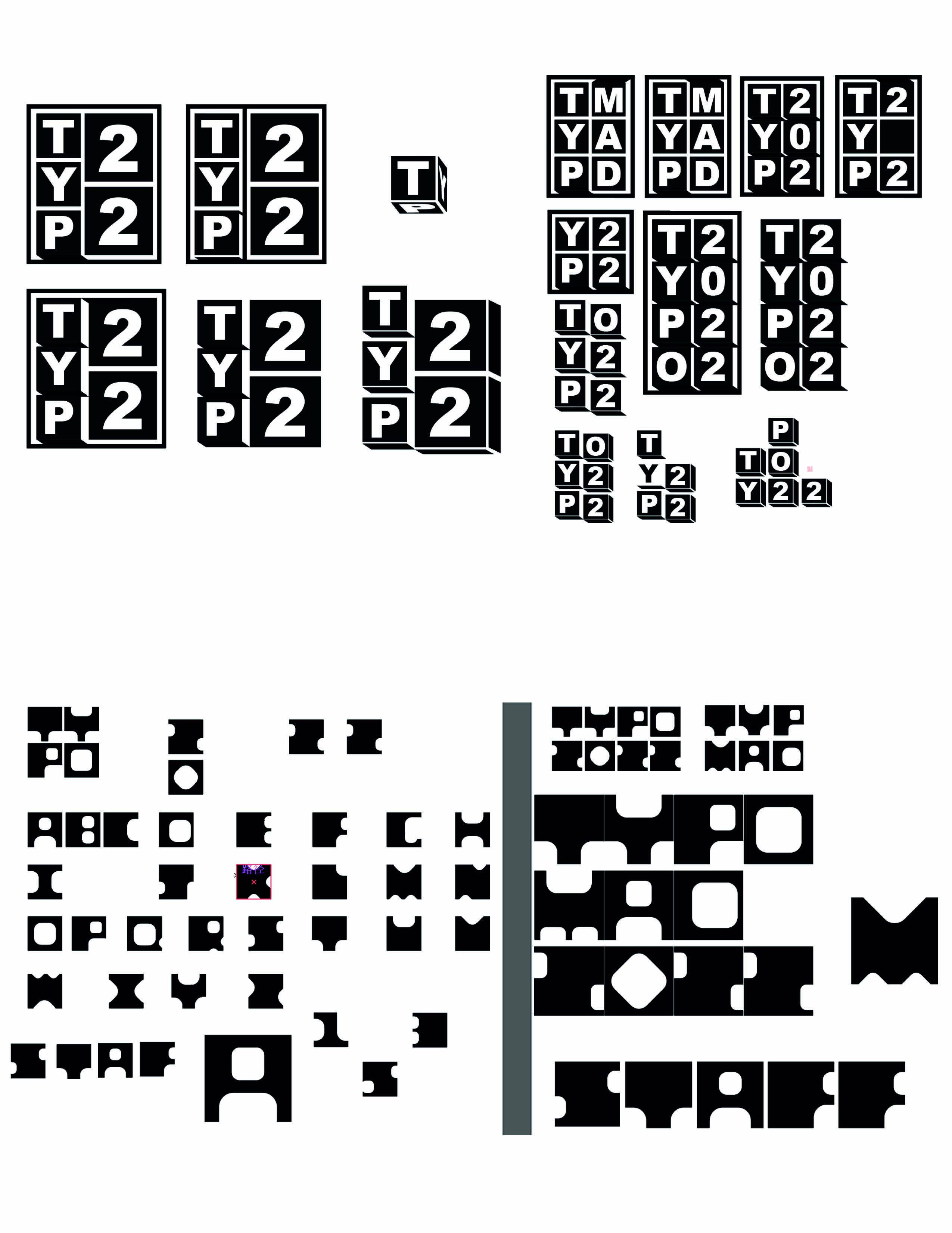
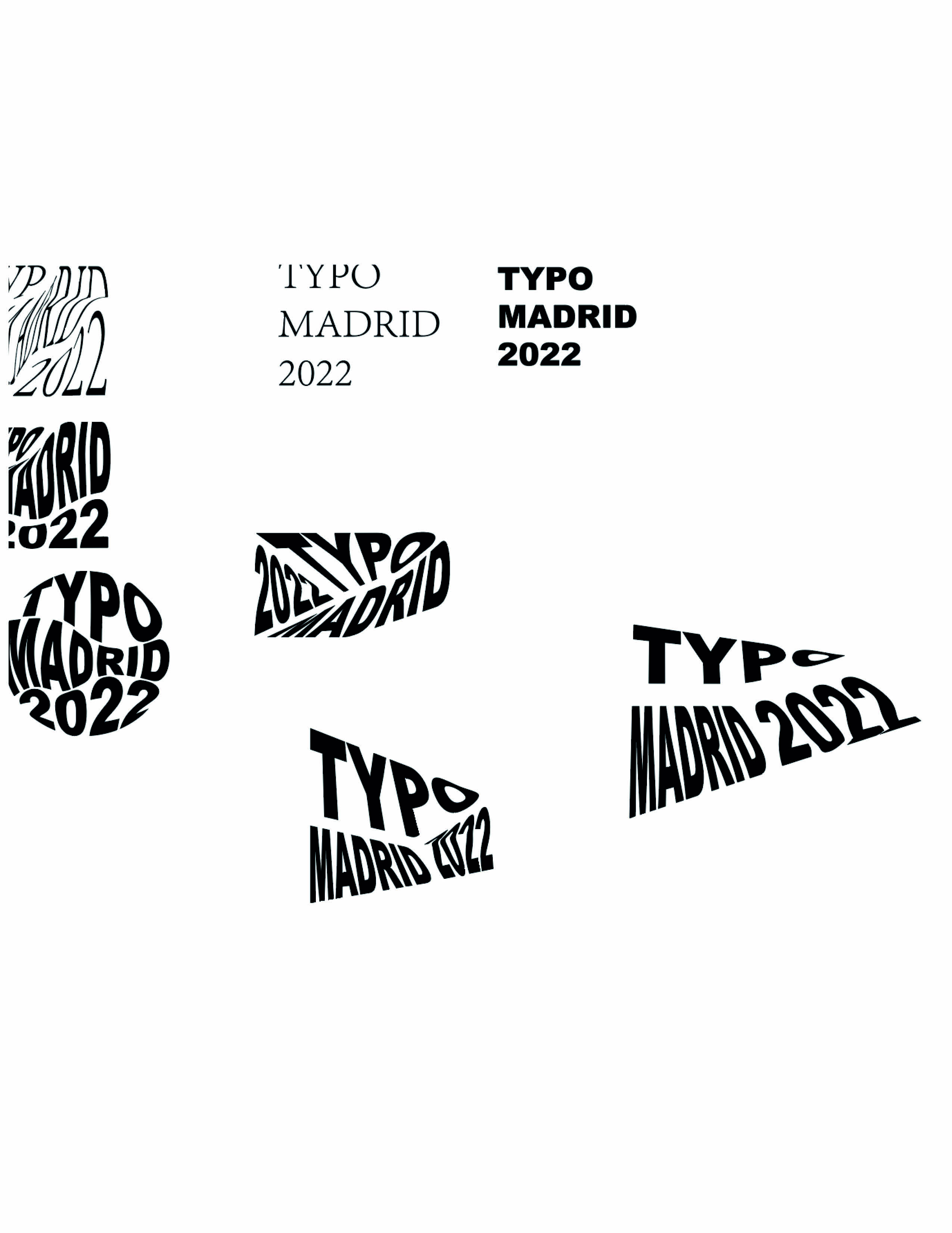
LOGO Variations
Image
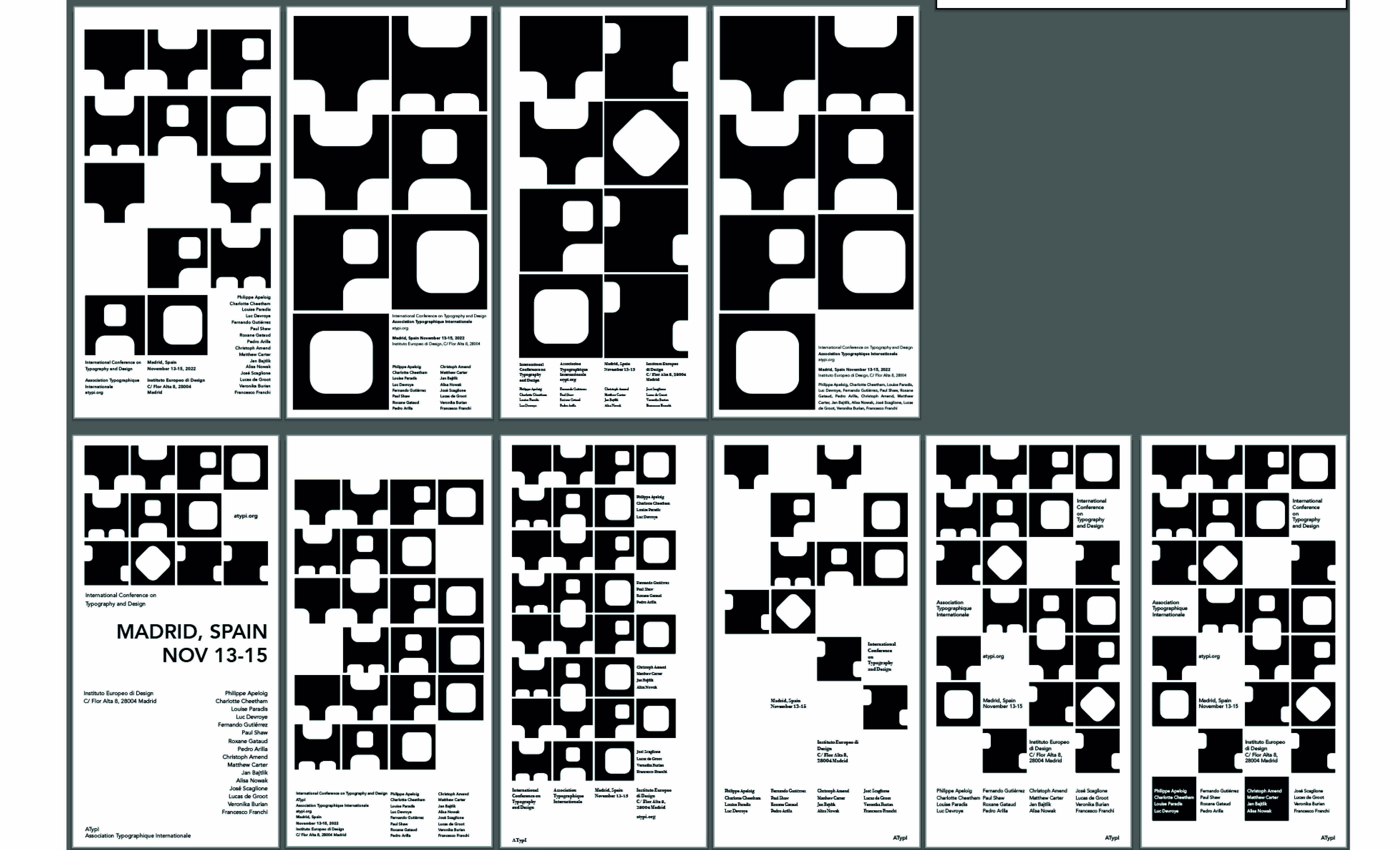
Poster Variations
Image

Image
Image
Image
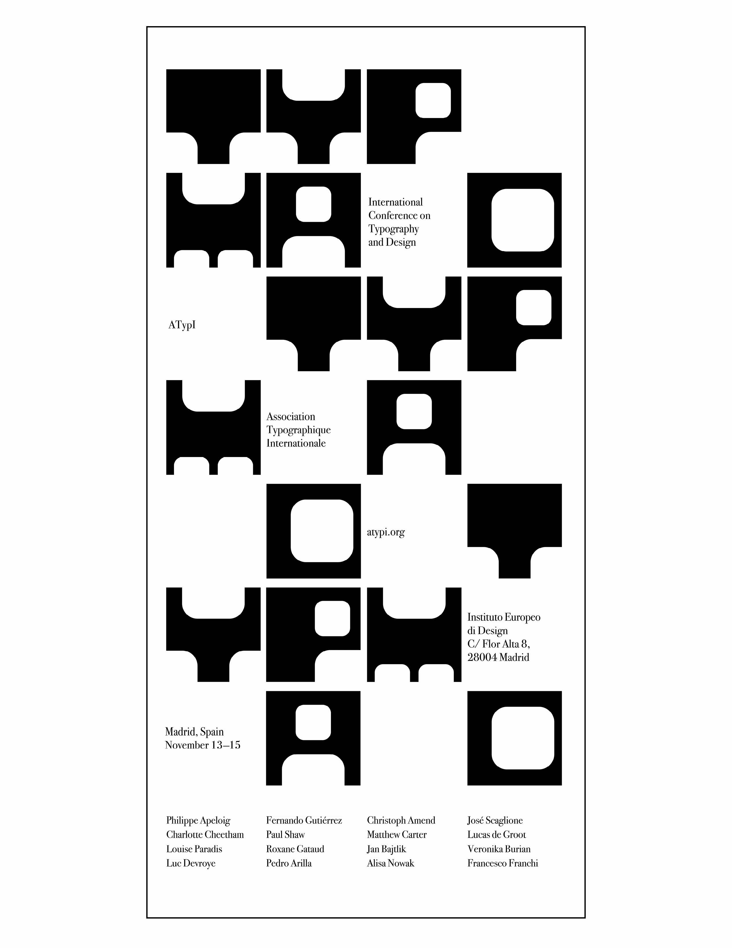
FInal Poster
Image