Image
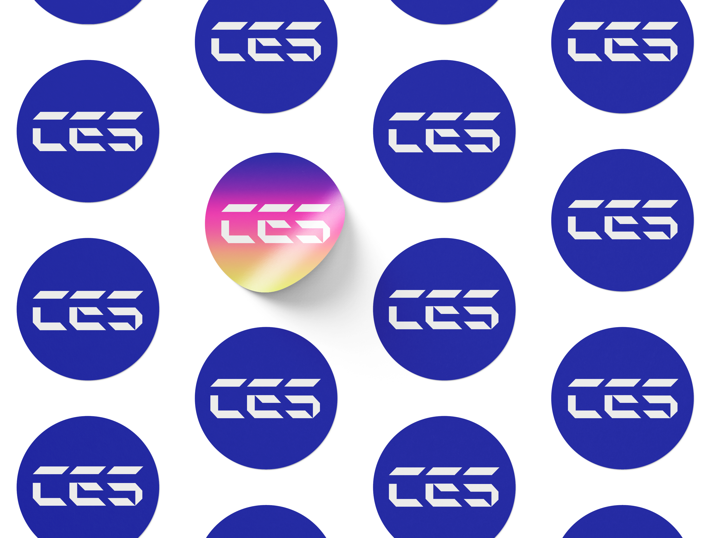
Logo 1: Short form
Image
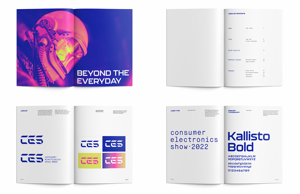
Logo 2: Long form (uses in business, formal situation)
Image
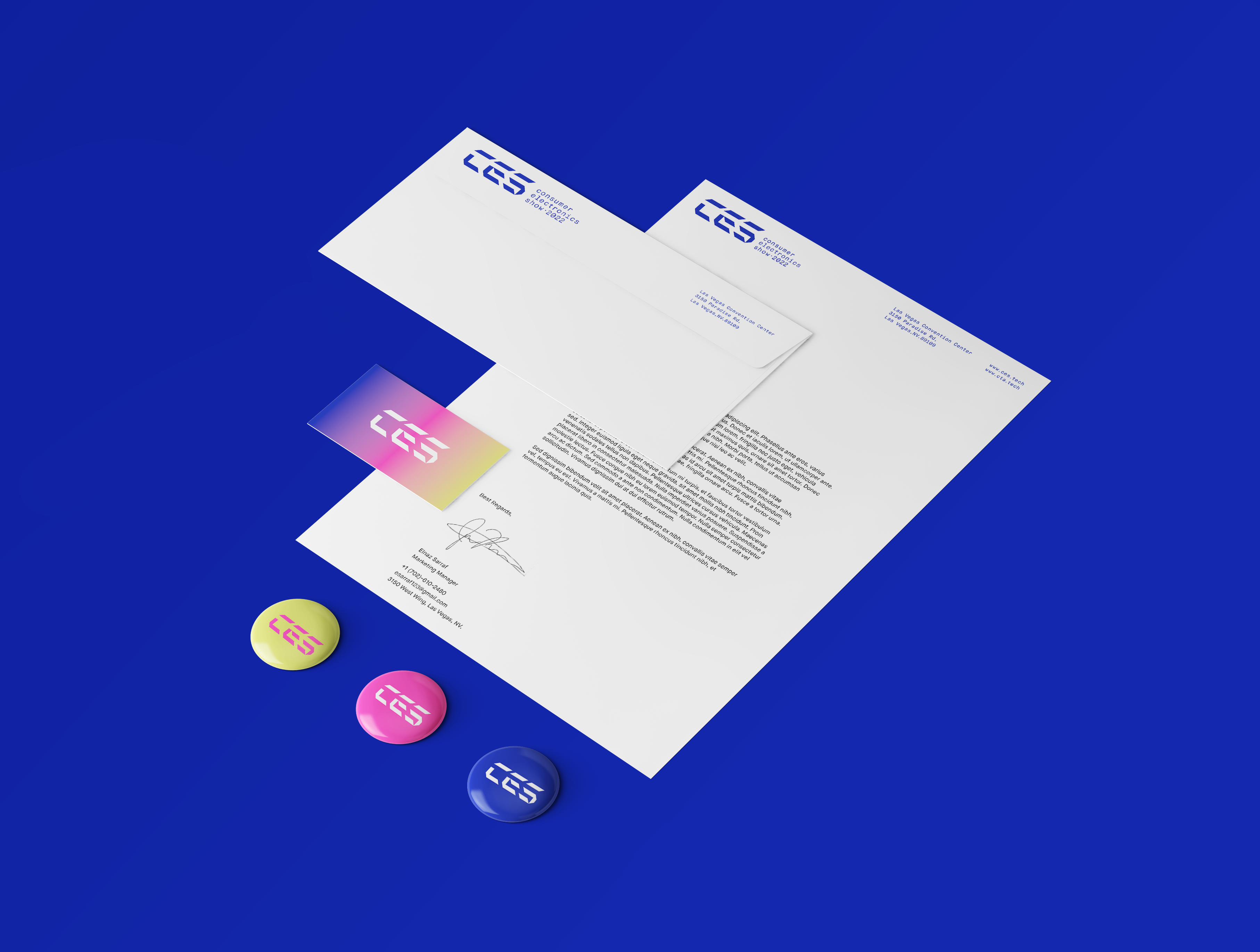
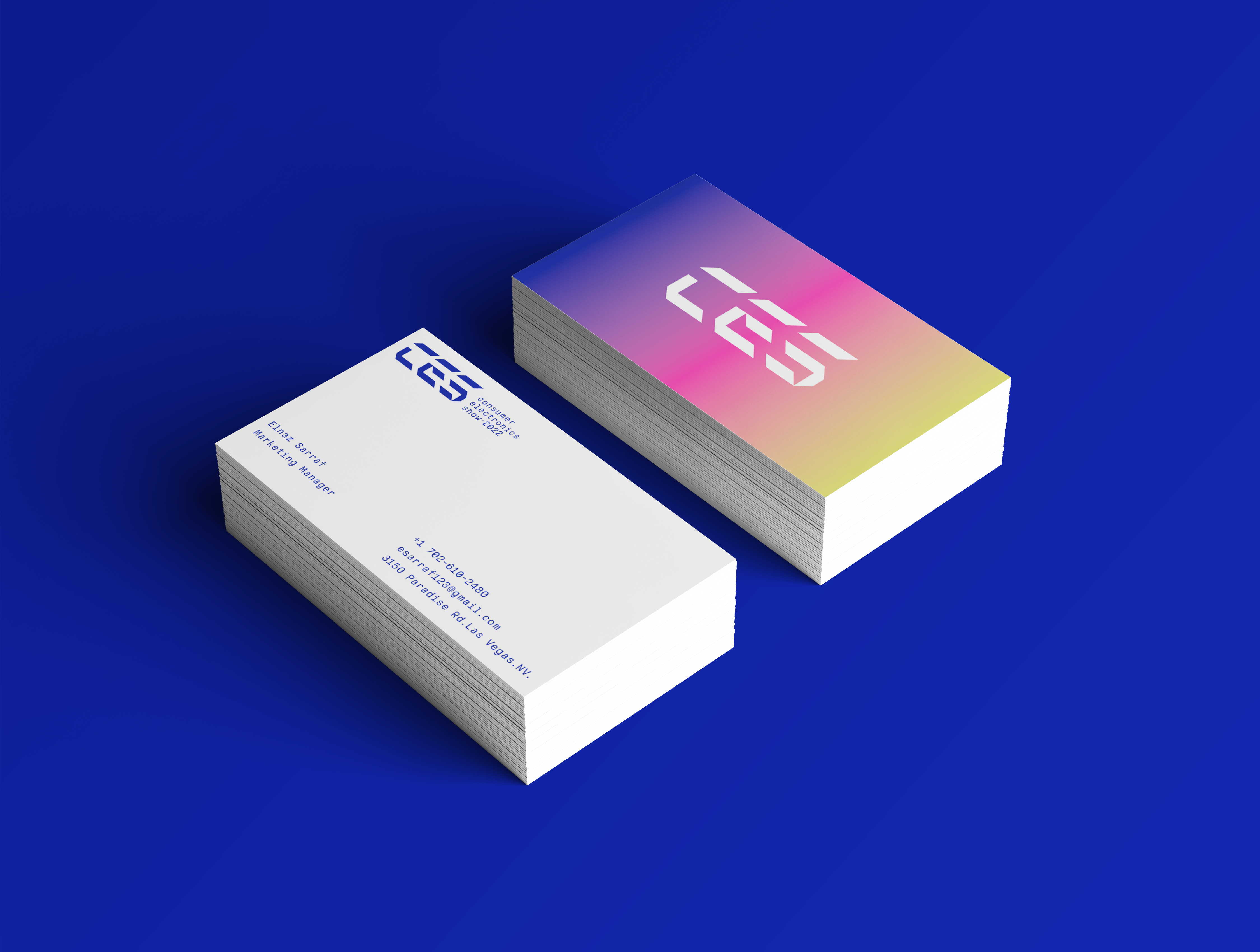
Stationery
Image
Image
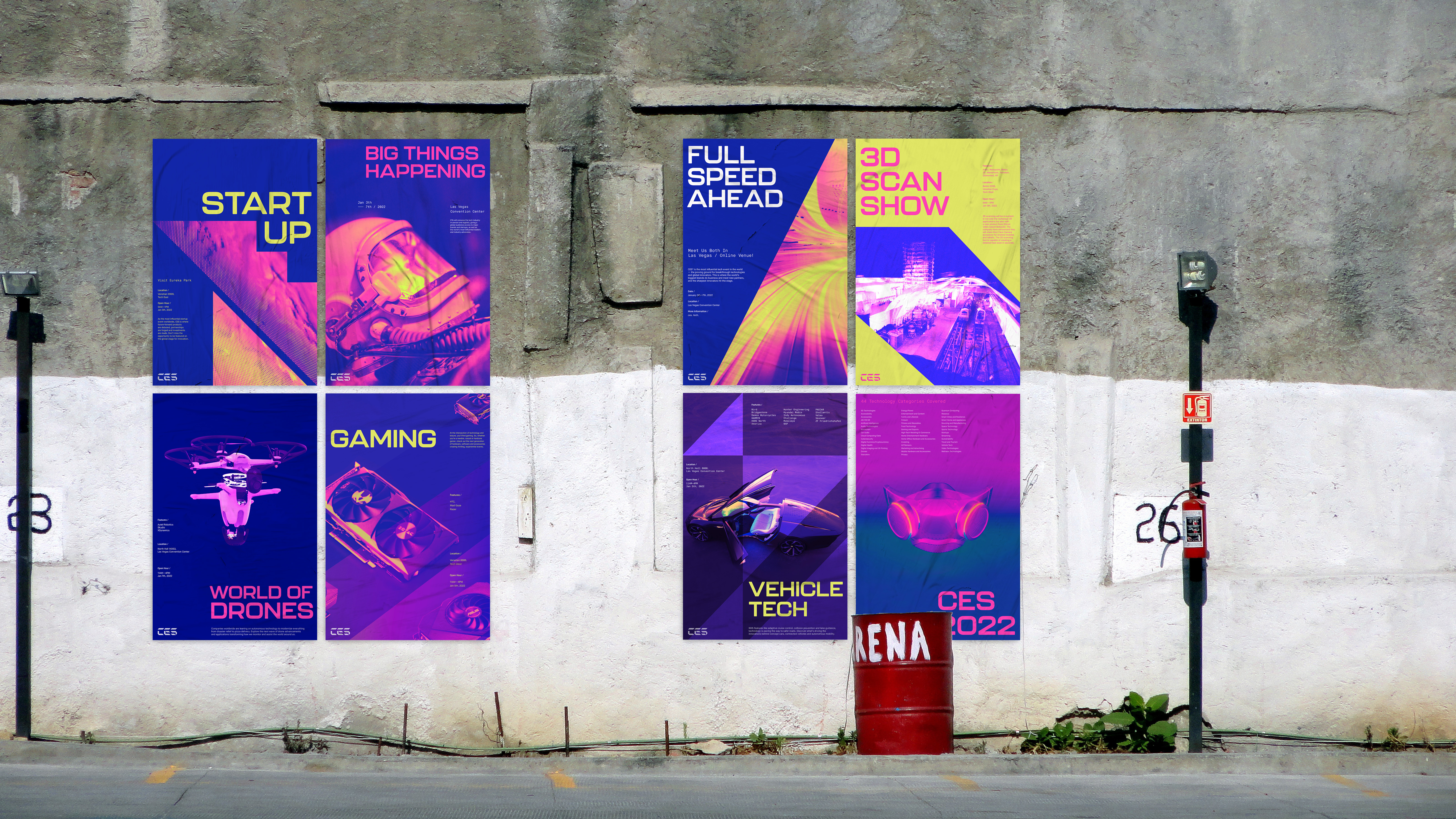
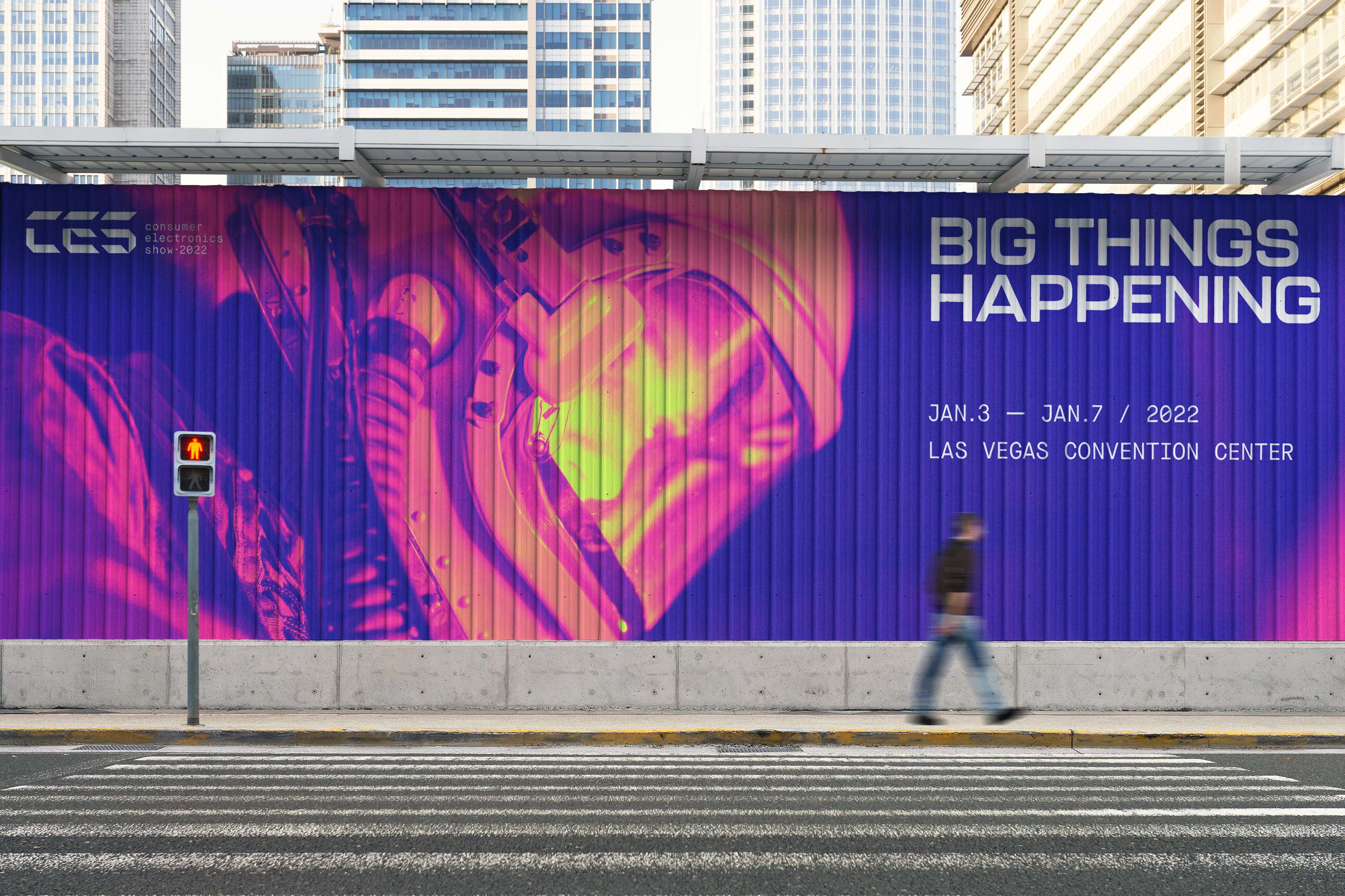
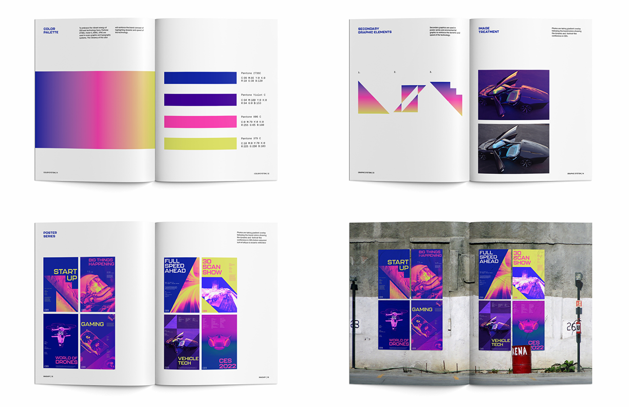
Poster Series
Image
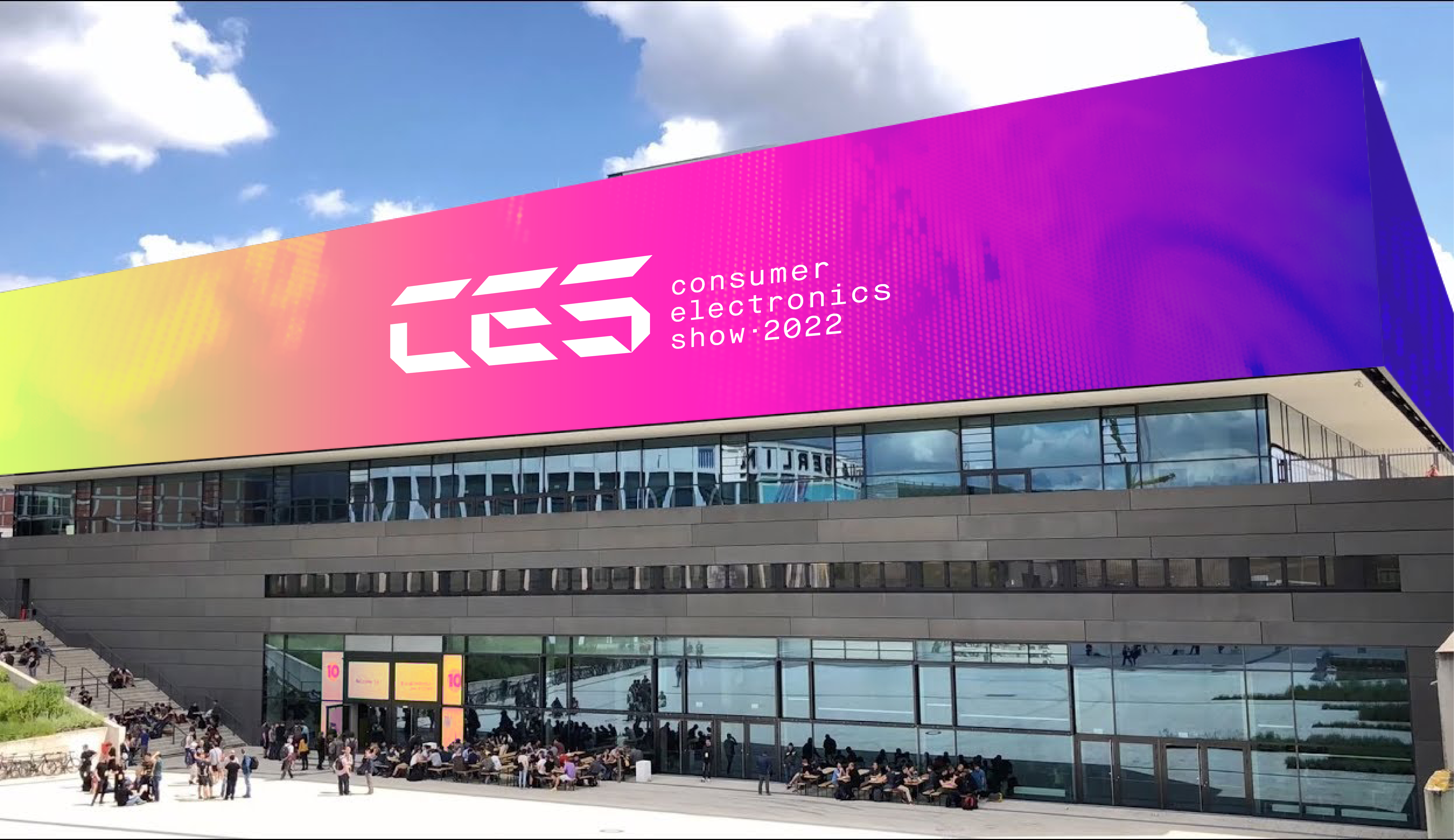
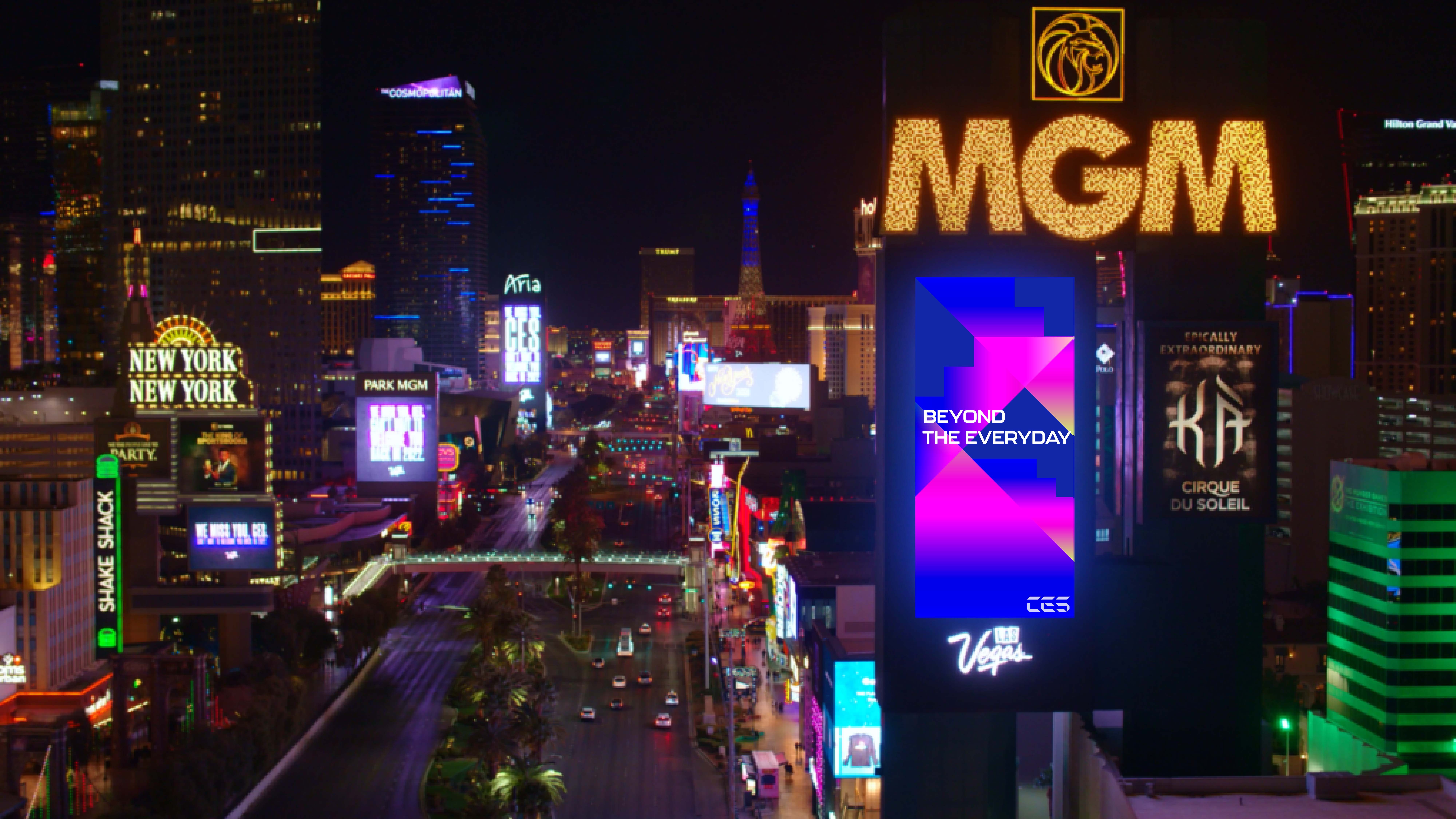
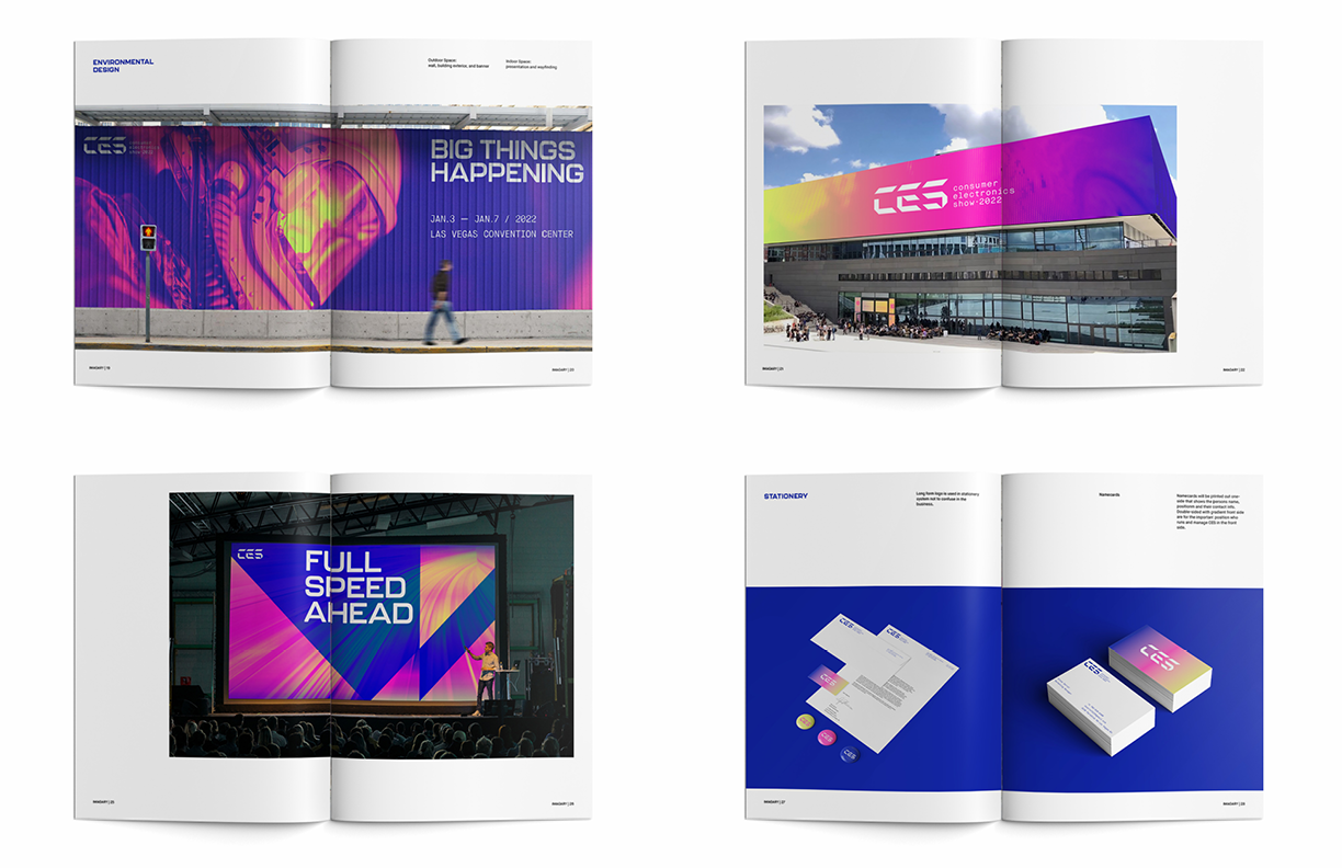
Environment: Exterior
Image
Image
Image
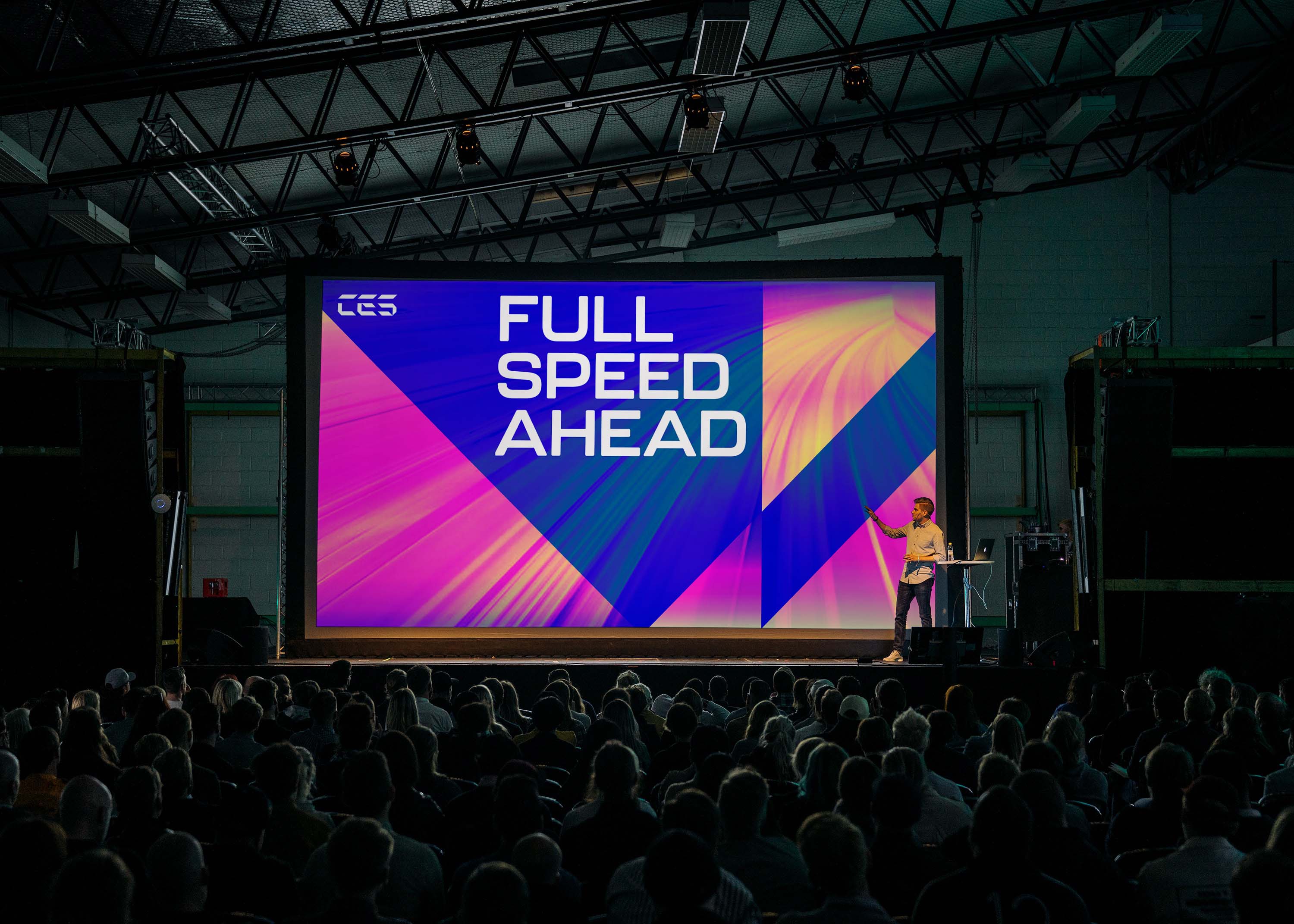
Conference Presentation
Image
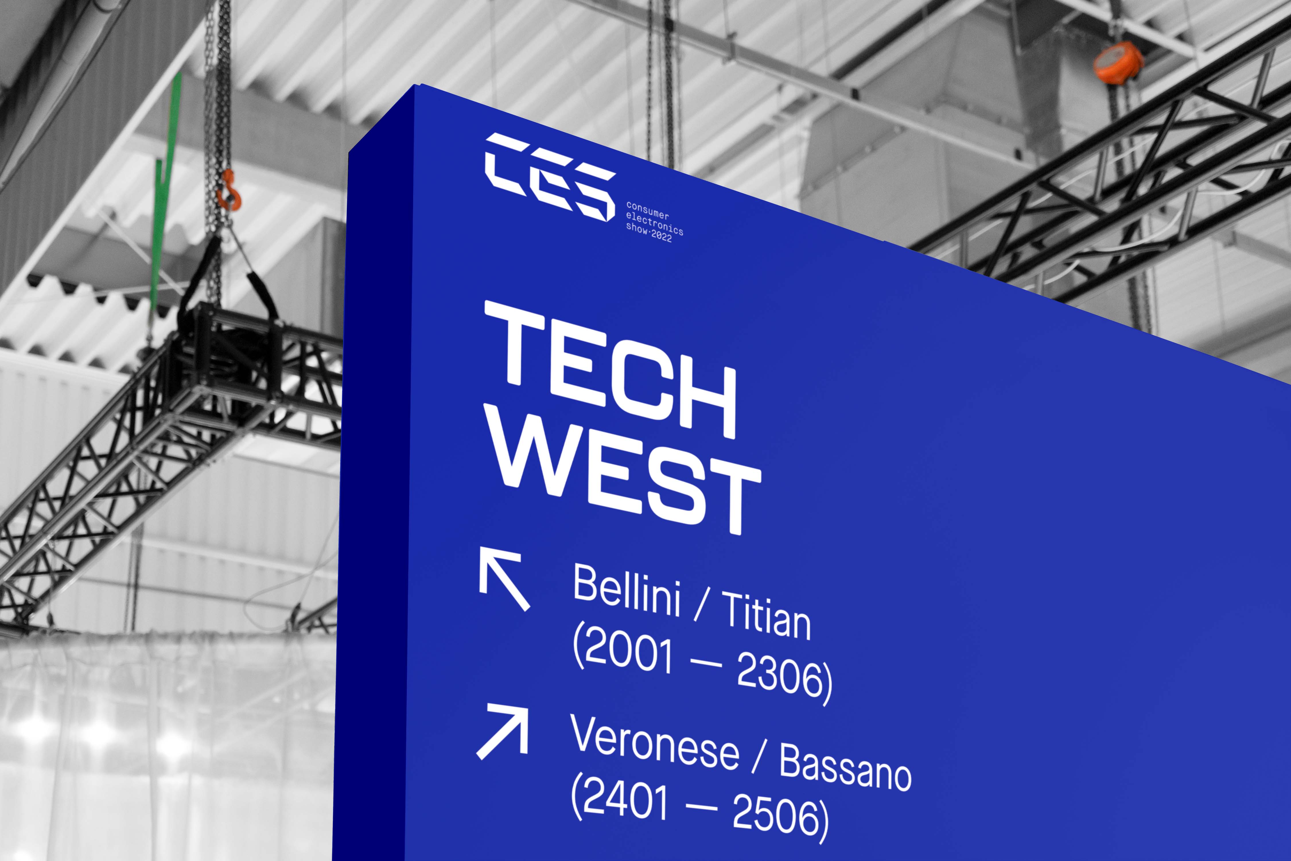
Wayfinding
Image
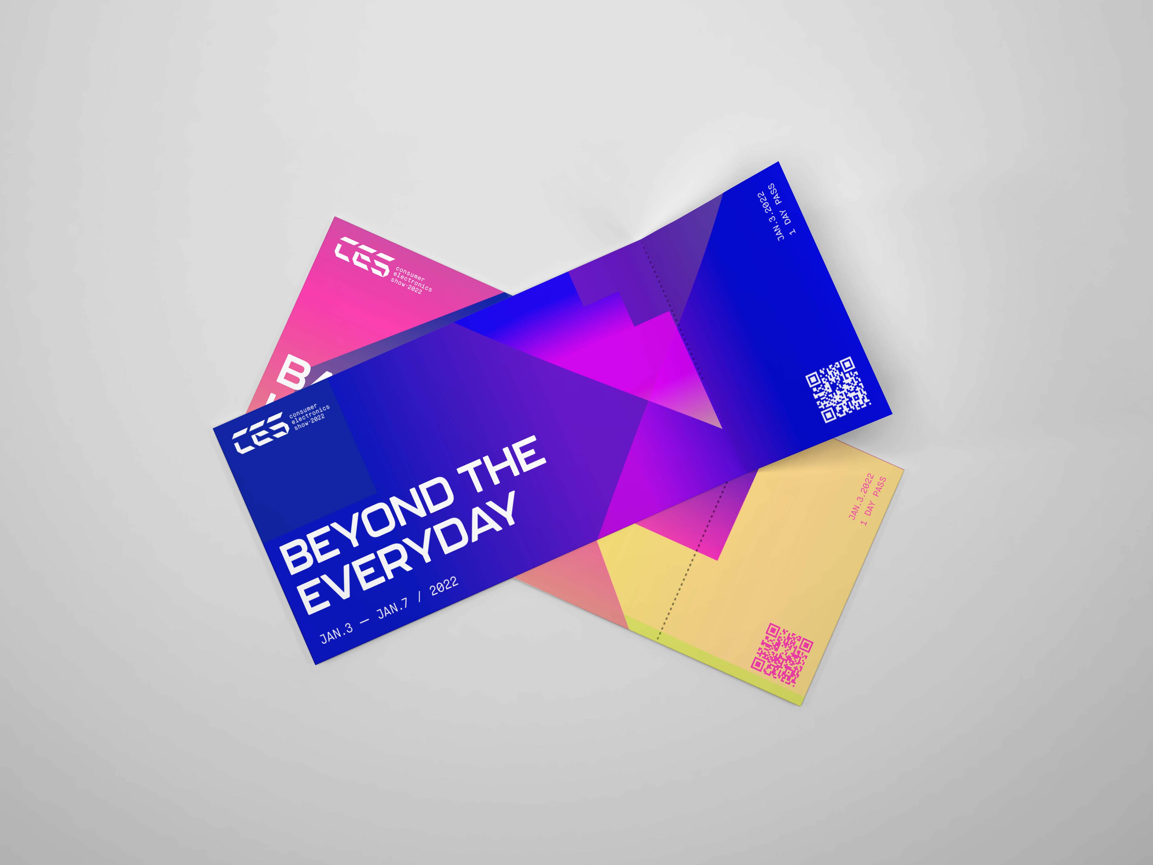
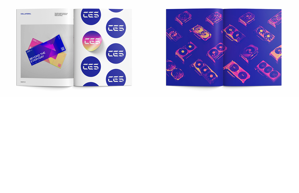
Collateral
Image
Image
Brand Guideline
Image
Image
Image