Image

This project uses the Valley of Terror theory as an entry point to explore the study of the extent to which humans feel fear of different things and stories. Based on a collection of strange stories and events, it presents some of the world's odd stories to everyone. And to classify these stories and present a museum branding design system with a visual approach.
Image

The brand color system of the Uncanny Museum is based on blue and green. This primary color system of blue and green from the earth was extracted to express the various strange stories within the confines of the earth presented in the museum. These two colors also represent the forest and the ocean, two places that are most mysterious to humans and give rise to endless reverie, and it is this unknown that makes people feel uncanny.
Image
The design of the logo and signage of the Uncanny museum is based on the corner of the museum's building plan, which is a simple summary of the Uncanny museum building, and a specific logo with a specific meaning.
Image

The font design style in the logo also includes the corner design, and in order to make the overall frame line of the logo not dull horizontal and vertical, the letters are uniformly tilted slightly to the right, making the whole graphic look more varied.
Image

The design of the guidance system inside the museum continues to follow the characteristics of the logo and the topographic map kind of corner, using a combination of straight-line turns and circles for a clear and crisp presentation. The graphic elements of the museum are more fully reflected and further characterized.
Image

Shown below are three uncanny vignettes selected for each of the three floors according to their different themes, and nine poster designs made. Simple lines are used to simplify the complex graphics for abstract visual treatment. Also the folded corner elements match the graphic elements of the floor plan and logo, once again highlighting the unified design elements of this exhibition.
Image
Image
Visitors will receive an introduction manual for this exhibition when they enter the exhibition hall, which will mainly explain the content of the exhibition and floor topography, and will also mark basic information such as the location and distribution of some facilities. So that visitors can better visit this exhibition and achieve the best experience.
Image
Image
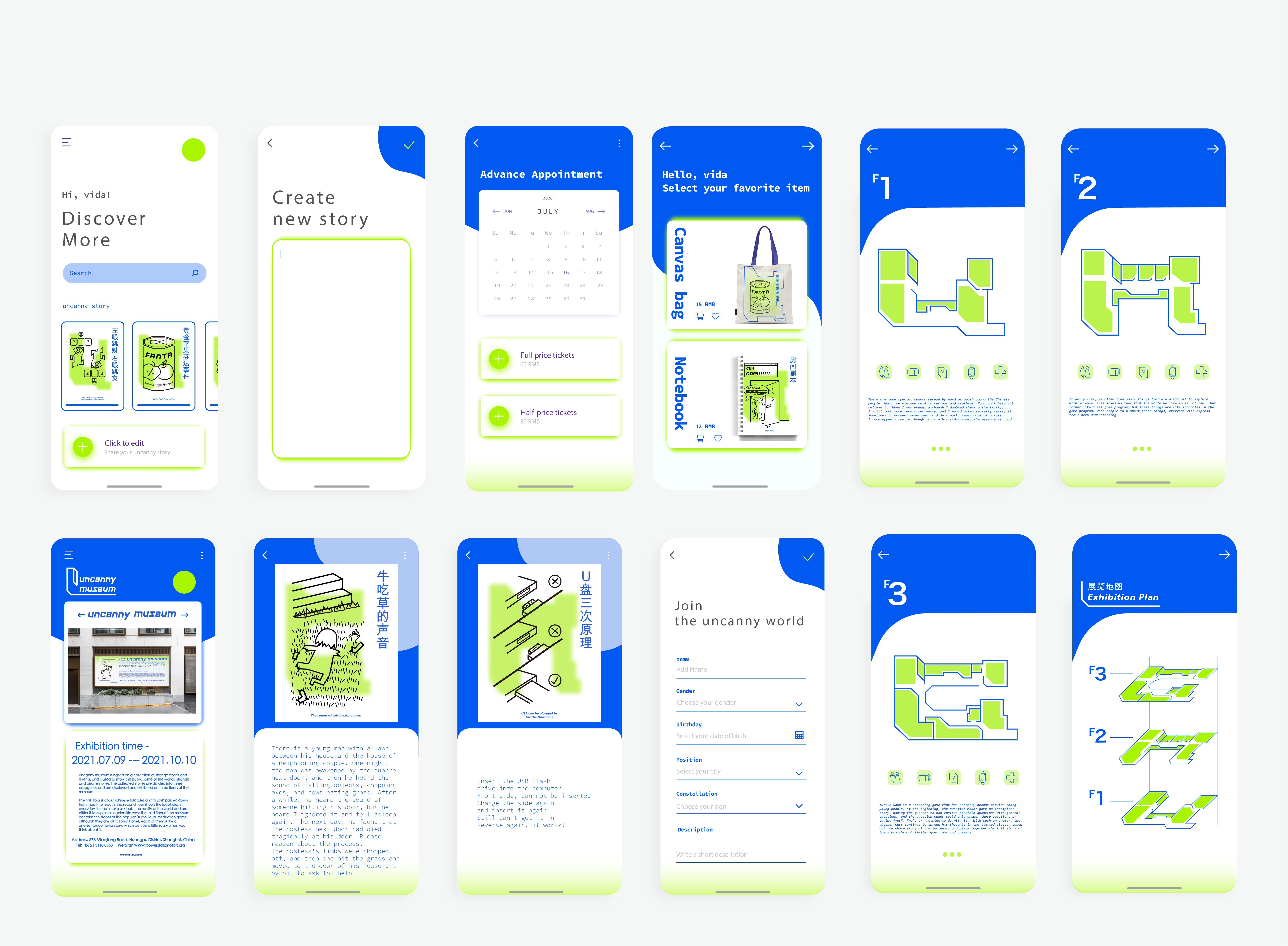
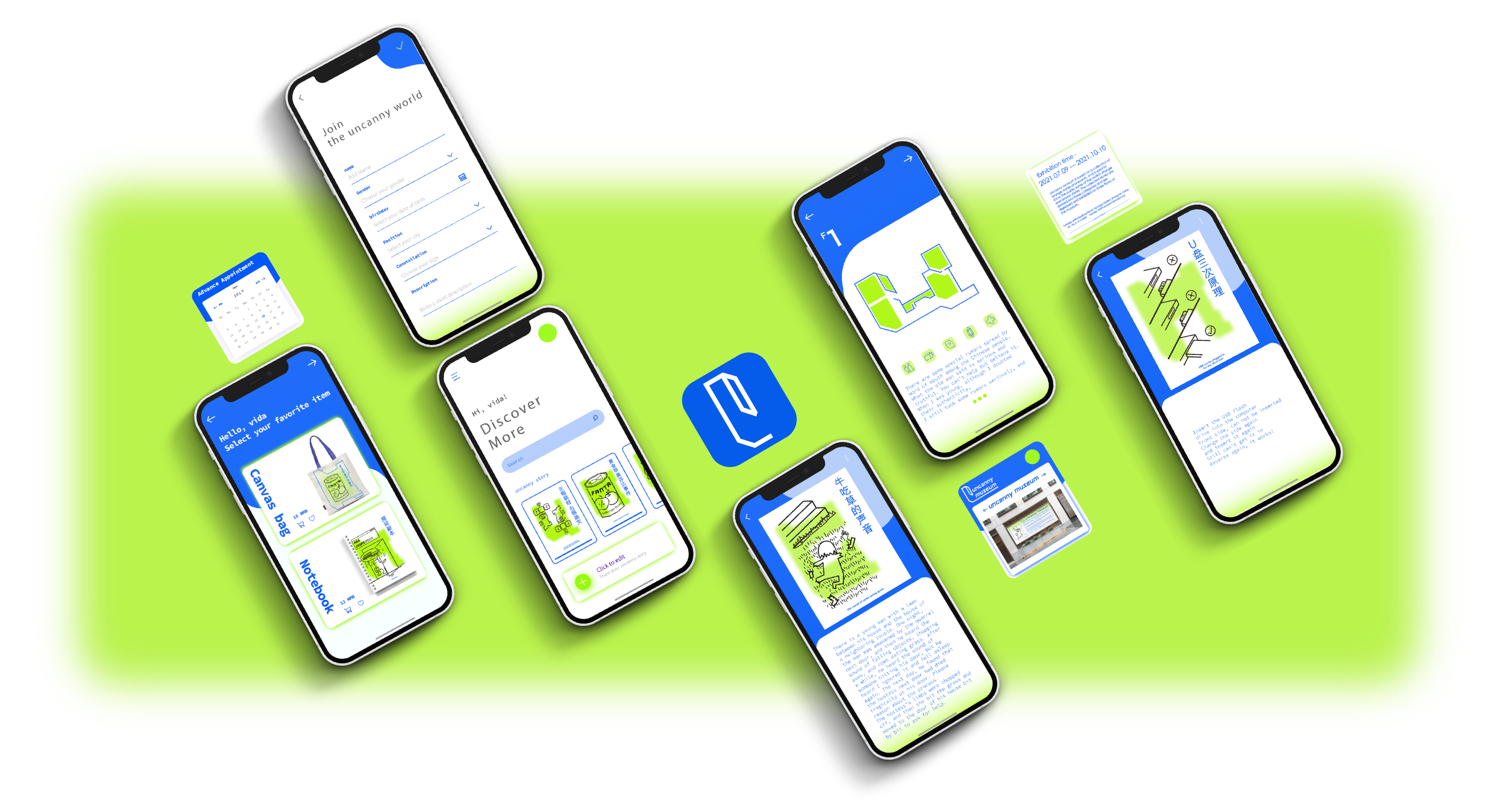
This mobile application is designed to provide visitors with information about the uncanny museum in a more convenient way. It includes information about the museum's ticketing and advance reservation services, a brief overview of the exhibition's basic information, a map of the pavilion, and an introduction to the exhibits, so that visitors can view detailed information about the corresponding exhibits on their cell phones as they tour the museum. It also includes some post-visit online services, where visitors can store for the exhibition's peripheral goods in the mobile app, and share their uncanny stories in the community section.
Image
The logo of the application continues to use the graphic elements and color features of the original logo of the museum, the font part was removed due to the size, but the remaining part is also very graphic features of the museum's elements, making it simple and unforgettable.
Image

final output