Image
Image
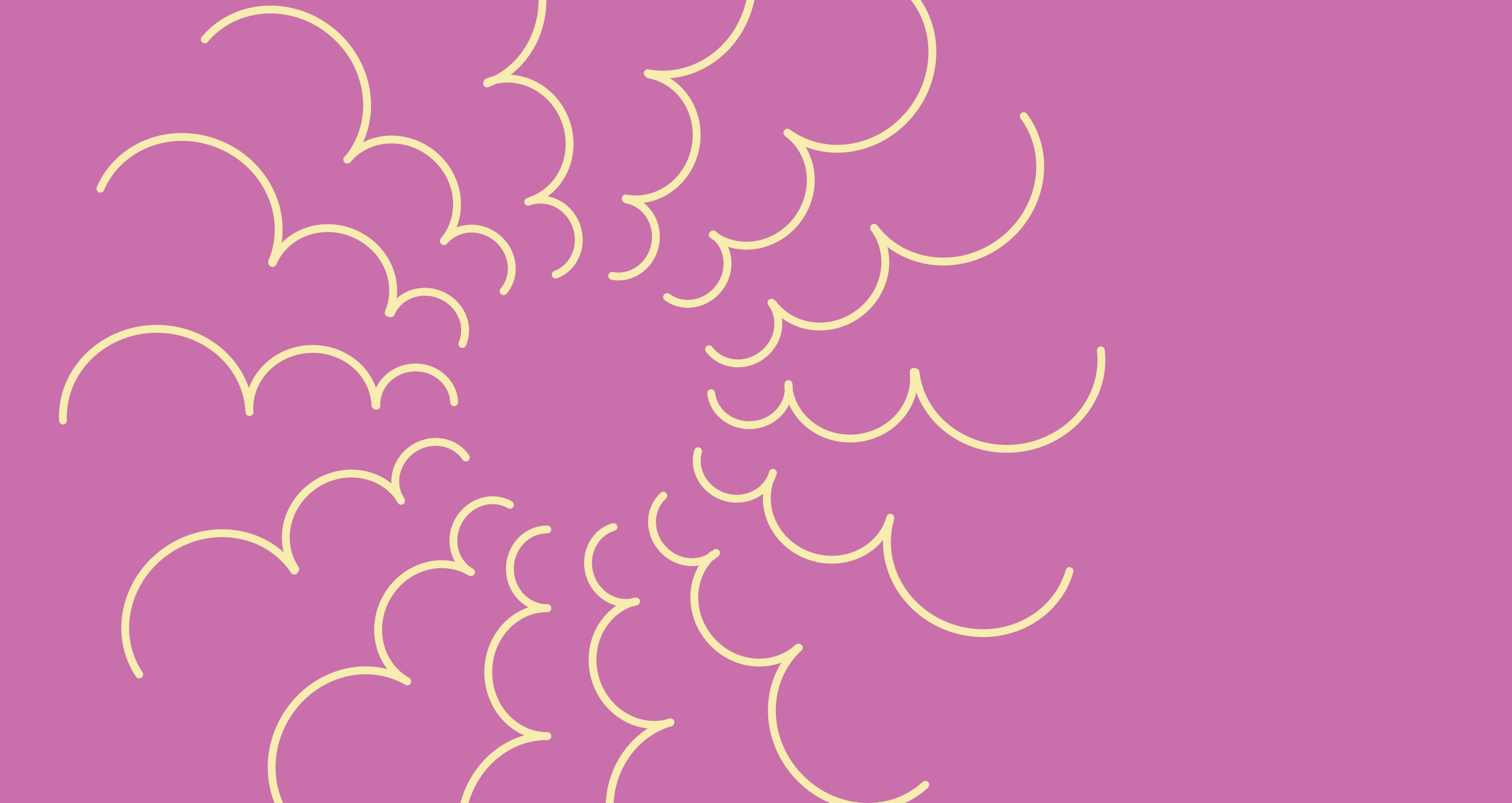
Bilateral Symmetry 01
Image
Bilateral Symmetry 02
Image
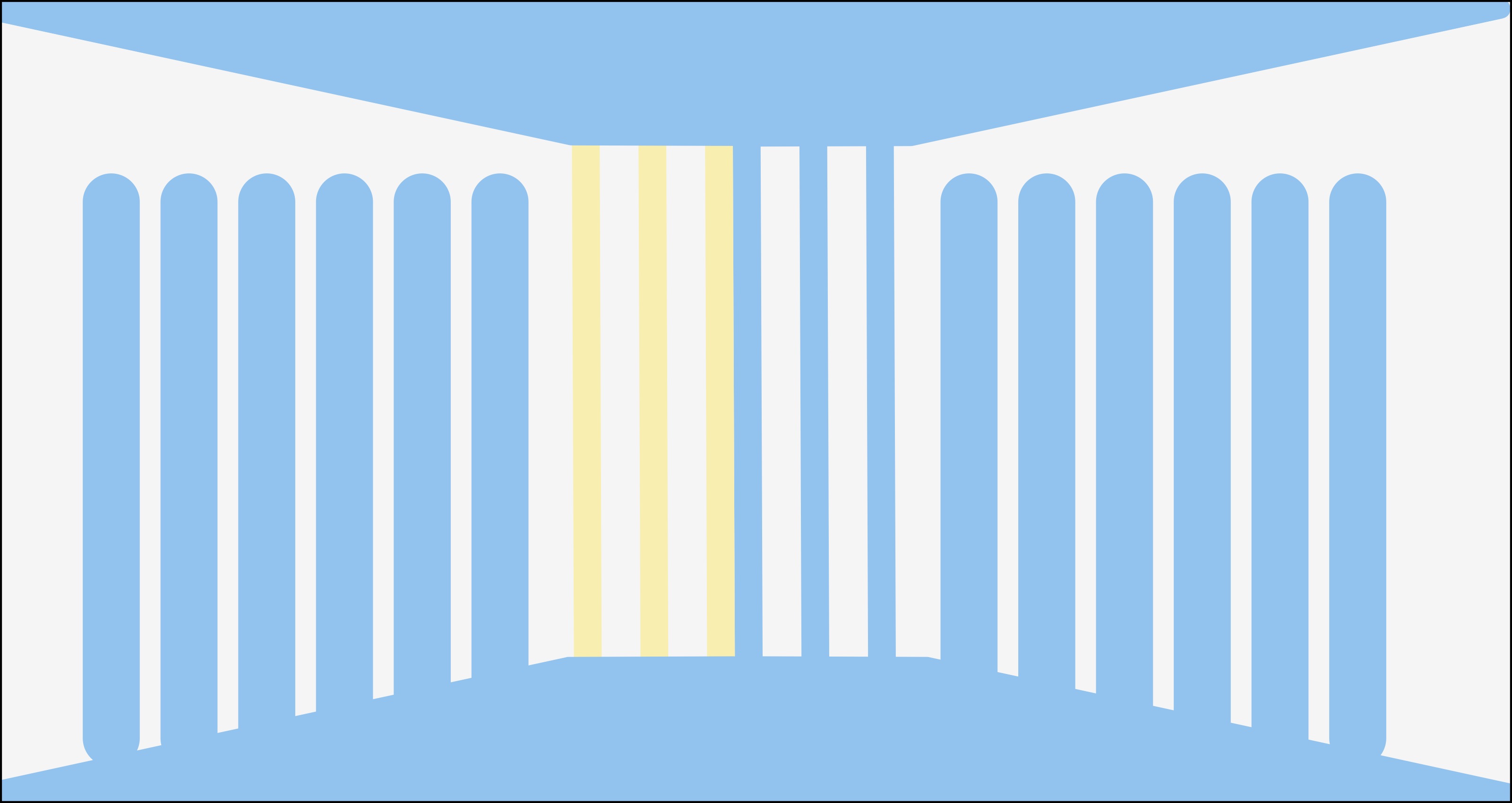
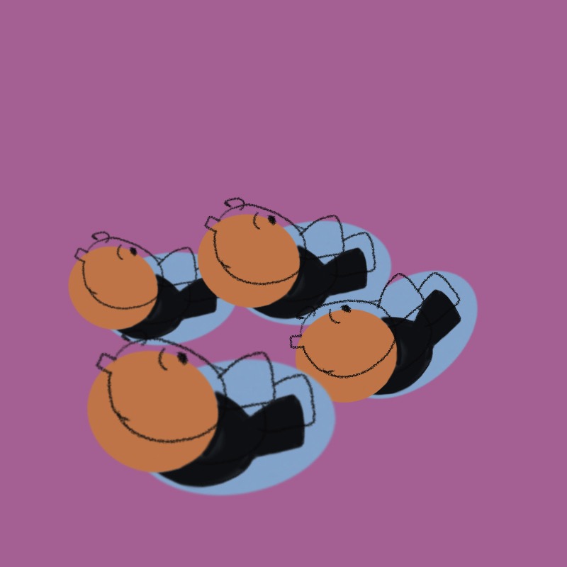
Radial Symmetry 01
Image
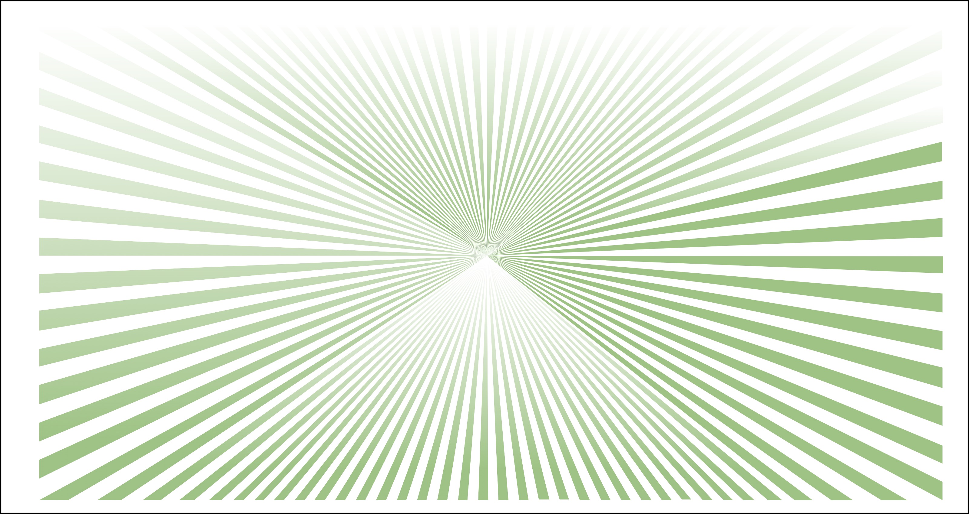
Radial Symmetry 02
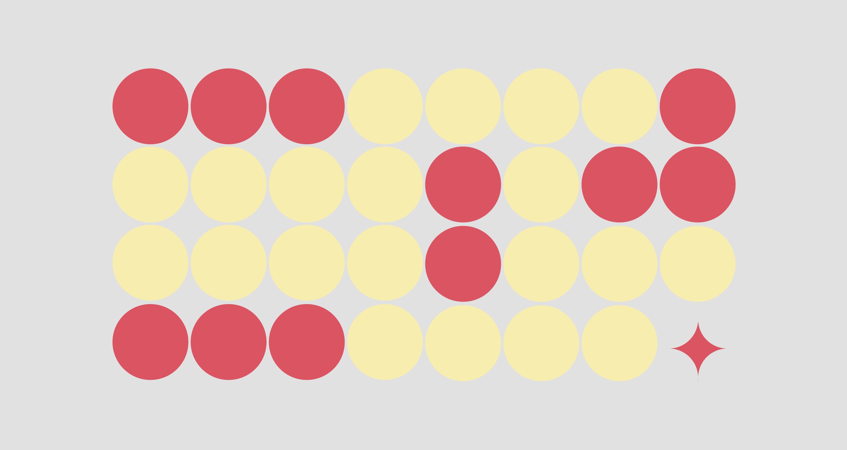
Image
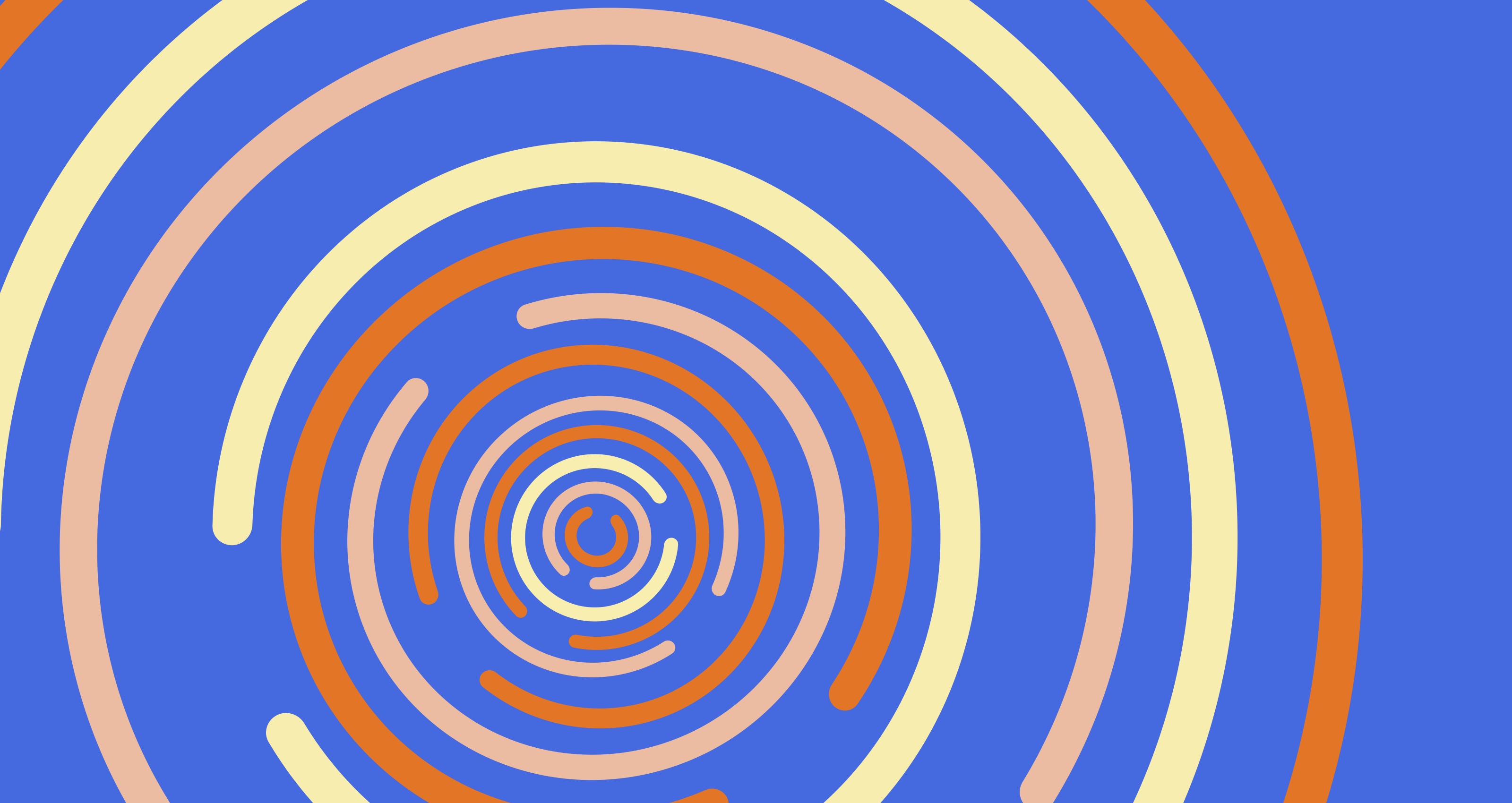
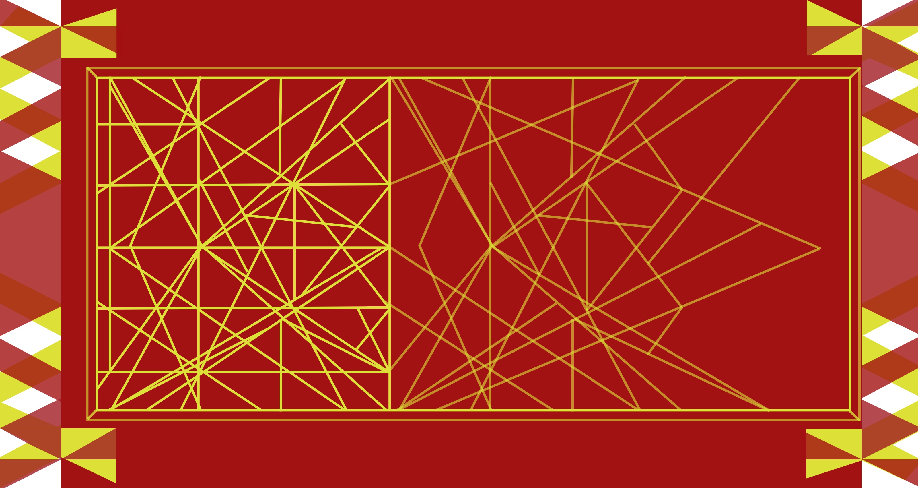
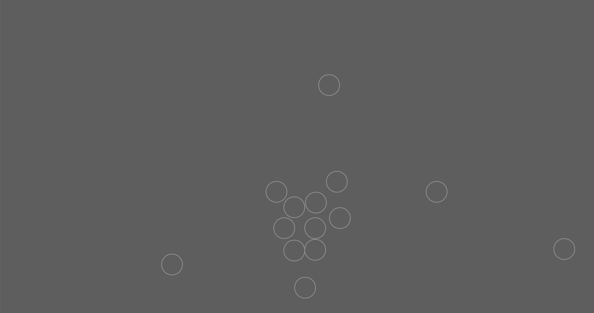
Target Symmetry 01
Image

Target Symmetry 02
Image
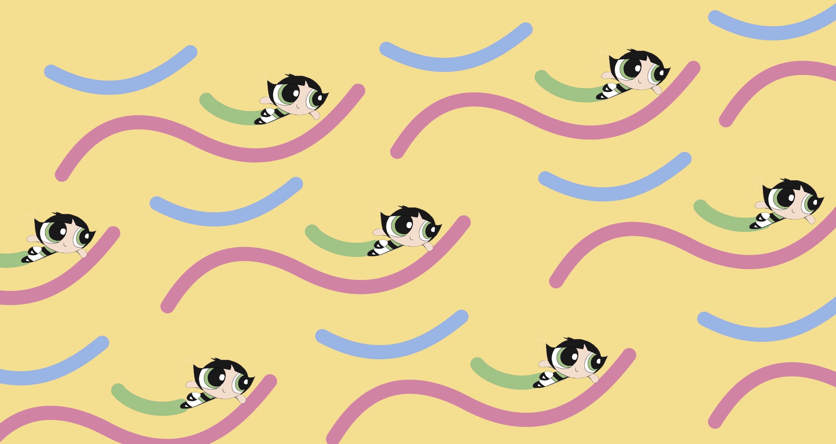
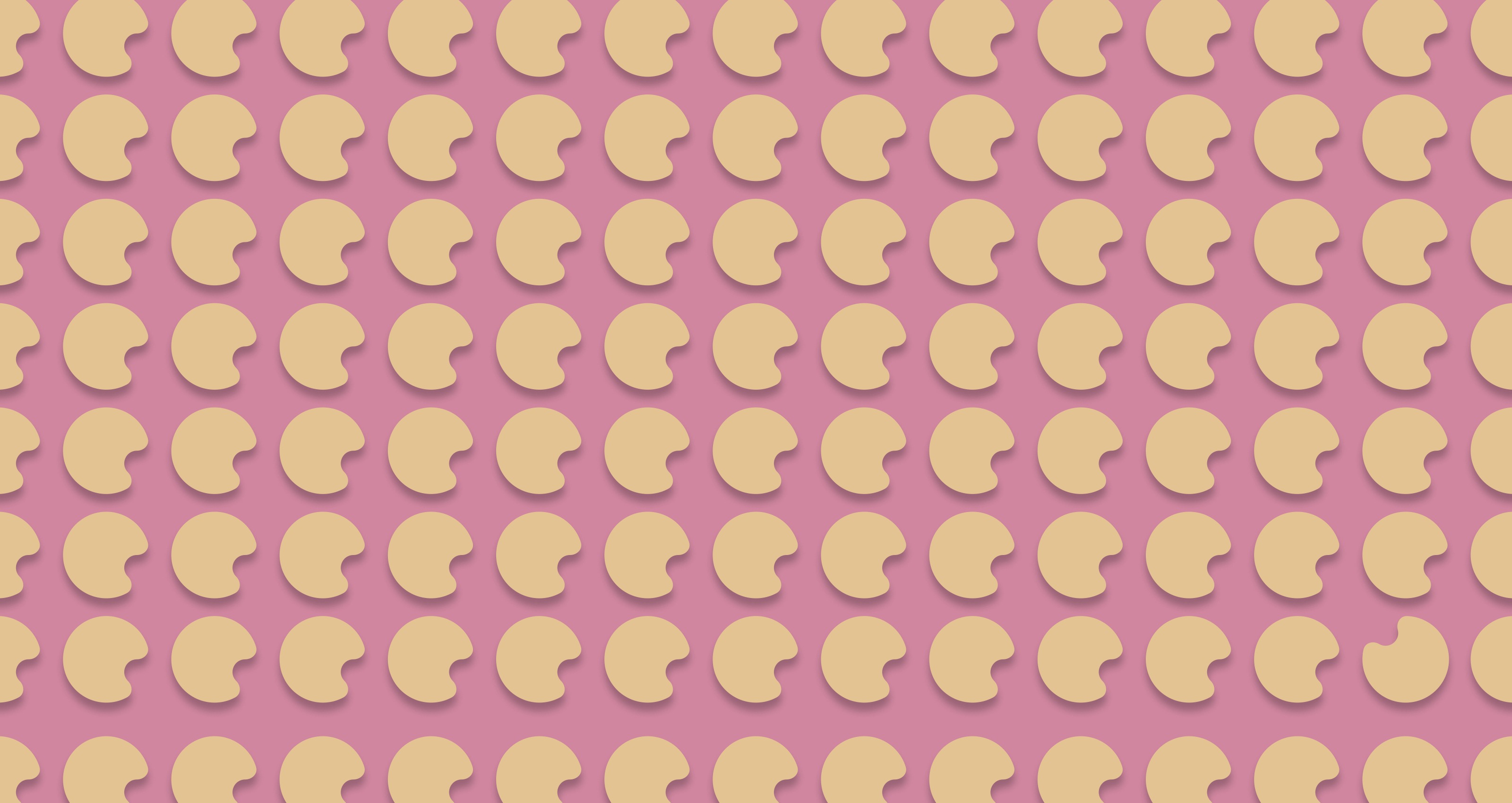
Patterns/Tessellations - The Powerpuff Girls 01
Image
Patterns/Tessellations - The Powerpuff Girls 02
Image
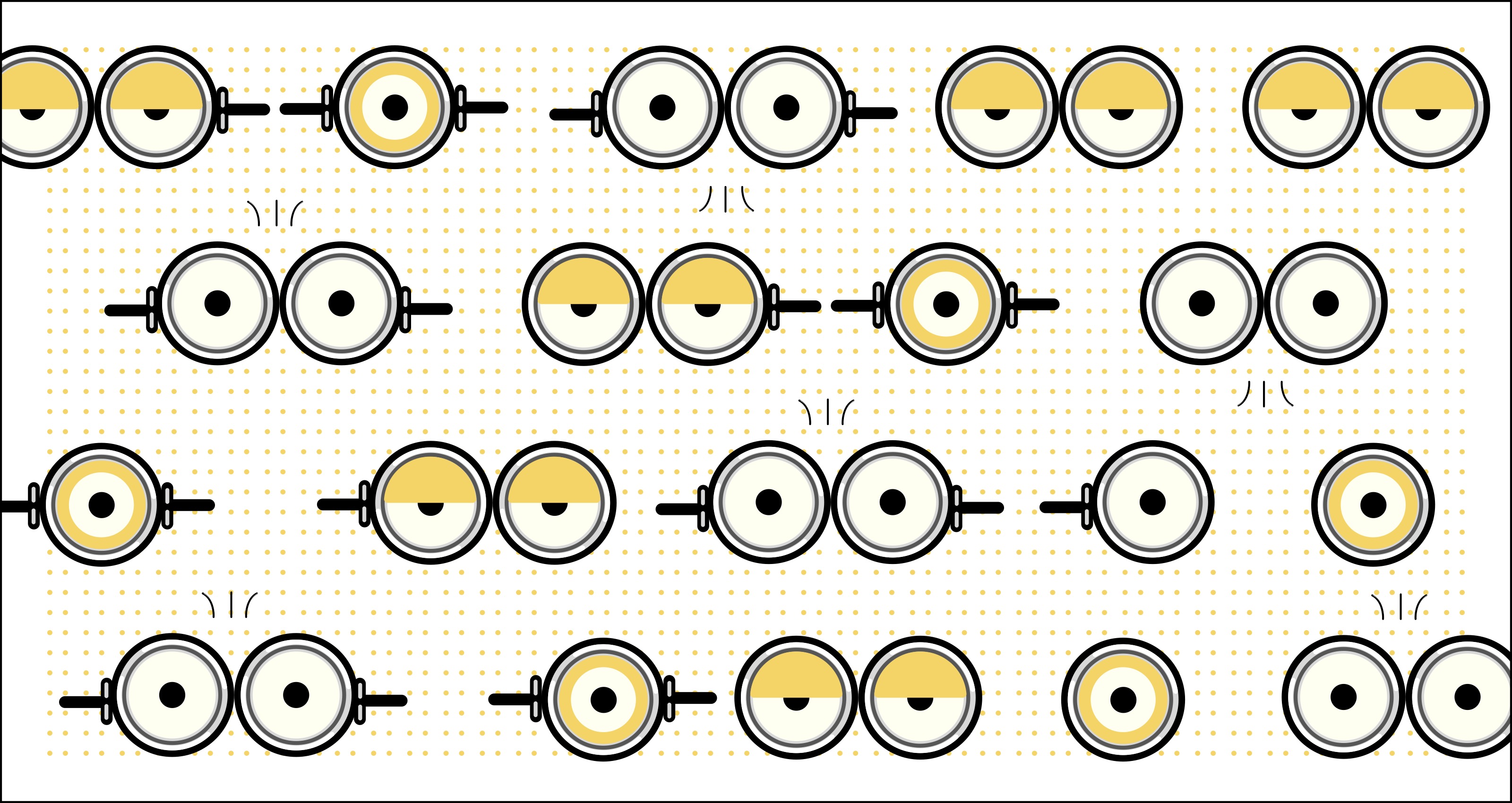
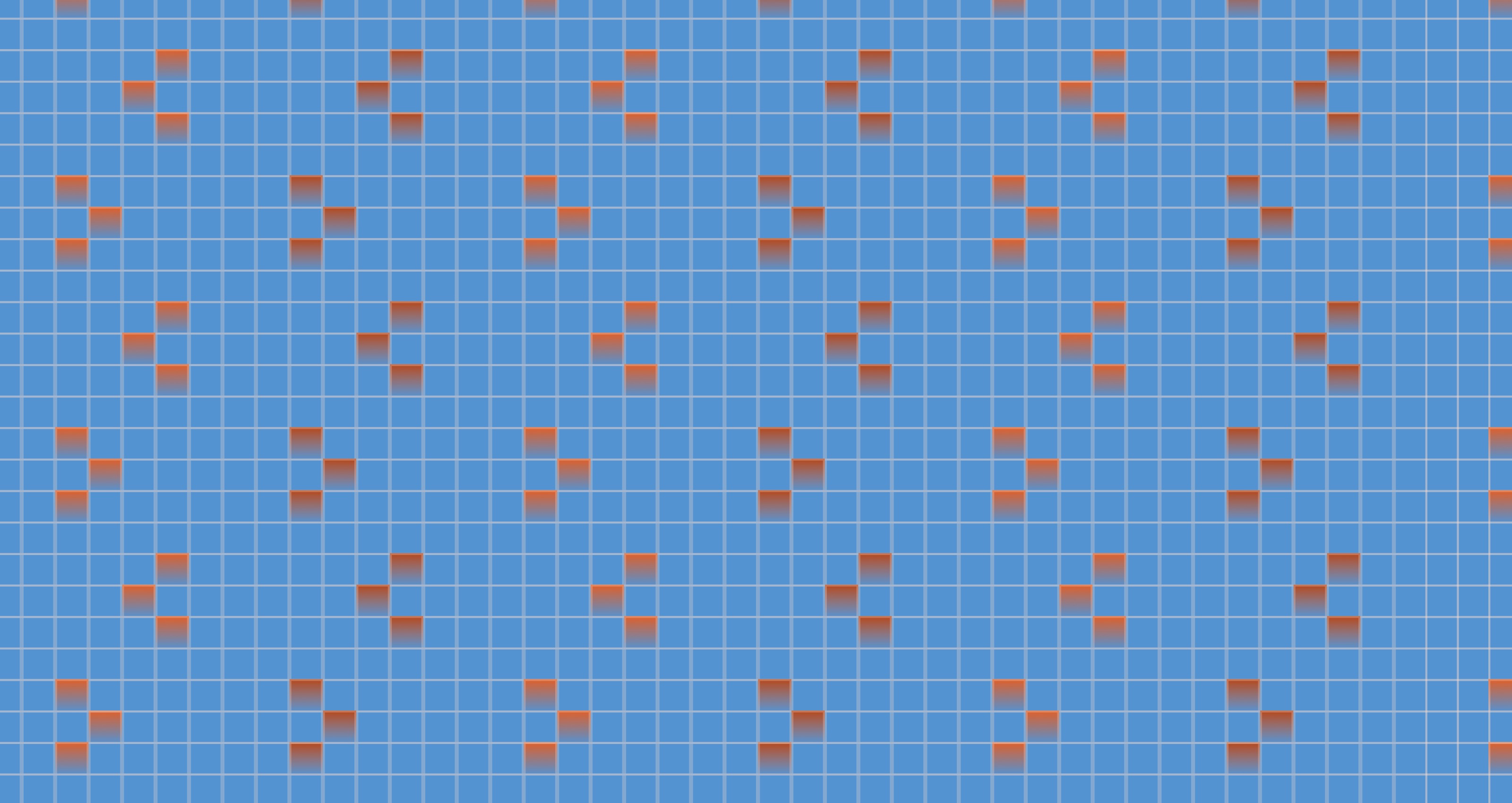
Patterns/Tessellations - Minions 01
Image
Patterns/Tessellations - Minions 02
Image
Image
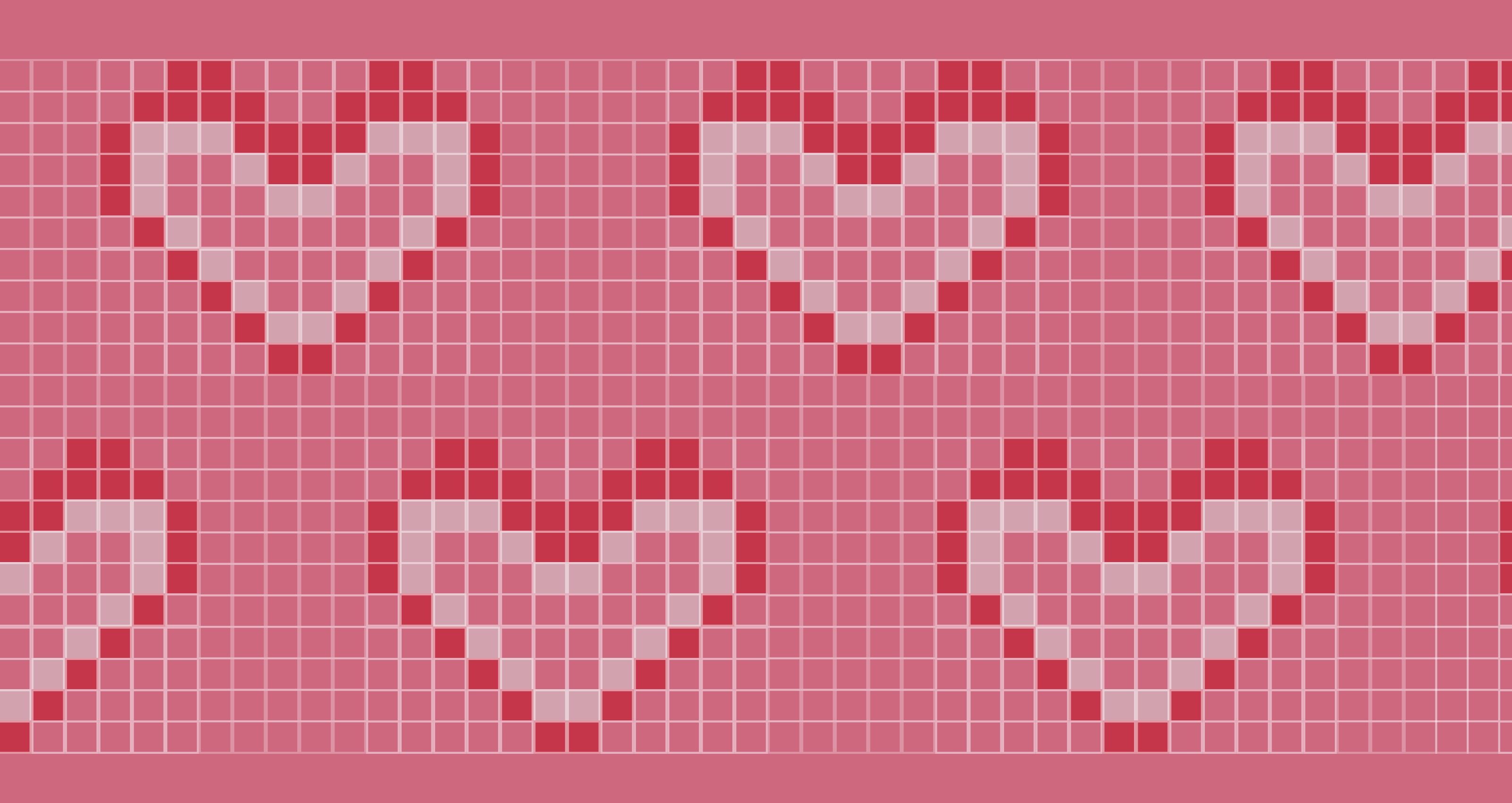
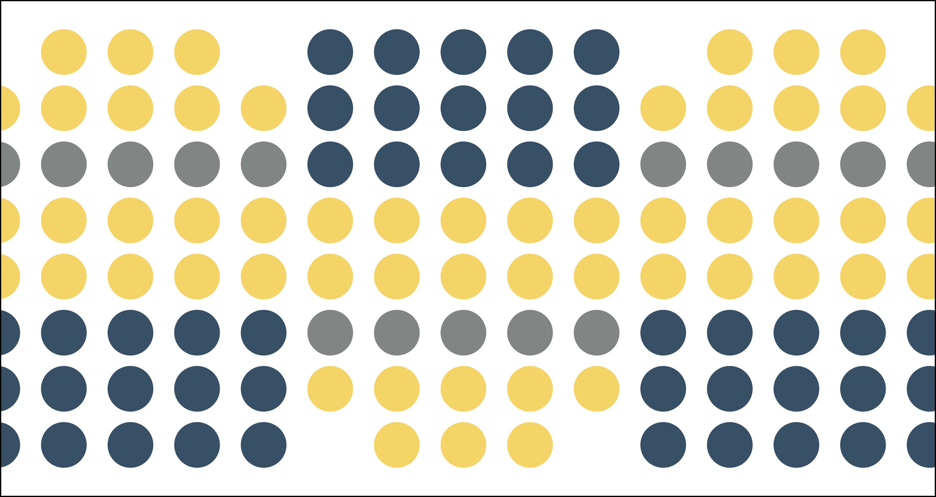
Monochrome 01 (Monochrome is one hue + black, white, or gray.)
Image
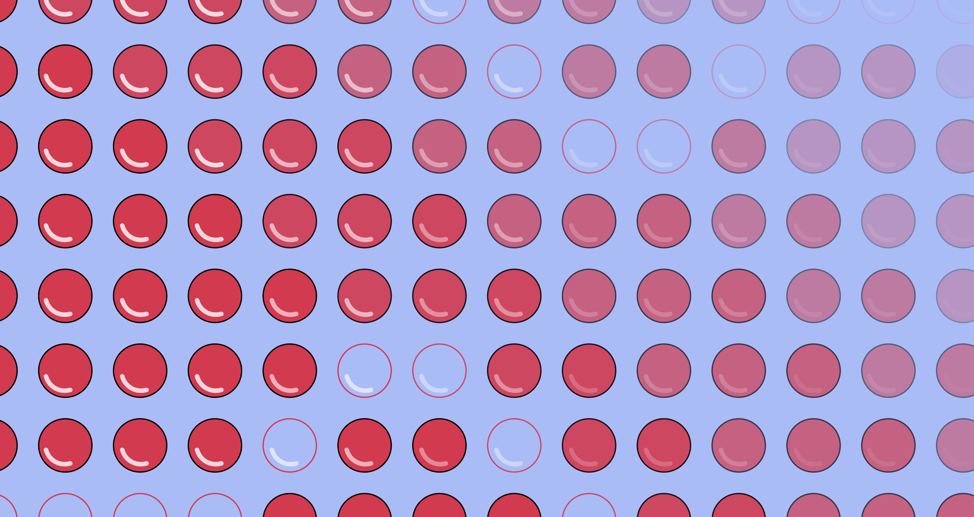
Monochrome 02
Image
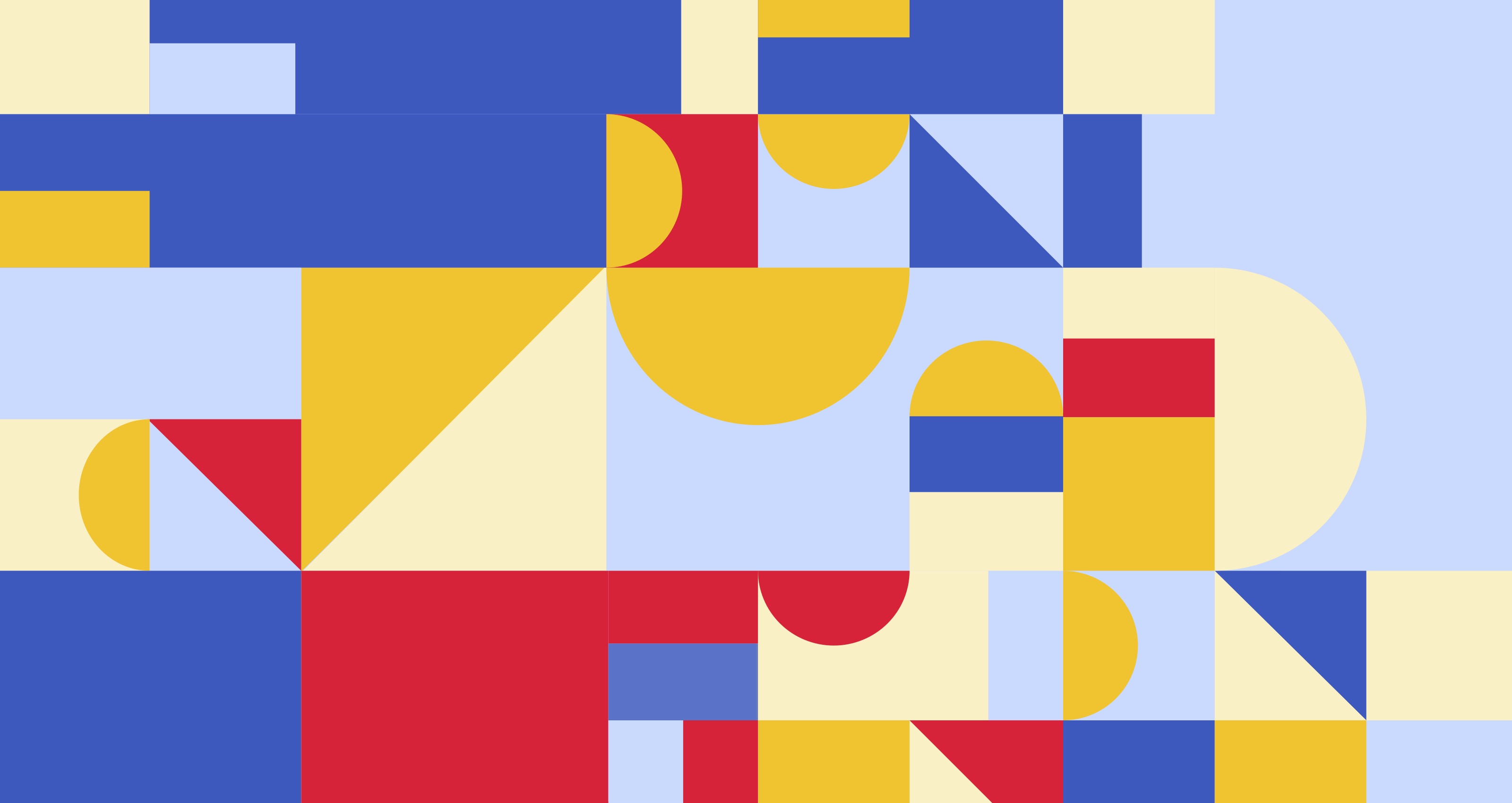
Triadic 01 | Yellow/Red/Blue (Triadic is three hues equal distance from each other on a 12-step Itten Color Wheel.)
Image
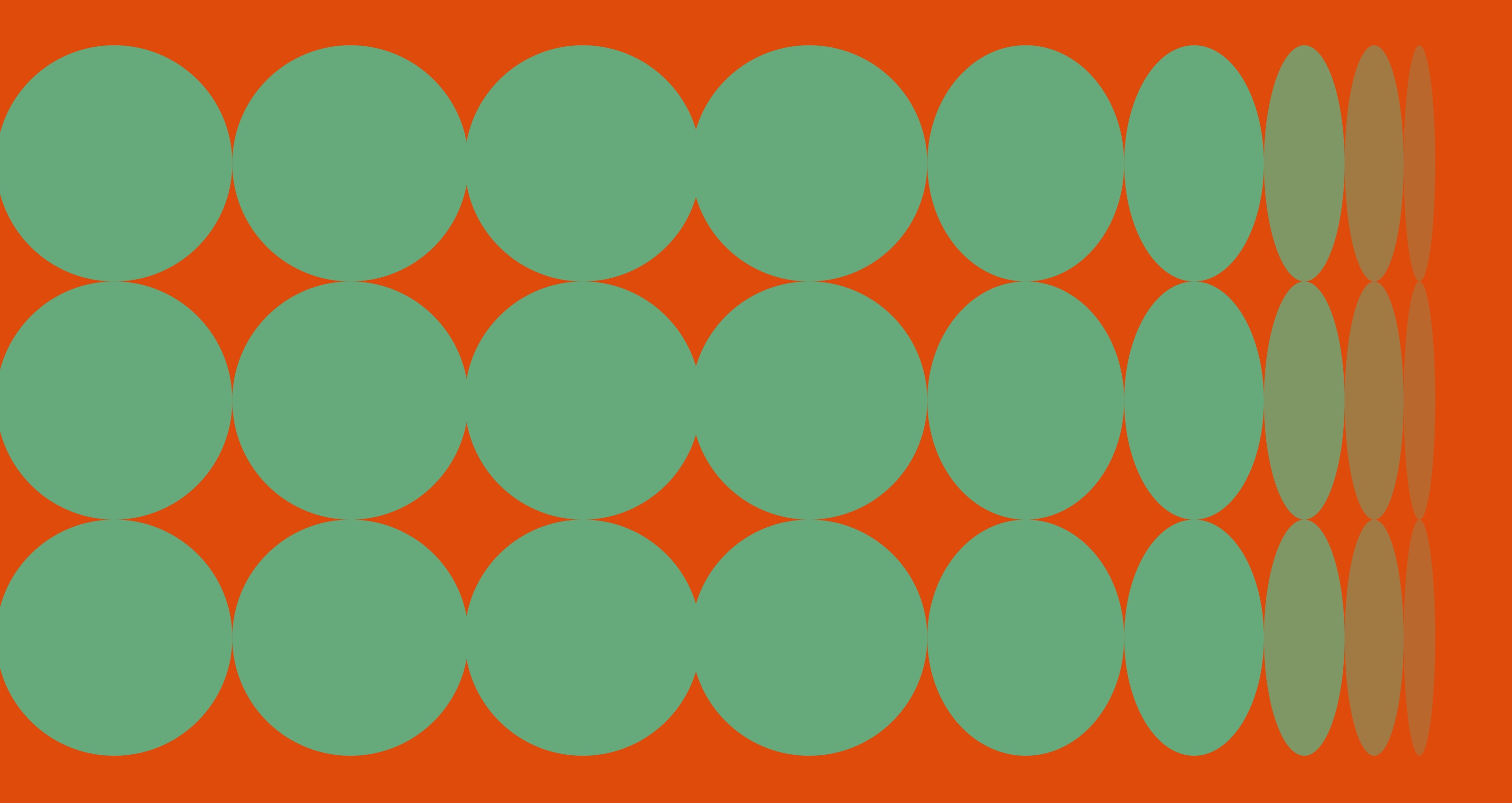
Triadic 02 | Orange/Green/Purple
Image
Analogous 01 | Orange/Red/Yellow (Analogous is three hues next to one another on a 12-step Itten Color Wheel.)
Image

Analogous 02 | Blue/Green/Purple
Image
Complementary 01 | Green/Red (Complementary is two hues opposite from one another on a 12-step Itten Color Wheel.)
Image
Complementary 02 | Blue/Orange
Image
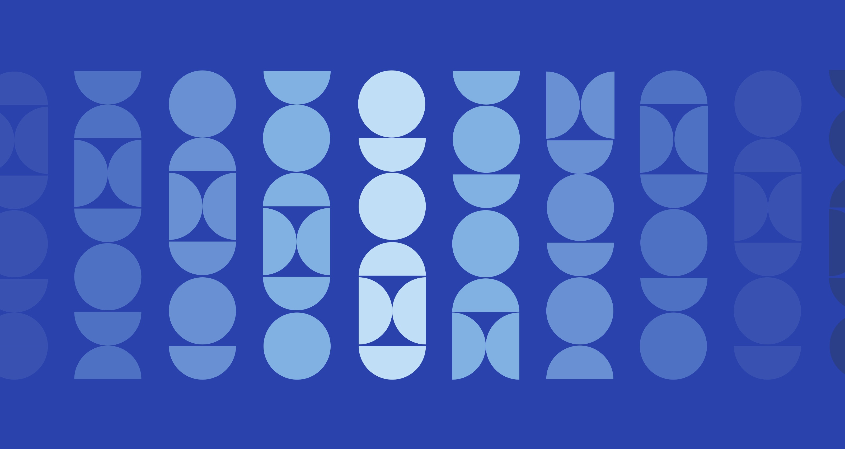
Warm/Cool 01 | Orange/Green (Warm/Cool is two hues that are not directly opposite on a 12-step Itten Color Wheel.)
Image
Warm/Cool 02 | Red/Blue
Image

Image

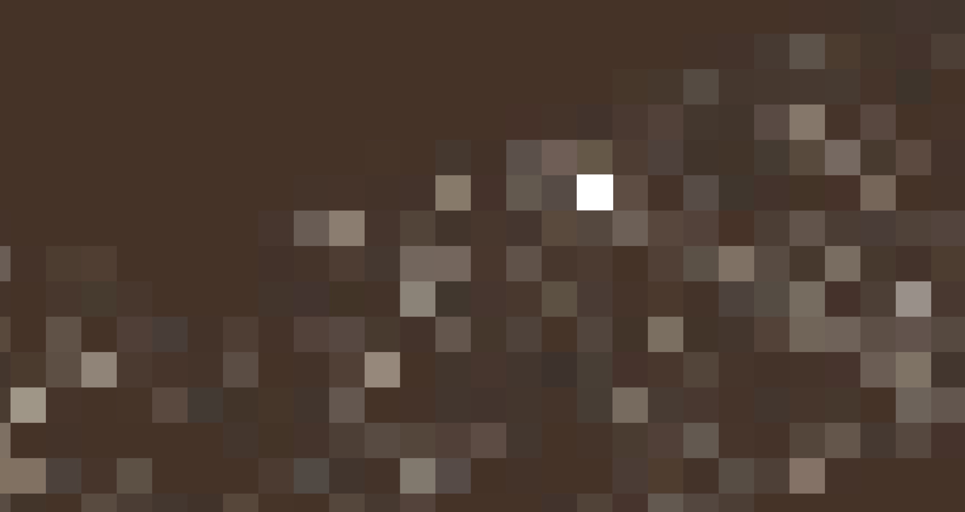
Emphasis with value using color 01 (Object of emphasis: Yellow rectangle)
Image
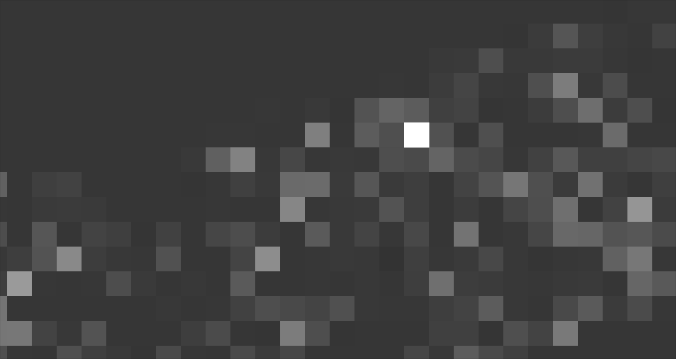
Emphasis with value using color 01 (greyscale)
Image
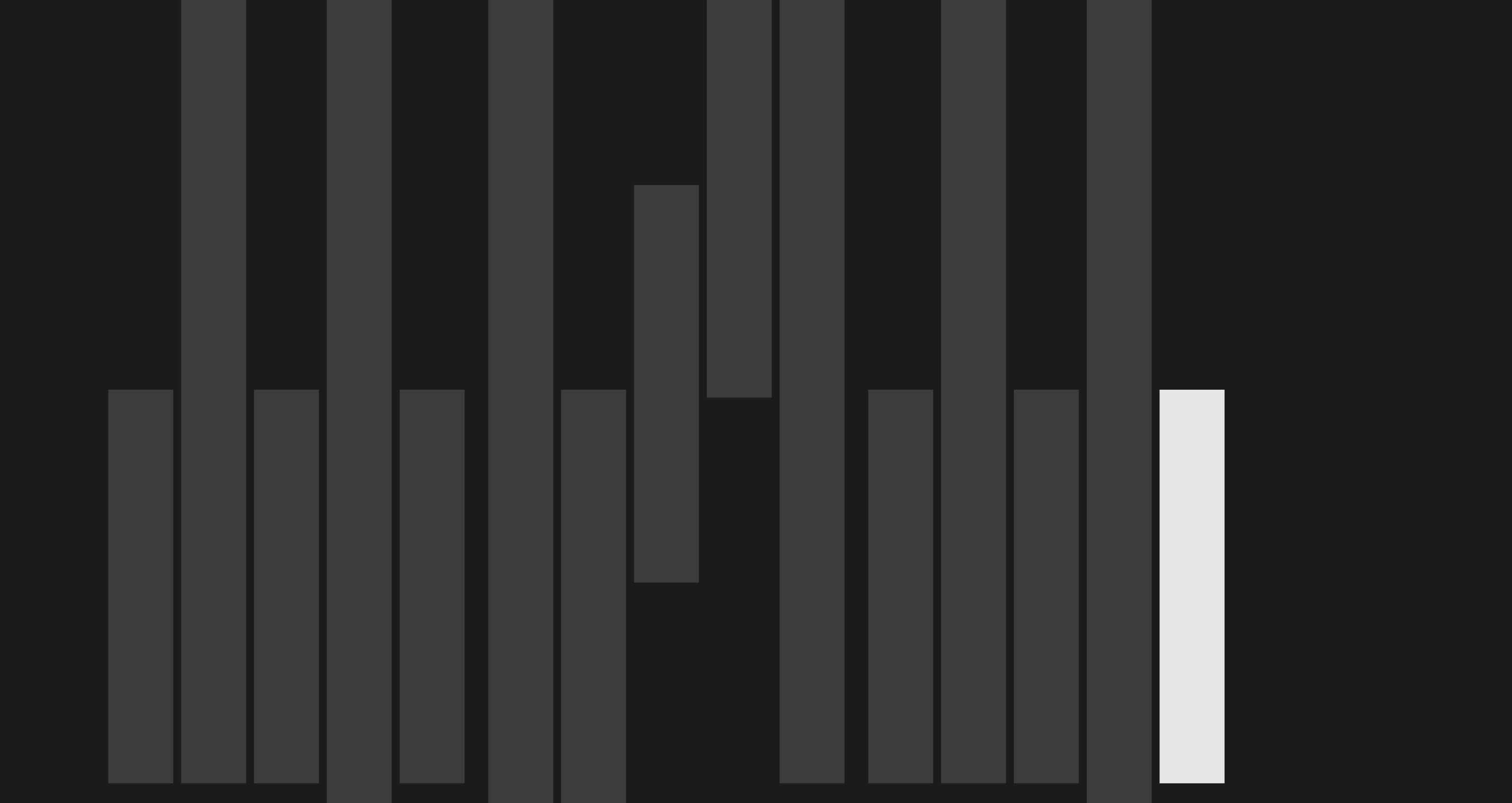
Emphasis with value using color 02 (Object of emphasis: White square)
Image
Emphasis with value using color 02 (greyscale)
Image
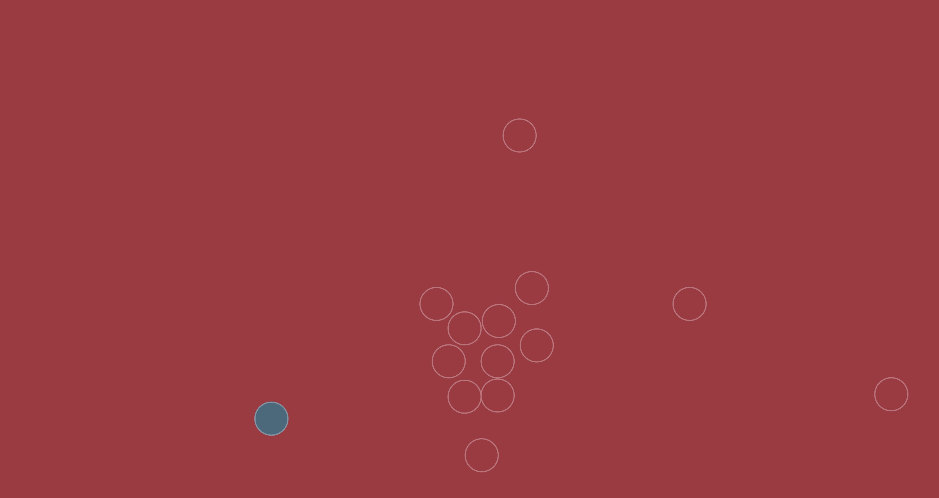
Emphasis using warm vs. cool colors 01 (Object of emphasis: Blue circle )
Image
Emphasis using warm vs. cool colors 01 (greyscale)
Image
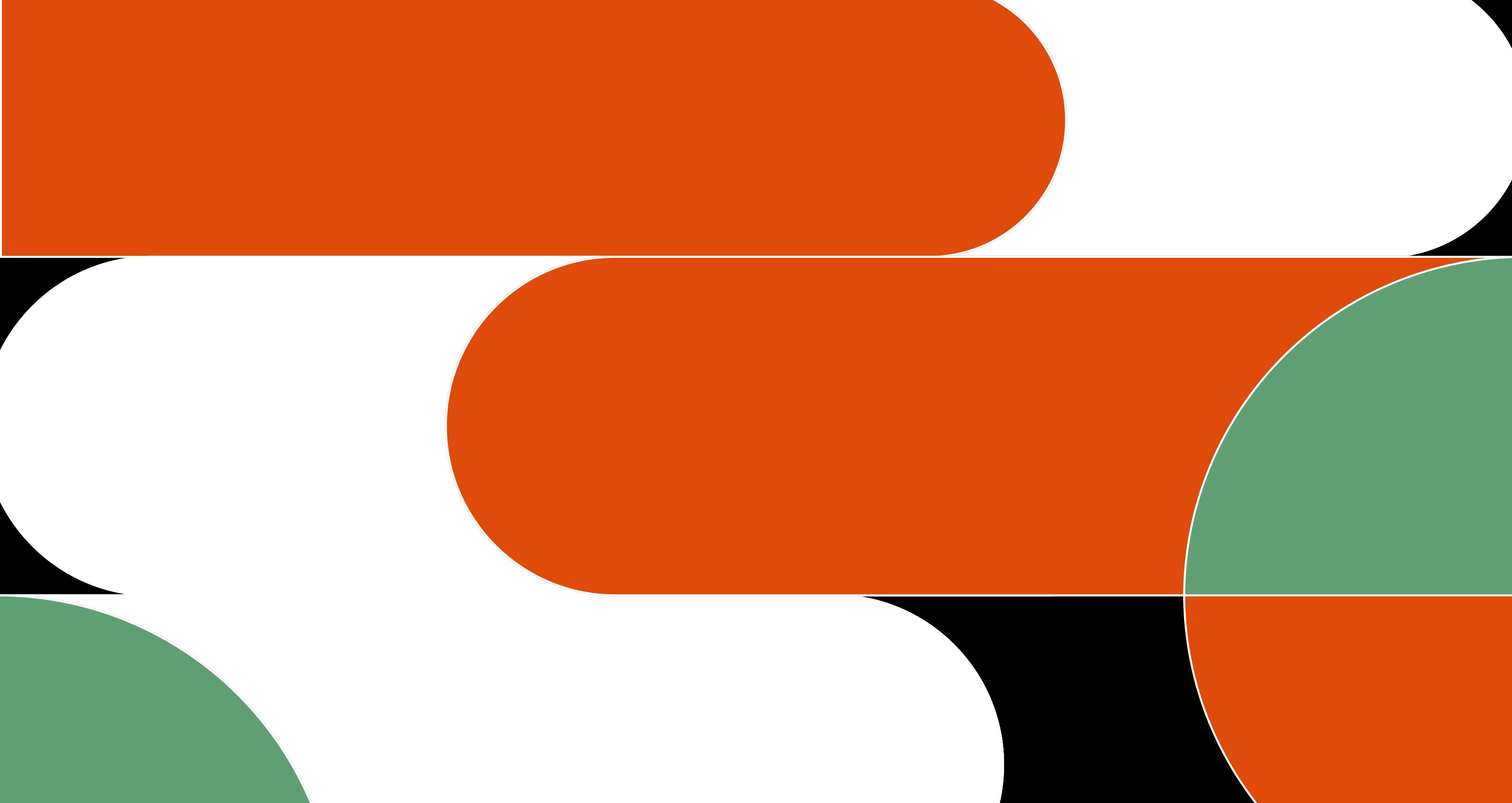
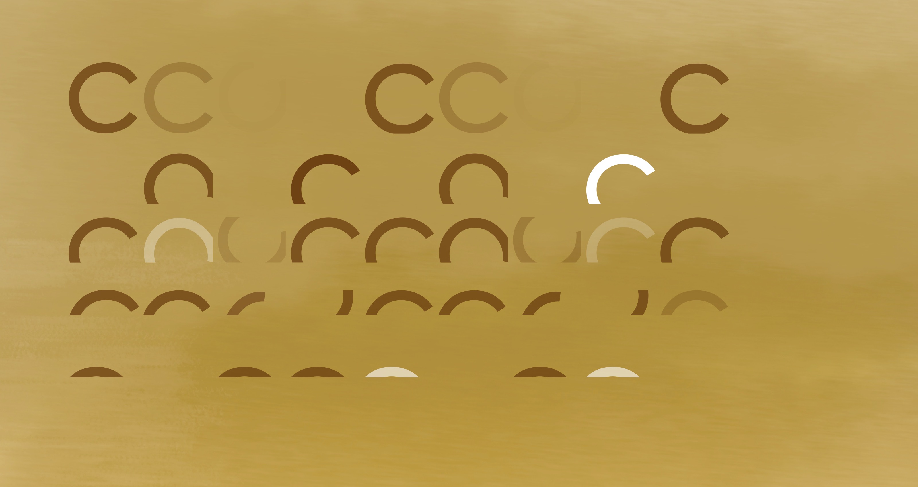
Emphasis using warm vs. cool colors 02 (Object of emphasis: Green quarter of a circle)
Image
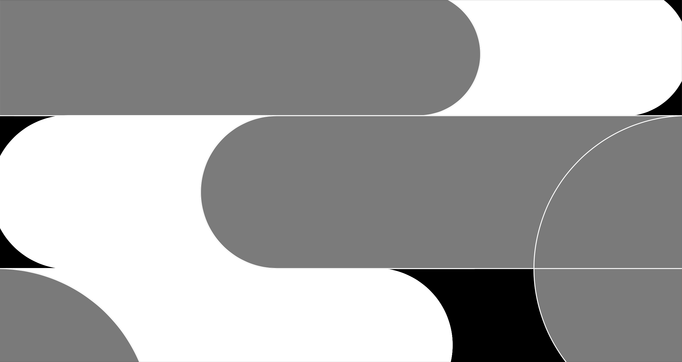
Emphasis using warm vs. cool colors 02 (greyscale)
Image
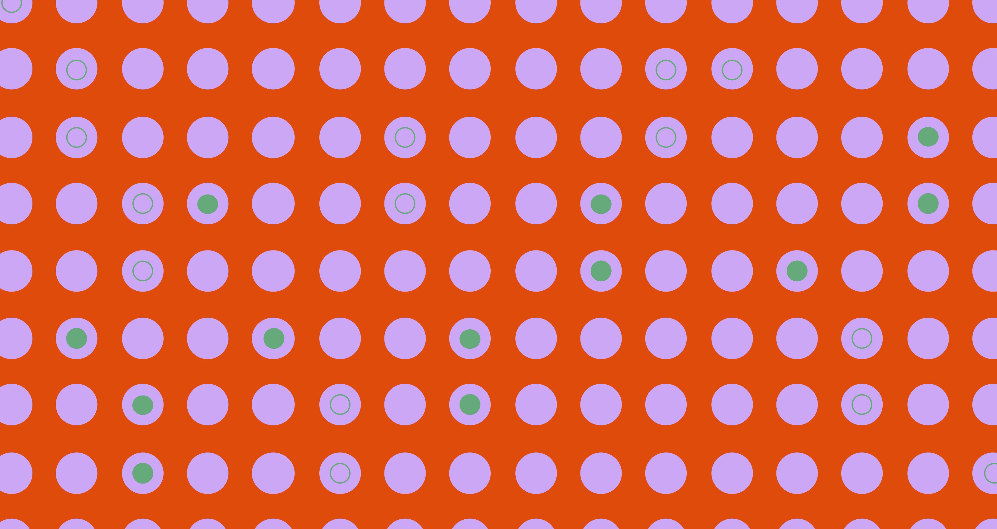
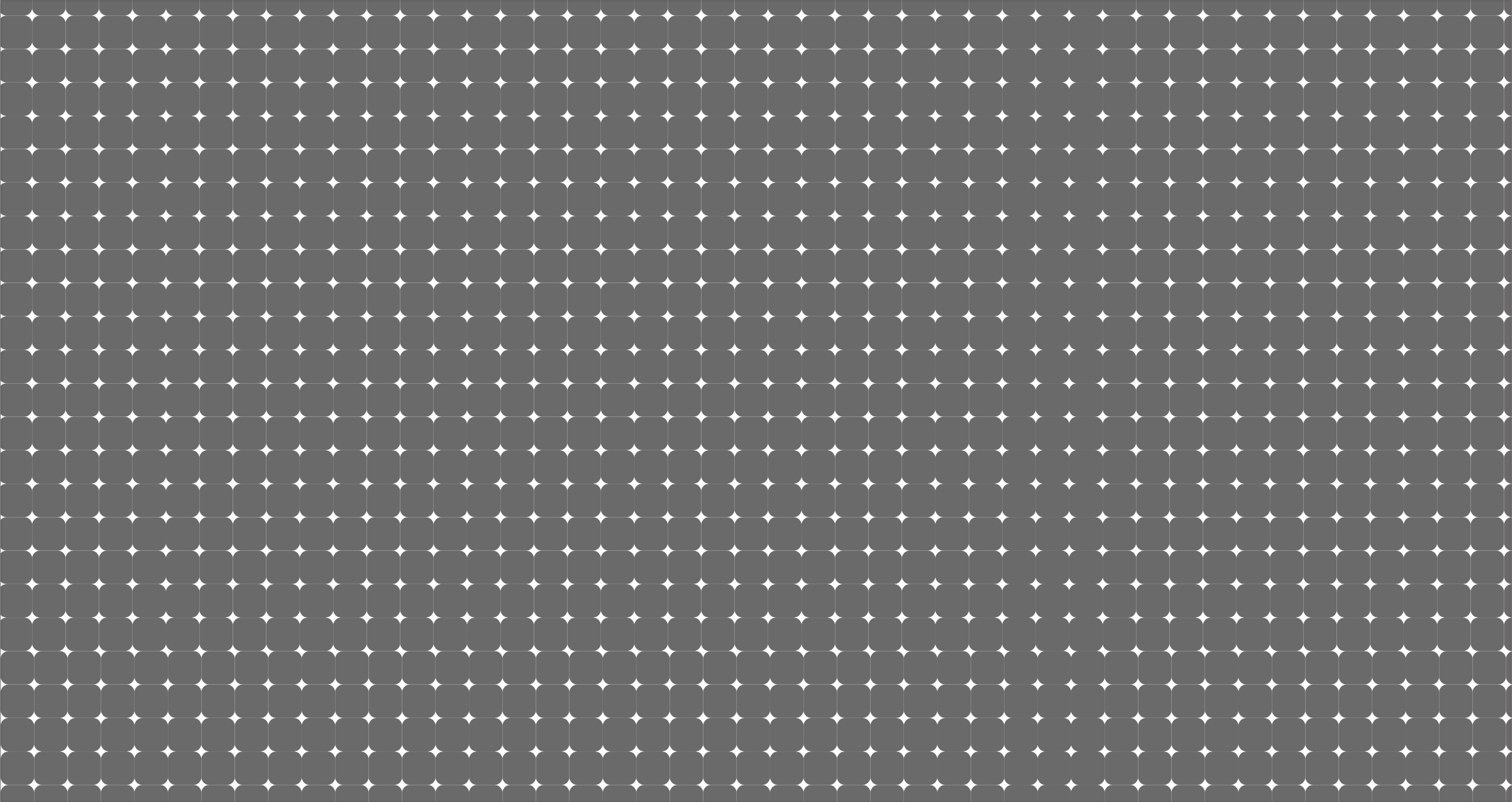
Emphasis using Saturation 01
Image
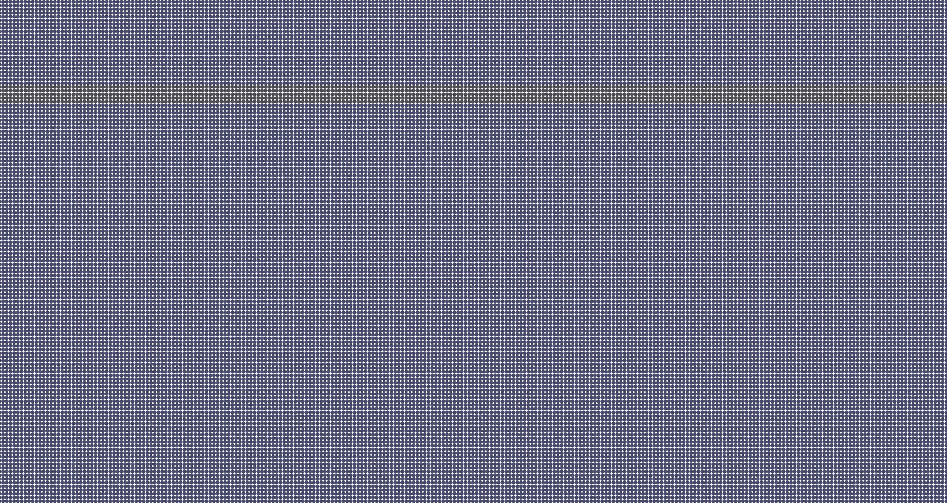
Emphasis using Saturation 01 (greyscale)
Image
Emphasis using Saturation 02
Image
Emphasis using Saturation 02 (greyscale)
Image
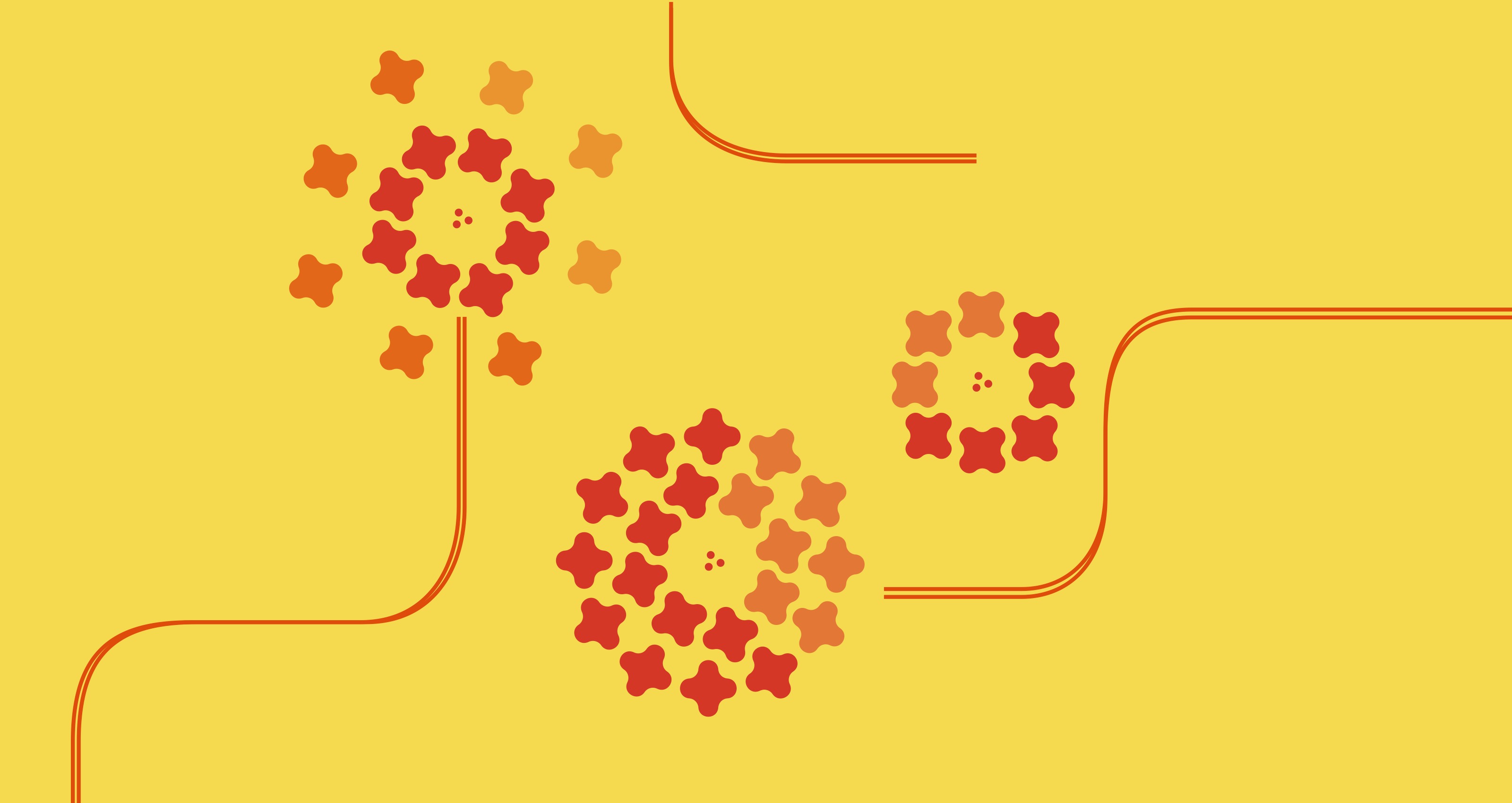
Emphasis using Anomaly (or tension) 01
Image
Emphasis using Anomaly (or tension) 02
Image
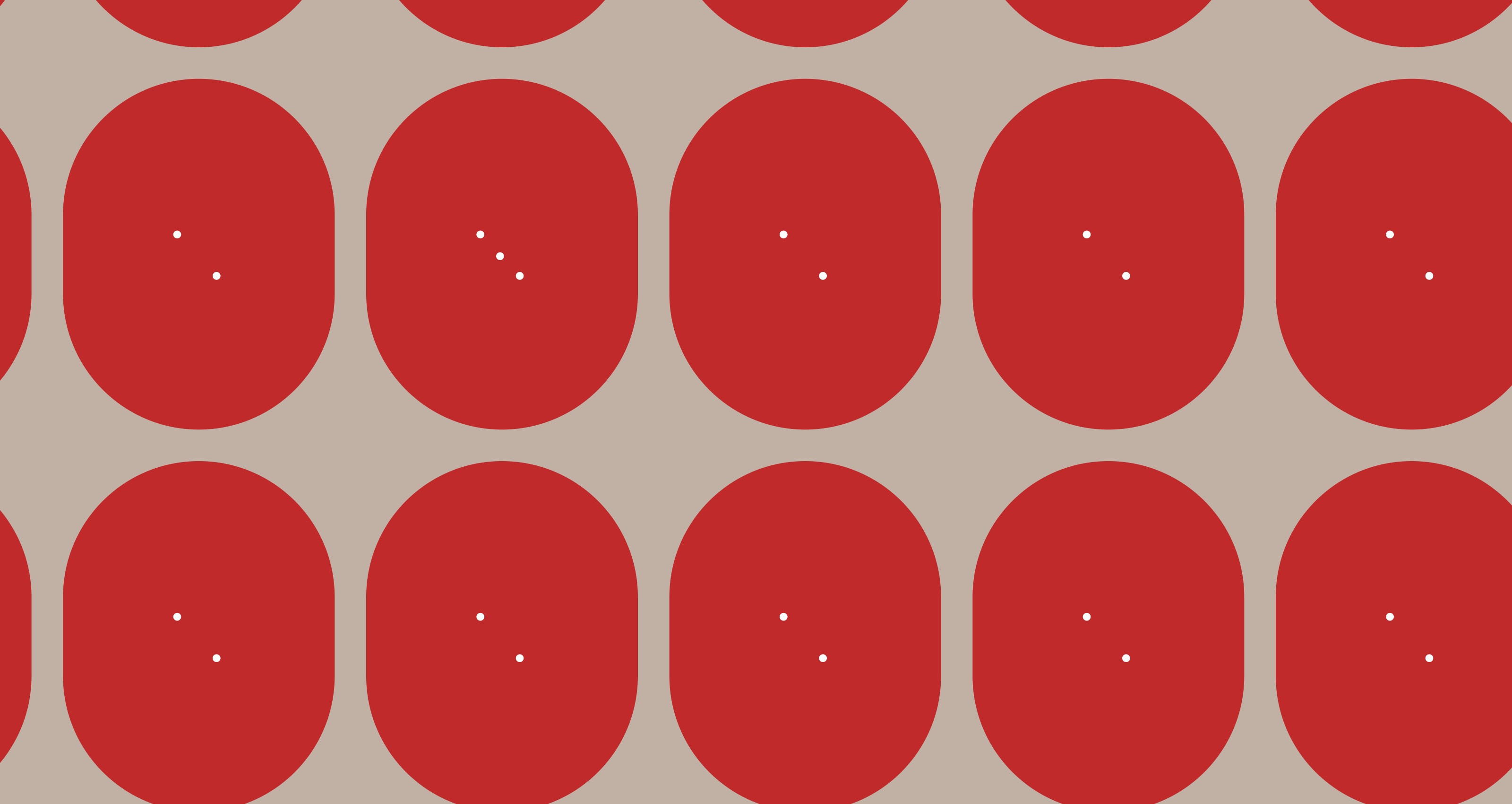
Emphasis using Atmospheric Perspective 01
Image

Emphasis using Atmospheric Perspective 02
Image
Mashup: a design with two different IP styles. IP: Intellectual Property, a design style that makes a product unique and easily recognizable that cannot be reused commercially without paying royalties to the owner(s)
Image
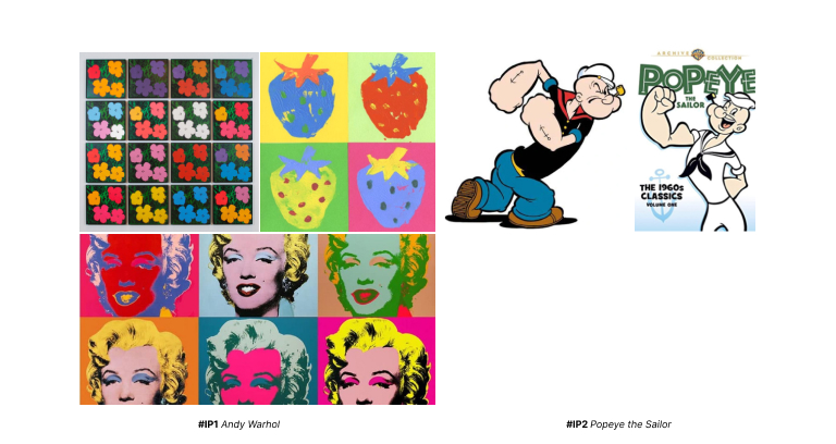
Designed 10 compositions(5 concepts) based on Andy Warhol + Popeye the Sailor.
Image
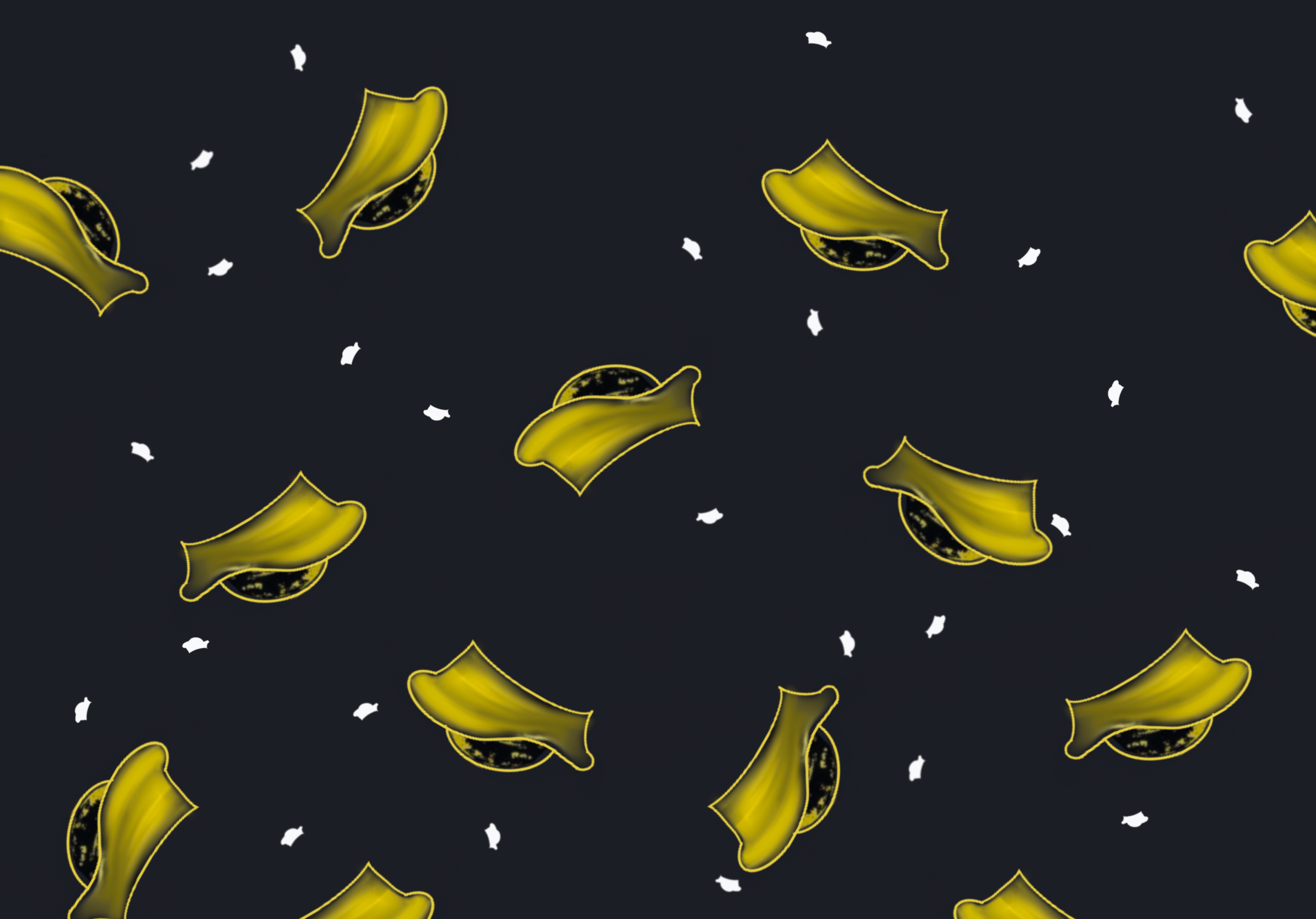
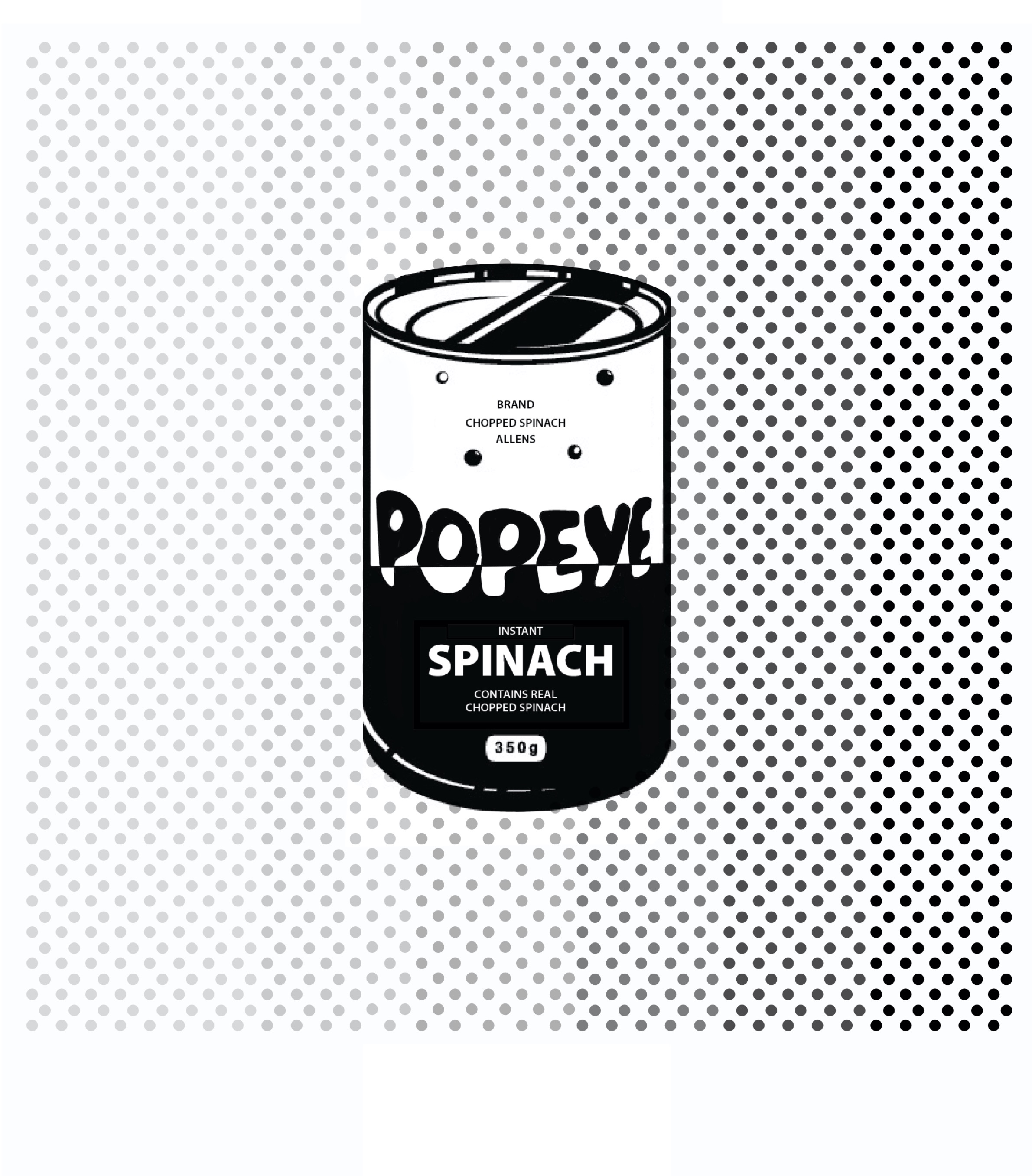
Mashup Concept #1 Popeye in MoMA 01
Image
Mashup Concept #1 Popeye in MoMA 02
Image
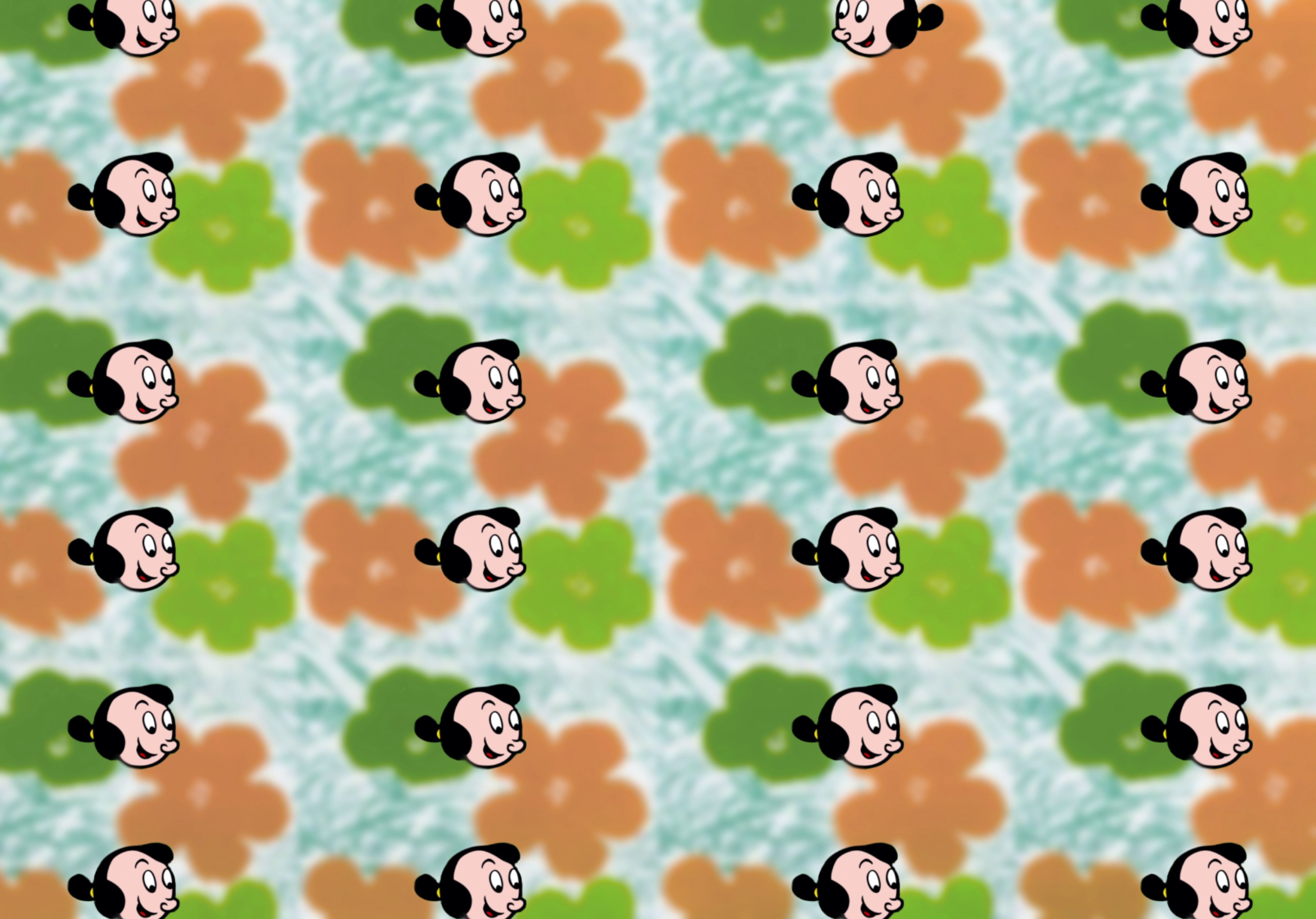
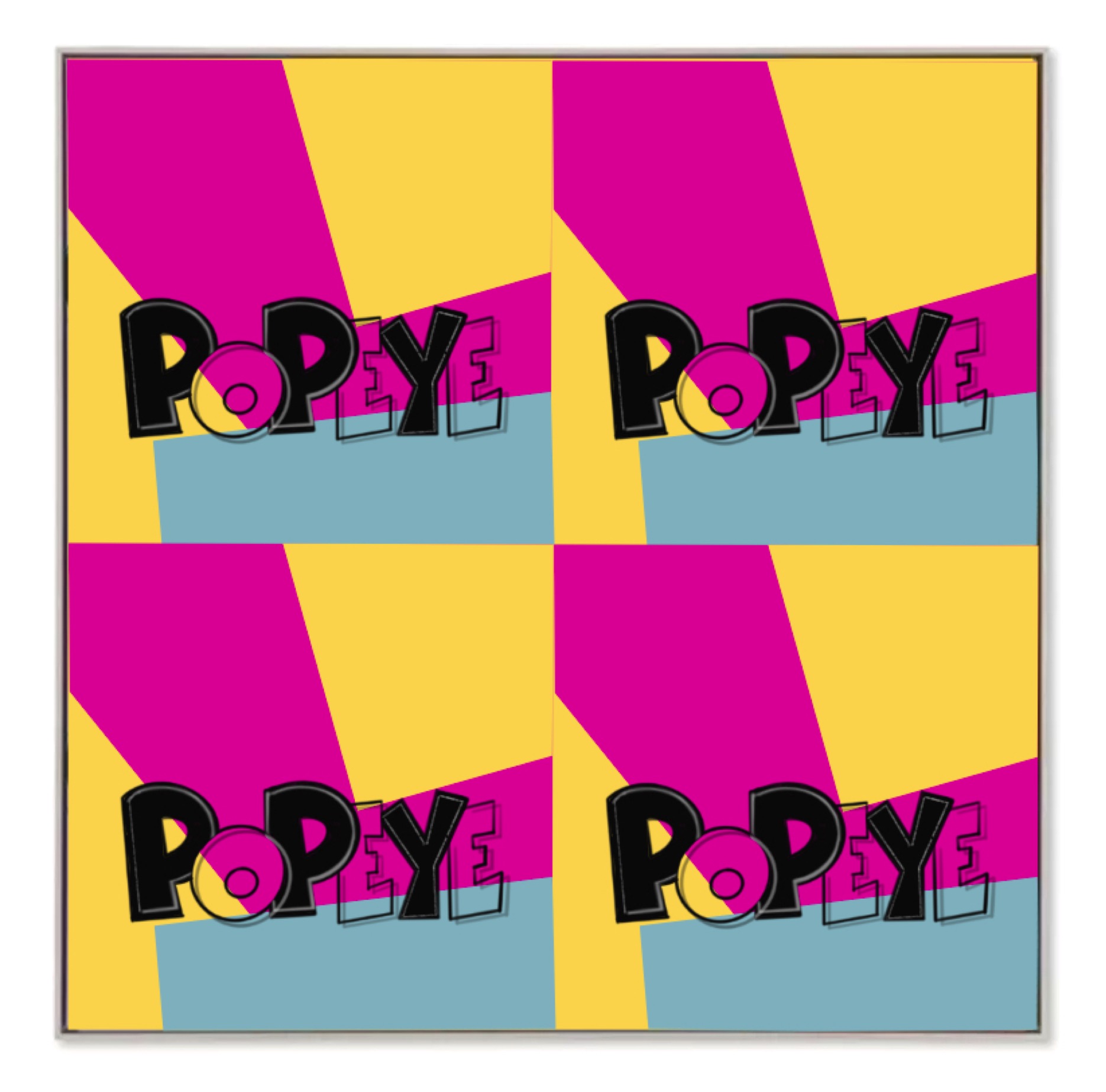
Mashup Concept #2 Pattern 01
Image
Mashup Concept #2 Pattern 02
Image
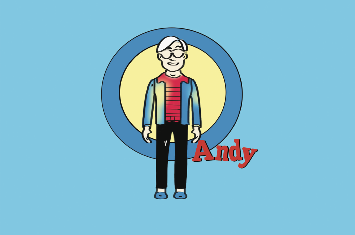
Mashup Concept #3 Character style swap 01
Image
Mashup Concept #3 Character style swap 02
Image
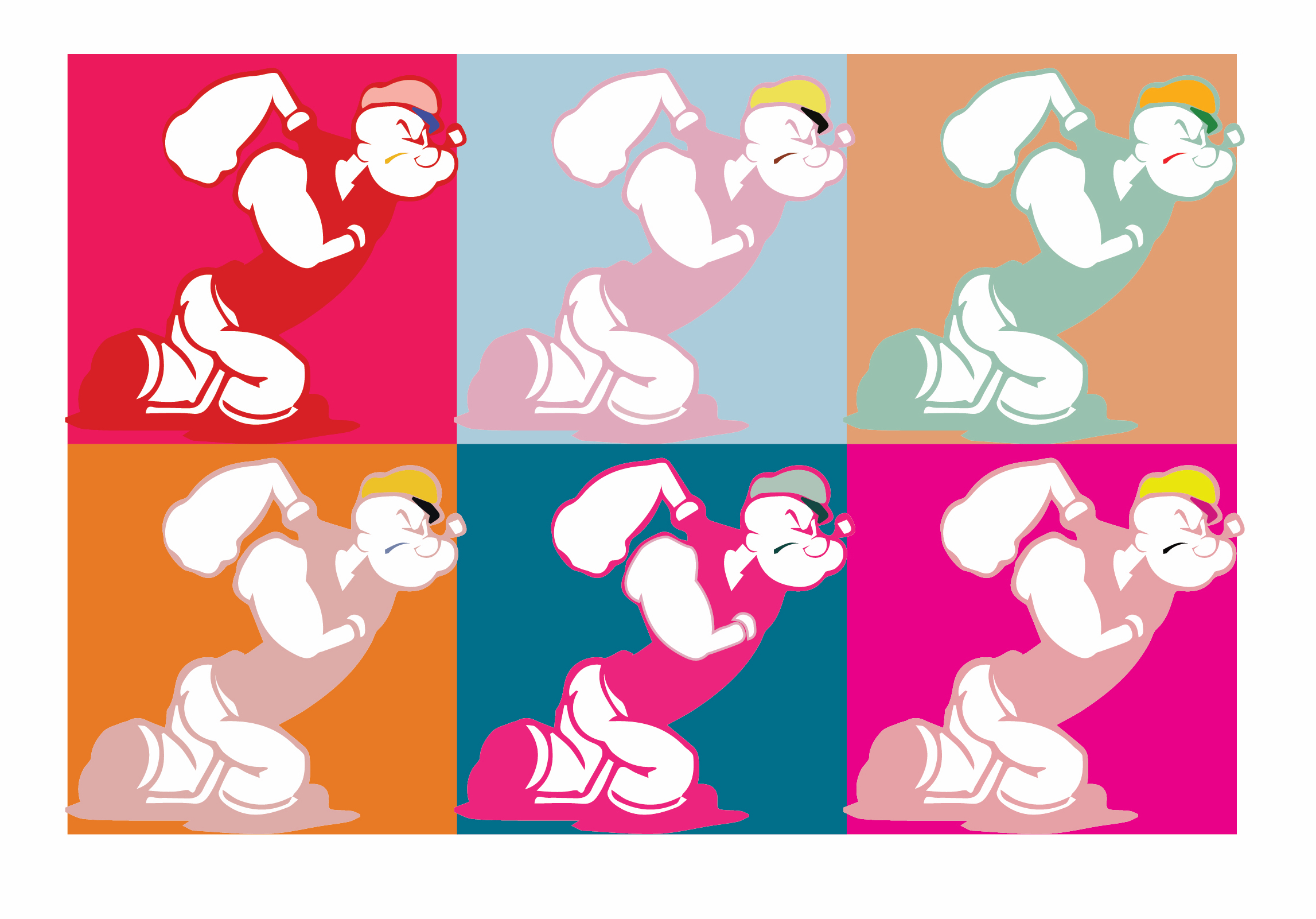
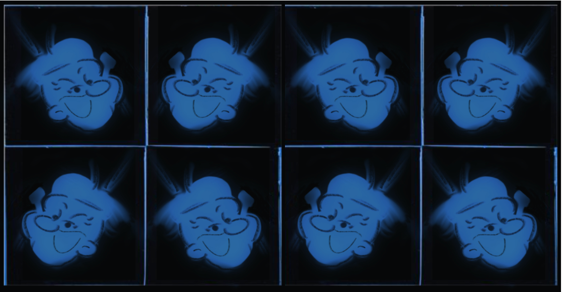
Mashup Concept #4 Different levels of saturations 01
Image
Mashup Concept #4 Different levels of saturations 02
Image
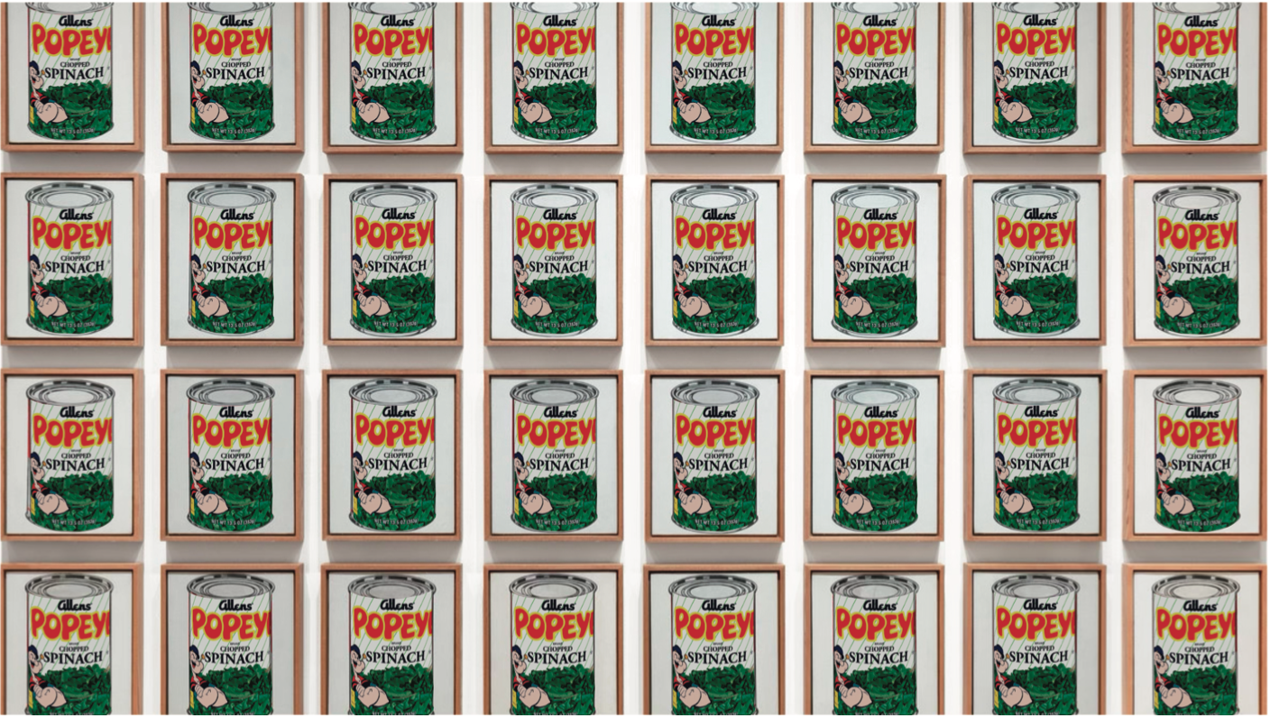
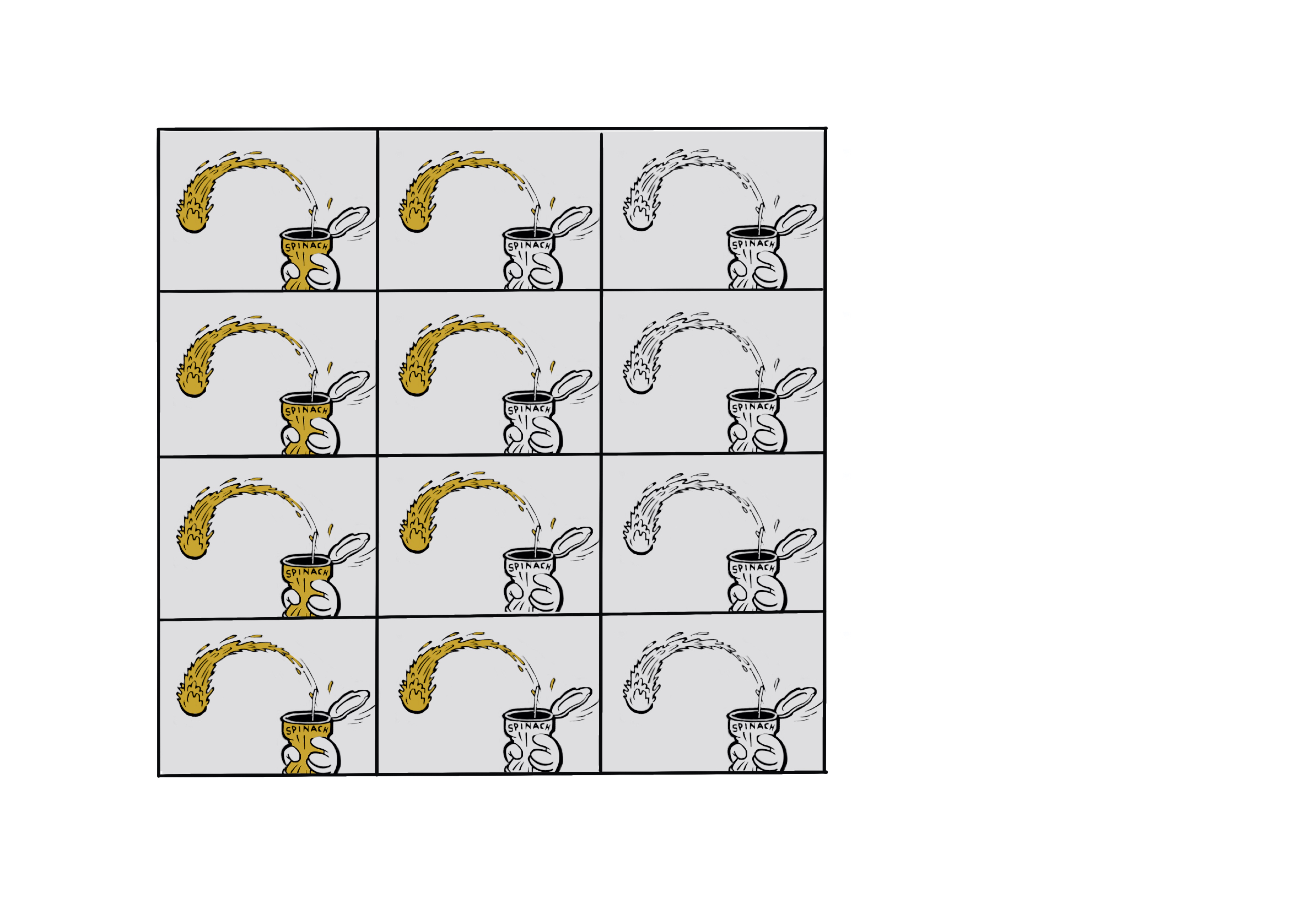
Mashup Concept #5 Color block 01
Image
Mashup Concept #5 Color block 02