Image
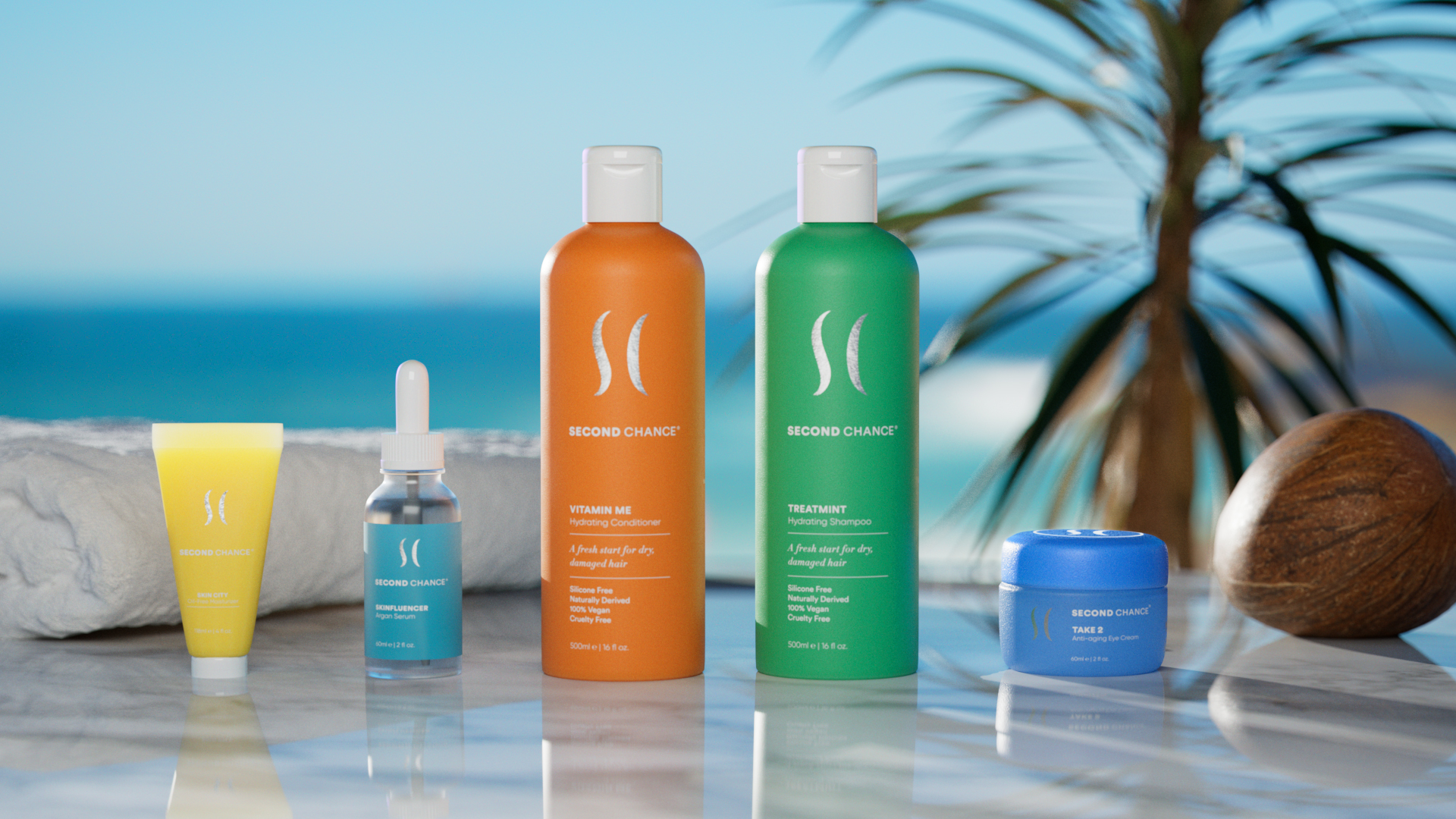
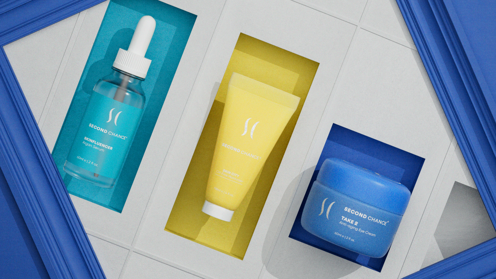
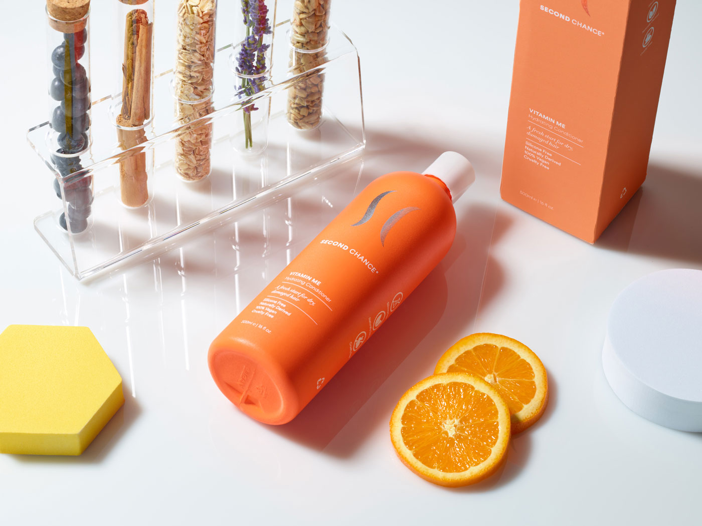
The product range, united by a vibrant tropical color scheme, encapsulated various sensory experiences, with each hue symbolizing elements of a Caribbean landscape.
Image
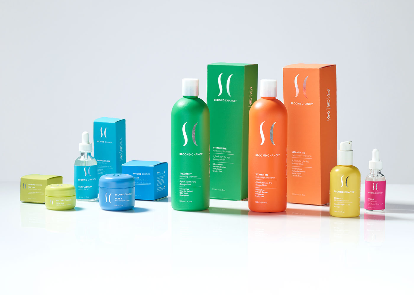
Each product in the family has a different purpose. The product range, united by a vibrant tropical color scheme, encapsulated various sensory experiences, with each hue symbolizing elements of a Caribbean landscape. Each hue describes a different sensory experience: green suggests palm leaves, blue the clouds on a bright sunny day, and yellow the shining sun.
Image
Image
Image

Contrasting from the colorful display, a logotype symbol appears in a metallic greyscale. The sleek, wave-like logotype and metallic logo on each bottle represents the significance of a second ritual and two diverse strands of hair.
Image
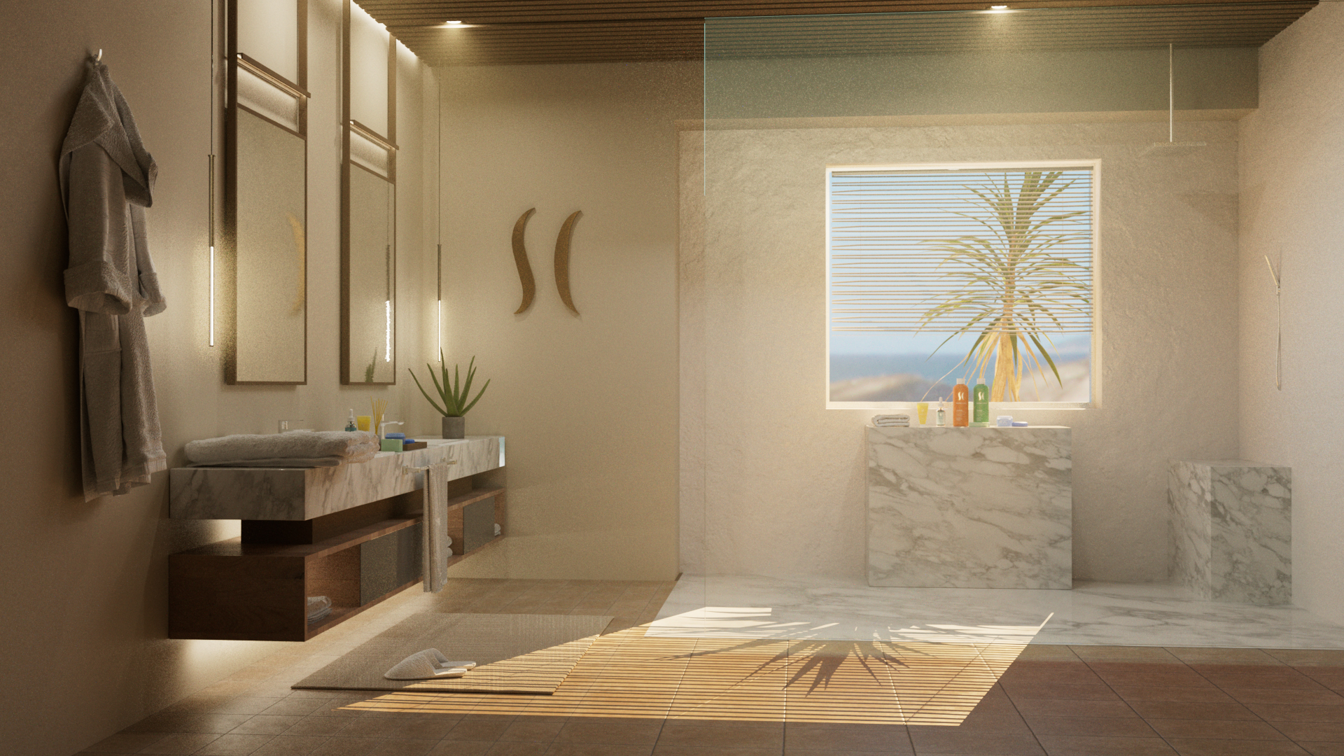
To further enhance the connection between customers and the Second Chance product line, I envisioned a unique experience that allowed individuals to visualize the products in their own home. Drawing upon my expertise in brand identity and packaging design, I meticulously crafted a luxury bathroom to show the products in their environment. This immersive environment allowed customers to see how the Second Chance products seamlessly integrated into their daily routines. The elegant bathroom design created an aspirational yet attainable atmosphere, showcasing the products in a real-life context. This immersive approach not only accentuated the brand's commitment to delivering premium solutions but also reinforced the idea that Second Chance was more than just skincare; it was a lifestyle.
Image
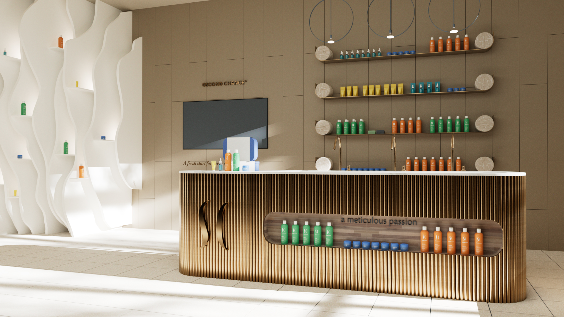
In addition to my dynamic role in entrepreneurship, I took on the exciting task of designing a retail space that would serve as the perfect home for the Second Chance product line. Leveraging my creative expertise, I envisioned a space that reflected the brand's essence of rejuvenation and elegance. The retail environment I designed was carefully curated to be a haven of luxury and sensory delight, mirroring the lush and tropical landscapes featured in the product visuals. With meticulous attention to detail, I crafted an inviting atmosphere where each product could shine, and customers could immerse themselves in the Second Chance experience. This retail space was more than just a store; it was a sensory journey, an oasis where customers could explore and connect with the brand's vision and values.
Image
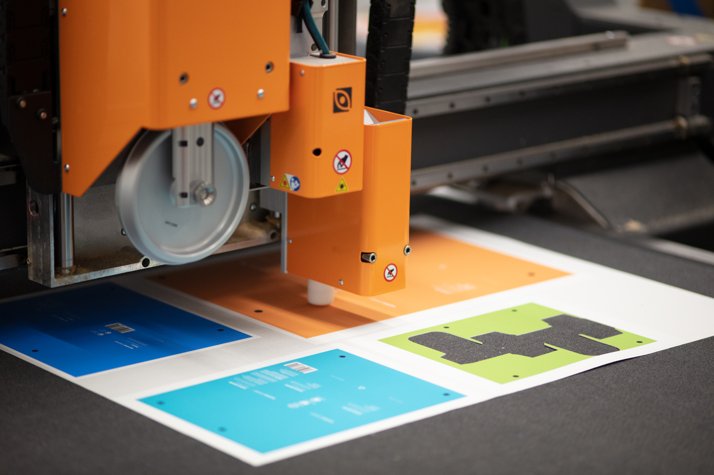
The Kongsberg table by Esco was used to create dielines for folding cartons of each product.