Graduates

Joseph Meza

MFA in Graphic Design - 2 Yr Path — Graduate Graphic Design
Faculty:
Stephen Serrato

ITEM Stencil

Design a basic uppercase and lowercase alphabet (A–Z, a–z) using modules built from the primary forms (●, ▲, ■) and combinations thereof. Working with this modular method will help you to understand the architecture of letterforms and the modularity, coherence, and harmony inherent to type design.
Learning Outcomes:
I learned to keep things simple. From the start I went ins a wildly complex direction that just felt overwhelming. I brought my self back to a smaller grid of 3x3 and basic shapes such as square rectangle and a quarter circle. Building from simple shapes helped bring the complexity I was looking for from the start with out all the hassle of having too many shapes.
Image
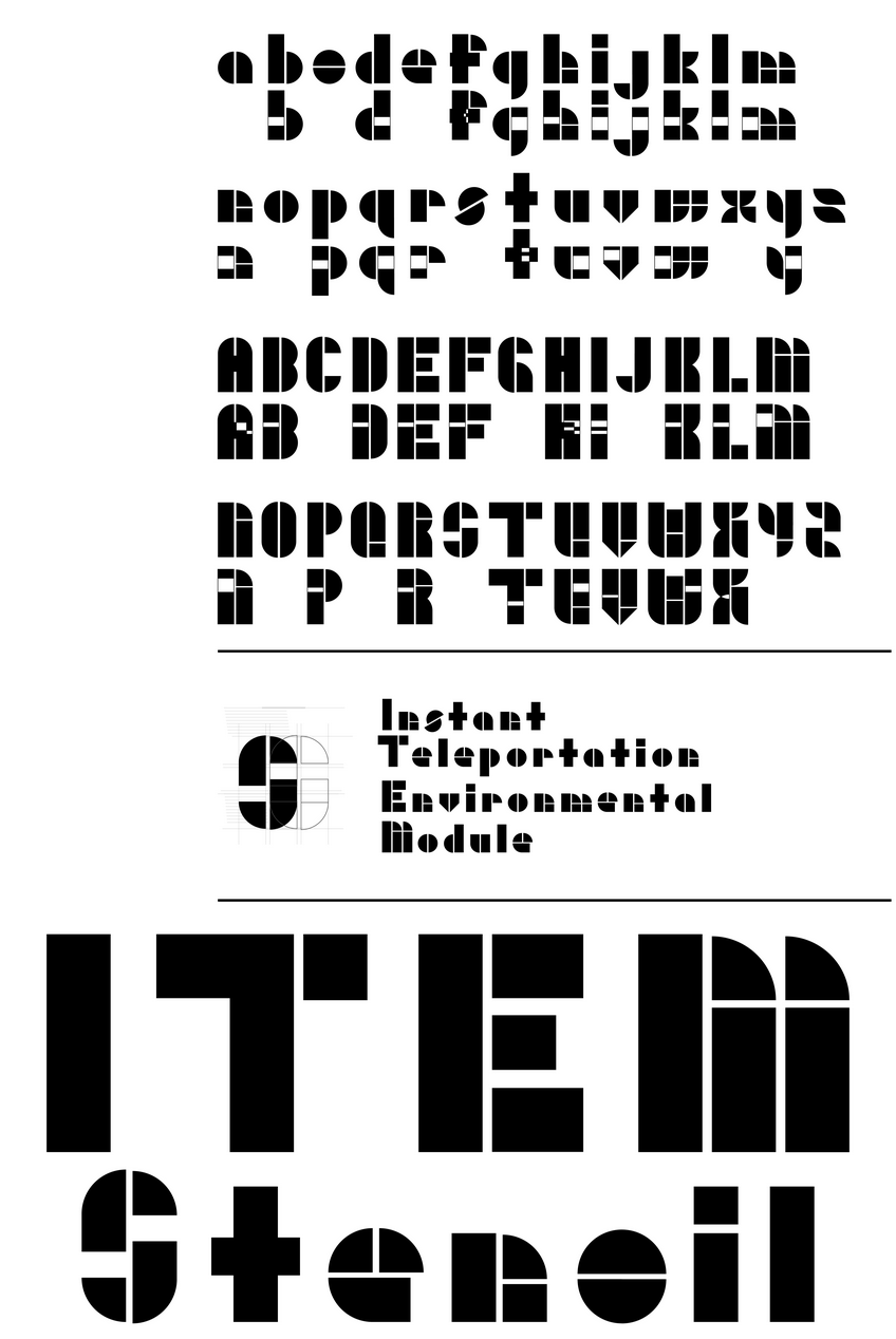
Along with the actual finished typeface I went ahead an made a decorative variation on some of the letters it worked with. These were made into compound shapes in a slightly different way and they show the ways the originals were build and how the modular shapes were overlapping. These letters while I was making them I kept in mind another project I am currently working on for studio class in which it revolves around a new form of transportation. We often see traffic stencils in our daily life. This is my take on incorporating that sort of traffic stencil design where its rooted in the past, but a slight futuristic approach. Yes, my studio project revolves around the idea of teleportation as a form of public transportation.