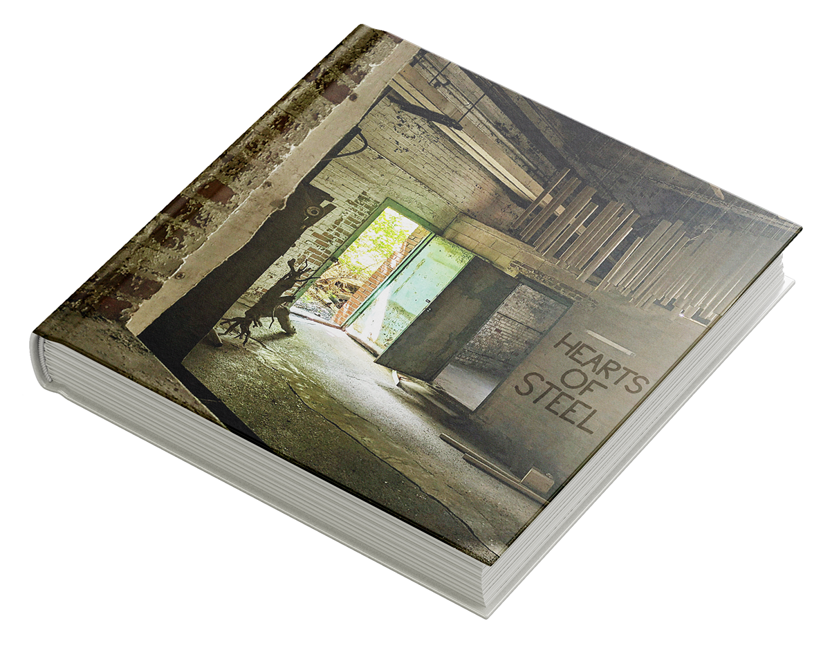
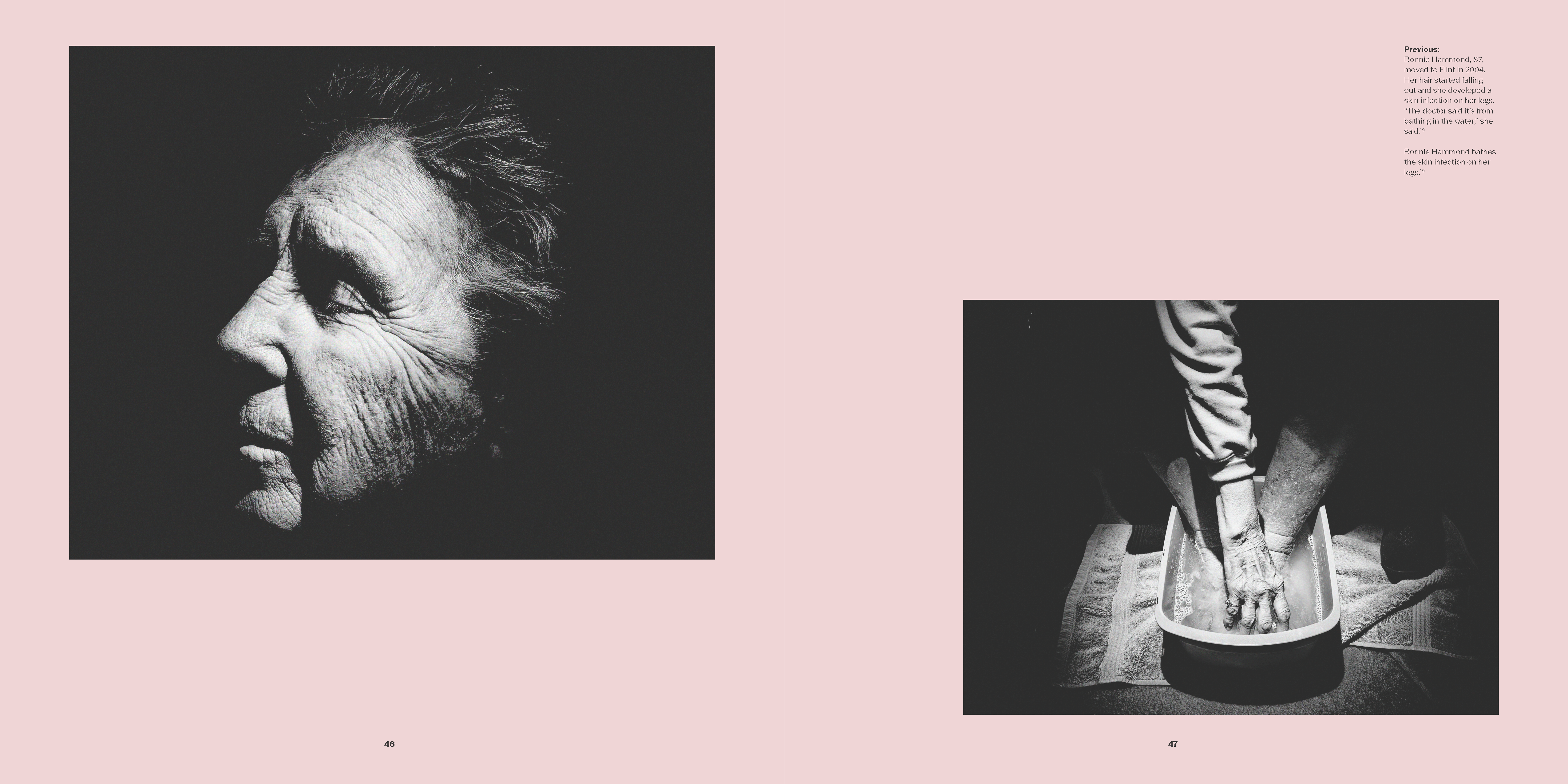
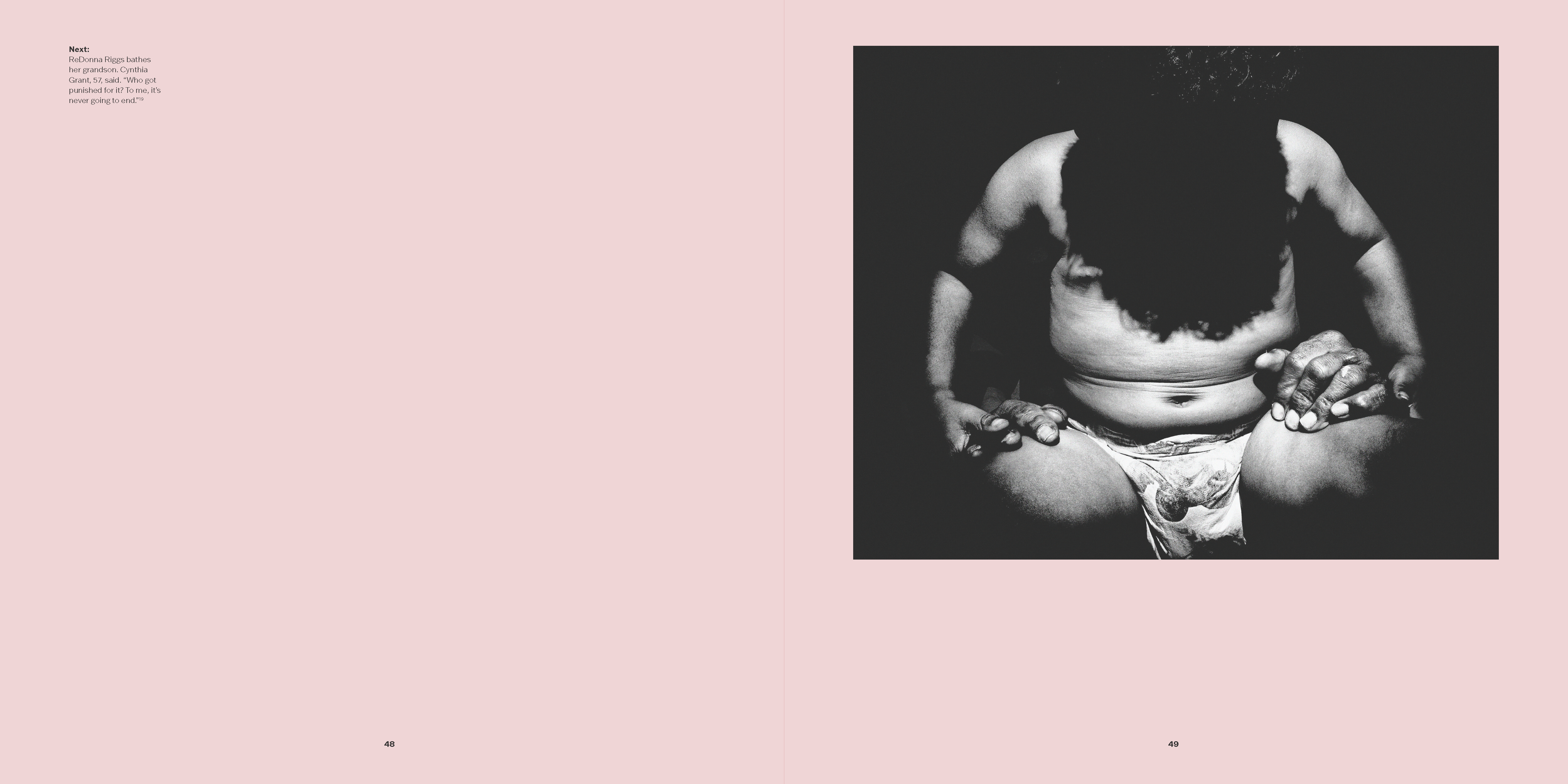
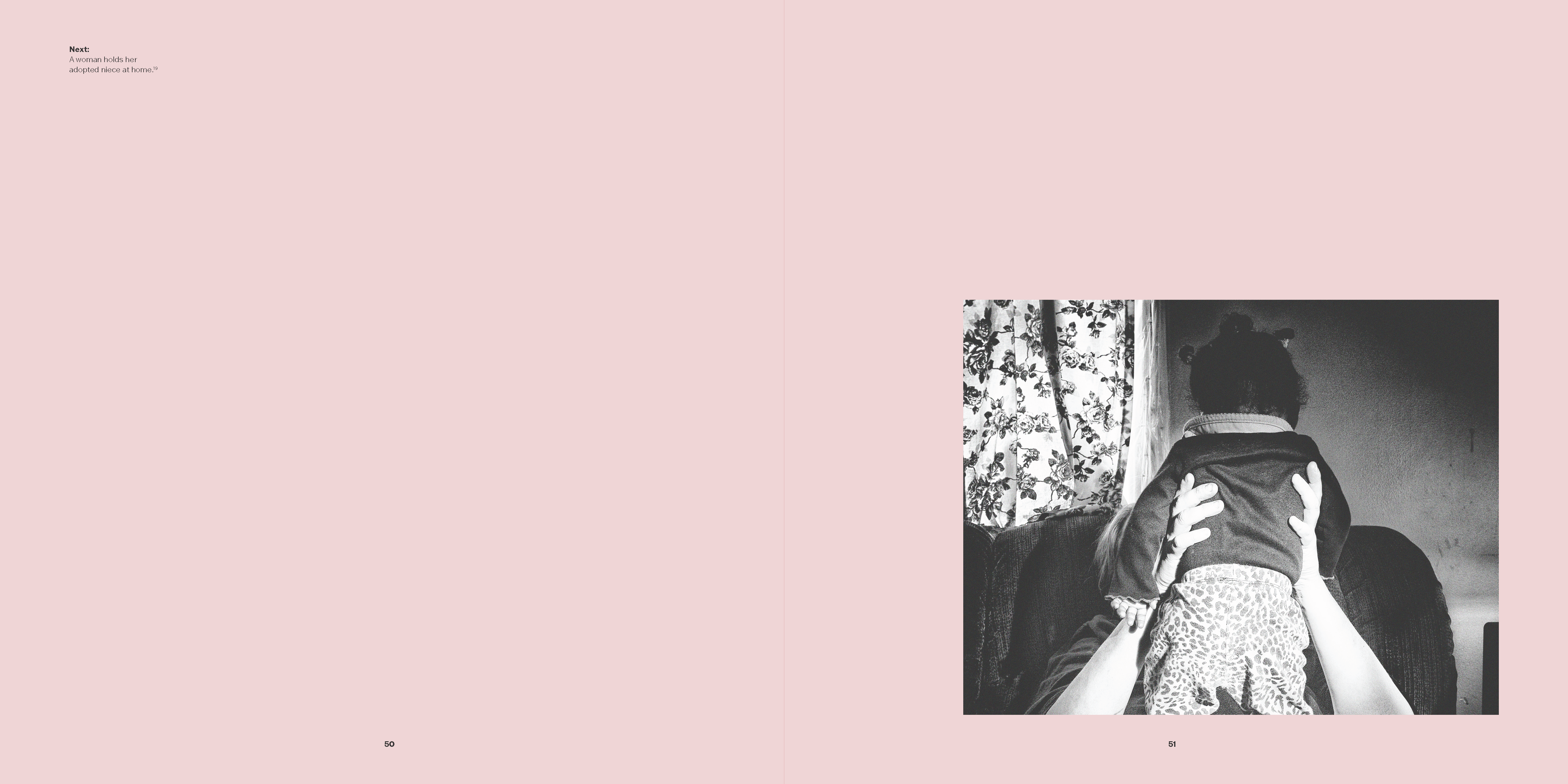
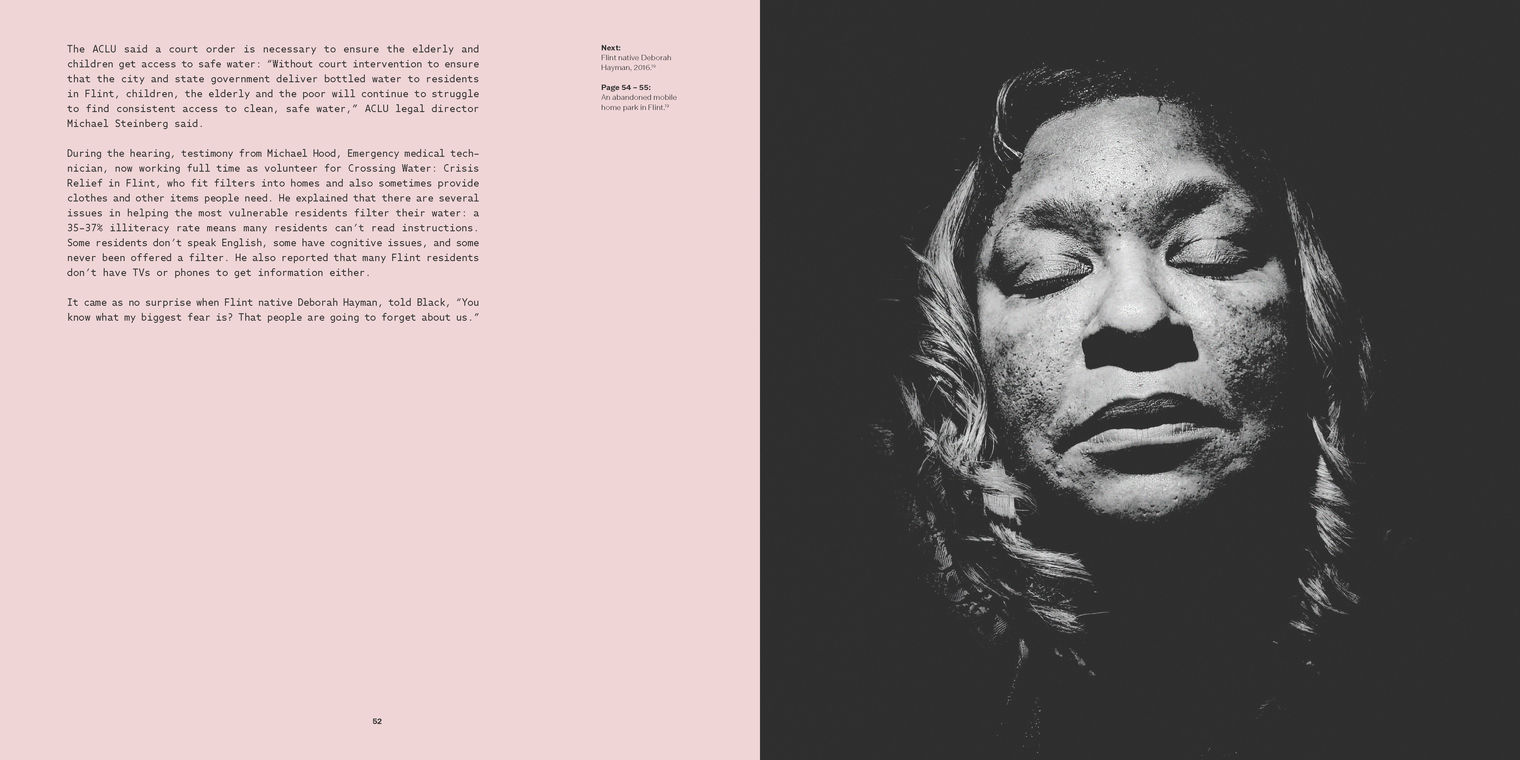
Image
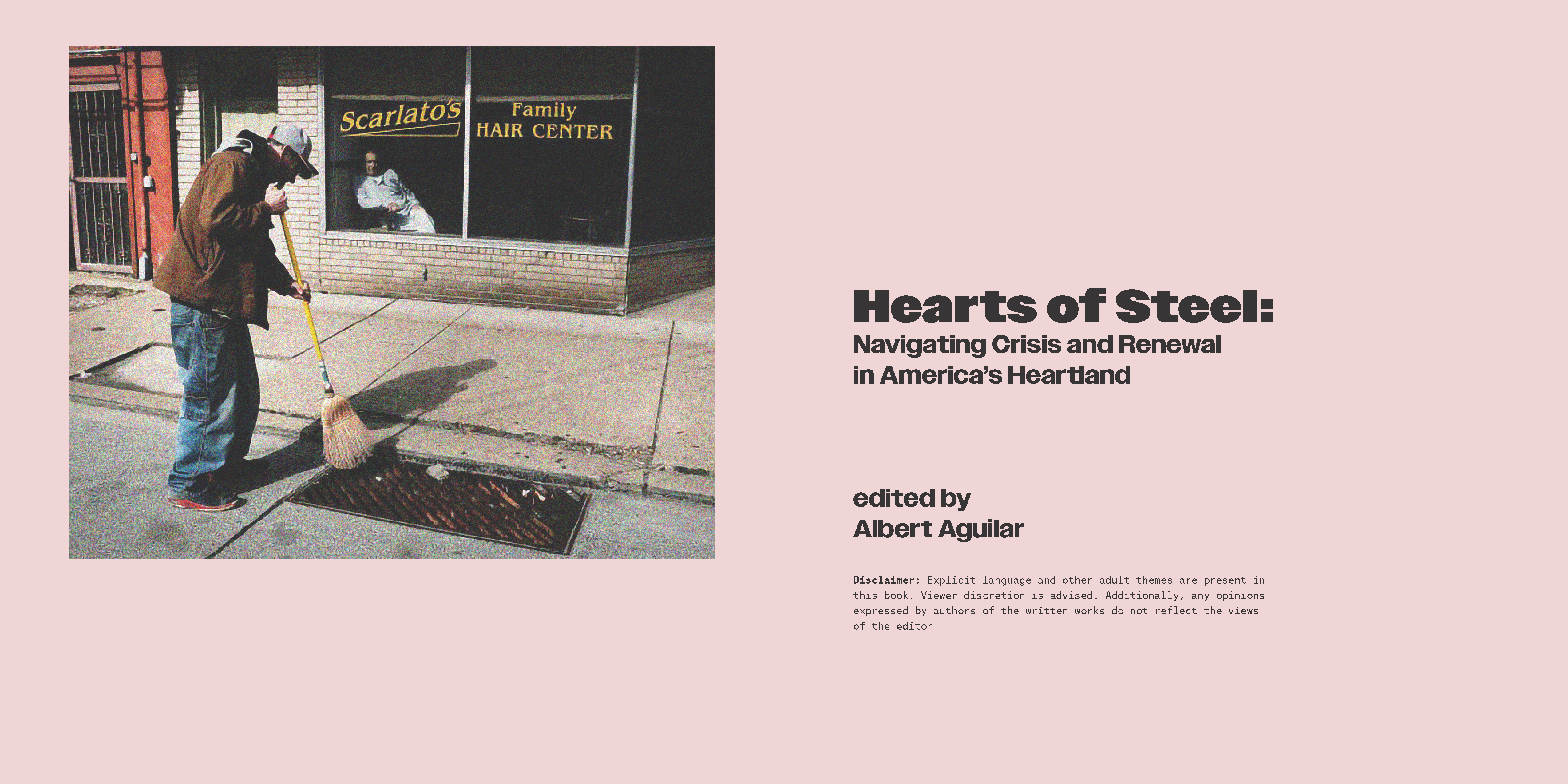
For the book's front cover, a photo of an abandoned industrial space acts as a metaphor for the book's content. The first half of the book explores the compelling (and often tragic) stories of the loss of economic opportunity in the US heartland and its effects on communities (characterized by the door leading to a dark and foreboding interior). The book also explores the revitalization efforts undertaken by communities in order to remake themselves, characterized by the door opening to the sunlight.
Image
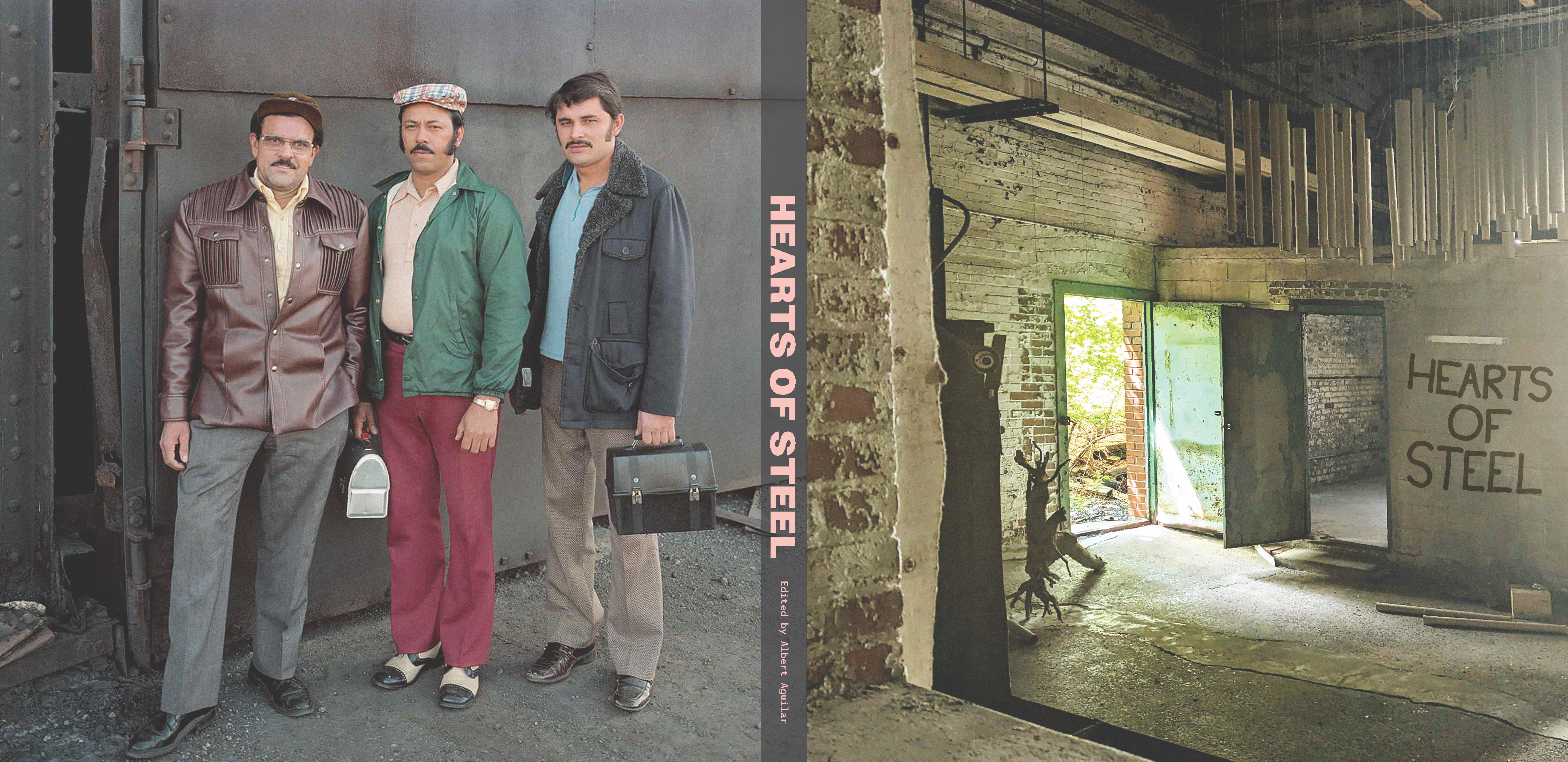
The back cover, shot by photographer Stephen Shore, depicts three factory employees, working in Struthers, Ohio (late 1970s).
Image
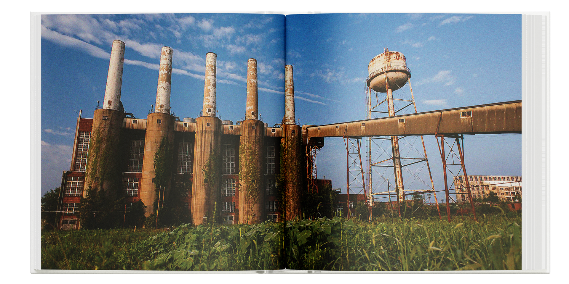
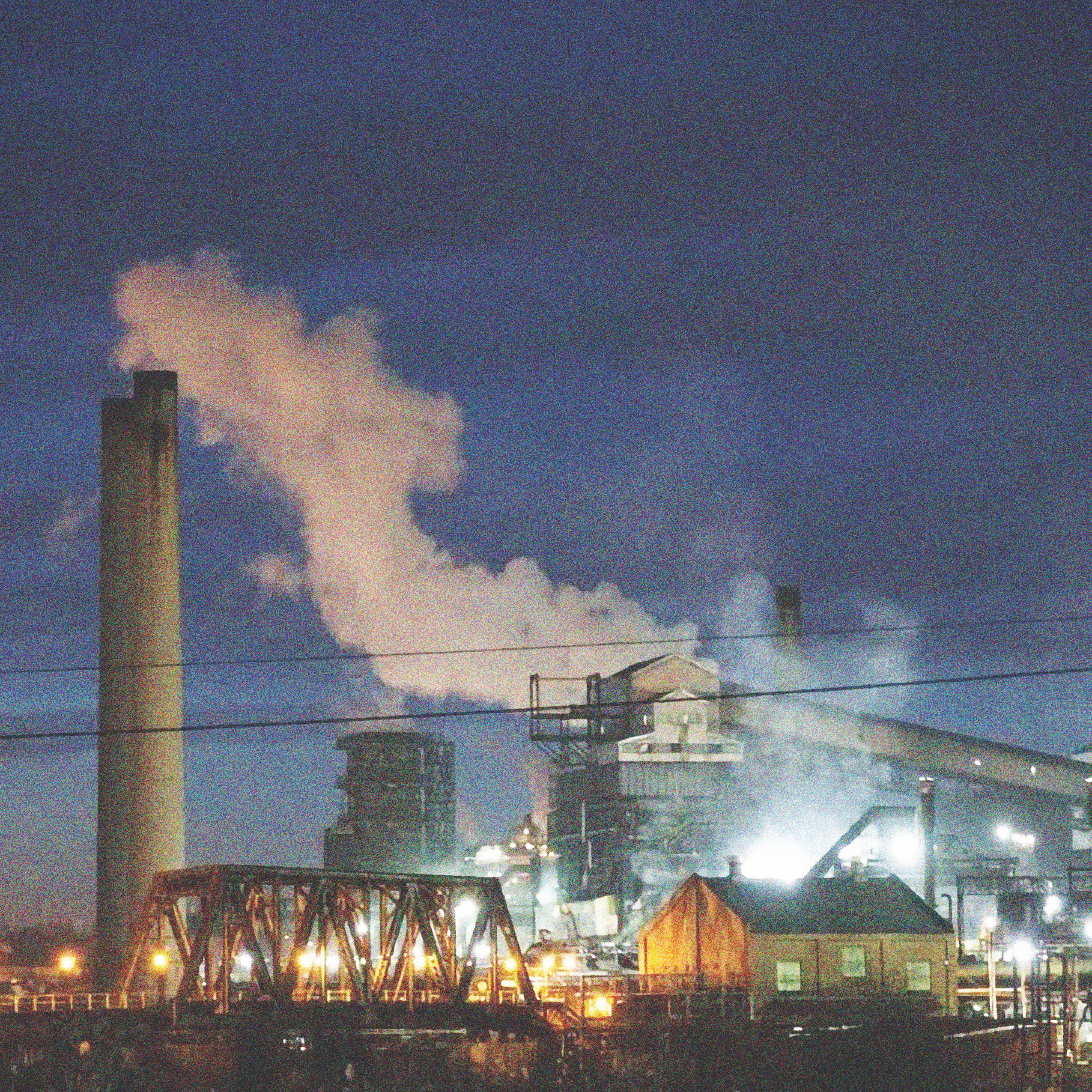
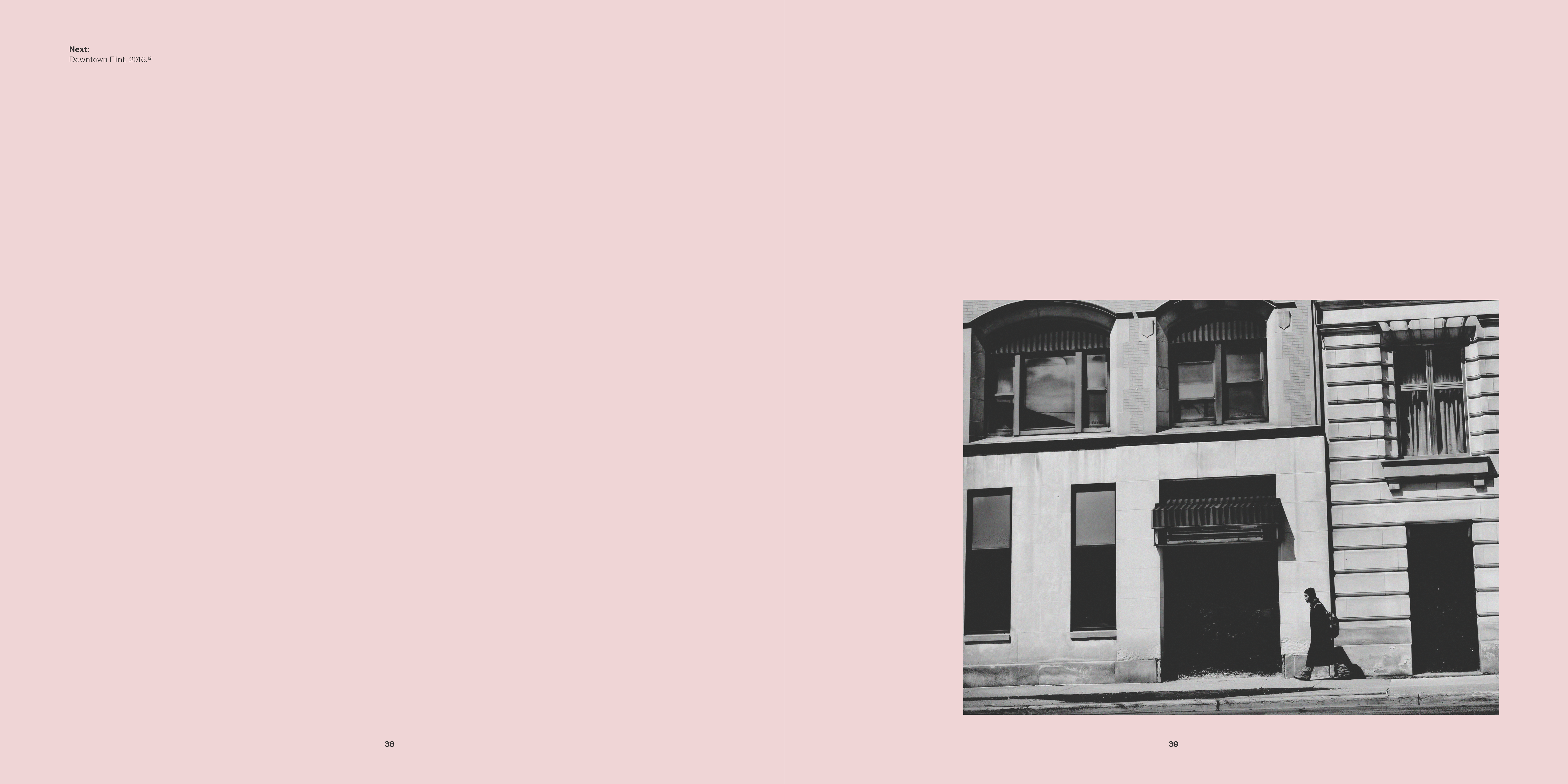
This project direction involved many serious topics—such as urban decay and the trauma inflicted on communities from loss of opportunity. As a result, I decided against any noticeable image alterations (other than minor grain), to depict subjects in the most honest light possible.
Image

There were several image subjects, such as architecture, artwork, and people. I practice two alternating image placement structures, which ensures the layout is engaging and not repetitive.
Image
My use of typography is conservative and acts to respectfully respond to the imagery. Azo Mono is my body copy typeface, a humanistic monospace font responds to the structure of factories and buildings through its rigid forms. Its plain presentation, like with the images, acts to tell the narrative in a way that is respectful and straightforward.
Image
Image

Image
Image
Image
Image
Image
Image
Image
Image
Image
Image
Image
Image
Image
Image
Image
Image
Image
Image
Image
Image
Image
Image
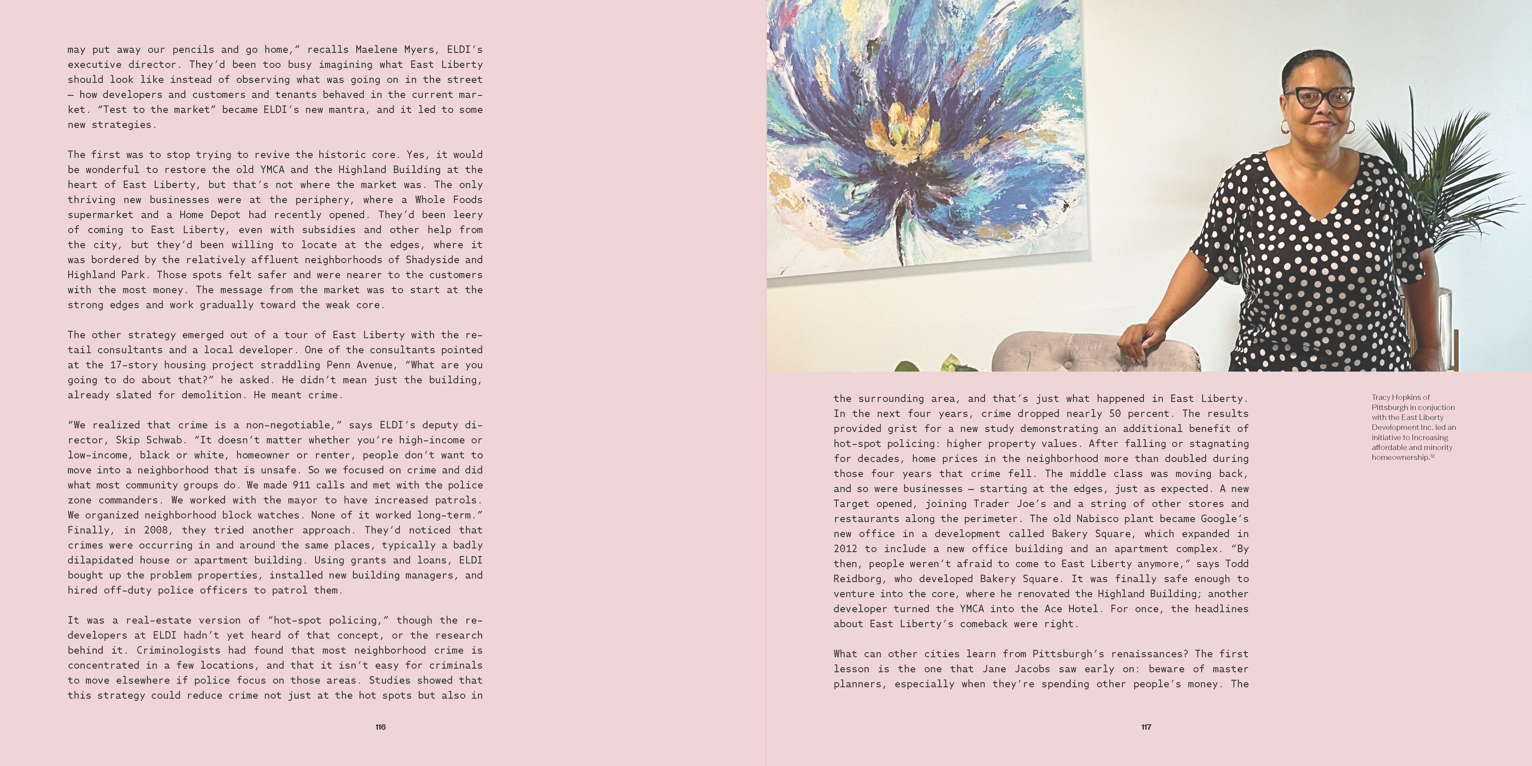
Image
Image
Image
Image
Image
Image
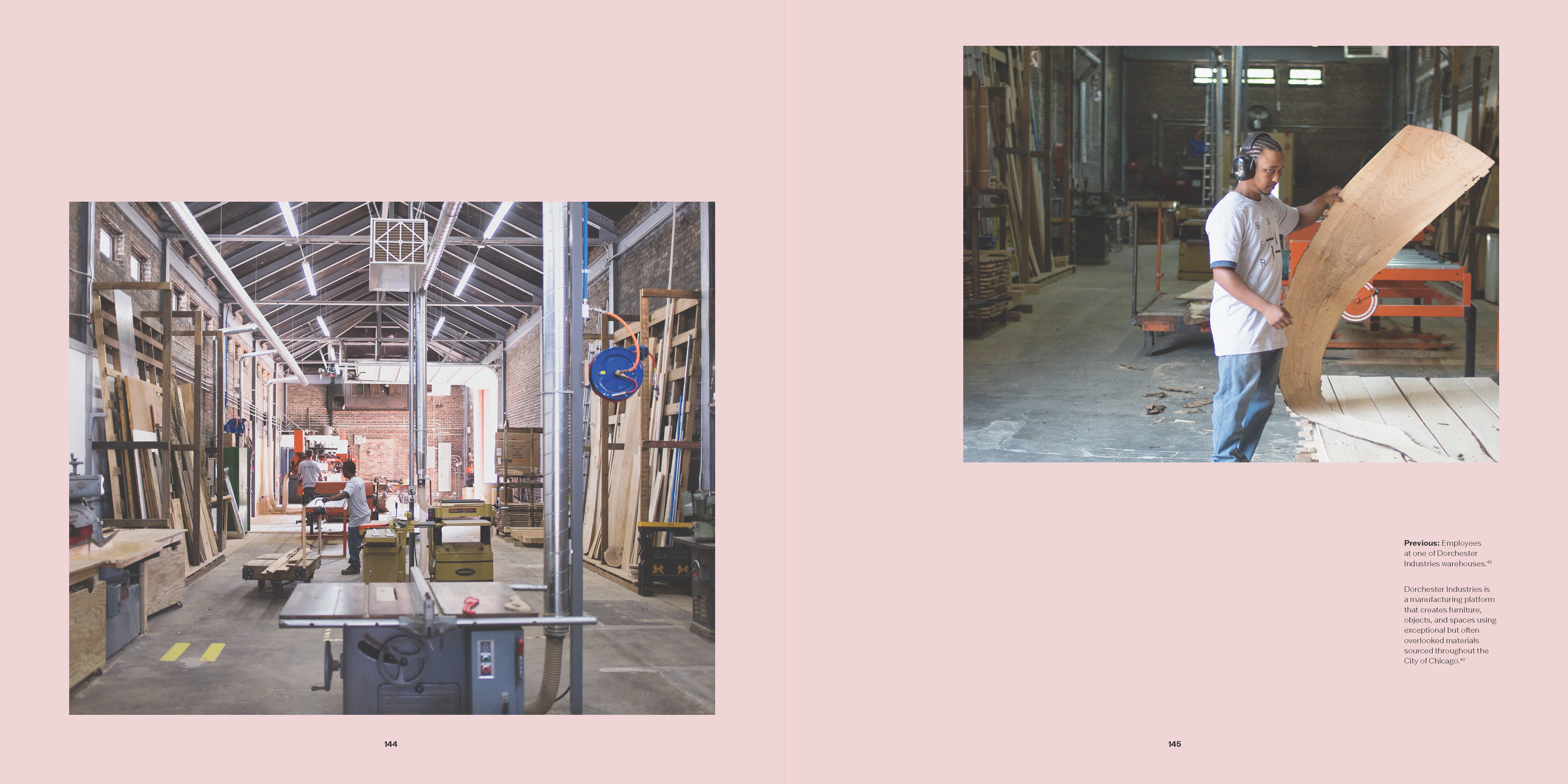
Image
Image
Image
Image
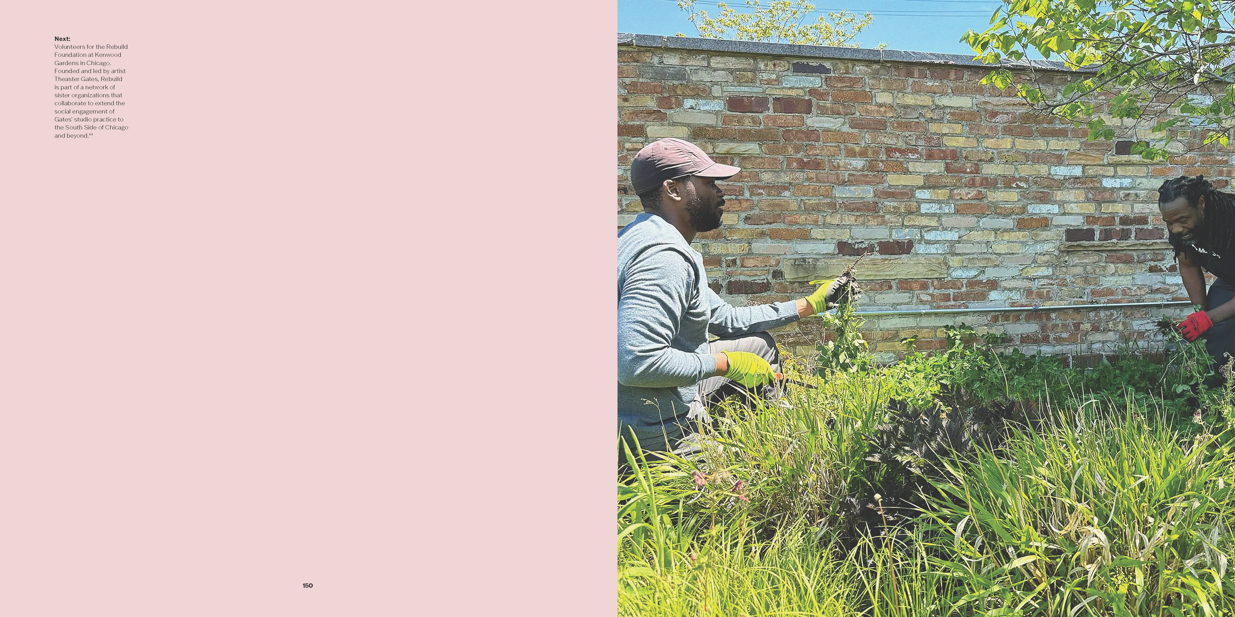
Image
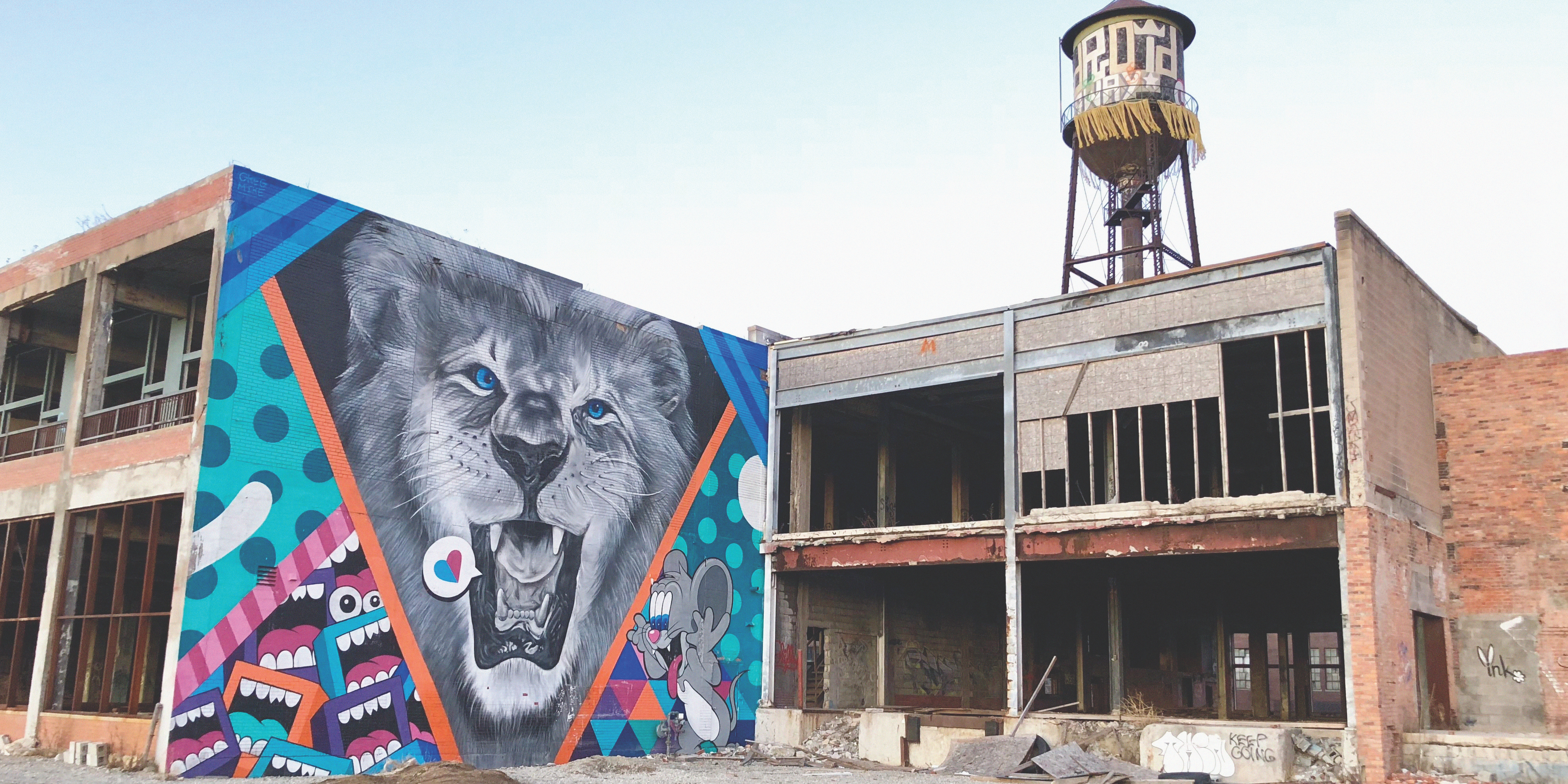
Image
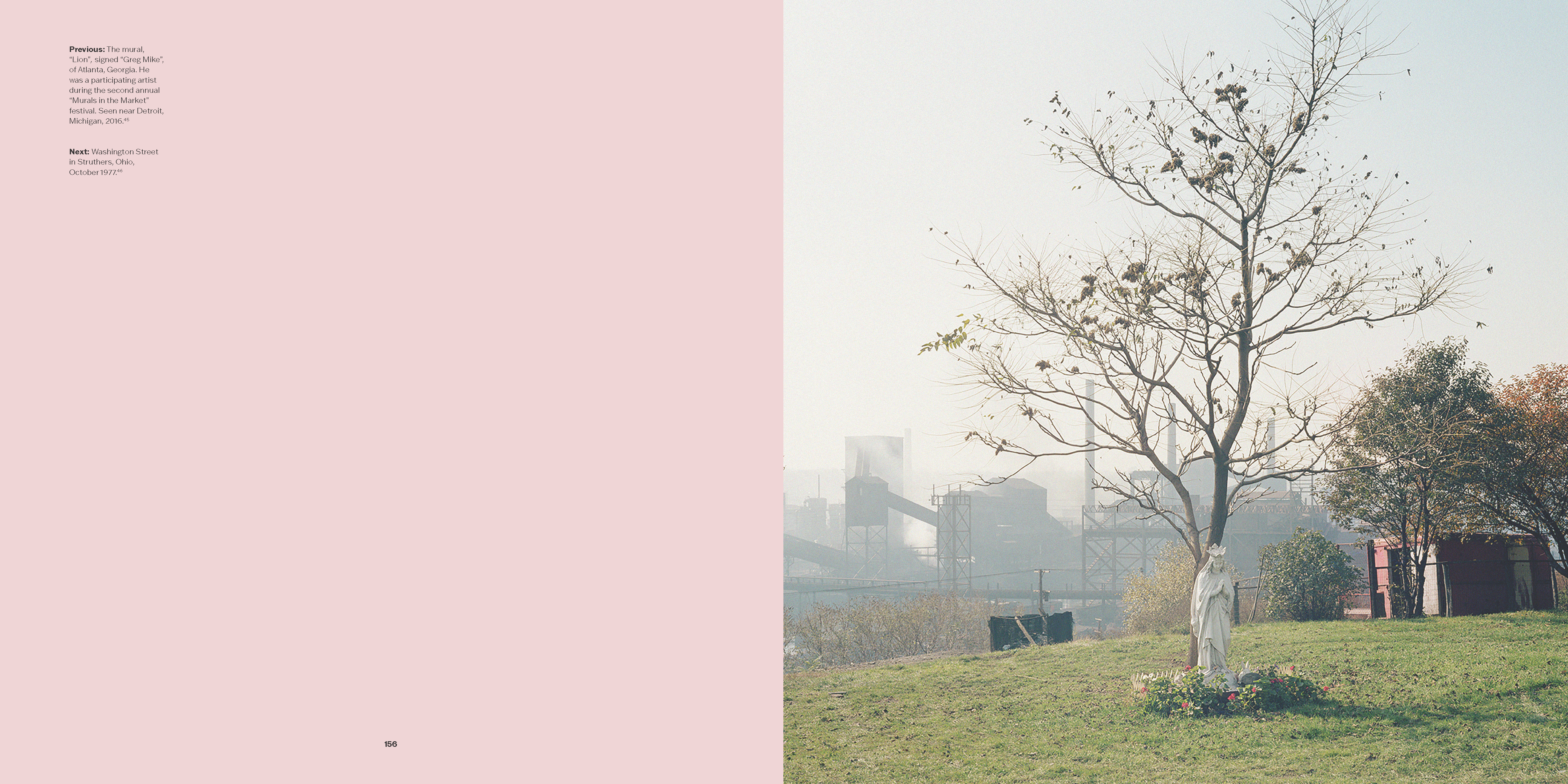
Image
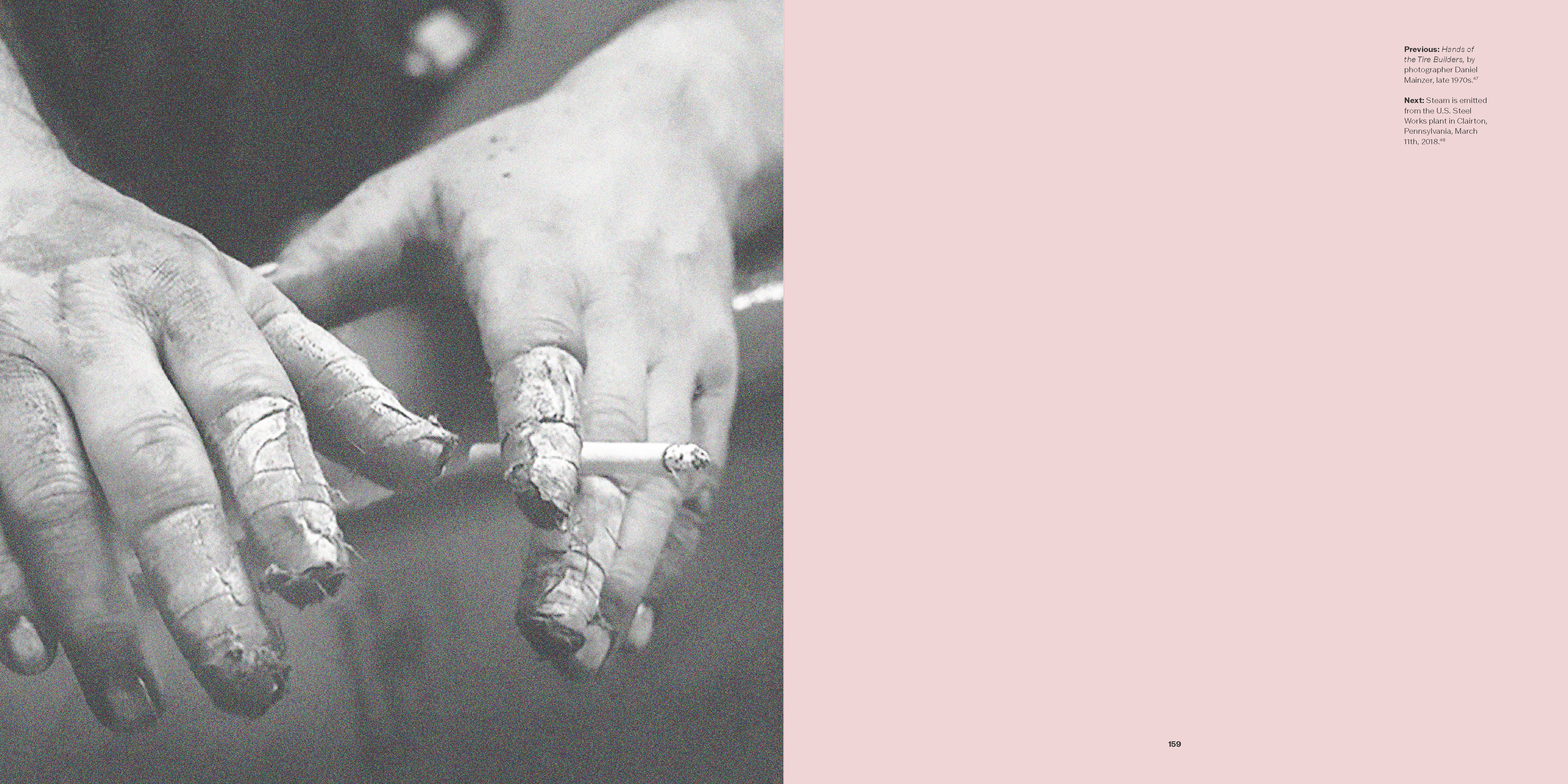
Image
Image
Image
Image
Image
Image
Image
Image

Image
Image
Image
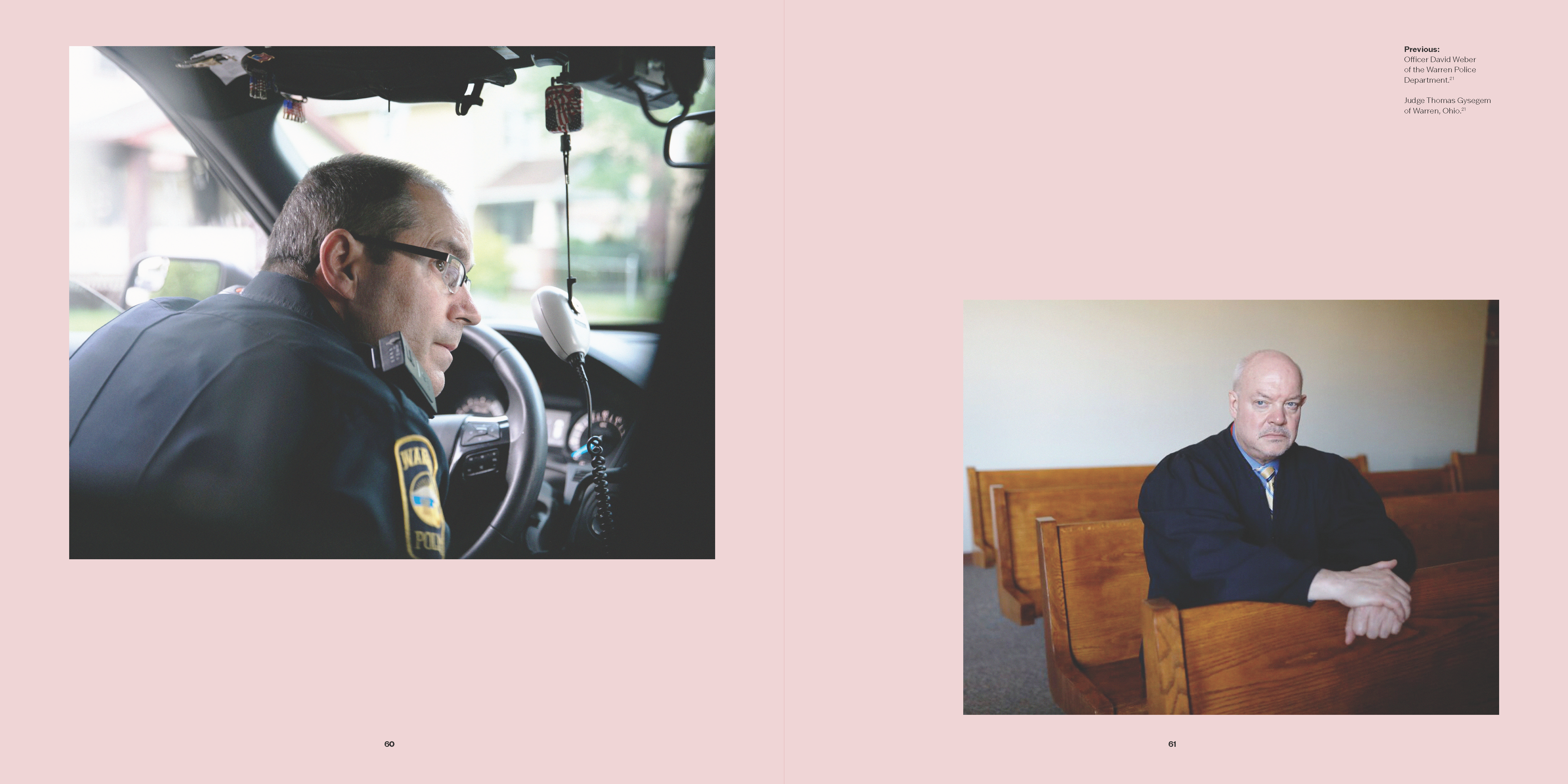
Image

Image
Image
Image
Image
Image
Image

Image
Image
Image
Image
Image
Image
Image
Image
Image
Image

Image
Image
Image
Image
Image
Image
Image
Image
Image
Image

Image

Image
Image
Image
Image
Image
Image