Amanda Chum
BFA in Graphic Design — Graphic DesignSumei: Ume Clear Spirits Line
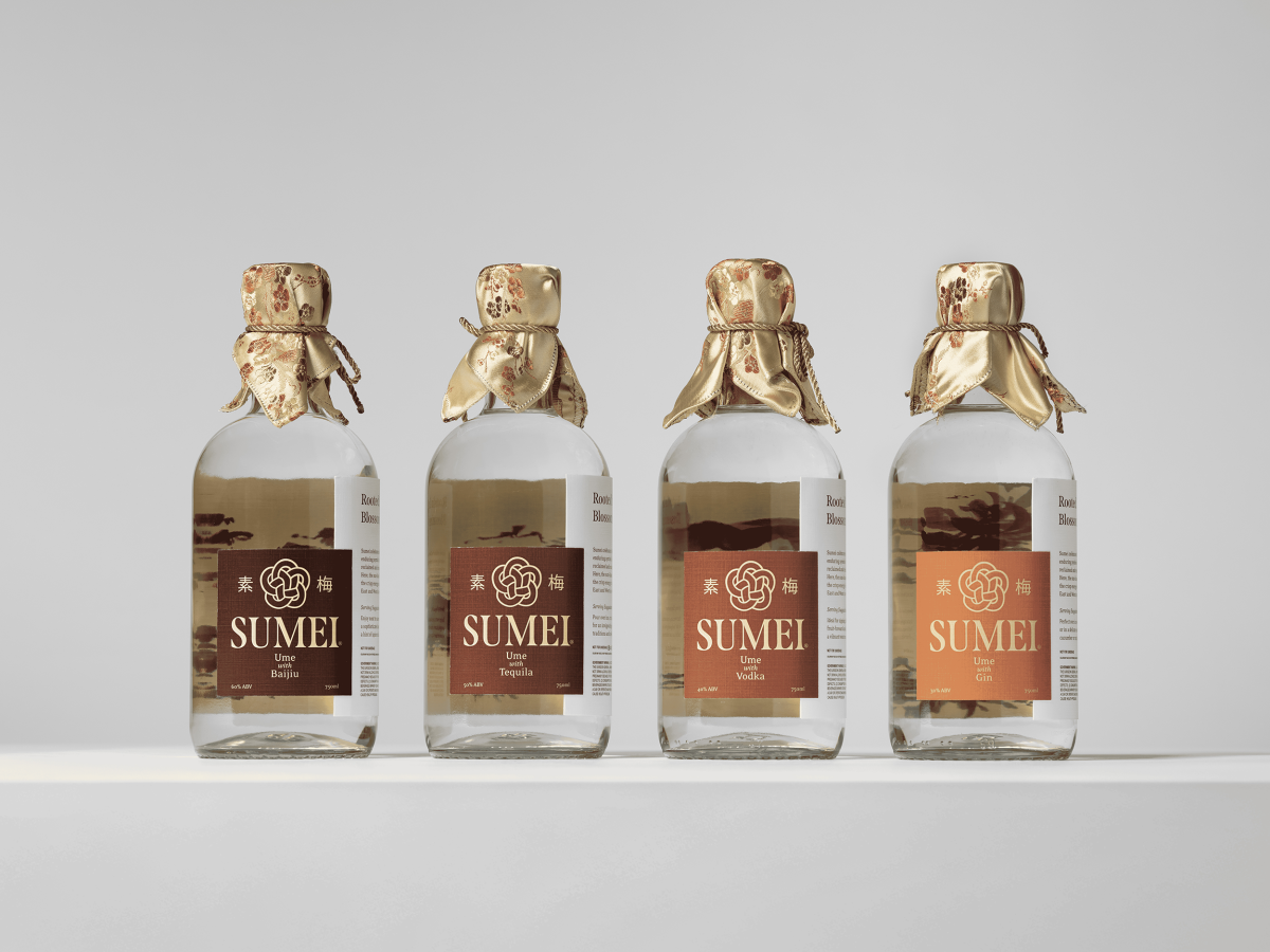
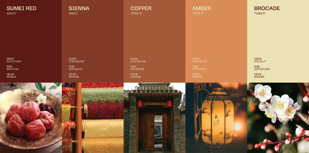
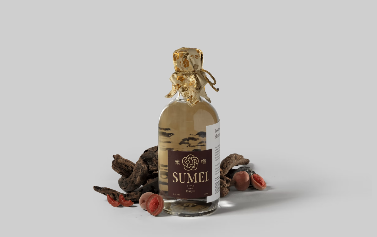
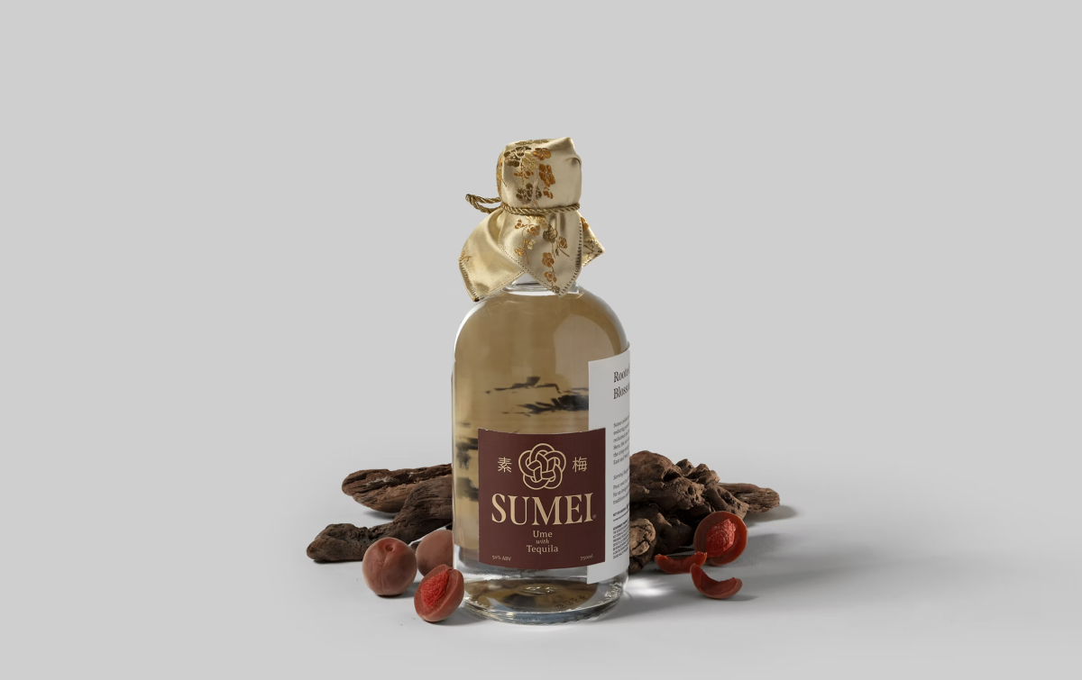
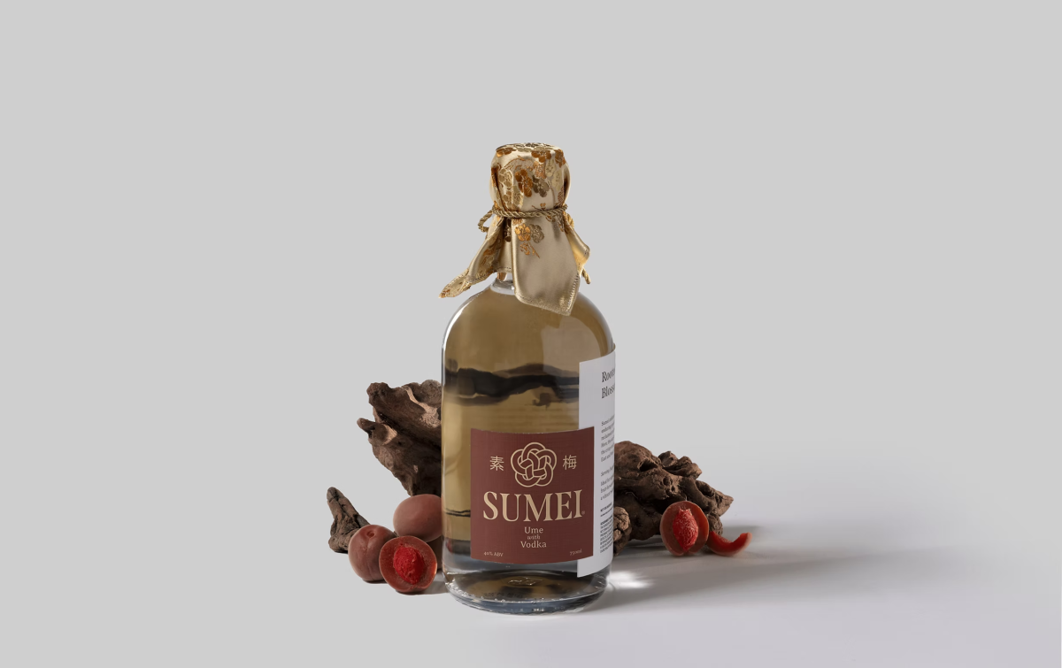
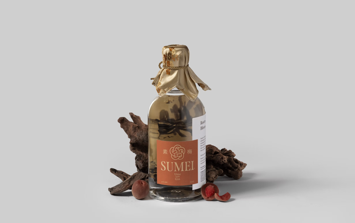
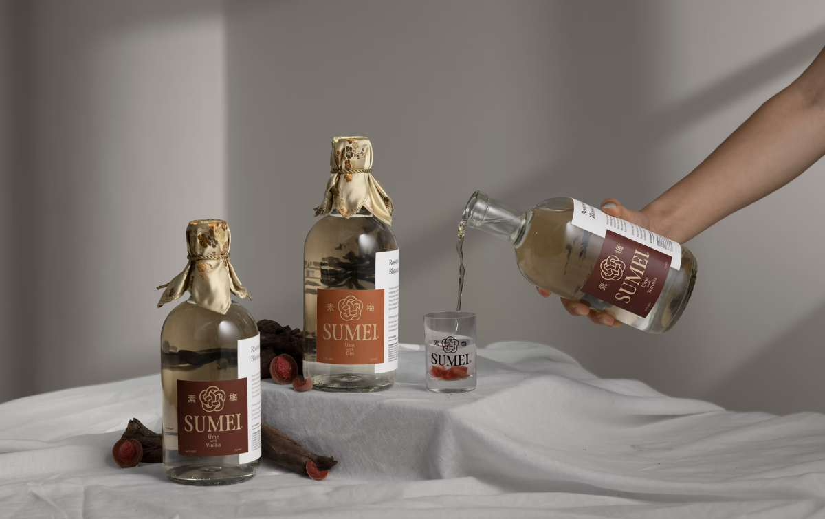
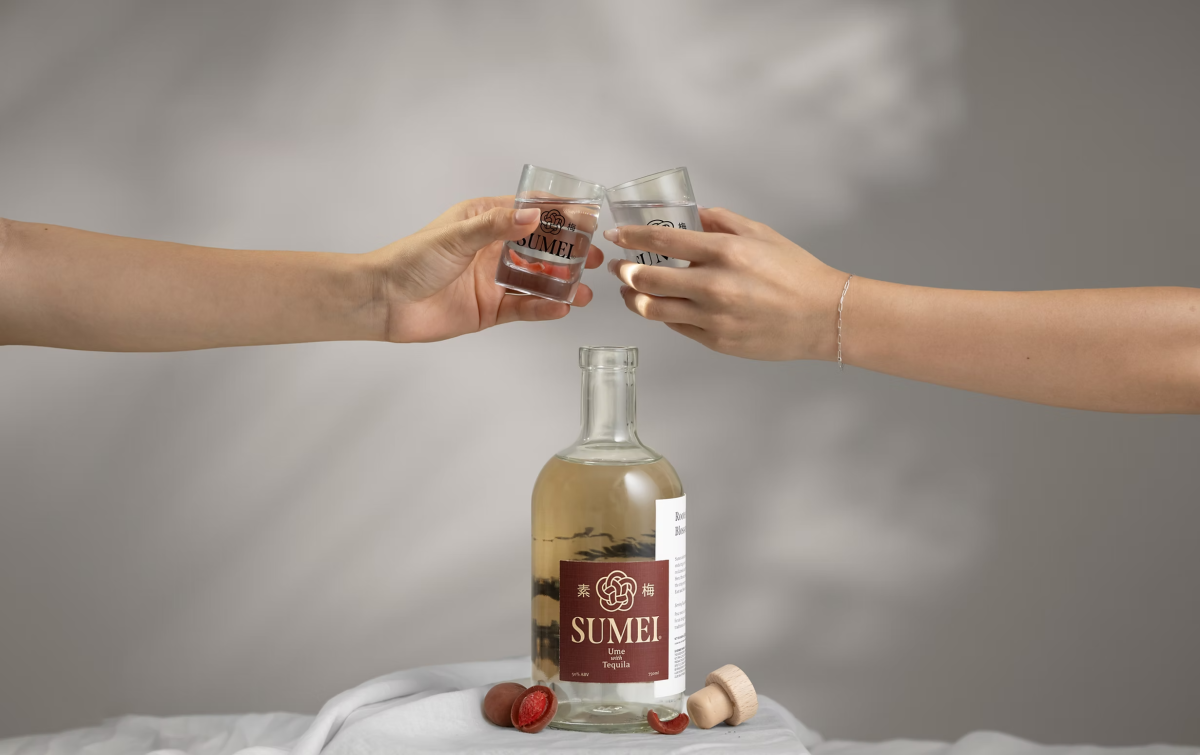
At the heart of Sumei lies a reverence for tradition paired with modern craft. The brand’s roots in Meizhou, Guangdong, echo throughout the visual identity, harnessing inspiration from the region’s storied silk brocade textiles—symbols of luxury, artistry, and intergenerational legacy. By placing the ume plum at the heart of this cocktail line, Sumei celebrates and reclaims the fruit’s deeply woven Chinese heritage, inviting discovery and appreciation beyond its familiar forms.
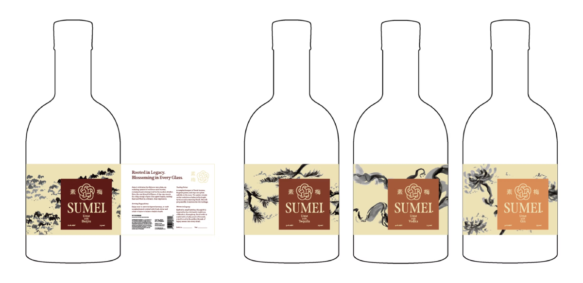
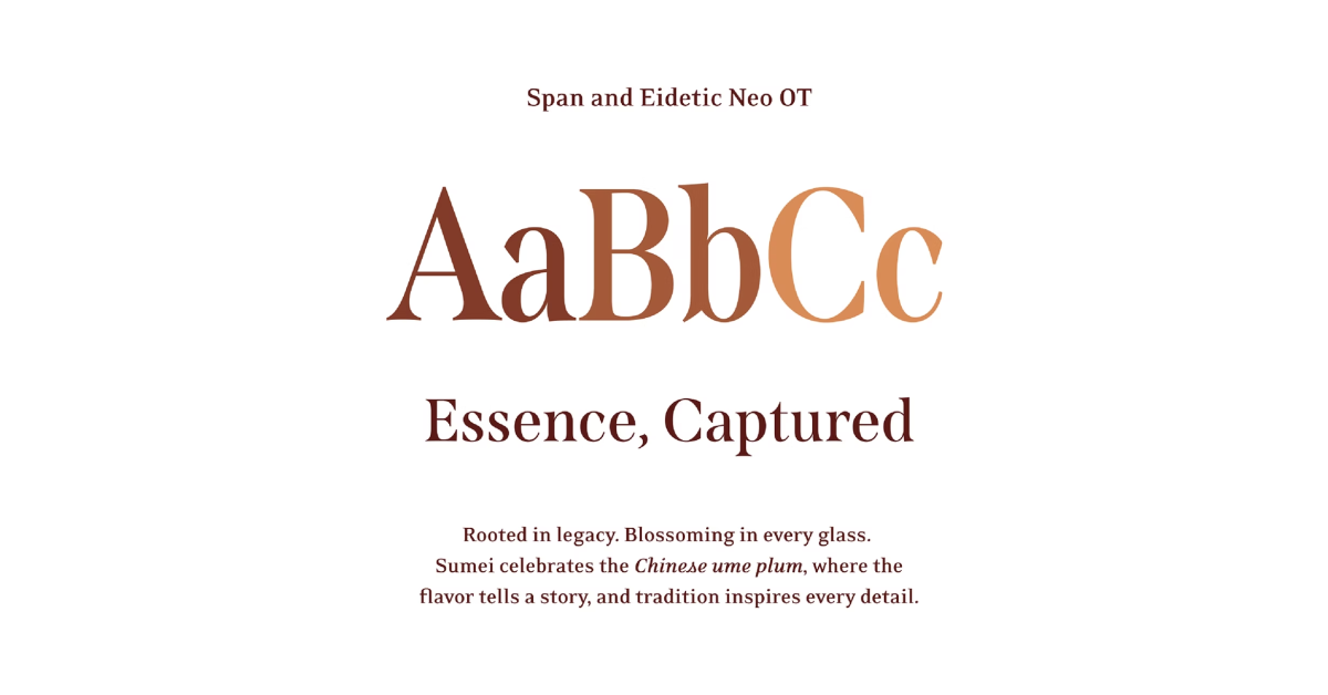
Sumei began with research into the ume plum’s cultural heritage, drawing inspiration from Meizhou’s silk brocade craft to create a brand rooted in artistry and tradition. The process focused on translating cultural motifs into modern forms through custom illustrations, textured linen paper, and sewn fabric seals that express refinement and heritage. Iterations across label layouts, typography, and materials developed a unified packaging system defined by tactile elegance and a nuanced color progression that reflects the spirit’s character and craftsmanship.
I learned how to translate cultural heritage into contemporary design in a way that feels both authentic and relevant. The process strengthened my understanding of how visual storytelling and material choices can elevate brand perception and emotional connection. I also developed skills in balancing tradition with modern aesthetics, creating a cohesive system that communicates cultural depth while appealing to a broader audience.

