BFA in Illustration - Motion Illustration — Illustration
Course:
Type 5: Motion
Faculty:
Ming Tai
Term:
2026 Spring
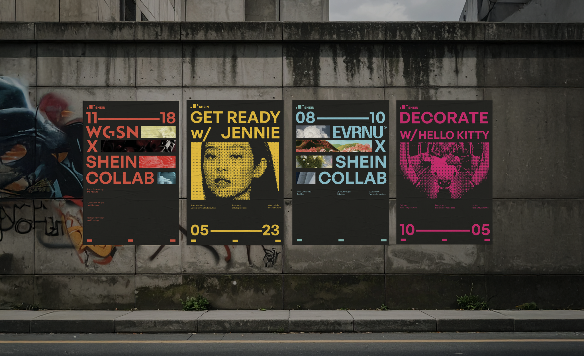
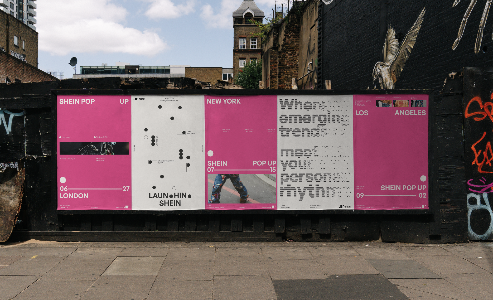
SHEIN
SHEIN’s speed built its success, but also created concerns around waste, overproduction, and trust. The challenge is to keep that speed while redefining it through a stronger, more intentional brand identity.
Approach:
My rebrand centers SHEIN’s label as both a visual and strategic symbol. The identity is built from a 3x3 grid, with each module based on the size of a SHEIN label, reflecting a system shaped around personal preference. Because the label represents “fashion tagged for you,” it becomes a flexible form that can adapt to different users and tastes. The circles surrounding it symbolize data, showing how user-specific insights shape each experience. Together, the system repositions SHEIN’s data use from mass trend forecasting to personalized trend prediction.