Image
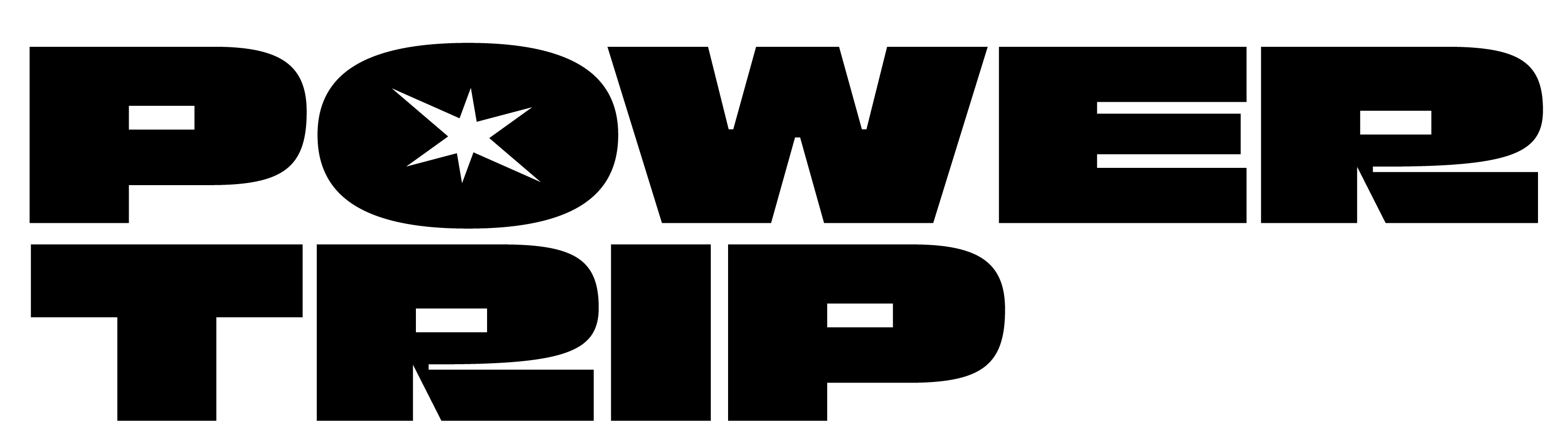
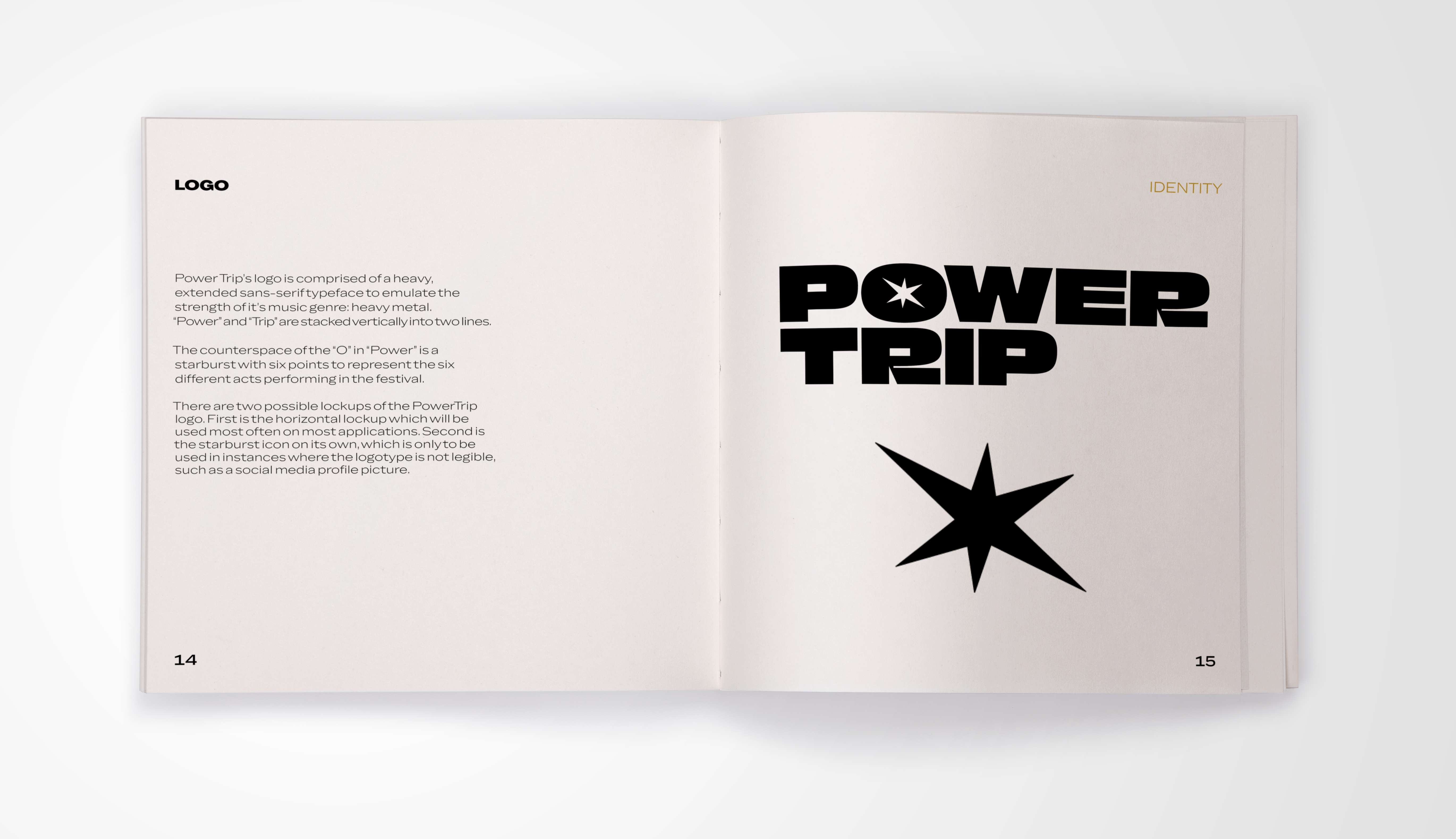
When designing the logo, I listened to AC/DC to get inspired. I wanted the logo to feel as grounded as their music, and I replaced the counter space of the “O” in “Power” with a six pointed burst. The six points represent the six different acts performing at the festival, and I chose a starburst shape to emulate the loud, in your face feeling heavy metal offers.
Image
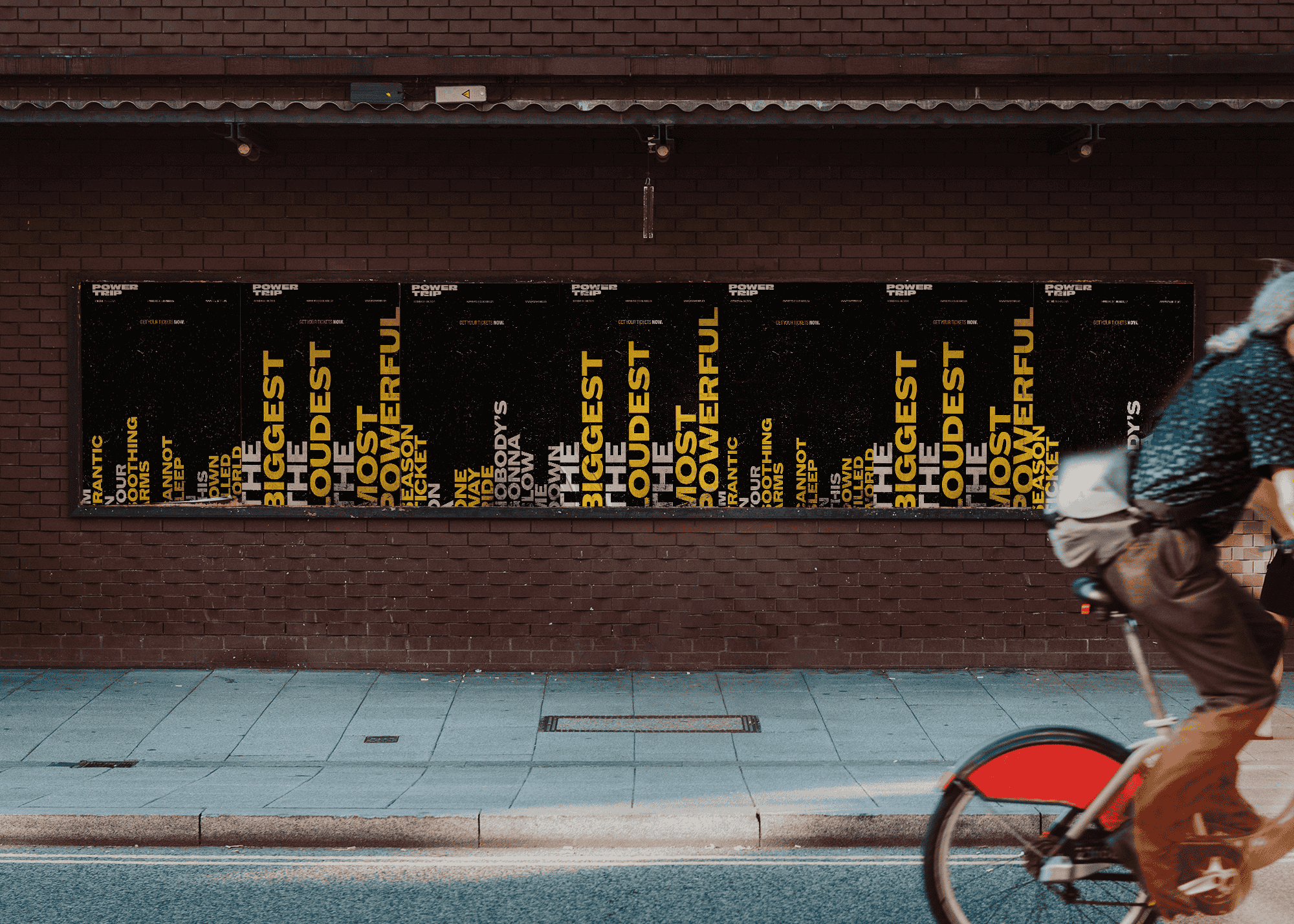
For the posters, I wanted to visualize the text as sound. When they’re shown all together like this, it emulates the look of sound waves while also teasing a hint to passerby as to what the event may be. I wanted the experience of viewing the posters to be fun, so I included lyrics from some of the bands performing at the festival within the posters.
Image
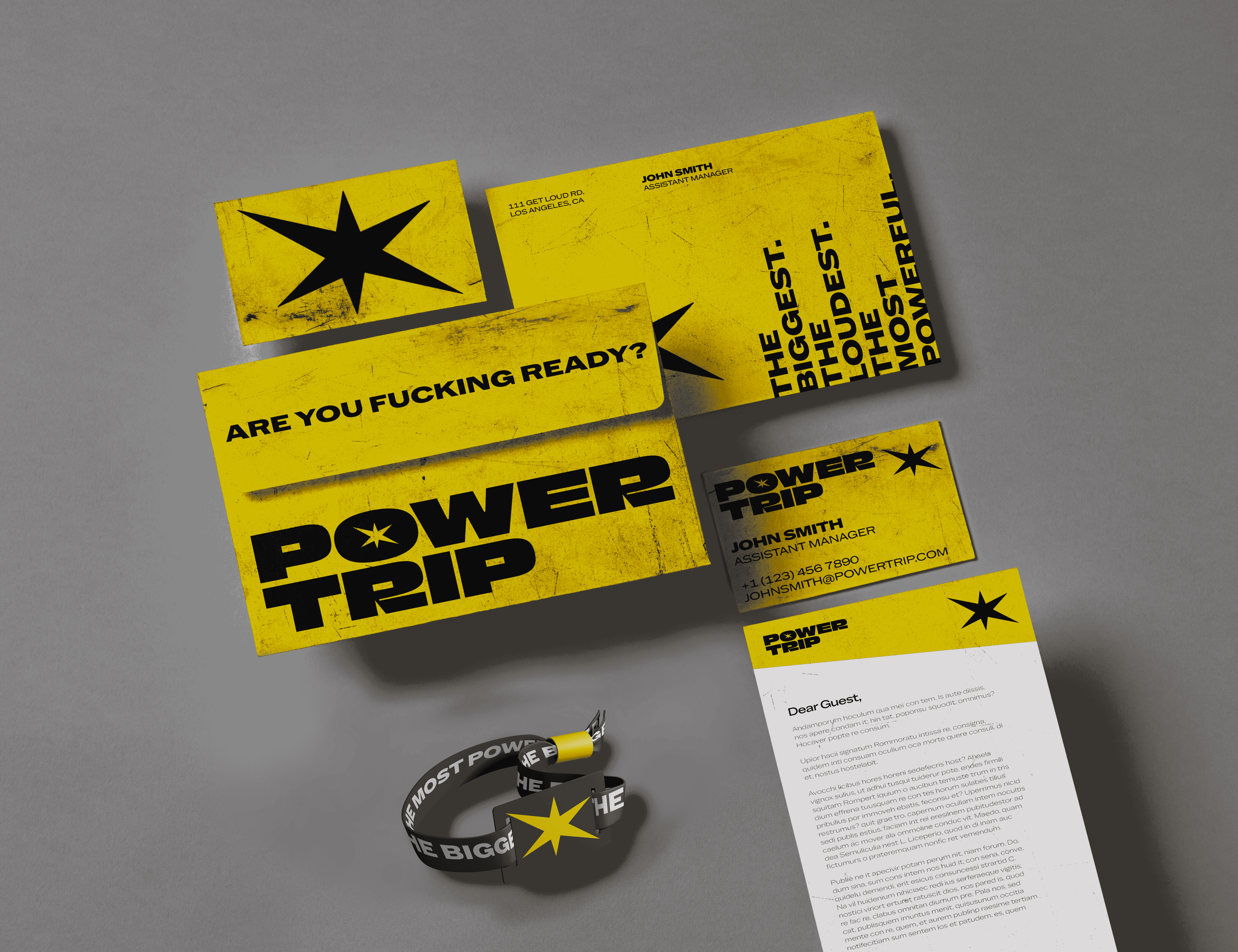
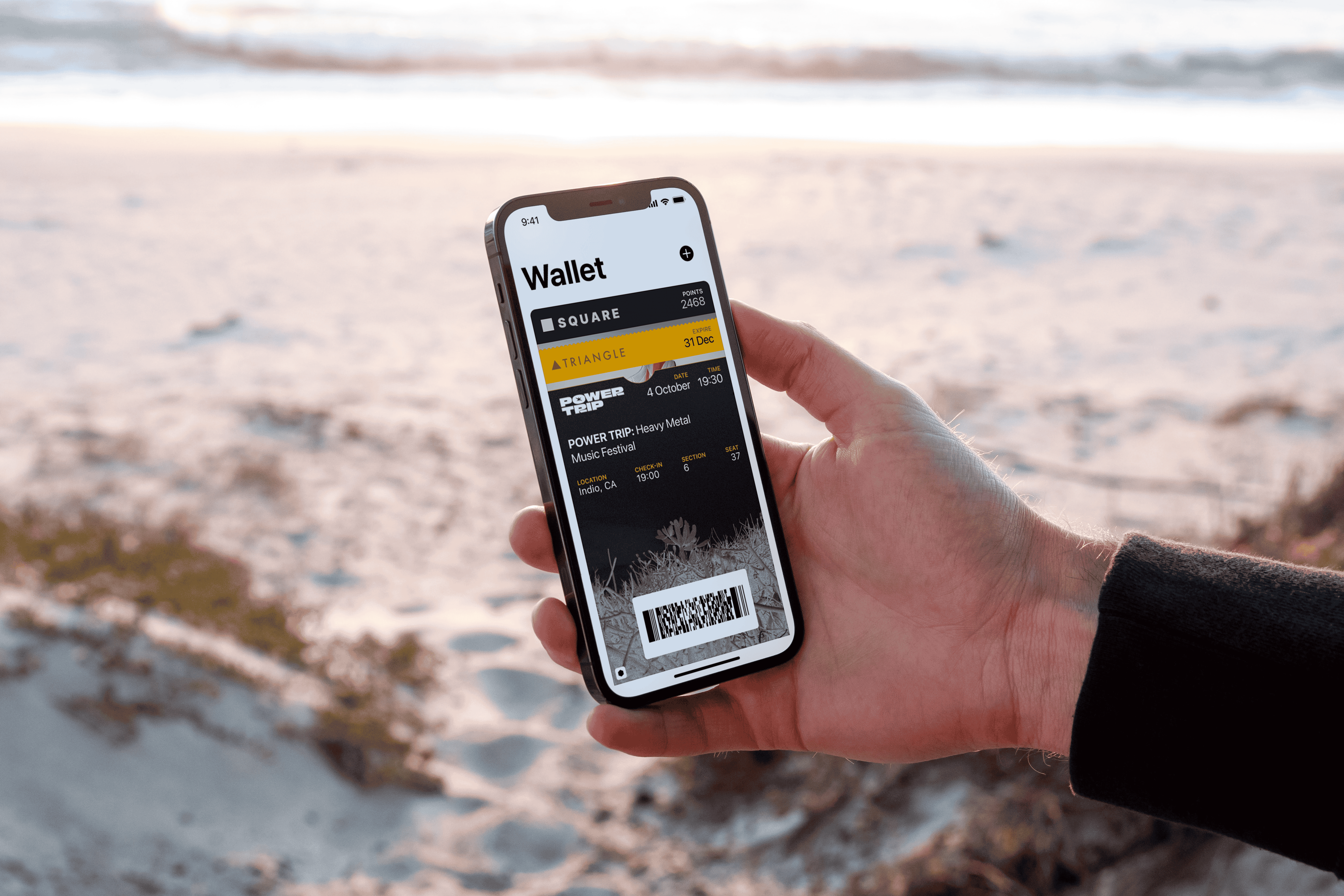
The welcome package was created to make the festival experience as smooth and personal as possible. The package comes with a welcome letter, a setlist with times so visitors can plan their trip, as well as a wristband which will act as their ticket into the festival.
Image
Image
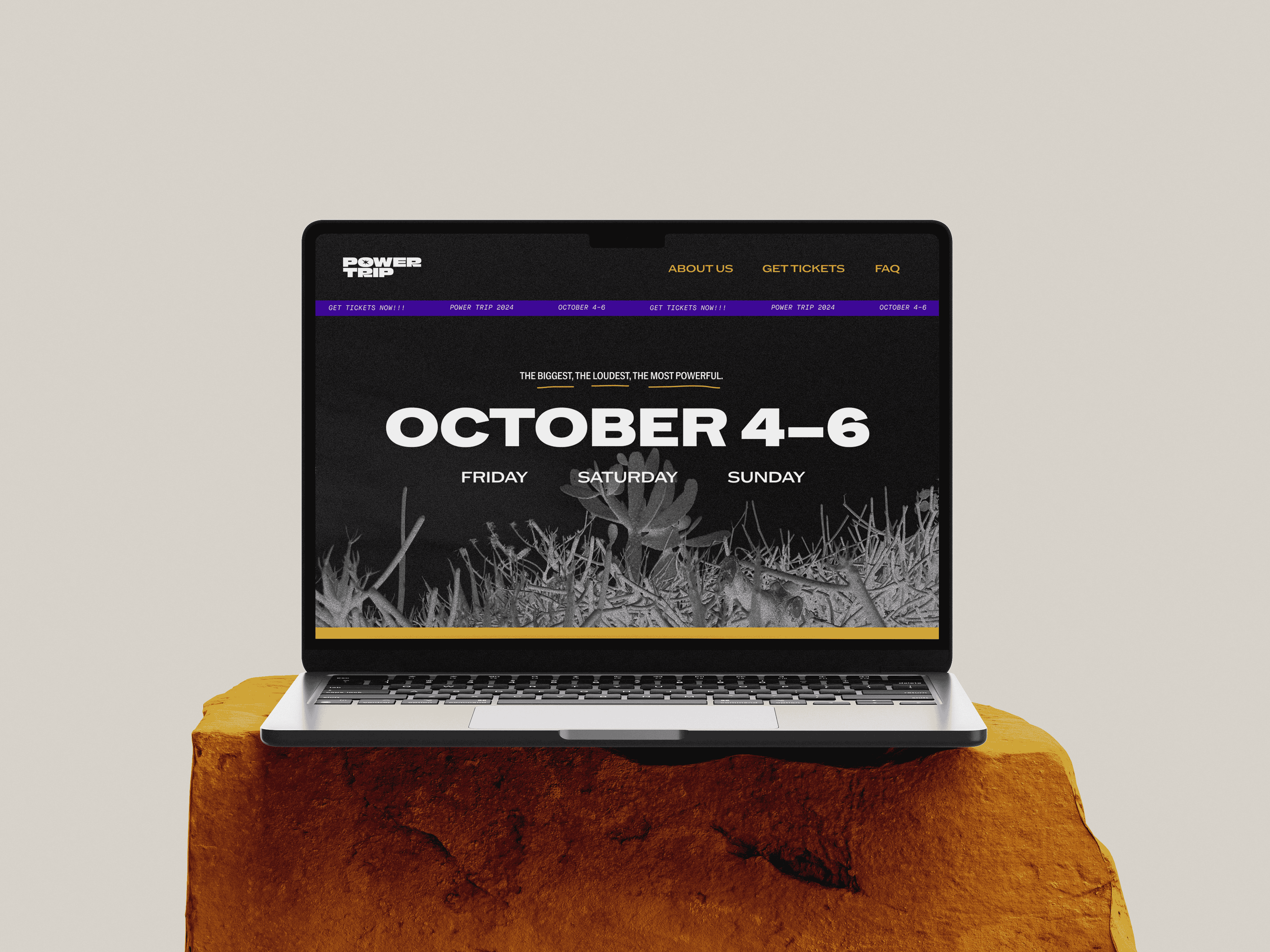
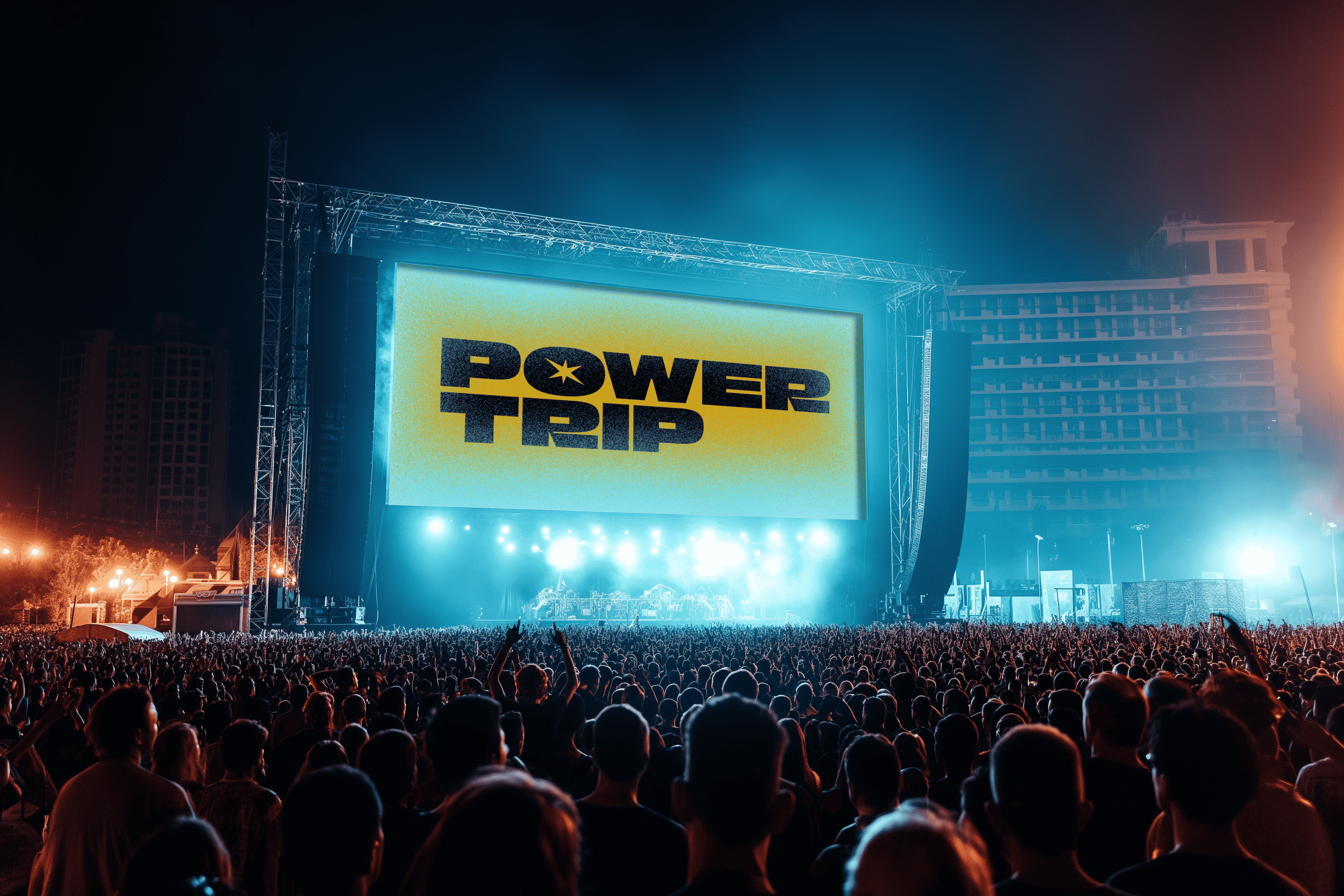
The website offers a miniature experience that visitors can expect from the festival. While the welcome package offers plenty of valuable information, I wanted the information to be as accessible as possible, so a website was born to both advertise the festival and be a quick and easy way to bring up information.
Image
Image
Image
Image

Image
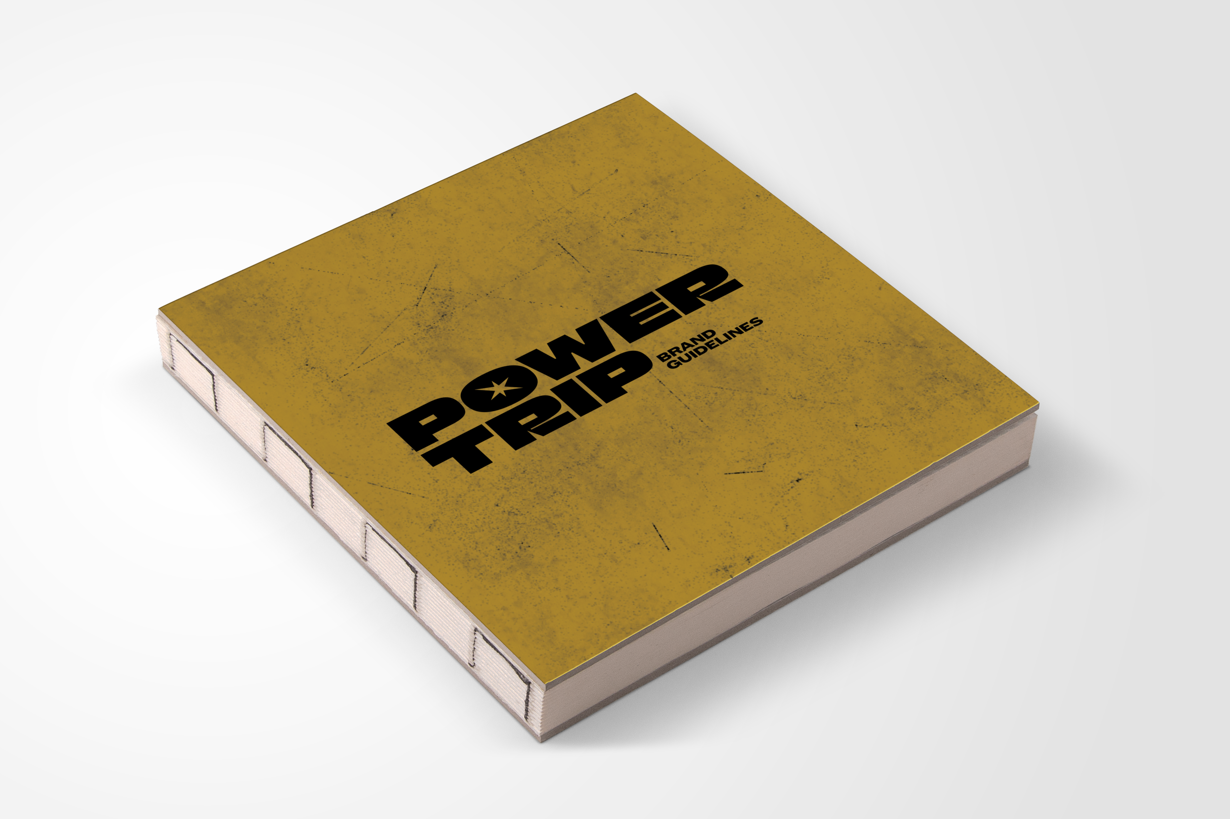
Because the event is so large, I created a brand guidelines book to help make the process of designing the festival smoother. The book would be given to set designers, social media planners, marketing, and so forth in order to make the event cohesive and seamless.