Image
Image
Image
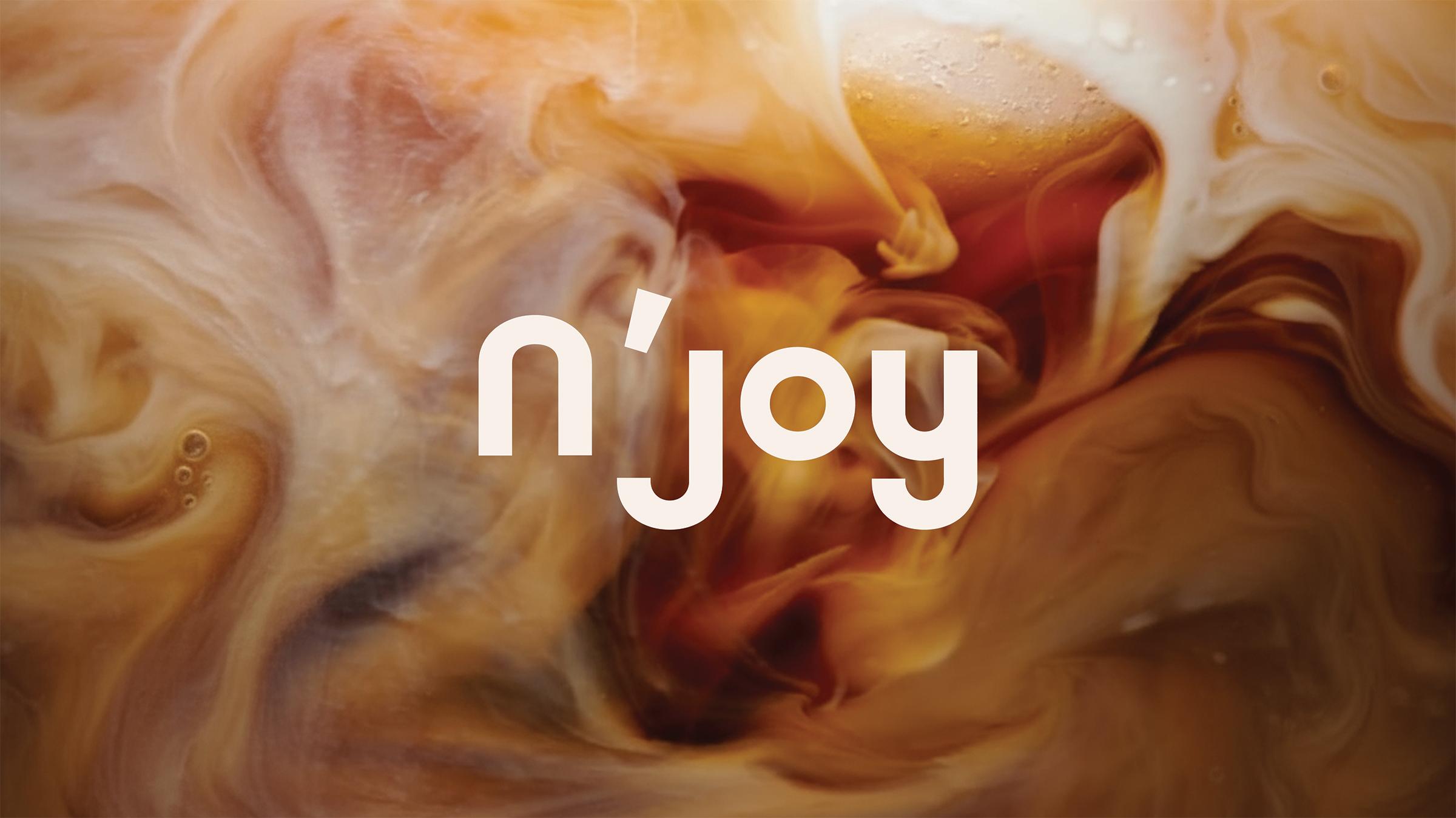
Given its popularity in corporate spaces, I leaned into a conceptual narrative that emphasizes N’Joy’s unique positioning. N’Joy emphasizes the profound impact of a sweet, revitalizing pause amidst the hustle of the workday. Rooted in values of collaboration and professionalism, the brand effortlessly integrates into daily routines, fostering personal rejuvenation while deepening workplace connections. N’Joy is dedicated to inspiring a collective journey toward enhanced well-being and transforming mundane moments into sweet opportunities.
Image
Image
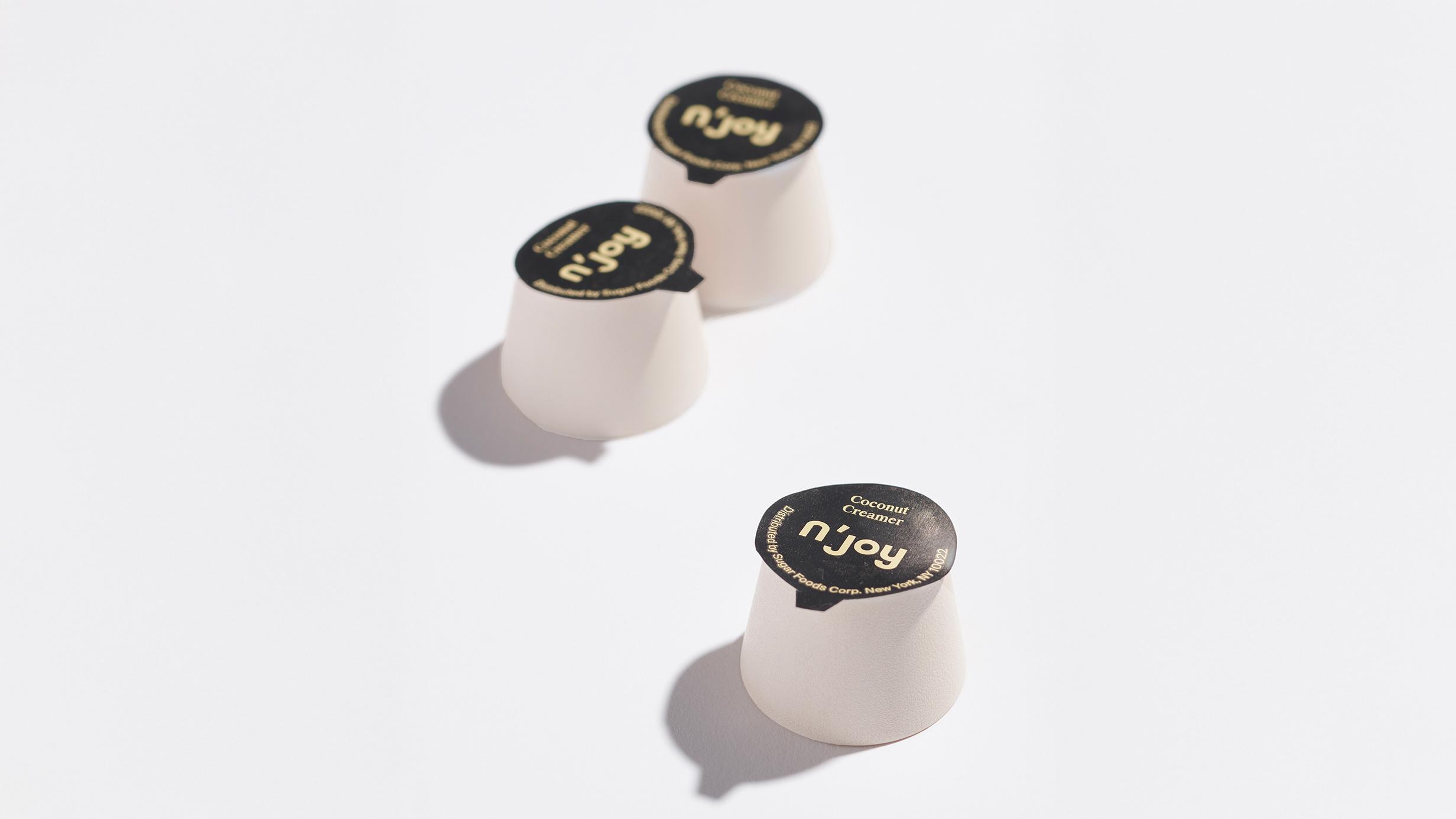
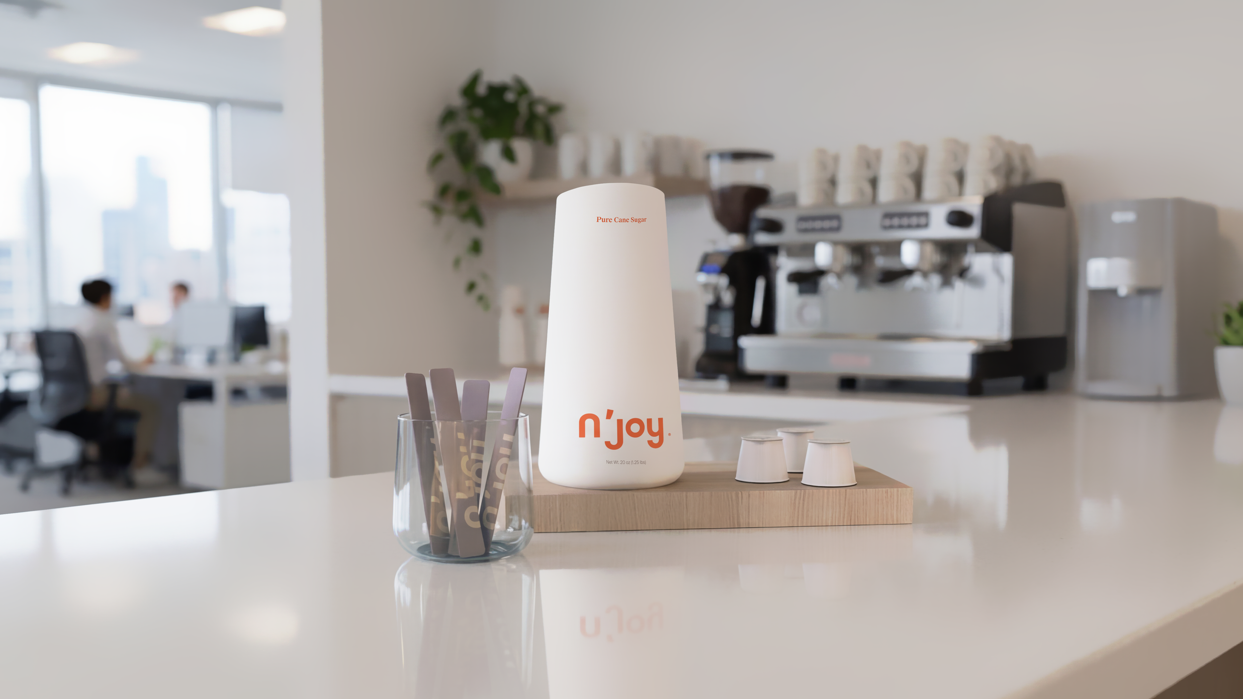
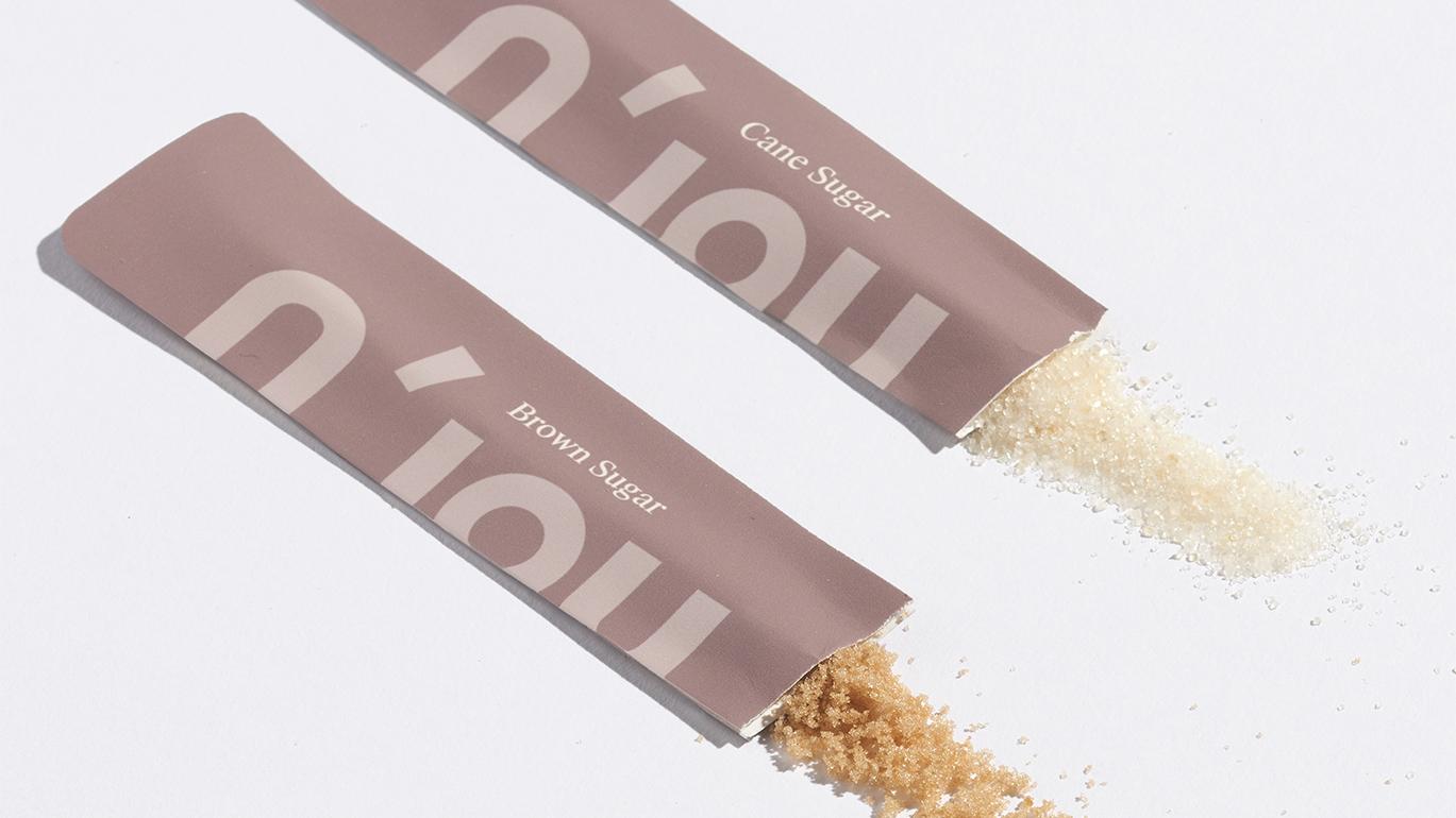
Through market research of the sugar landscape, I found the brand to be functional and efficient, currently prioritizing its cane sugar and powdered coffee creamer. It primarily serves larger-scale audiences, where other sugar brands have the advantage of recognizability. With this in mind, I saw an opportunity for N’Joy to open up to adjacent markets, including hospitality and conference spaces. Considering the experience of the consumer, I also saw an opportunity for N’Joy to adapt to the new generation of corporate employees with both their product offerings and approach to branding.
Image
Image
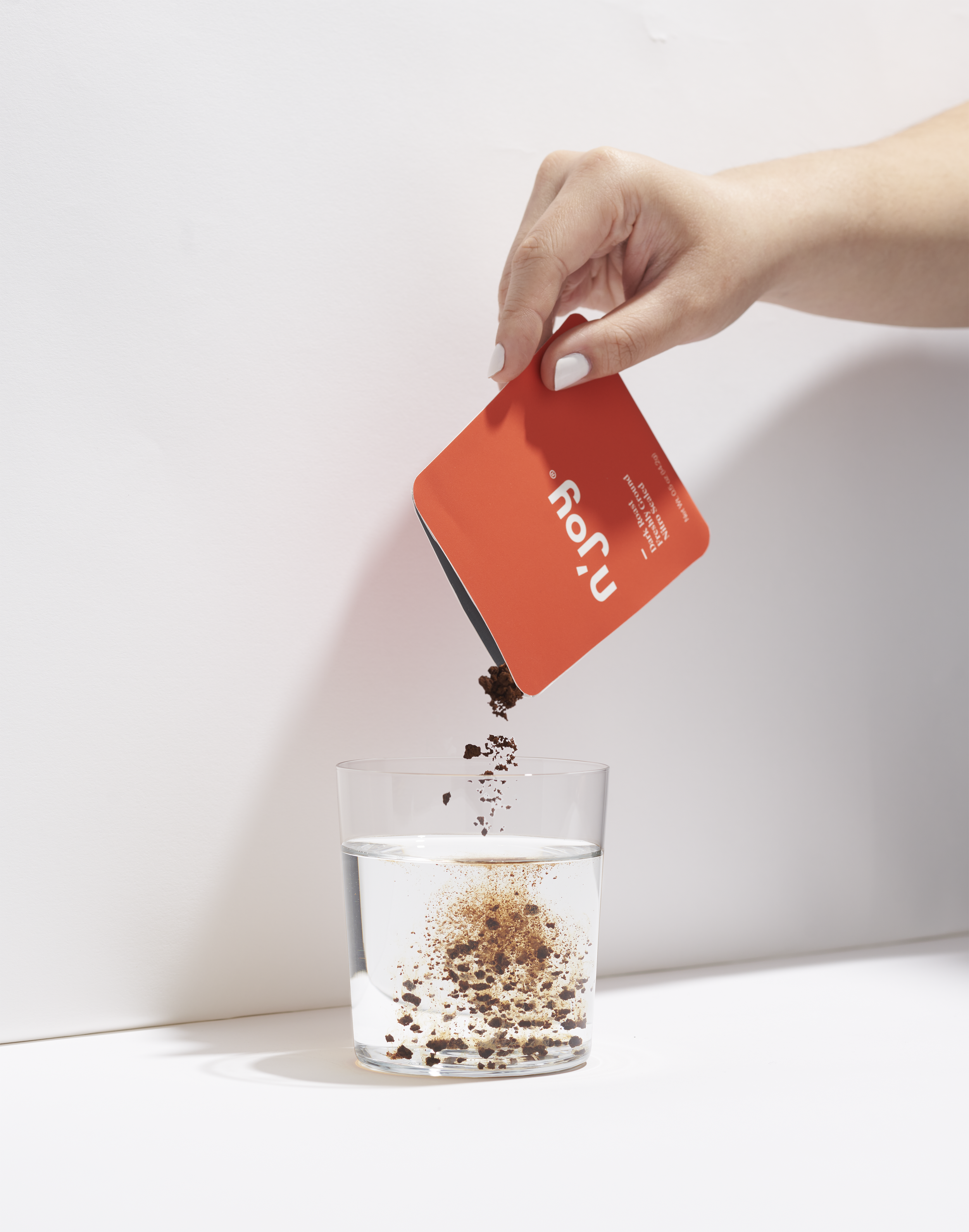
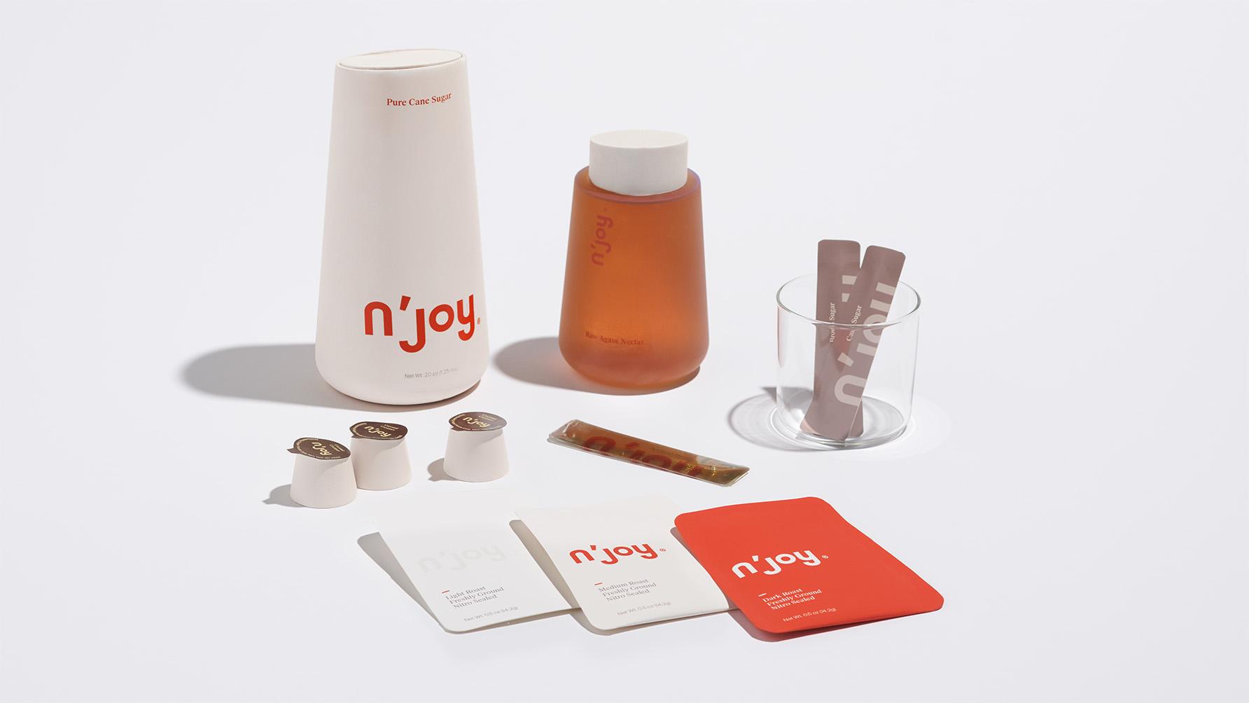
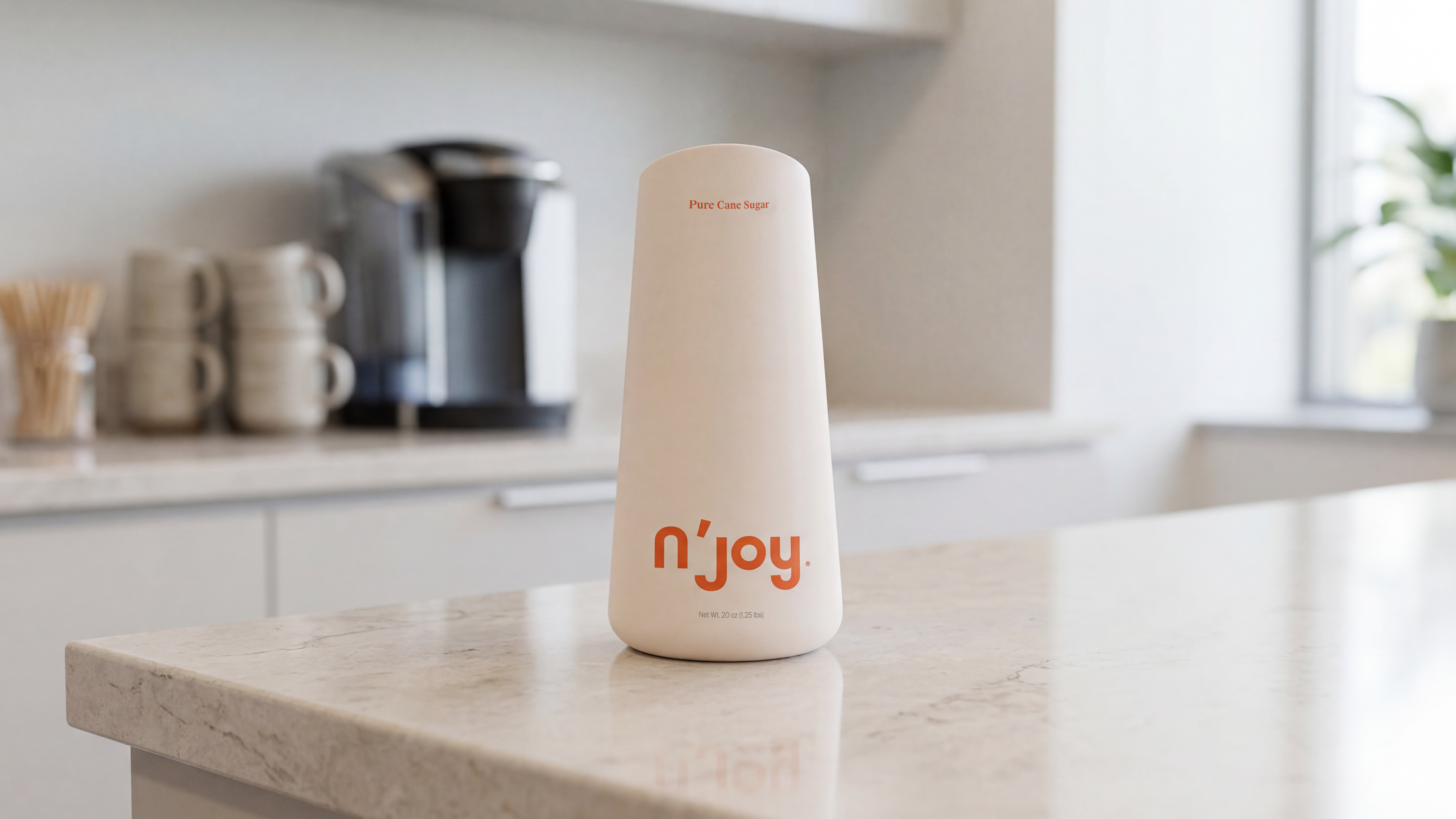
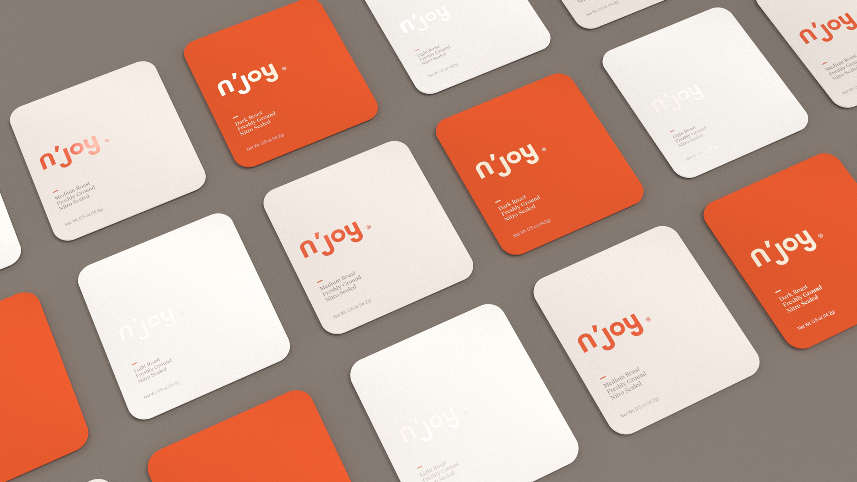
Understanding the manufacturing process for corporate-level packaging meant deciding what was going to stand out amongst other brands while prioritizing efficiency and sustainability. With a minimal approach to typography and emphasis on form over graphics, I created a system that signals consumers to take a moment to pause. The conical forms of the canisters utilize the significance of stability as a symbol. I designed refillable aluminum canisters to give N’Joy the chance to play their part in sustainable practices. The new identity adapts the hero color of red to maintain a piece of the original branding while having a shelf/counter impact.
Image