Image

Logo and Logotype: square portrays stability, deep red represents strength, and the arrows indicate direct, and the arrows going in a circle illustrate money flow. The typeface is Gill Sans Regular. The wideness of the typeface shows stability and the color shows seriousness.
Image
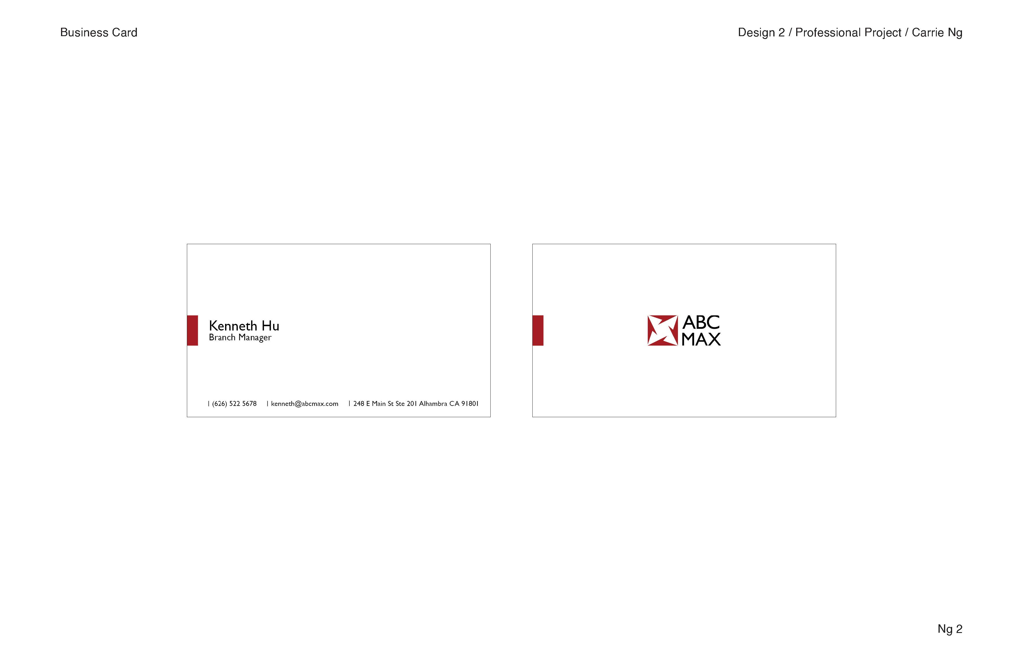
Business card: minimal design portrays professionalism and trustworthiness. The red detail on the left adds cohesiveness to the stationery set and it is inspired by business card clips.
Image
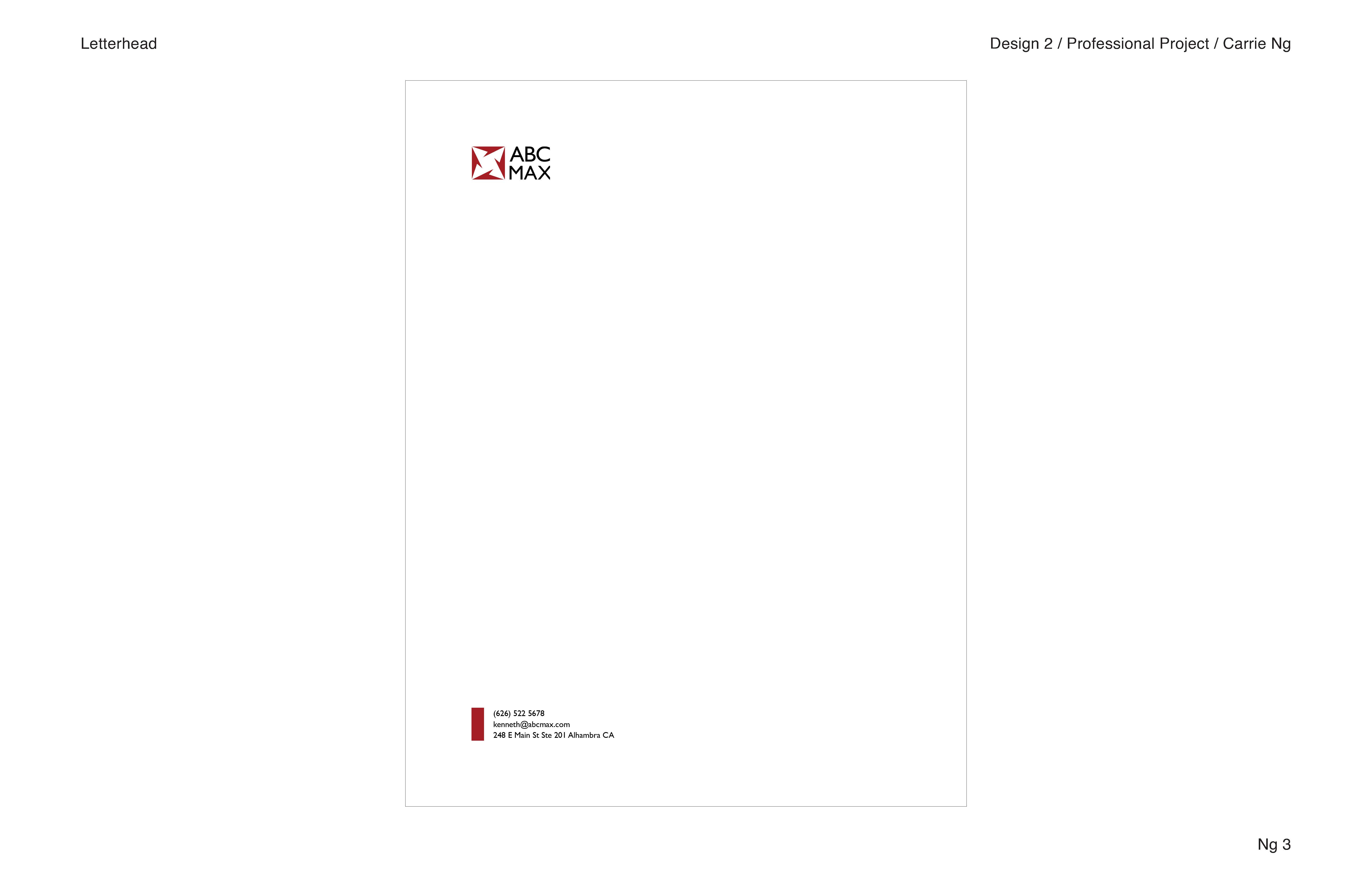
Letterhead
Image
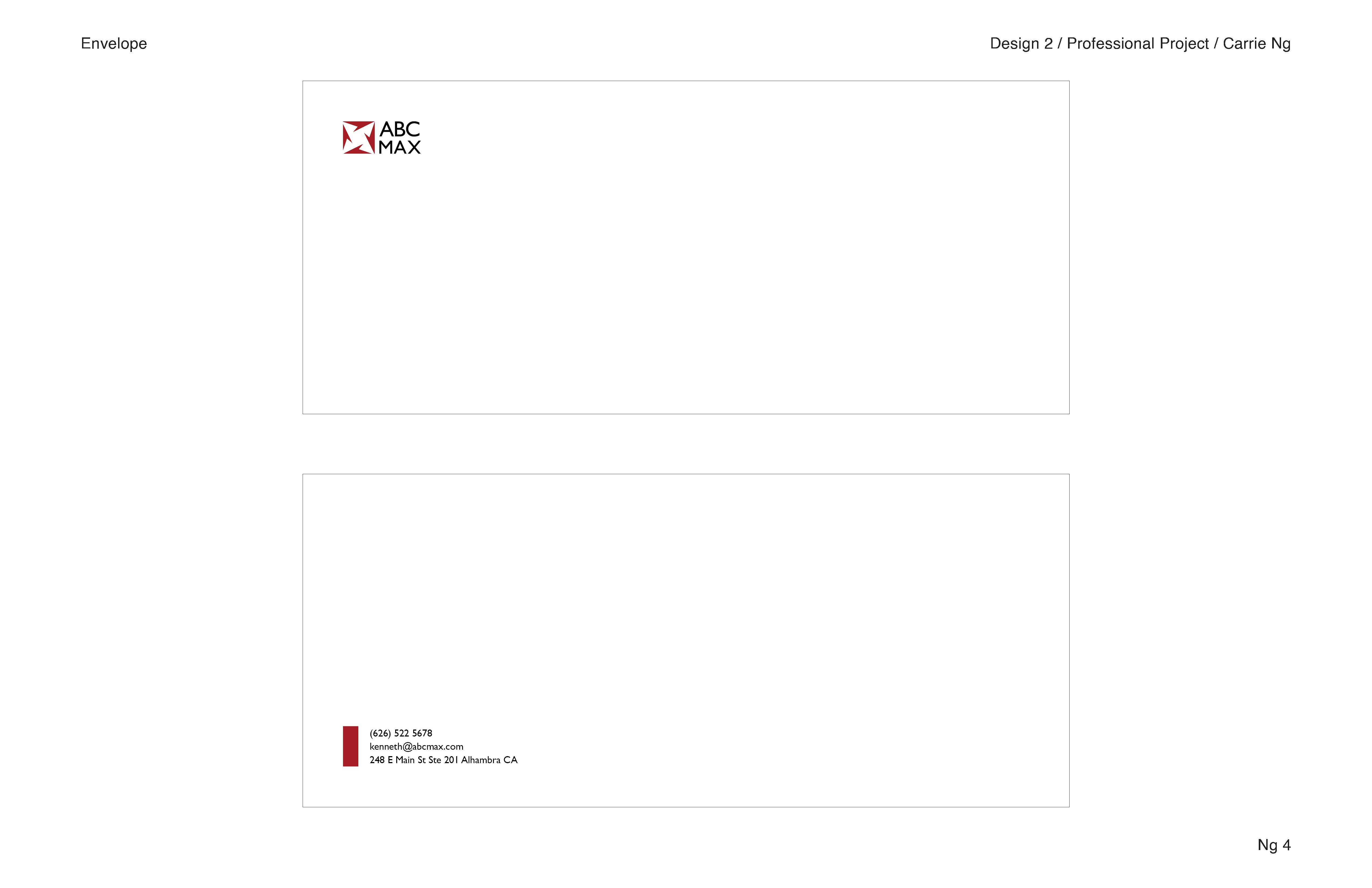
Envelopes
Image
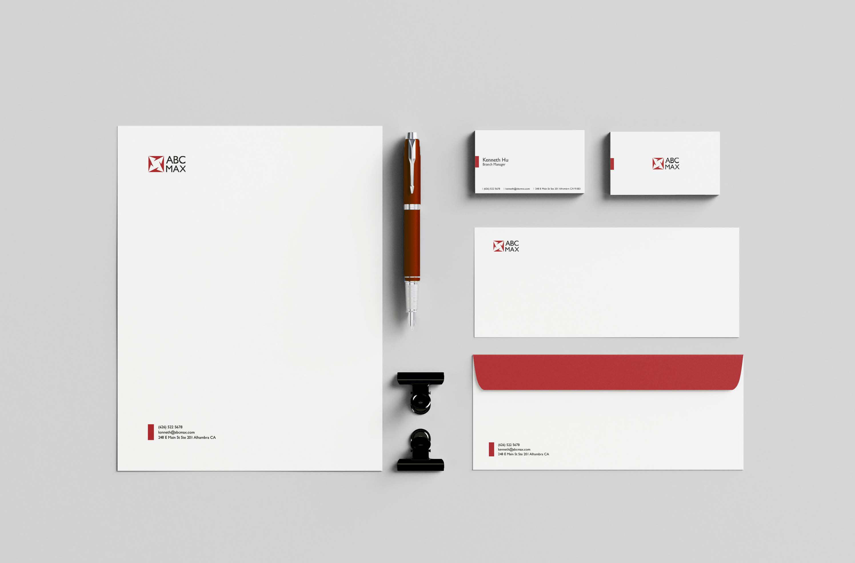
Stationery Set
Image
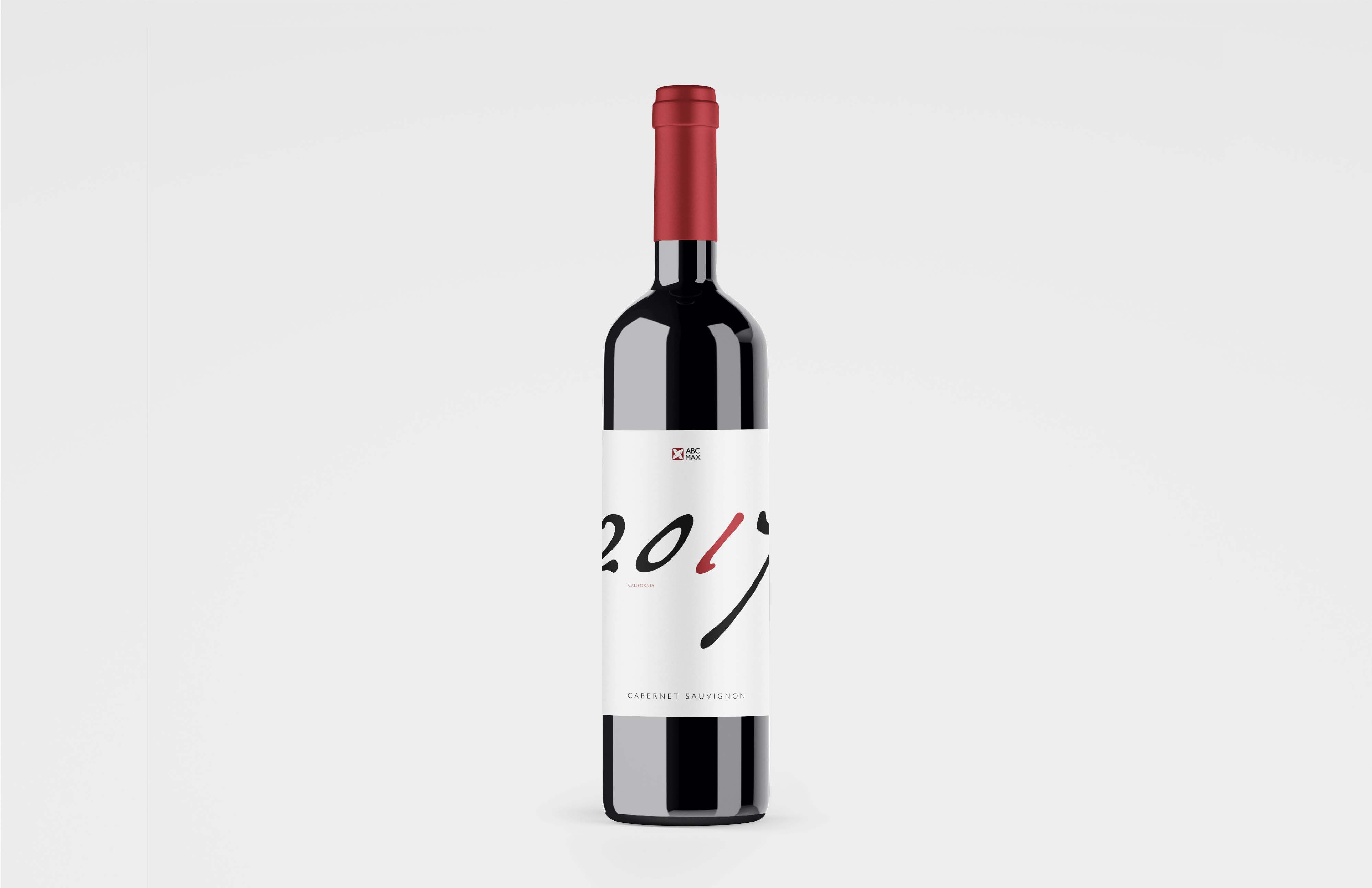
Wine: this bank has its own wine for giving out to customers.
Image
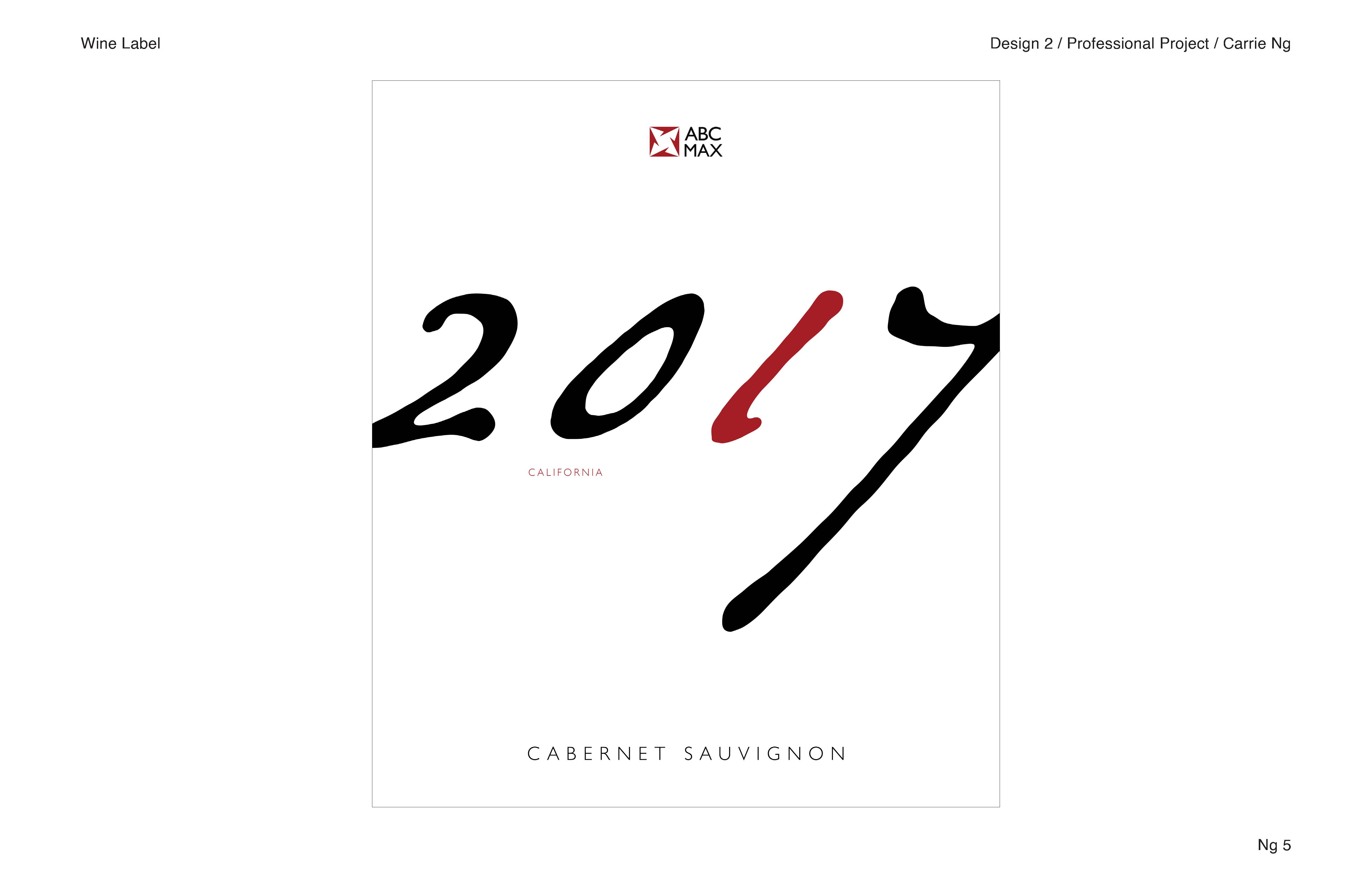
Wine label