Image
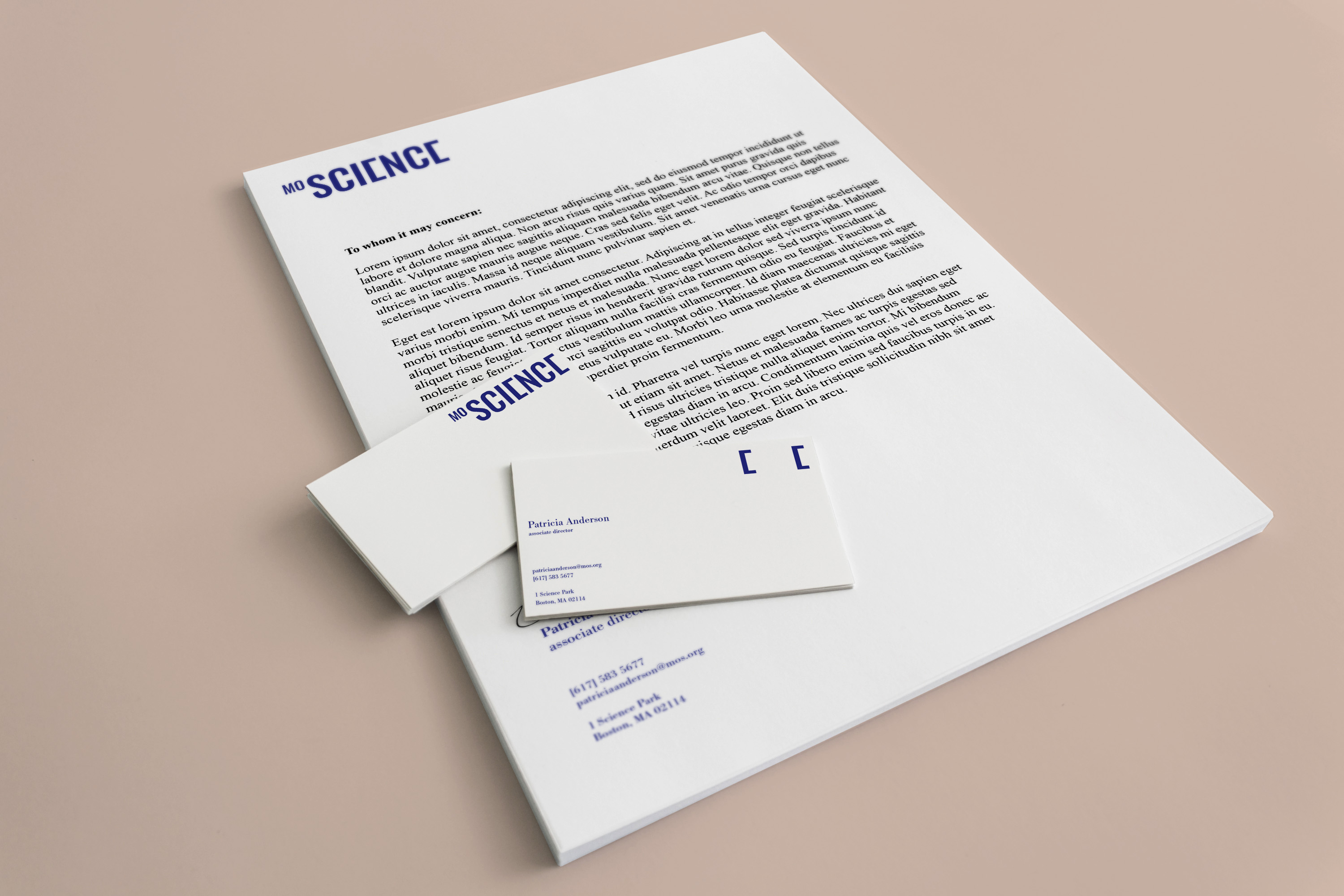
I created this logo by modifying the letter “E” in science. It is inspired by the mathematical brackets in equations that are often used to organize and analyze data in tables and graphs.
Image
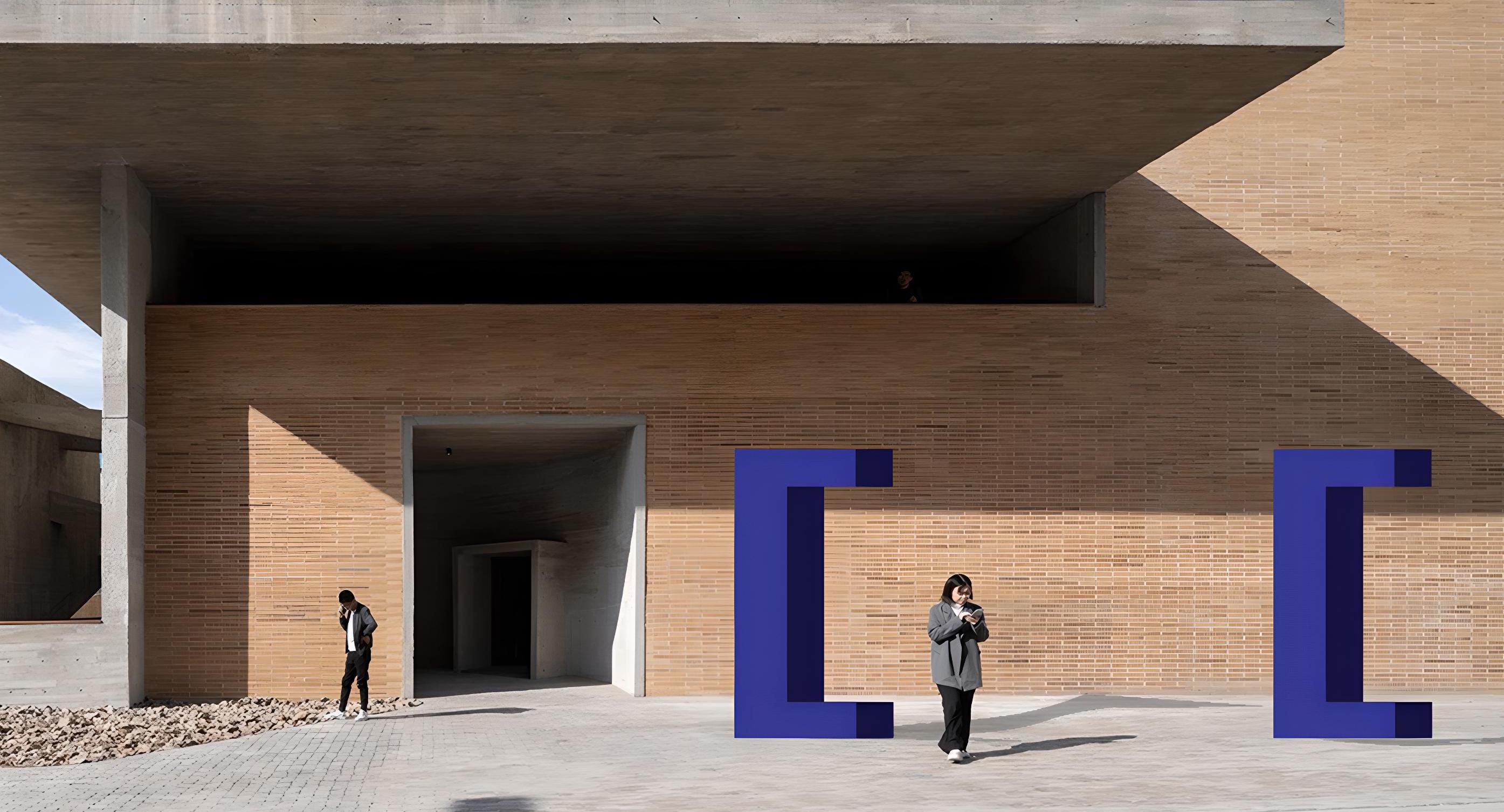
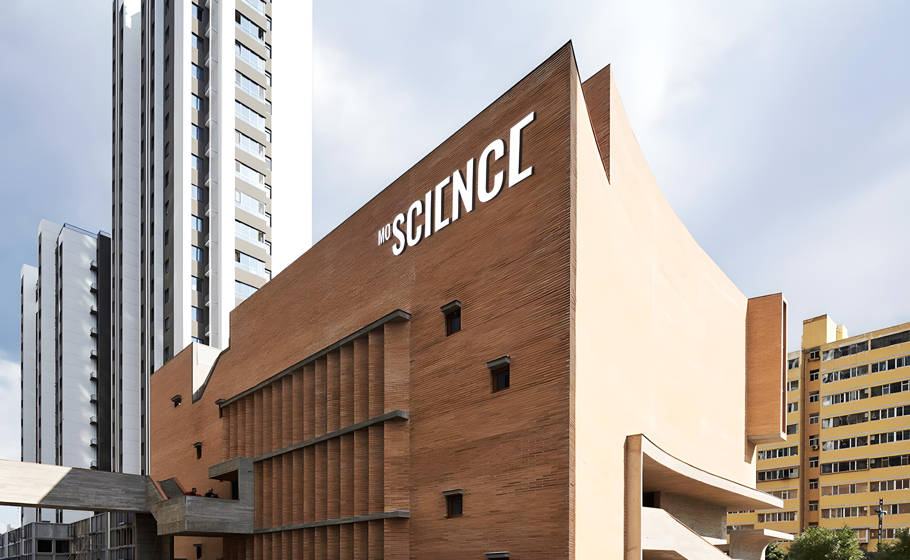
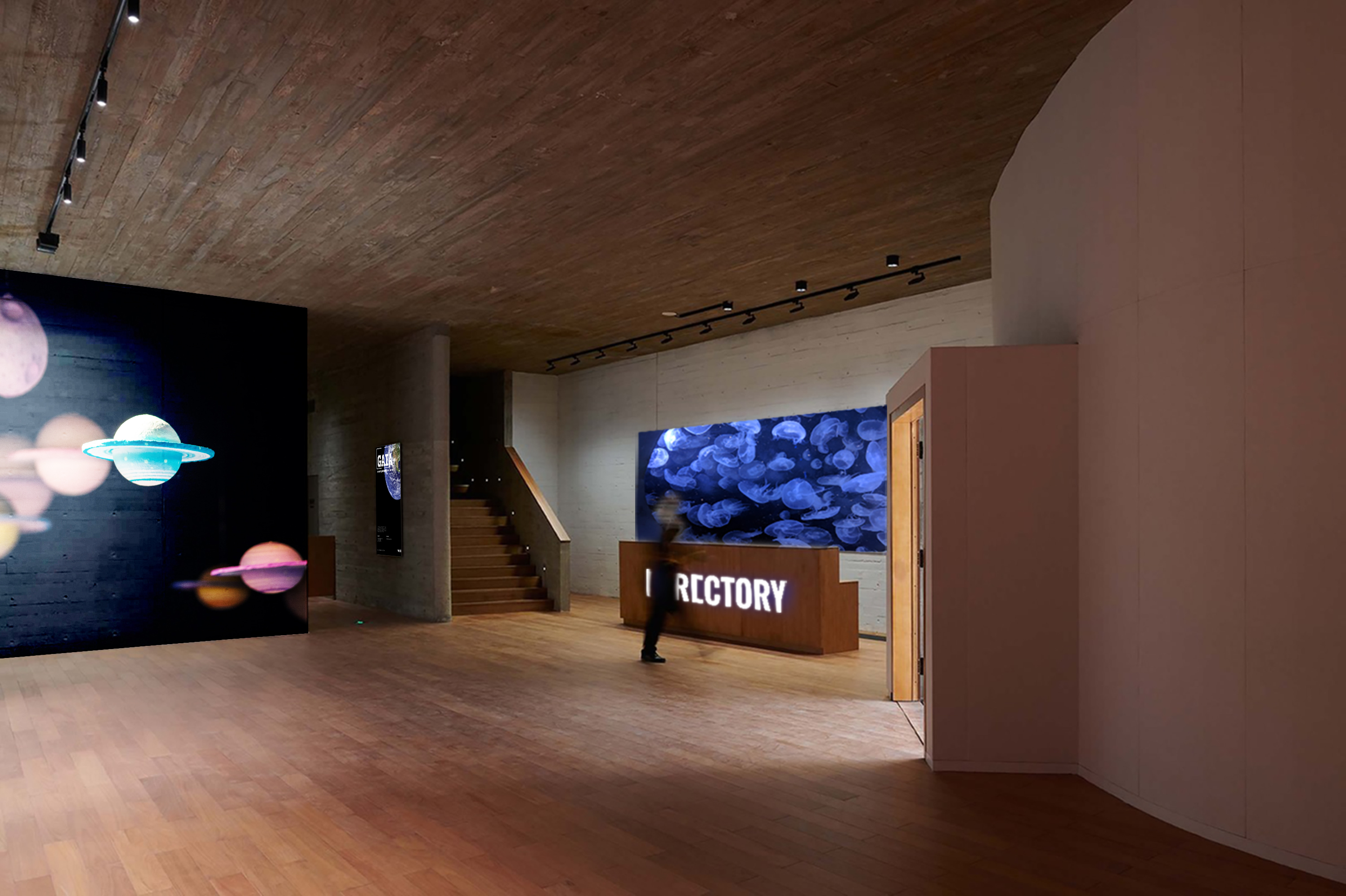
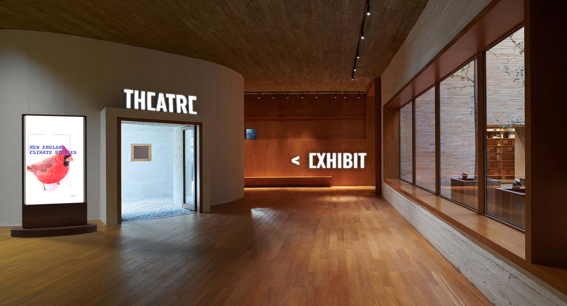
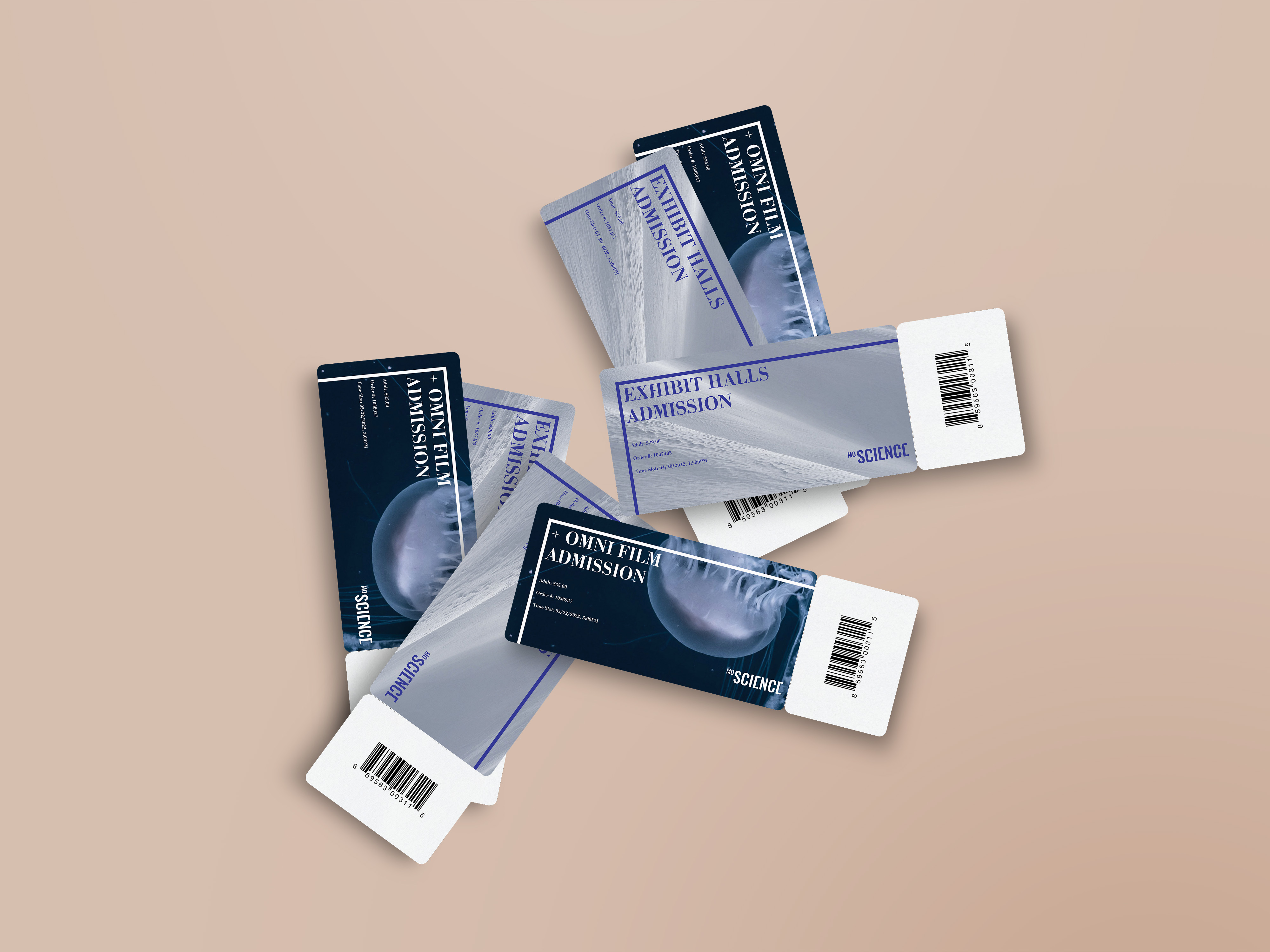
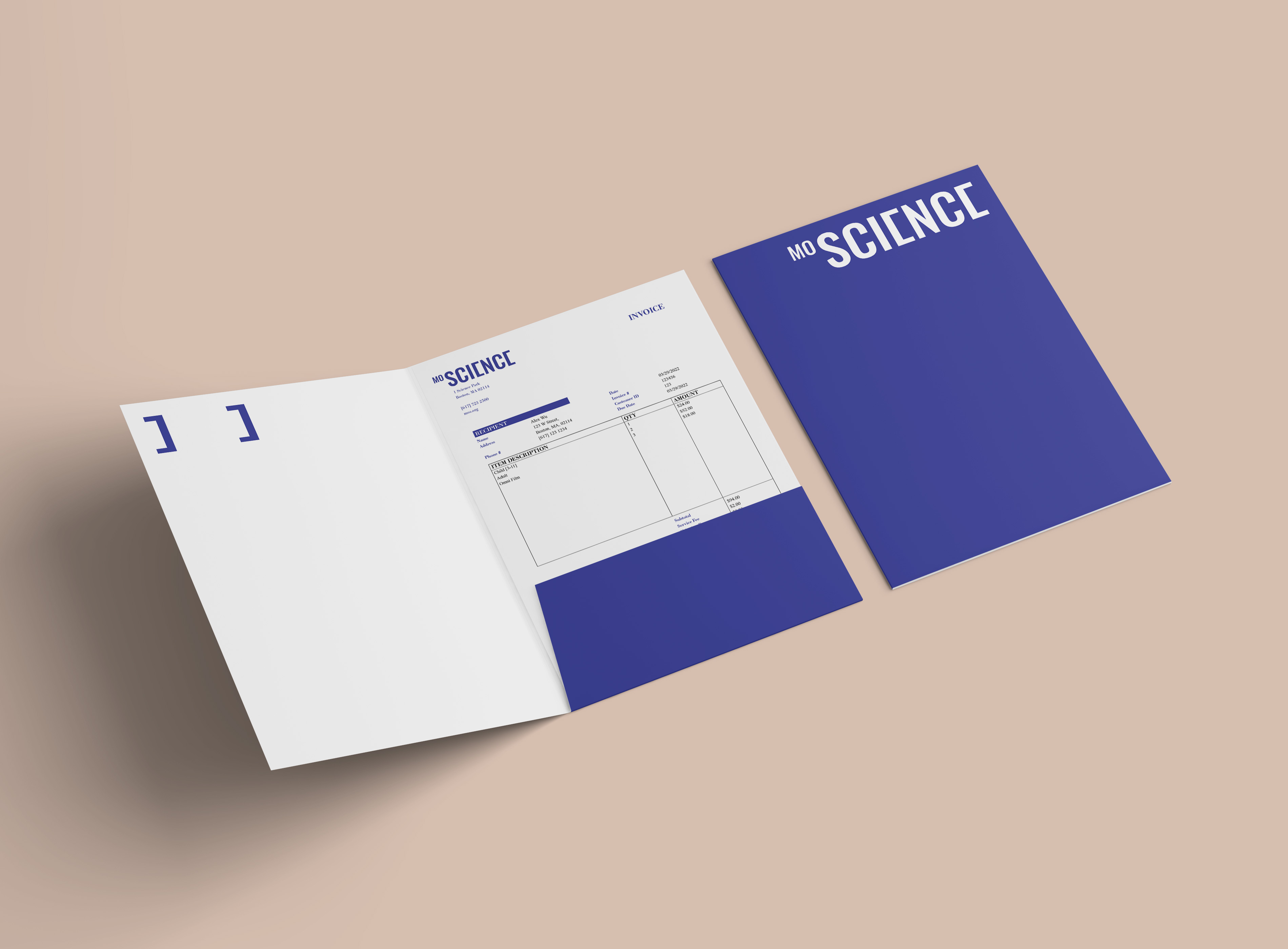
The new identity system is intended to serve MOS for the long term. I designed the logo to be flexible enough for different applications such as physical installations and wayfinding system.
Image
Image
Image
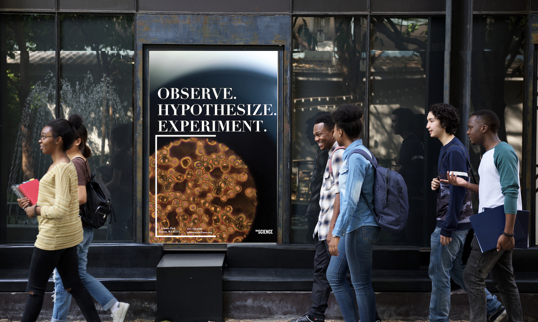
This poster demonstrates how elements derived from the bracket can be used in promotions for the museum. The brackets are also made thinner compare to the logo to differentiate them between a logo vs a graphic element.
Image
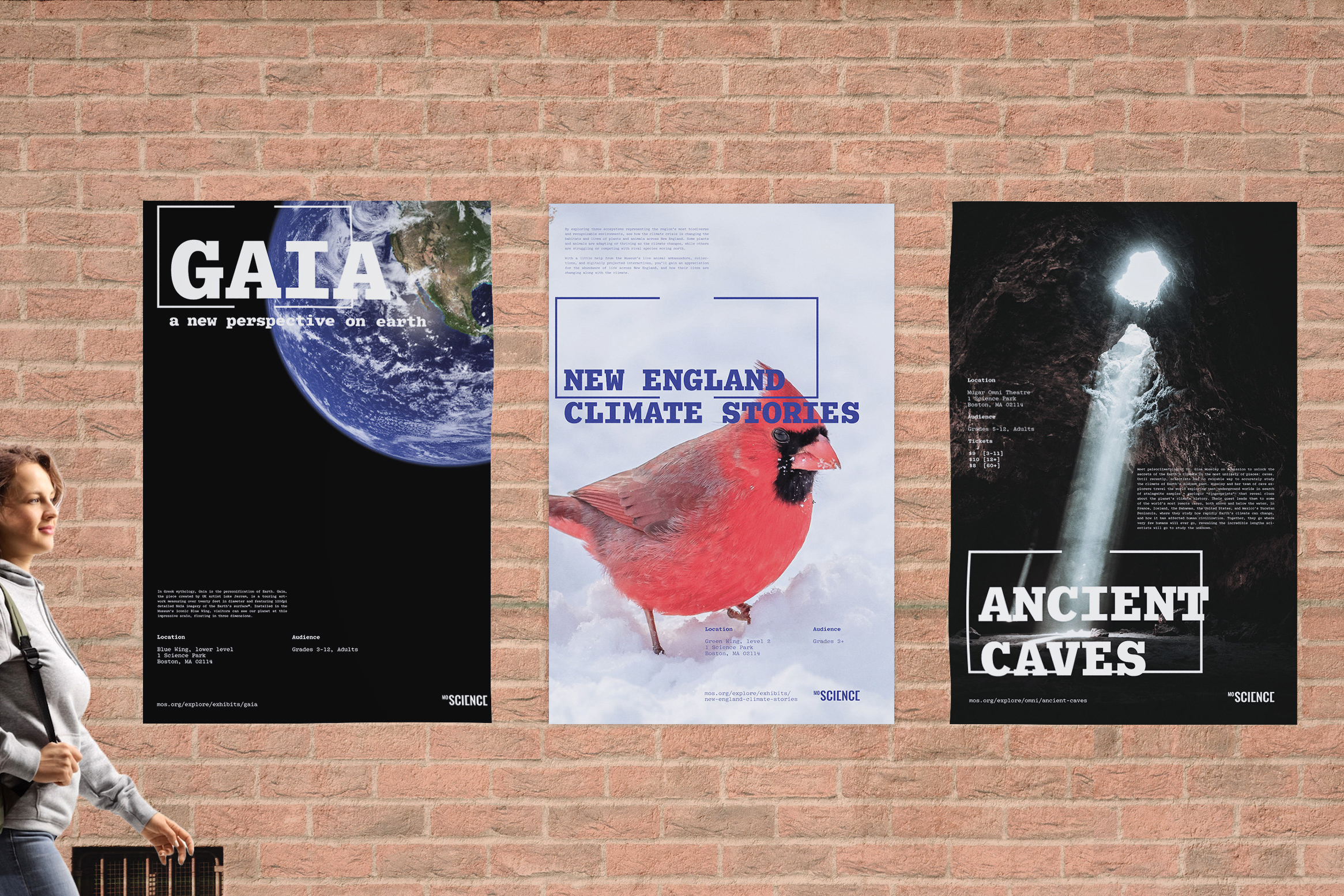
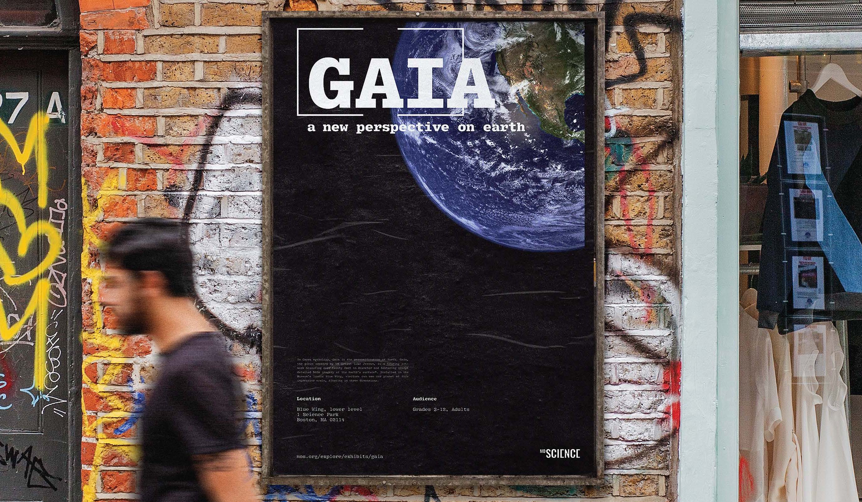
This poster demonstrates how the identity system can be applied for promoting seasonal events and exhibitions.
Image
Image
Image
Image