Image
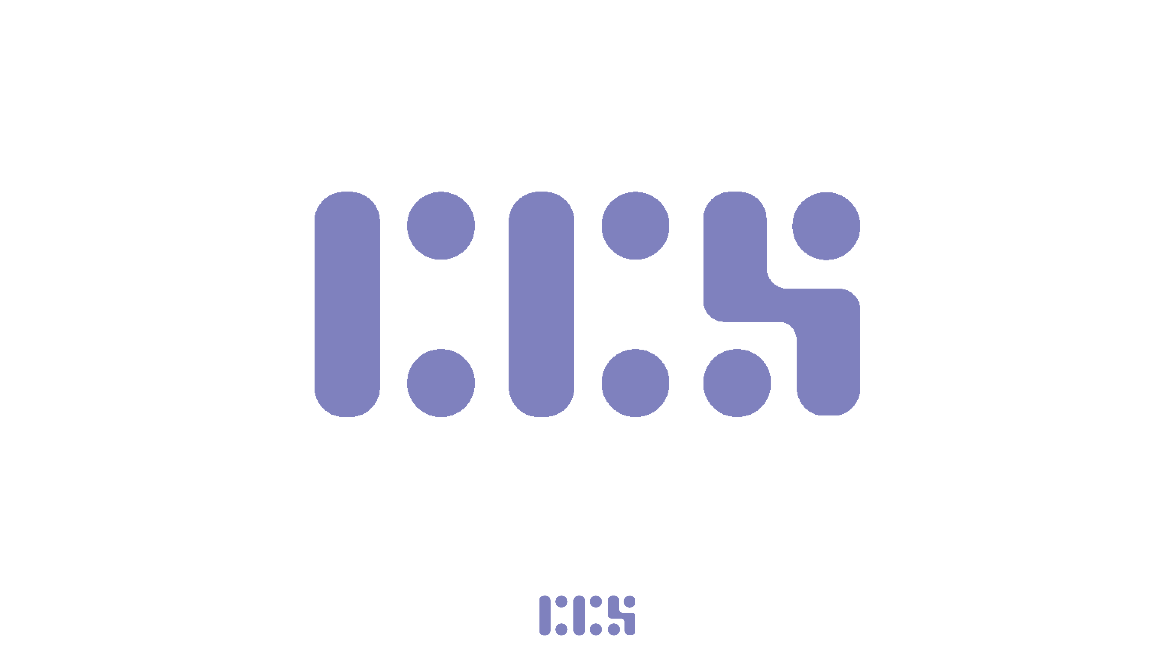
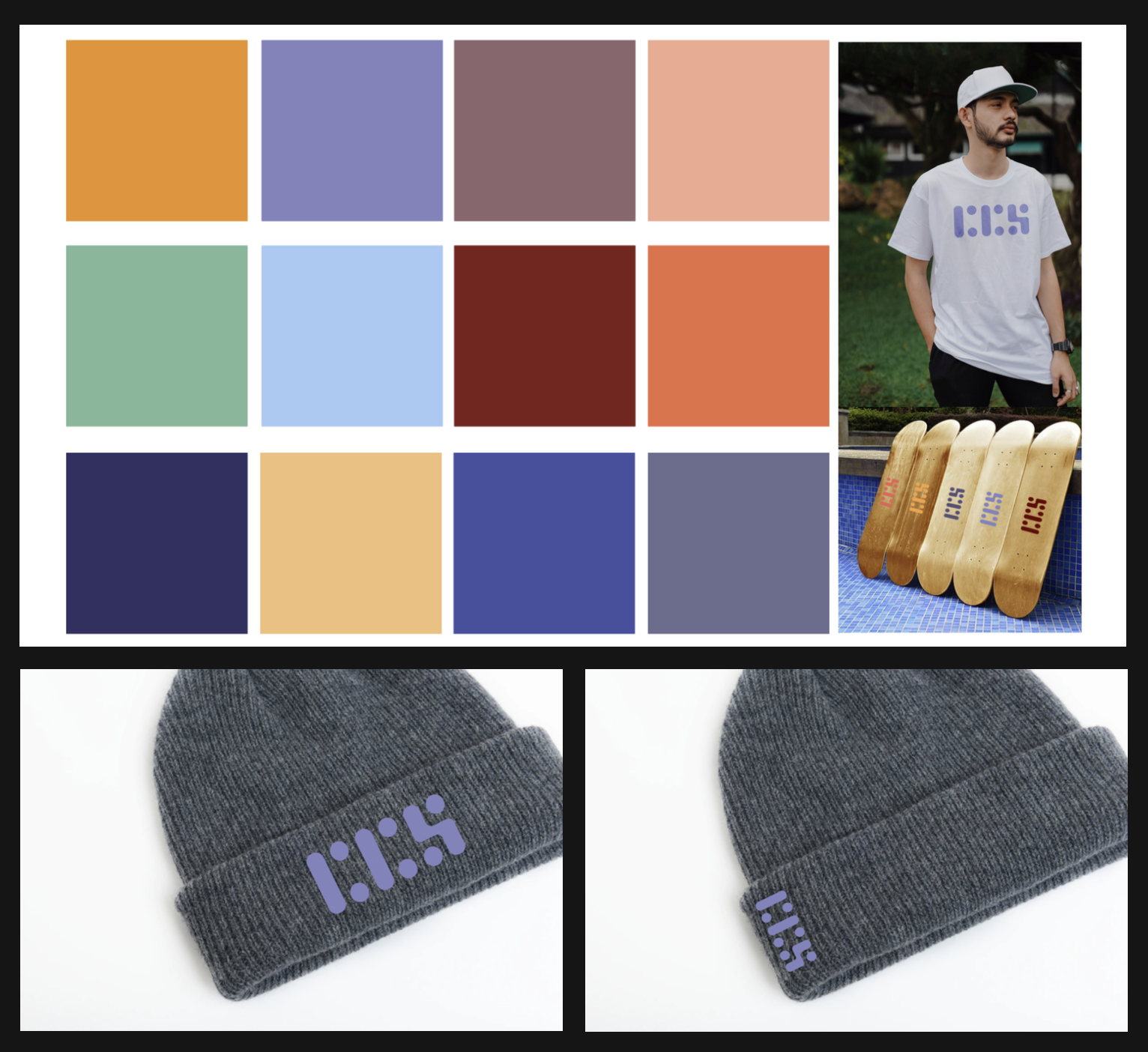
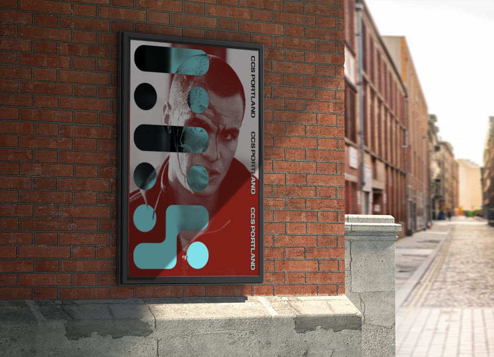
The logo is created from a modular typeface system I developed that is inspired both by the shapes of skateboard wheels and decks, and expands upon the use of the stencil typeface in their original identity. The color system is a refined selection of vibrant colors drawn from the color schemes of their initial catalogs.
Image
Image
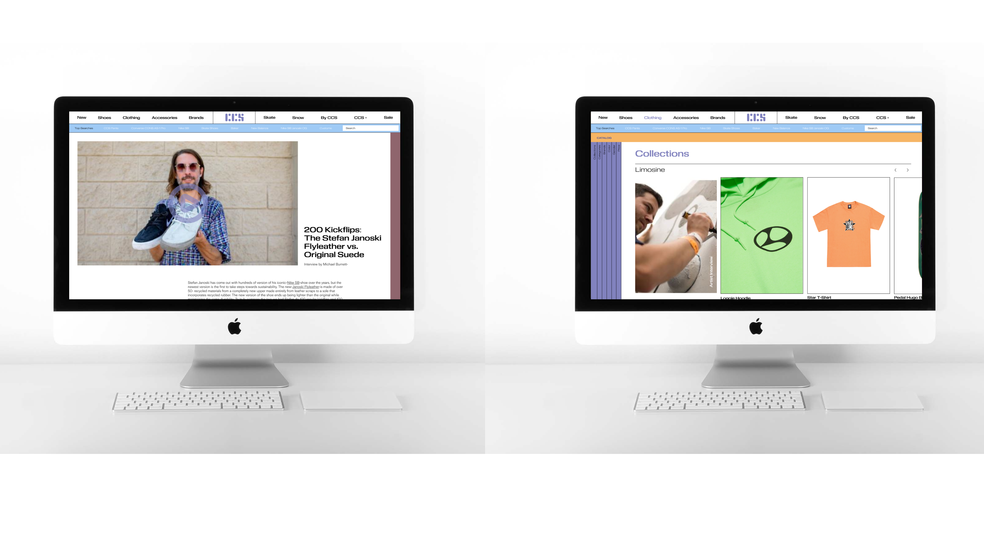
In the shopping section, the catalog articles corresponding to a particular item or clothing collection are promoted at the bottom of the page. Correspondingly, the catalog articles promoting or testing specific clothing items/skate gear also promote the products featured in the article at the bottom of the page.
Image
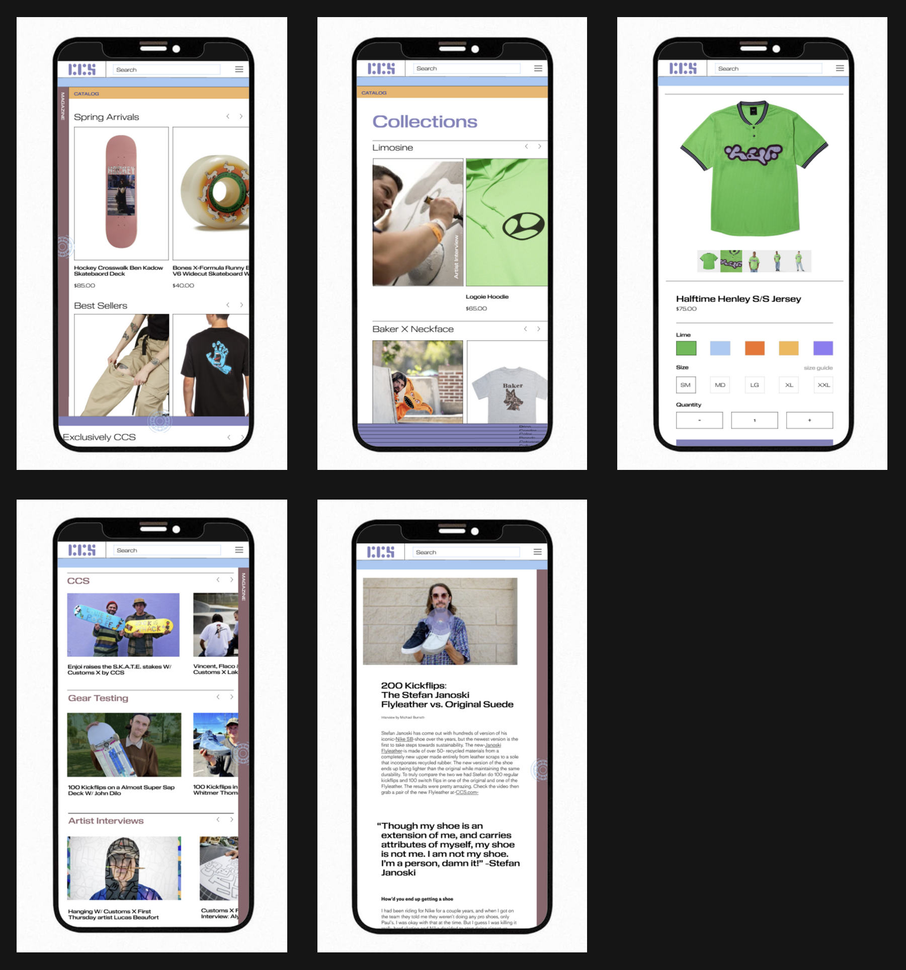
I translated the layout of the desktop web design to a vertical format to cohesively match the aesthetic and function between the two formats.
Image
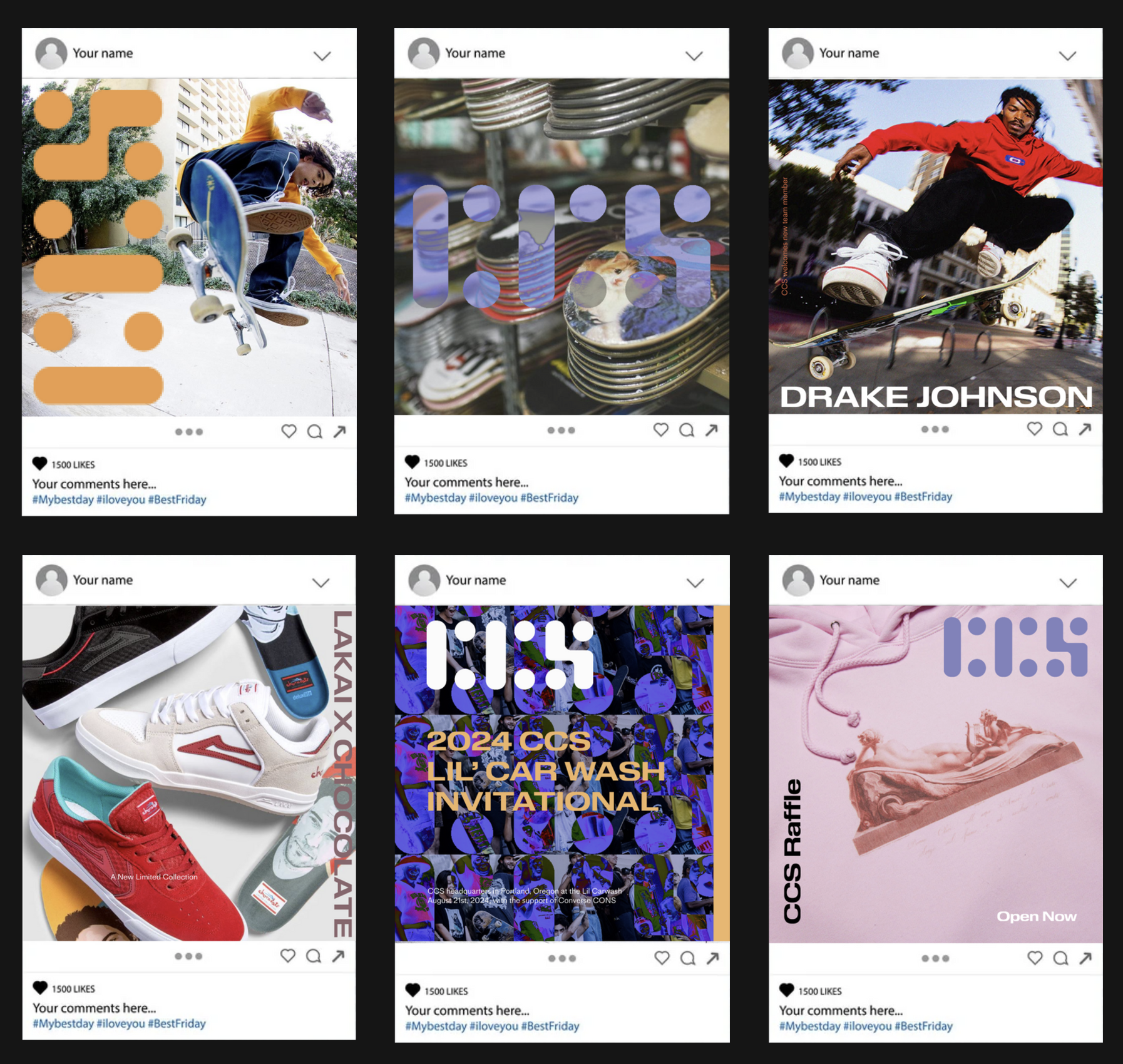
I created these layouts for instagram posts revealing the new identity, promoting the skate team newest member and promoting events and online giveaways/raffles.
Image
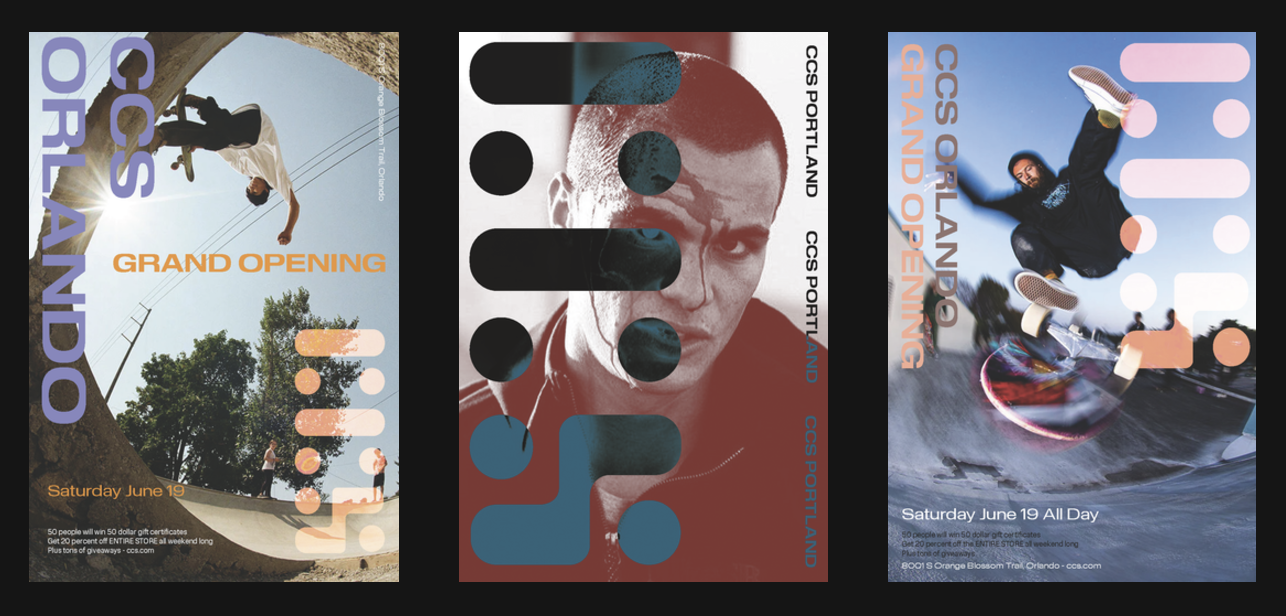
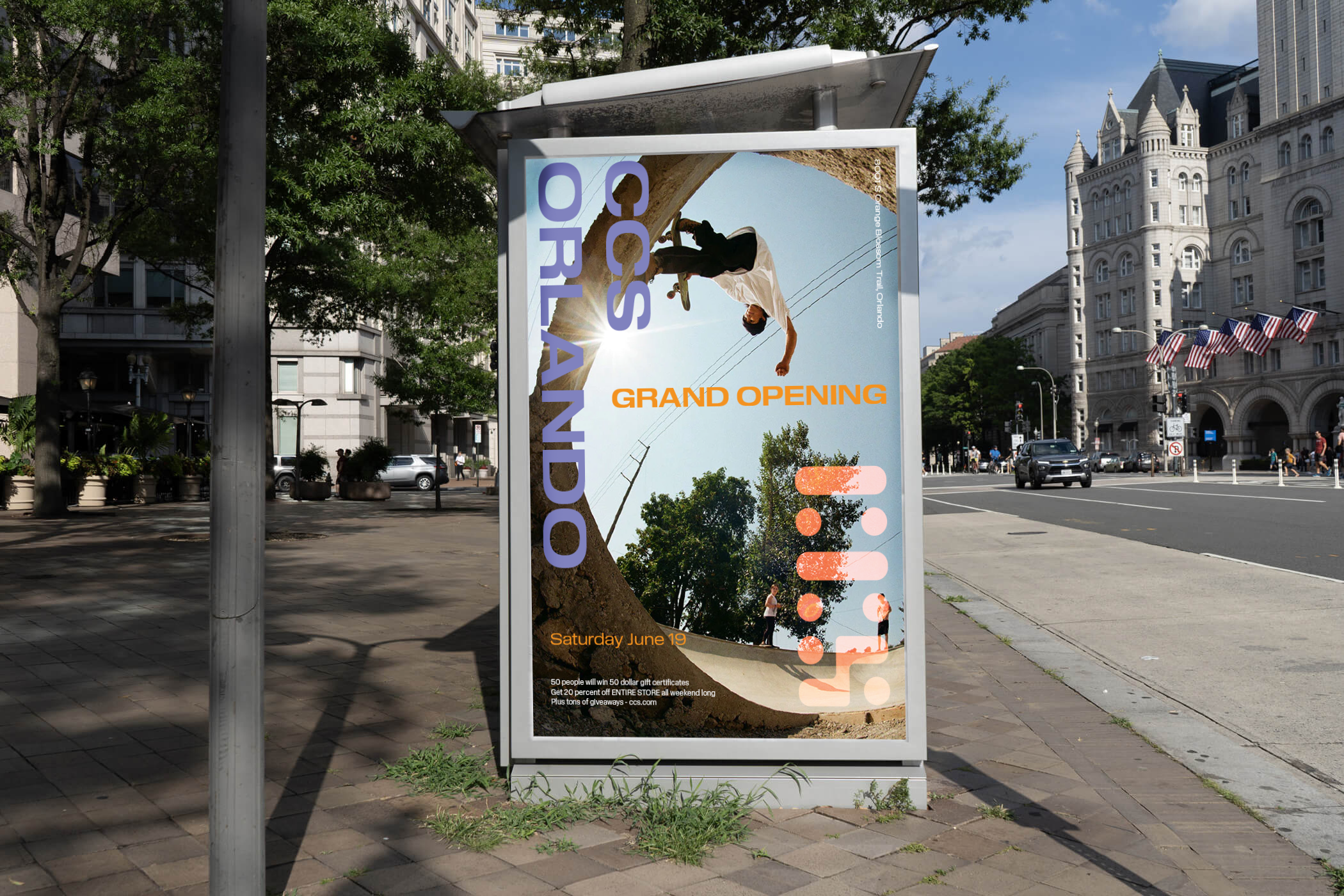
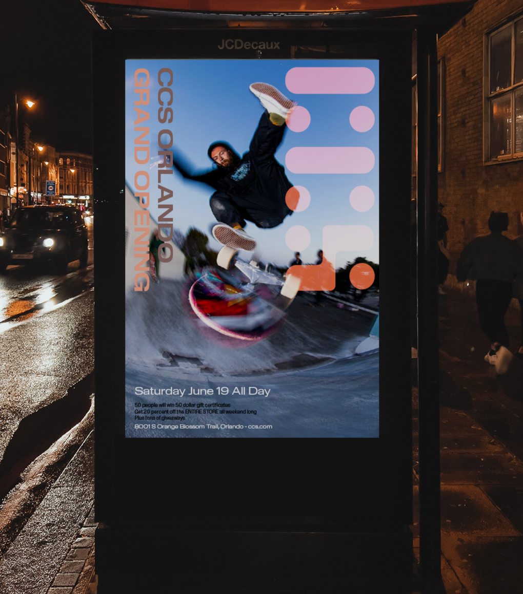
I created a set of posters that promote their brick and mortar stores as well as opening ceremony events to reconnect with the skate community and finally address the lack of a physical store that was creating a disconnect amongst consumers in the past.
Image
Image
Image
Image

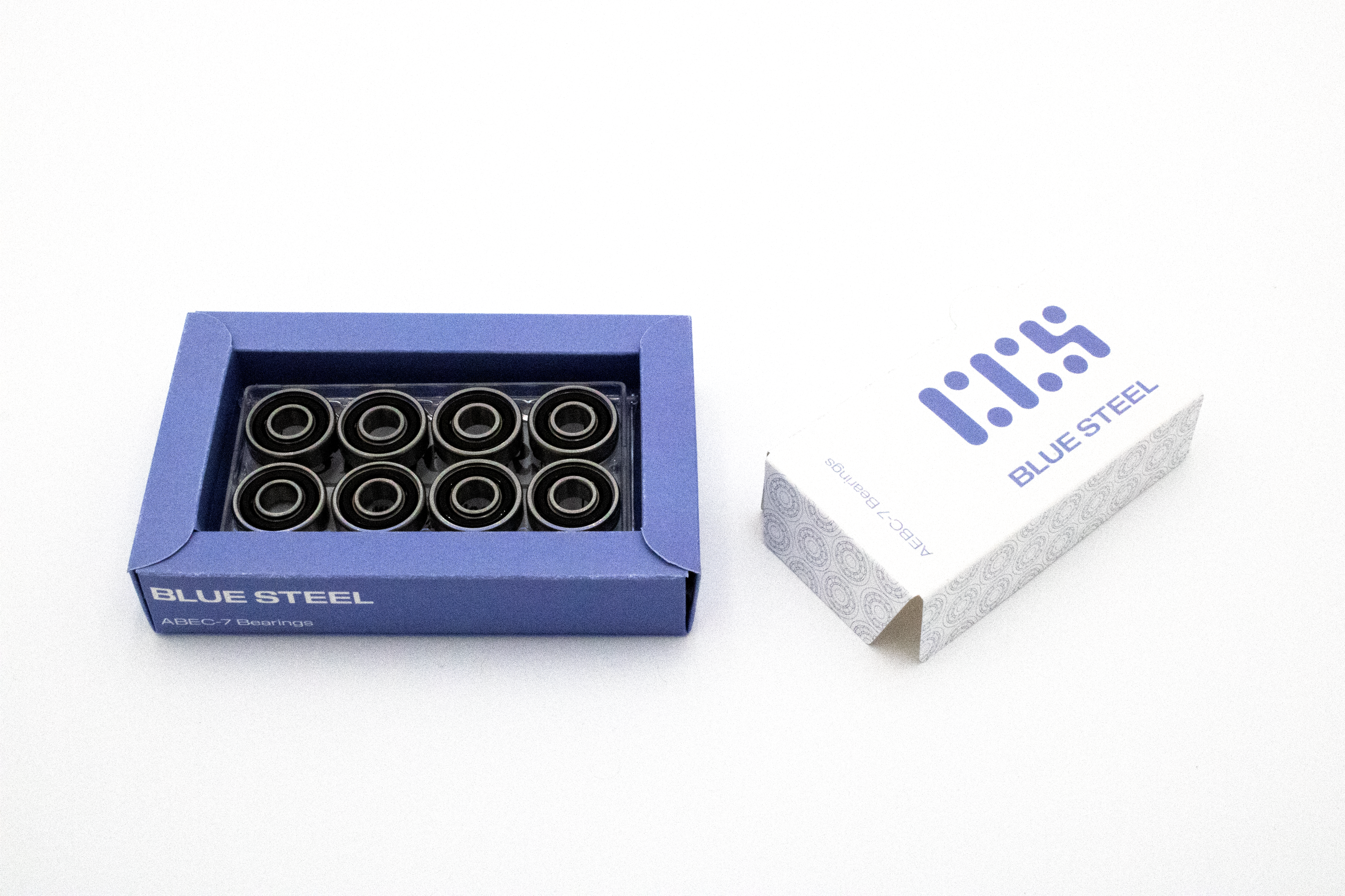
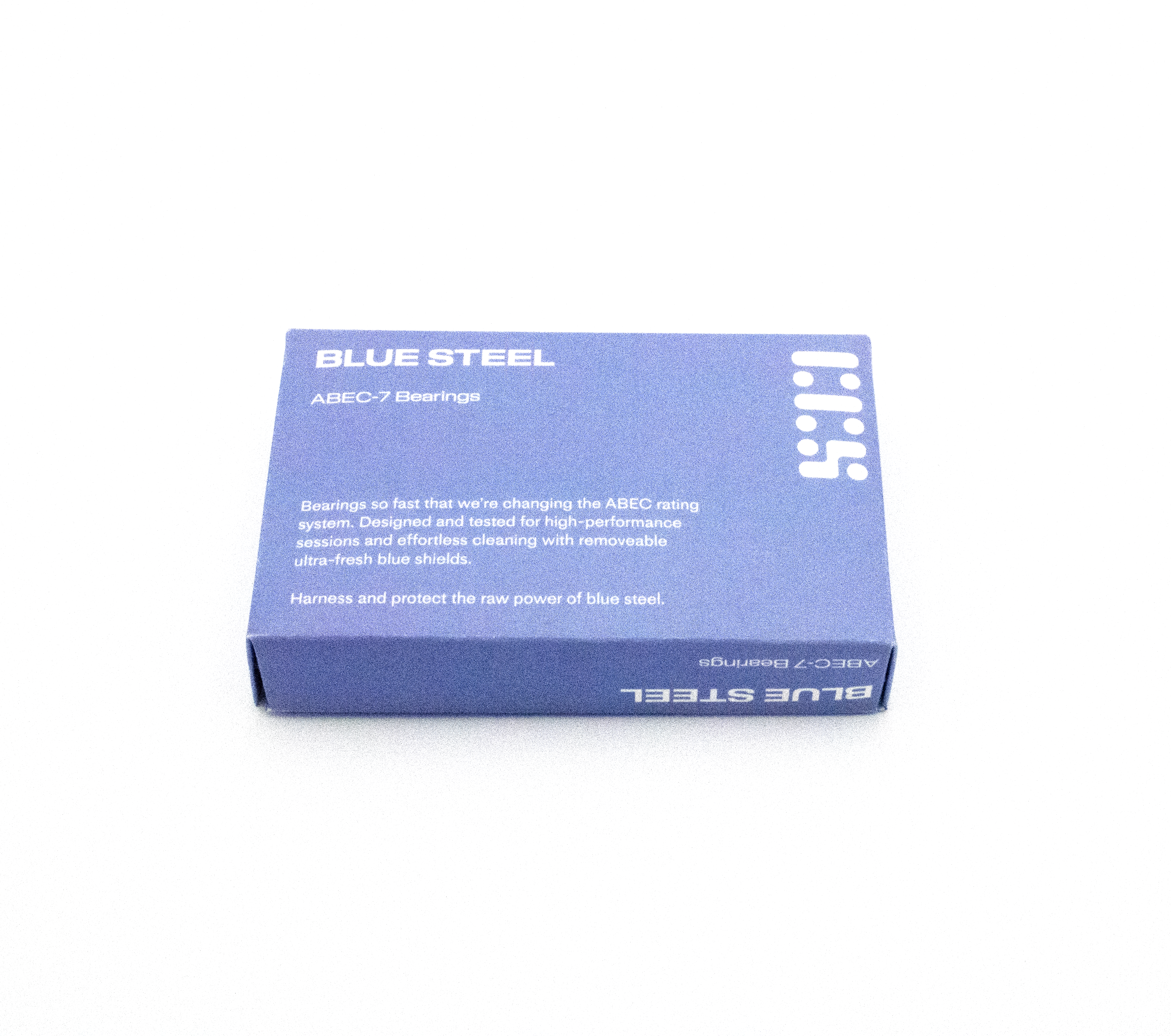
I continued the application of this new identity system to the packaging for the CCS Blue Steel bearings, with a packaging form that more elegantly reveals the product and identity system, elevating the perception of quality of the in-house product and brand.
Image
Image
Image
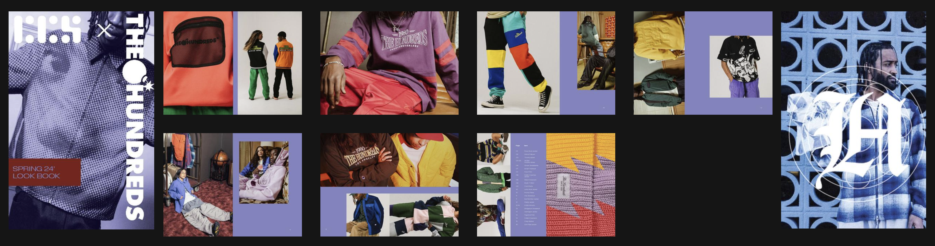
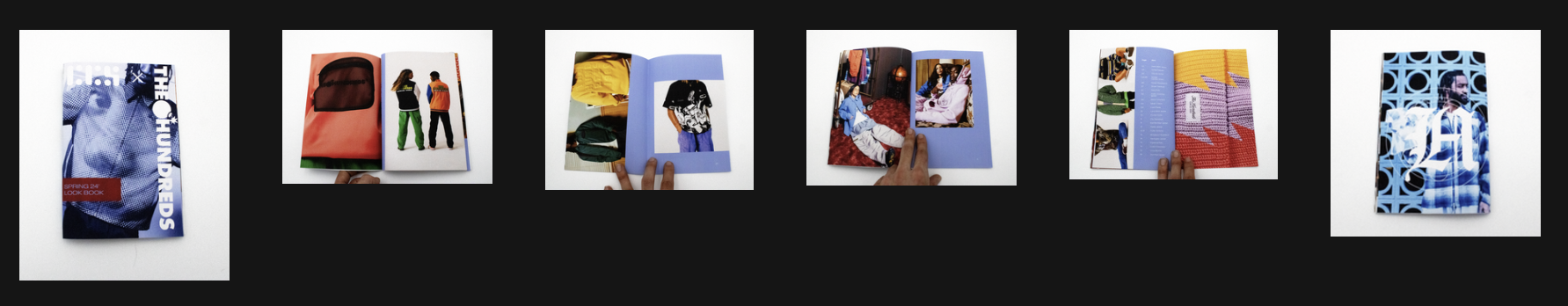
I designed the new catalog layout to emulate the style of a designer brand lookbook/collection book. This catalog focuses on the Spring 24’ Huf collection featured on CCS.
Image