Image
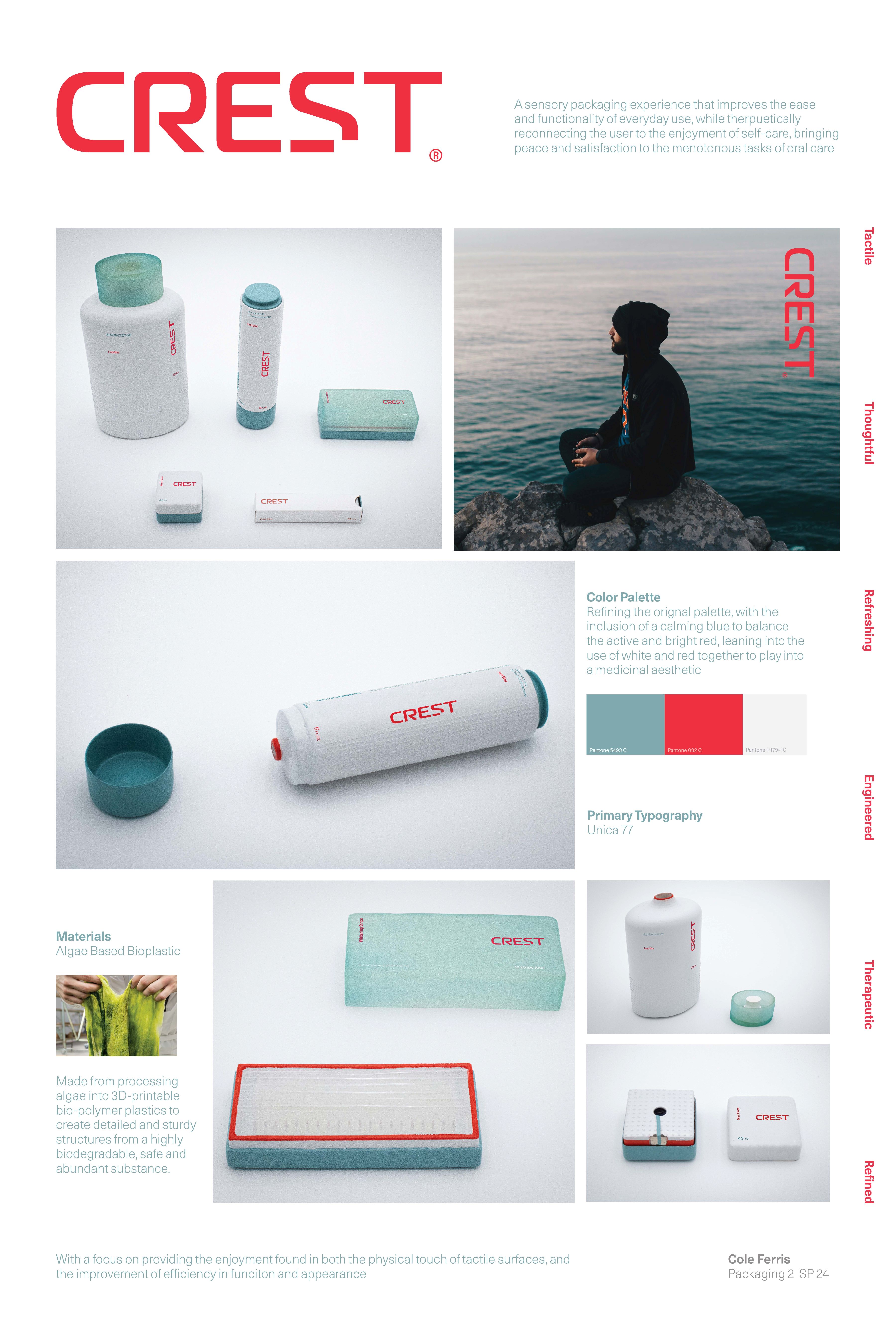
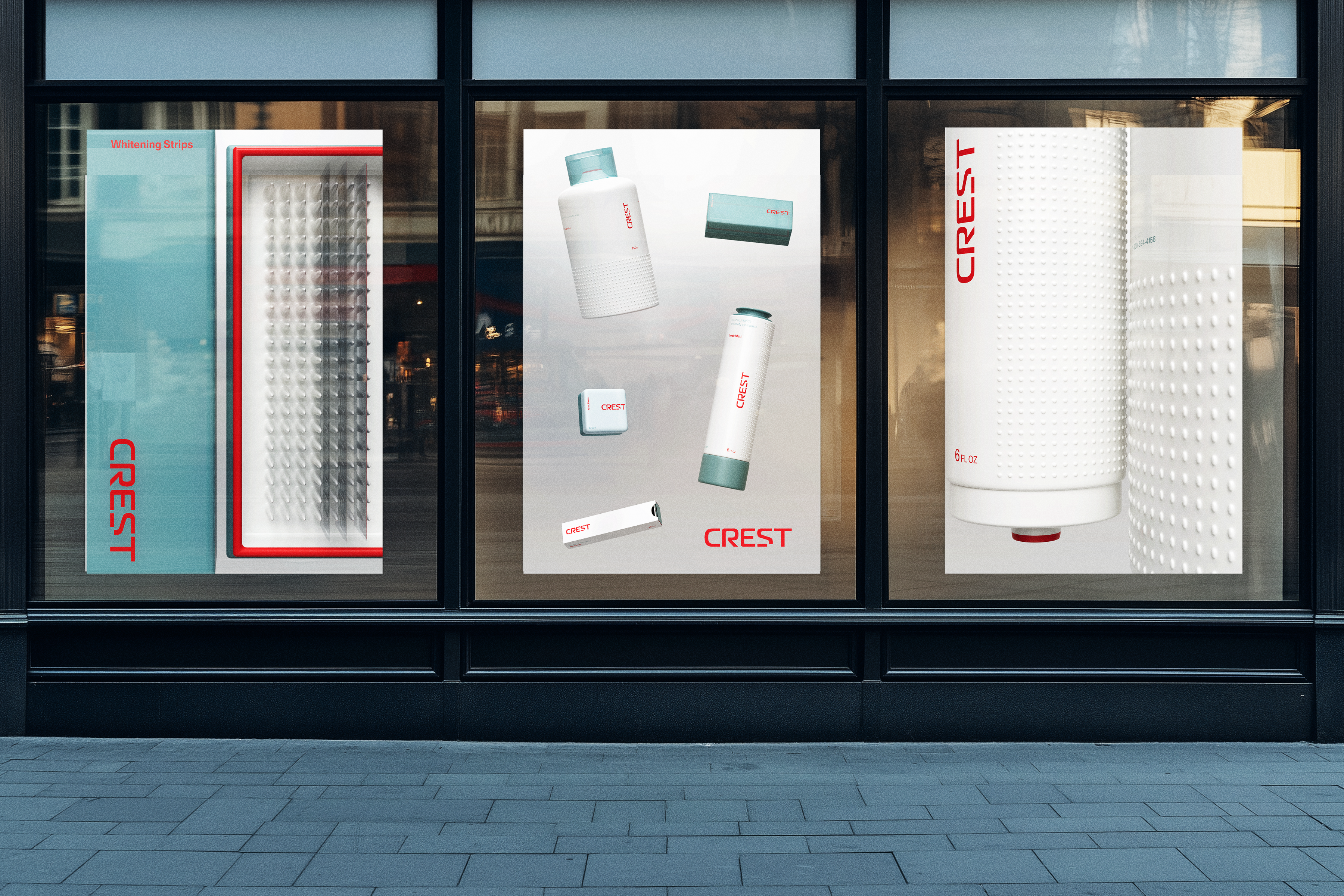
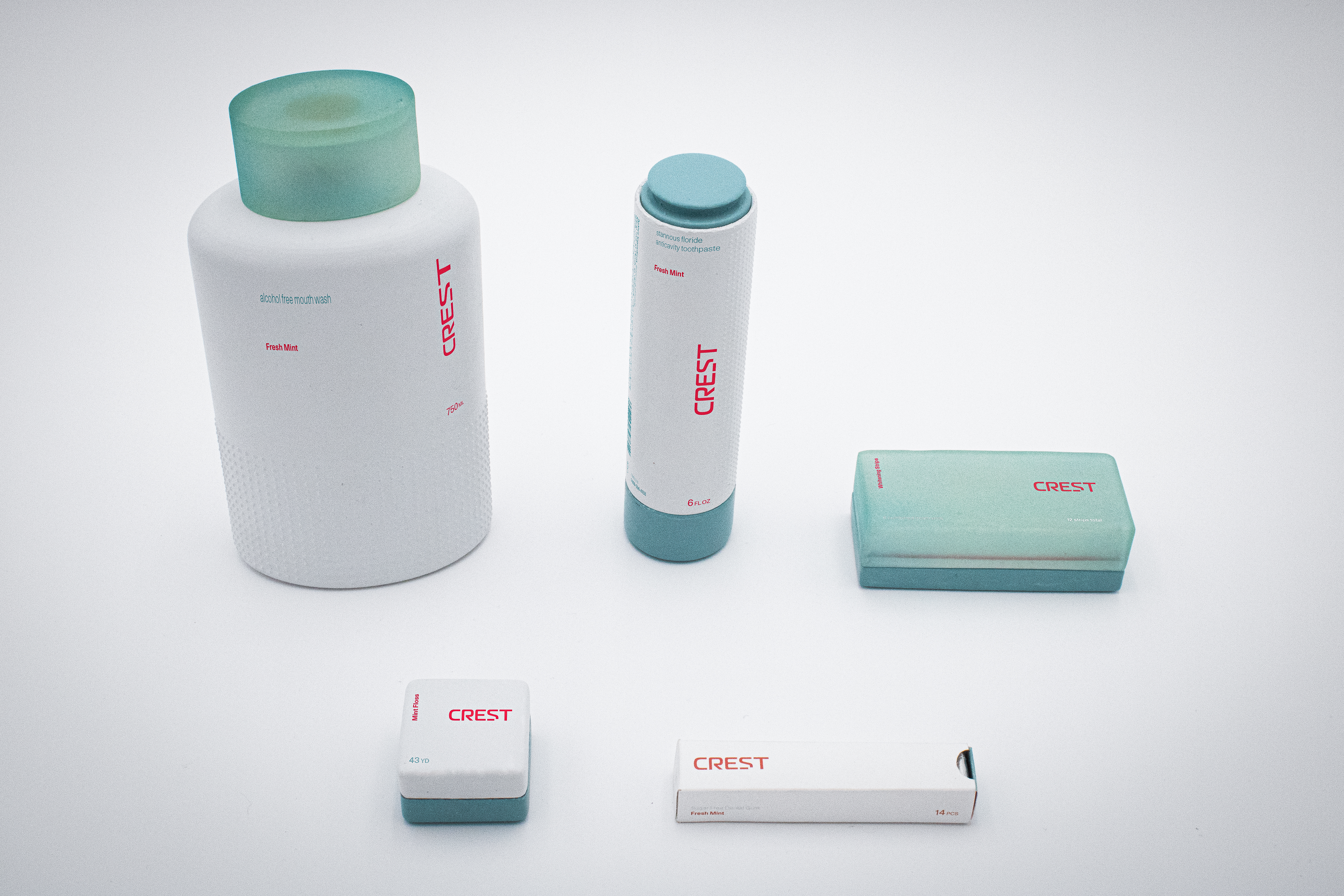
I developed a wordmark that modernizes the brand and reconnects it to the values of a younger demographic. The subtle destruction of the typeface within the “S” and the sharp edges I created on the interior shoulder of the “R” help communicate the modern and technologically advanced feeling that the improved functionality of the packaging creates.
Image
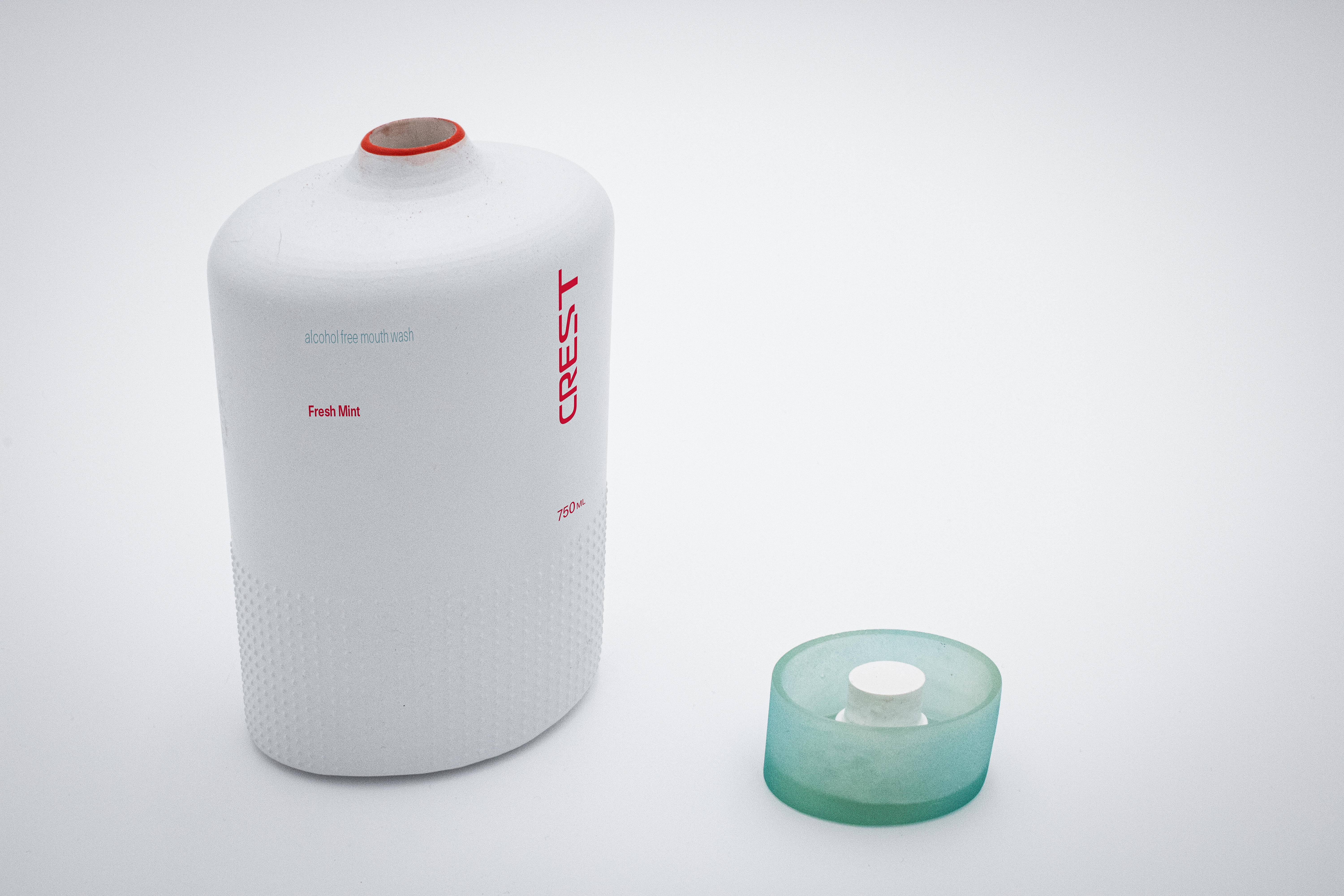
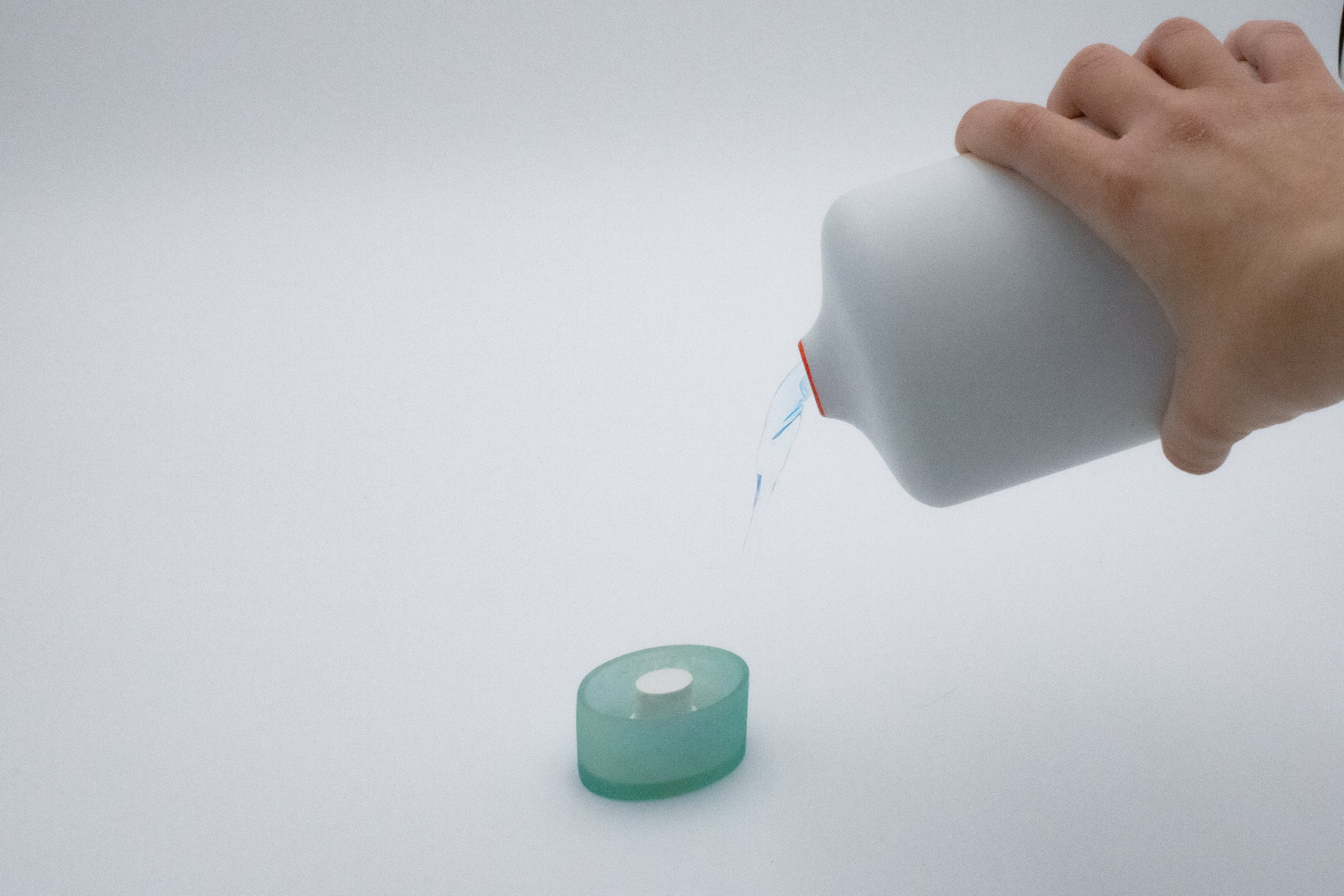
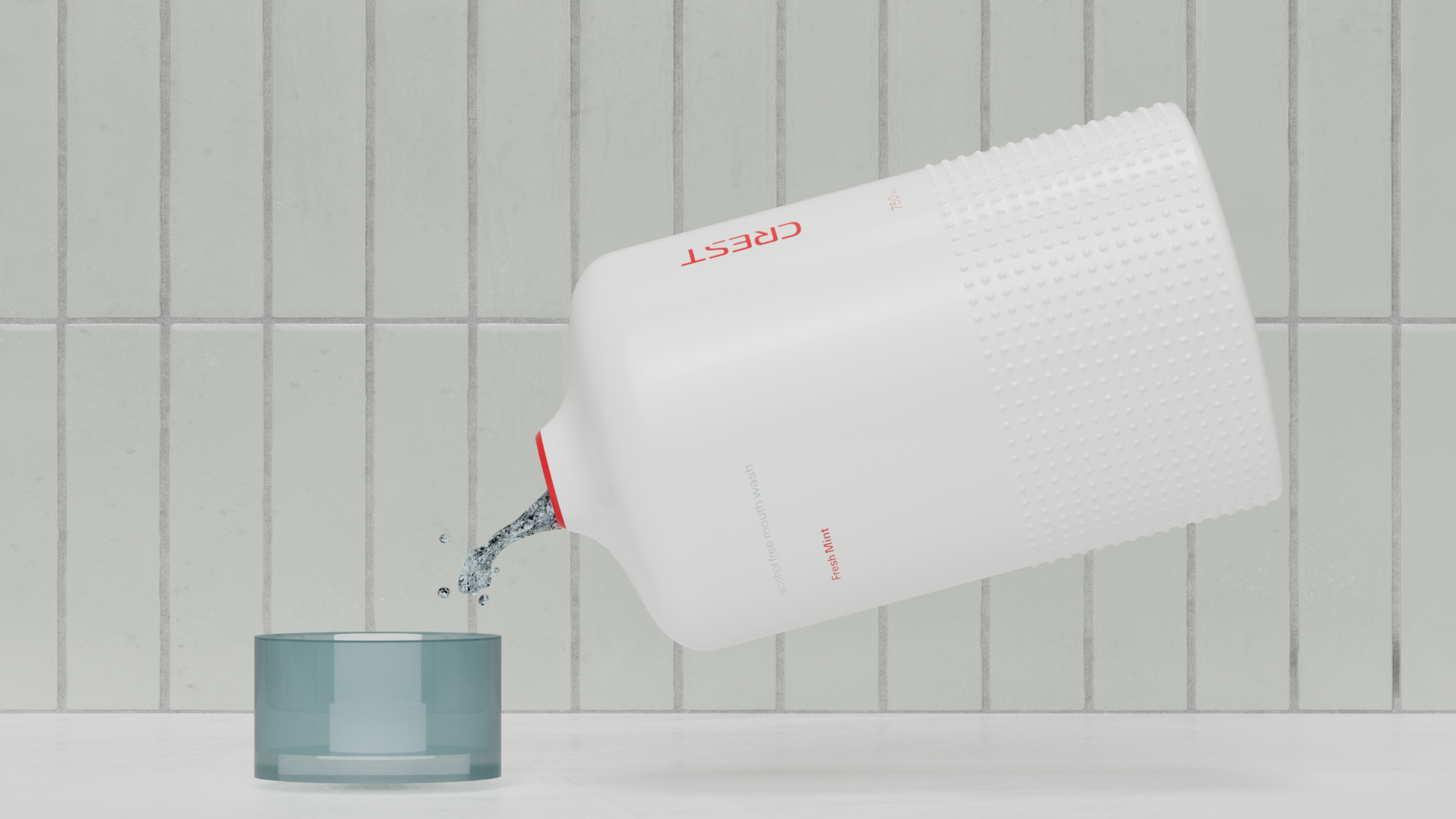
Mouthwash with Measuring Cap
Image
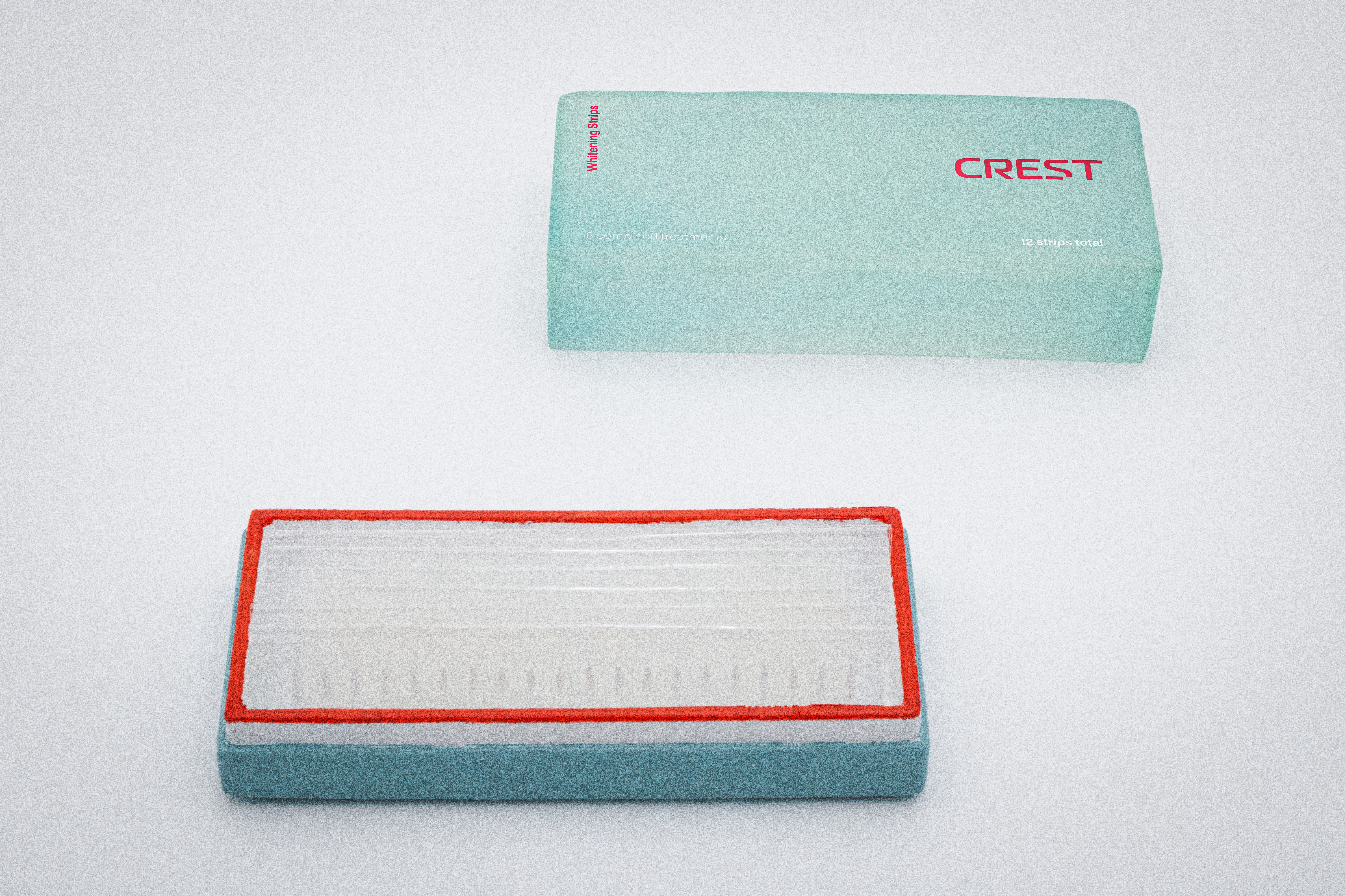
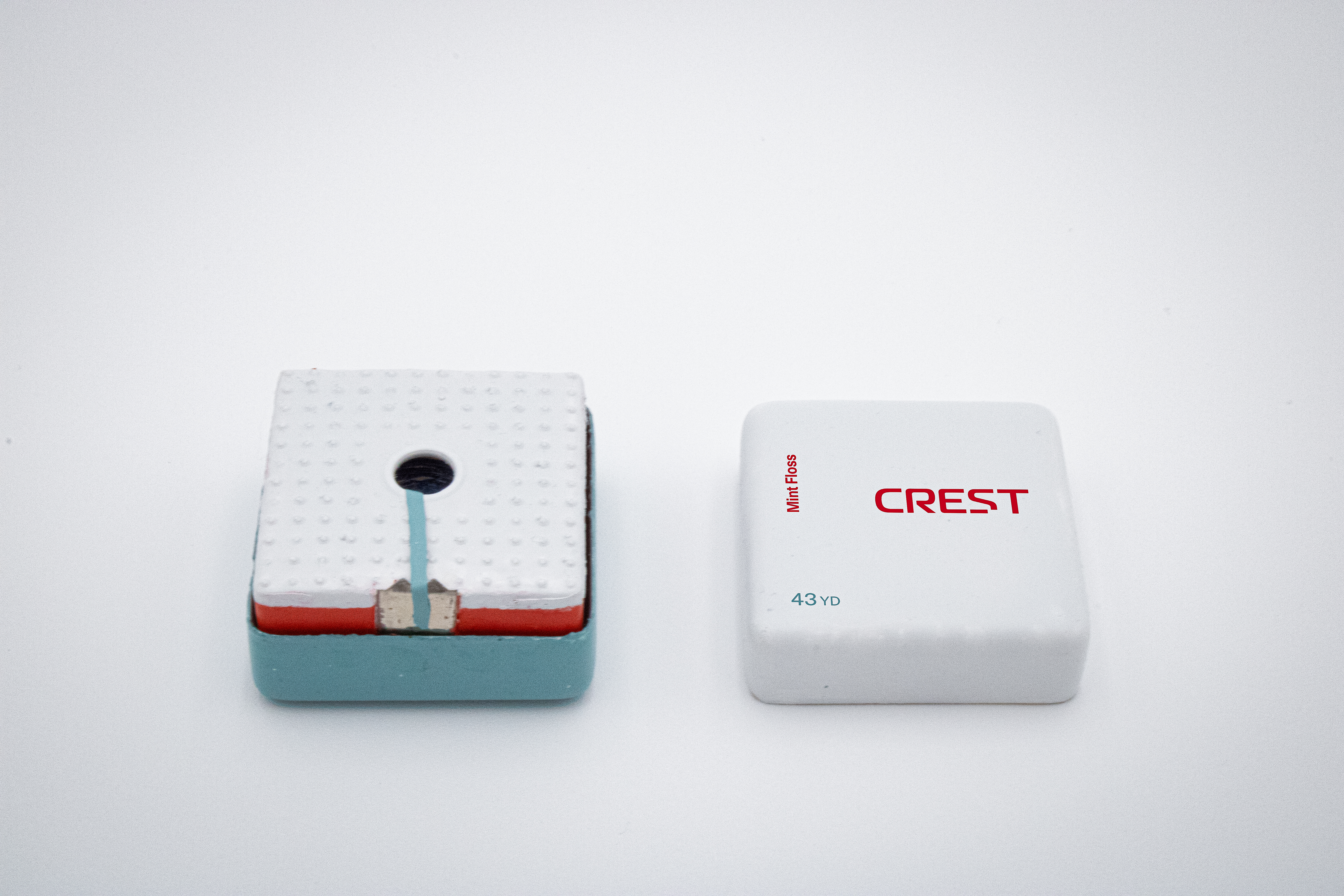
Whitening Strips
Image
Image
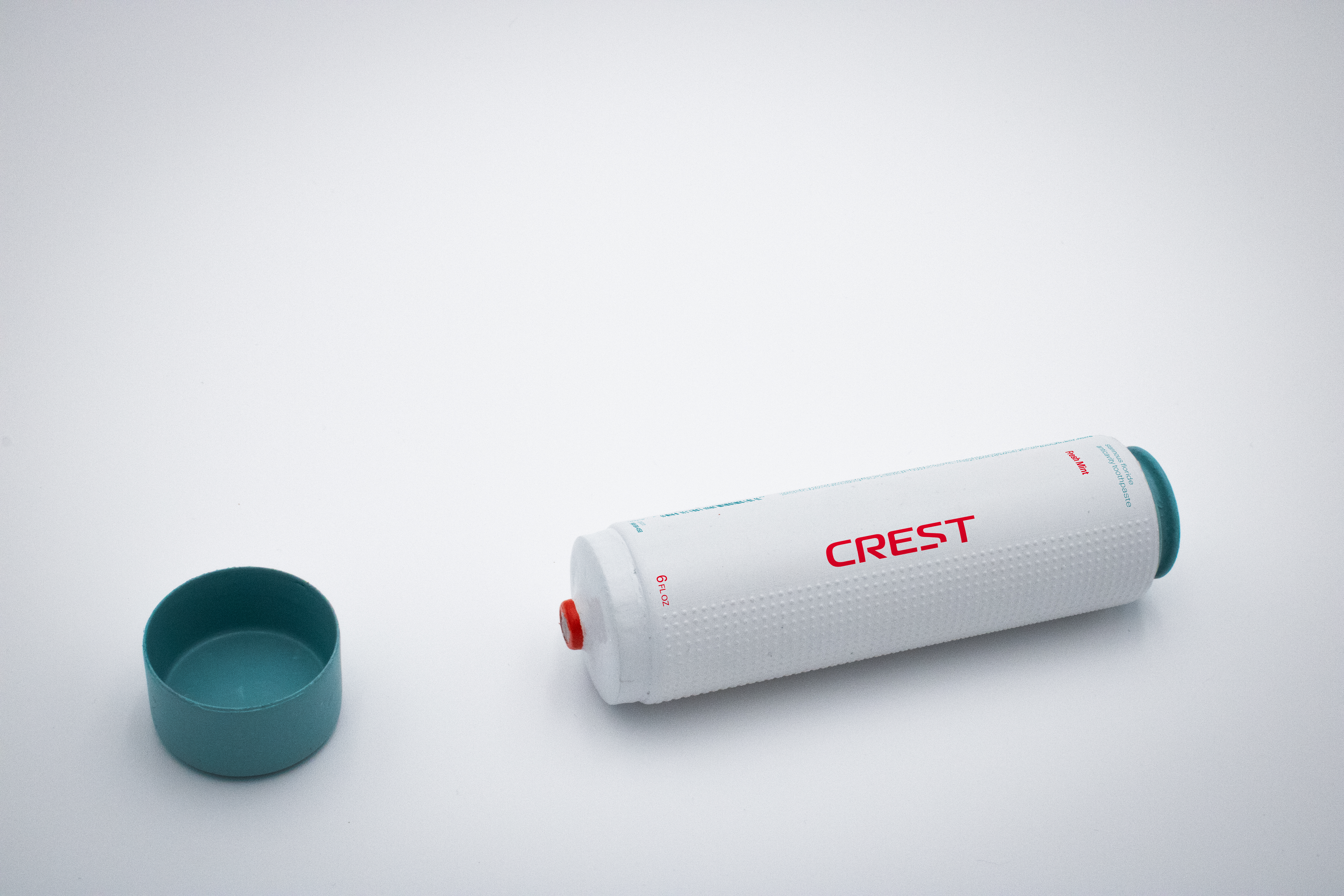
Toothpaste
Image
Image
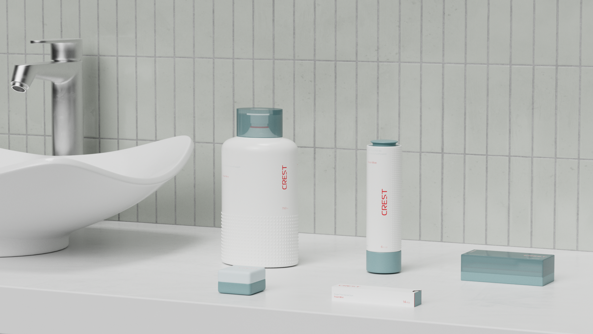
The packaging focuses on both functionality and providing a sensory experience to evoke the theruapuetic practice of self-care to you dental care routine. I used the technique of adding a grid of small bumps to different parts of the packaing forms to create this tactile quality as well as provide grip or function where needed.
Image
Image
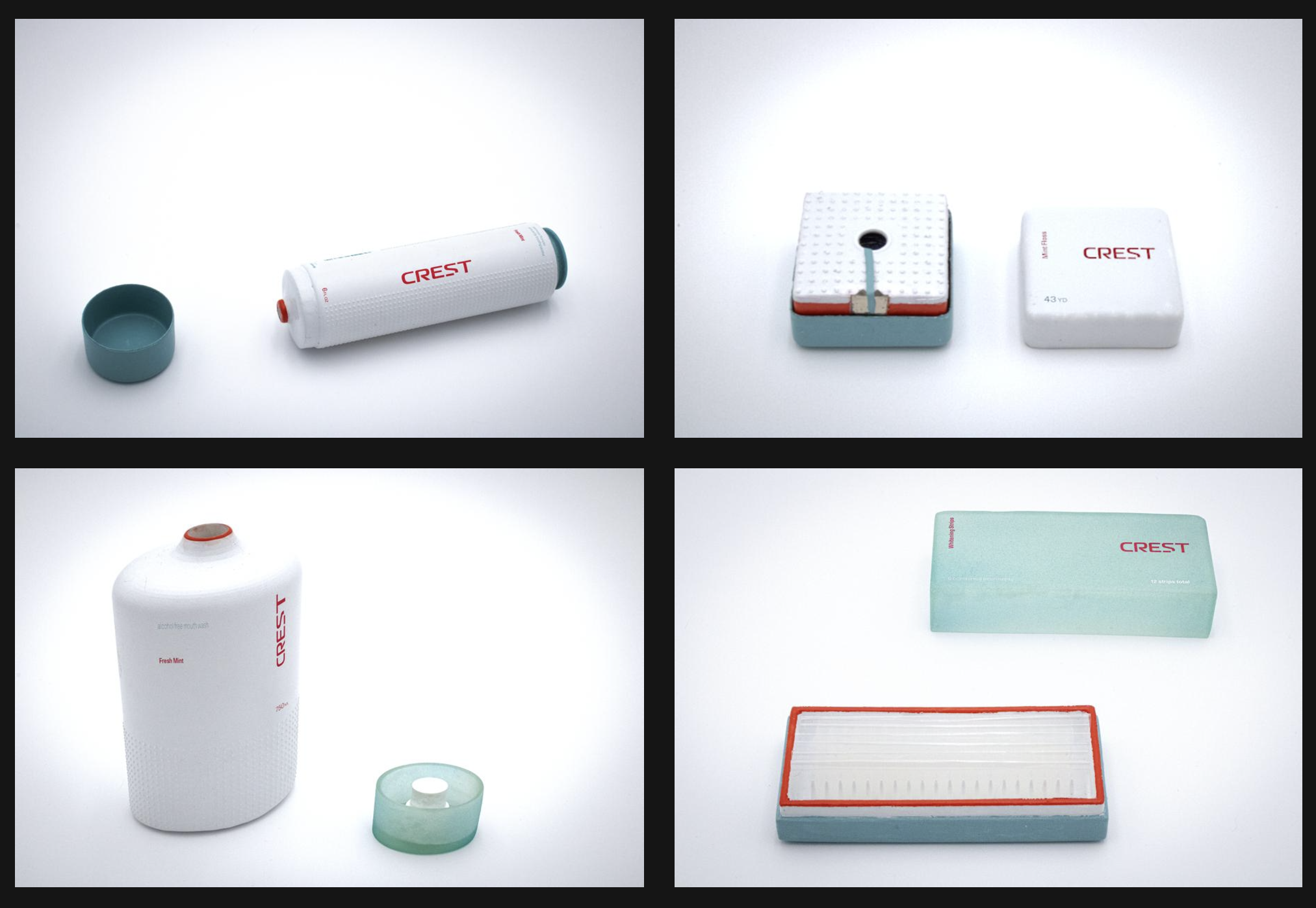
To create the prototypes I modeled my packaging forms in Cinema 4D, then 3D-printed and hand painted my models fully at home using a resin 3D-printer I purchased. I then printed the graphics as dry transfers and applied them to the painted models.
Image
Image