Image
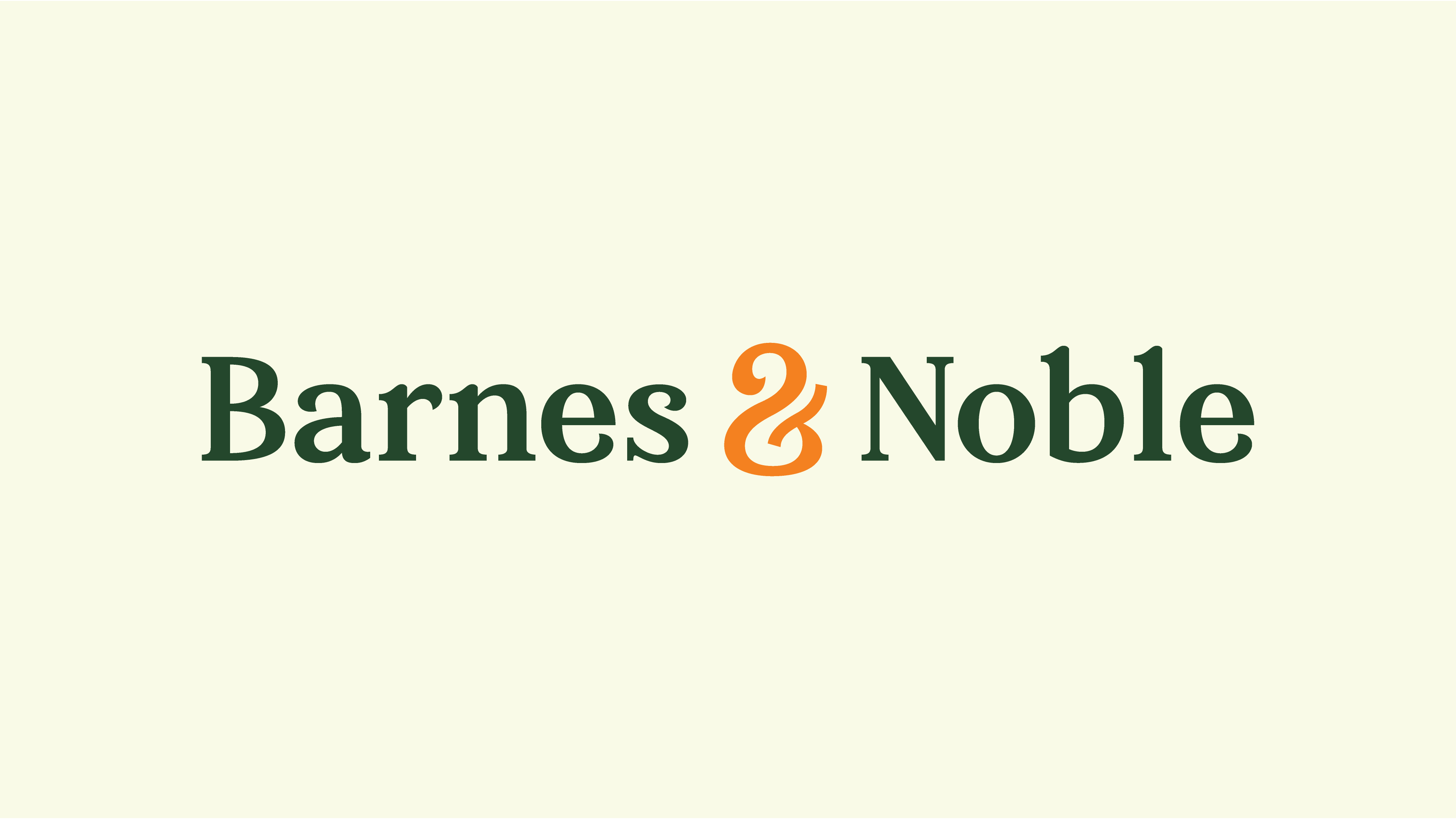
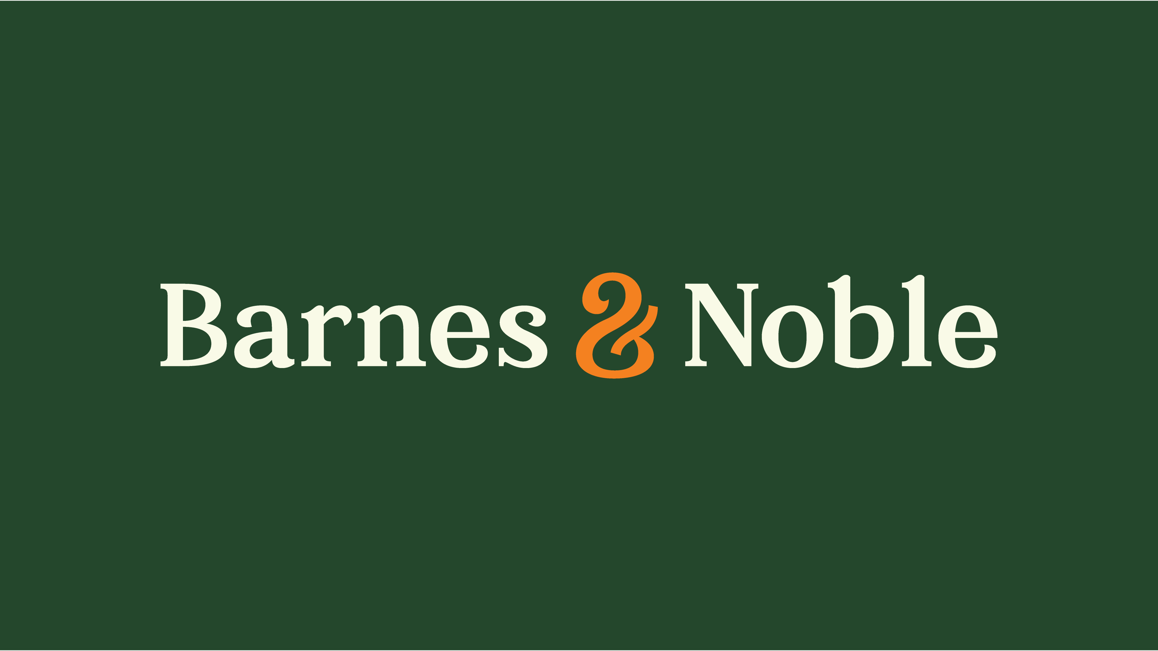
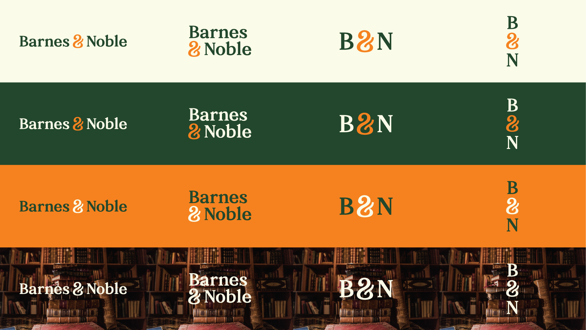
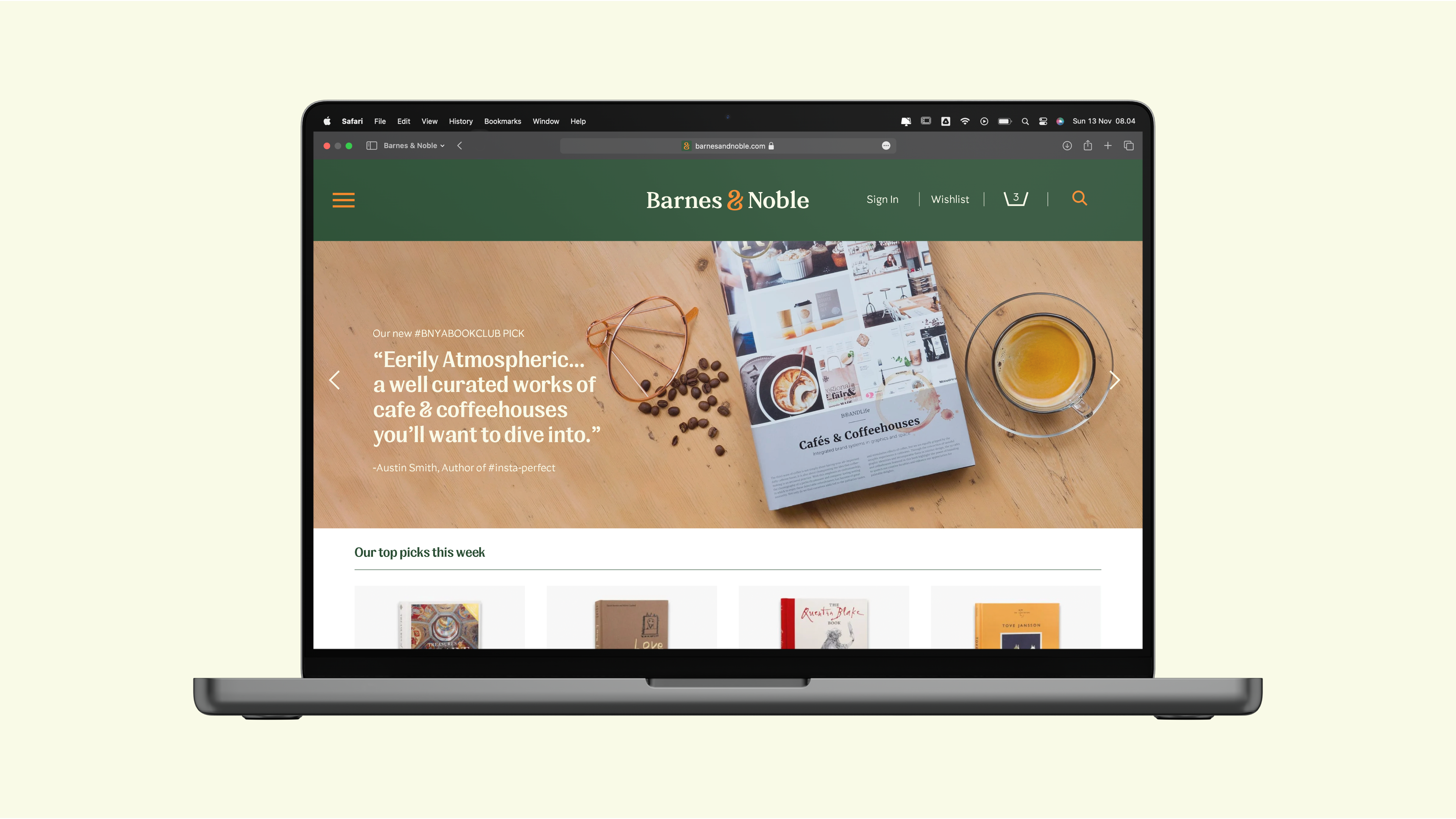
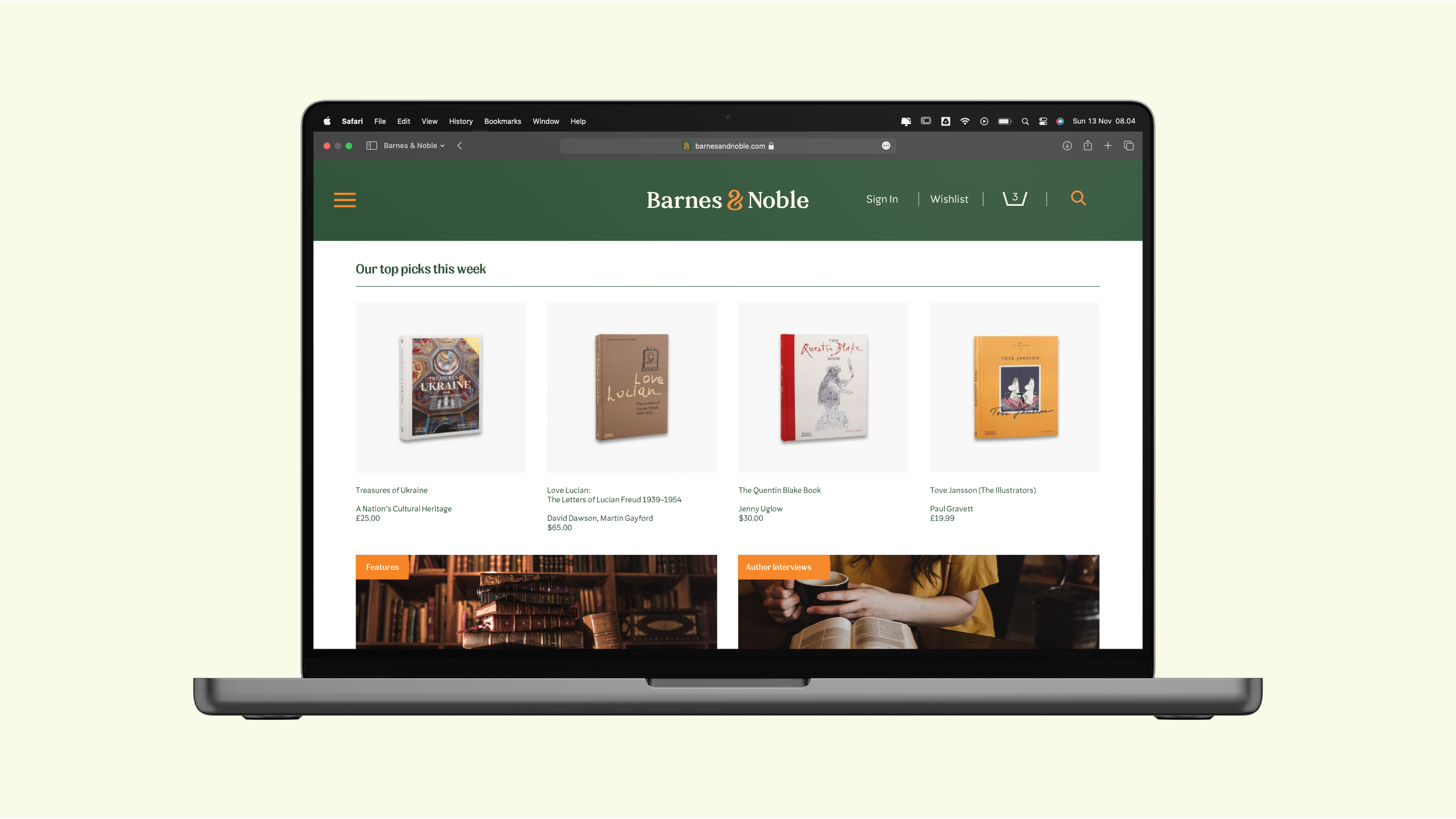
The logotype ideation was inspired by a broad nib pen stroke that already exists within the ampersand of the old logo. This characteristic is then implemented in other letters to articulate better feelings of humanism in the brand. By combining a contemporary serif font with a closed stylistic aperture, our new logo aims to better represent Barnes & Noble’s warm & inviting personality. The classical proportion was also infused into a modern construction to evoke feelings of intimacy and a genuine connection with the audience.
Image
Image
Image
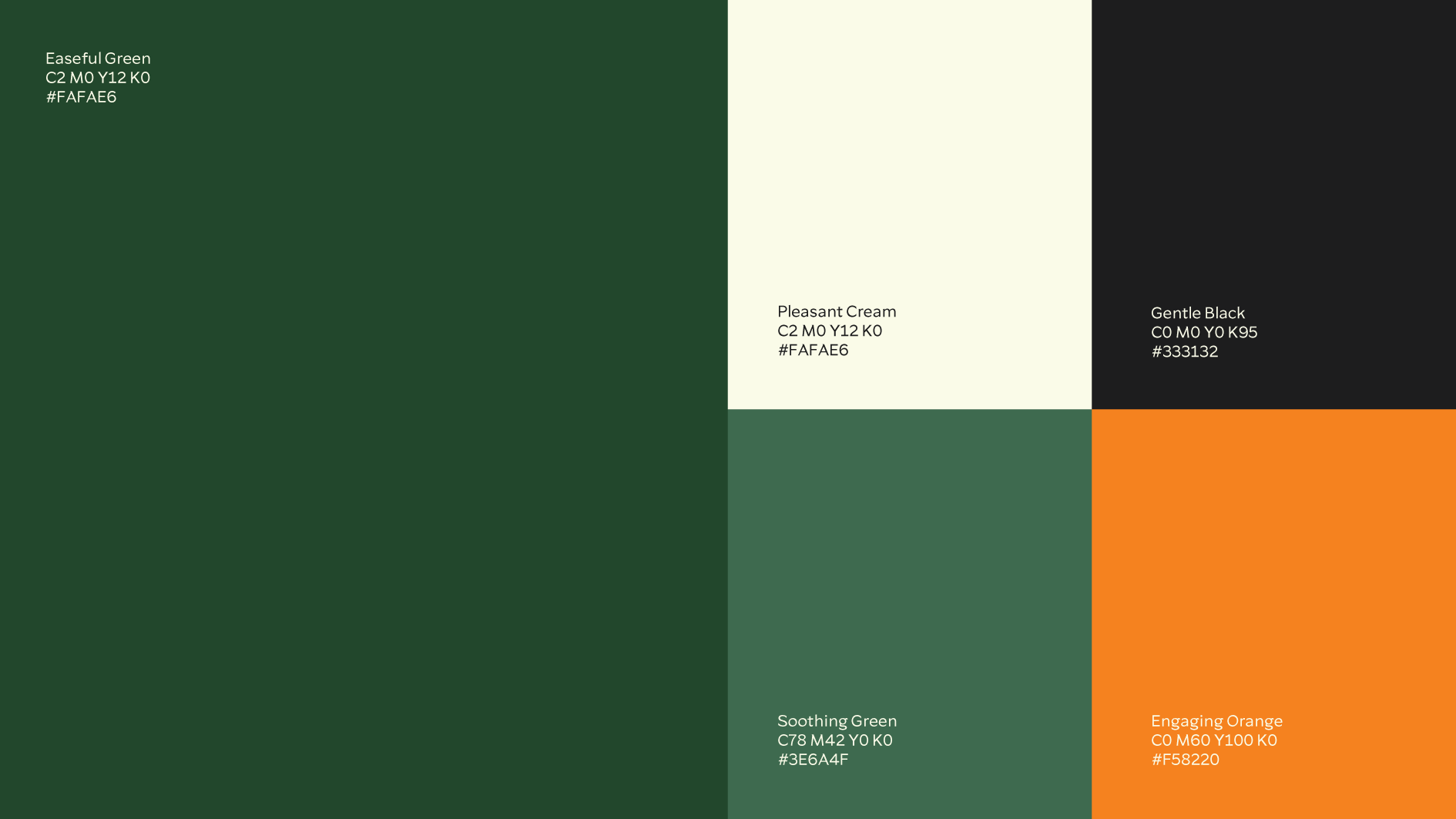
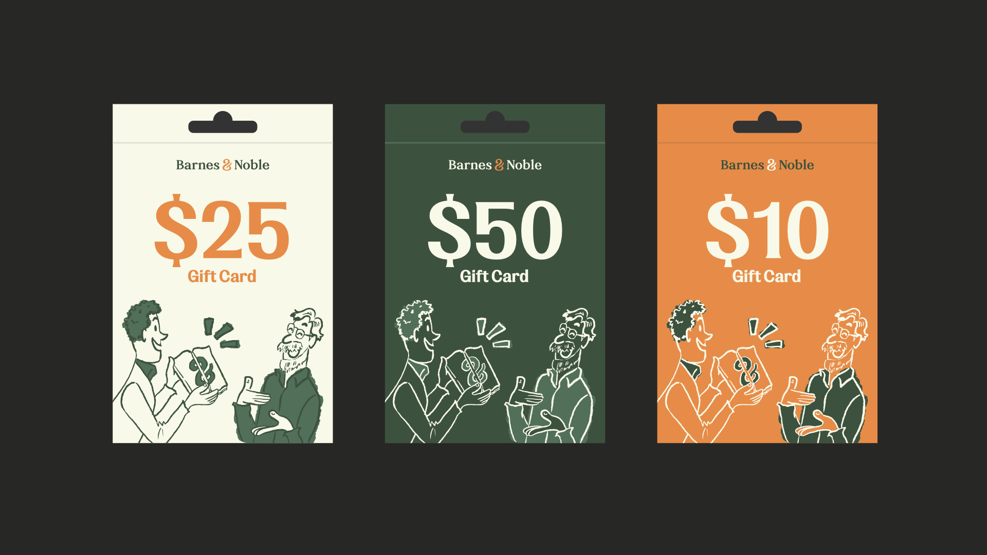
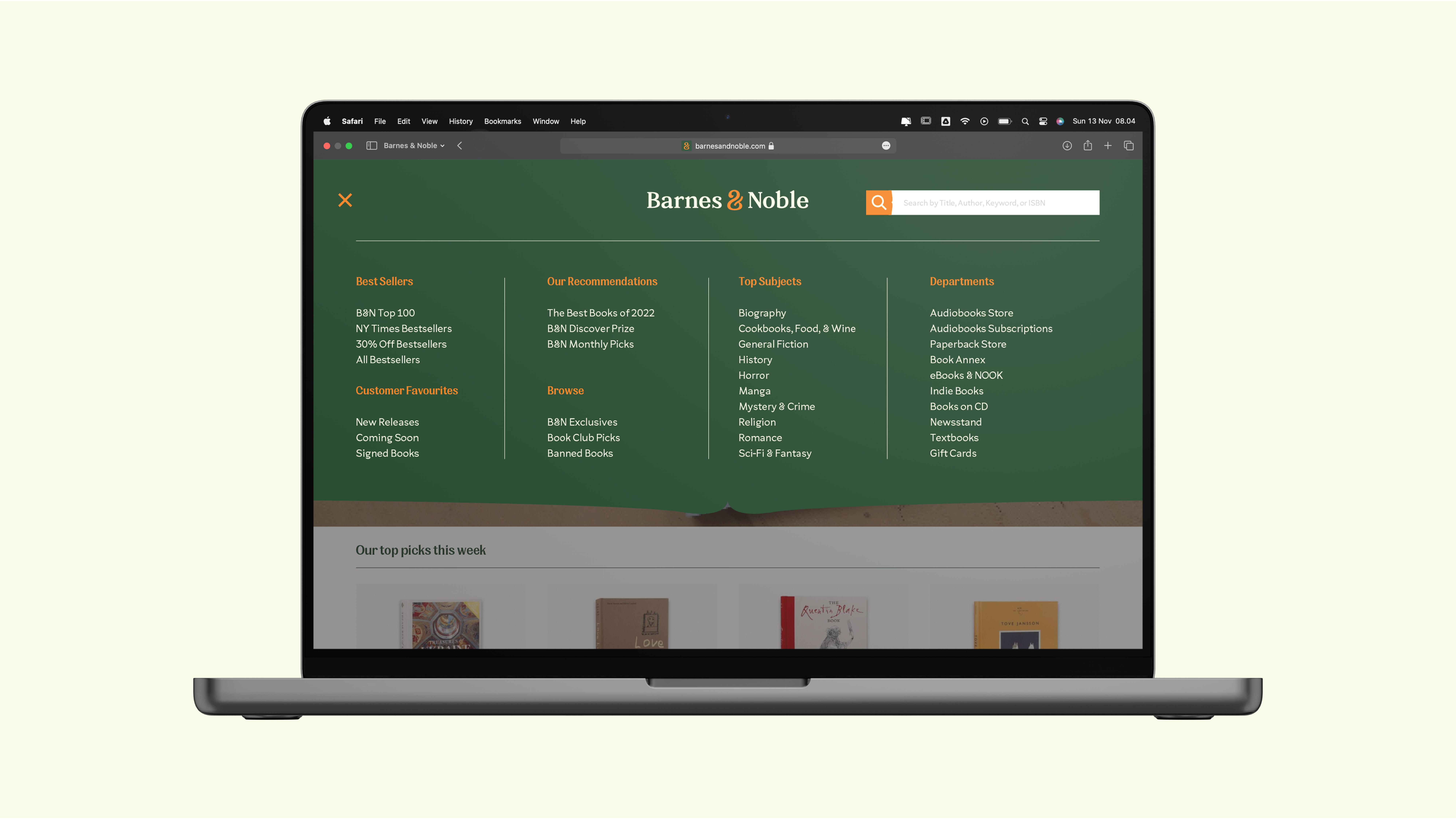
The newly refined brand colors try to better reflect Barnes & Noble’s personality, such as friendly, reliable, appealing, and inclusive.
Image
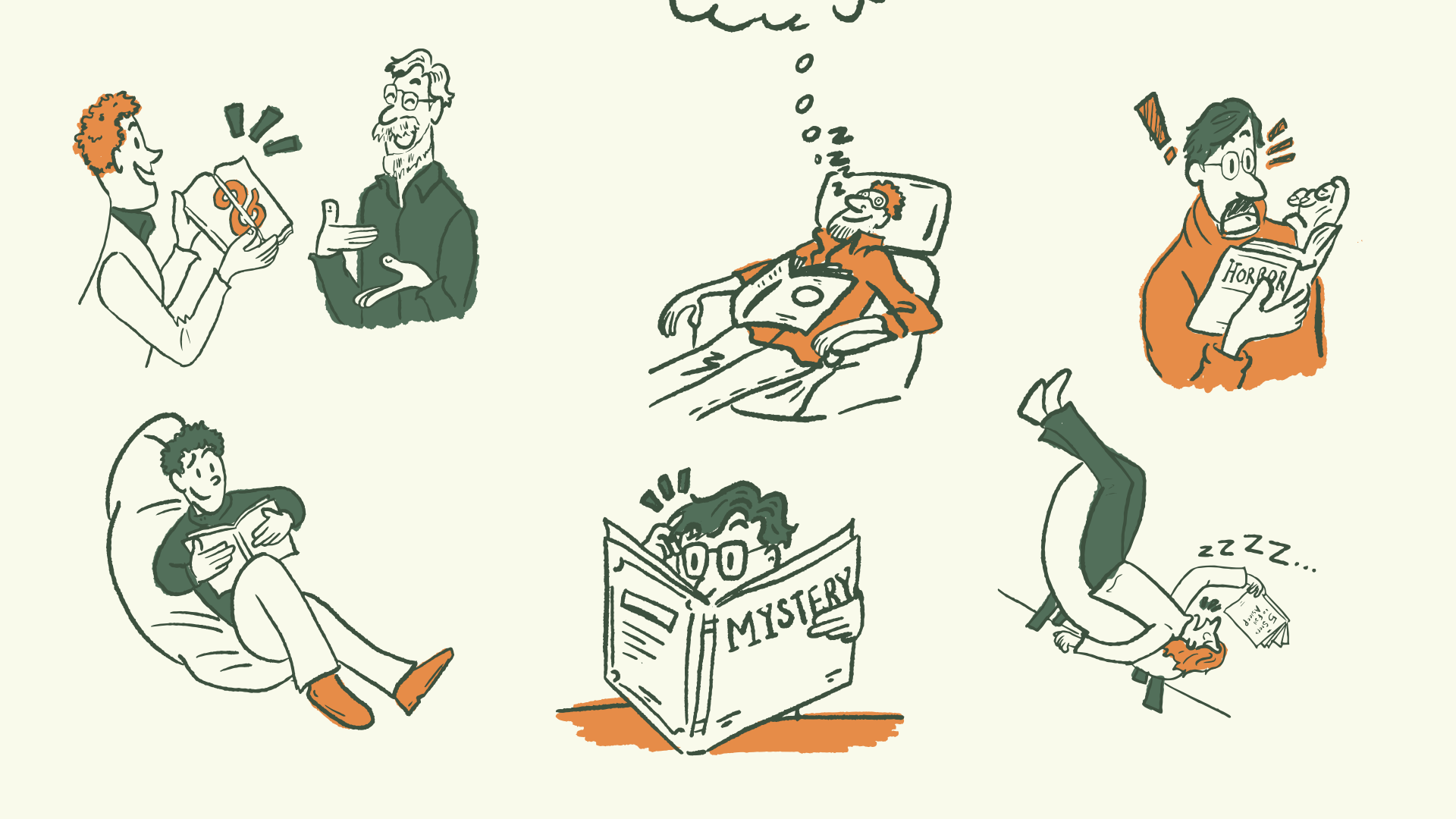
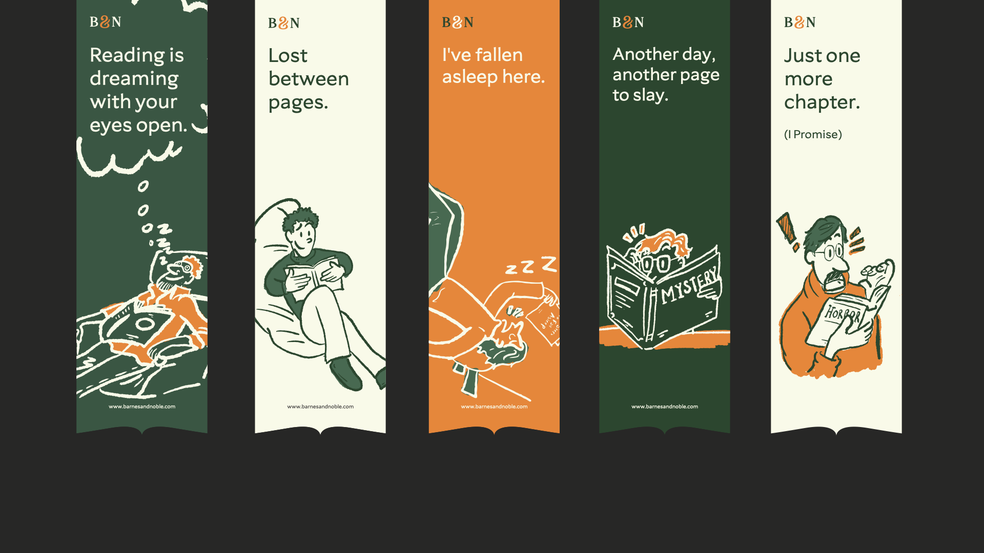
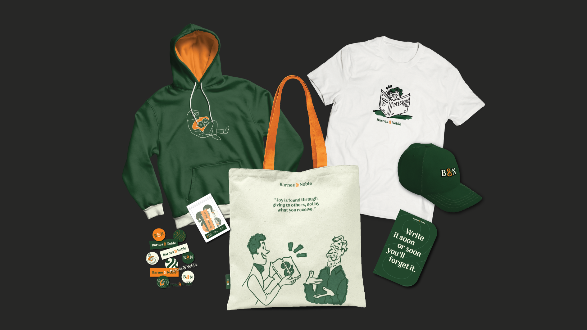
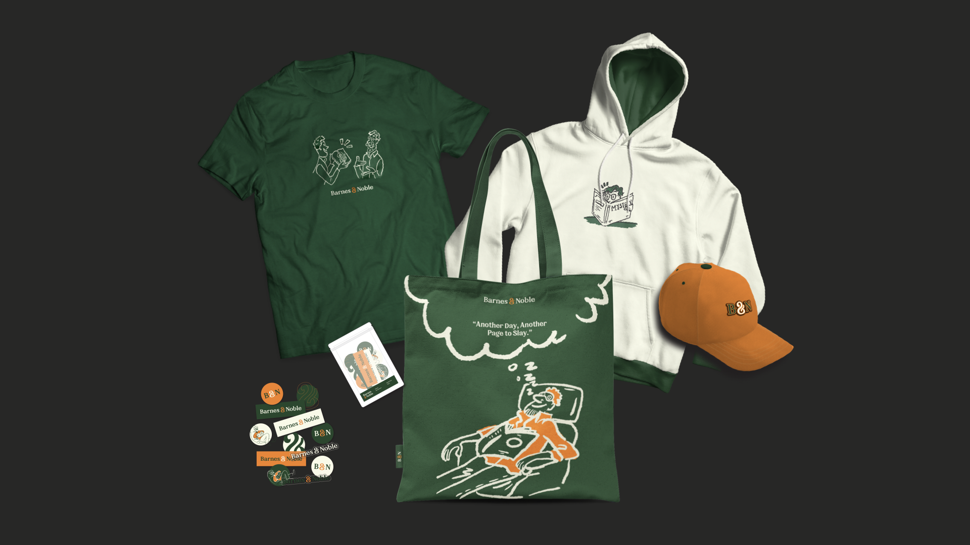
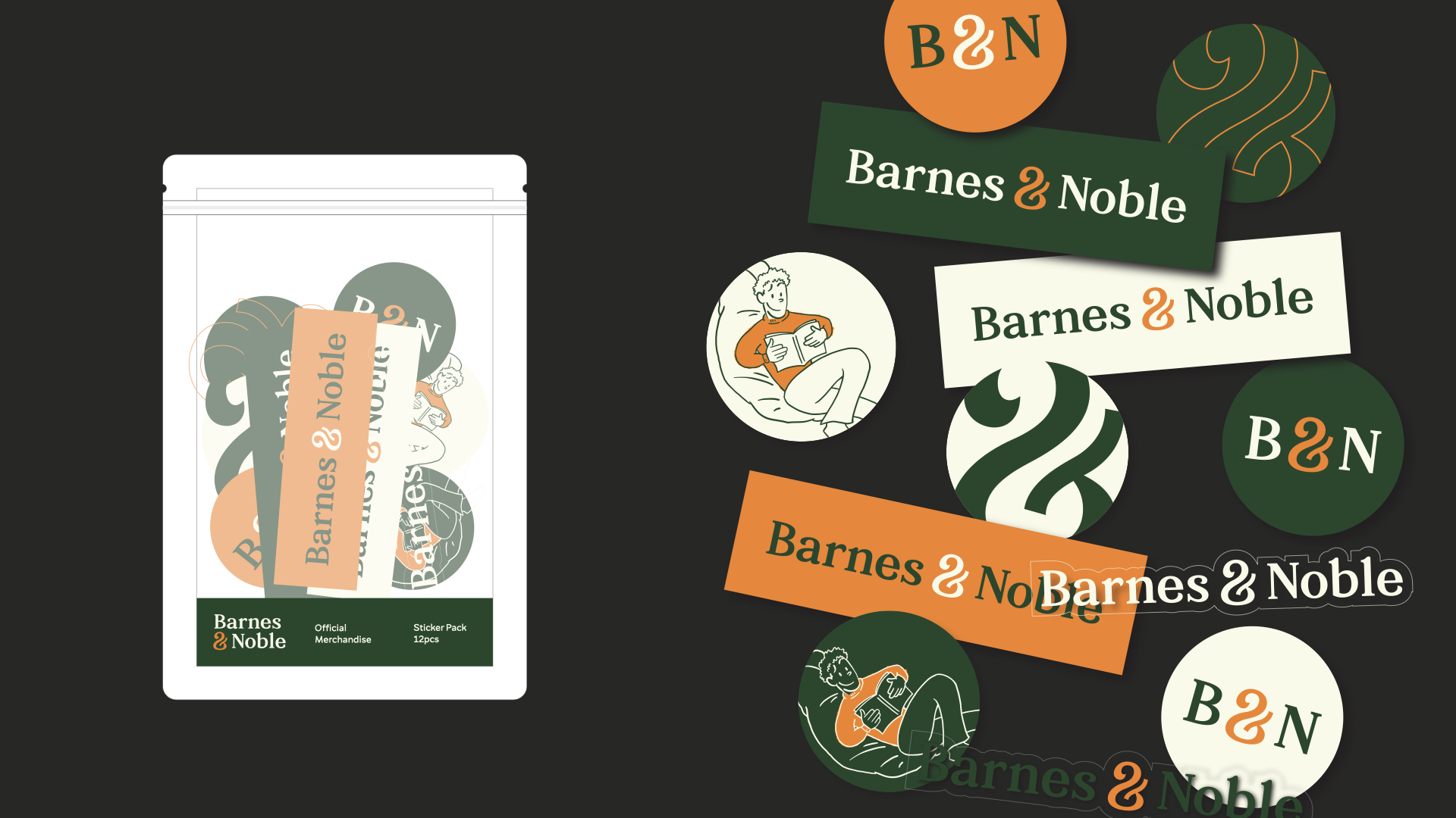
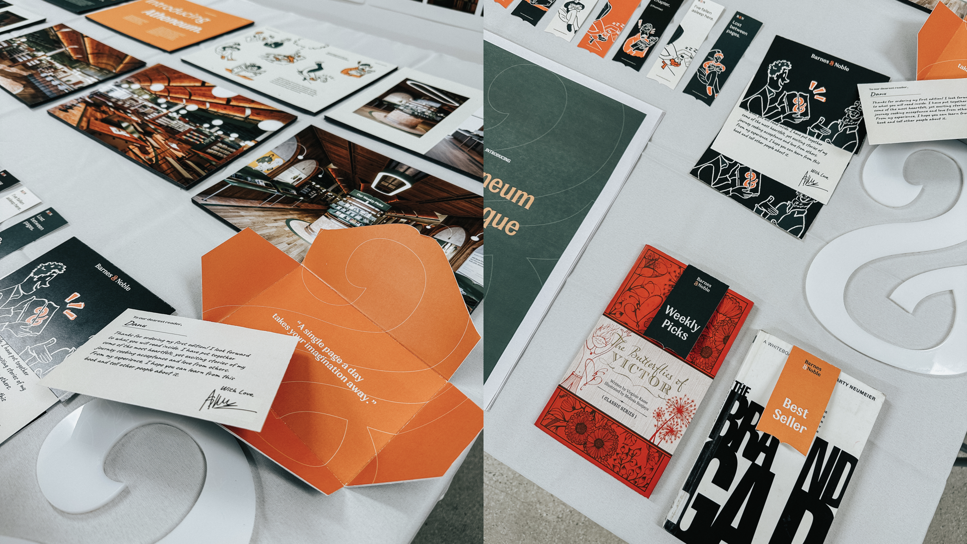
In order to better convey the brand expresssion, I'm developing a simple, hand-drawn illustrations that capture everyday moments of people reading books with different poses & emotions, we want to communicate a humble and relatable feeling when Barnes & Noble's customers see these illustrations.
Image
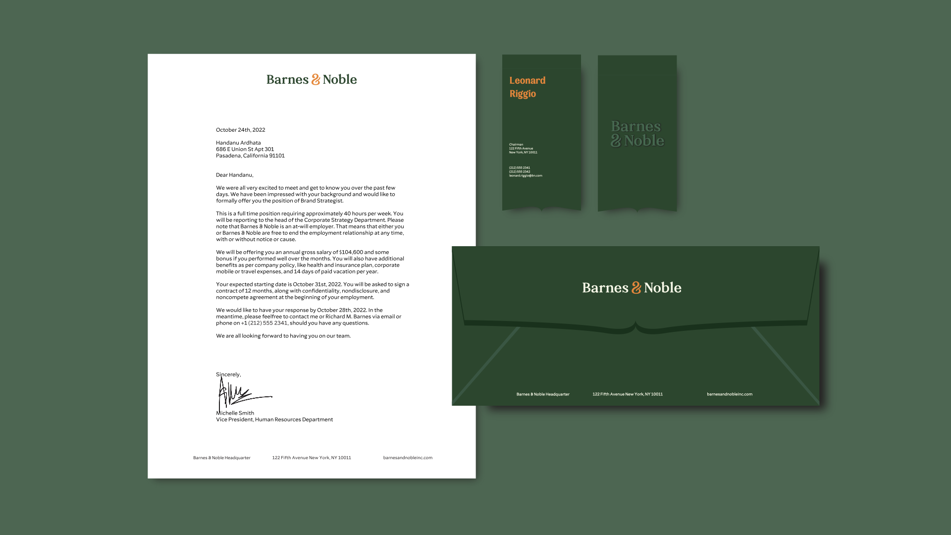
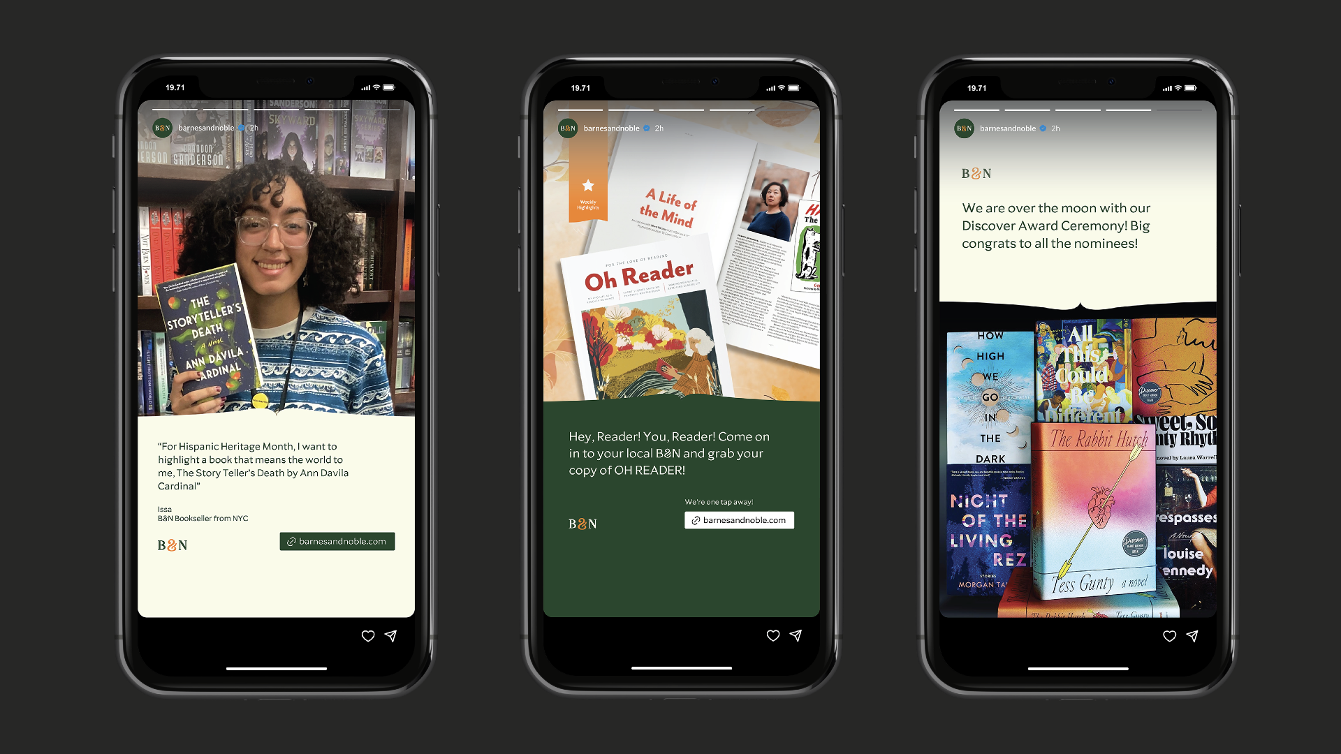
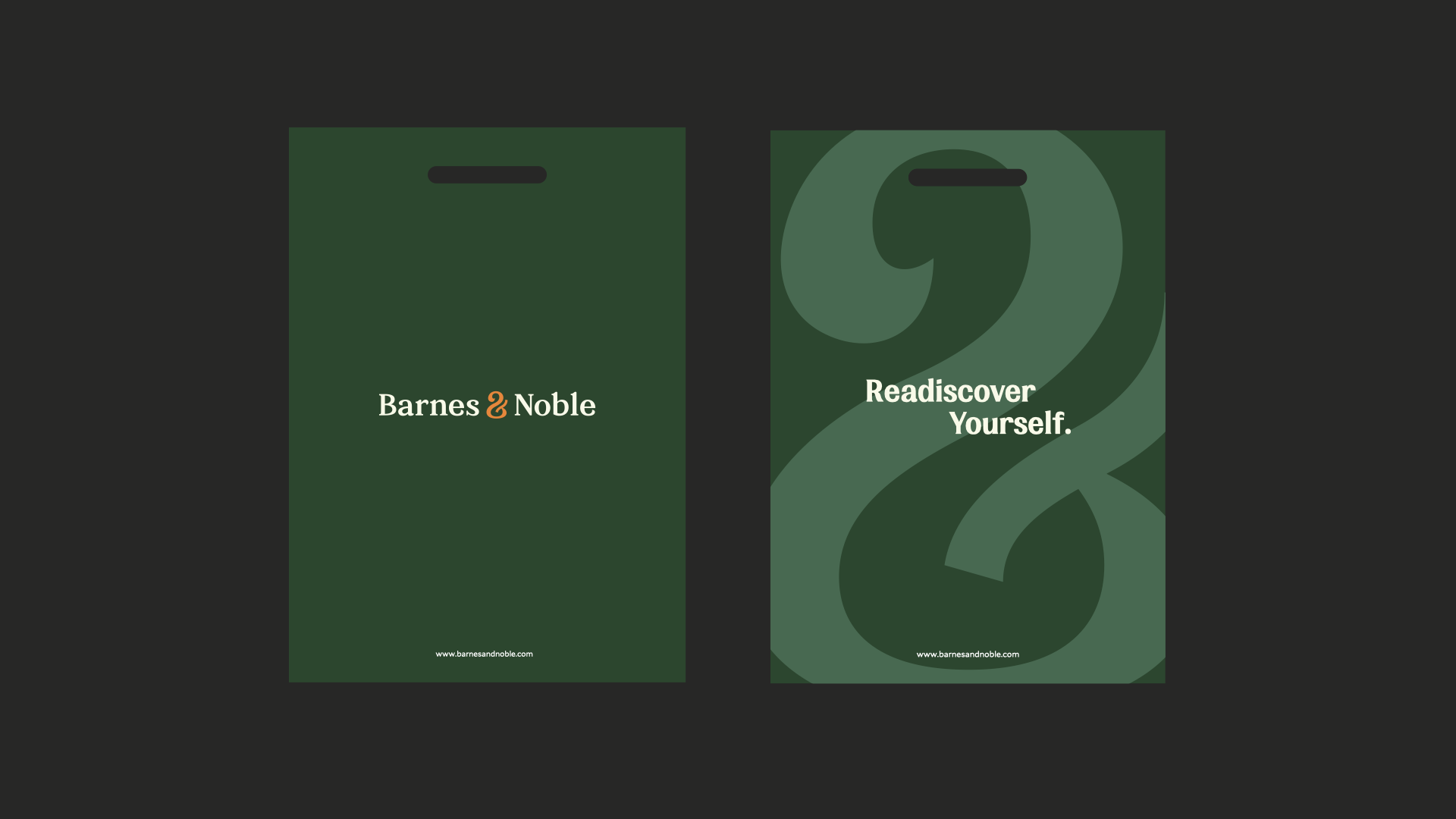
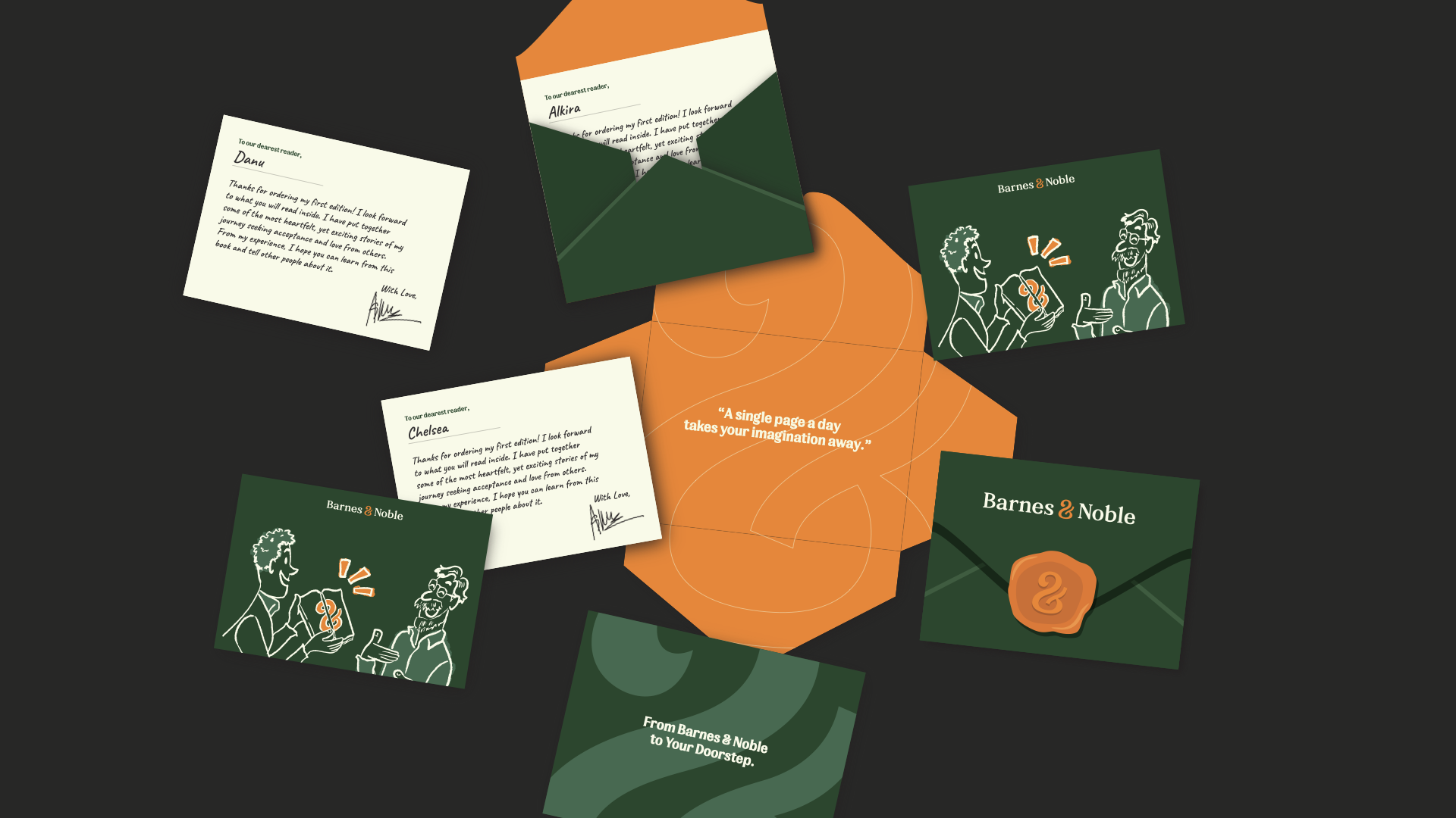
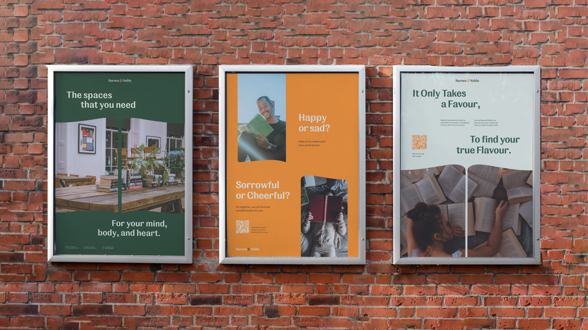
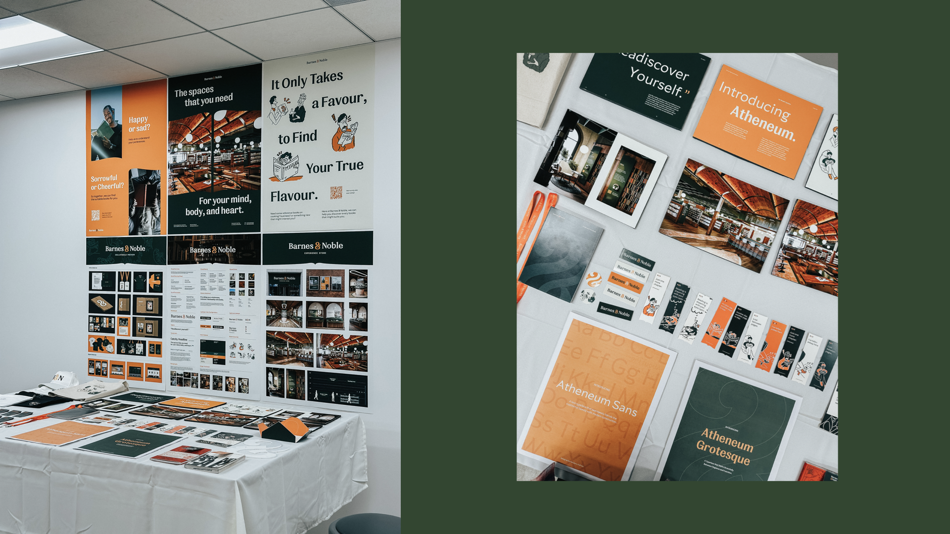
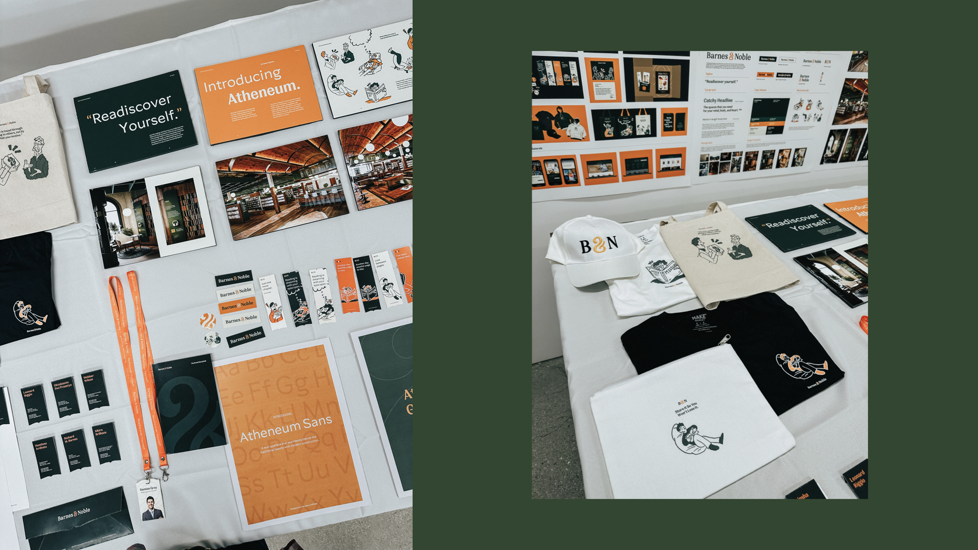
All of the designed printed collaterals were made to create a fragmented brand experience for Barnes & Noble's customers. Each touchpoint, external or internal, unconsciously constructs a brand image over users.
Image
Image
Image
Image
Image
Image
Image
Image
Image
Image
Image
Image
Image
Image
Image