BFA in Illustration - Motion Illustration — Illustration
Course:
Type 3
Faculty:
Meryl Pollen
Term:
2024 Spring
Typography Conference
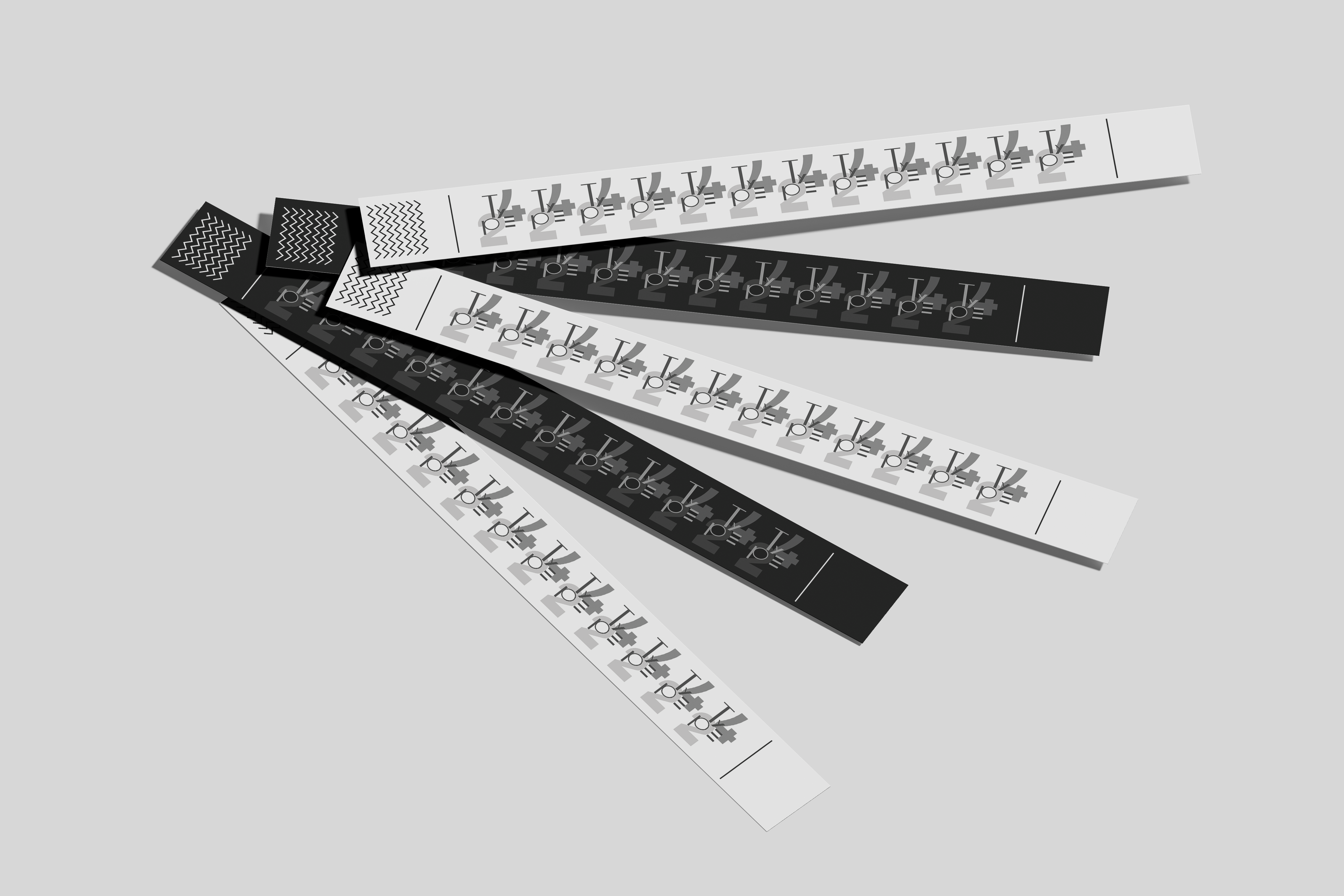
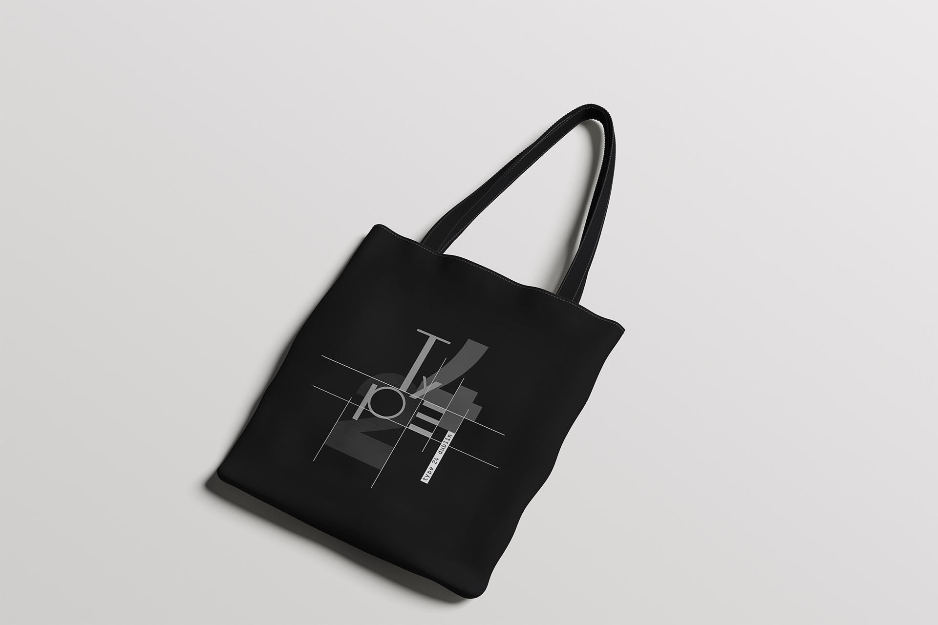
A brand identity for a hypothetical Typography Conference in Dublin. My intention throughout the identity was to view the letterform as a dynamic shape; a piece of art, by deconstructing the letterforms.
Process:
I used BC Mikser Bold for headers and BC Mikser regular for my body copy. I paired this with a custom type face for my logo. When looking for a type pairing I searched for a font with a good balance of structure and curvature to go with my logo. My intention was to draw attention to the curvature of the lettering and experimentation of typography, approaching it like a museum art piece. I used BC Mikser Bold for headers and BC Mikser regular for my body copy. I paired this with a custom type face for my logo. When looking for a type pairing I searched for a font with a good balance of structure and curvature to go with my logo. My intention was to draw attention to the curvature of the lettering and experimentation of typography, approaching it like a museum art piece.I used BC Mikser Bold for headers and BC Mikser regular for my body copy. I paired this with a custom type face for my logo. When looking for a type pairing I searched for a font with a good balance of structure and curvature to go with my logo. My intention was to draw attention to the curvature of the lettering and experimentation of typography, approaching it like a museum art piece.