Image
Final Lockup + Color I wanted to include more energy and spunk in the new lockup.
Image
black & white version
Image
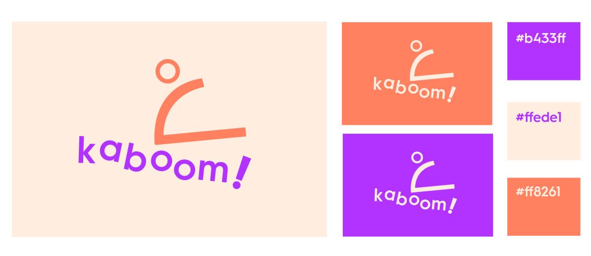
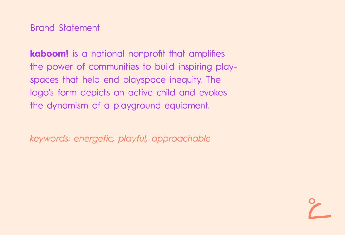
Color Rebrand The previous purple shade of Kaboom's logo felt a bit sterile and cold to me. To make it warmer, I paired a saturated purple for energy with a warm tan and salmon for approachability.
Image
Image
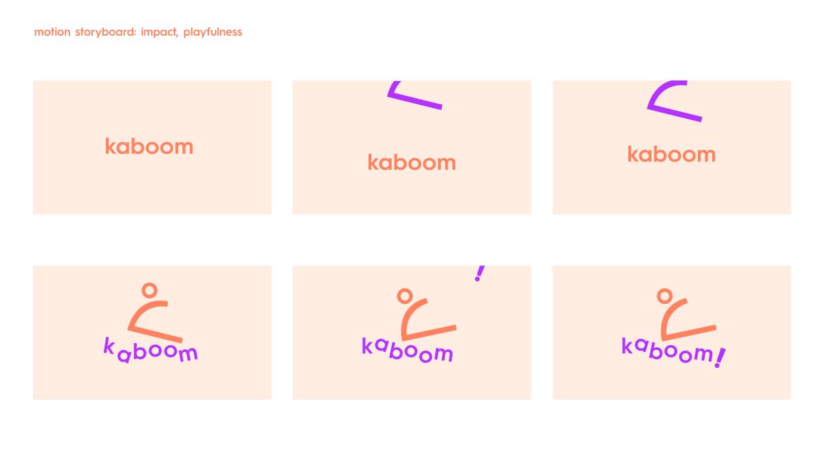
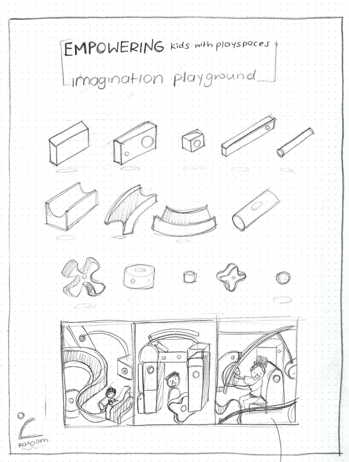
Continuing the theme of youth and energy, the motion storyboard also has a lot of impact and movement.
Image
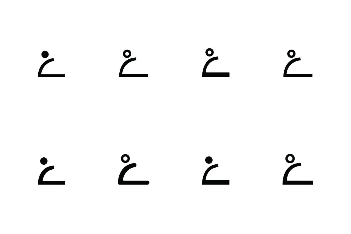
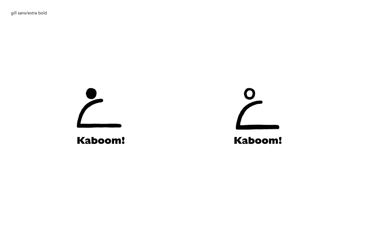
Logoform Variations
Image
Image
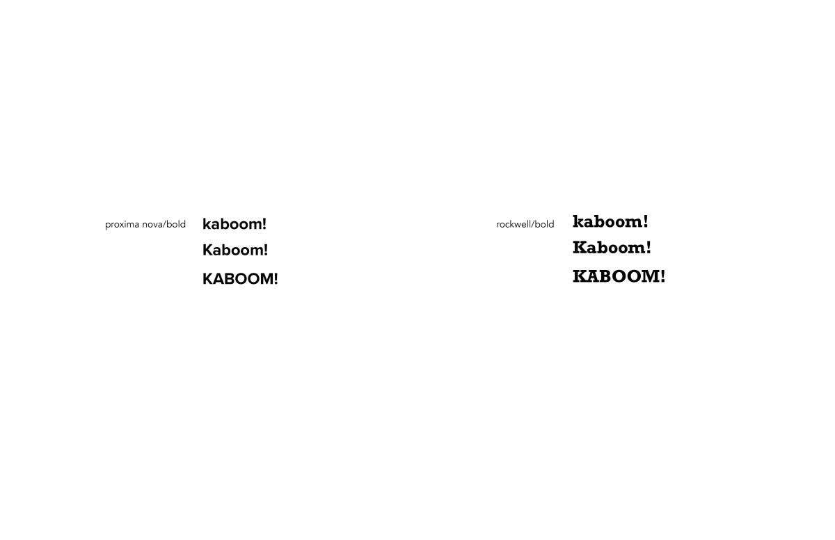
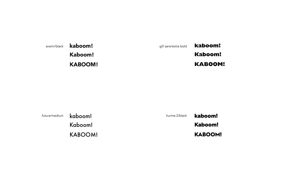
Typeface Exploration
Image
Image
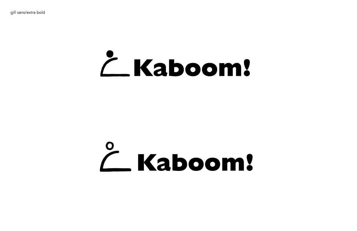
Lockup Exploration
Image
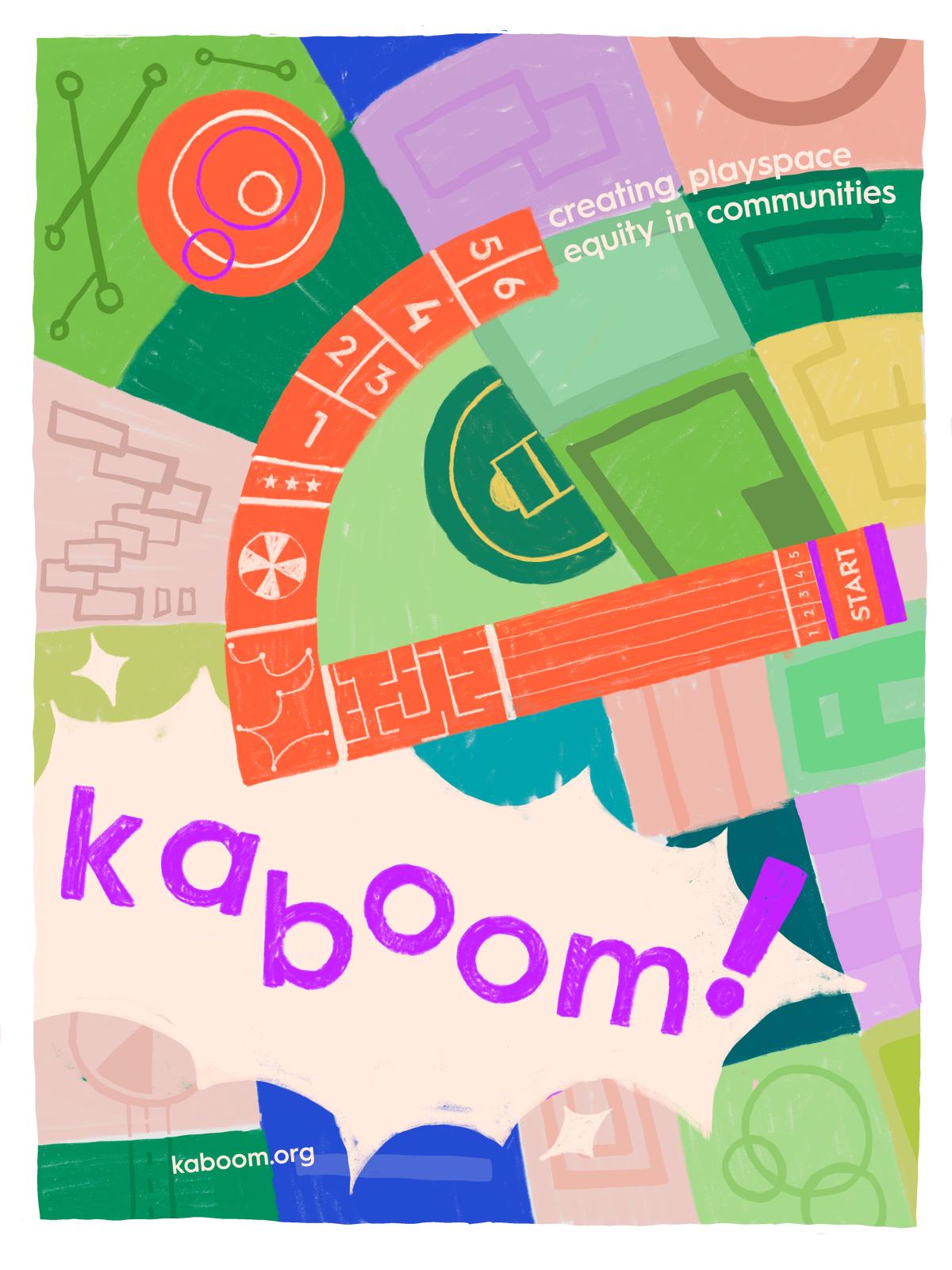
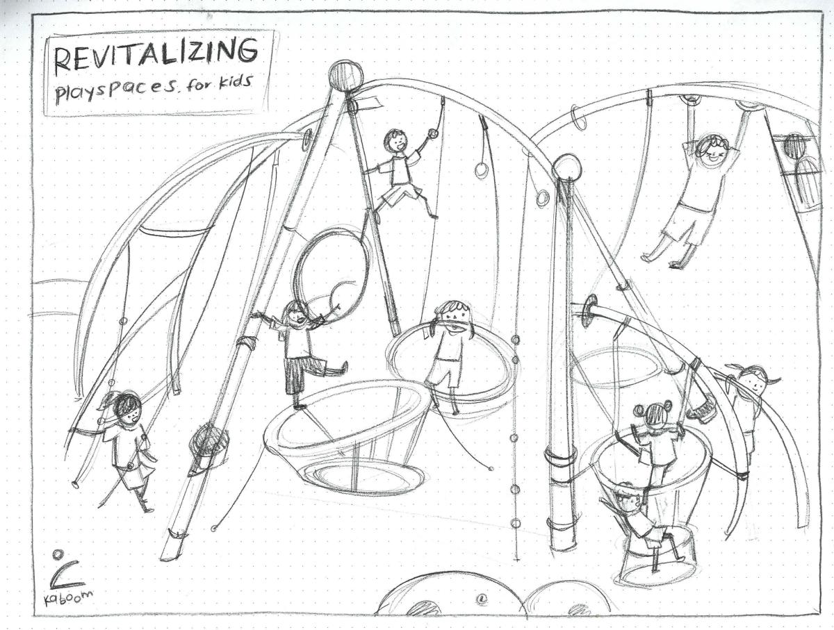
Final Kaboom Poster Initially, the poster was done completely digitally, with vectors. Because that looked too rigid and did not reflect the theme, I illustrated most parts of the poster by hand to give it a friendlier feel.
Image
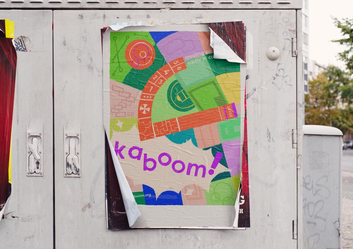
Poster Mockup
Image
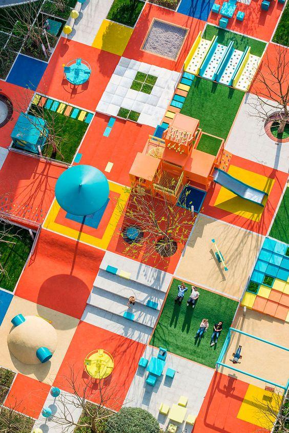
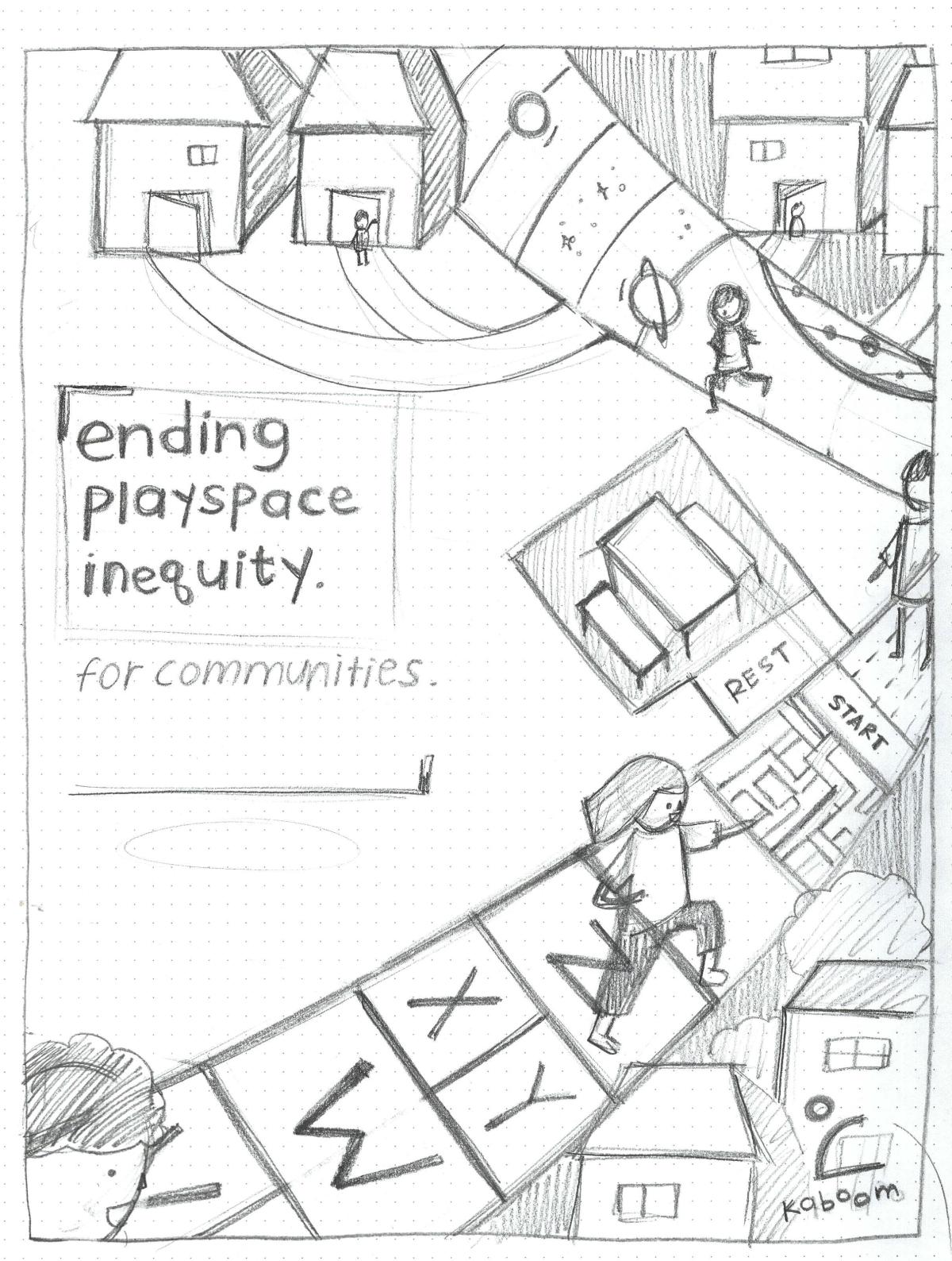
Upon research, I found some of Kaboom's previous community works. I used these as references for the poster.
Image
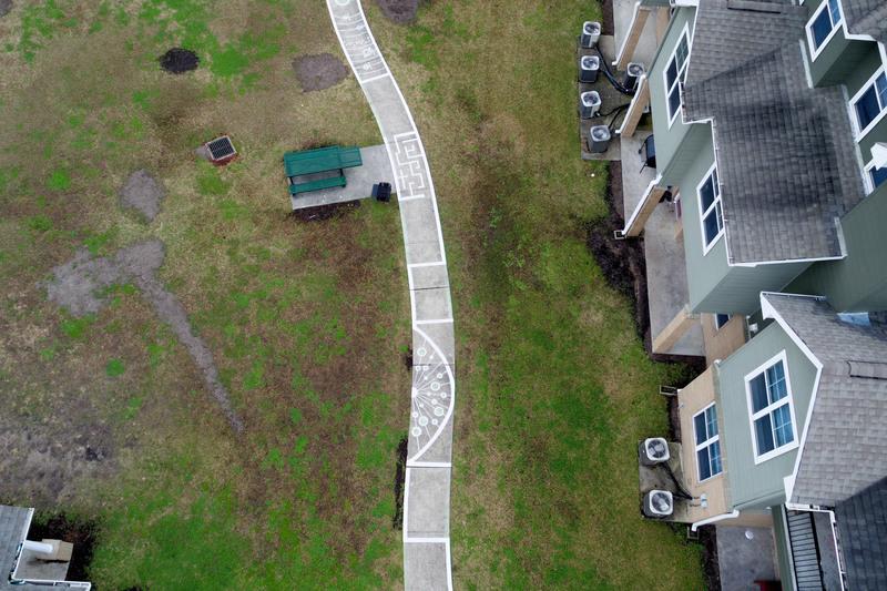
One that stood out to me was a street playground, painted on the pavement next to a small neighborhood. This made it more accessible for children in neighborhoods to play with each other without leaving too far away.
Image
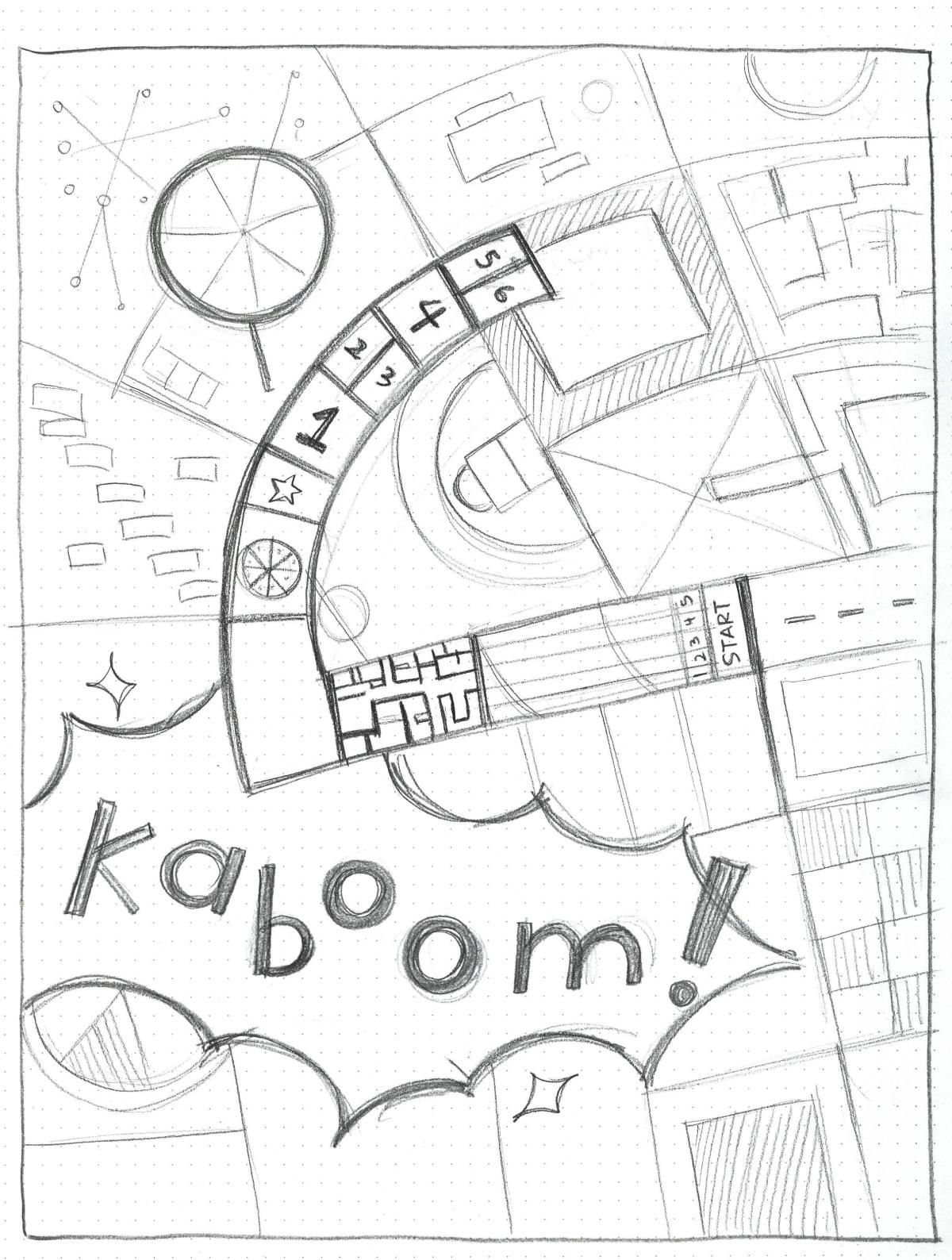
Poster Sketch
Image
Poster variation sketches
Image
Image