Image

Video file
Image
Logo: The new logo reflects the brand's values of warmth, freshness, and joyful companionship. The soft, rounded typography, called Doughy, creates a friendly feel that matches the brand's focus on healthy, human-grade pet food. The illustrated character adds a playful and personal touch. The bold form of logo works both in digital and physical applications.
Image
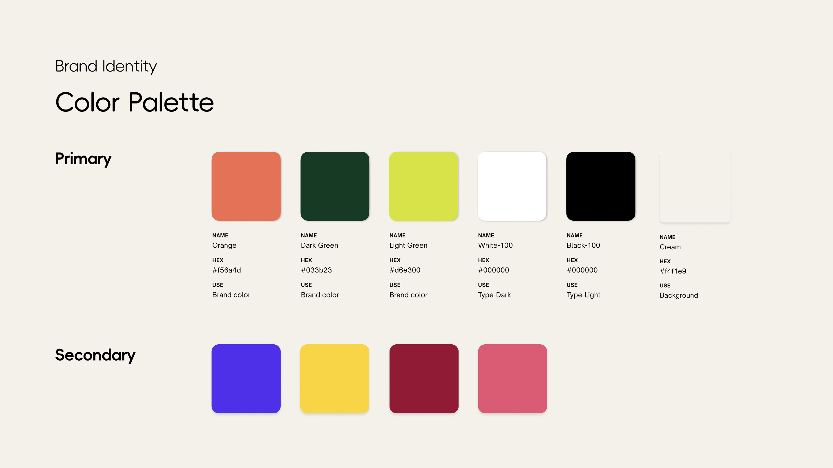
Color Palette: The Farmer’s color palette features orange and green as primary hues, complemented by secondary tones of warm pink and yellow. Inspired by the natural colors of fresh meat and produce, the palette conveys vitality and health while creating a contemporary aesthetic that balances freshness with urban sophistication.
Image
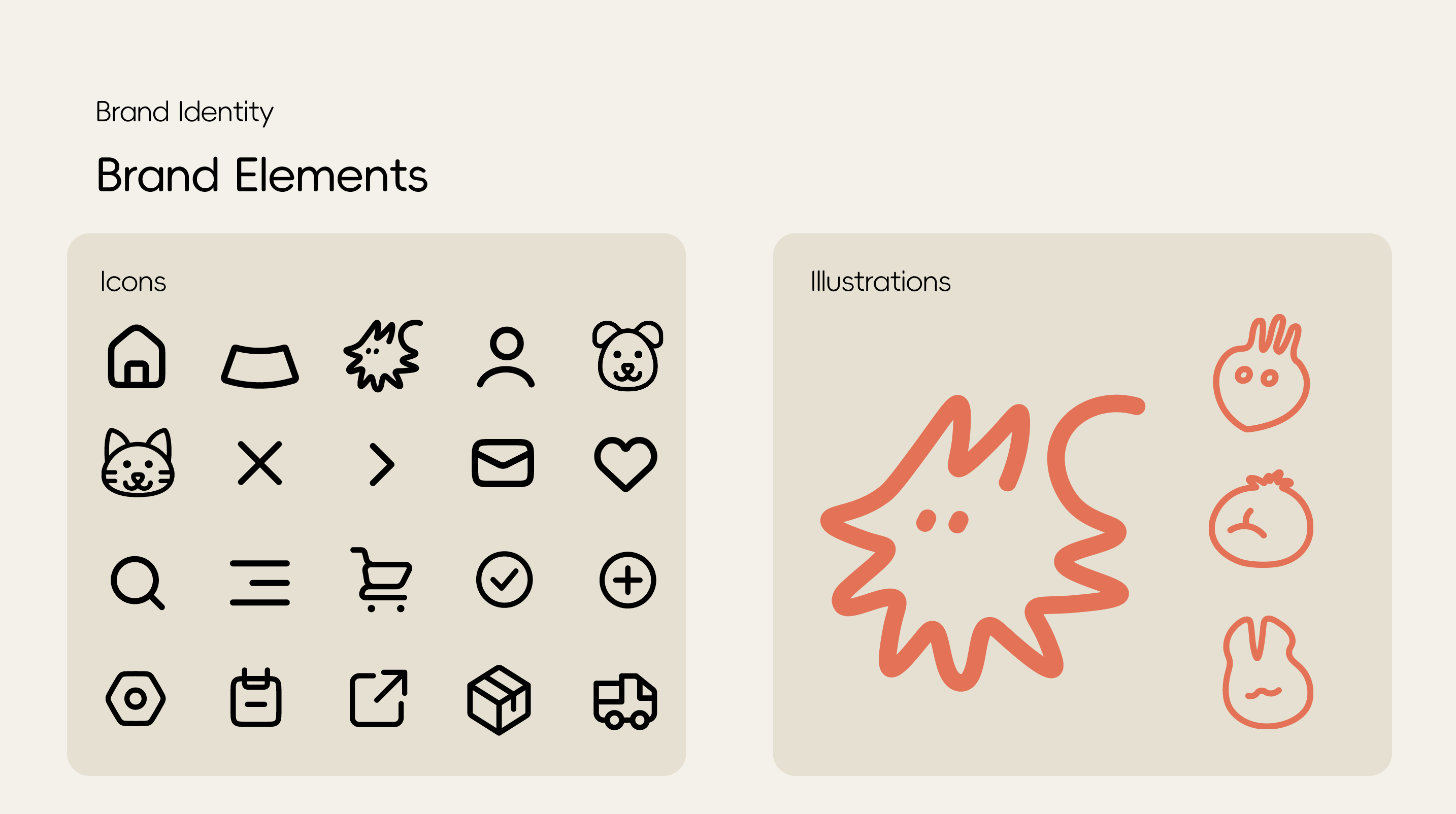
Brand elements: The brand elements feature line illustrations that reflect the brand’s natural, healthy, and approachable personality.
Image

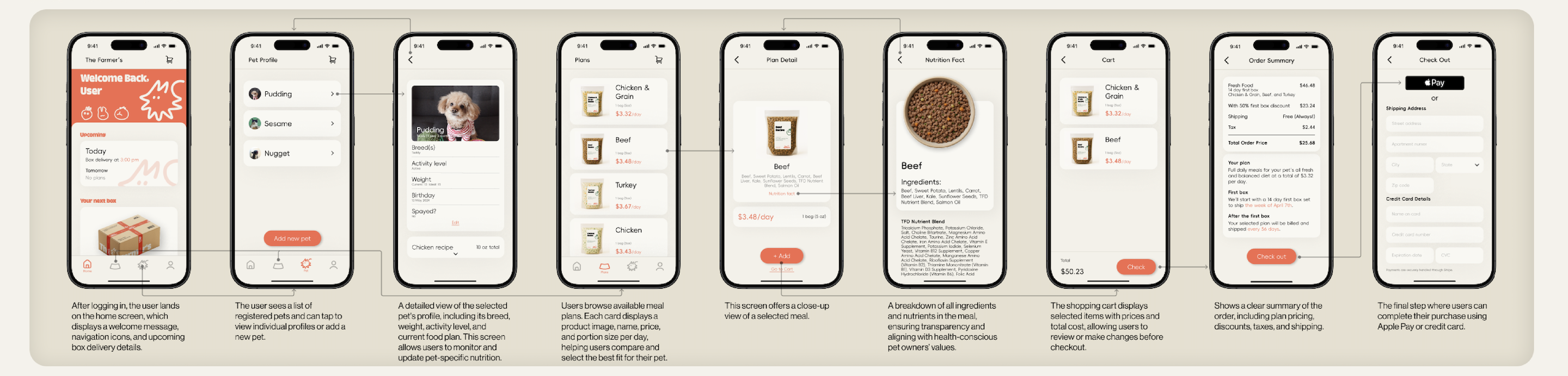
UI Components: The UI components adopt a relaxed, flat design style that feels clean, intuitive, and easy to navigate. The interface supports quick interactions suited to modern, fast-paced lifestyles.
Image
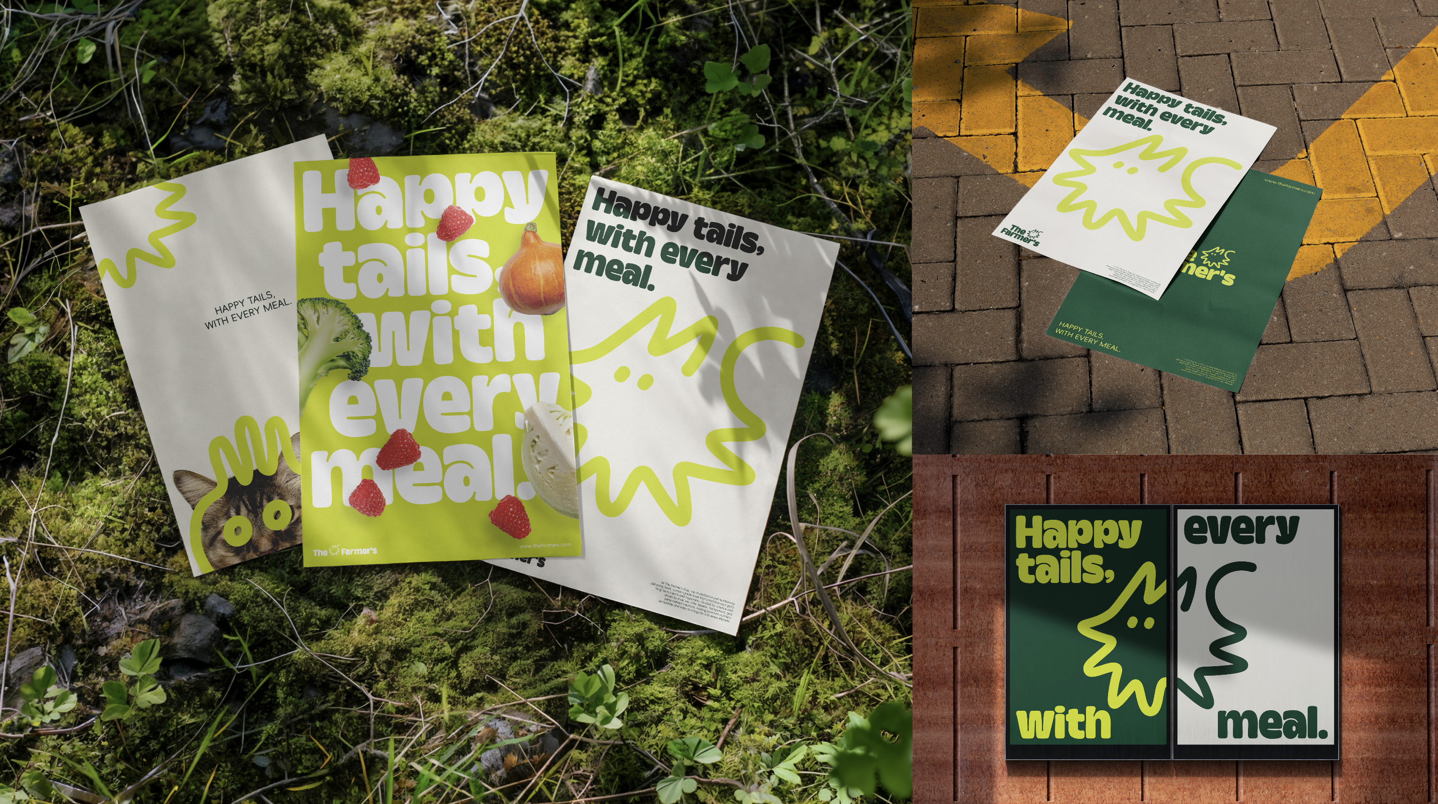
Posters: The Farmer’s poster design continues the brand’s primary orange and green palette, combining hand-drawn animal illustrations with fresh produce imagery. The overall style is bright and lively, expressing a sense of health and energy.
Image
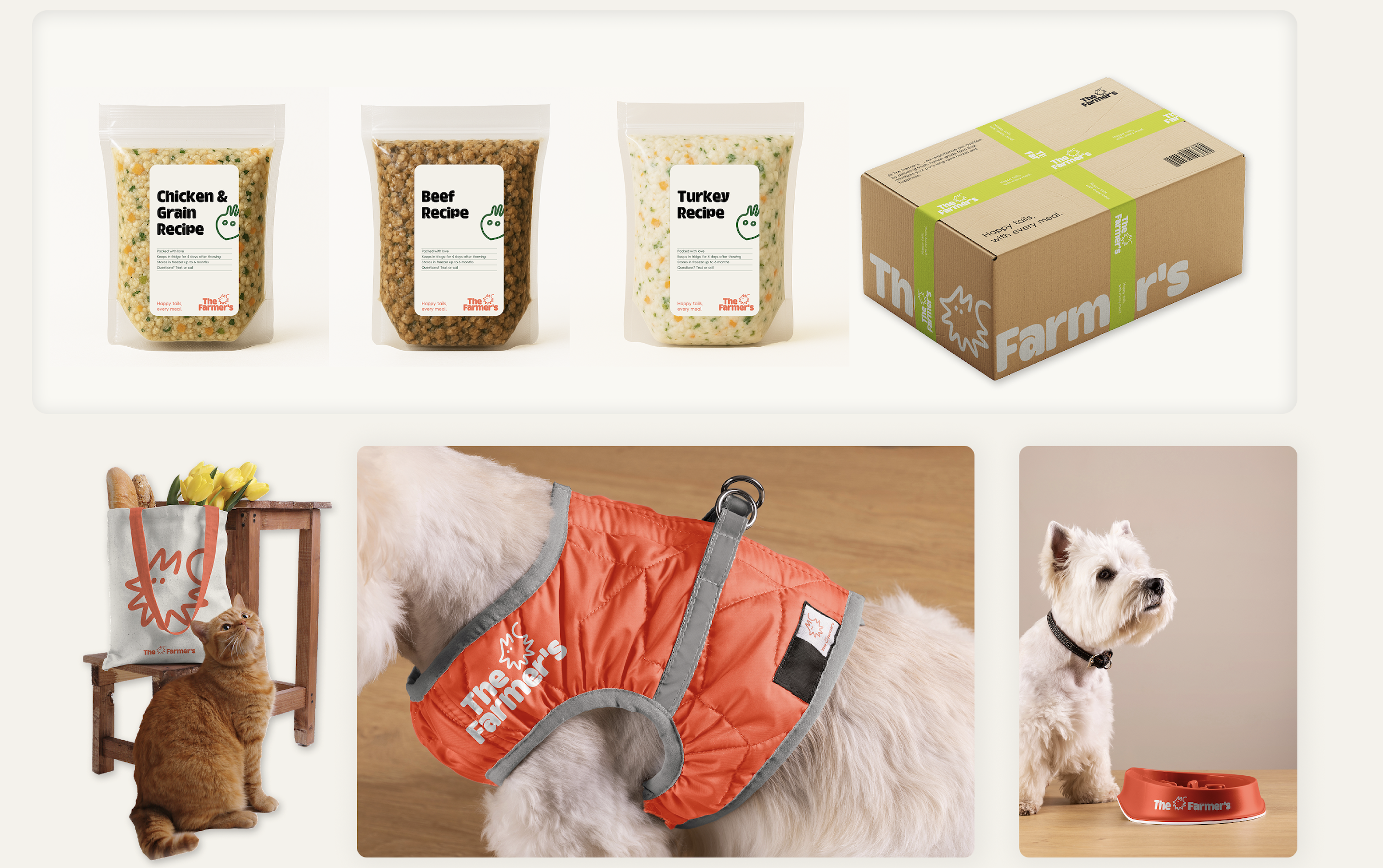
Application: Alongside the redesigned packaging, The Farmer’s also introduced a series of pet-related accessories to extend the brand experience. These everyday items enhance the sense of lifestyle and emotional connection between pets and their owners, creating a more holistic brand identity.
Image
User Scenario1: Jenny opens The Farmer’s app and logs in to her account. She completes a short survey about her dog Pumpkin, reviews the suggested meal plan, and places an order. After the purchase, she lands on the homepage where she can view delivery details. Later, she decides to update Pumpkin’s birthday in the profile and check the recommended recipe.