Image
Image
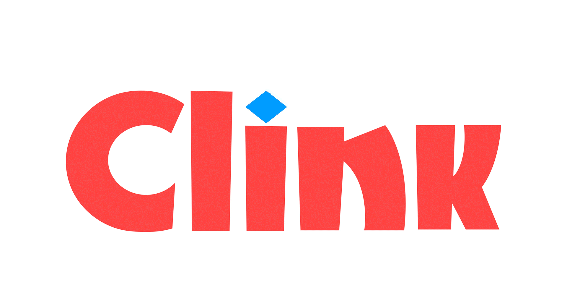
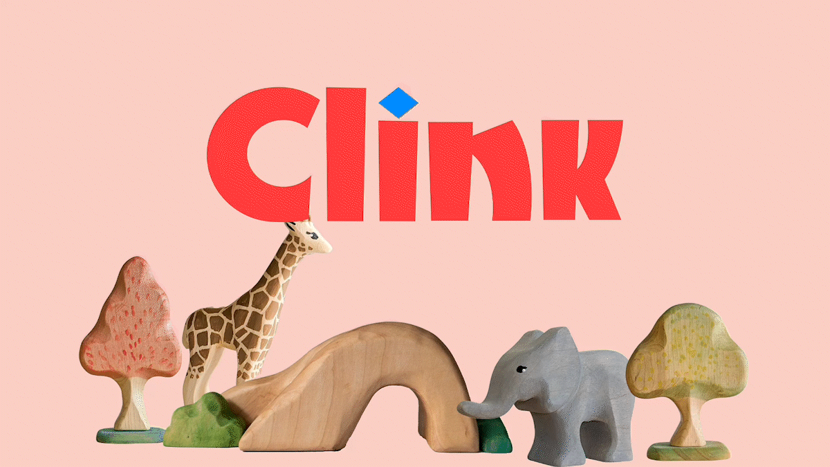
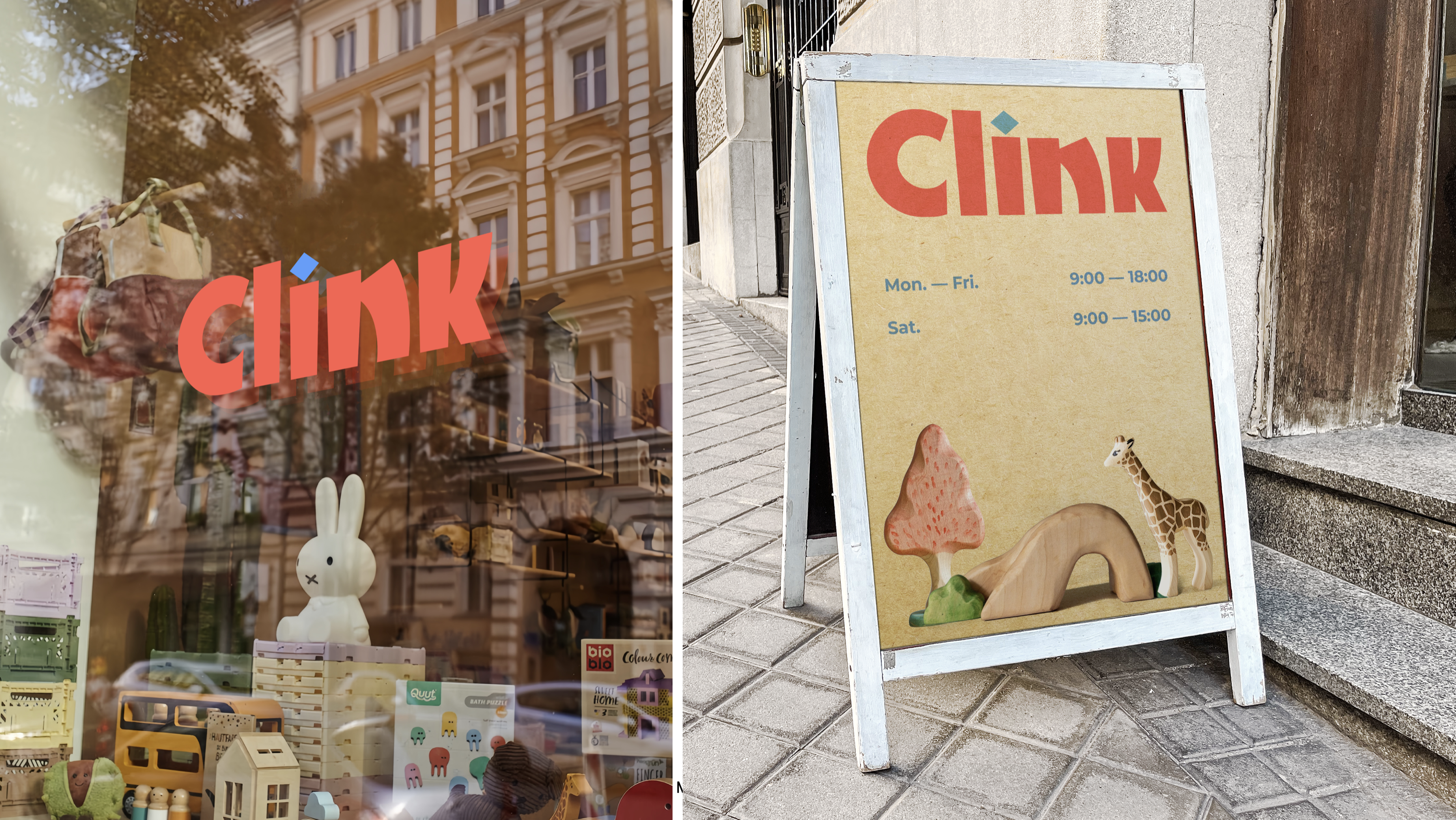
The name Clink was created to evoke a sense of playfulness, inspired by the sound of toys clinking together. The rounded letterforms give the logo a friendly and approachable look, while the transformation of the dot above the "i" into different toy shapes allows for dynamic usage across various contexts, keeping the brand lively and interactive.
Image
Image
Image
Image
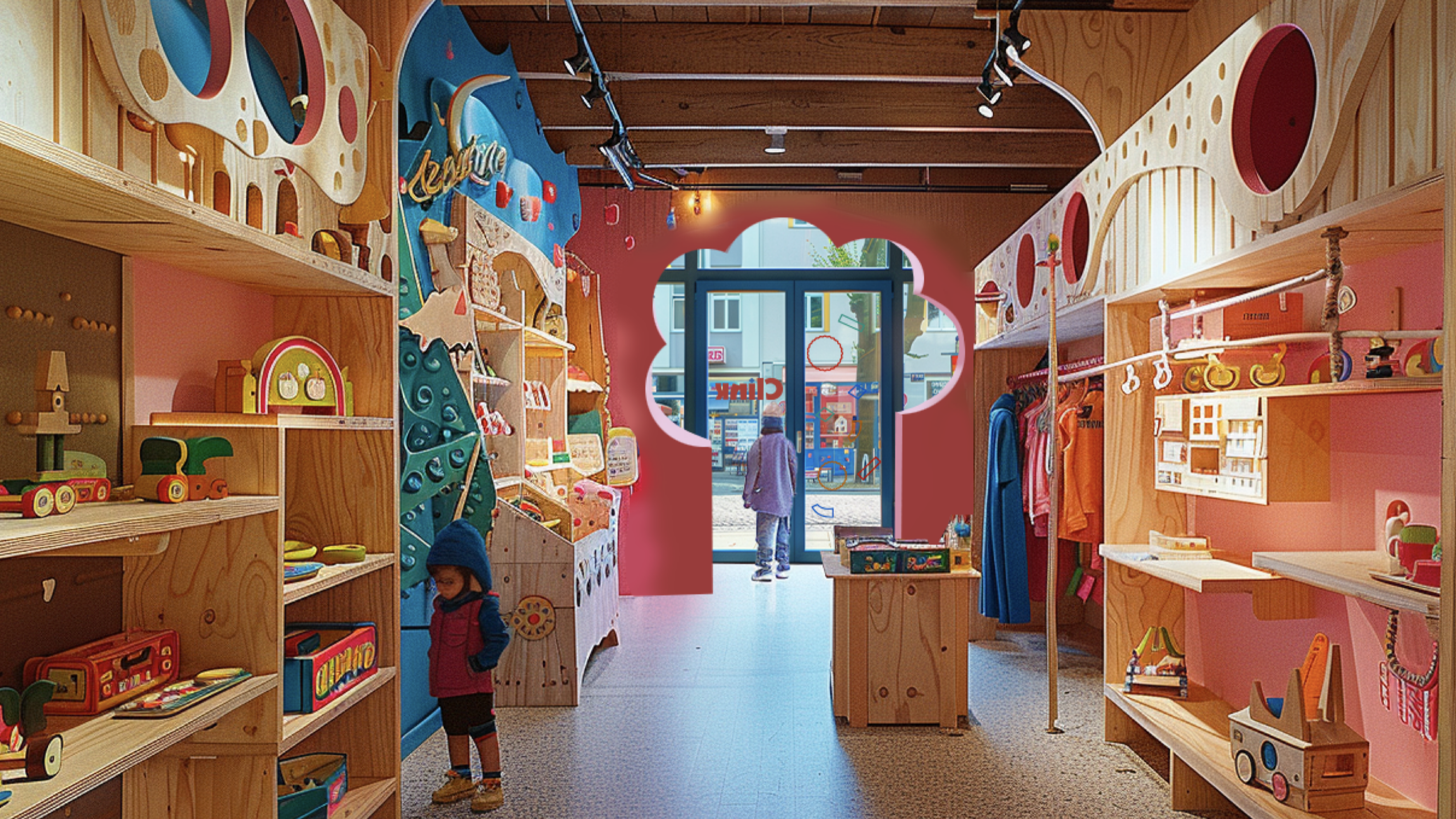
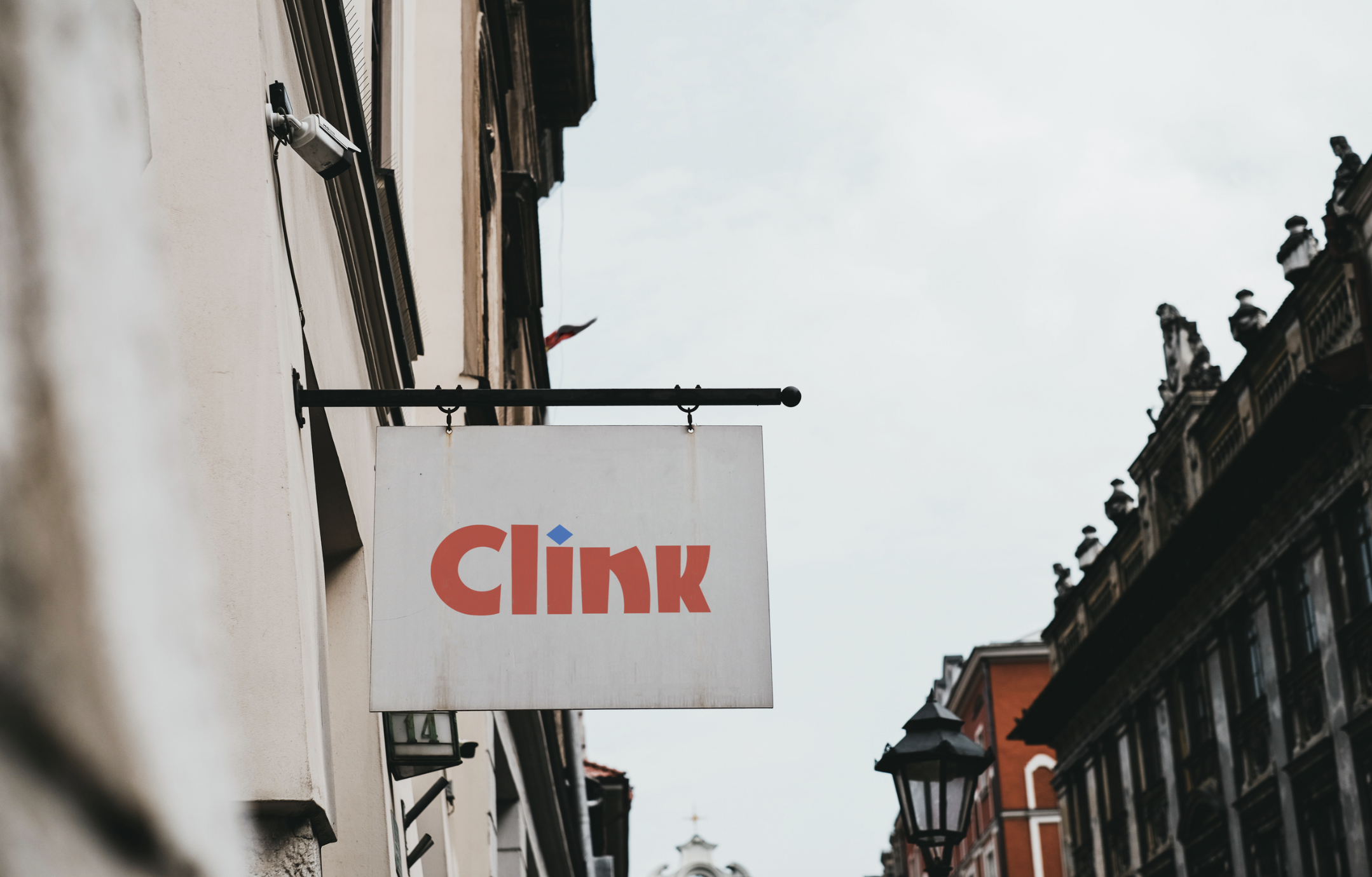
I used Midjourney to bring this imaginary store concept to life. I crafted a detailed prompt to capture its essence and atmosphere. The prompt also included details like a child’s curious gaze, high-definition color, and a ground-level perspective, which work together to evoke a warm, inviting space for children and parents alike. This approach allowed me to create a vivid visual that effectively communicates Clink’s brand identity in a way that traditional mockups might not capture.
Image
Image
Image
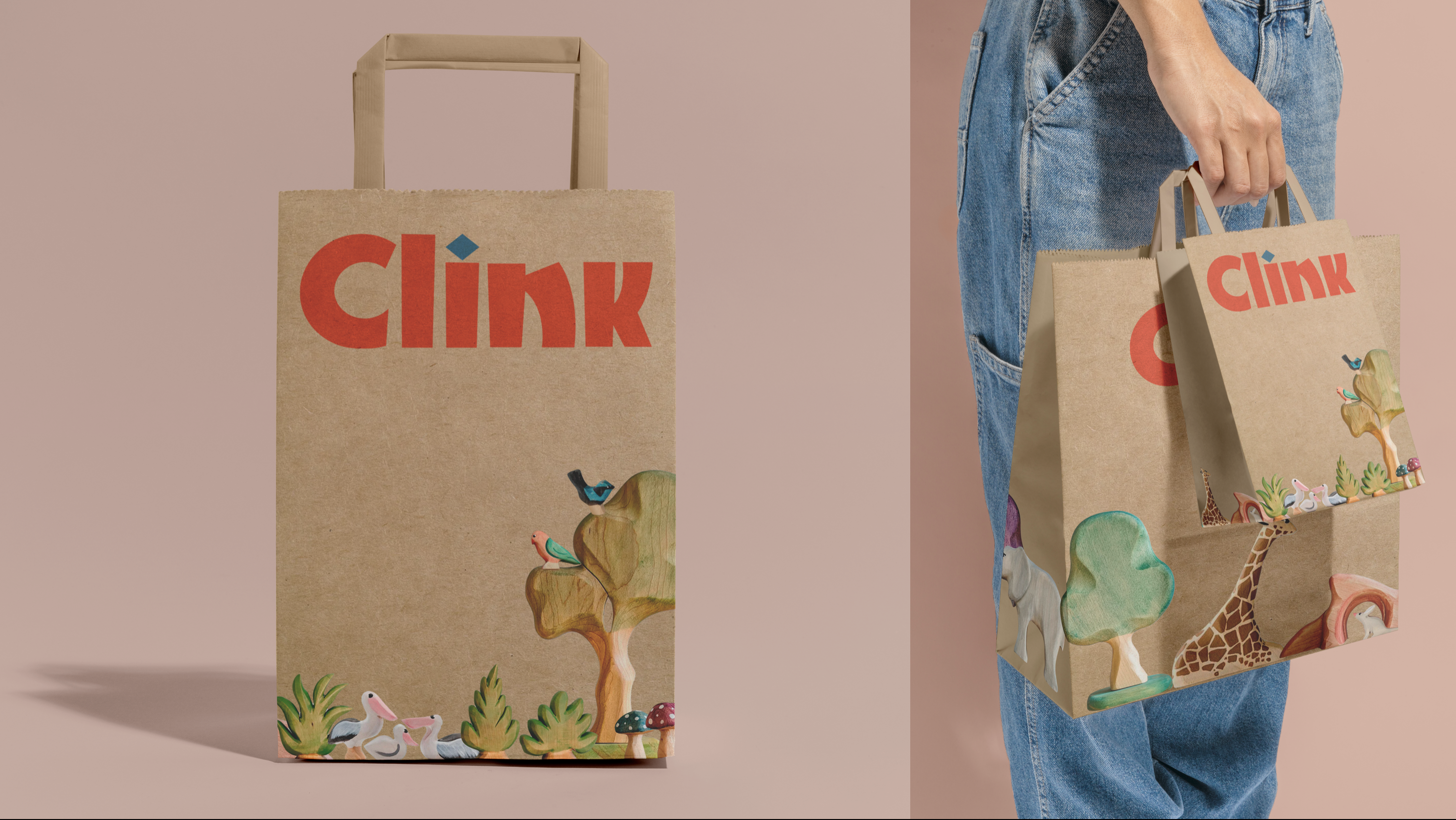
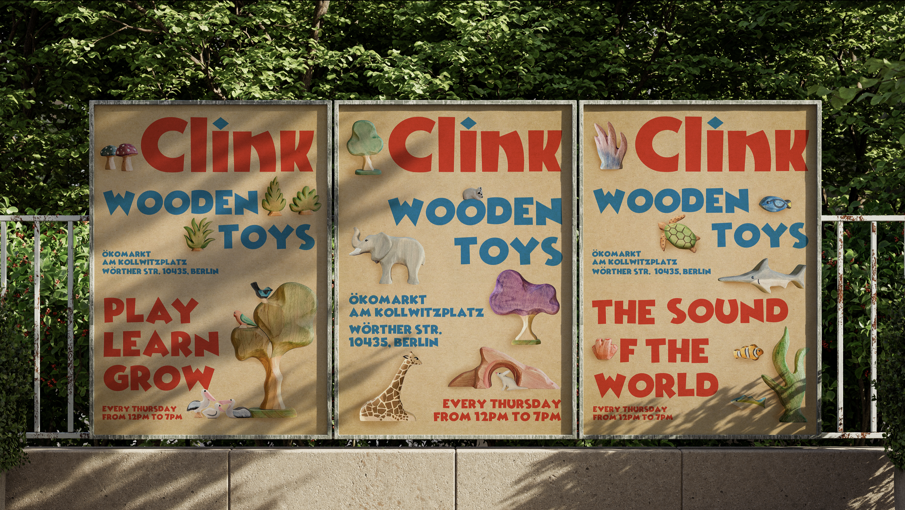
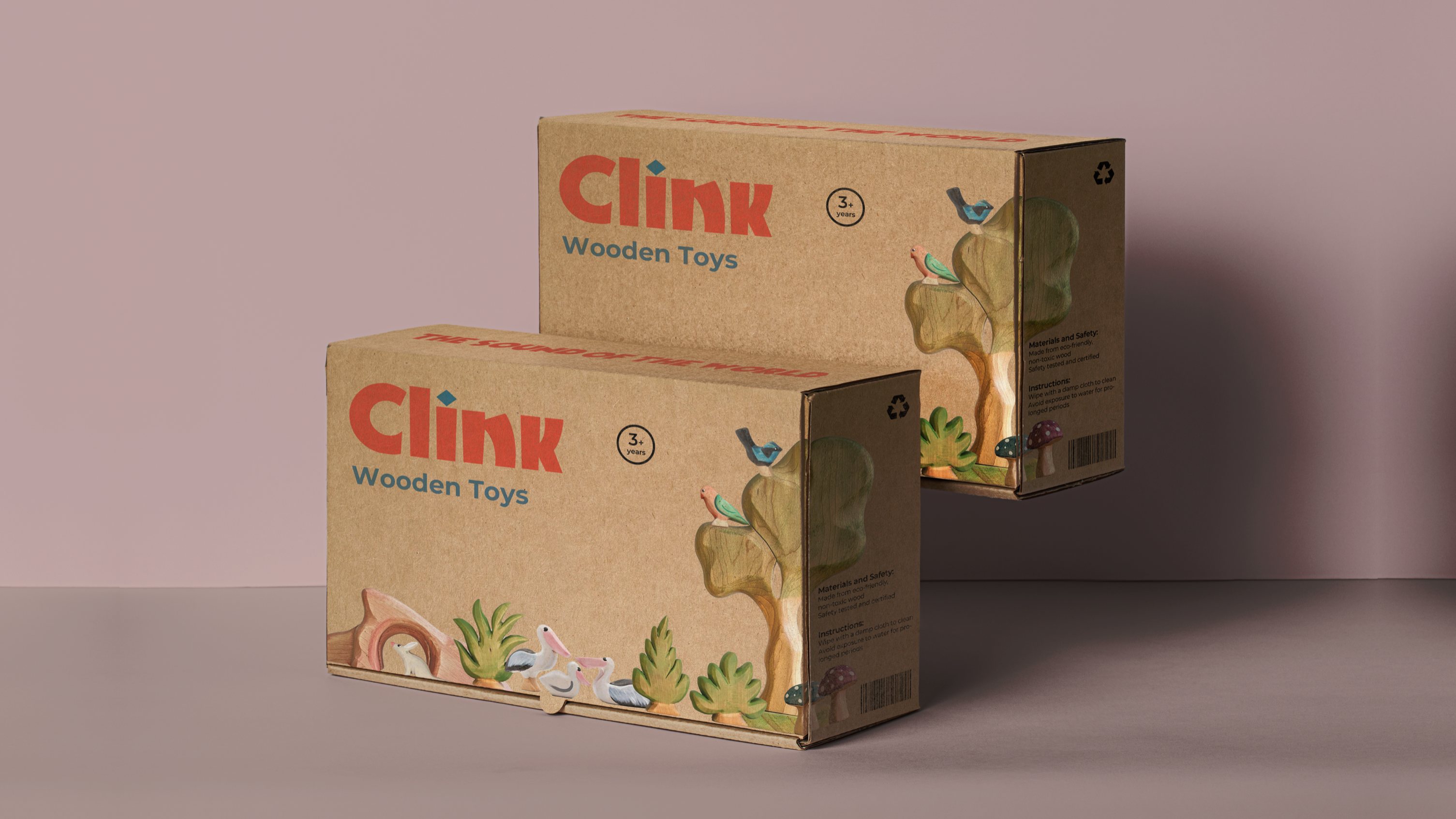
I used kraft paper for the packaging to reflect the natural, eco-friendly materials of the wooden toys. The packaging features real toy patterns, emphasizing the handmade craftsmanship and authenticity of each product. This design approach reinforces the brand’s commitment to sustainability and the timeless appeal of traditional wooden toys.