Graduates

Greta Long

MFA in Graphic Design - 3 Yr Path — Graduate Graphic Design
Course:
GPKG-202 Package Design 1: Design Principles
Faculty:
Daniel Hoy

Sesha

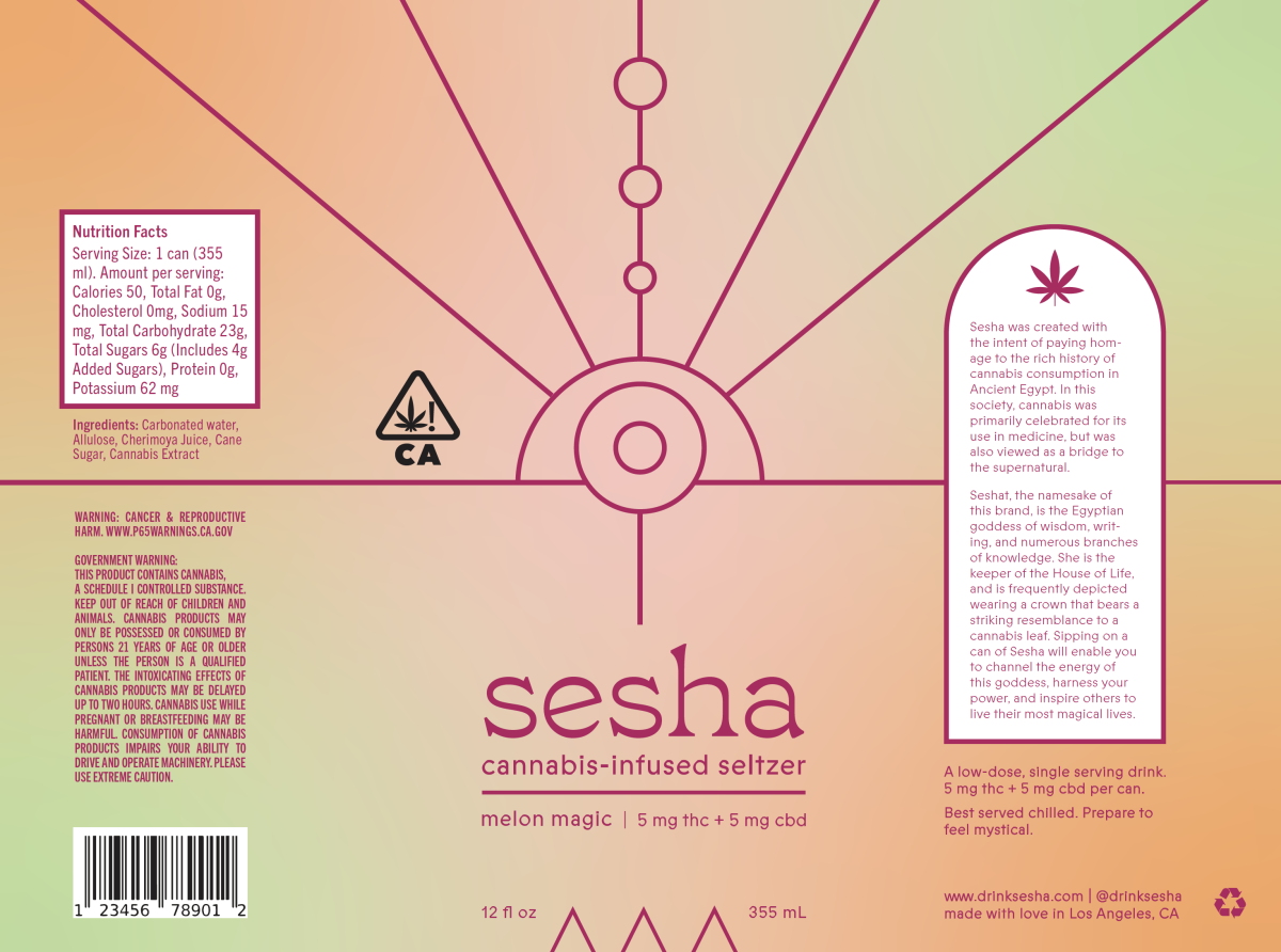
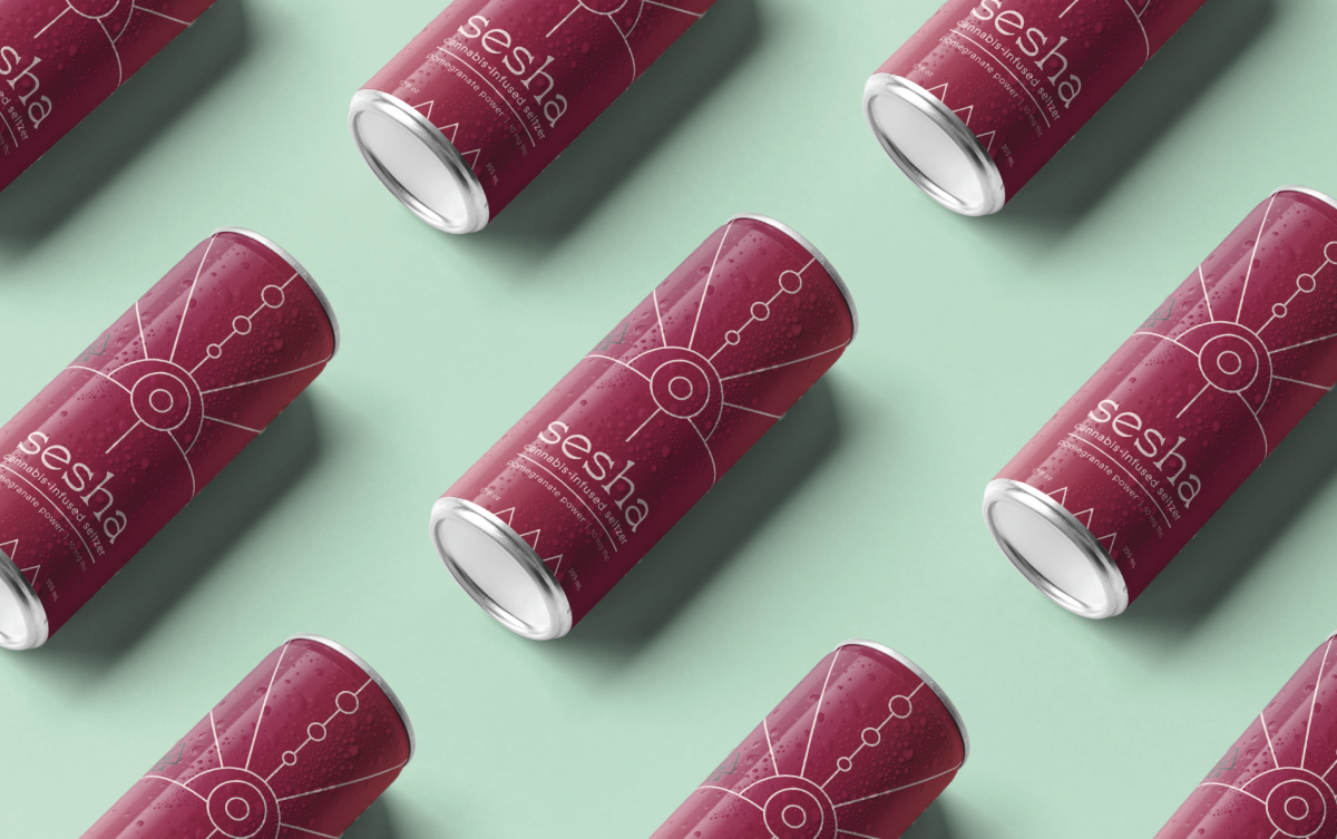
For my final project, I’ve created packaging designs for cannabis-infused seltzer. My hypothetical brand and product line is inspired by the rich history of cannabis consumption in ancient Egypt. In this culture, cannabis played a big role in the practice of obstetrics and midwifery, which was largely the domain of women. These healing modalities were intertwined with ceremonial magic, often in the form of spell-setting and incantations. I tried to convey the medicinal and the magical.
Learning Outcomes:
I learned a lot about the history of cannabis consumption in Ancient Egypt, the legal copy involved in creating cannabis packaging, and the rise in popularity / demand of cannabis-infused beverages today.
Image
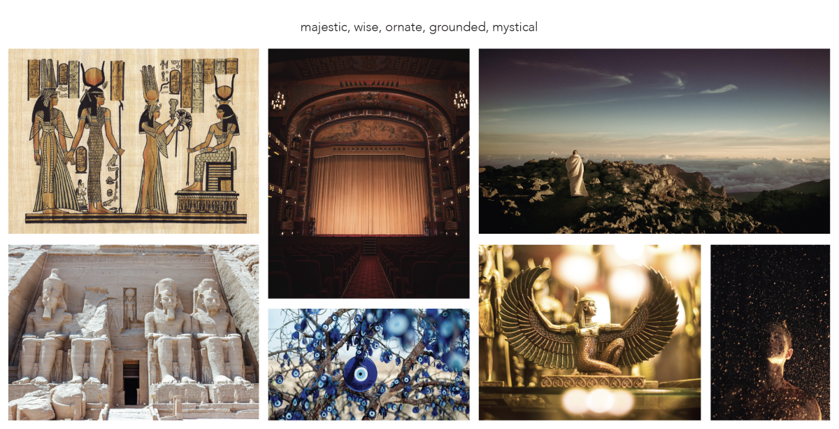
5 key words that informed the project
Image
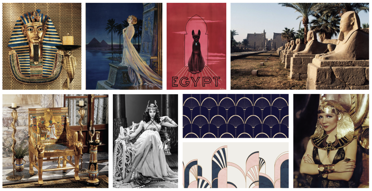
Moodboard - Inspired by metallics, navy blue, Cleopatra, and Egyptian Revival styles
Image
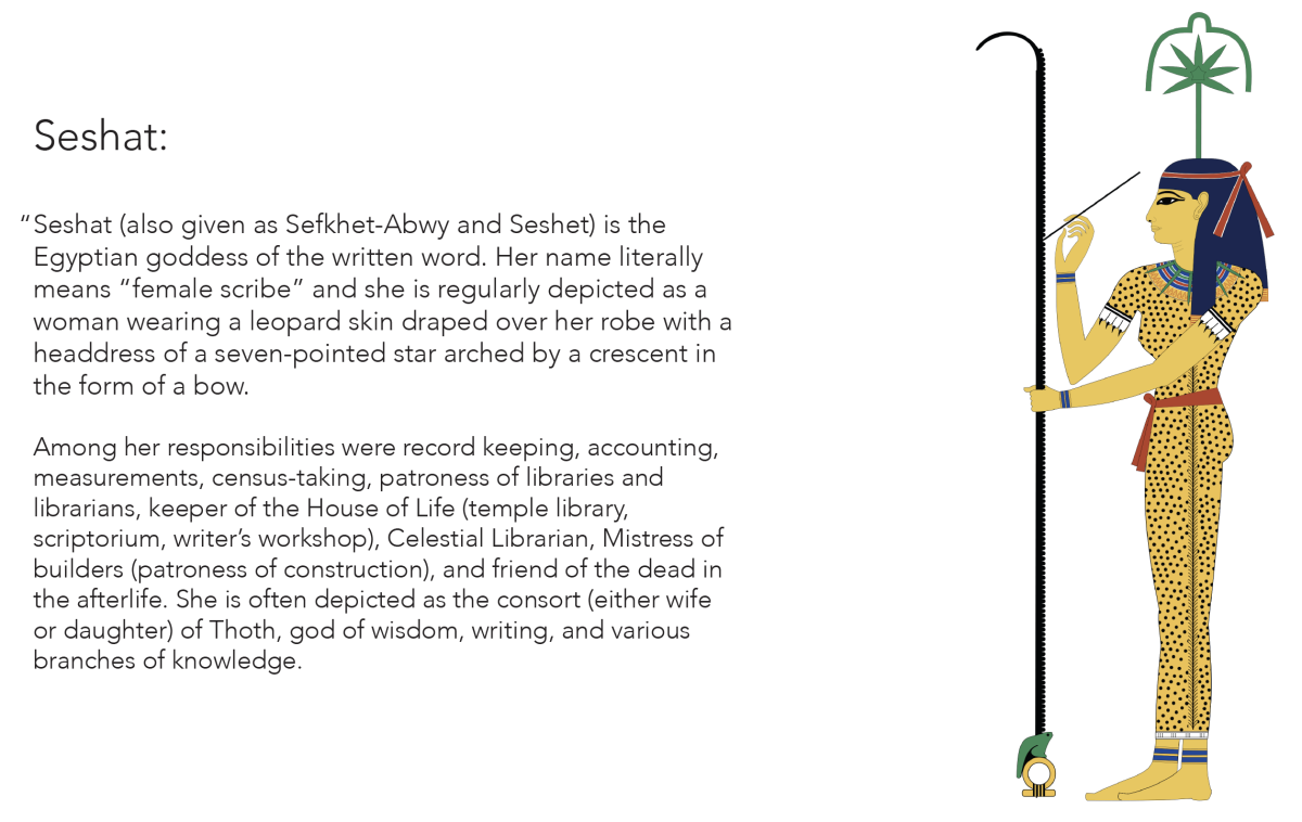
The meaning behind my brand name, Sesha. Originally, I thought Seshat would be the name of my brand, but I decided to modify it later on.
Image
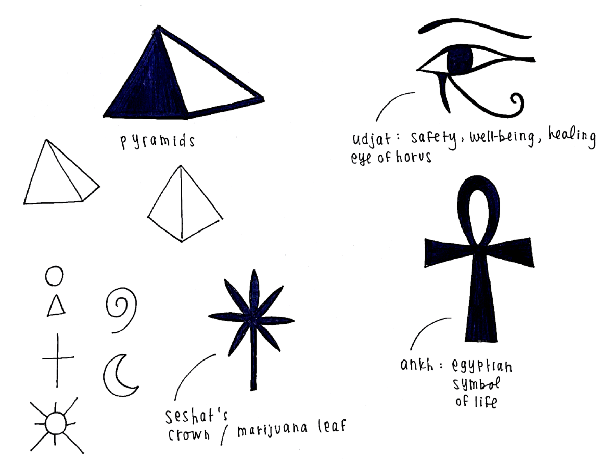
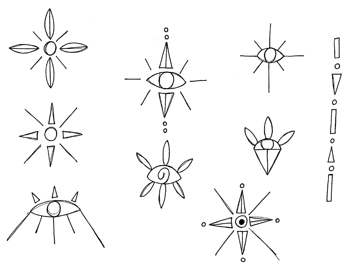
Icon exploration
Image
Logo / graphic elements exploration. On Instagram, I was looking at line-work tattoos, which inspired me to incorporate this style into this project. I found that it is a simple and contemporary way of incorporating geometry and abstract + representational forms into the label design.
Image
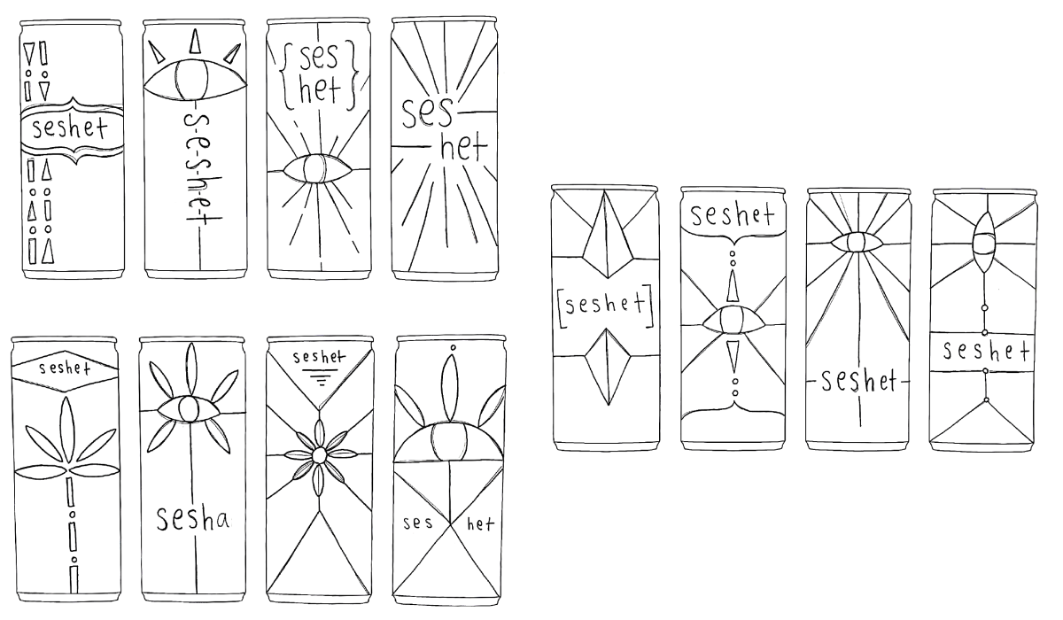
Initial PDP (principal display panel) exploration
Image
I shortened the goddess' name to Sesha, because I found it to be more memorable, fun, and easier to pronounce.
Image
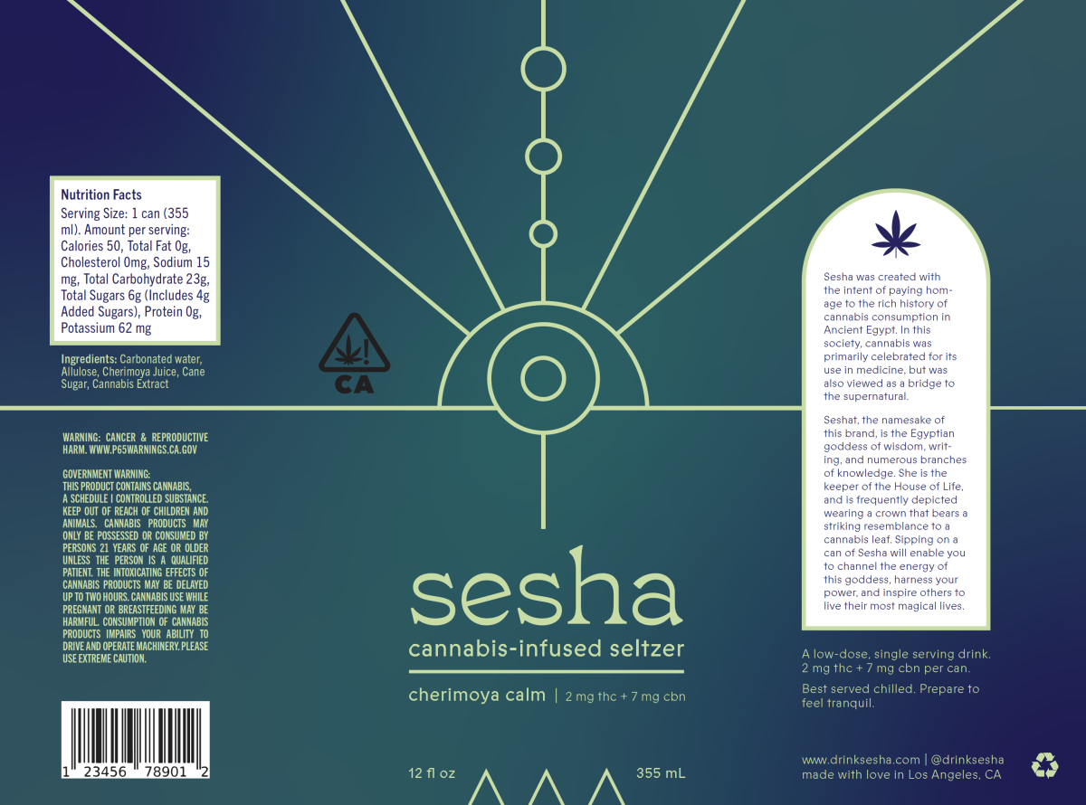
Dieline 1
Image
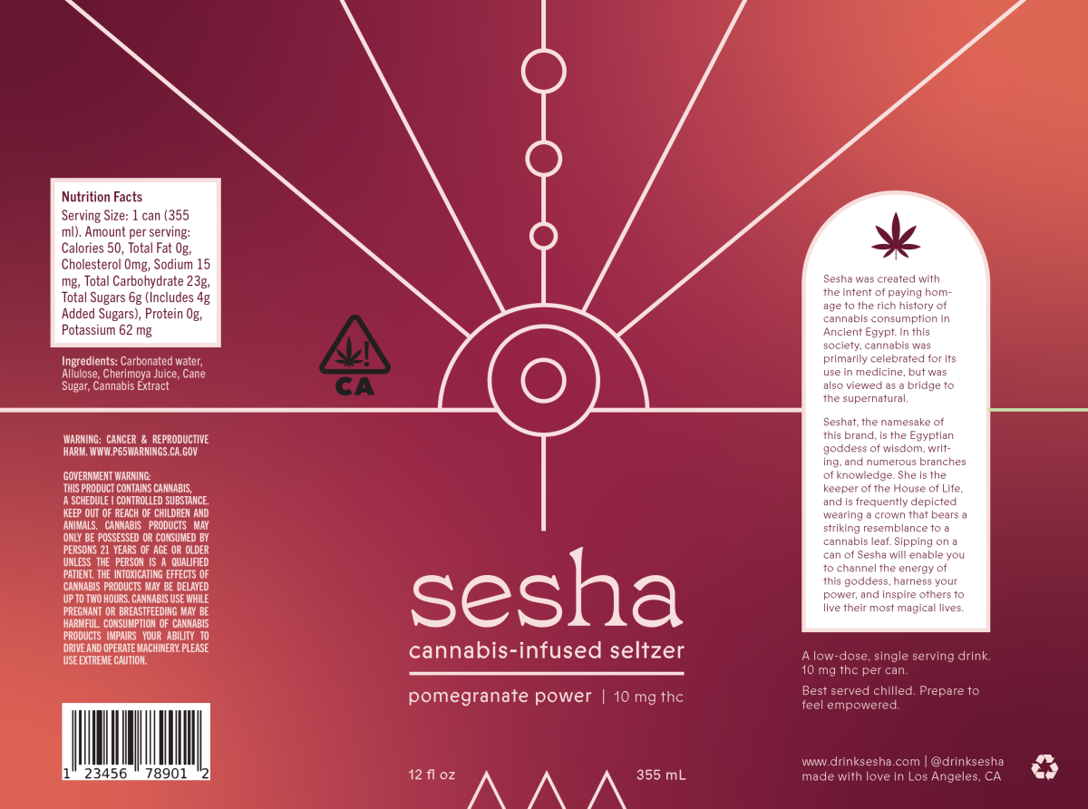
Dieline 2
Image
Dieline 3
Image
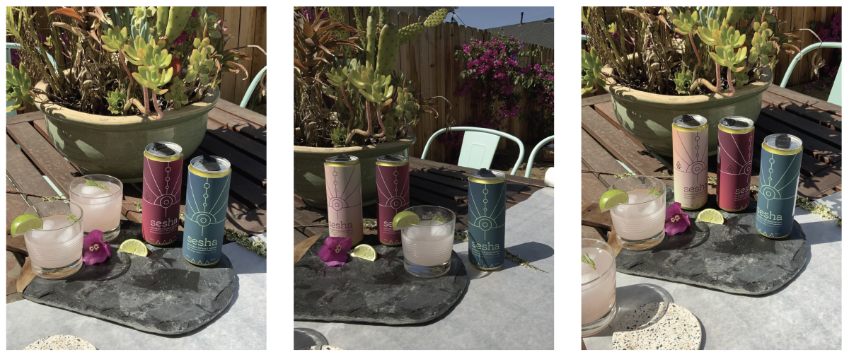
Photography of physical appearance models
Image
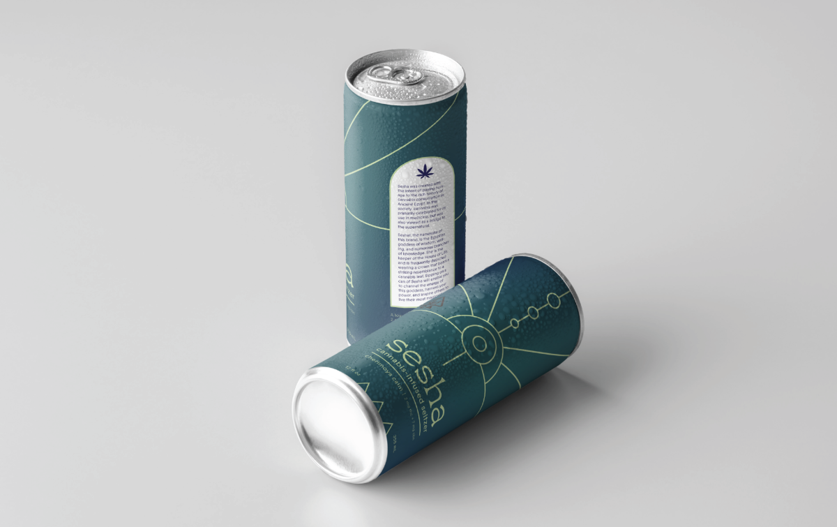
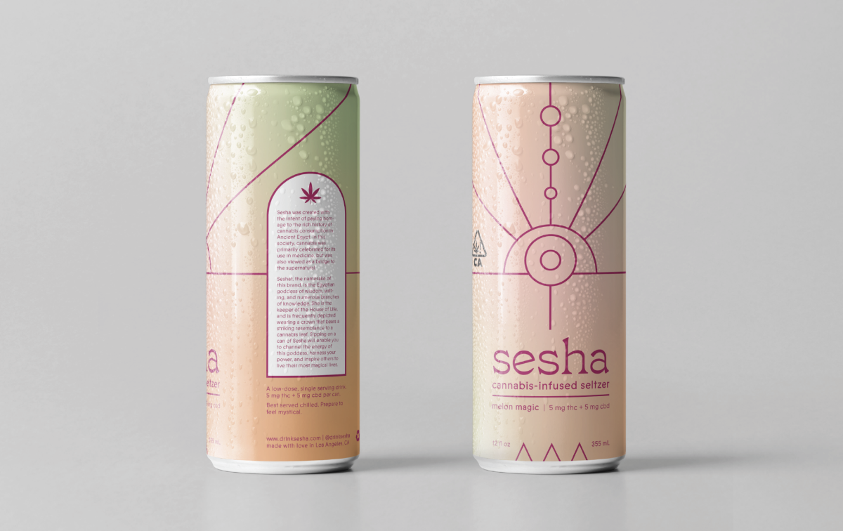
Digital mockup 1
Image
Digital mockup 2
Image
Digital mockup 3